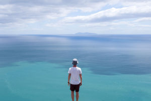
Geometric Landscapes

Mood Board The Altered Landscapes Project

For this project I wanted to focus on Geometric Landscapes and they way that they are edited to highlight the patterns and repetitiveness in everyday landscapes. However I also wanted to bring in elements to the Romanticism genre so that the images will have a overall nicer look to them

Plan For The Shoot 

Concept Genre /  Artist Location Props Shot type Lighting Settings
Altered Landscapes/ Thye Reading/Geometric/Romantisim Beach Tripod Landscape Natural/Sunset Manual focus,f/2.8-f/4, 1/60 shutter speed ISO-100

For the shoot, I am planning to go down to St Brelades beach during golden hour. Golden hour is the period of time just after and before sunset when the colours in the sky are the most vibrant. As I wanted to included element of Romanticism in the shoot, by having a dramatic sky in the backdrop of the images this will help to change the look of the image so that they fall in the category of romanticism  which is an area of photography that I want to combined with Geometric for the shoot.The equipment that I am planning to use is a single tripod as this will help to make sure that the perfect straight which is very important for geometric landscape

Altered Landscapes Johnny Joo

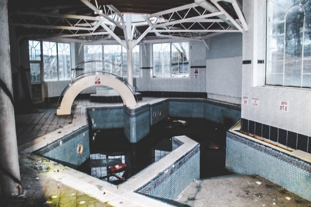
For this shoot, I was inspired to do a similar set of photographs as Joo because I wanted to create a haunted and sinister atmosphere. However I also want to explore the beauty of the abandoned and derelict buildings to grasp a sense of what once was their and appreciate the past and memories which it entailed.

This photo shoot links directly to the theme of altered landscapes due to the fact the landscape has been changed and manipulated by natural disasters and human destruction. Although it hasn’t been altered through the editing process it still has been altered but for real by nature and humans.

Photo shoot Plan

Genre /  Artist – Landscape, derelict urban

Concept –  Capture images in the style of Johnny Joo

Location – Les Charriers Hotel

Props – Tripod to keep images sharp and in focus

Shot type – Landscape, varied angle dependent on subject matter

Lighting – Natural lighting for outside shots, light source to reflect light within the building.

Settings – 2 Second exposures with ISO of 200 as the light is rather dark inside these buildings.

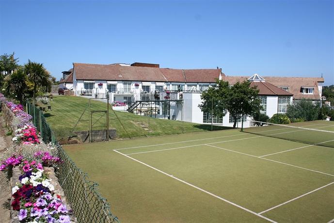
Image result for les charrieres hotel

Image result for les charrieres hotel

Image result for les charrieres hotel

These images are from google and of the hotel when it was in action and completely usable. I will try to replicate some of these images to give a direct contrast between how it used to be and how it is now.

Contact Sheet 1


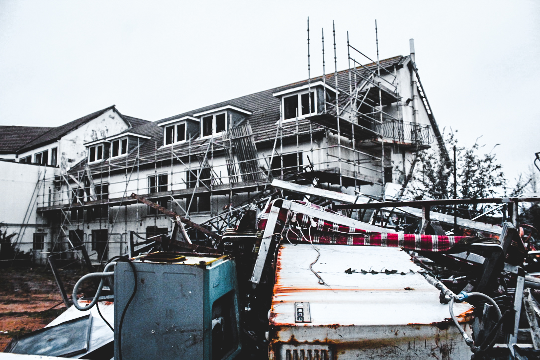
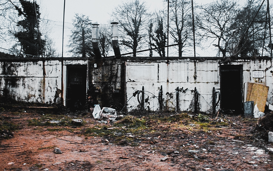
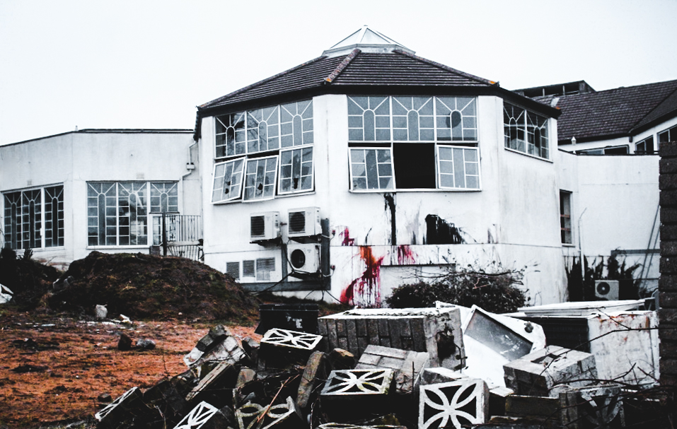
I believe this photo shoot was beneficial in being able to capture the outside features of the abandoned building as the natural lighting was bright helping to illuminate the building. However i was not satisfied with the inside shots as many of them were blury, which had to be deleted. This was due to the darkness within side the building. I intend to re-do this photo shoot but focus on the inside features to convey feelings of horror and show the presence of humans without them being there.

Edits

Contact Sheet 2

Edits

Best image, Analysis

Joan Fontcuberta and James Casebere

Due to his aim of wanting to portray a truthfulness within his work and examine conceptual aspects of art his approach to art is unique.His propaganda and dictatorship of Spain allowed him to reflect his authority wihtin his are,his advertising had complete relationships between photography and truth but most importantly he believed that his humour is the most important concept throughout his work and called his art ‘postmorden’

How does Fontcuberta’s work compare to the work of James Casabere ?

Since the mid-1970s James Casebere (b. 1953, Lansing, Michigan) has been carefully constructing architectural models and photographing them, yielding images somewhere between realism and obvious fabrication.All of Casebere’s work is filled with highly detailed models of but in a juxtaposing nano-detailed space.he does this in order to create his’ constructed  photography’. He focused much of his work on minimalism and the emptiness of spaces to that of the expansion of prison cells to flooded rooms.He likes to promote hunting images that do not underestimate the use of light and shadow to form a sense of size. Casebere is interested in the memories and feelings that are brought to mind by the architectural spaces he represents. The resulting works are dramatic, surreal, and remarkably true to life, embracing qualities of photography, architecture, and sculpture.

This differs strongly to that of Joan Fontcuberta’s work and how he focuses on the interesting work in which we are surrounded to portrays aspects of surrealism and adventure within his images. the juxtaposition wihtin their photos are enormous yet both highly influential.

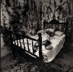
To me Fontcuberta’s work inspires such a depth of beauty and detail of action within his images,everything has a meaning and belonging while still being filled with many visuals. He also has many portrays of people within his work to show how a human ideal to the scenario.I chose this image due to the way in which nature is seen surrounding a basic human necessity, it proposes the state in which he himself lives and how he is tangles and almost retrained to the life of nature and a drawn very humanness aspect of not wanting to leave the bed. It is a minimalist idea but presenting in a more diverse way whereas;

James Casabere’s work prestos a beauty within. basic man made future as he uses the delicacy of light to from and enhance the stutter to become a life and shows a sense of nature though the confinements of human life.

Within my work I too want to show different contrasting elements of more simple and structurally dynamic images enhanced within light but I also ant more interesting and conceptually interesting images.I think both images are just as successful as each other and encompass what they both want to portray every efficiently.I chose to all experiment within His work due to the way in which he is able to show how he captures the landscapes an nature shots which will be the boom of my development shots. Although I think he most effect part of this research is how James Casebere uses light to show tones and stutter within his work which is too what I need to experiment within. He does also have themes of surrealism which will also help me within my project.


Mood-board of relevant images to project idea,And Action plan for shoot

Mood-board and brainstorm

As explained previously I want to expand upon using nature landscapes, urban and historical buildings and putting them into these situation weather it be the sea or the woods,this does create a surreal aspect to the images but overall creates an effective development of original ideas.I chose all the images because they all have a similar theme of moulding architecture  and some urban images to forms of nature, although I will further experiment as this is just inspiration and a theme in which I will too follow. I will edited all my image in a  similar method such as above, and editing the tonal enhancements and creating a black and white effect.

Action plan for final shoot

For the shoot itself  will need to visit around  varies separate locations,althought this will be split into four sections

1)the first of which will be trying to capture a variety of typologies of buildings itself, I want to show urban buildings,strong historical shapes and army grounds,I also want to show large buildings that hold lots of power within my chosen theme,This will also develop the formalism within buildings and capture the shapes and importance of tones also seen within the architecture.

2)The second shoot will be focused  on capturing natural landscapes such as Rocky grounds, woods and as seen above large tree trunks will also take images that are purely for the woodland landscape and  have a power, and  possibly a strong romanticised theme within them.I also want to capture landscapes in which I can edit a more surrealistic images to edit them such as the image above with the door in the rock itself.

3)The Third shoot will be a much more beach and water inspired shoot, this is to show the simplicity of the artists above and how I can show illusions and repetition of shapes and lines and formalism within the piece creating a specific mood

4)finally this shoot is a lot more abstract, it is a lot more based upon capturing light and city scapes with slow exposure shots,I chose to do this incase I can edit them into the image and create a more interesting intriguing landscape image.I have previously experimented within this in my urban shoot and think it was successful so will further look through these images.

After experimenting within all of this I will further edit all the images together this will be around two or three images formed and photoshopped together and then further enhancing the tones. I think I will have to do a lot of extermination within this but overall will develop successfully.

Artist case-Noemie Goudal +image analysis

Noemie Goudal

Her work that I am interested within is all about “observatories” this is a series of black and white images in order to demonstrate harsh strong structures such as concrete juxtaposed within the opposition of their natural equal,so in this case a calm sea.She creates this within using a two dimensional backdrops constructed entirely from paper by herself.This is interesting because it is forming a creates photography element in order to create a mass 3D feel. she consistently uses nature in order to show a more urban area and create an atmosphere that is not accurate to her surrounding when taken.

Noémie Goudal  has always has been drawn to nature and how she can use a combination of culture and combine them,she describes her methods as “invaded” by the man-made. Her strong attraction additionally to drama so also likes to combine all her learning into one. She has two stages throughout her work being her underline absurdity and the contrasting nature being relegated to a supporting feature.She has consistency said to have a deep  attraction for all but the most hardened urbanite. And yet water has had to give way to plastic, a word which has become synonymous with ’cheap’ and ’false’,although her work shows a beauty of nature and also illusion aspects. This is the conceptual concepts behind a strong majority of he photos.

I chose her as an artist due to her clear ideas of the formal elements trying to enhance the beauty of a strutrue that is man made,although also as a metaphor to demonstrate the obscurity of what humans do to land.

Image analysis

I chose this image due to the industrial impact that the center structure has,and also the impact that the reflection has and the power that it holds over the slow clam sea.There is a clear division and symmetry of three aspects within this image,this it the division of the building,the water and the sky, this allows a segmented and well thought out overall composition of the piece. I will have to do a lot of experimentation  in order to know how to successfully mirror a reflection within the water of the image as the object itself will obviously not be there. I think the tonal depth of colours all work very well together due to the way in which the centre is the main depth and then it gets light and then darker tones to the outside against signifying  a strong cut of shape. I like how the structure is such a solid model and how the cut tones and forms allow a strong contrast within the surrounding nature. the sky also has a hint of romanticism but is very reserved due the removal of colour and form to the clouds themselves.Her narrative is so transhistorical and transcultural she uses such simplistic images in order to prints all of her ideas of how she sees society building all these aggressive large buildings and this is taking away from nature,It is meant to symbolise life itself

My inspiration

I do think that all her methods from tones to the way in which she contrast her buildings to nature is all successful and the way in  which she too wants to show,I also think that the way in which she hangs her images and finally presents them is also successful and highly unique I too will put a lot of thought into presenting my overall last images because it is definitely one of the most important finishing features and I will experiment within this more after I have produced my images.

Development of my ideas:Altered Realities/Final Ideas

As previously I explored the idea of capturing landscapes and then editing them in order to show a more creative and dynamic arrangement of the pieces. I chose this idea due to the way in which I can capture romanticised landscapes but then additionally I can Also capture night sense and experiment within exposure and shutter speeds whiten my camera. The mirror movement of the composition also connotes a feeling of a moon and enhancing the overall beauty and natural concept to the pieces. However I have then gone through my images in which I already have and decided that these would not be the most appropriate as the editing and such is not as advanced and urbanism is lacking in many of the images in the darker tonal range in which I want to show.

Although when researching to find inspiration of altered realities many incomprehensible areas such as surrealism of joining typologies of buildings and nature all into one successful piece.

:

Firstly I chose this due to how it demonstrates both industrial and a more nature surrounding aspects of landscape photography and forms them together,it prosopeses an illusion and also a statement of history of what was their first yet the significance that both have are of importance. I was drawn to the connection of the house and the large impact the piece had overall,I do think this purposes an altered reality but also highlights a surrealism.The concentration of typologies of buildings and also a landscape that melds urbanism within nature,which to me is the most important aspect to the images

Overall I will now  focus purely on molding urban architecture within nature and how I either do this in contrasting scenarios or with the addition of camera techniques and editing to show slow shutter speeds and such. I could also further this within mirroring lines and previous experimentation with editing techniques seen within my urban shoots.

Due to me having this idea I think it would be effective for me to do more studies on forms and also typologies in order to get an array of buildings in which I can develop to form within nature.I do think urban buildings would also be suiting to attack into themes of nature but I would want to form a more accurate bond such as using a city scape and then slo light exposure moulding the images of night and an urban landscape.

Furthermore I could expand my ideas to being that of many different circumstantial places of nature that still conflict with different urban  or historic buildings such as seen above.I believe this will give more a lot more development methods of how I can accomplish this also surreal style and also how I can form symmetry and editing  wihtin my image and create them as a style of interest.

JOHNNY JOO – Altered Landscapes

Johnny Joo gives the world a glimpse of places long forgotten through the lens of his camera. He is a photographer by trade but an urban explorer at heart. The scenes he shares are covered in weeds, moss and cobwebs. They serve as an eerie reminder that nothing lasts forever.Related image

Joo cautions that viewers should appreciate the subjects of his incredible photos but keep them in mind also as examples of humanity’s wastefulness and the impact society has on nature.”It’s really important to think about just how much we leave behind,” the 25-year-old Mentor native said. “I want to try and make a change in the way people think.”

He’s photographed abandoned malls, stadiums, schools, hospitals and houses. His pictures from inside Mike Tyson’s deserted Ohio mansion and the decaying Geuga Lake Amusement have gone viral on the Internet.

Image result for johnny jooImage result for johnny jooImage result for johnny joo

Photo Analysis

Image result for johnny joo

This photograph is a true representation of the past. It represents a discovery of forgotten things which brings a realization that this place was someones past; the history of lives we never even knew. There is great use of leading lines and depth of field within this photograph. The layered chairs, which represent a sense of structure which once used to stand, helps to draw the audience to the daylight in the distant windows. I believe this small amount of natural light represents a feeling of hope that is left about the building. The carefully positioned chairs create a strong contrast and juxtaposition to the rest of the building which is completely wrecked and derelict. This use of contrast may be a reference to the atmosphere which once was present to how it appears to be now. Personally I see these this photo as a missed opportunity to help those who don’t have a place to call home such as the homeless.

Beomsik Won

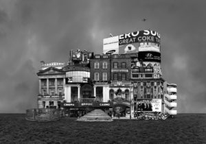
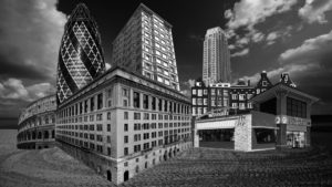
Beomsik Won takes photographs of urban buildings from different times and spaces, breaks them down into segments using digital techniques, and constructs collages to create familiar-looking, yet imaginary buildings. To make these “Archisculptures” as it is called, he carefully combines the segments taking into consideration the architectural size, space, and formative elements; he then places them against simple backgrounds, and lastly adds people or birds for the viewers to guess the size of the building. Although these strange buildings are products of the artist’s imagination, they show various styles of architectures throughout history.

My response to Beomsik Won.

Case Study: Tyhe Reading

http://www.tyhereading.com/

Tyhe Reading is a professional photographer and graphic designer located in Melbourne, Victoria. With a focus on sustainability, Tyhe captures his subjects in a way that is truly representative of the experience.  He first started taking images at aged 14 but really found his passion for the subject and deiced to peruse it as a full-time career when he was 17. His photography works stems from his childhood of growing up on the Coast, admiring the natural environment in ways that had to be captured with a camera. This crosses over into his design work as he tries to incorporate his love for the natural environment and geometric structures into his designs.
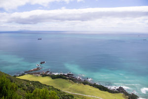
 

Image analysis


This image was taken during golden hour using natural lighting to capture the image. You can tell this because the light that is being reflected of the sea and the mist in the background of the image had a golden tint to it which would only happen during golden hour which is ethier sunset or sunrise. The shutter speed would have been around 1/40 1/100 to make sure that the waves are in focus and sharp The main focus of the image is the triangle in the centre which has then been split up into furthering different parts of the image to create a geometric effect. There isn’t much texture in this image as the waves in the foreground ae very smooth and sleek, however a bit of texture can bee seen in the background of the image with the rocks but mainly only the silhouette can be seen. Overall the image is very light the only dark tones in the the high raise of the wave and the outline of the rocks in the background

David Hockney’s Landscape Joiner Photography

David Hockney

David Hockney (born 1937) is an English painter, print maker and photographer. He was an important contributor to the pop art movement of the 1960’s and is considered one of the most influential British artists of the 20th century.  Hockney has made prints, portraits of friends, and stage designs for the Royal Court Theatre and the Metropolitan Opera in New York City. Hockney was born with synaesthesia, he sees synesthetic colours in response to musical stimuli. In the early 1980’s, Hockney began to produce photo collages that he called ‘joiners’, in these Hockney took multiple photographs and arrange a patchwork to create a composition.

Image result for david hockney landscape joiners

Image result for david hockney landscape joiners

My Favourite Photograph

Image result for david hockney landscape joiners

In this joiner photograph it appears that Hockney used natural daylight to capture it. This is because the colours are very vibrant and there is a natural level of contrast within the photograph. In the photographs that make up this collage, I think that a deep depth of field will have been used to ensure that the whole of the photograph is in focus. A shutter speed of 1/40 – 1/100 will have been used along with an ISO of 100 or 200 for this as the photographs making up the collage are sharp and have the correct amount of exposure.

There are lots of vibrant colours in this collage which catches the viewers eye, this creates a wider tonal range and more contrast between colours in the photograph. The majority of the collage is light, the only dark tones are in the trees and shadows. There is a texture in the ground in the collage which allows the viewer to see the photograph as more realistic and relate to it more. It is quite a 3D image as there are obviously subjects in the foreground and subjects in the background which get darker as they get further back.

This photograph is one of Hockey’s joiner photographs in which he would use polaroid prints and 35 mm commercially processed colour prints of a single subject to create a collage. The result of this joiner work has an affinity with Cubism, which is one of Hockney’s major aims – discussing the way human vision works.