Tableau photography ideas and shoot

For my tableau photography I want to focus upon 7 deadly sins and capturing some, in specific I want to capture  a whole person of the person and in which they can.

I want to show more of a portraiture close up in order to show a close use effect and persona, I do although want to show more of the color of light in order to exaggerate the whole persona and sense top the image itself. 
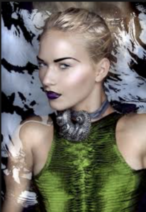
This image was inspired by envy and show the green  and snake around her neck are all placed there in order to successfully I’ve herself a persona. Furthermore the black water shows a deep tonal range  and mysterious and dark connotations of hurt .
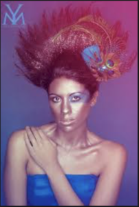
I chose these images because of the vibrancy  in the color which I like and also how this is accomplished but the way in which the color and vibrancy allows a sense of persona.This image is inspired by list but in a more Modern day creative  way, the peacock feather allows a sense of calling or login for someone else.The positioning and composition of her arm also shows her low sense of security without someone with herself.

although in addition I also want to show the way in which the darker image more accurately show the darker side to signings and the whole concept of 7 deadly sins.

tableau artists

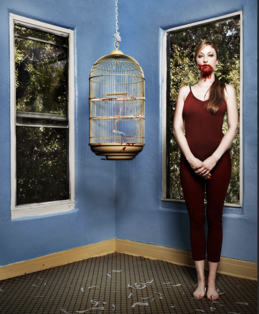
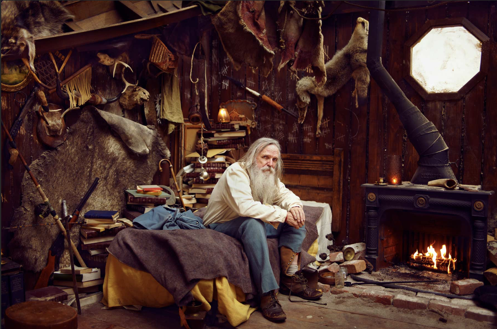
Ryan Scudded :Is a tableau photographer who’s works are highly vibrant and creative but not always in the conventional means of color. Chicagoland – growing, climbing, playing 1997 – 2003 – San Francisco – reading, writing, learning 2003 – 2006 – San Diego – shooting, driving, flying 2006 – Now – Los Angeles – making, lotsa, stuff.I chose his images because ei liked the way in which he captured a specific theme and scenario in a way in which is stereotypical and not heard of.

although the following work is not inspired by the theme in which I will develop I do think it is interesting and lots of good techniques that I too could use throughout my own work ethic.
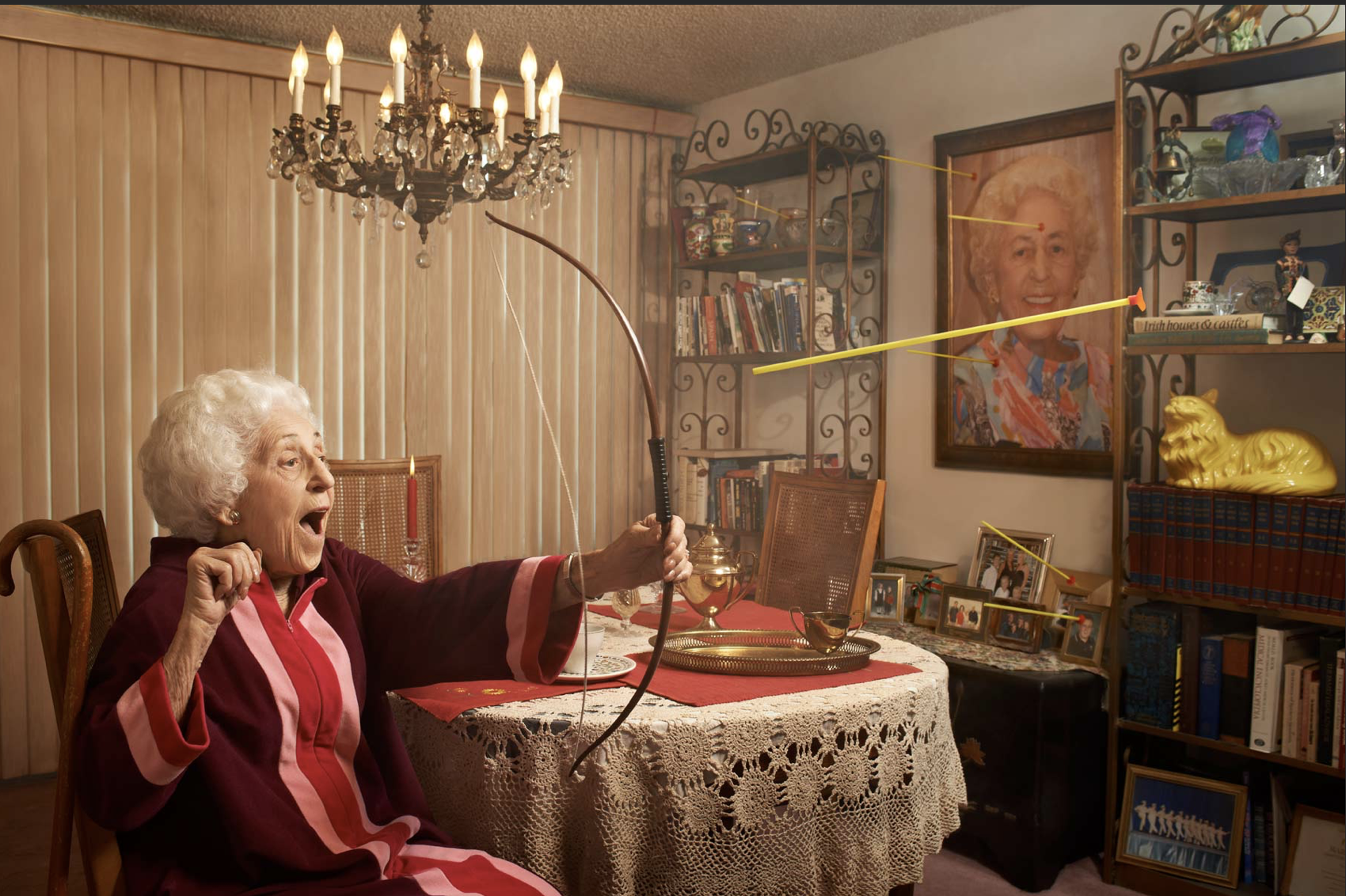
I chose this image because I liked the way in which the photographer captured a persona to the person and a sense of action with the addition of having her self portraiture and furniture that compliment the age and history of herself.It could be perceived as a juxtaposition of adventure for such an older person and how her child like persona has not diminished throughout her aging. The light on this image is quite warm and reserved in order to take away the light that shows connotations to being young and so presents a later presents in her age and also how that compliments the atmosphere  itself.
settings for my shoot:

due to me being inspired but he 7 deadly sins I want to choose settings that work well within these words and have clear connotations to the meaning of themselves.

  • Lust.
  •  Gluttony.
  •  Greed.
  •  Sloth.
  •  Wrath.
  •  Envy.
  •  Pride.

for the following I was mostly inspired by the following three, envy,lust,greed. For the setting of lust I would want to capture a sinister feel to the image,having a sense of fair tail and how people are fuled with want and not love.While also having the connotations of revenge and darker themes theirs should also be themes of stereotypical love and lust such as using sheet and other people within the shoot itself.

for envy I want to show sins of red and fire and a deep hatred of jealously within the photos, this can also be shown with money and riches that perhaps themselves they are missing. for this image it met be effective if there is one entered person surrounded by many other people who possibly envy her, this would begin a movement and a large central impact to the images themselves.snakes can also be an accessory and also perhaps water with the following accessories surrounds themselves.,also possibly eating an apple again showing the fairy tale connotations.

greed is the final word in which I am own to use, this is due to the impact that I can use many old and silver enrichment and a crown and possess an over exaggerated feel to the image itself. I also want an interesting placement and composition for these images,so I would ;possibly use a bath and many colors in order toe exaggerate the bean of persona of luxury and money.

editing techniques for my shoot:

1)enhance the color that has connotations to the word itself, red for lust,green for greed, black and white for lust.

2)Photoshop more accessories or objects that are again related to what I am trying to create in the atmosphere.

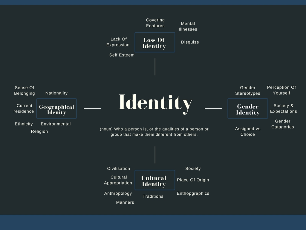
This links to lack of identity in the following,The three sins that I am recording relates to how people become these people and how their whole identity  revolves around how others treat them and so how they decided to interact to others,and if they are envious and or anything else.

Finished results:


Tableau Photography

What is tableau photography?

Tableau is the French phrase for 'living picture'. Before photography was a thing it was a popular past time to which people would recreate scenes from famous paintings at parties. These people would dress up and use props to make it as accurate as possible. As photography emerged artists such as Julia Margaret Cameron created fantasy scenes like Sir Launcelot and Queen Guinevere, which prompted a huge interest in the art form. However this form of photography fell out of fashion with the introduction to realism.

Some of Julia Cameron's work can be seen below:
As seen in her work, she wanted to focus on how the photos were meant to recreate paintings in an innovative and creative way not seen before.
The 7 deadly sins were a popular topic when doing tableau photography due to each one having an important connection. These were Lust, Gluttony, Greed, Sloth, Wrath, Envy and Pride. I could then link this back to how these all formed their own unique identity and change the individual for the good or worse.
Final presentation Ideas

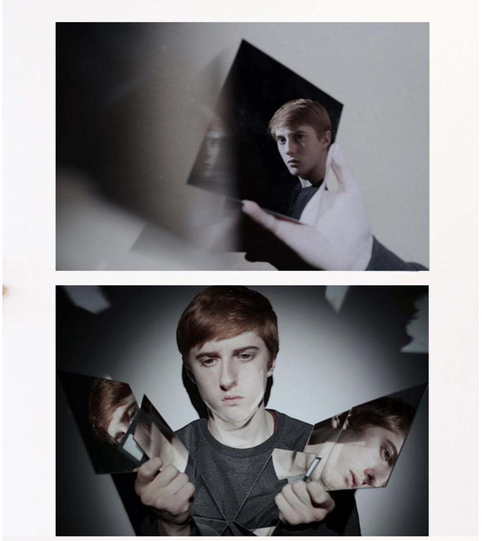
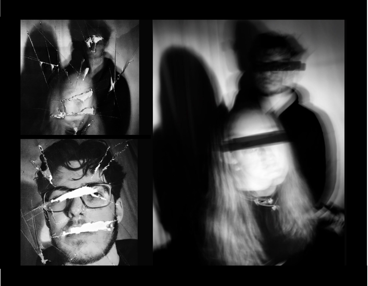
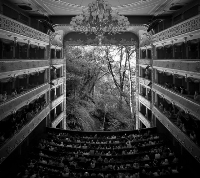
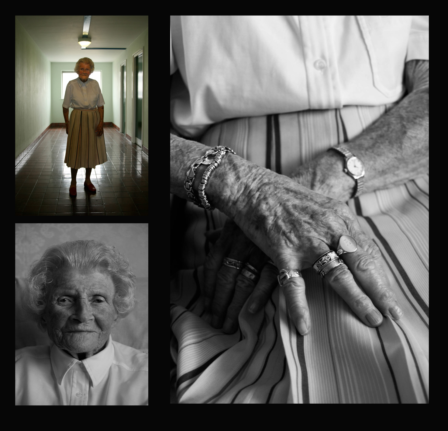
For this presentation I wanted a clear cut and also elegant presentation of the photos themselves, the sizing also compliments the image as the white is not too harsh so very suiting to the images themselves,I finally chose these two images to be displayed because both have the interesting illusion enhanced by mirrors and additionally the same tonal range and would both be enhanced with the same background color and cut of edge. I think the presentation of one being displayed on top of each together would work because it clearly displays the images both confidently and also creates a good demonstration of what the images are and can achieve.

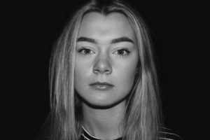
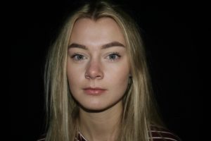
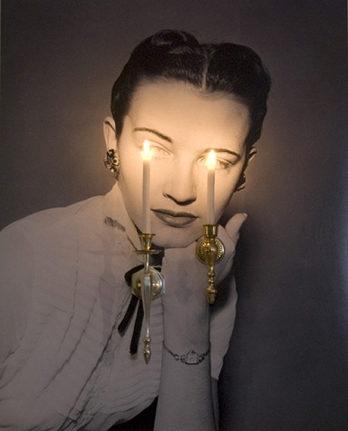
This image is also more busy but works well as it reflects the busyness and also the hardship reflected by the strong connotation of loss of identity. I chose three and separate these into one harsh of the cutting editing and the second with a slow shutter speed and covering of the eyes in a. different manner which is effective.The black background brings around a sense of cohesion between all the images but the placing also suggests an interesting overall composition and dominance within the photos.

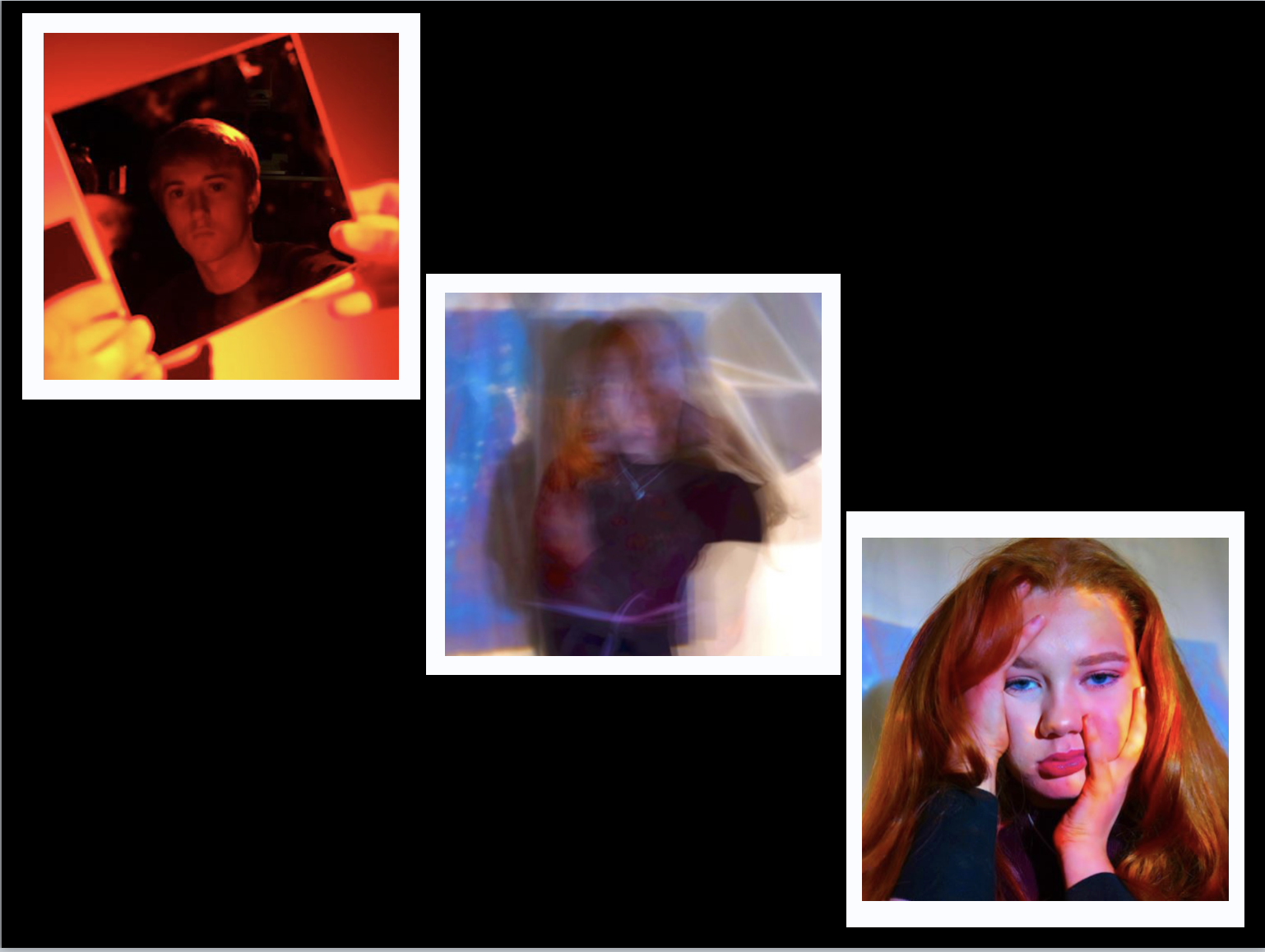
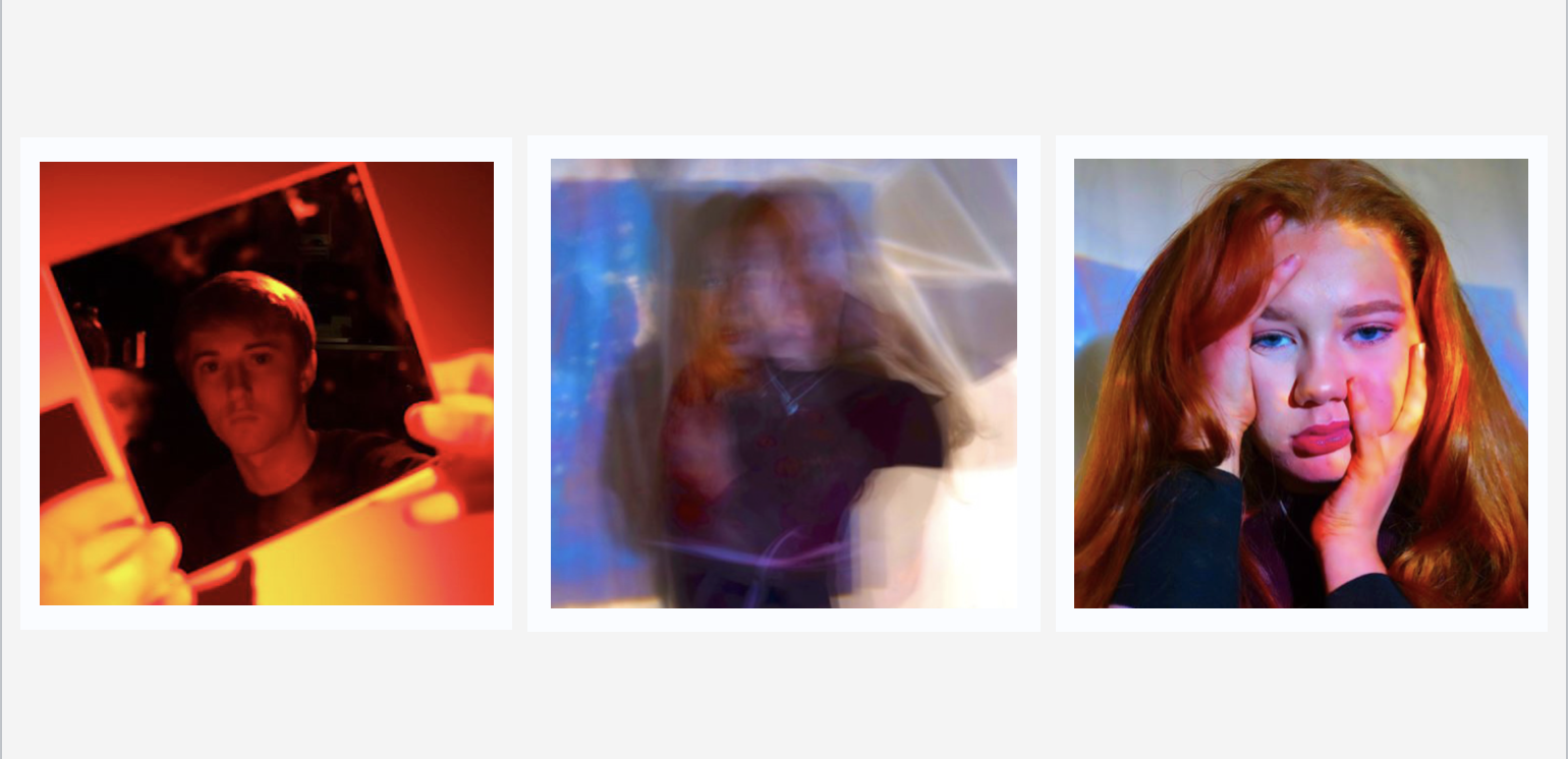
For the more colorful abstract pieces I chose black for the background but these did not successfully show the vibrancy of the color, due to this I decided on a more interesting white boarder for the images,which I just need to further check that they are all equal in proportion but this would also have both themes of the first and second presentation  within the final one seen here.I do think i could further experiment within this and perhaps lining up all three images to be in a line would be more effective overall.


I think this is a much better presentation,the harsh colours do not remove the attention from the actual images themselves and in addition you are still able to see the white boarders giving more of a shape.Also being in a line create a form to the piece and does again not remove from the vibrancy already in the image themselves.

My Work Compared to Johnathan Ducruix’s

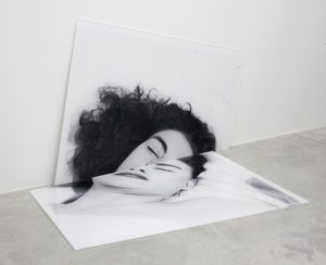
For my final portraits I took inspiration from Johnathan Ducruix’s work titled “Metamorphosis” in which he uses photoshop to manipulate the human body to show how flexible and fascinating the human body is and what it is capable of. I liked the mystery in Ducruix’s work and the uneasy viewing it has so I tried to replicate this in my photographs.

Image result for jonathan ducruix
Johnathan Ducruix’s photograph that my primary inspiration came from.
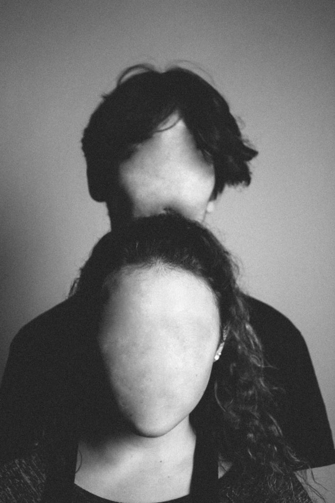
My photograph that drew inspiration from Ducruix’s work.

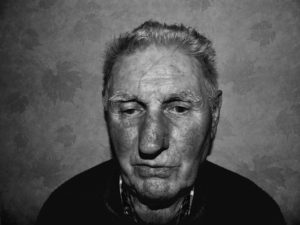
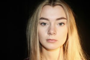
A similarity in our photographs is the lack of facial features and the mystery and uneasiness. The mystery in Ducruix’s photograph is recreated in this by the lack of context, the photograph tells nothing to the viewer – it leaves them confused and intrigued but also uneasy, This uneasiness was created by removing the facial features and placing the models in the centre of the photograph. This uneasiness was also created in Ducruix’s photographs from how unnatural and physically impossible the photograph was.

The difference in the photographs are the settings – Ducruix’s photograph is lit with quite a high exposure and uses natural tones. The high exposure and bright lighting takes away from the effect of the photograph so in my photograph I decided to use some chiaroscuro to add the the mystery and to create more contrast and shadows. I also put the photograph in black and white to create a more dramatic image.

Week 12 + 13 Completing The Portrait Unit

You now have 2 weeks to complete…

  • FINAL photo shoots as a direct response to your chosen photographer Re : Case Study (AO1 + AO3)
  • get out “on location” and explore tableau approaches in depth
  • explore a wider range of editing techniques (AO2)
  • blog-based presentation of final outcomes (AO4)

Ensure you have enough evidence of…

  1. moodboards
  2. mindmaps
  3. case studies (artist references)
  4. action plans
  5. photoshoots + contact sheets (annotated)
  6. appropriate selection and editing techniques
  7. presentation of final ideas and personal responses
  8. analysis and evaluation of process
  9. compare and contrast to a key photographer
  10. critique / review / reflection of your work

By Friday 8th December we should have your final prints (x3) ready to mount and frame

  • you will learn how to cut window mounts using a bevel cutter
  • you will learn how to group  / sequence your images
  • you will learn how to present your images using foam-board

Alternative Presentation Techniques

You should explore other possibilities and show on your blog a range of ways that you could present your work

such as…

Tanja Deman…using screens or backdrop to display images and present an alternative context
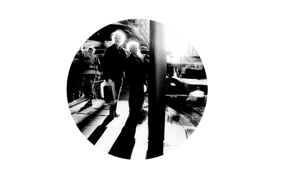
Experiment with alternative-shaped images….try circles


Remember to pay careful attention to…

  • your lighting
  • exposure control
  • composition
  • focus

Add at least one sequence of images to your blog to show the layout / framing of your final images


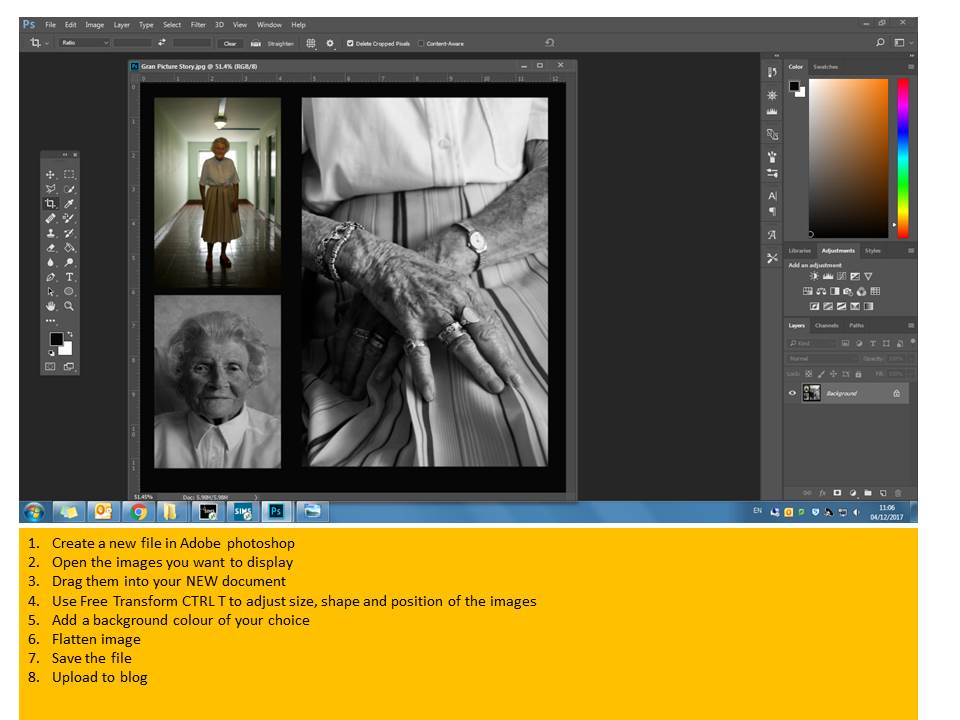
Use Photoshop to place your images within a document and add screen shots to show your process…

Tableau Ideas and Starting points

  • re-create an existing story-based photograph or painting, or scene from a film
  • illustrate a poem, story, song lyrics, dream etc
  • one or more of The Ten Commandments
  • one or more of The Seven Deadly Sins

Tableau Photography is staged. Think of it like theatre. Include props, backgrounds, costume etc that connects to your theme somehow.

Tableau Photography makes use of symbolism and metaphor.

Allegorical paintings / photographs contain metaphor and symbolism

Pictorialist Photography has connections with Tableaux Vivant.

here are some examples that could inspire your own ideas…

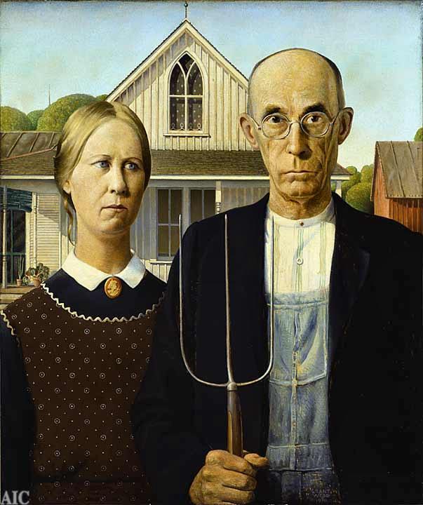
American Gothic by Grant Wood
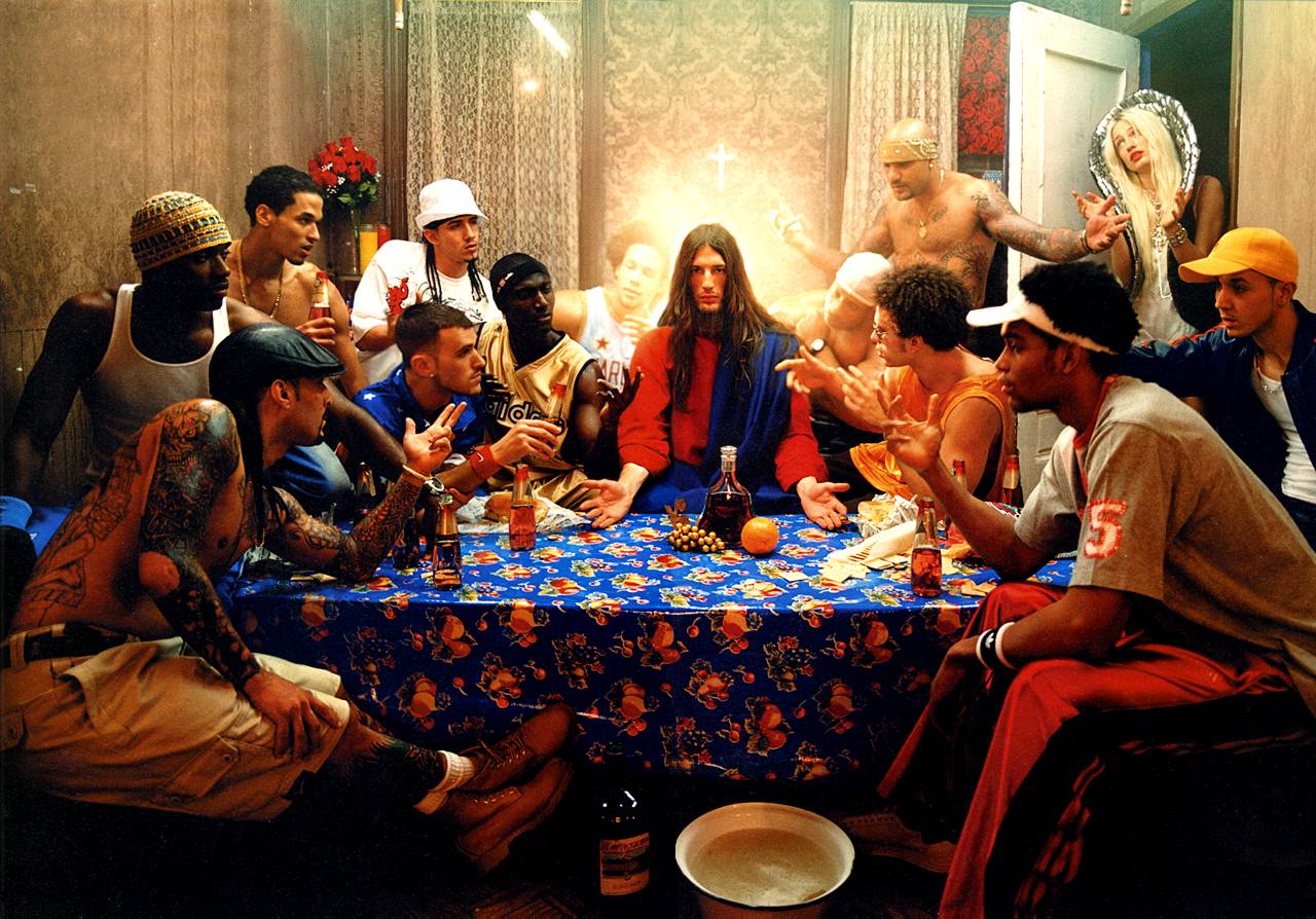
The Last Supper by David LaChapelle
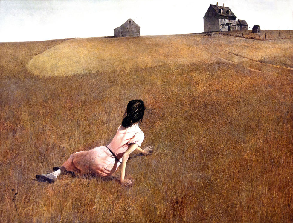
Christina’s World by Andrew Wyeth
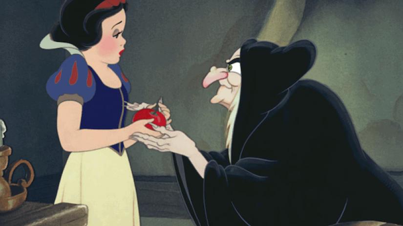
Disney’s Snow White

Critical Analysis of the story of Snow White CLICK HERE

Extension Task

  • Visit the Constructed Narratives Exhibition by Hautlieu A2 Photography Students
  • Berni Gallery—Jersey Arts Centre
  • Open 9am-5pm
  • Document your visit with photographs
  • Create a blog post with a review of the exhibition
  • Analyse a key image / set of images that interested you.