Landscape Photography | Coursework Unit 3 | Getting Started…

YOU WILL HAVE 7 WEEKS JAN 3 -FEB 26 TO COMPLETE AND SUBMIT YOUR FINAL UNIT OF COURSEWORK.

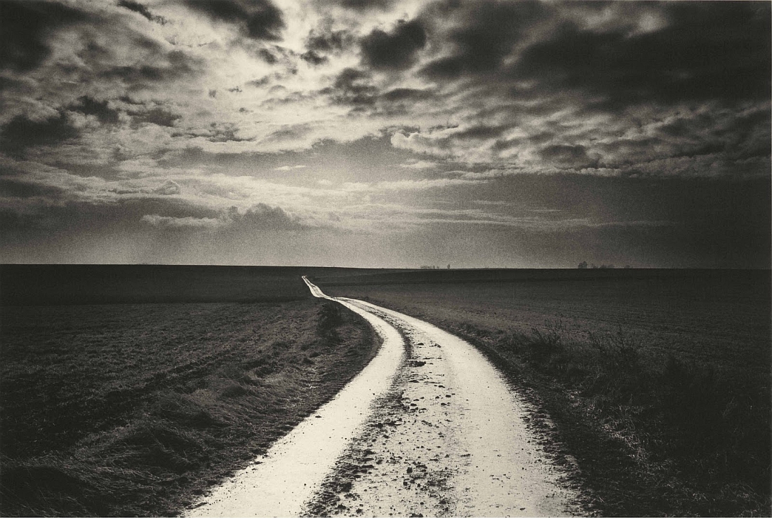
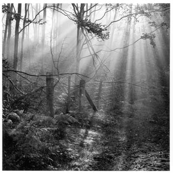
Christmas Break : you should aim to produce a range of landscape inspired images, focusing on natural environments, evocative and atmospheric settings.

Try to get out in the morning / evening light or even at night and capture interesting light effects, colours, mist, fog, and shadows too…

Possible locations include : woods, forests, sand dunes, beaches, fields, valley settings, cliff and coastal areas, sea-scapes (looking out to sea), church-grounds etc

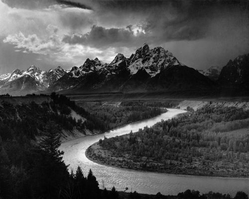
We will be looking at Romanticism as a starting point and if you click here you will have a better understanding of some of the roots of landscape in contemporary photography….
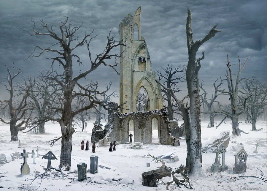
Caspar David Friedrich 1832 Germany
Ansel Adams 1942 USA
Don McCullin 2000 UK
Fay Godwin 1985 UK


AS PHOTOGRAPHY MOCK EXAM

THEME : LANDSCAPE 

DATES…

MONDAY 26TH FEBRUARY 12 A PERIODS 1-5 IN PHOTOGRAPHY ROOM

TUESDAY 27TH FEBRUARY 12 B PERIODS 1-5 IN PHOTOGRAPHY ROOM

WEDNESDAY 28 FEBRUARY 12 C PERIODS 1-5 IN PHOTOGRAPHY ROOM

THURSDAY 1 MARCH 12 D PERIODS 1-5 IN PHOTOGRAPHY ROOM

PRINT DEADLINES

FEBRUARY 19TH 12A, 20TH 12B, 21ST 12 C, 22ND 12 D

(You can add abstract, formalist, portrait and landscape final images to this print run too)

You may have other opportunities to explore architecture, and make links to what you studied in ABSTRACT AND FORMALIST photography…

Link to BBC Website feature on Architectural Photography


Photoshoot 2 // Loss Of Identity

Rosanna Jones

Rosanna Jones is a 19 year old photographer and mixed media artist  who distorts and tampers with her photographs to create unique mixed-media pieces that are both beautiful and disturbing at the same time.  She is based in London and recently graduated in Fashion Photography from Falmouth University. Rosanna explores how body image – whether positive or negative – can unconsciously effect identity. Through Rosanna’s work, she questions and challenges the ideas of beauty in regards to how a person feels internally compared to how a person is perceived by the outside world.

I believe there is a strong link between Rosanna’s work and the theme of loss of identity. This is seen through the use of camera settings which she intentionally uses to capture a sense of lack of identity. For example using slow shutter speeds to create a motion blur on peoples faces or using aperture to focus to foreground and blur the background, thus being the models. She also makes the most of the natural things, like smoke which she seems to have used in many of her projects. She uses this smokey effect to help hide certain features of a persons body and reveal some too.

Examples Of His Work

Image result for Rosanna JonesImage result for Rosanna Jones

Analysis

Related image

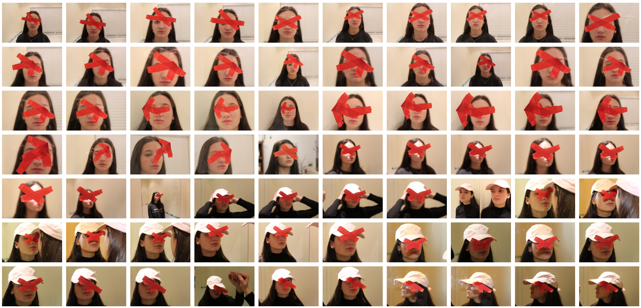
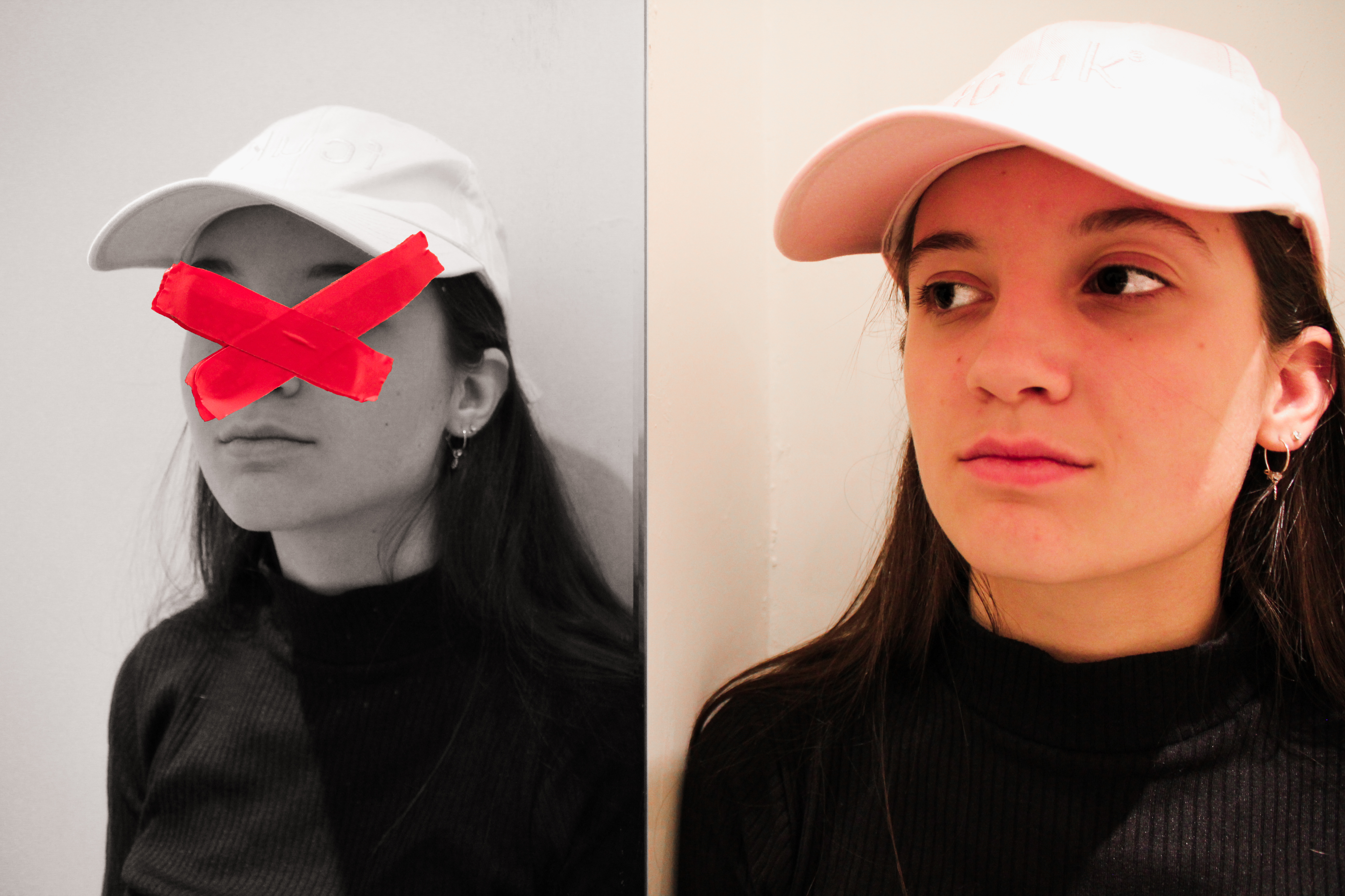
This image happens to be effective purely due to the simplicity yet effectiveness that it has. Although the image appears to be rather simple, it can be interpreted in a variety of ways, having many connotations. I believe this photo was taken through some glass or a window with the tape stuck onto the window. The photographer would have used a low aperture setting to allow a shallow depth of field, ensuring only the tape is in focus. The eyes are the key symbolization of a persons identity which I believe Rosanna covered to give this sense of a loss of identity. The tape, which is vibrant, help to attract the viewer and influence them to intake the messages associated with the picture. One message may being that you shouldn’t judge a person on their identity as we are all equal. I believe the messy positioned tape could reflect the harsh stereotypes that people make based on appearance. The  untidy tape acts as a leading line to help guide us around the face of the model. The eyes have seemed to been tampered, by the way in which they have purposely been covered. This may relate to how the person has been effected with what they have seen wrong in our society or how their personality has been tampered with. Overall this image is influential and a very captivating that helps to reflect a loss of identity through the use of a strong contrast and symbols that represent this.

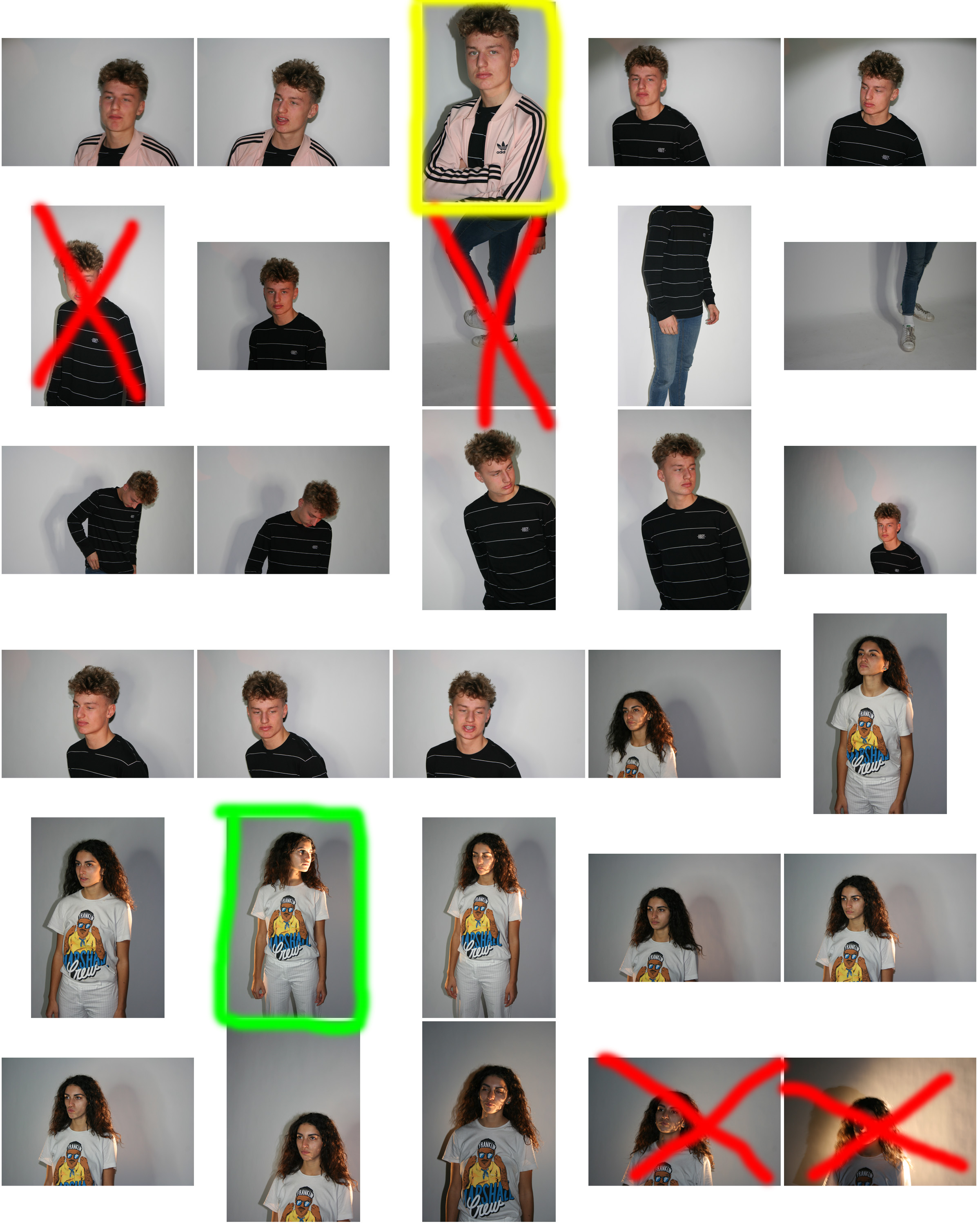
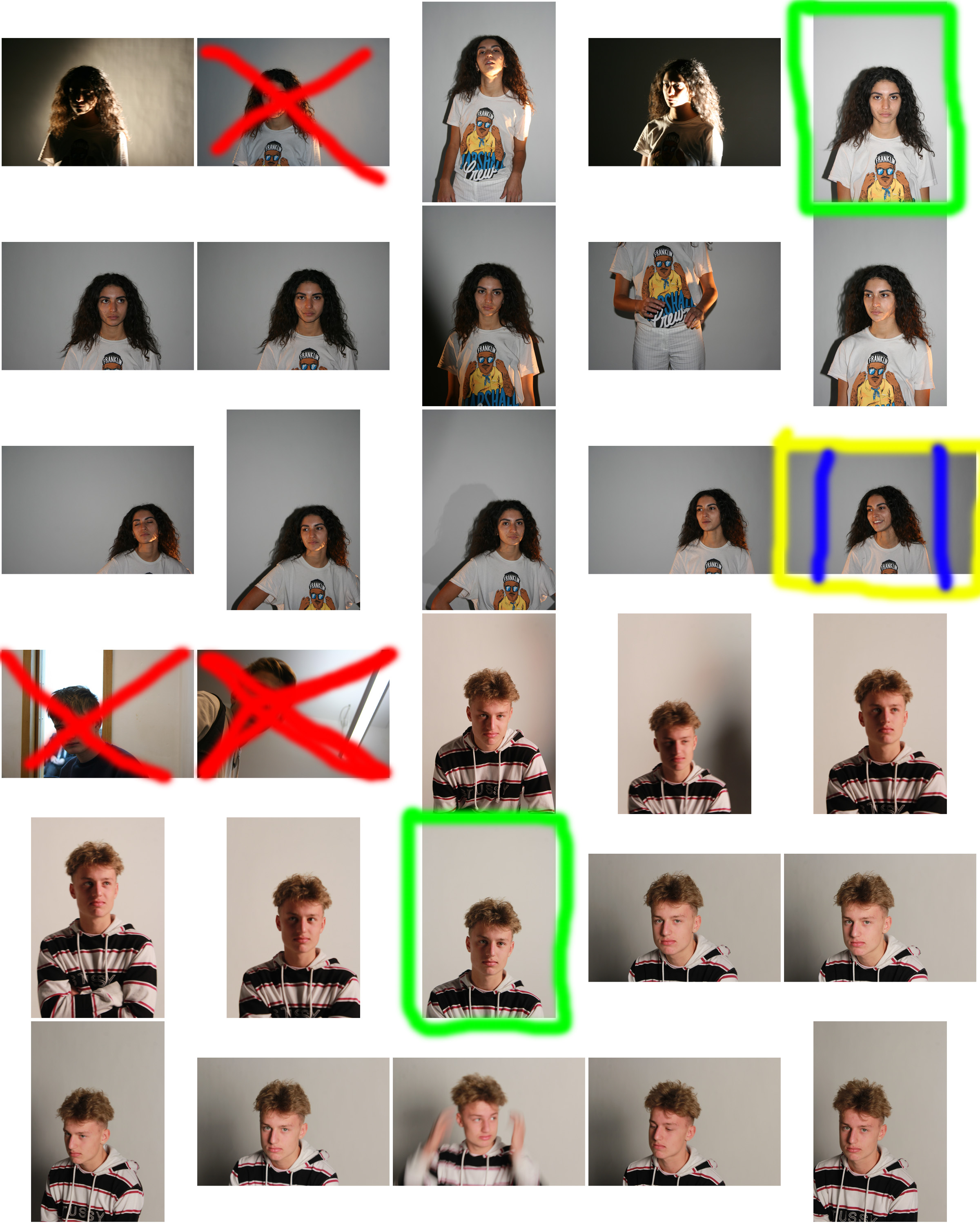
Contact Sheet

Edits

Creative Portraiture Edits [social identity]

CREATIVE EXPERIMENTS

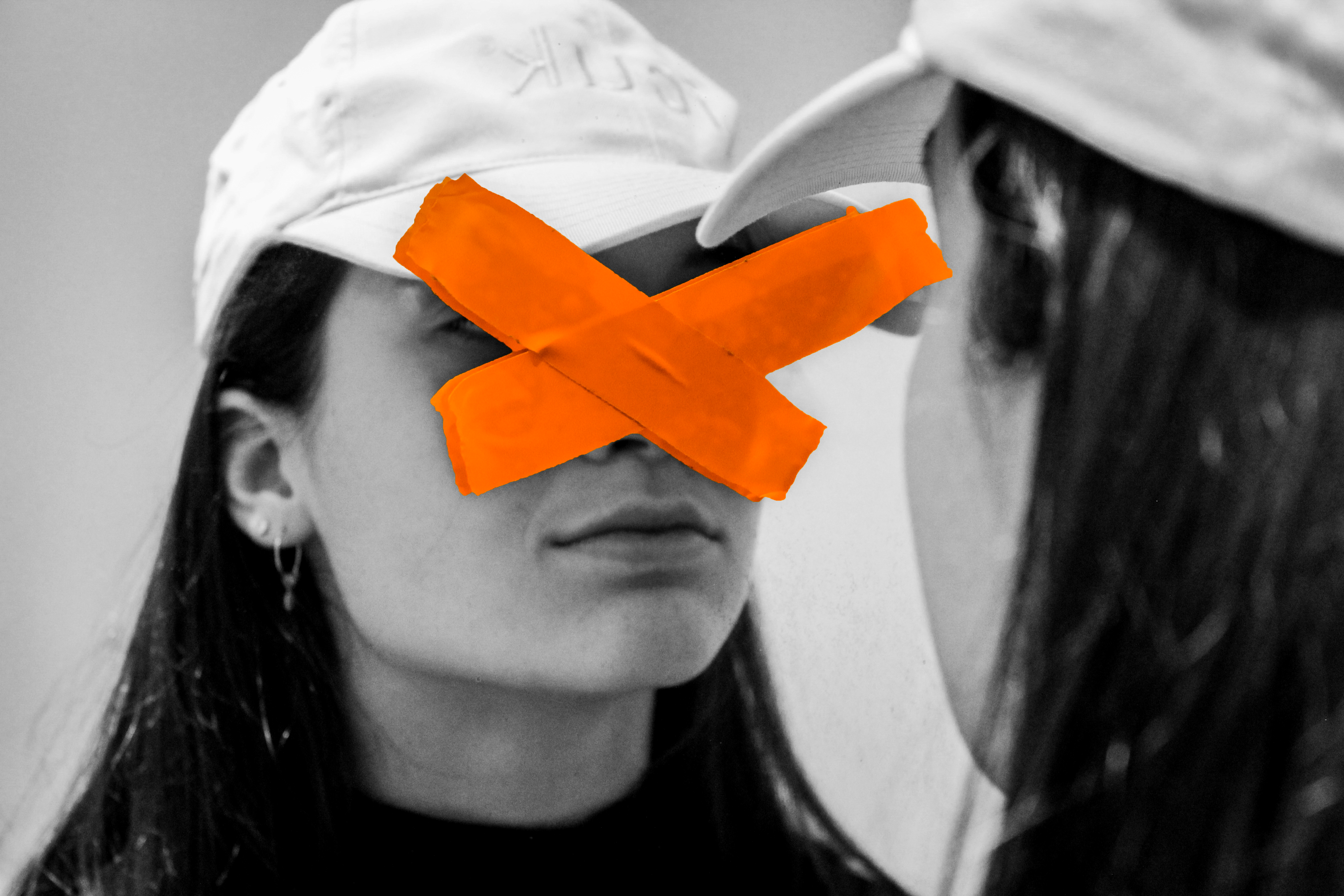
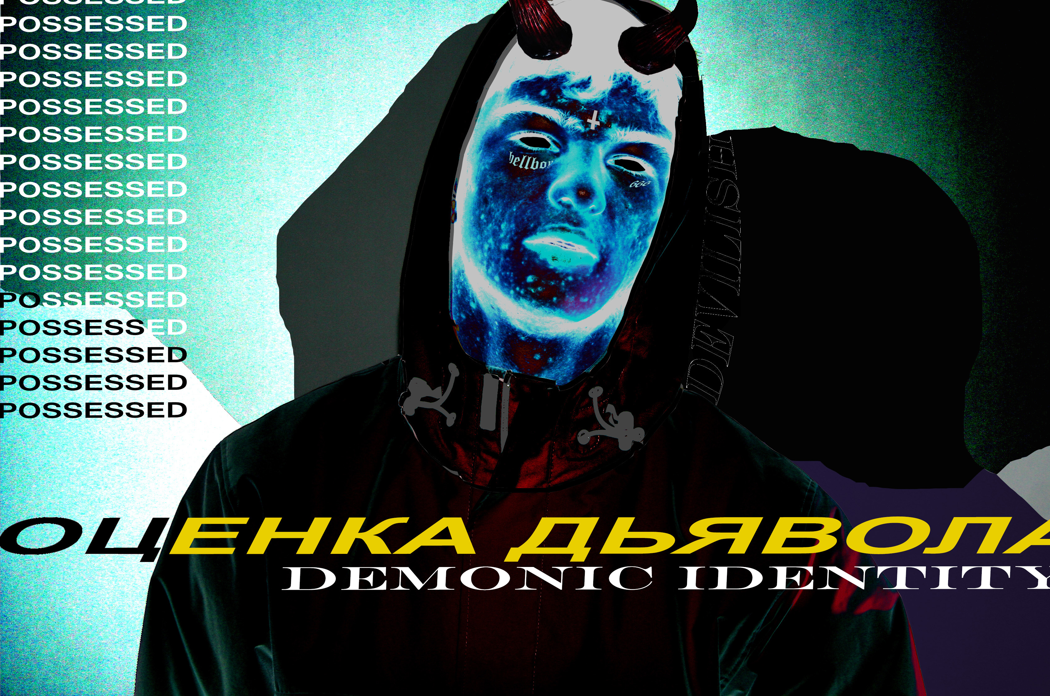
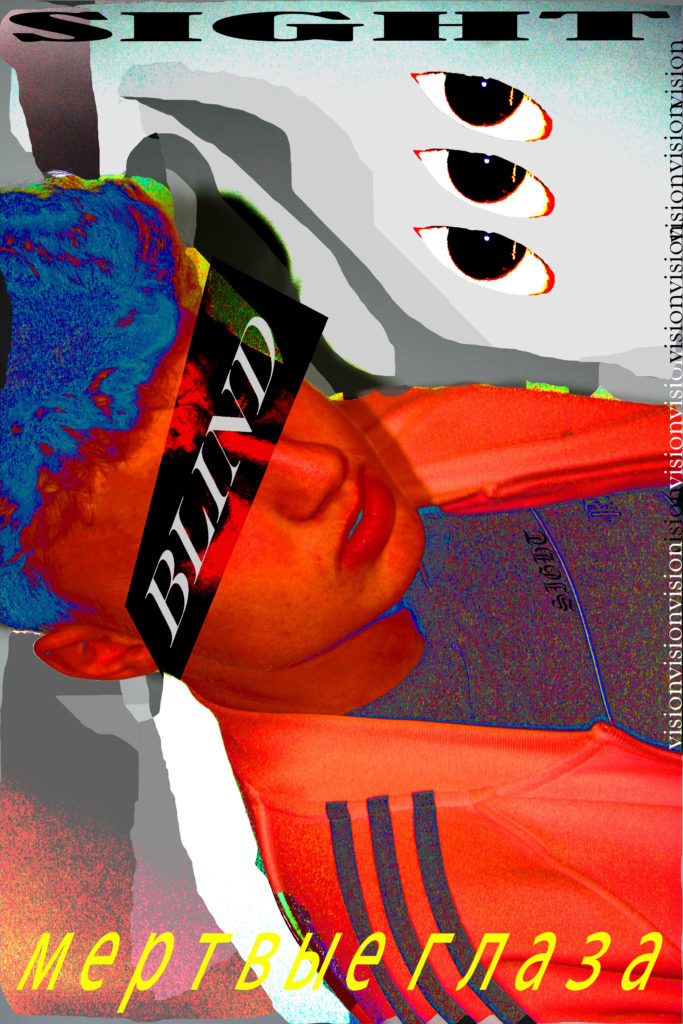
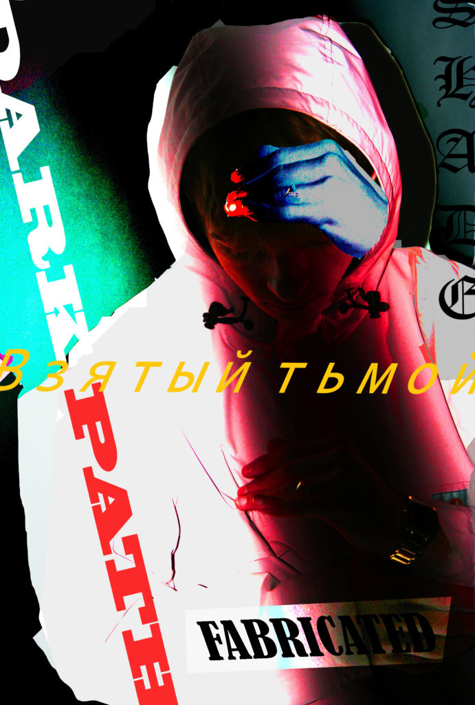
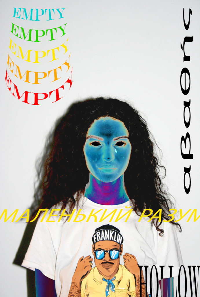
These creative experiments were made surrounding the topic of social identity and how people portray themselves within society and how other people portray them, not specifically to the subjects of the image but in general as a society how people seem to see themselves as individuals.

I will probably use other styles of photos in my prints selection due to the purposeful use of grain in these images which could effect the printing process. However I would like to compile 4 of these images as on of my A3 prints.

Influences / Inspiration

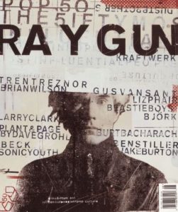
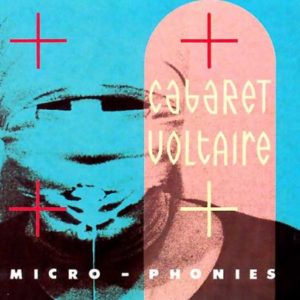
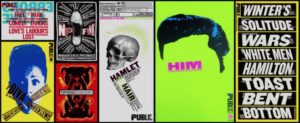
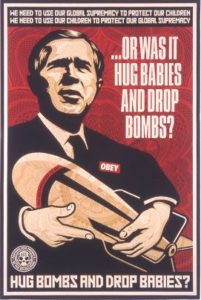
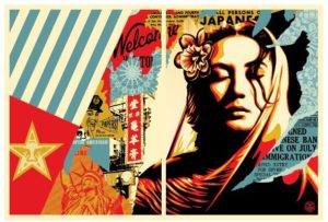
This style of work which I have used in this collection of work is inspired by various photographers and graphic artists including: David Carson, Lester Beall, Neville Brody, Paula Scher, and Shepard Fairey (the creator of the OBEY brand.) Here is some of their work…

David Carson
Lester Beall
Neville Brody
Paula Scher
Shepard Fairey
Shepard Fairey

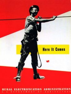
The work also was influenced by Russian graphic propaganda. This was a way of representing the topic of  social identity as a battle within my work.

Examples of Russian propaganda

Creative Portrait Definitions

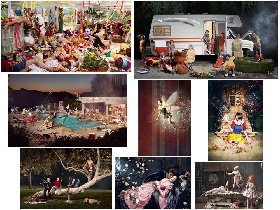
  What is Tableau Photography?

TableauFrench for ‘living picture’, is a style of artistic presentation. It most often describes a group of suitably costumed actors, carefully posed and often theatrically lit.

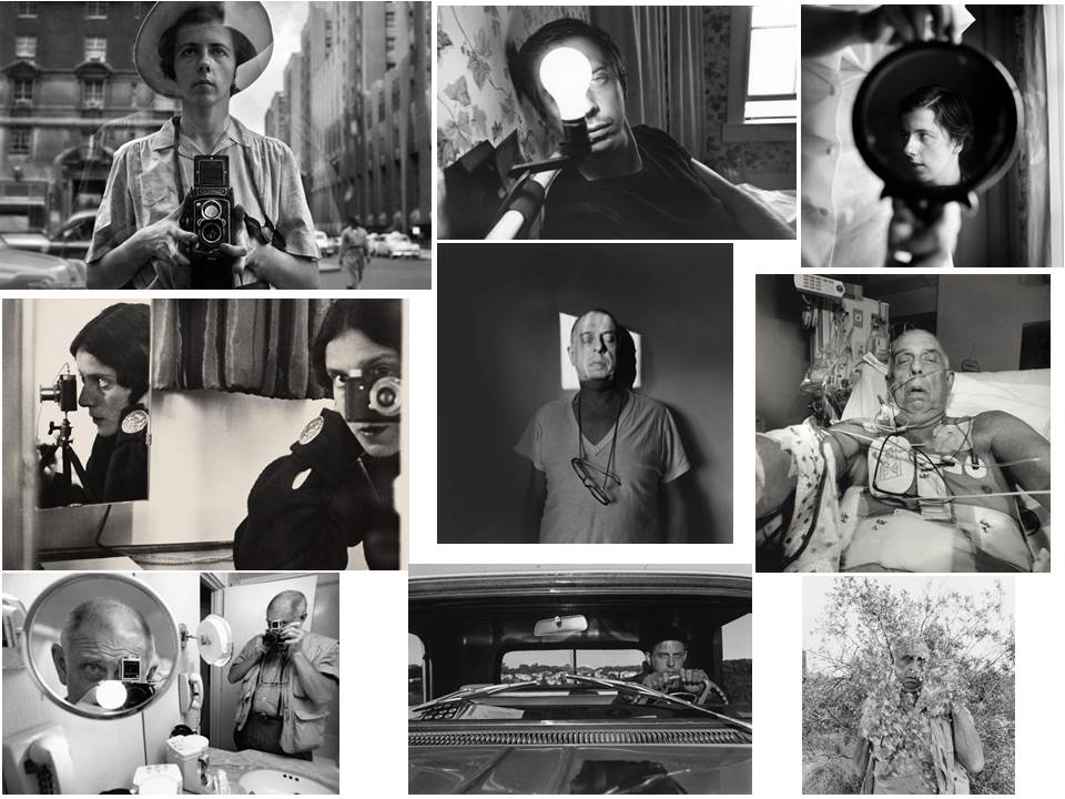
What is a Self-Portrait?

A self-portrait is a representation of an artist that is drawn, painted, photographed, or sculpted by that artist.

Many Photographers use self portraits as the best way to portray their own emotions and how they feel about a situation.

What is Identity?

Identity is the fact of being who or what a person or thing is. Photographers choose their subjects based on what area of their identity they want to portray. This could be age, gender, culture, social identity or even a loss of identity.

Final Image

I chose this as my final images as I think it is a good interpretation of Bruno Metra and Laurence Jeanson photos from their series ‘The Identity Project’. In this series  they apply cut outs of facial features from  magazines onto their subjects faces to create a new form of facial expression, like they appear to have cosmetic surgery. This provides a juxtaposition between everyday humans and the images seen in advertisements e.c.t

The image has the contrast between cold and warm colours. The blue tints on the cut out face is balanced out with the blue shirt the model is wearing which is contrasted with the warm colours on face similar to the hair, makes it complementary. The image has a background which is created from taking the photos in a studio. Unlike Bruno Metra and Laurence Jeanson’s photos where they sometimes incorporate a background of a bedroom or something personal, I decided to keep the background black as it keeps the focus and emphasises the model and creates contrast between the bright white cut out and the dark background. In Bruno Metra and Laurence Jeanson’s photos they physically stuck the cut out on to the models face whereas I had the model hold the cut out in front of her face creating mask like effect. The cutout is mostly centered  creating a division between the paper and face down the middle of the image. Although the cutout is not the same size as the models face and does not meet to look like a real face, Bruno Metra and Laurence Jeanson also did this to make it obvious that the cutout are not edited on after the original photo was taken. I made it so the cutout is bigger than the models head to emphasise the seriousness and harshness on the models face (as well as the cold colours) which is contrasted with the warm colours on the models face to show power. The lighting used when taking the photo was harsh to highlight the models features and to brighten the face on the cutout making it stand out more than the actually models face. It is also portrayed harshly to create a harsh division.

The concept of the image I found when exploring Brno Del Zou and John Stezaker photography when they manipulated faces to create a different appearance for them. The concept for Bruno Metra and Laurence Jeanson series is beauty, identity and fashion. The idea came from challenging brainwashing ideas of beauty as it is expressed in culture and especially in the illusion of beauty as represented in fashion magazines.  The series is to picture an individual’s face as a collage of collective images: models, standards, norms of beauty, to question the construct of personal identity. It focuses on Photoshop creations, and the impact that this beauty has on people. Bruno Metra and Laurence Jeanson covered eyes and lips of models from fashion magazines on real humans and the result is a mixture between reality and glamour.

Throughout the project i developed my ideas and overall I think this photo sums up my portrait project and my final ideas well.

Final Outcomes

Image 1

I chose this as one of my final images from my creative portraits homework that interprets Bruno Metra and Laurence Jeanson’s photography where they apply cut outs of facial features from  magazines onto their subjects faces to create a new form of facial expression, like they appear to have cosmetic surgery. This provides a juxtaposition between everyday humans and the images seen in advertisements.

Experimentation

I first experimented by altering the colour of the photo from black and white to colour and adjusted the hues to create contrast wihin the image. I also edited the cut out face different colours from the background to create even more contrast and to emphasise that it is an important part in the image.

I also experimented with the shape of the frame to see if the image was more effective when focused on the middle section of the photo.

I found that i preferred the image when i had a rectangular frame so the audience is not distracted from the image and concept.

Compare and Contrast

When compared to Bruno Metra and Laurence Jeanson’s photography I think that the image portrays the same concept and provokes the same emotions that the audience would get if they saw Bruno Metra and Laurence Jeanson’s work. One main difference between my work and ‘The Identity Project’ series is that where in Bruno Metra and Laurence Jeanson’s work they often physically stick the cut out image to the models face, whereas in my work I had my model hold the image in front of her face creating a mask-like appearance. This makes the image look like the cut out could have been edited in after the photograph was taken but the model was physically holding the cut out so the image did not need too much editing afterwards. Another difference is that the background of my photographs is black focusing all the attention onto the model with no distractions, whereas in a couple of Bruno Metra and Laurence Jeanson’s photographs they included a background of a bedroom or something personal in the photograph making the images more personal which is not achieved in my images. Although most of their images had a white background to emphasise the model rather than whats in the background aswell.

Image 2

Another one of my final images is this image that was in my creative portraits homework and took inspiration from Brno Del Zou’s work where the body and the faces are revisited and their volumes are highlighted in order to create installations of multiple scales. I tried to recreate his work by editing images in photo shop and also physically cutting out paper and sticking it down and found that when I physically cut out the face it was more effective.

Experimentation

I tried experimenting by changing my image from colour to black and white like Brno Del Zou’s photos and also different colours like pink and red. The one with the best overall appearance is my original as I think the experimentation’s look too over edited and i like the orange/yellow tint that is shown when i took the picture as i used artificial light and altered the ISO.

Compare and Contrast

When compared to Brno Del Zou’s photography you can definitely tell that my images are inspired by and are an interpretation of his work. One main difference between the images are that Brno Del Zou’s photography contains many different images with significantly different angles of the same face. Mine however, although are of the same face, do not contain as many angles as Brno Del Zou’s in the final image and are mostly of the same angle but with different facial expression. This is the effect I wanted to created and wanted to create the image of a full face with altered expressions and arrangements within it. Another difference between mine and Brno Del Zou’s work is that he physically raises the different images within the face to create visible shadows between the different cut outs. Whereas I directly stuck the cut of images onto the original image to make it look more like a real face without shadows and different sections. I think both these arrangements create different effects but have similarities between them. Another difference is that Bruno Del Zou’s work is in black and white whereas mine i kept like the original photo with the orange/yellow tint as it makes the photo look even more individualized and direct. Because you can  see the thin white outline where I cut the paper it creates an unrefined, homemade effect which I think makes the image more personal.

Tableau Photography

What Is It?

Tableau is used to describe a painting or photograph in which characters are arranged for picturesque or dramatic effect and appear absorbed and completely unaware of the existence of the viewer. Tableau paintings were natural and true to life, and had the effect of walling off the observer from the drama taking place, transfixing the viewer like never before.

Source

Famous Tableau Photographers – Jeff Wall

Jeff Wall was born in 1946 in Vancouver, (Canada) where he currently lives and works. He  became interested in Vancouver’s experimental art scene and taught himself photography, seeing it as the best tool for expressing his conceptual ideas. He received his Bachelor of Arts degree in 1968, and his Master of Arts degree from the same university in 1970.

During the 1990s, Wall began seeing photography as a medium to connect film and literature to art. To create such a connection, Wall first redesigned his studio, modeling it after ‘cinematic film production-miniaturized’. Next, he began shooting his photographs much like a Hollywood movie; he built and dressed large sets, gathered costumes, and hired models. The resulting photographs were a representation of the natural world. However, Wall had not simply happened upon a scene and clicked a picture. He artificially recreated the natural scene where he controlled the image. Below is a collage of some of my favourite photos from this photographer, I chose those photos because of their eye catching nature and peaceful yet disturbing atmosphere.

Source


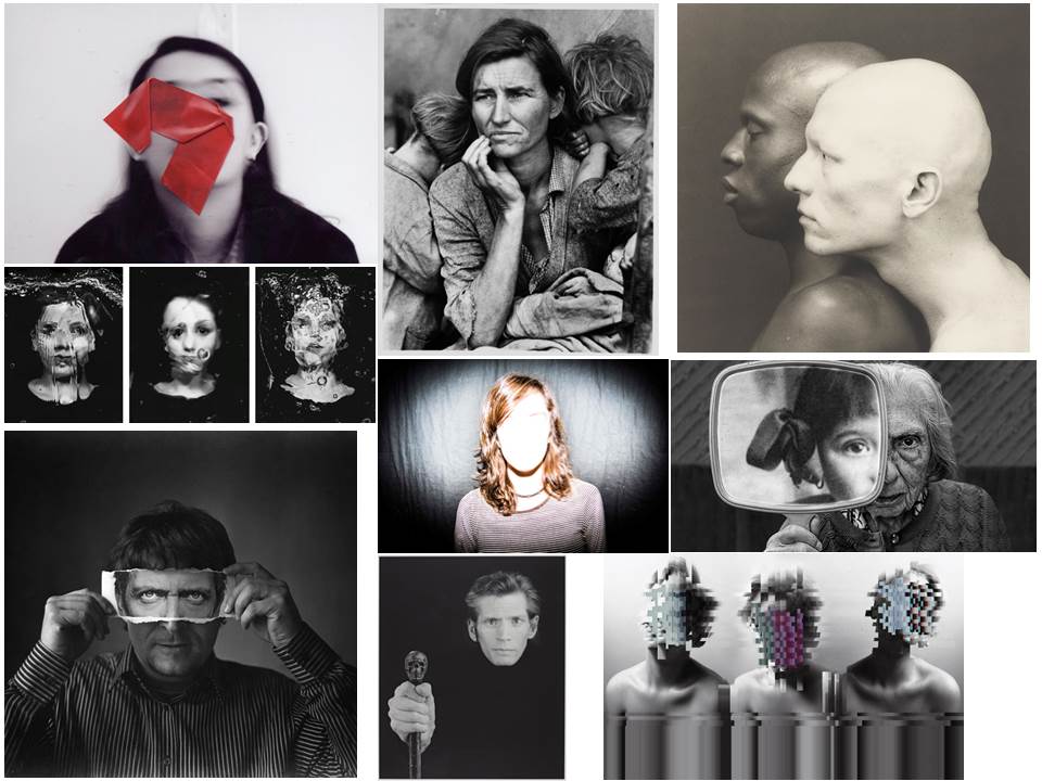
Identity Photography

In this post I will be exploring photography based around the idea of identity loss. I will be looking at the perspectives that we see people in, including the issues that many have to deal with. 
Here are some example of this type of photography:
In response to this I wanted to have a go at trying to create images based around this theme, using images taken by me which I could manipulate into these designs. These were my outcomes:
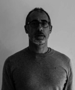
I explored a variety of techniques such as liquify, layering and separation. This allowed me to have the effects desired as I was able to manipulate the facial features of the subject, which can be related to the theme of missing or lost identity within yourself.
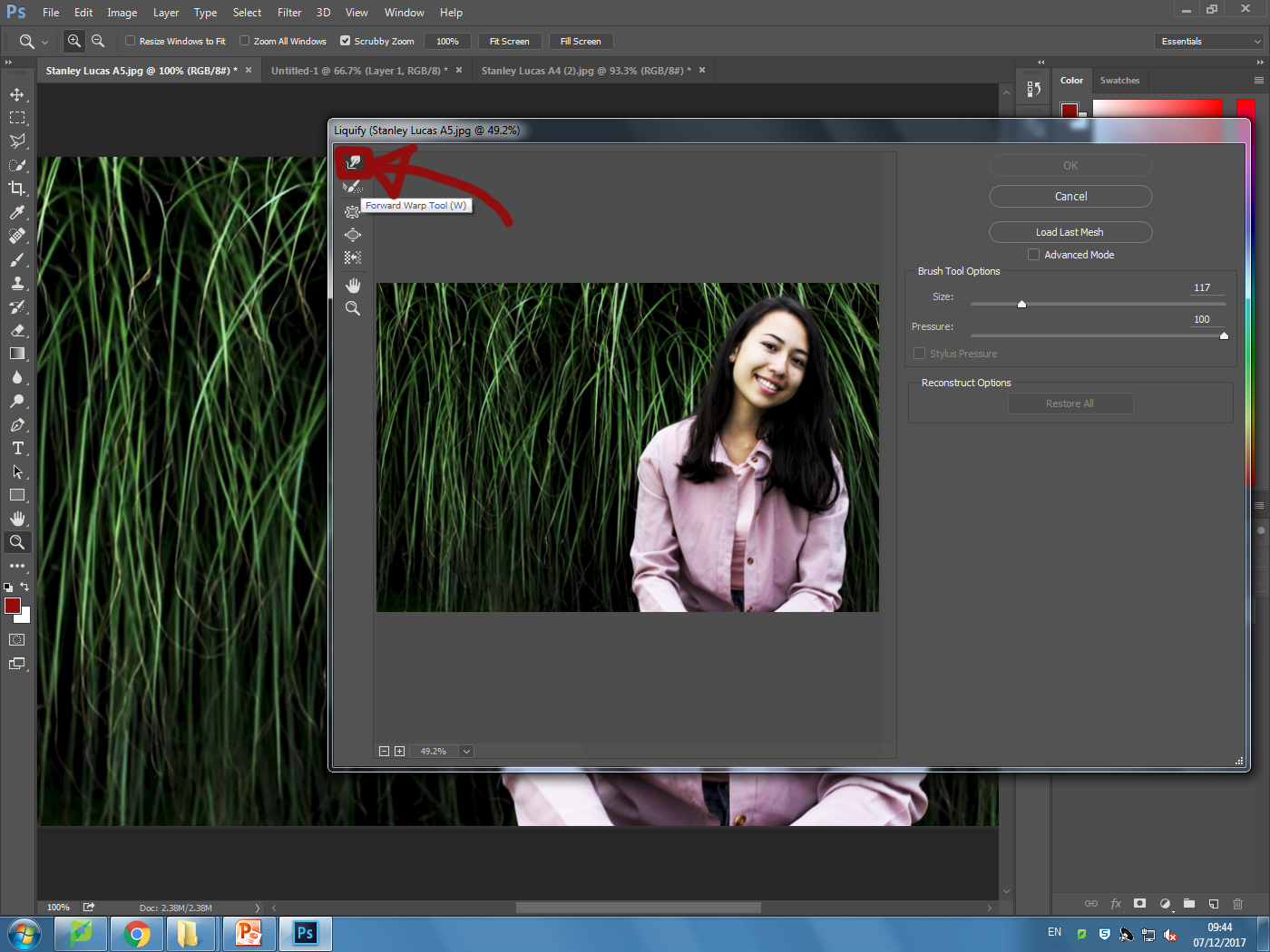
Liquify:
Layering:
Inside: