For this shoot I decided to experiment with a broader variety of lighting types and techniques from my previous shoots within the studio. I wanted to use a variety of filters like red and yellow to allow for more dramatic effects on the subjects.
 I also wanted to switch between monochrome and the portrait settings when taking photos to allow for a greater contrast between the lights and darkness of an image. This would allow for a more sinister look when produced due to the emotionless expressions of the subject.
 Before the shoot I wanted to create a mind map of the ideas towards this, so that I would have an idea of what and how to take the photos of both subjects.
 From there I decided to carry out the shoot, these were my results:
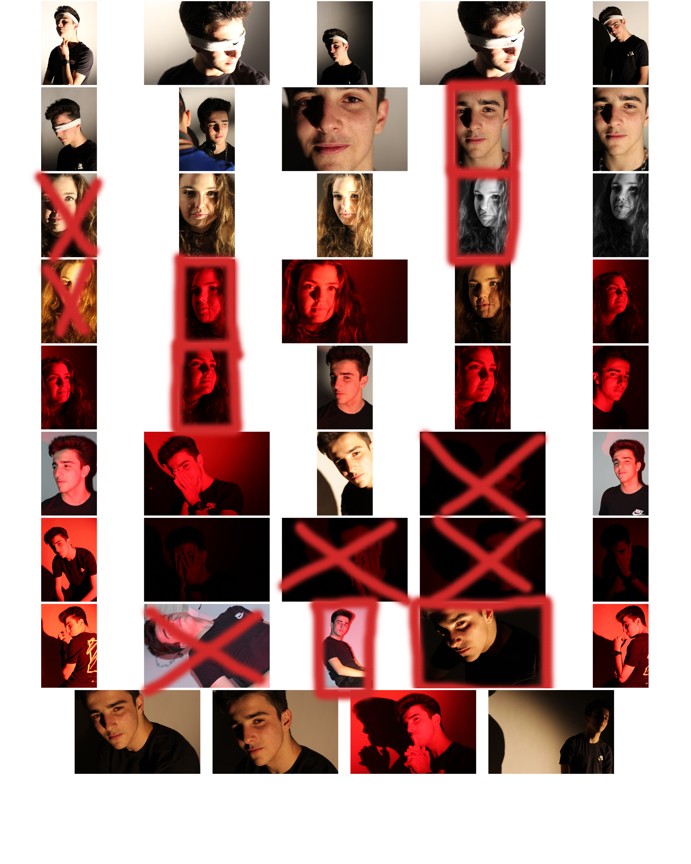
 From here I selected the top ten image from the entire shoot, this would make it easier for me to narrow it down to the final image that I deemed best from the shoot. These were the images I selected:
I chose these image because of the composition, lighting and color. I particularly liked the effect created by the shadows behind the subjects, allowing for an emphasis on certain features. What I then wanted to do was narrow the selection down once again to pin point the top five images out of the batch. These were the images I selected:
 I chose this image due to how I liked the obviously contrasting shadows from the subjects face, which highlighted particular features. I also found that the huge shadow on the left of the image balanced the photo as the composition of the subject was equally divided onto the other side of the image itself.
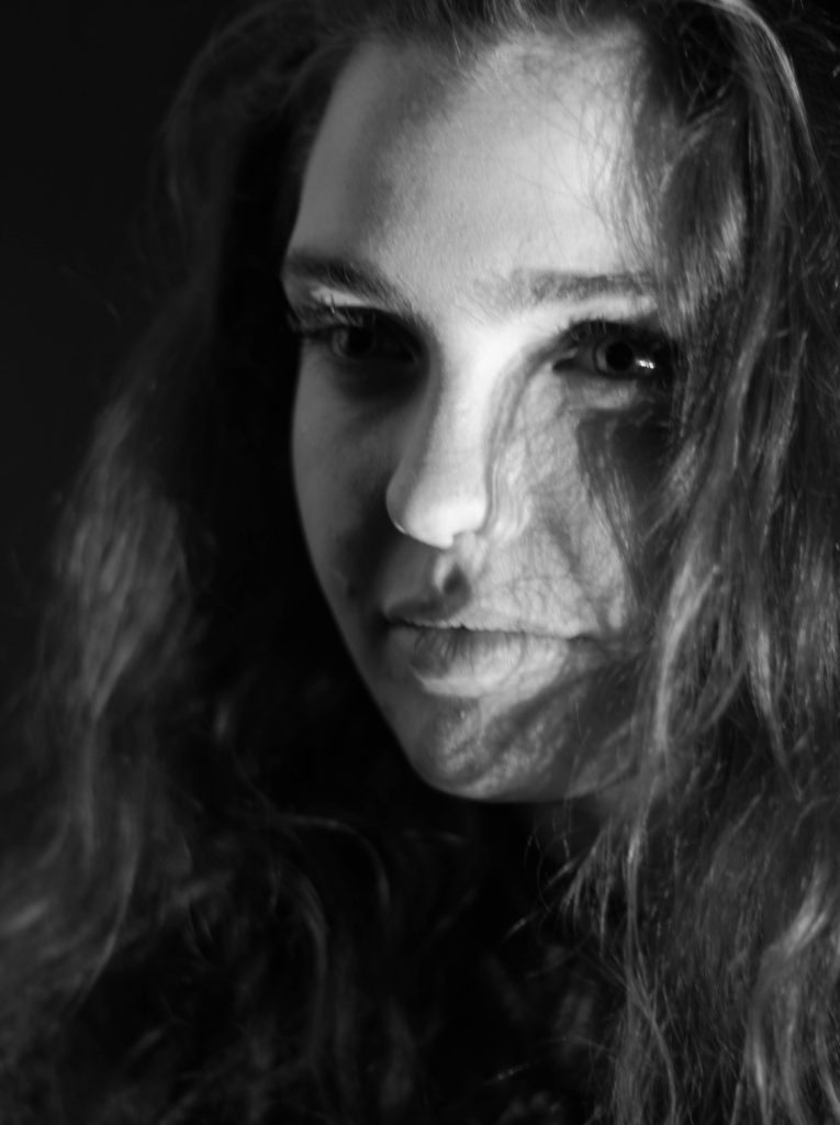 What I liked about this image was once again the contrast between the light and dark of either side of the subjects face. Whilst the darkness of the hair added depth into the image, allowing it to be more visually pleasing. The right eye of the person is centered in the top right of the rule of thirds, this allows the viewers gaze to drift almost immediately to the eyes.
 I chose this image because of the composition of the subject compared to the rest of the picture. The fact that the person's head lined up once again with the rule of thirds, helped make it aesthetically pleasing.
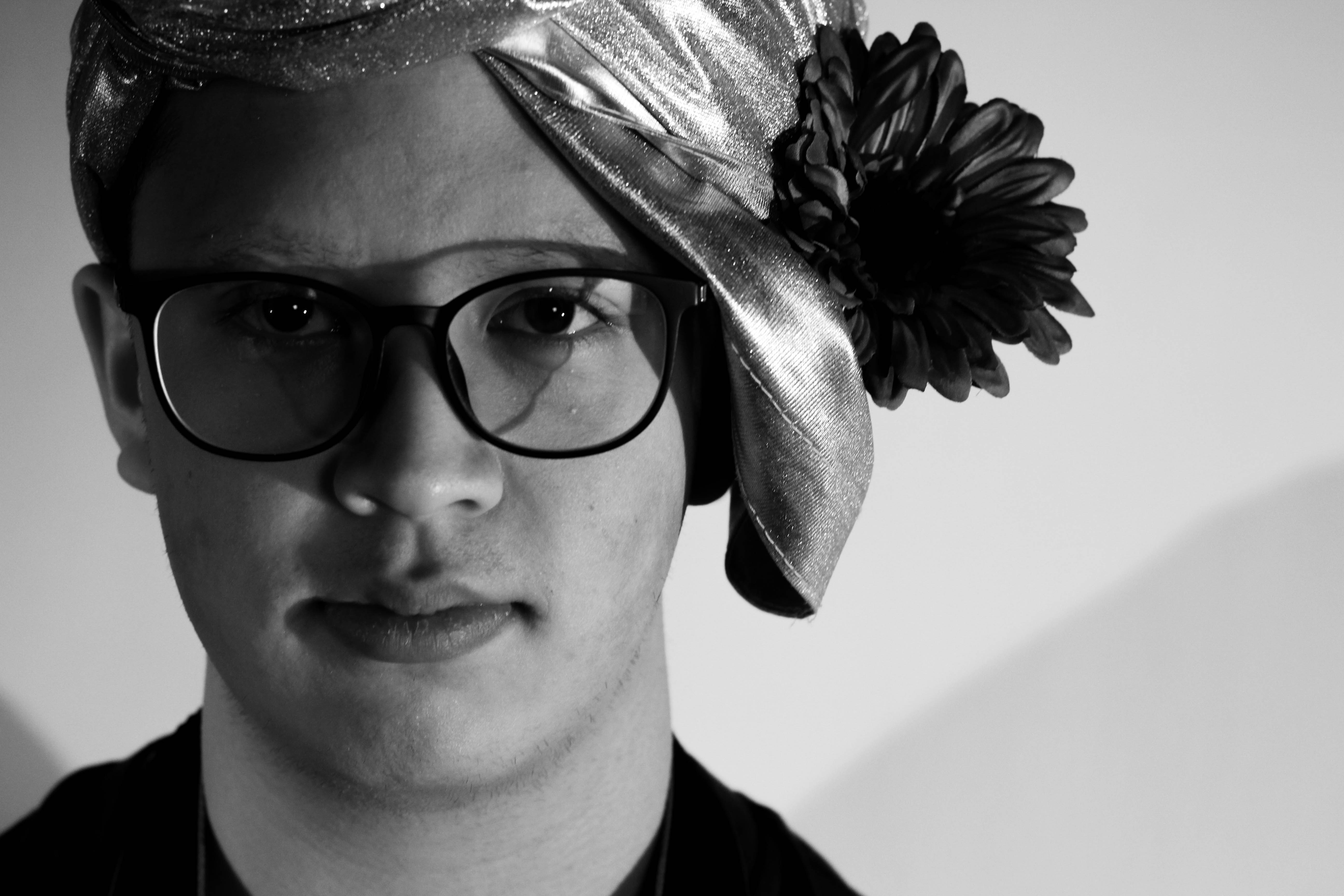 What I loved about this image was the obvious difference between the light and dark on either side of the face. This to me compared with the light backdrop allowed for a clear definition to the face, drawing out certain feature above others.
 Finally I chose this image due to how I liked the link back to the theme of identity in previous shoot, based around idea of blinded by identity. From this I found the darkness provided on one side of the face allowed emphasis towards this, creating a more mysterious tone.
Finally I brought the pictures down to a one photo that I viewed as the most effective out of the selection. This was the image I chose as my final picture:
This was my favourite image because of the composition, lighting and shadowing. I found that the clear contrast between the light and dark of the face and backdrop, allowed for the image to be perfectly balanced, with the dark left side of the face adding definition to the overall piece.
I found that the use of nature was particularly effective when it came to the images, as the trees could be used for a variety of different things such as fades etc. Through this I found it great how trees could be used to define a certain aspect of the image itself, and so allowed for the silhouettes of the creatures they wished to be highlight. I decided to make a response to these ideas by mainly focusing around the human body and nature combined. These were the results:
To create these I used the opacity tool, this increased the transparency of the top image, allowing for the lower image to be seen more clearly, creating the desired effect. I then used the paint tool to rub out the excess parts of the image to match the shape of the subjects face, making it seem more realistic.


 I also wanted to switch between monochrome and the portrait settings when taking photos to allow for a greater contrast between the lights and darkness of an image. This would allow for a more sinister look when produced due to the emotionless expressions of the subject.
 Before the shoot I wanted to create a mind map of the ideas towards this, so that I would have an idea of what and how to take the photos of both subjects.
 From there I decided to carry out the shoot, these were my results:

 From here I selected the top ten image from the entire shoot, this would make it easier for me to narrow it down to the final image that I deemed best from the shoot. These were the images I selected:
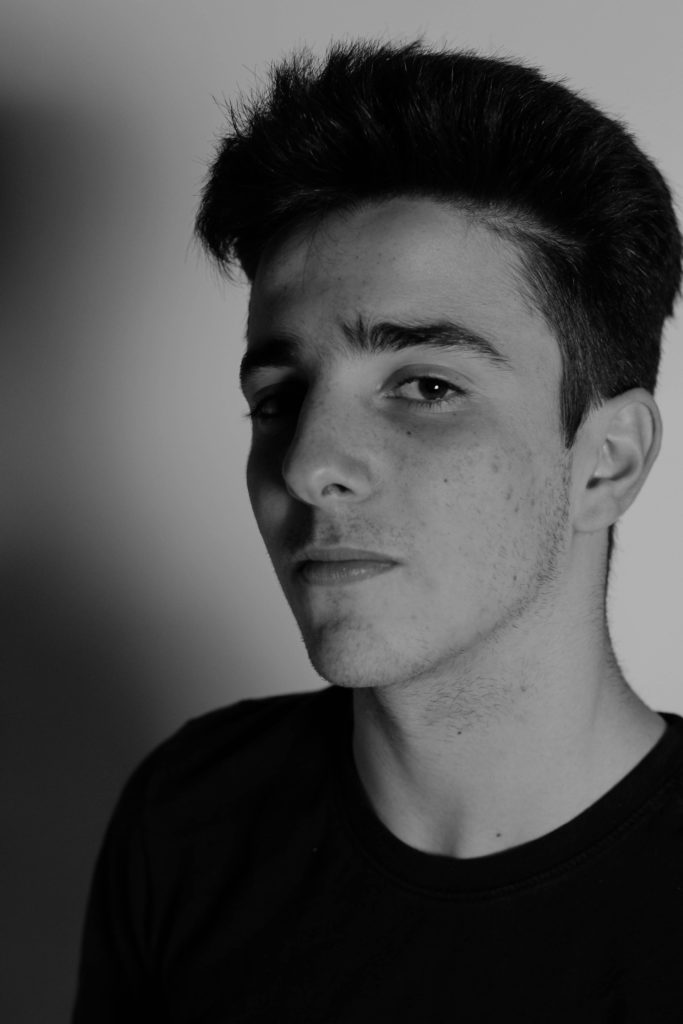

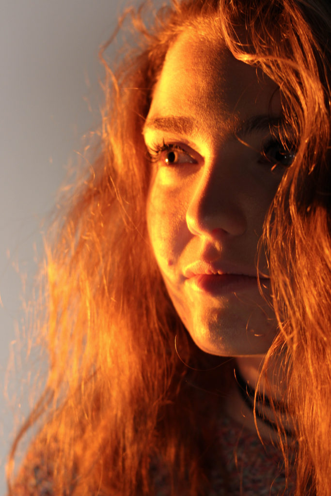


 What I loved about this image was the obvious difference between the light and dark on either side of the face. This to me compared with the light backdrop allowed for a clear definition to the face, drawing out certain feature above others.