
For my final portraits, I decided to take my inspiration from Rosanna Jones work. What I liked about Rosanna’s work was how the image had not been obscured from view digitally but physically placing tape on top of the image to create texture in the image, which is a unique concept which I wanted to incorporate into my work.

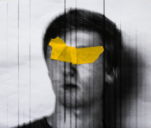
The similarities that the images have is that they both tape which is obscuring the faces of the model and is the main focus of the image have been physically placed on top that then the photo has been taken, which create texture in the image. Both of the images have had the tape by physically placed onto of a first image which has then been re photographer to create depth in the image.
The differences in the photographs are that my images had vertical lines going across the image I decide to keep this the final images as I felt like it added another layer to the image. Rosanna’s image has slight hint of purple whereas my images is in total black and white I wanted my image to be this way as I felt that by having the sole colour in the entire image to be the tap covering the model’s faces would make the image have a greater impact
A confident and assured approach, showing understanding throughout. A more meaningful outcome for the tableau section would enhance the project and mark.