
FINAL OUTCOMES
My favourite chosen outcomes from the project are also those that I have used for my final print compositions, here is a link to the post that went over my final prints…
https://hautlieucreative.co.uk/photo19al/2017/12/18/print-compositions-framing/
Outcome 1
The first of my final pieces is a composition of 2 studio portraits that I believe simply work together rather well and effectively, to create 1 piece.
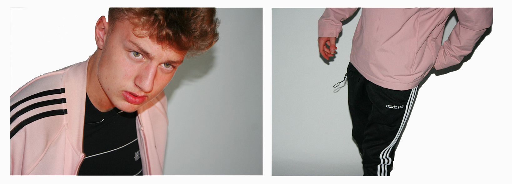

 The images needed slightly enhancing in order to balance the light, contrast, saturation and shadows of the 2 photographs, and cropping in order to make sure that the background of the images look clean and fully white so that the subjects stand out nicely.
This composition of 2 images is one that I believe shows my raw camera skills. I believe that the 2 images compliment each other perfectly due to the colours, composition and patterns within the images.

The thing other than the balanced colours/shades pink, black and white that stands out to me between the two images is the balance between pattern through the 3 Adidas stripes in both images. These 3 stripes are something that you will see just about everywhere in which people are wearing casual attire. The stripes are the trademark the adidas sport and casual wear brand, causing Adidas to be known as the “The three stripe company” after being called this by its founder Adolf Dassler. In my 2 photographs the dark on light stripes create a good contrast with the light on dark stripes.
Outcome 2
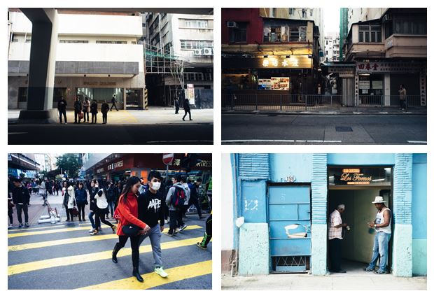
The second of my final pieces is a composition of 9 images (Street photography and Environmental portraiture) in a story board style which explore how the surroundings of a subject visually effects the subject, and how the subject effects its surroundings.
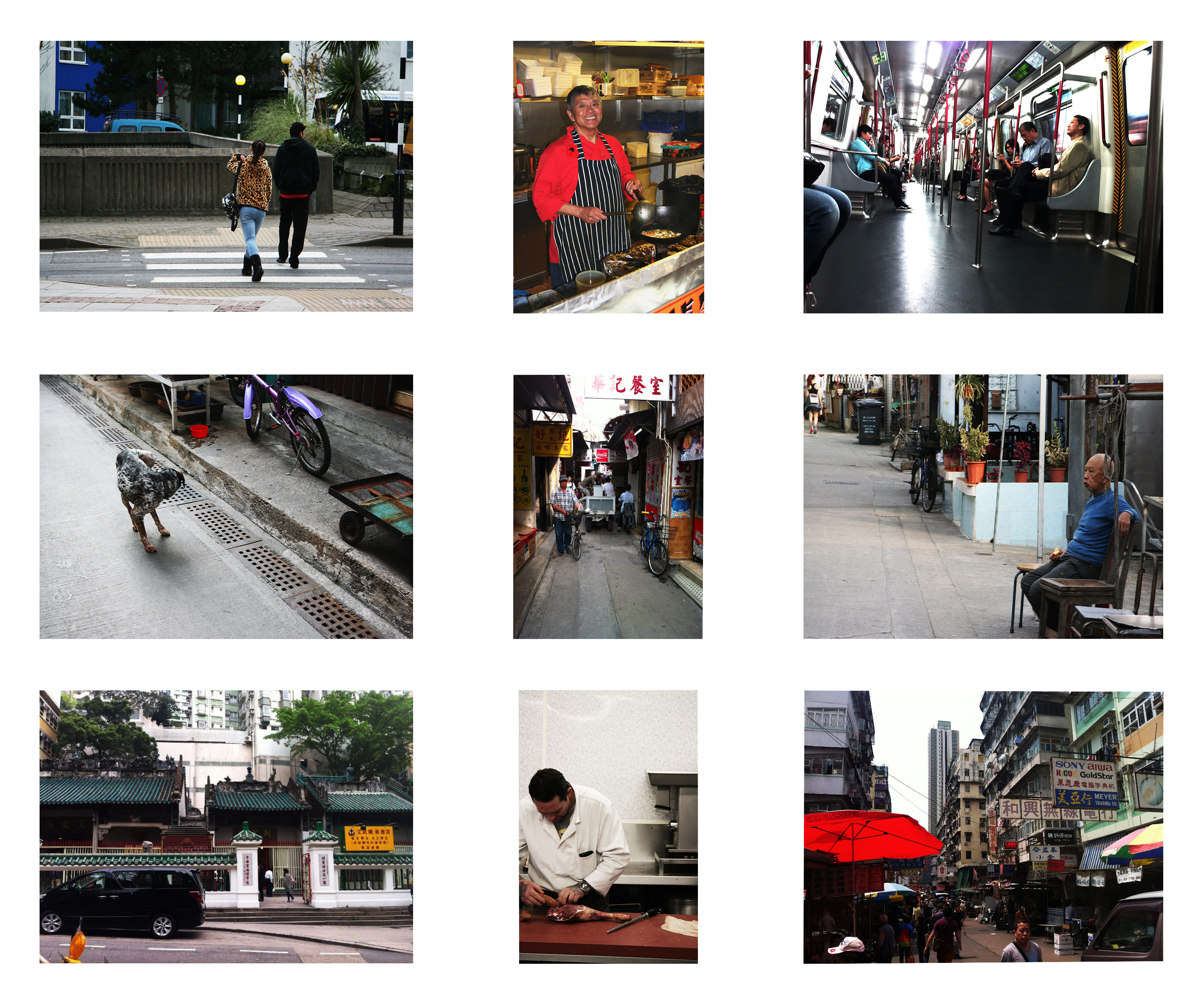
I have composed the images in this fashion as each image that is opposite to another length-wise or height-wise is related to and balanced with each other.
Here are the 9 original photographs that I have used in this piece…


The environmental portraits were inspired by August Sander who had a mission of photographing every worker in the whole of Germany, here are some examples of his work…
The street photographs were inspired by Genaro Bardy who photographs the streets of metropolitan cities and small towns. Here are some examples of his work…
Outcome 3
The third of my final pieces is a composition of 4 creative portraits exploring a theme of socially perceived identity.
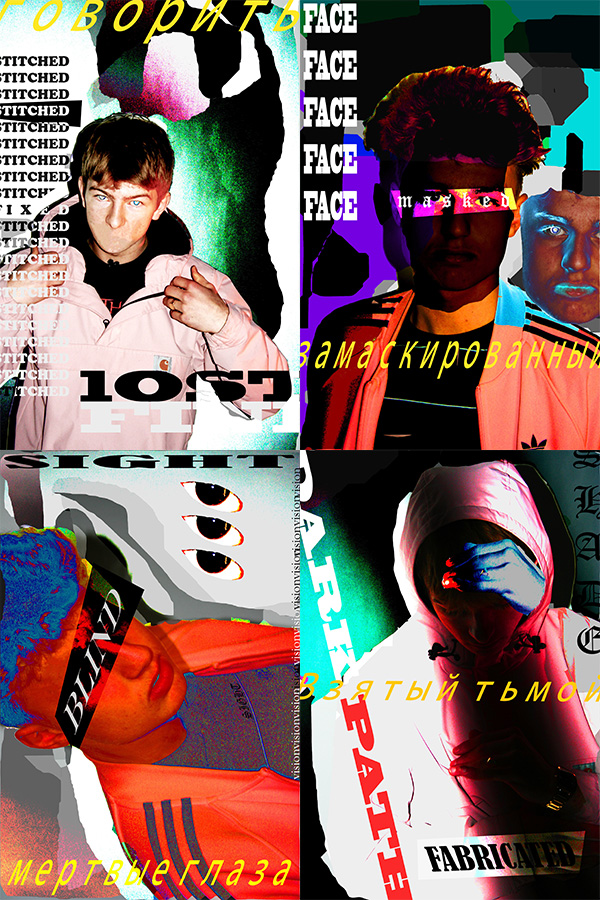
I believe that these creative portraits present my creative skills through the use of Photoshop and Typography. The theme of socially perceived is about how people portray themselves within society and how other people portray them, not specifically to the subjects of the images but in general as a society how people seem to see themselves as individuals. The words used in these images explore different social boundaries that some people may come face to face with in society.
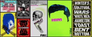
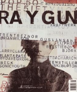
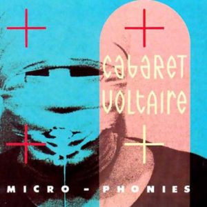
This style of work which I have used in this piece of work is inspired by various photographers and graphic artists including: David Carson, Lester Beall, Neville Brody, Paula Scher, and Shepard Fairey (the creator of the OBEY brand.) Here is some of their work…

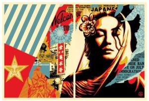
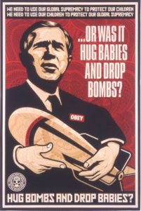
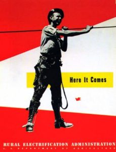
The work also was influenced by Russian graphic propaganda. This was a way of representing the topic of social identity as a battle within my work.


