
Image 1

I chose this as one of my final images from my creative portraits homework that interprets Bruno Metra and Laurence Jeanson’s photography where they apply cut outs of facial features from magazines onto their subjects faces to create a new form of facial expression, like they appear to have cosmetic surgery. This provides a juxtaposition between everyday humans and the images seen in advertisements.
Experimentation
I first experimented by altering the colour of the photo from black and white to colour and adjusted the hues to create contrast wihin the image. I also edited the cut out face different colours from the background to create even more contrast and to emphasise that it is an important part in the image.
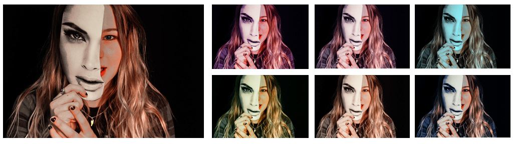
I also experimented with the shape of the frame to see if the image was more effective when focused on the middle section of the photo.

I found that i preferred the image when i had a rectangular frame so the audience is not distracted from the image and concept.
Compare and Contrast

When compared to Bruno Metra and Laurence Jeanson’s photography I think that the image portrays the same concept and provokes the same emotions that the audience would get if they saw Bruno Metra and Laurence Jeanson’s work. One main difference between my work and ‘The Identity Project’ series is that where in Bruno Metra and Laurence Jeanson’s work they often physically stick the cut out image to the models face, whereas in my work I had my model hold the image in front of her face creating a mask-like appearance. This makes the image look like the cut out could have been edited in after the photograph was taken but the model was physically holding the cut out so the image did not need too much editing afterwards. Another difference is that the background of my photographs is black focusing all the attention onto the model with no distractions, whereas in a couple of Bruno Metra and Laurence Jeanson’s photographs they included a background of a bedroom or something personal in the photograph making the images more personal which is not achieved in my images. Although most of their images had a white background to emphasise the model rather than whats in the background aswell.

Image 2

Another one of my final images is this image that was in my creative portraits homework and took inspiration from Brno Del Zou’s work where the body and the faces are revisited and their volumes are highlighted in order to create installations of multiple scales. I tried to recreate his work by editing images in photo shop and also physically cutting out paper and sticking it down and found that when I physically cut out the face it was more effective.
Experimentation

I tried experimenting by changing my image from colour to black and white like Brno Del Zou’s photos and also different colours like pink and red. The one with the best overall appearance is my original as I think the experimentation’s look too over edited and i like the orange/yellow tint that is shown when i took the picture as i used artificial light and altered the ISO.
Compare and Contrast

When compared to Brno Del Zou’s photography you can definitely tell that my images are inspired by and are an interpretation of his work. One main difference between the images are that Brno Del Zou’s photography contains many different images with significantly different angles of the same face. Mine however, although are of the same face, do not contain as many angles as Brno Del Zou’s in the final image and are mostly of the same angle but with different facial expression. This is the effect I wanted to created and wanted to create the image of a full face with altered expressions and arrangements within it. Another difference between mine and Brno Del Zou’s work is that he physically raises the different images within the face to create visible shadows between the different cut outs. Whereas I directly stuck the cut of images onto the original image to make it look more like a real face without shadows and different sections. I think both these arrangements create different effects but have similarities between them. Another difference is that Bruno Del Zou’s work is in black and white whereas mine i kept like the original photo with the orange/yellow tint as it makes the photo look even more individualized and direct. Because you can see the thin white outline where I cut the paper it creates an unrefined, homemade effect which I think makes the image more personal.