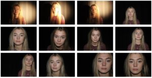
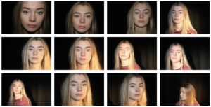
My favourite images
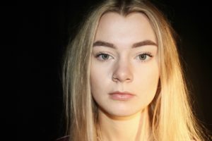
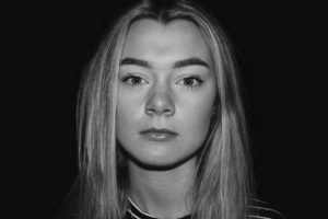


My favourite images


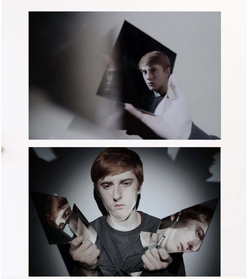
For this presentation I wanted a clear cut and also elegant presentation of the photos themselves, the sizing also compliments the image as the white is not too harsh so very suiting to the images themselves,I finally chose these two images to be displayed because both have the interesting illusion enhanced by mirrors and additionally the same tonal range and would both be enhanced with the same background color and cut of edge. I think the presentation of one being displayed on top of each together would work because it clearly displays the images both confidently and also creates a good demonstration of what the images are and can achieve.
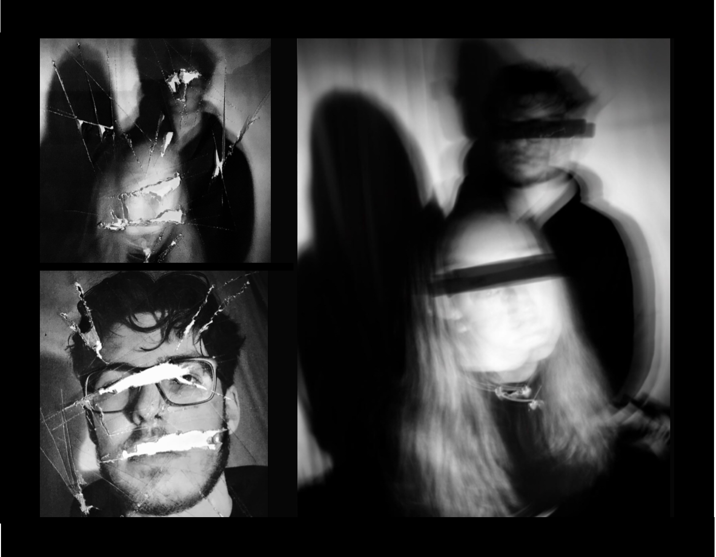
This image is also more busy but works well as it reflects the busyness and also the hardship reflected by the strong connotation of loss of identity. I chose three and separate these into one harsh of the cutting editing and the second with a slow shutter speed and covering of the eyes in a. different manner which is effective.The black background brings around a sense of cohesion between all the images but the placing also suggests an interesting overall composition and dominance within the photos.
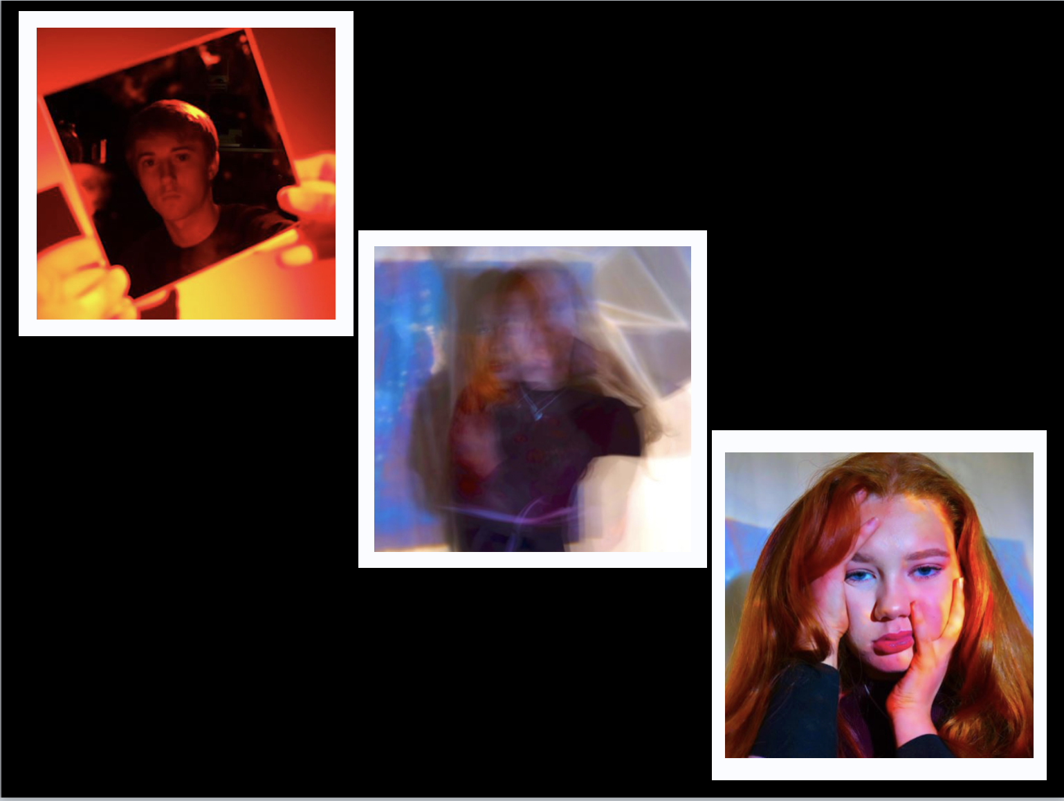
For the more colorful abstract pieces I chose black for the background but these did not successfully show the vibrancy of the color, due to this I decided on a more interesting white boarder for the images,which I just need to further check that they are all equal in proportion but this would also have both themes of the first and second presentation within the final one seen here.I do think i could further experiment within this and perhaps lining up all three images to be in a line would be more effective overall.
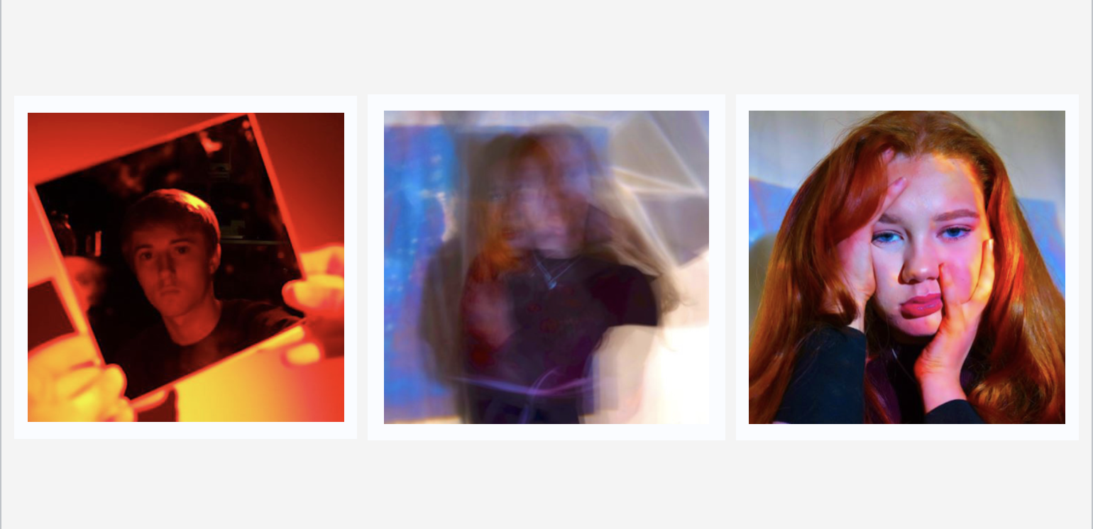
I think this is a much better presentation,the harsh colours do not remove the attention from the actual images themselves and in addition you are still able to see the white boarders giving more of a shape.Also being in a line create a form to the piece and does again not remove from the vibrancy already in the image themselves.
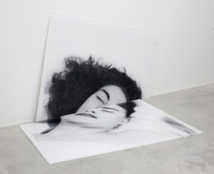
For my final portraits I took inspiration from Johnathan Ducruix’s work titled “Metamorphosis” in which he uses photoshop to manipulate the human body to show how flexible and fascinating the human body is and what it is capable of. I liked the mystery in Ducruix’s work and the uneasy viewing it has so I tried to replicate this in my photographs.

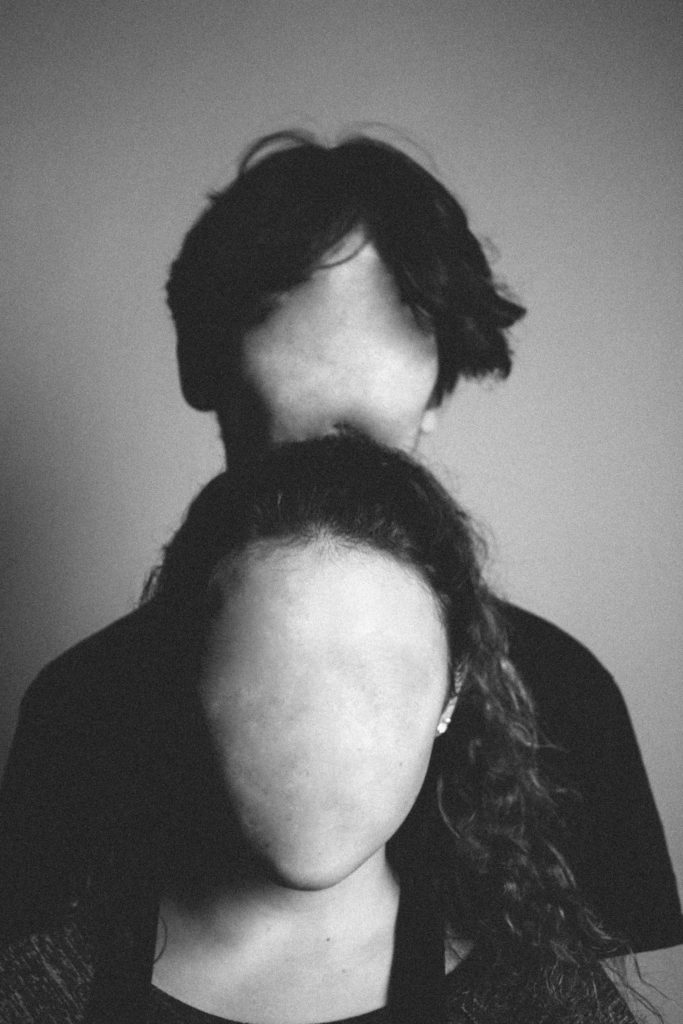
A similarity in our photographs is the lack of facial features and the mystery and uneasiness. The mystery in Ducruix’s photograph is recreated in this by the lack of context, the photograph tells nothing to the viewer – it leaves them confused and intrigued but also uneasy, This uneasiness was created by removing the facial features and placing the models in the centre of the photograph. This uneasiness was also created in Ducruix’s photographs from how unnatural and physically impossible the photograph was.
The difference in the photographs are the settings – Ducruix’s photograph is lit with quite a high exposure and uses natural tones. The high exposure and bright lighting takes away from the effect of the photograph so in my photograph I decided to use some chiaroscuro to add the the mystery and to create more contrast and shadows. I also put the photograph in black and white to create a more dramatic image.
You now have 2 weeks to complete…
You should explore other possibilities and show on your blog a range of ways that you could present your work
such as…
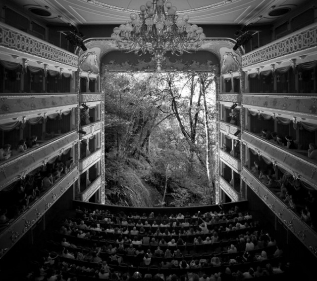
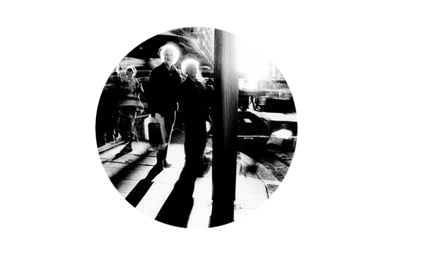

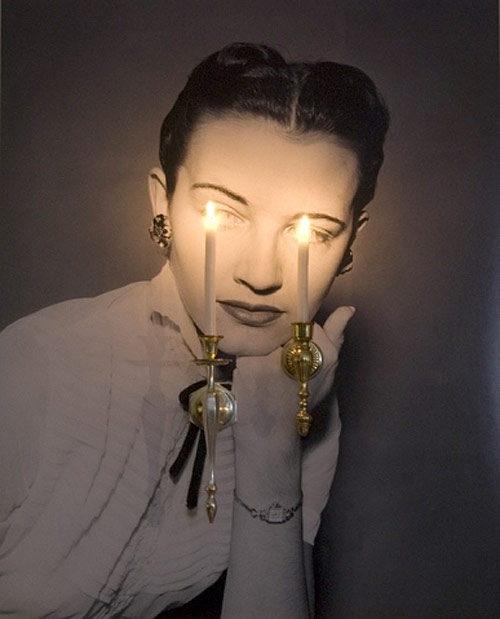
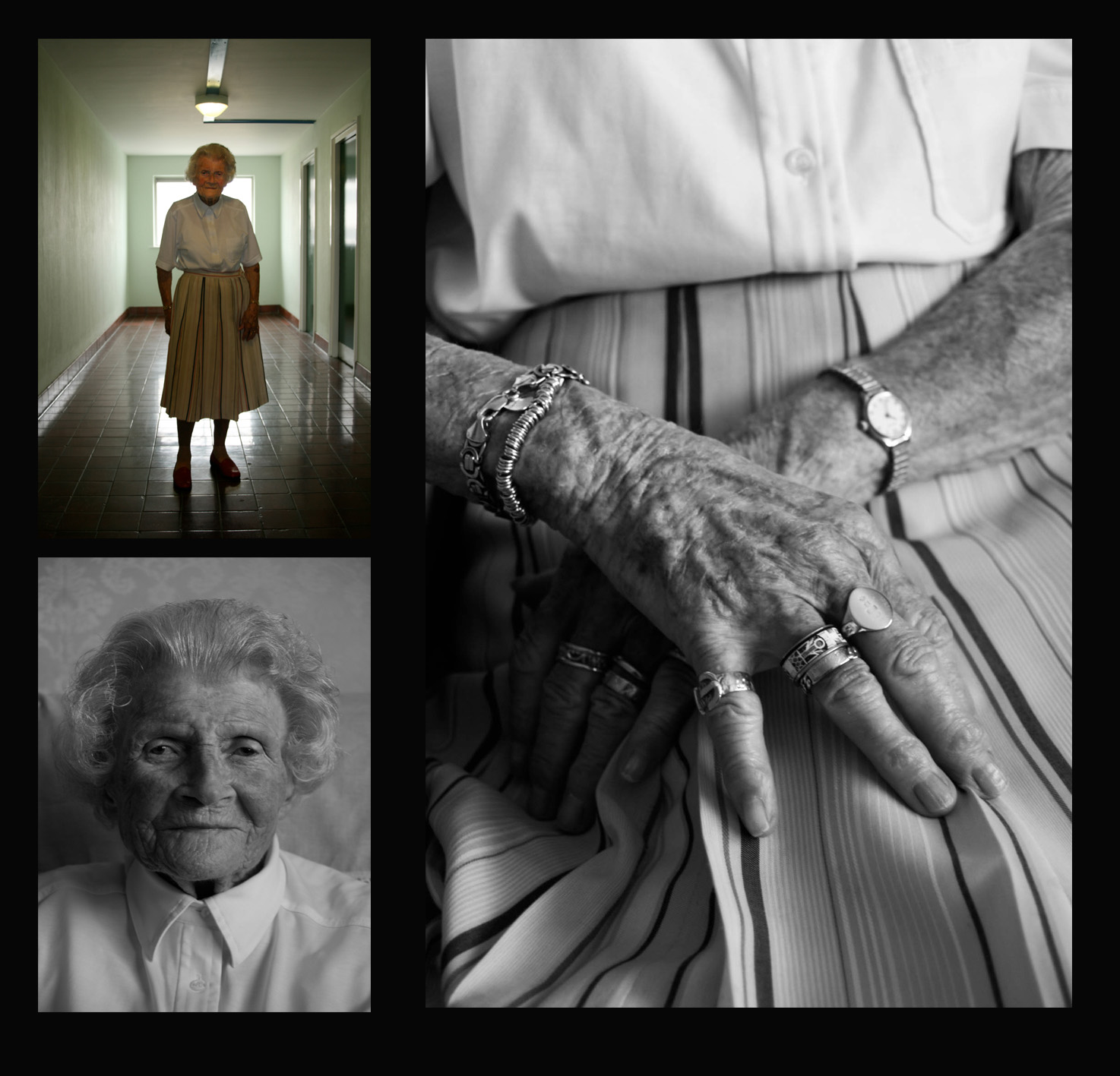
Use Photoshop to place your images within a document and add screen shots to show your process…
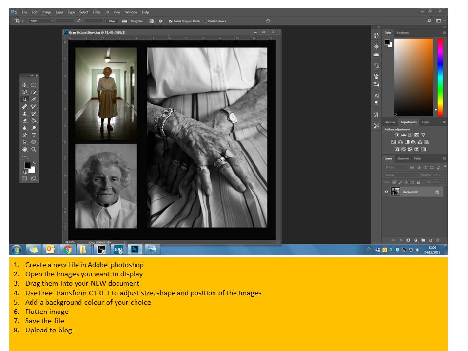
Tableau Photography is staged. Think of it like theatre. Include props, backgrounds, costume etc that connects to your theme somehow.
Tableau Photography makes use of symbolism and metaphor.
Allegorical paintings / photographs contain metaphor and symbolism
Pictorialist Photography has connections with Tableaux Vivant.
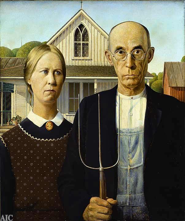
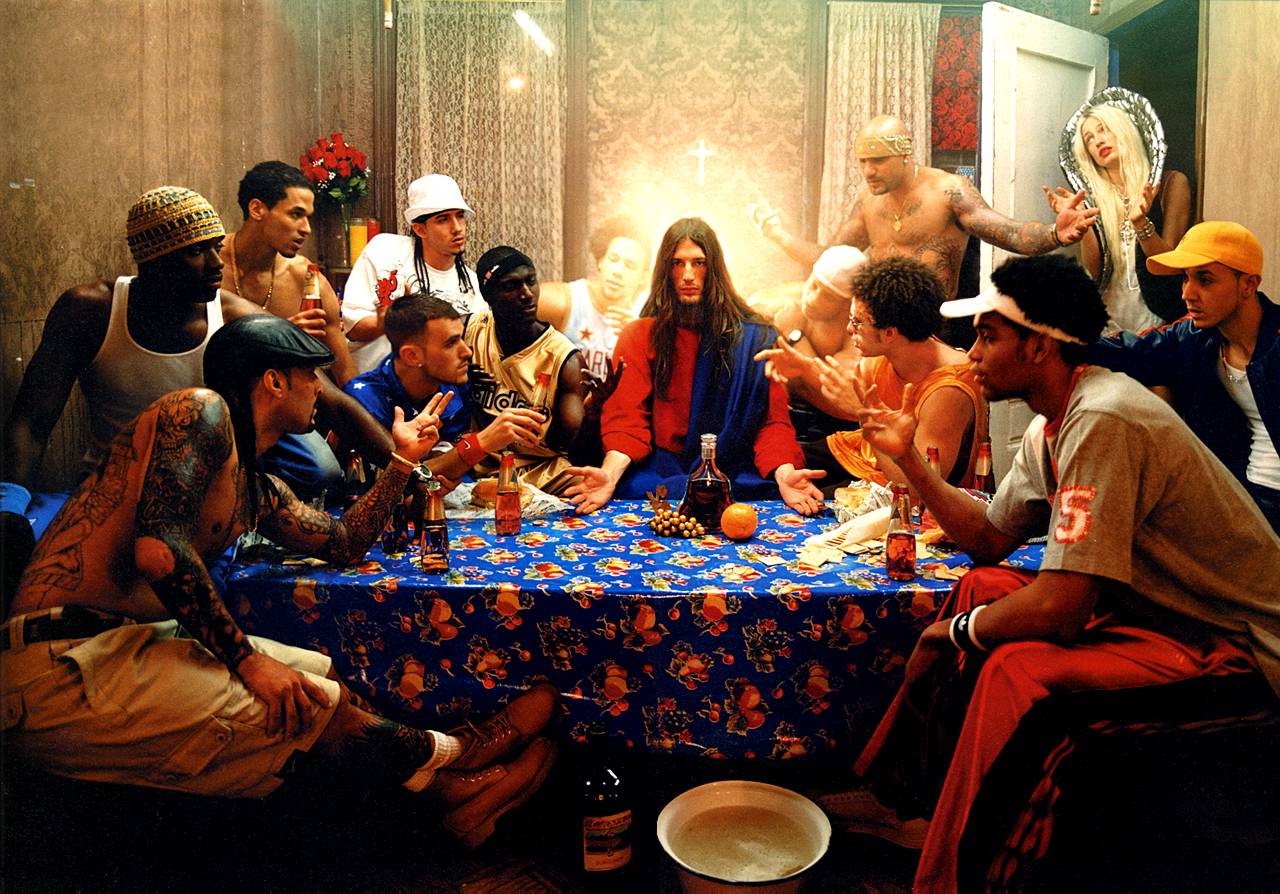
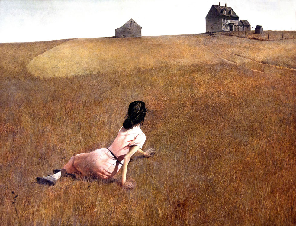
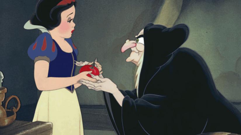
here are some examples that could inspire your own ideas…
Critical Analysis of the story of Snow White CLICK HERE