


Monthly Archives: December 2017
Filters
Double Exposure
What is double exposure? Double exposure is the method of superimposing two exposures in a single frame, most commonly known as double exposure, and to the day is one of photography's most impressive techniques. Using this method of overlaying images on top of each other, you are able to shape an image of nature into the silhouette of a person, to create dream like portraits. It is easily one of the most creative techniques in photography as the possibilities are endless due to digital photography. Here are some examples of double exposure:I found that the use of nature was particularly effective when it came to the images, as the trees could be used for a variety of different things such as fades etc. Through this I found it great how trees could be used to define a certain aspect of the image itself, and so allowed for the silhouettes of the creatures they wished to be highlight. I decided to make a response to these ideas by mainly focusing around the human body and nature combined. These were the results:
To create these I used the opacity tool, this increased the transparency of the top image, allowing for the lower image to be seen more clearly, creating the desired effect. I then used the paint tool to rub out the excess parts of the image to match the shape of the subjects face, making it seem more realistic.
Studio Shoot #2
For this shoot I decided to experiment with a broader variety of lighting types and techniques from my previous shoots within the studio. I wanted to use a variety of filters like red and yellow to allow for more dramatic effects on the subjects.I also wanted to switch between monochrome and the portrait settings when taking photos to allow for a greater contrast between the lights and darkness of an image. This would allow for a more sinister look when produced due to the emotionless expressions of the subject.
Before the shoot I wanted to create a mind map of the ideas towards this, so that I would have an idea of what and how to take the photos of both subjects.
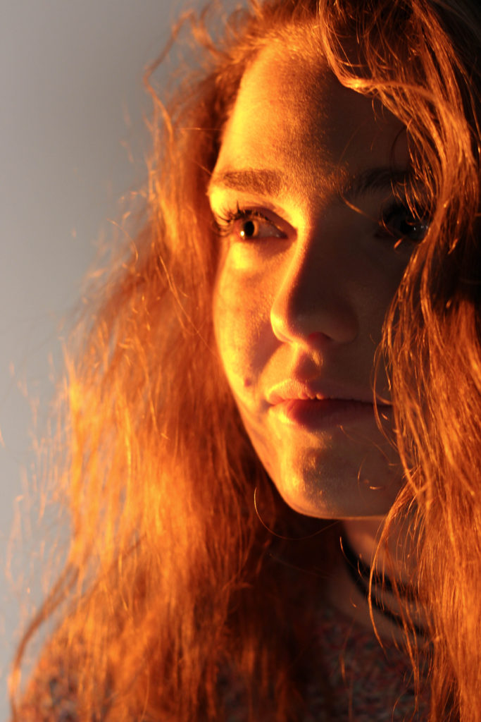
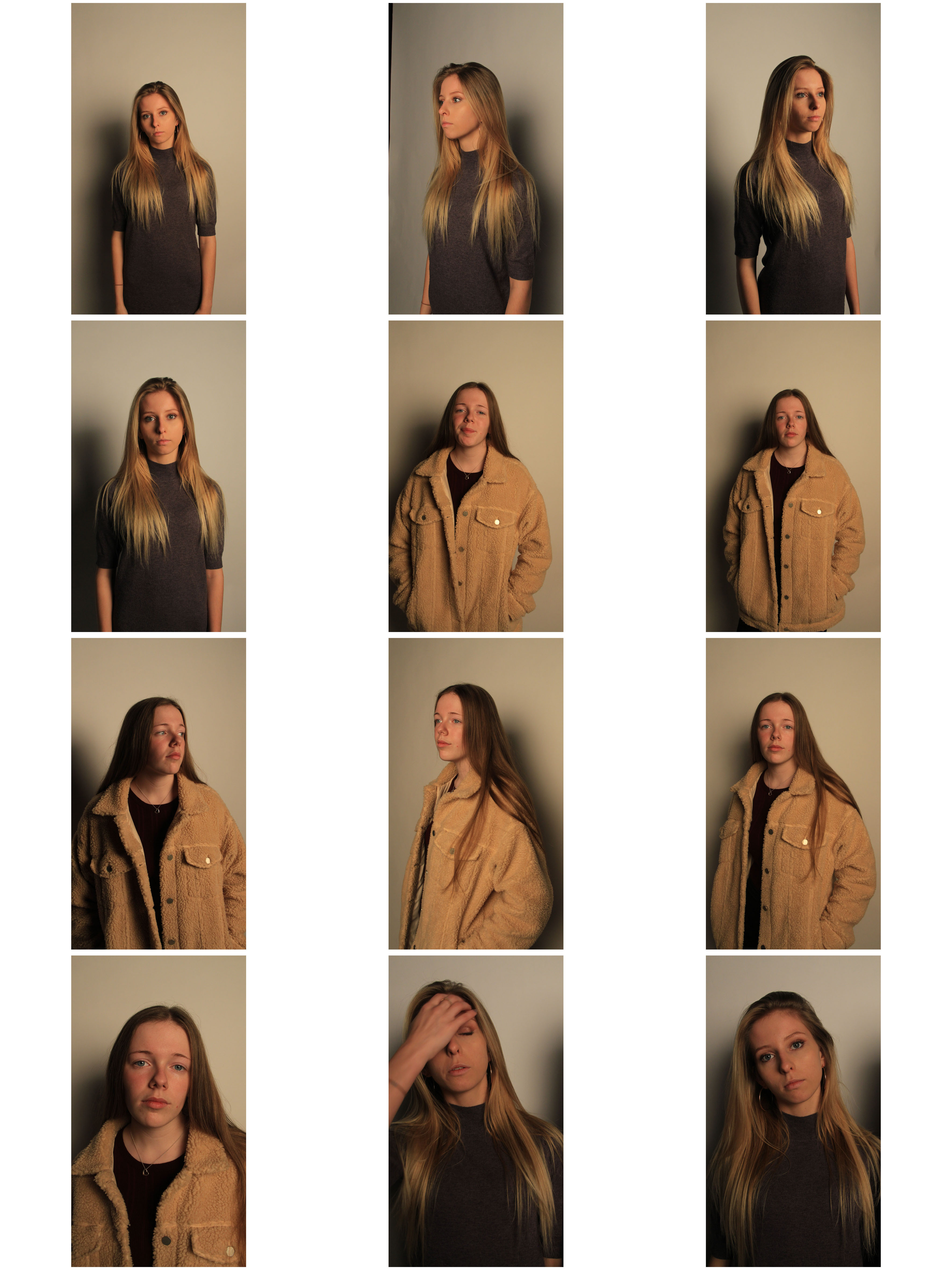
From there I decided to carry out the shoot, these were my results:
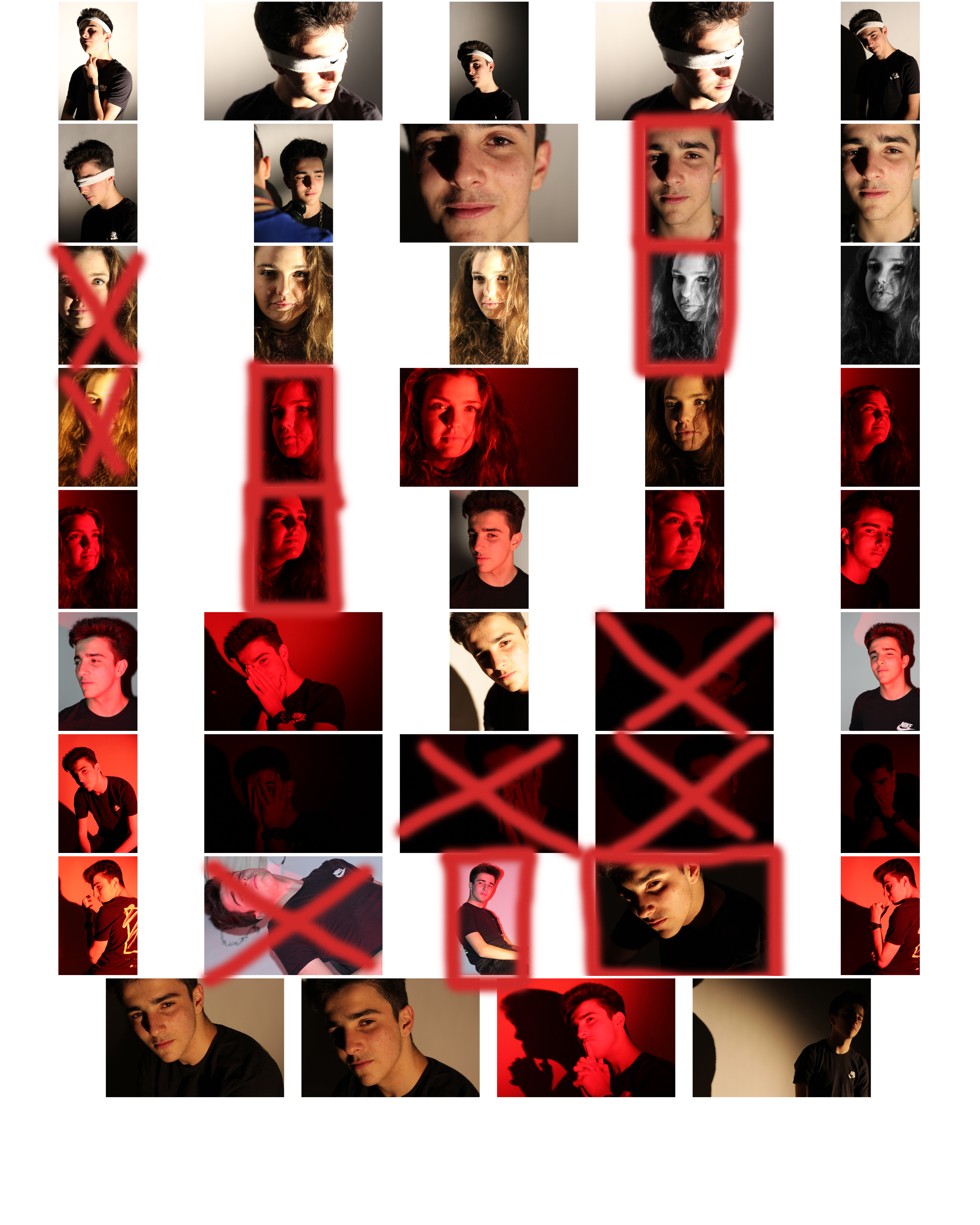
From here I selected the top ten image from the entire shoot, this would make it easier for me to narrow it down to the final image that I deemed best from the shoot. These were the images I selected:
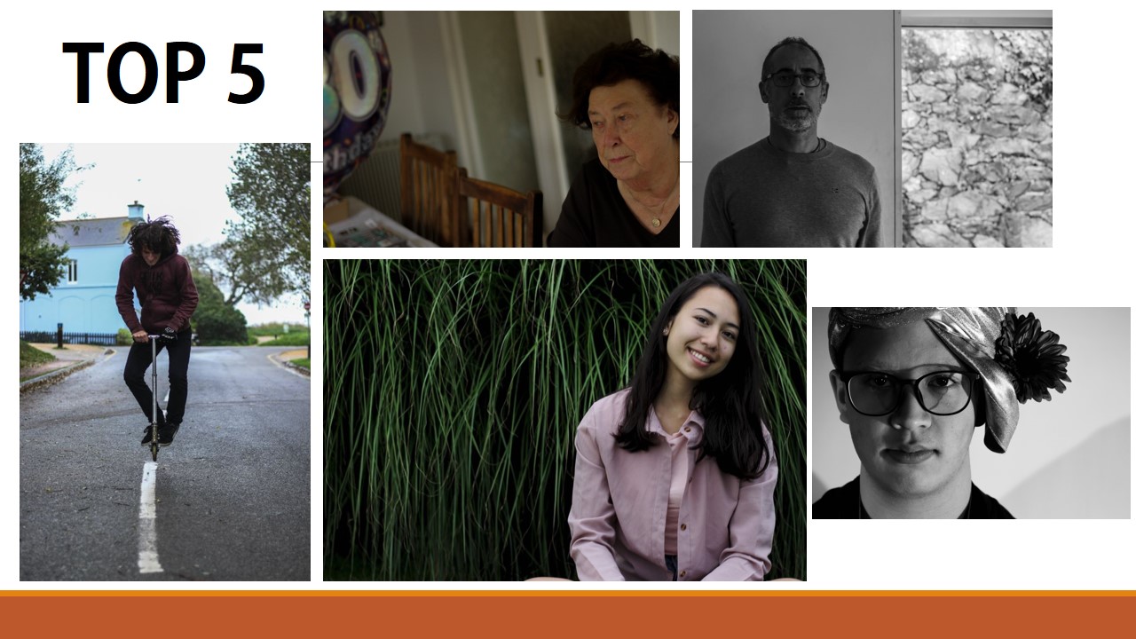
I chose these image because of the composition, lighting and color. I particularly liked the effect created by the shadows behind the subjects, allowing for an emphasis on certain features. What I then wanted to do was narrow the selection down once again to pin point the top five images out of the batch. These were the images I selected:
I chose this image due to how I liked the obviously contrasting shadows from the subjects face, which highlighted particular features. I also found that the huge shadow on the left of the image balanced the photo as the composition of the subject was equally divided onto the other side of the image itself.
What I liked about this image was once again the contrast between the light and dark of either side of the subjects face. Whilst the darkness of the hair added depth into the image, allowing it to be more visually pleasing. The right eye of the person is centered in the top right of the rule of thirds, this allows the viewers gaze to drift almost immediately to the eyes.
I chose this image because of the composition of the subject compared to the rest of the picture. The fact that the person's head lined up once again with the rule of thirds, helped make it aesthetically pleasing.
What I loved about this image was the obvious difference between the light and dark on either side of the face. This to me compared with the light backdrop allowed for a clear definition to the face, drawing out certain feature above others.
Finally I chose this image due to how I liked the link back to the theme of identity in previous shoot, based around idea of blinded by identity. From this I found the darkness provided on one side of the face allowed emphasis towards this, creating a more mysterious tone.
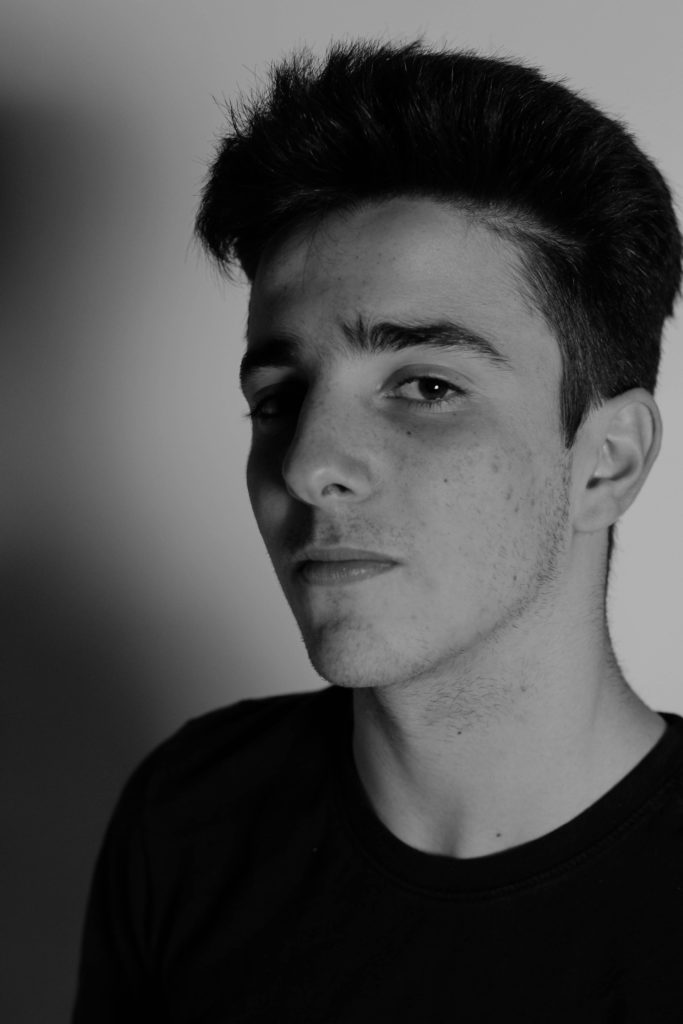
Finally I brought the pictures down to a one photo that I viewed as the most effective out of the selection. This was the image I chose as my final picture:This was my favourite image because of the composition, lighting and shadowing. I found that the clear contrast between the light and dark of the face and backdrop, allowed for the image to be perfectly balanced, with the dark left side of the face adding definition to the overall piece.
Compare and Contrast – Rosanna Jones
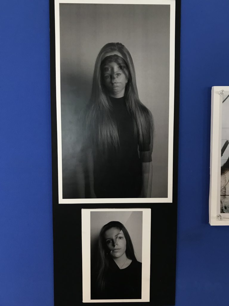
For my final portraits, I decided to take my inspiration from Rosanna Jones work. What I liked about Rosanna’s work was how the image had not been obscured from view digitally but physically placing tape on top of the image to create texture in the image, which is a unique concept which I wanted to incorporate into my work.

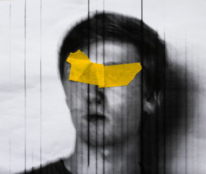
The similarities that the images have is that they both tape which is obscuring the faces of the model and is the main focus of the image have been physically placed on top that then the photo has been taken, which create texture in the image. Both of the images have had the tape by physically placed onto of a first image which has then been re photographer to create depth in the image.
The differences in the photographs are that my images had vertical lines going across the image I decide to keep this the final images as I felt like it added another layer to the image. Rosanna’s image has slight hint of purple whereas my images is in total black and white I wanted my image to be this way as I felt that by having the sole colour in the entire image to be the tap covering the model’s faces would make the image have a greater impact
Final Prints: Portraits
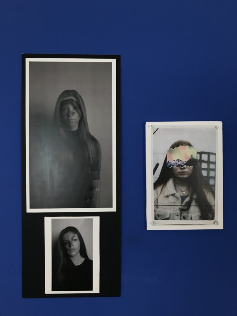
I paired the two black and white images together by placing them both on foam board which I backed up on the black mount.
The third image I backed up on foam board by itself as it was the only coloured image. I placed pins in the 4 corners for a 3D effect of the pins that appear in the actual image.
My Edits | Constructed Portraits
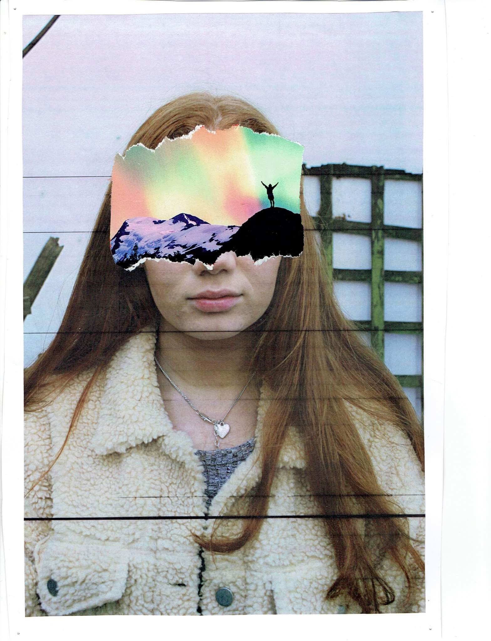
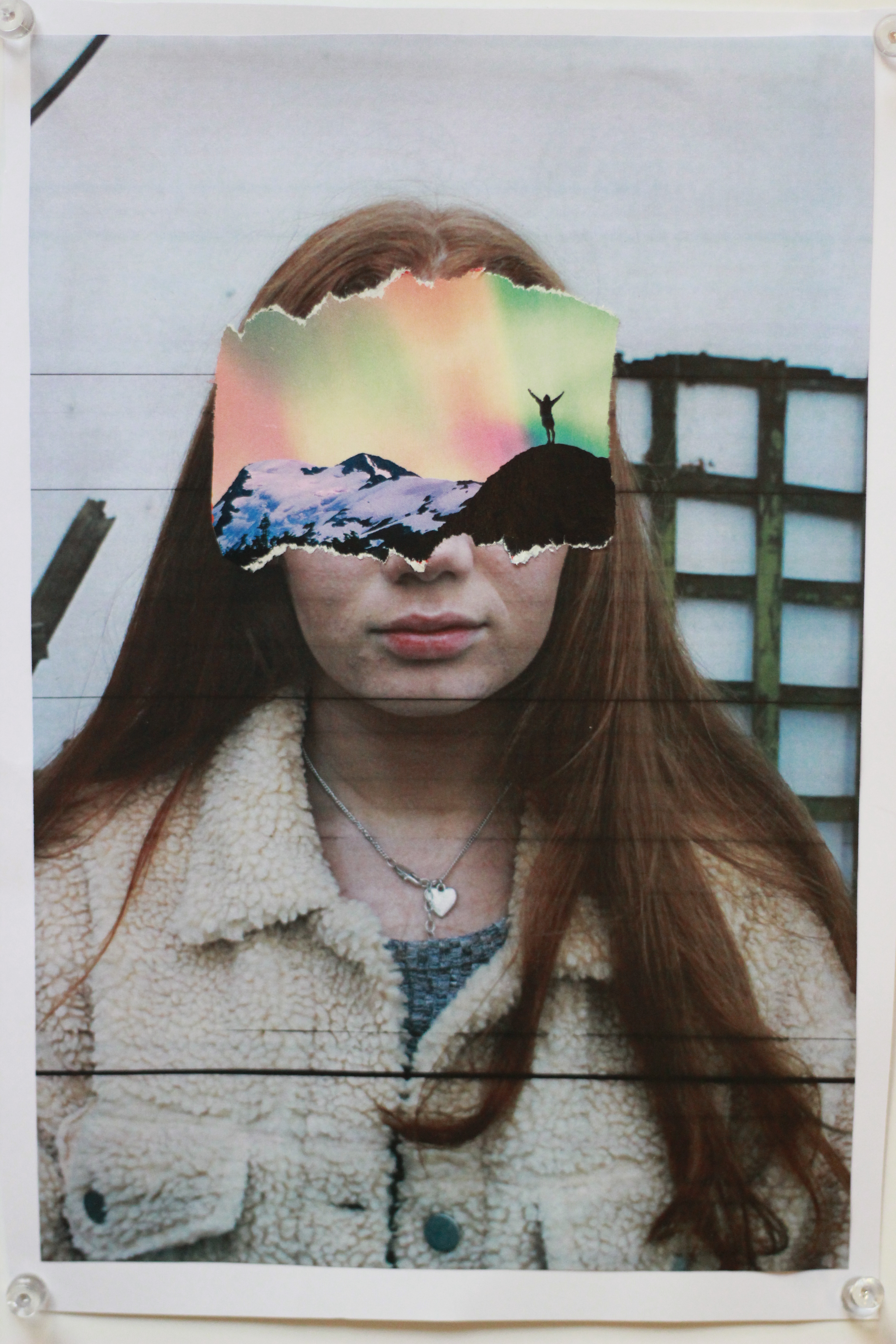
To make this image, I cut out a landscape image from a magazine and covered my subjects face, like John Stezaker’s work.
The pins in the orignal copy (which I took a photo of) added depth so I chose that version of the image over the scanned version. I knew that when presenting this image I could then add actual pins to further the effect.

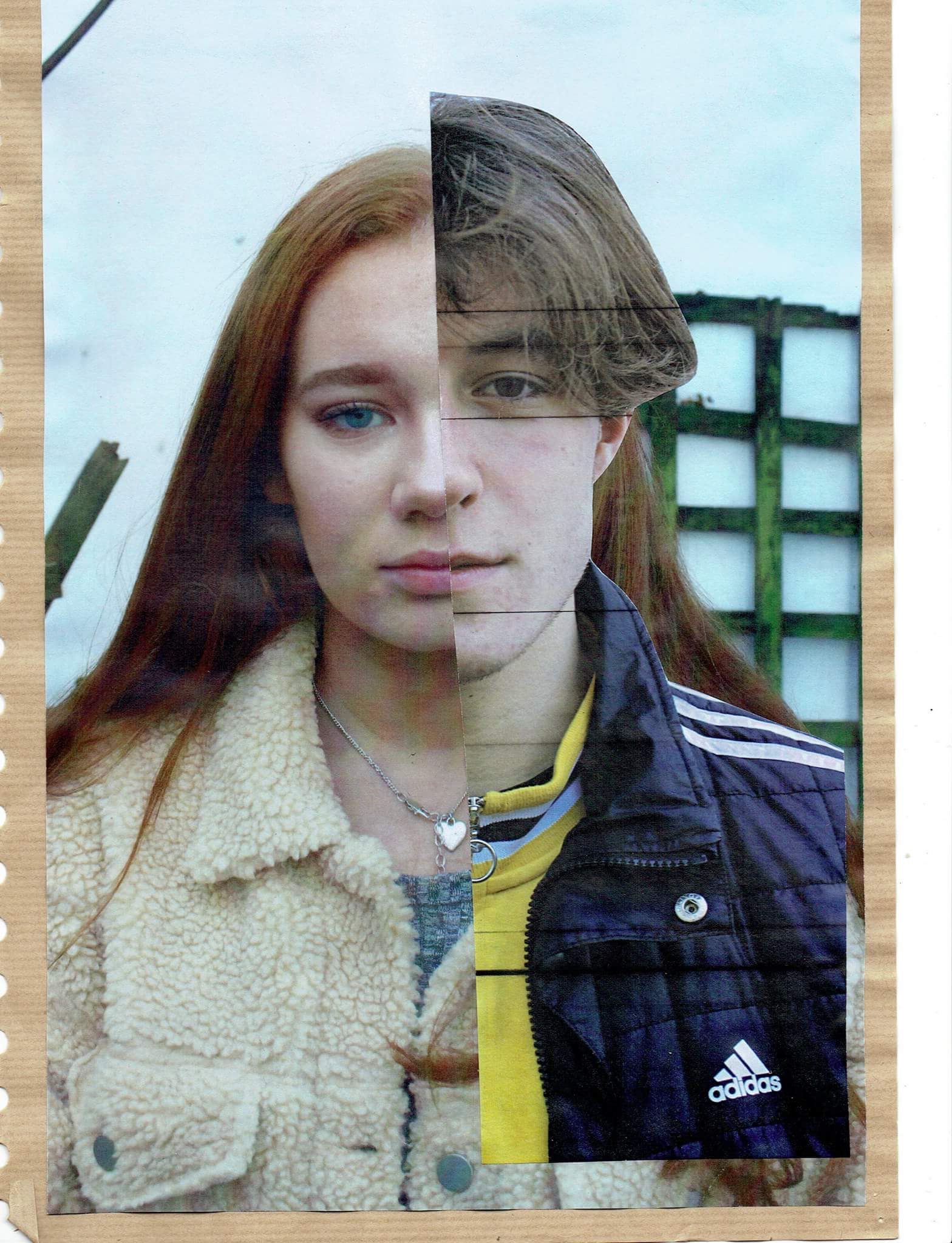
Like Stezaker’s work, I took two of my images and aligned them with eachother to present the differences and similarities in the two facial structures.

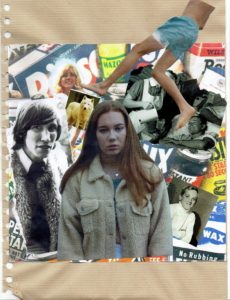


For the above two images, I looked at Hannah Hoch’s photomontage work and took images from online media and magazines of feminine and masculine looking things. I combined these with my own images which I had printed and cut out to collage.
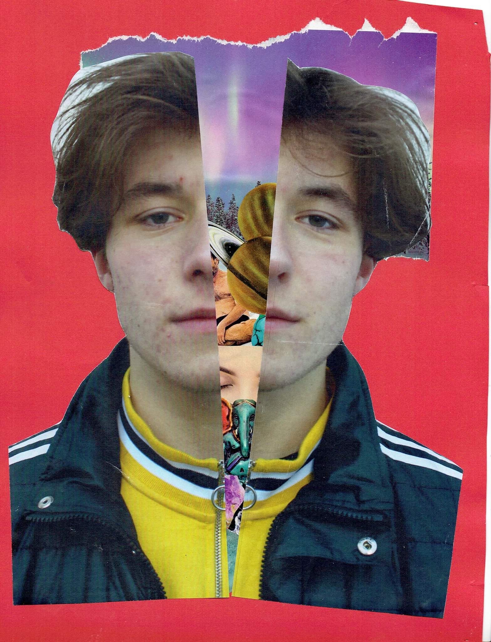

For this image, I used any leftover cut outs that I did not use. I cut out my portrait image and placed the cutouts underneith so as to imply what is going on inside his head.
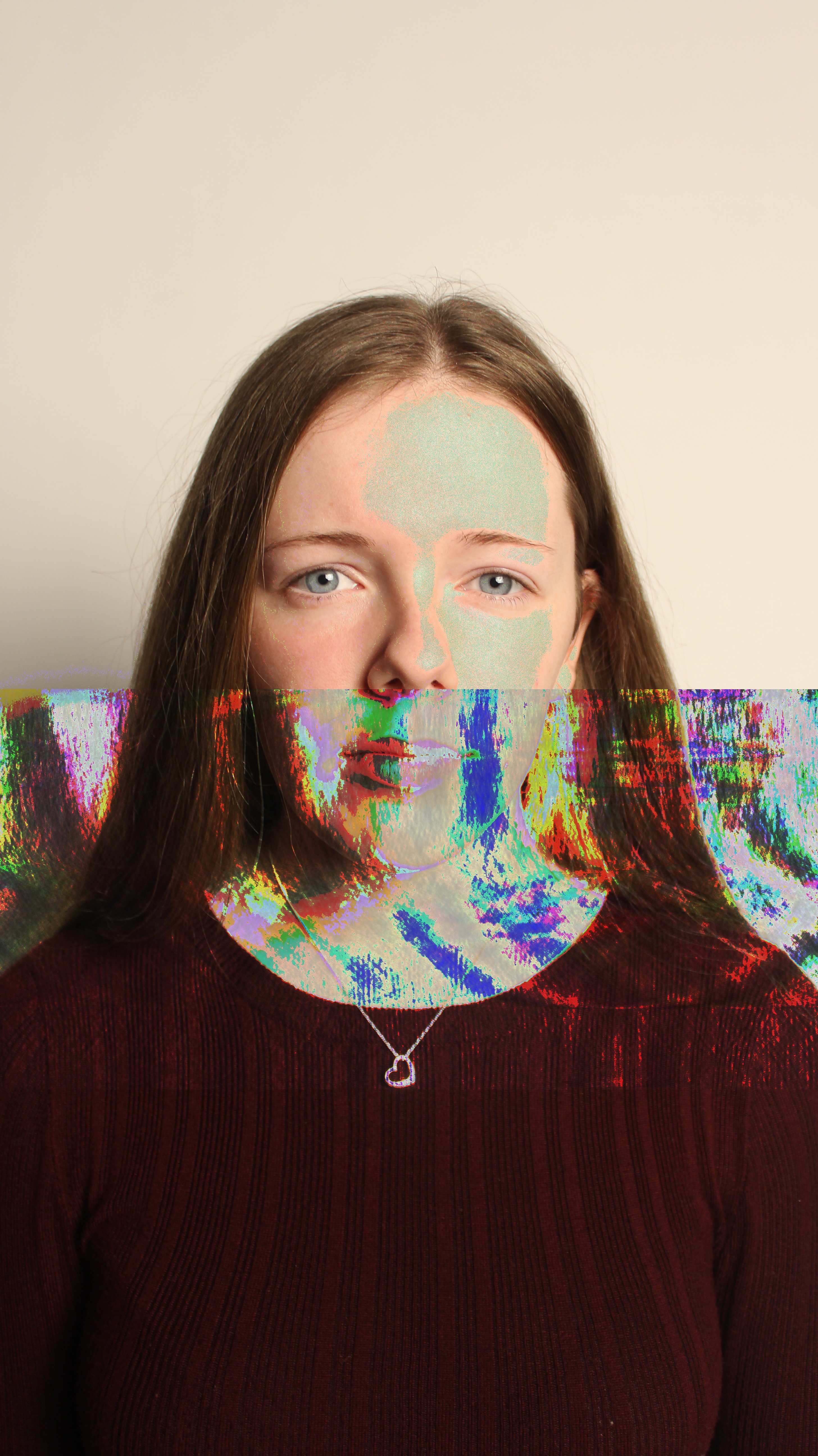
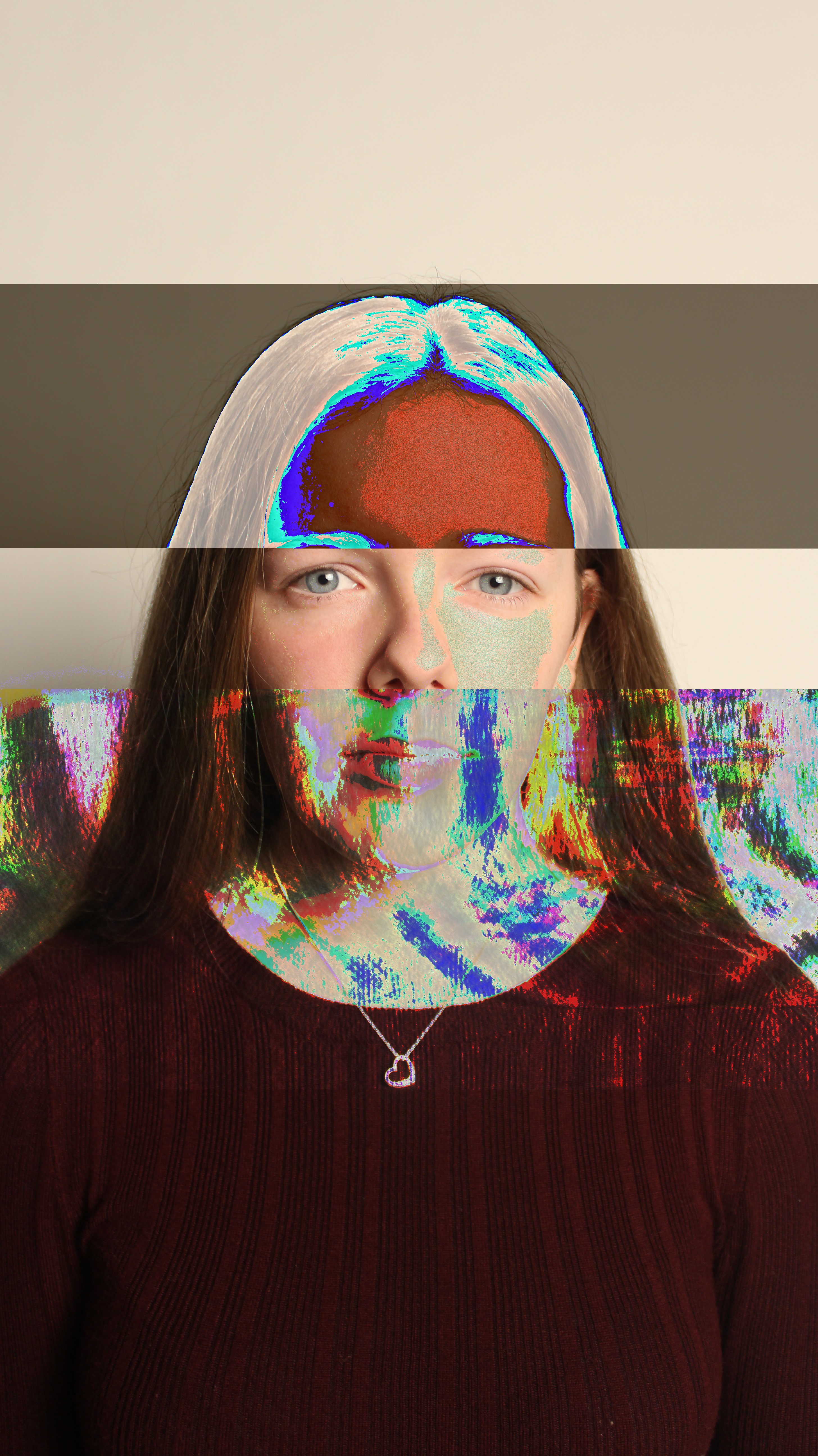
To make my glitch images like Heitor Magno’s, I converted my image files into audio files. Once I had done this, I added effects to the audio file such as amplitude. After doing this, I converted the audio file back to an image and I came out with the outcomes above.
http://datamoshing.com/2016/06/15/how-to-glitch-images-using-audio-editing-software/
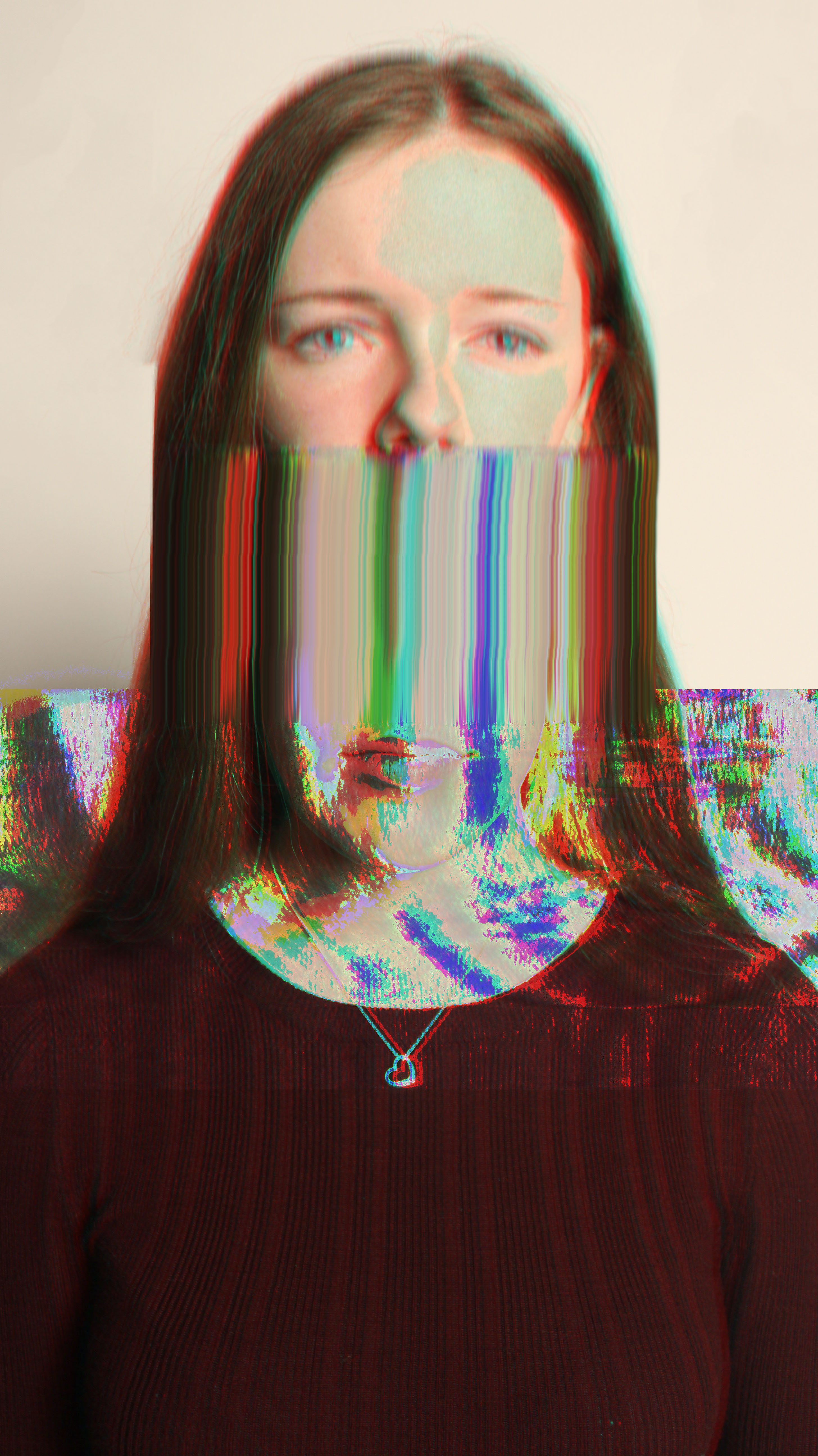
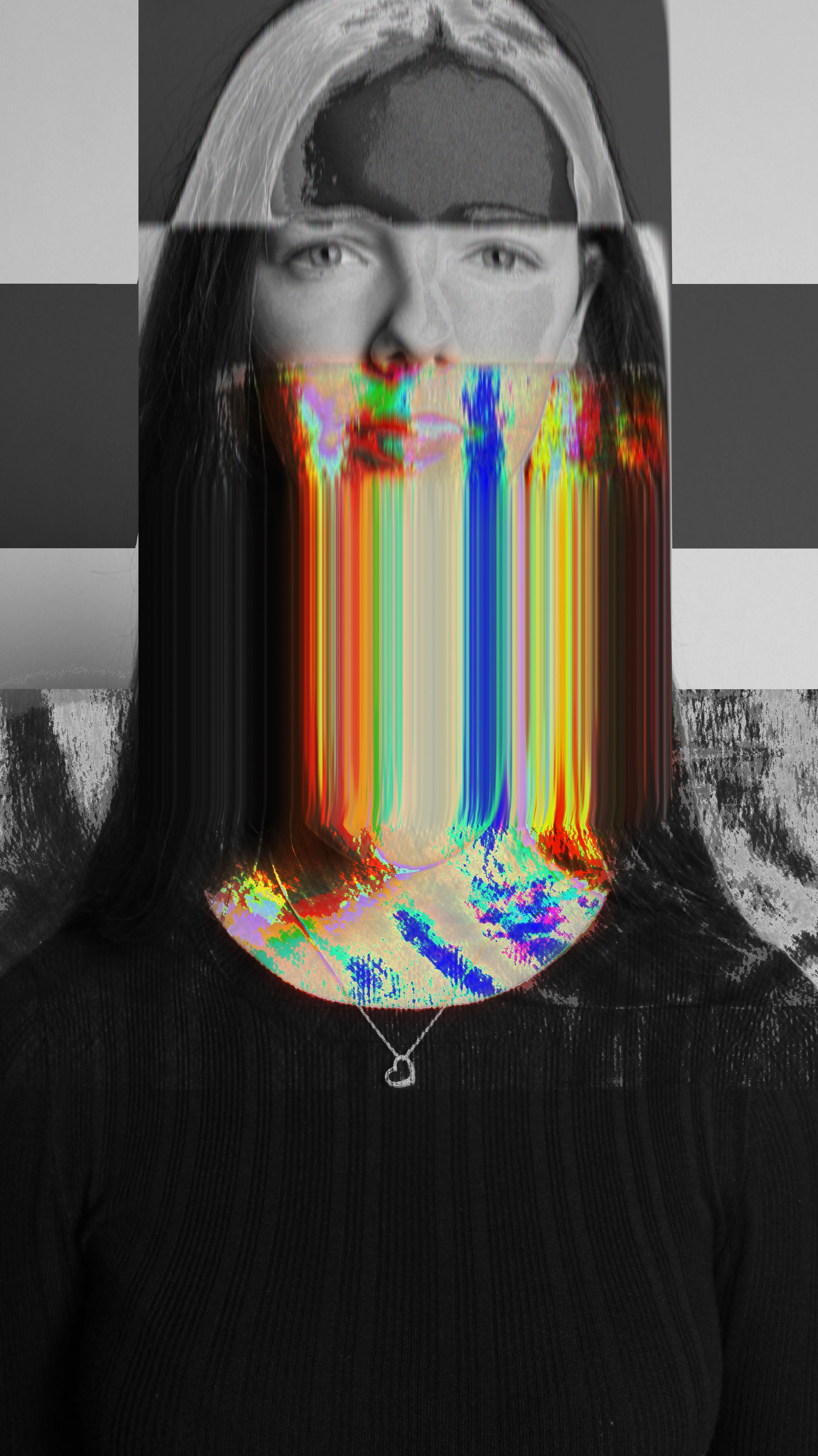
I took my already glitched images, and created another layer of the same image over it. I moved the top layer slightly and changed the channel to red to give the whole image a 3D looking effect. Next, I used the smudge tool over the head to drag out the colours in the glitch.
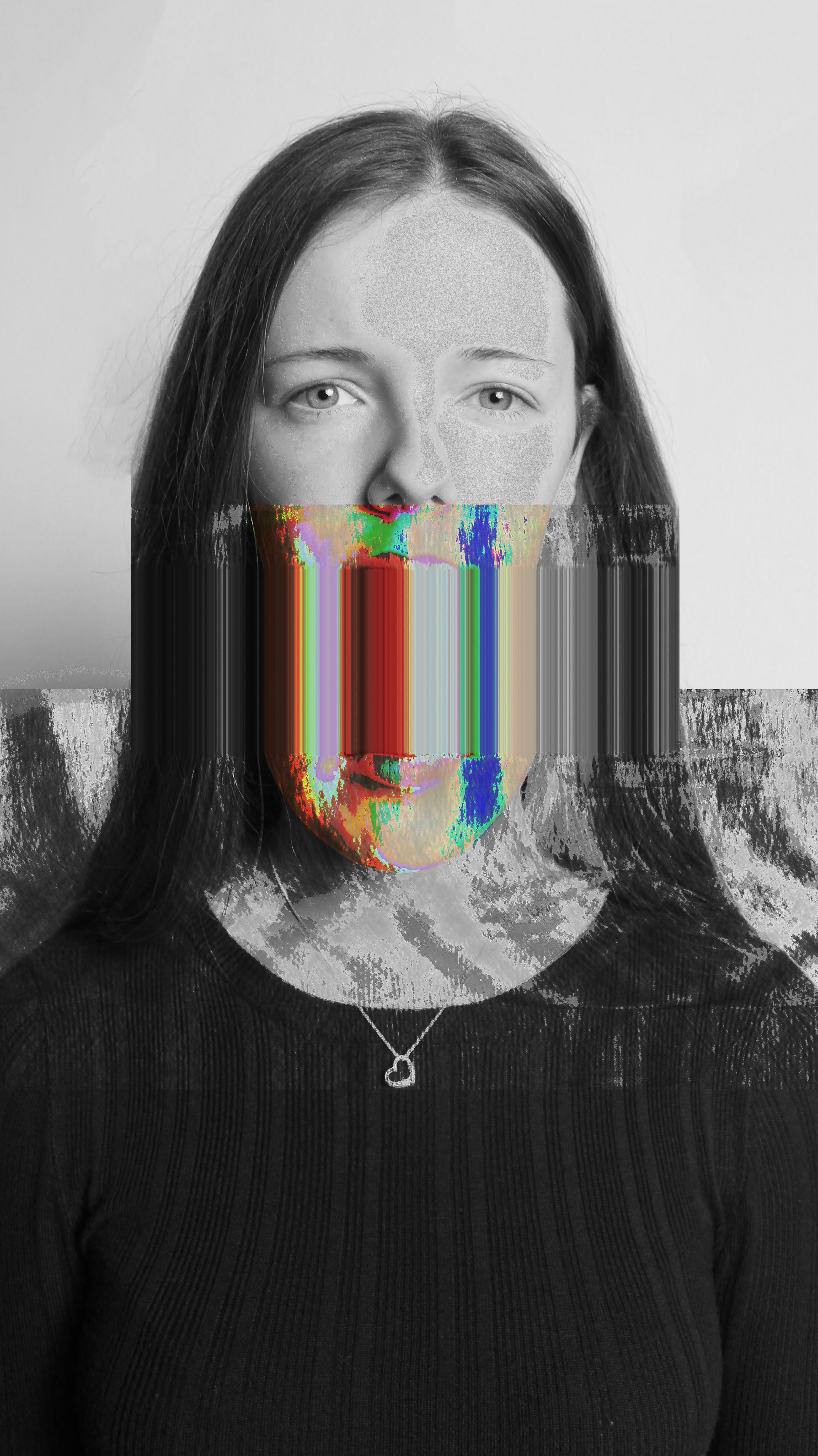
For the above image, I did not add the 3D effect as I thought it made the image hard to look at. However, I did create two layers of the image, where I made the top layer black and white and rubbed out the bits where there was colour. This gave my image an outcome that was more similar to Heitor Magno’s.

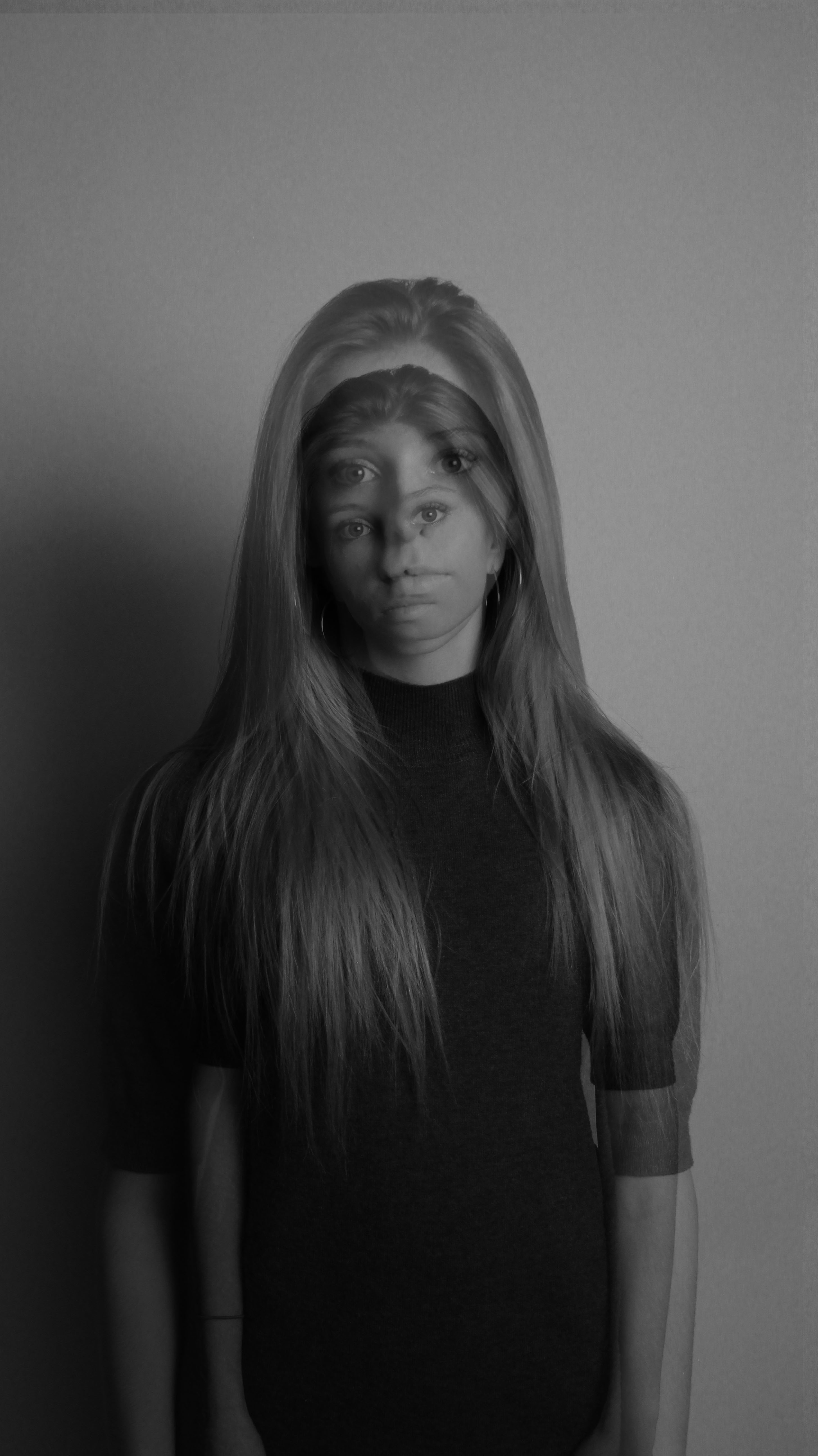
To recreate Adam Goldberg’s work, I took two similar images but with slightly different perspectives and placed one over the other, adjusting the opacity so that I could see both parts of the image. I converted the overall image to black and white and increased contrast to make the double exposure effect more dramatic.
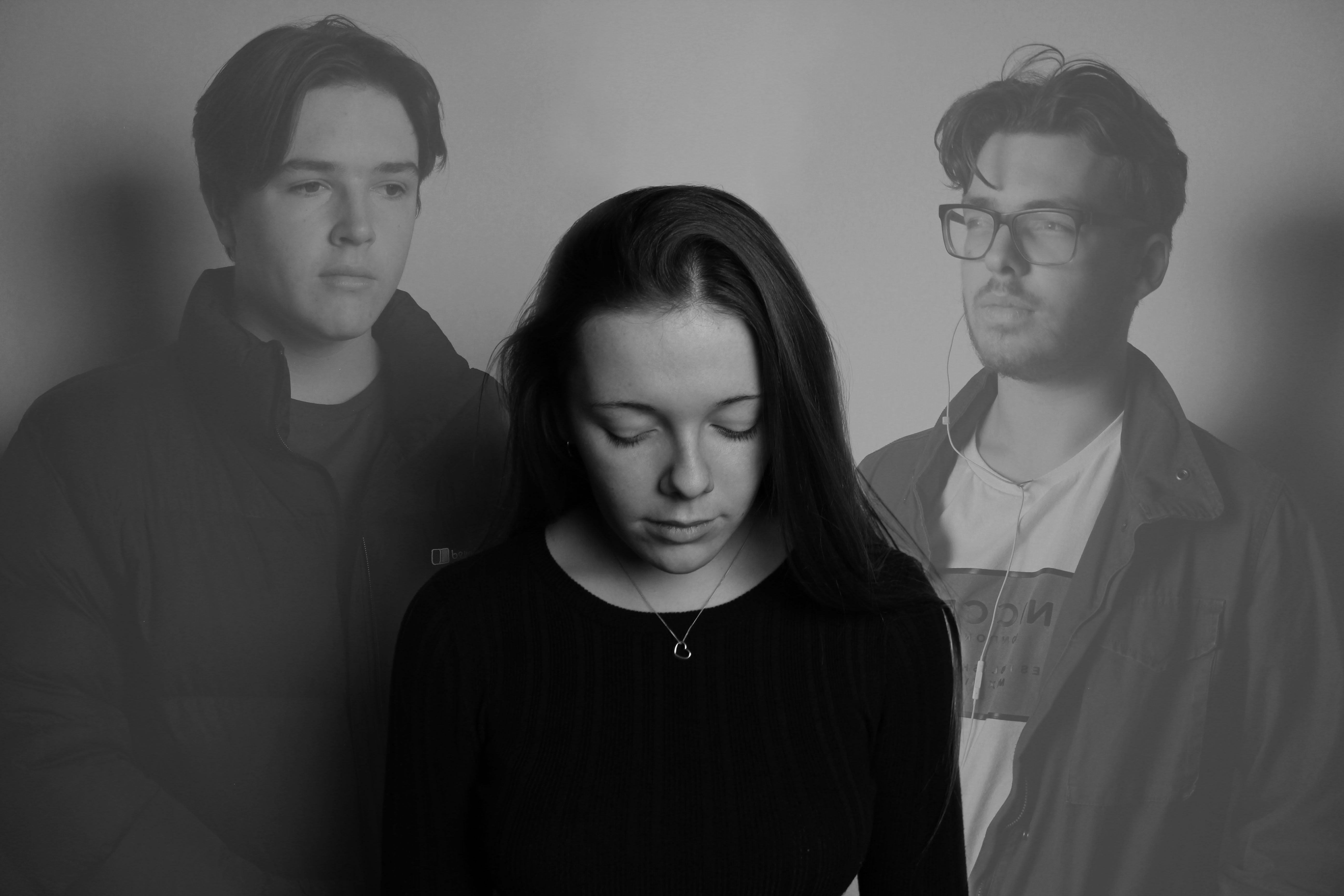
I added multiple photos but adjusted the opacity’s so that the person in the middle was the main focus. I liked this idea as it left it up to the viewer to figure out the story behind the image.
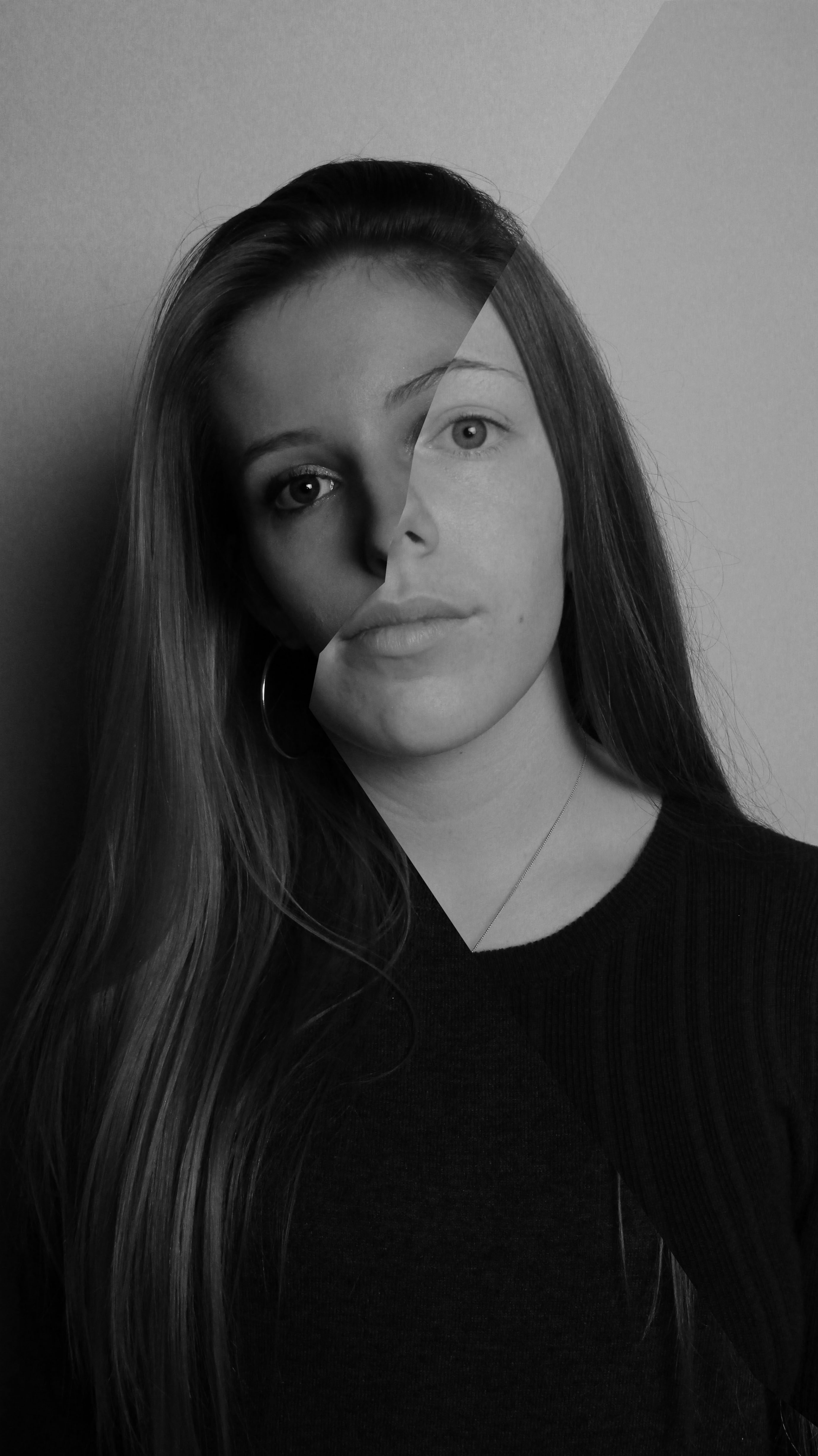
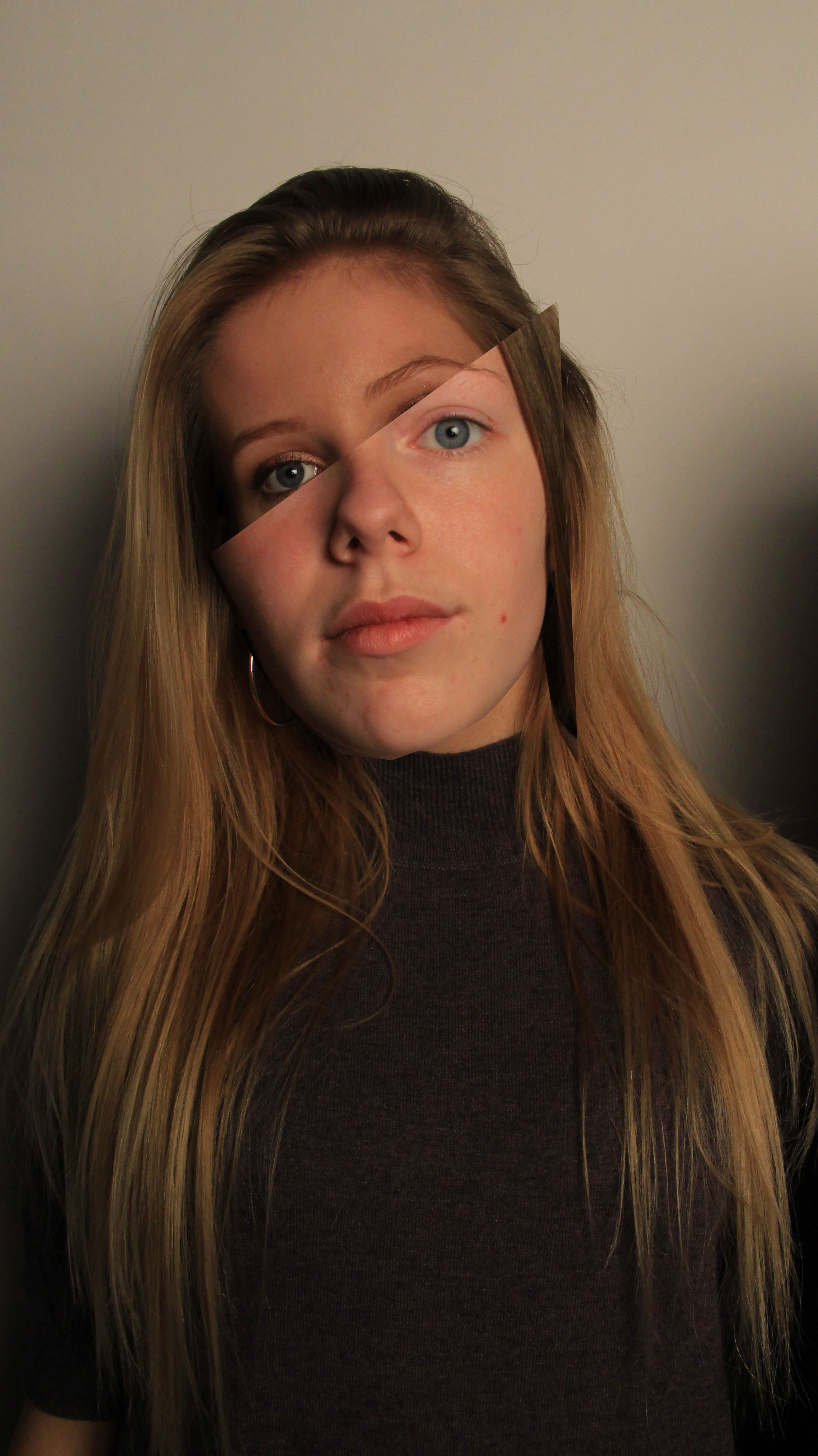
Again like Stezaker’s work, I took two images and cut them up on photoshop where I then positioned them on top of eachother so that the eyebrow, nose and hairline where in line. I converted one image to black and white to give it an older feel like Stezaker’s work
My Photos | Constructed Portraits


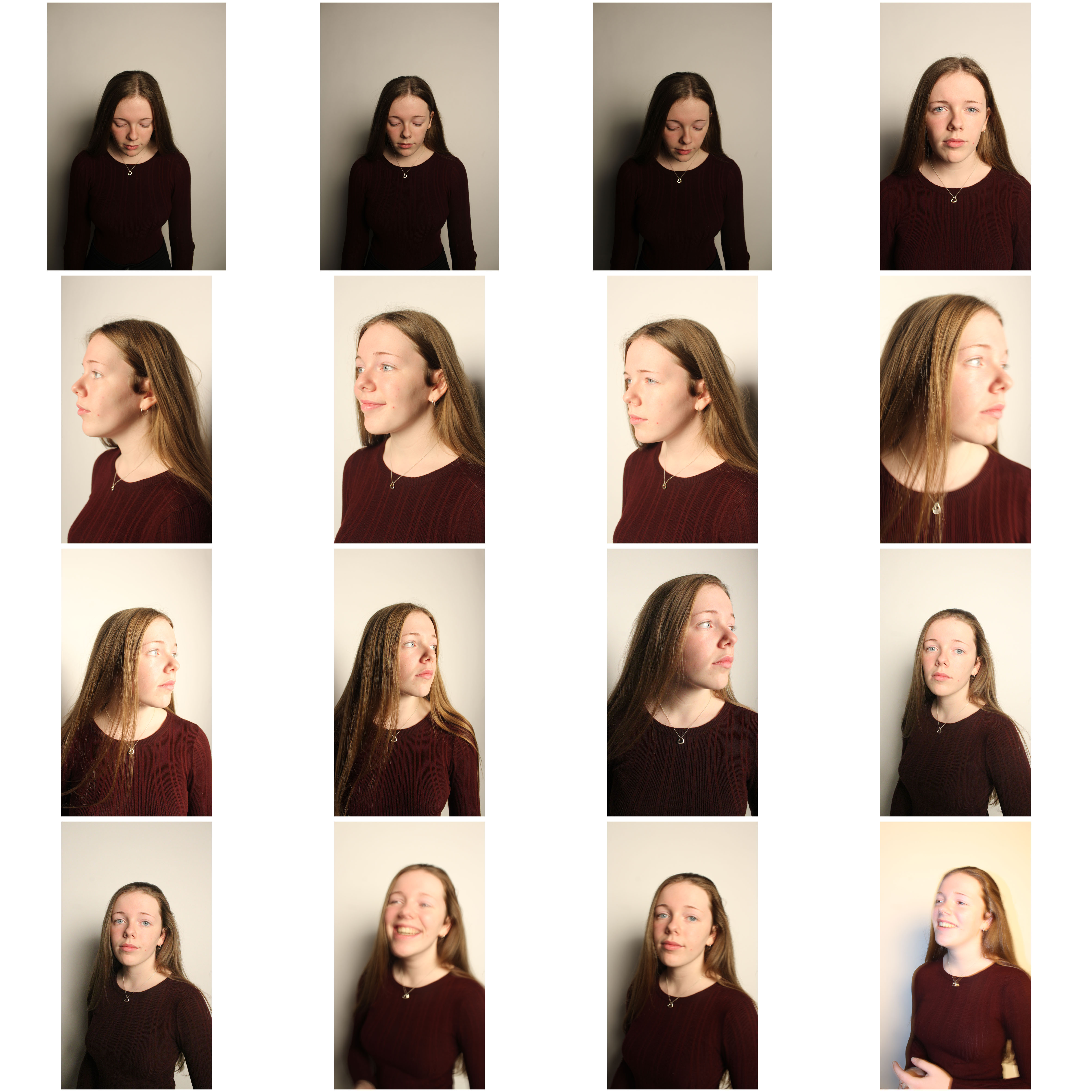


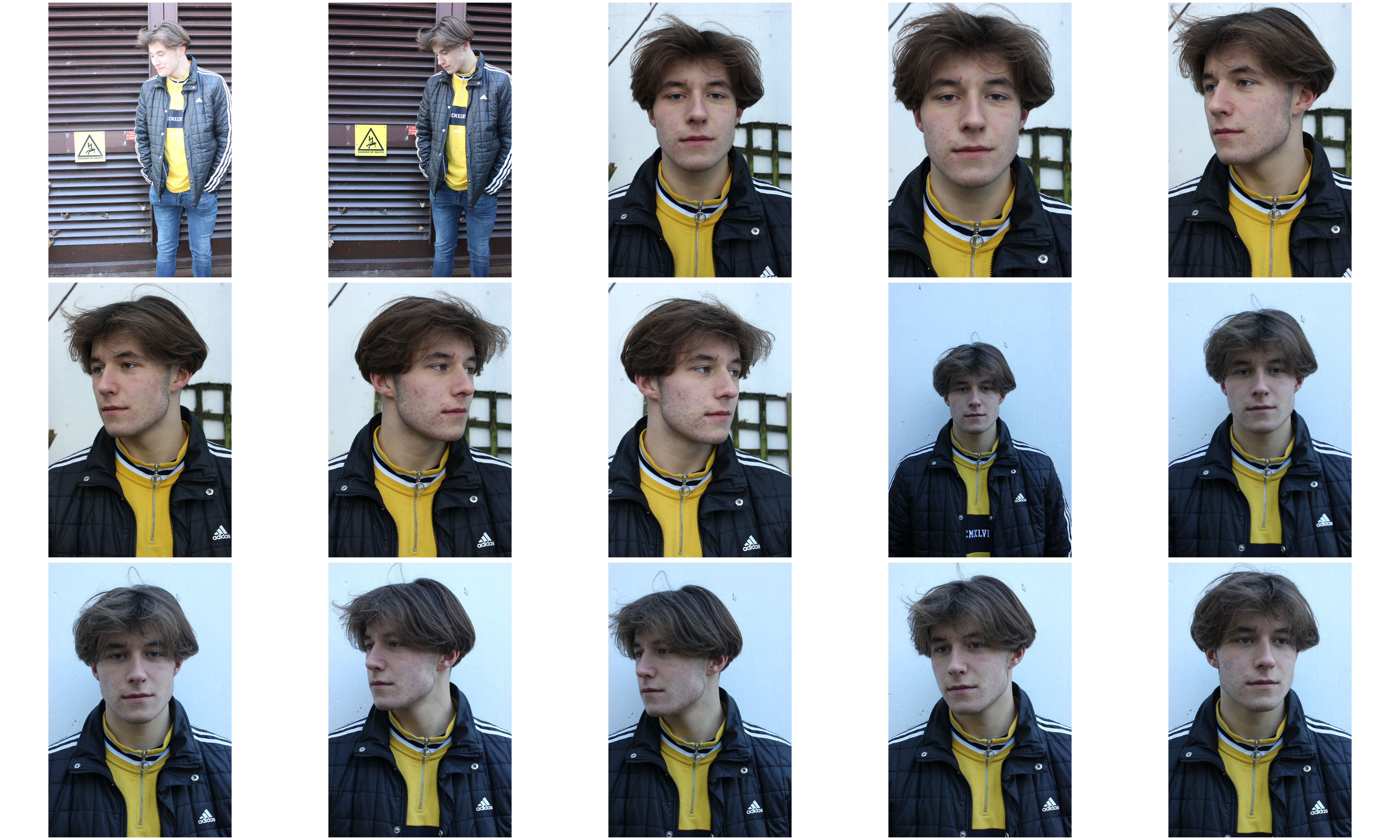
Adam Goldberg | Constructed Portraits
Adam Goldberg
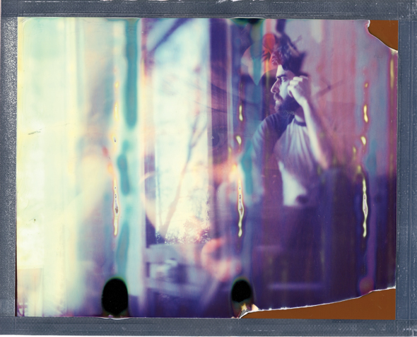
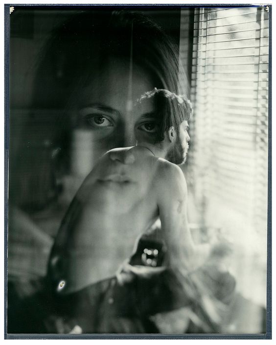
Known primarily as an actor, Adam Goldberg is also a photographer, musician, and a filmmaker.
Although he shoots digitally as well, Adam works primarily with several analog cameras and film stocks ranging from 35mm to 8×10 with an emphasis on instant films.
His works use double exposure techniques to layer multiple similar images over one another. This can portray a plot, or the idea of what is going on inside someones head.

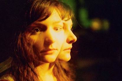
After looking at Adam Goldberg’s work, I wanted to also provide an underlying story of what is going on inside the subjects of my photos head.
John Stezaker & Hannah Hoch | Constructed Portraits
John Stezaker
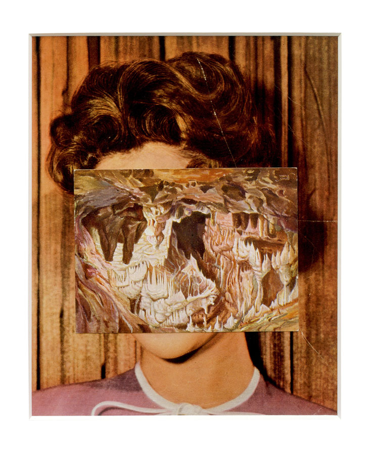
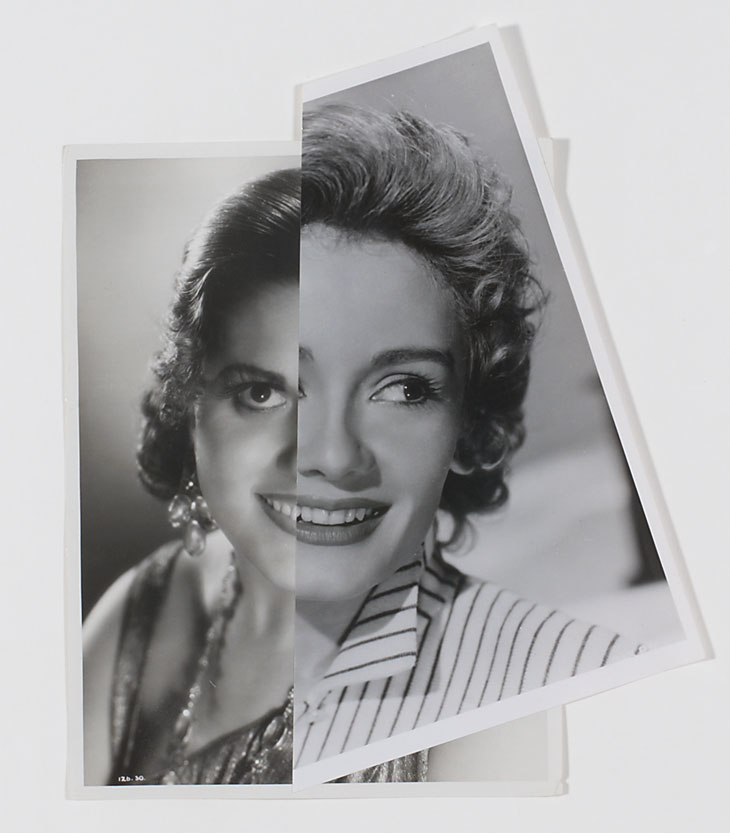
John Stezaker’s work re-examines the various relationships to the photographic image: as a documentation of truth, purveyor of memory, and symbol of modern culture. In his collages, Stezaker appropriates images found in books, magazines, and postcards and uses them as ‘readymades’. Through his elegant juxtapositions, Stezaker adopts the content and contexts of the original images to convey his own witty and poignant meanings.
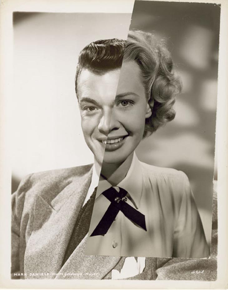
Using publicity shots of classic film stars, Stezaker splices and overlaps famous faces, creating hybrid ‘icons’ that dissociate the familiar to create sensations of the uncanny. Coupling male and female identity into unified characters, Stezaker points to a disjointed harmony, where the irreconciliation of difference both complements and detracts.

Hannah Hoch
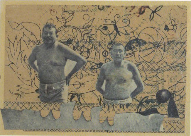
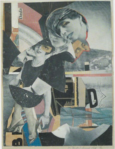
Hannah Höch was a German Dada artist who lived from November 1st, 1889 – May 31st 1978 . She is best known for her work of the Weimar period, when she was one of the originators of photomontage. Photomontage is a type of collage in which the pasted items are actual photographs pulled from other sources of media or photography.
Höch’s work often focused on gender roles where she wanted to show that woman were just as capable and equal as men. Her active interest in challenging the status of women in the social world of her times motivated a long series of works that promoted the idea of the “New Woman” in the era.
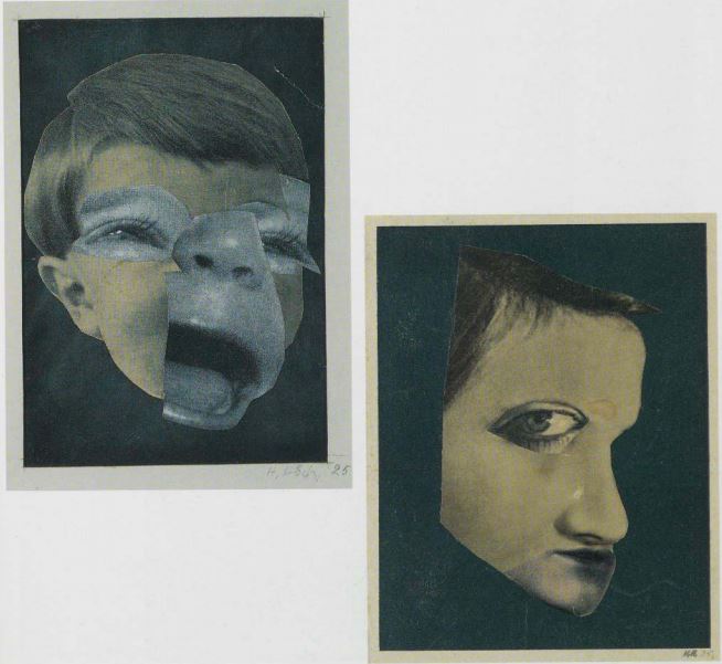
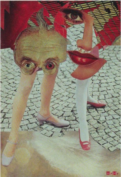
Using the same techniques of photomontage, I wanted to create works where I would merge masculine traits with feminine traits. I was inspired to combine my own images with photos of masculine and feminine stereotypes in media.
Project Final Outcomes
FINAL OUTCOMES
My favourite chosen outcomes from the project are also those that I have used for my final print compositions, here is a link to the post that went over my final prints…
https://hautlieucreative.co.uk/photo19al/2017/12/18/print-compositions-framing/
Outcome 1
The first of my final pieces is a composition of 2 studio portraits that I believe simply work together rather well and effectively, to create 1 piece.
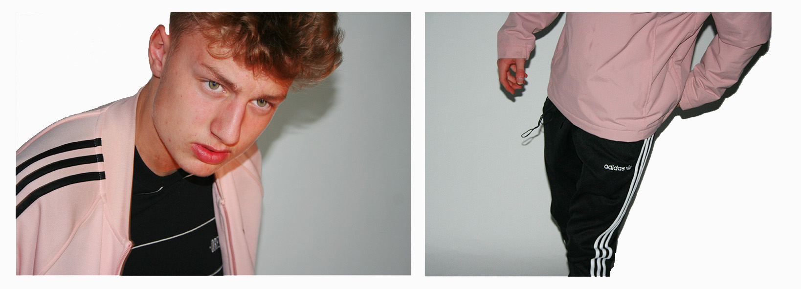

 The images needed slightly enhancing in order to balance the light, contrast, saturation and shadows of the 2 photographs, and cropping in order to make sure that the background of the images look clean and fully white so that the subjects stand out nicely.
This composition of 2 images is one that I believe shows my raw camera skills. I believe that the 2 images compliment each other perfectly due to the colours, composition and patterns within the images.

The thing other than the balanced colours/shades pink, black and white that stands out to me between the two images is the balance between pattern through the 3 Adidas stripes in both images. These 3 stripes are something that you will see just about everywhere in which people are wearing casual attire. The stripes are the trademark the adidas sport and casual wear brand, causing Adidas to be known as the “The three stripe company” after being called this by its founder Adolf Dassler. In my 2 photographs the dark on light stripes create a good contrast with the light on dark stripes.
Outcome 2
The second of my final pieces is a composition of 9 images (Street photography and Environmental portraiture) in a story board style which explore how the surroundings of a subject visually effects the subject, and how the subject effects its surroundings.
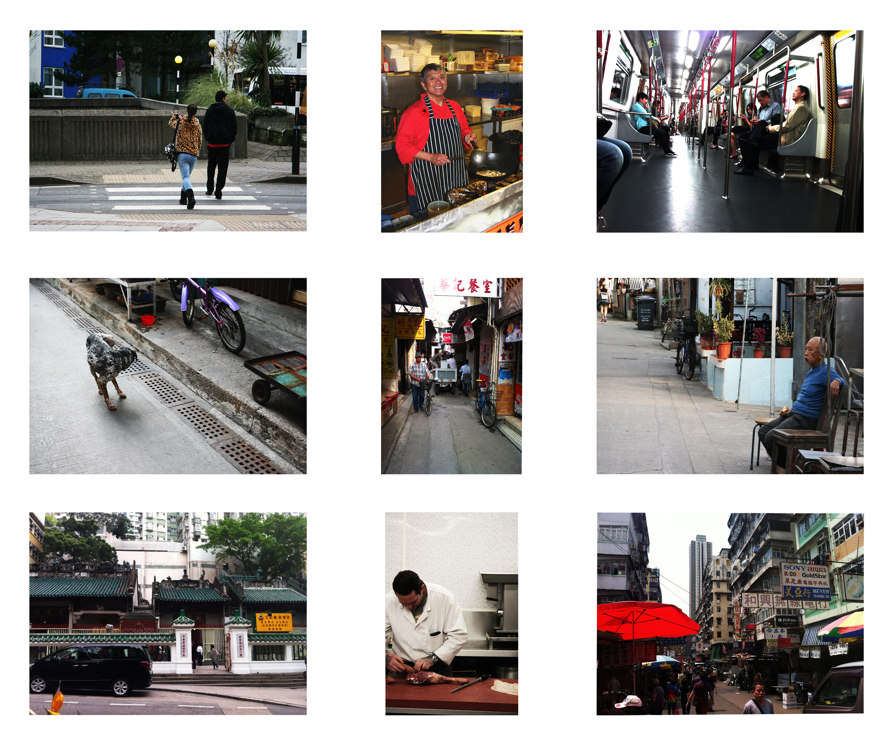
I have composed the images in this fashion as each image that is opposite to another length-wise or height-wise is related to and balanced with each other.
Here are the 9 original photographs that I have used in this piece…


The environmental portraits were inspired by August Sander who had a mission of photographing every worker in the whole of Germany, here are some examples of his work…
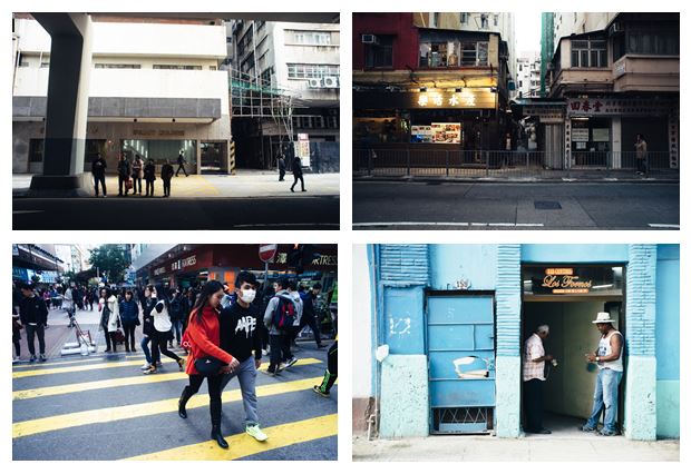
The street photographs were inspired by Genaro Bardy who photographs the streets of metropolitan cities and small towns. Here are some examples of his work…
Outcome 3
The third of my final pieces is a composition of 4 creative portraits exploring a theme of socially perceived identity.
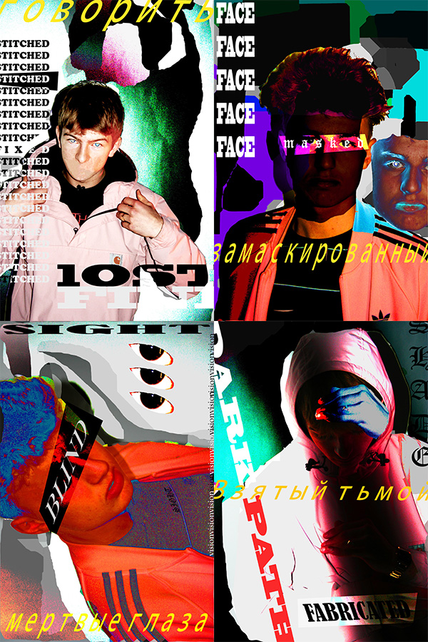
I believe that these creative portraits present my creative skills through the use of Photoshop and Typography. The theme of socially perceived is about how people portray themselves within society and how other people portray them, not specifically to the subjects of the images but in general as a society how people seem to see themselves as individuals. The words used in these images explore different social boundaries that some people may come face to face with in society.
This style of work which I have used in this piece of work is inspired by various photographers and graphic artists including: David Carson, Lester Beall, Neville Brody, Paula Scher, and Shepard Fairey (the creator of the OBEY brand.) Here is some of their work…

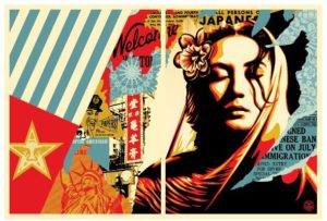
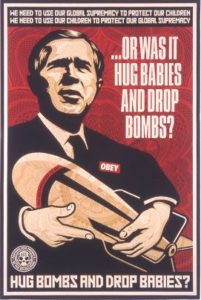
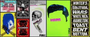
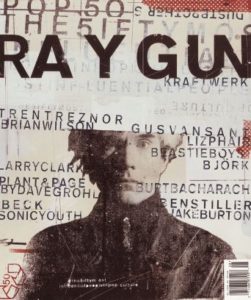
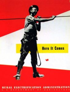
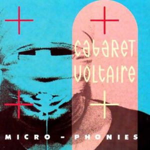
The work also was influenced by Russian graphic propaganda. This was a way of representing the topic of social identity as a battle within my work.


