Rankin

Rankin

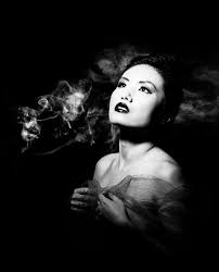
John Rankin Waddell (born 1966), who works under the name Rankin, is a British portrait and fashion photographer. Rankin founded the monthly magazine called ‘Dazed and Confused’ in 1992. It provided a platform for innovation for emerging stylists, designers, photographers and writers.  Rankin’s body of work features some of the biggest brands and celebrities, he has shot covers for Elle, Vogue and Rolling Stone along with many others. Rankin’s work has always questioned social norms and ideas of beauty.

Image result for rankinImage result for rankin

My Response

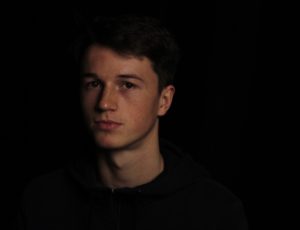
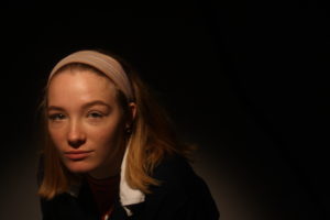
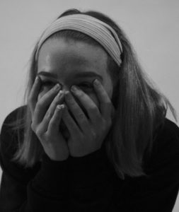
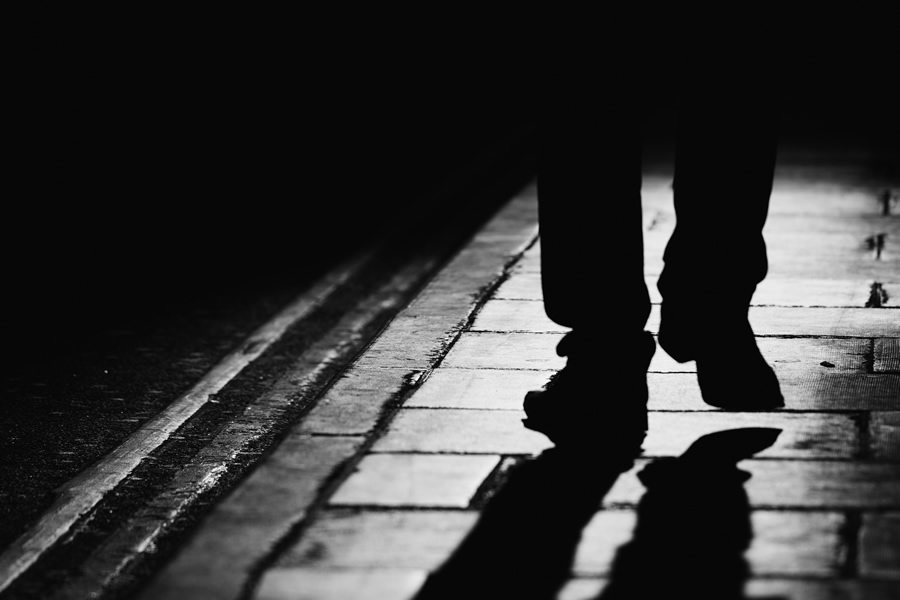
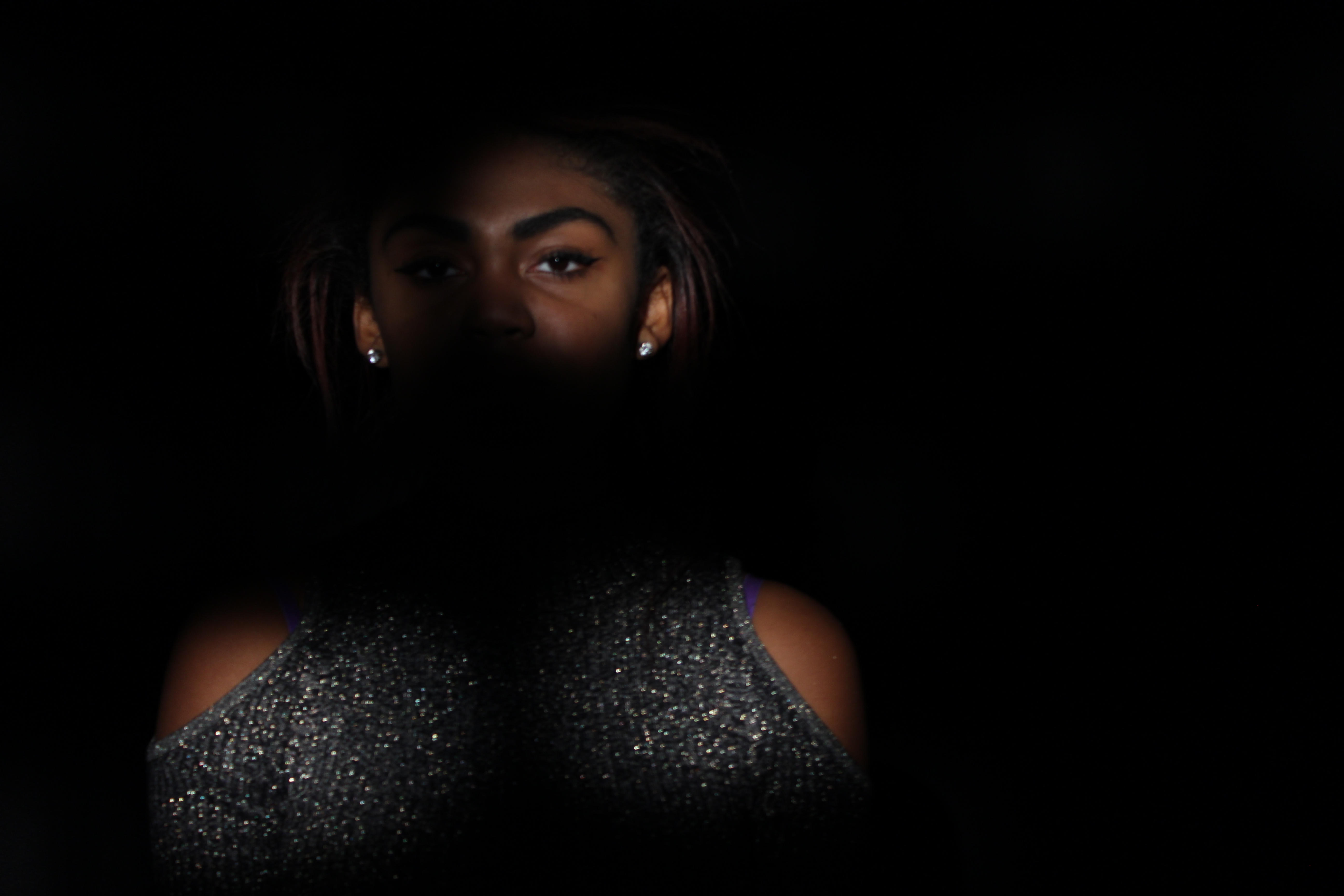
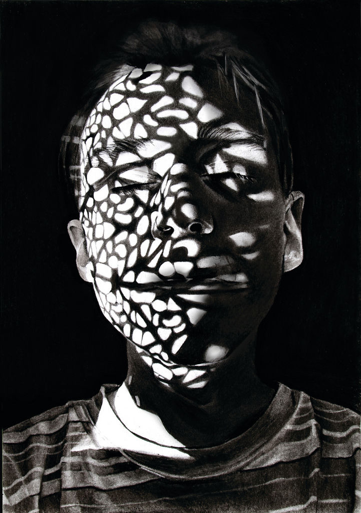
I have taken inspiration from the above photo to include chiaroscuro into my response to Rankin’s photography. I have used the strong shadows and contrast that Rankin has used in his photography. In the bottom image, I tried to replicate Rankin’s style by getting close up to the subject and using black and white.


Techniques in the Studio

Why Do We Use Studio Lighting?

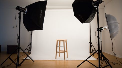
Studio lighting is used to create a controlled environment to capture the exact photograph that you want. It allows you to completely control how hard/soft the light is, the intensity of it and the direction of which it is coming from.

Image result for studio lighting

What is the Difference Between 1-2-3 Point Lighting?

Three point lighting is a method used in studio photography. It uses three separate positions so that the photographer can illuminate the subject in the exact way that he/she wants to. The first light is a key light, which is usually the strongest light and sets the lighting of the scene. The second light is a fill light which helps to fill the shadows that the key light casts. The last light is called a back light and is used to create contour and separation.

3-point-lighting

What is Fill Lighting?

Fill lighting is a light used in the 1-2-3 point lighting technique.  It fills the shadows that the main light cast.  Below is an example of the effects of fill lighting.

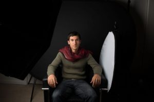
A photograph using the main light only
A photograph showing the effects of combined fill and main light

What is Spill Lighting?

Spill lighting is where light falls where it was not intended to fall, an example is light on a bedroom wall from across the street. It can be used in photography  to create different light effects and it can be controlled by re-positioning the lights.

Image result for what is spill lighting

What is Chiaroscuro? 

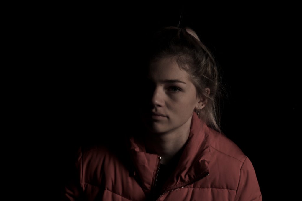
Chiaroscuro is a lighting technique that uses strong tonal contrasts between light and dark to model 3D forms with a dramatic effect.  It creates lots of drama and mystery in the photograph. Below is an example of my own work.

Chiaroscuro

What is chiaroscuro drawing?

chiaroscuro is the effect of light modelling in painting, drawing, or print making where three-dimensional volume is suggested by the value gradation of color and the analytical division of light and shadow shapes (Known as shading).

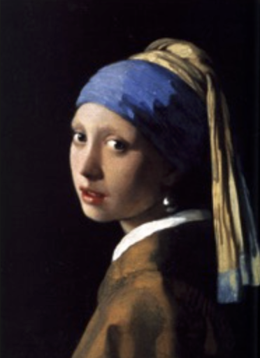
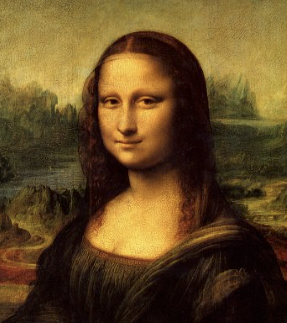
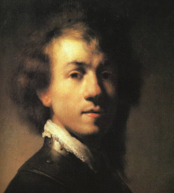
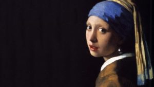
Chiaroscuro has been used since the Renaissance and Baroque period where the artists wanted to engage their viewers. To do this one side of the subject tends to be darker than the other, usually bringing out an aspect of their features, and really drawing your eyes to it.
Related image
How is it used in modern photography?

Chiaroscuro is used within modern photography today to create dramatic portraits by making certain aspects of an image once again stand out as seen below:
Using this technique it allow as seen, it can also be used today to make aspects of objects as well as people stand out. When compared to the art, the chiaroscuro inside photography tends to be more dark and dramatic than the art, which tends to just make one side of the face slightly darker.

Best class photos edited

I  chose this image due ti the interesting composition of round sections of light, its creates a highlight and direct sense of attention to the highlighted features upon her face. it creates a sense of suspension and also perhpas the development of how one side of her face has a much larger exaggeration of highlights. I edited this image to be in black and white as it would compliment the darker shadows yet still have a large view of standing out.

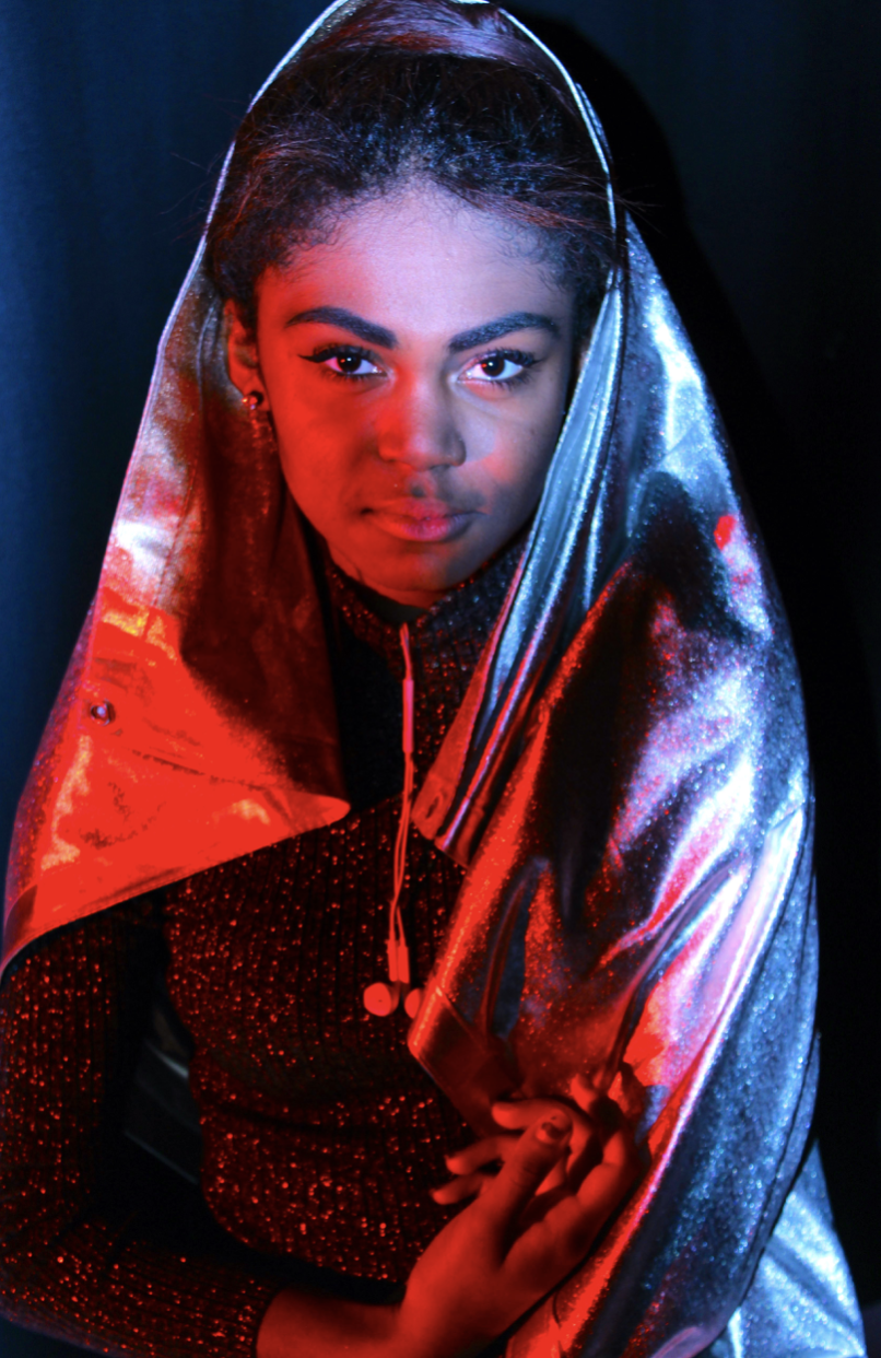
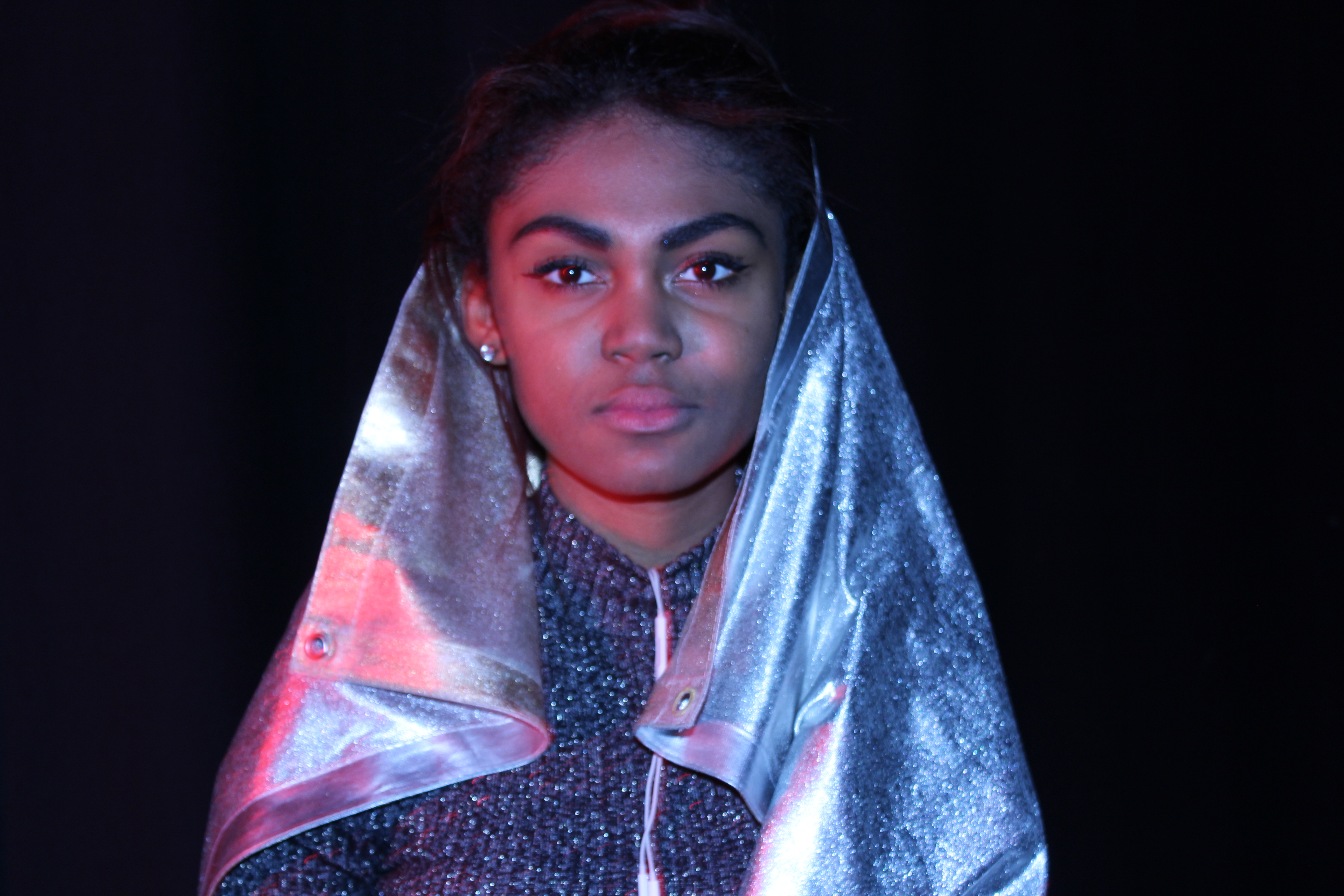
I chose this image due to the large juxtaposition of red harsh colour I wanted to capture compared to the lighter harsher highlights of the other side of her faces, we also used silver surrounding her in order o cause a further reaction to be seen within the reflection of her face.

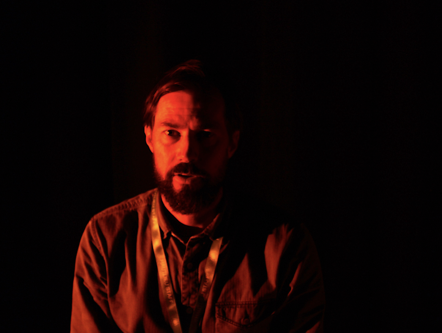
I chose this final image as it has a clear demonstration of again harsh dark light compared to a warmer brighter side. I chose red as it compliments the black and all combines to create a tone which create a line directly through the face itself. When editing this image I just wanted to further over exaggerate the red as it creates a vibrancy to the image as a whole.

studio lighting

Why do we use studio lighting?

Studio lighting is used to be able to completely control and create the environment most suitable for the photo you are trying to capture. it can also be used to create a sense of persona and feeling to the image, wether it be a softer fashion imager a strong harsh darker image in order to create ambiance to a candid portraiture.

What is the difference between 1-2-3 point lighting?

Three-point lighting is a standard method used in visual media,By using three separate positions, the photographer can illuminate the shot’s subject , while also controlling  the shading and shadows produced by direct lighting.this allows them to use light their advantage and produce many different images from the same shot.

What is spill lighting?

spill lighting is a light that illuminates a surface behind a certain line, such as a light illuminating a bedroom being seen through the window from outside, it can be used in photography  in order to couture a sense of life and also vibrancy  of lights that also create structure whiten a street.

What is Chiarascuro ?

The treatment of light and shade in drawing and paintingThe underlying principle is that solidity of form is best achieved by the light falling against it. Many famous older artists have used this in their work, that is highly effective to create s sense of place and composition  within a piece.

examples:

Why is light so important?

photography is completely reliant on the availability of light in in which ways the light can be developed to further an image.Usually natural light is available or ambient within the use of it, but we are mostly aware of the surrounding of different types of light, this is due to t how we can use it to exploit and create an aspect which is more creative. 

The other types of lights commonly used to enhance  images within  photography are:

intensity of the light:

The intensity of light is simplistic to understand, this is due to the the least amount of creative consideration necessary to achieve a successful photo. Rather than thinking of bright or dim think about the exposure of the photo itself and what effective f a dim shot or a harsh light you wield want to develop. A camera’s exposure settings (shutter speed, aperture, and ISO) are based largely on the overall intensity of the light in the scene. For any given amount of light, there are many combinations of shutter speed, aperture, and ISO that can be used (these are called equivalent exposures). This is done in order to show a development of opposite directions to show a juxtaposition of tonal lighting and the overall controllable effects in the piece. These three camera settings work in opposite directions—meaning that if you change one to be bigger/faster, then you have to change another to be smaller/slower to keep the overall exposure the same.

direction of the light

light has many characteristics of being harsh and light,but also being softer and diffusing instead of being sharp.in addition their is directional quality that can either enhance the subject or perhaps allow a sense of direction to the images, there typically three directions that we look at when discussing the direction of light.such as front lighting does from a source behind the photographer  and is usually a softer light in order to present unwanted shadows.light has a string tendency to flatten out a subject, this font lighting ill illuminate everything but will however offer a highly defined image and defined subject. 

temperature of the light and white balance

The temperature of lights allows a warmer more red  tones compared to that of the harsh light that is occasionally seen, this is used in order to show a clear juxtaposition of heat and perhaps suspense whiten the photo compared to that of a fashion photo or one to show strong shadows within the images. white balance is important in order to create a reassurance that everything is intact white and does not differentiate depending on the lighting used.

Using reflectors (silver / gold)

The silver is used in order to reflect the white light and create a strong bounce back onto the face and create an additional sense of lighting. whereas the gold shows a warmer tone and perhaps gives a more pinky skin colour effect and highlight the already existing tones within the image itself.


studio photoshoot in class

Within this shoot I wanted to experiment within  how the use of light can make a complete juxtaposition of colour and develop ways in which light can be harsh and also develop ways in which colour can be applied to a face.


These are purely experimental and not my final pieces and I will further these ideas and execute them in a better presented  manner.

lee friedlander

Who is Lee Friedlander?

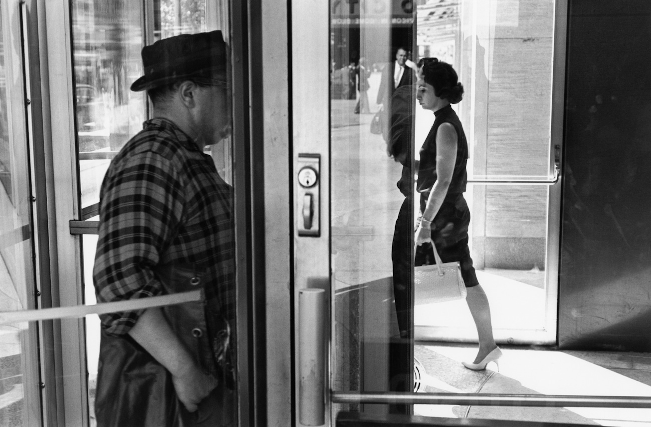
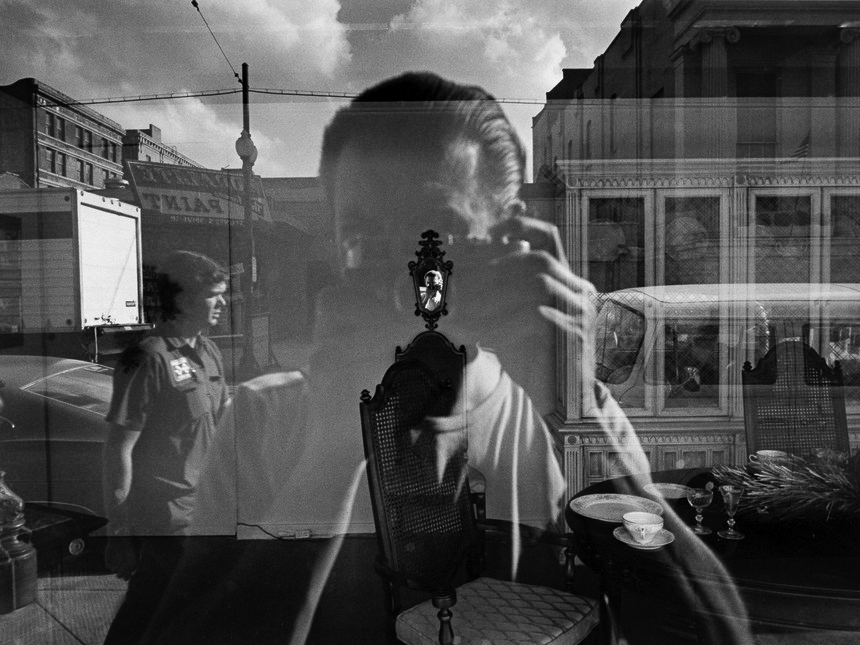
lee friedlanderis an American photographer and artist from the 1960s and 70s. Lee evolved an influential and often imitated visual language of urban social landscape, with many of his photographs including fragments of store-front reflections, structures framed by fences, posters and street signs.

Image result for Lee Friedlander

Image result for Lee Friedlander

Image result for Lee Friedlander

Image result for Lee Friedlander


Image analysis


Image result for lee friedlander

This is a black and white urban candid photograph. The black and white in this image creates strong contrasts, the black on the woman’s dress creates a strong contrast with the white zebra crossing on the road. The use of the strong contrast really allows the people to stand out and helps create a focal point for the image. This image also follows the rule of thirds as the large man on the right side of the image in on the two right intersecting focal lines. This photograph also has a sense of depth as it shows the people in the front but there is also a large group of people in the back that are also in focus.

My responses

Contact sheets

How I edited my images

Original Image
Final Image

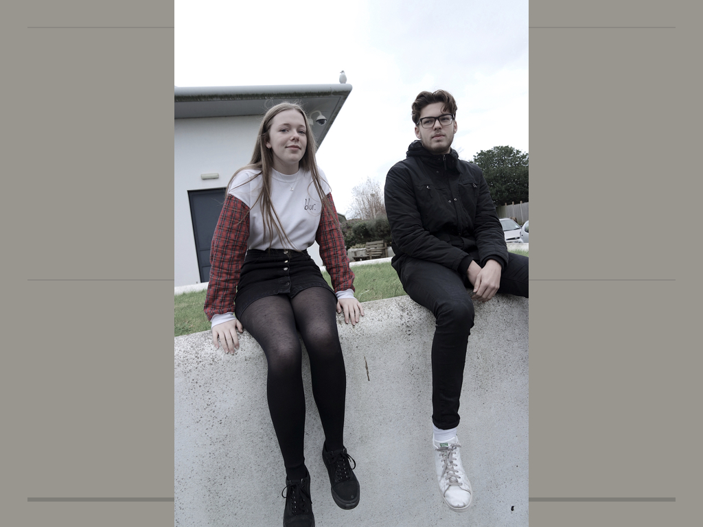
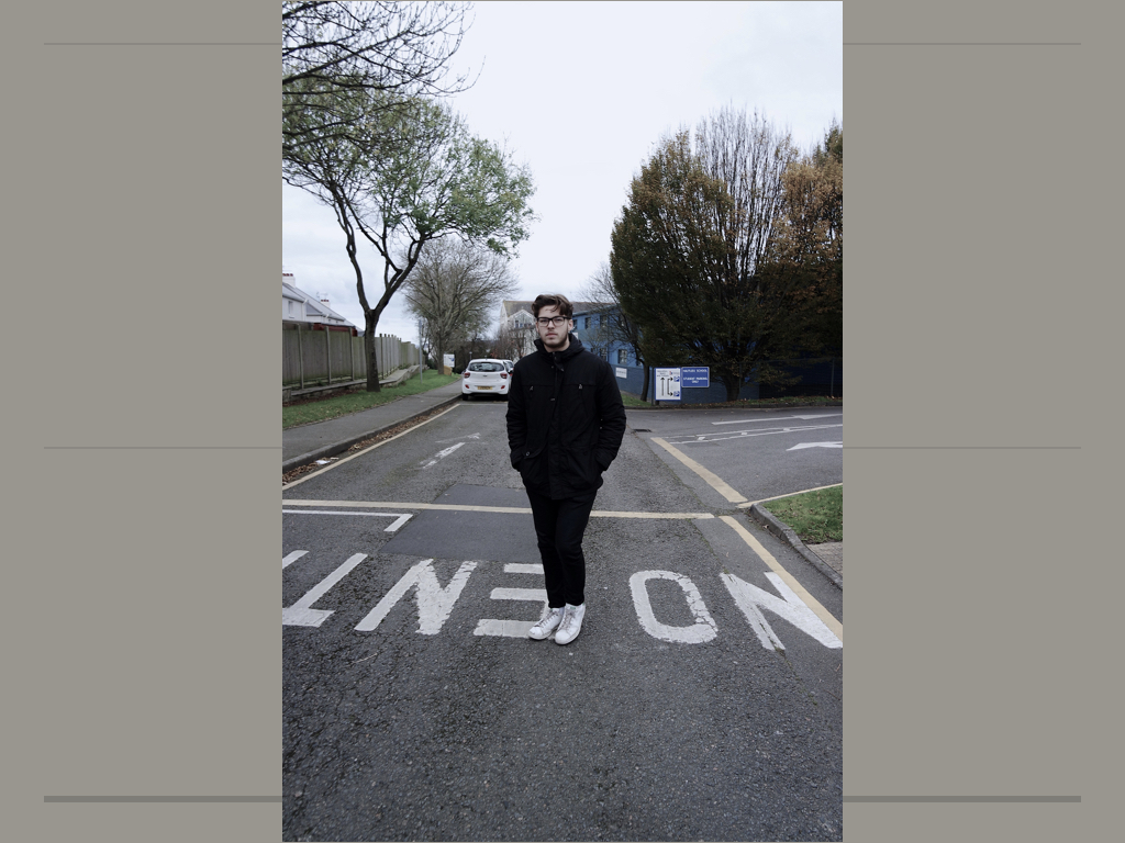
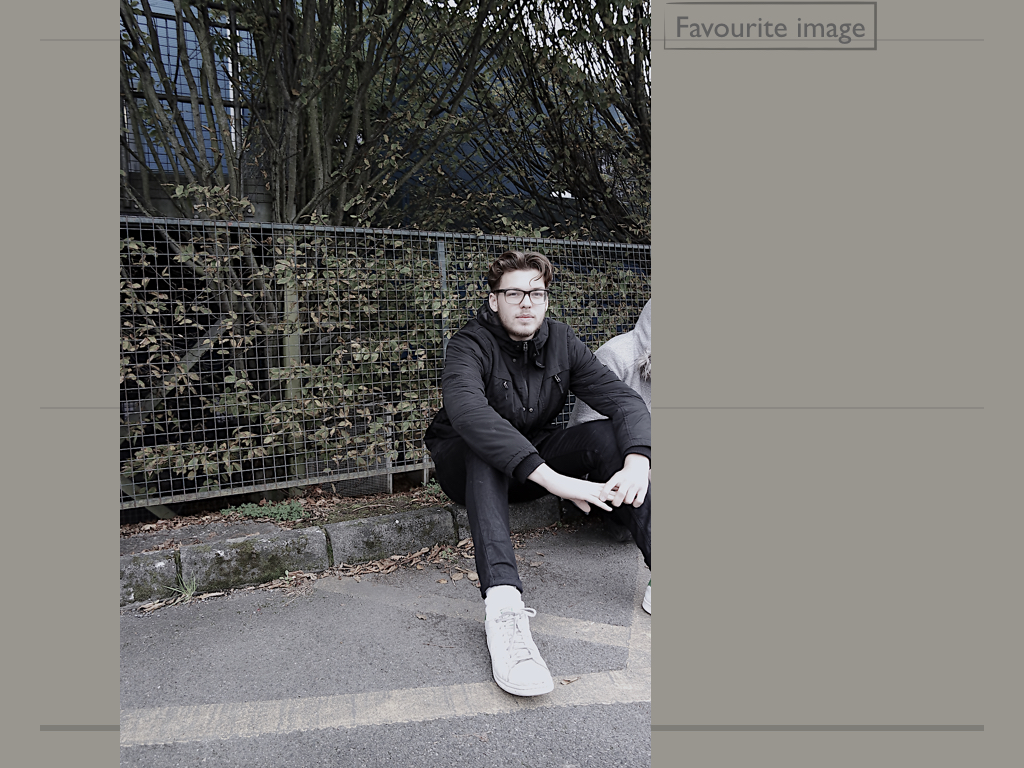
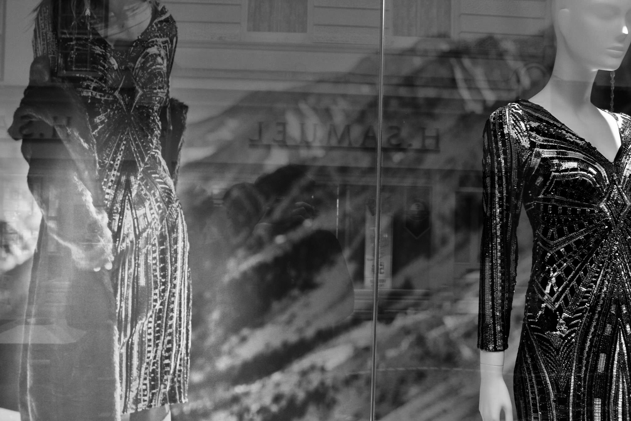
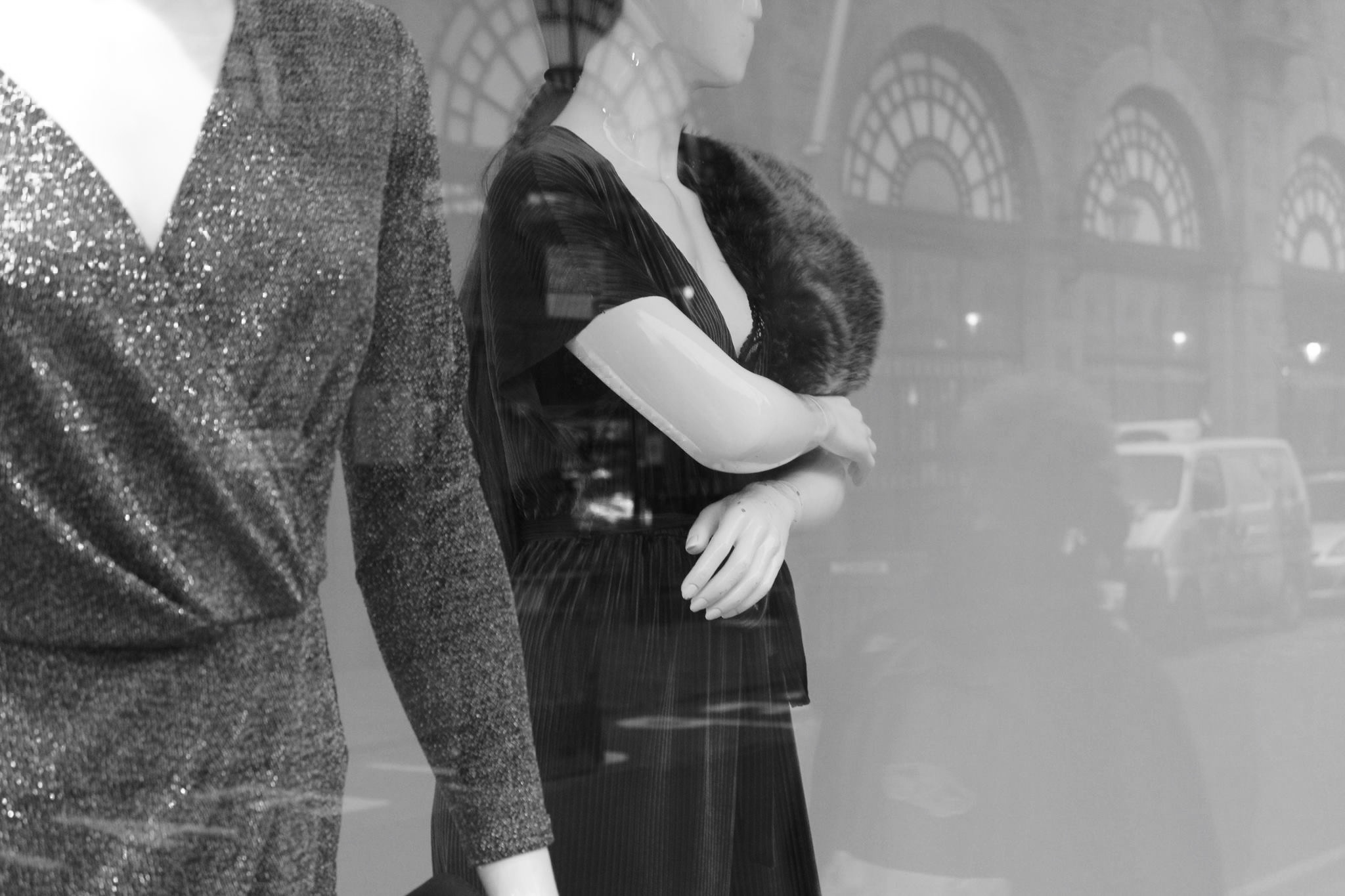
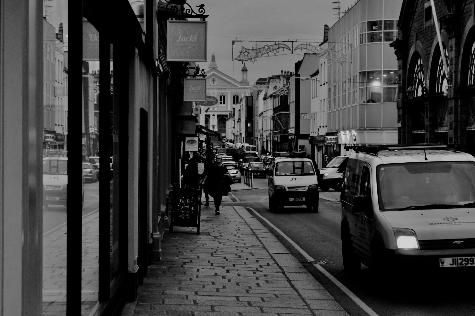
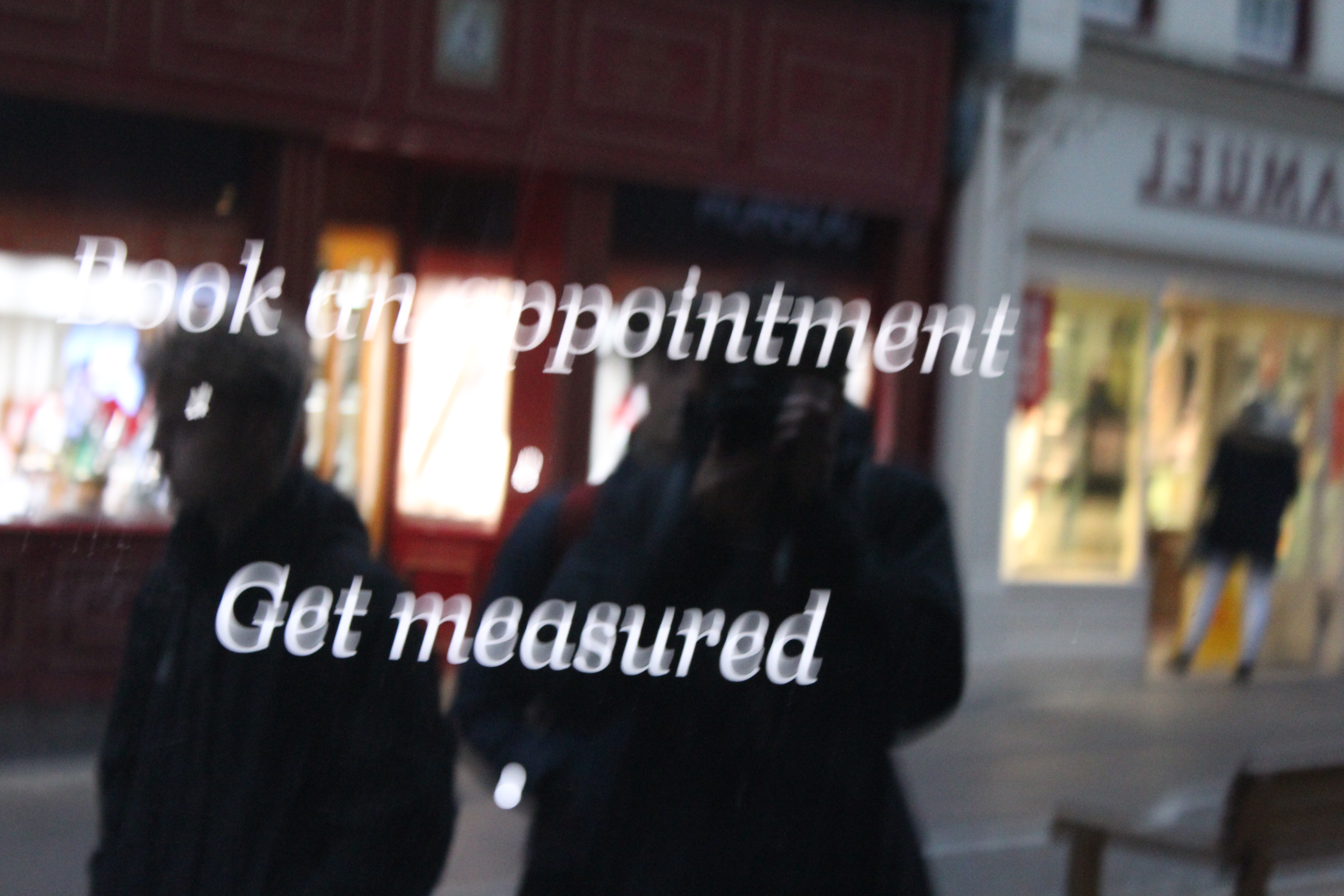
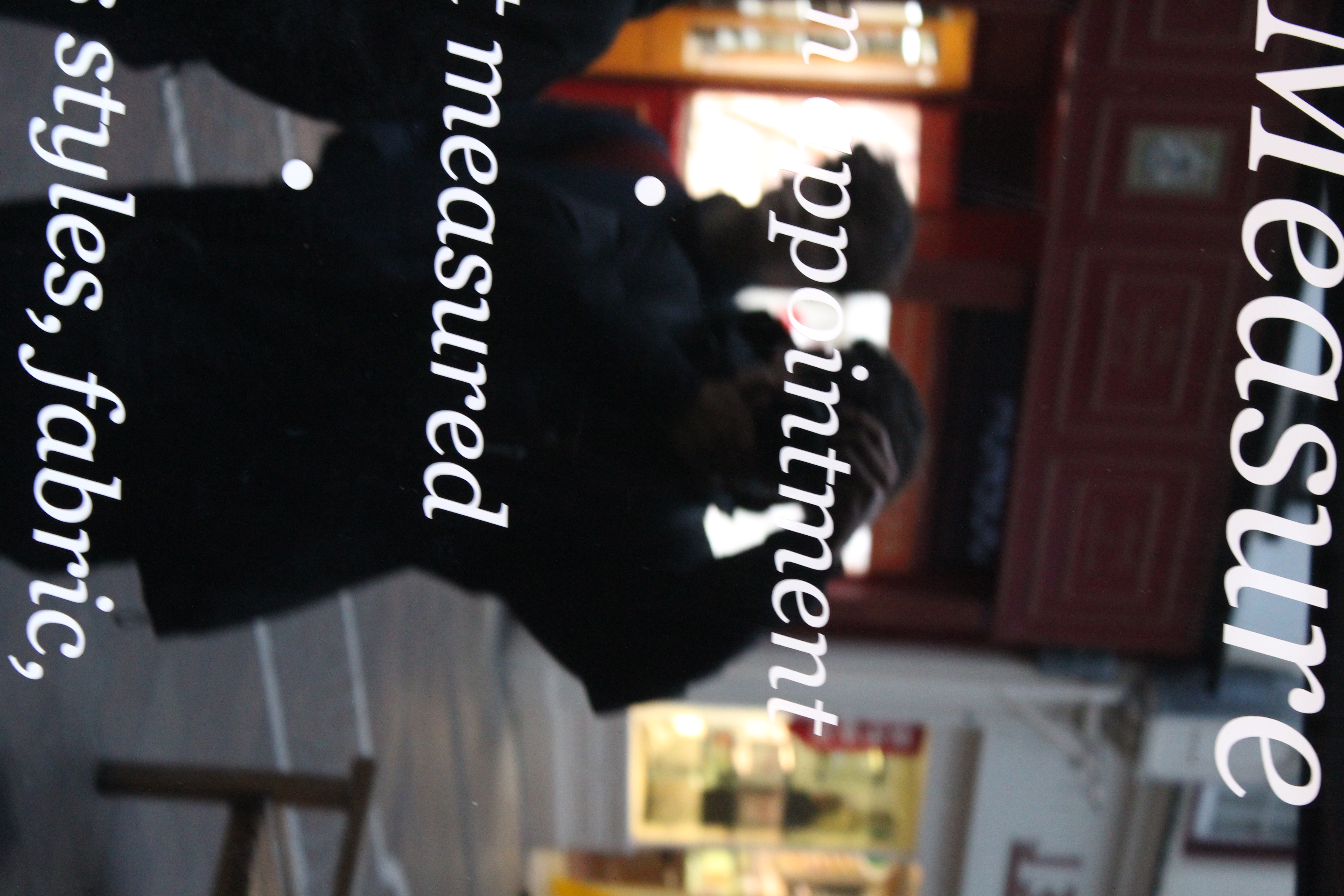
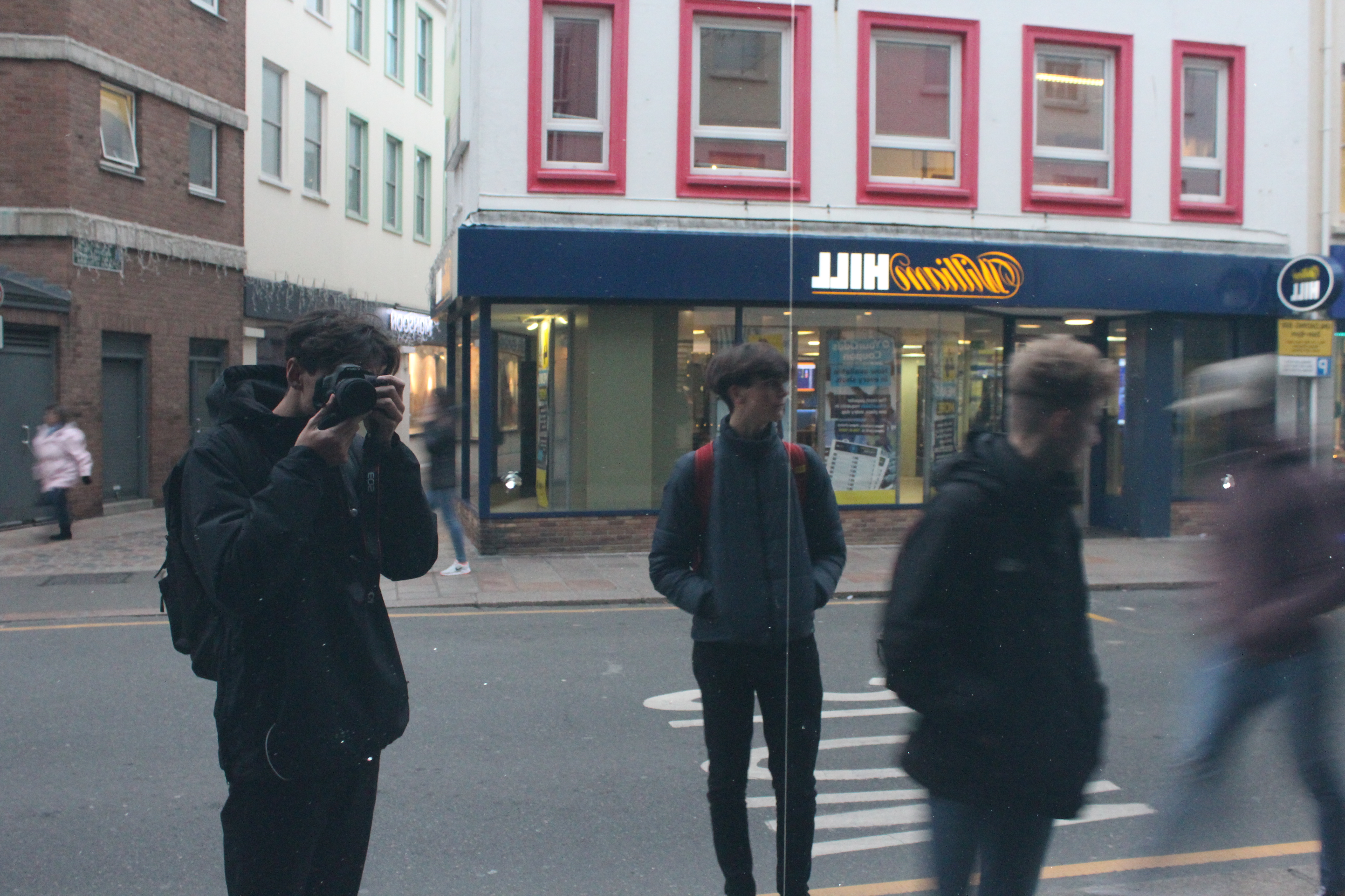
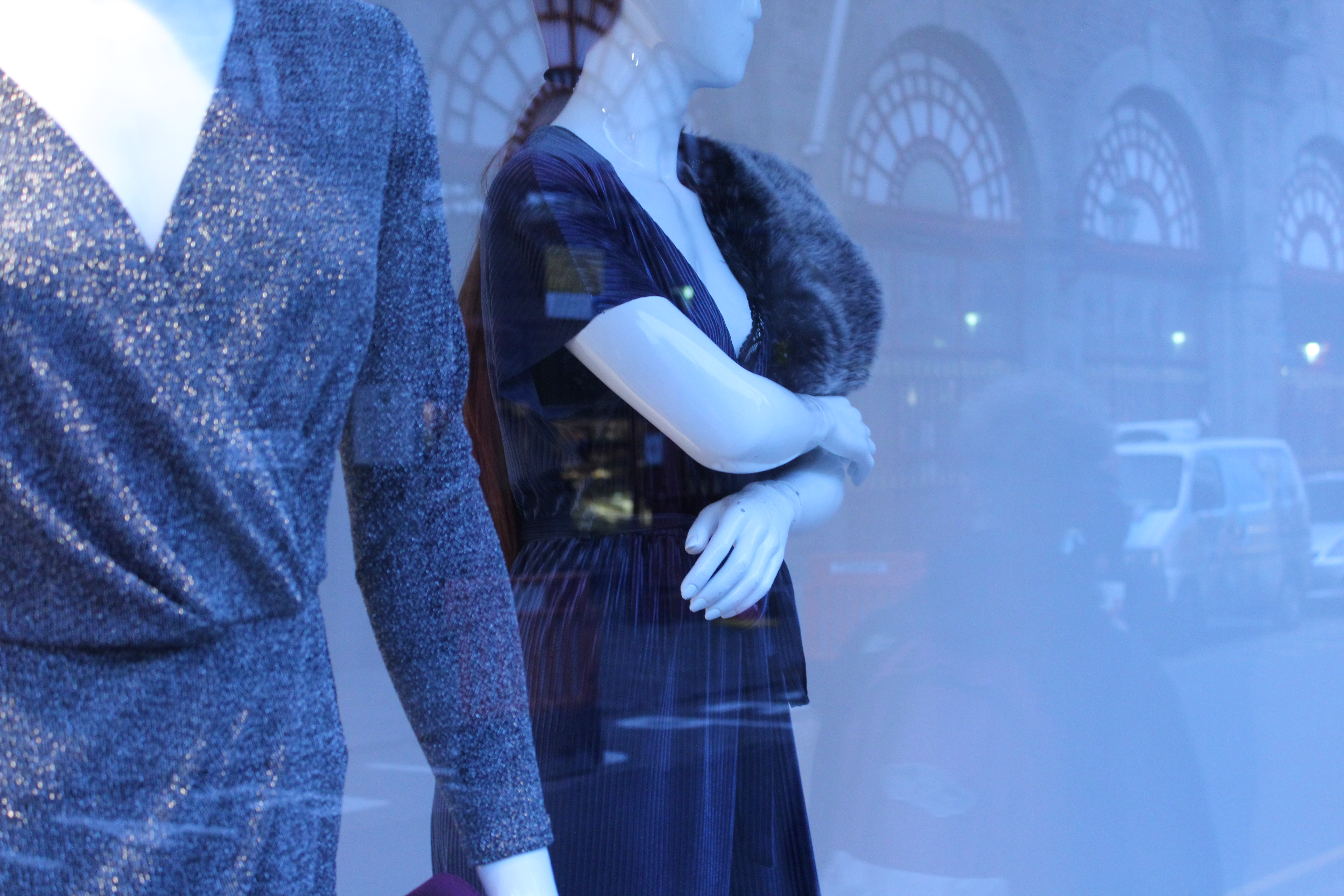
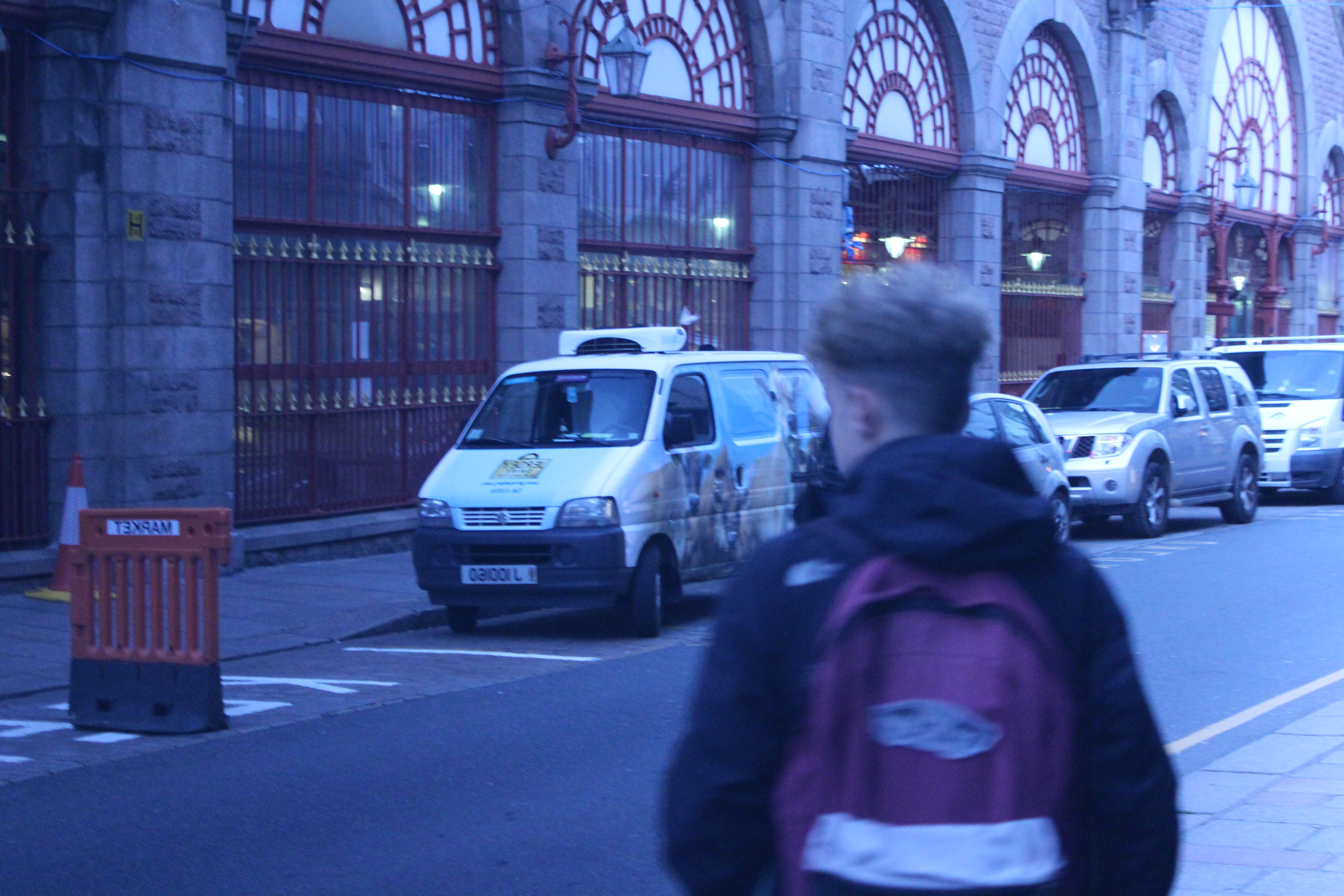
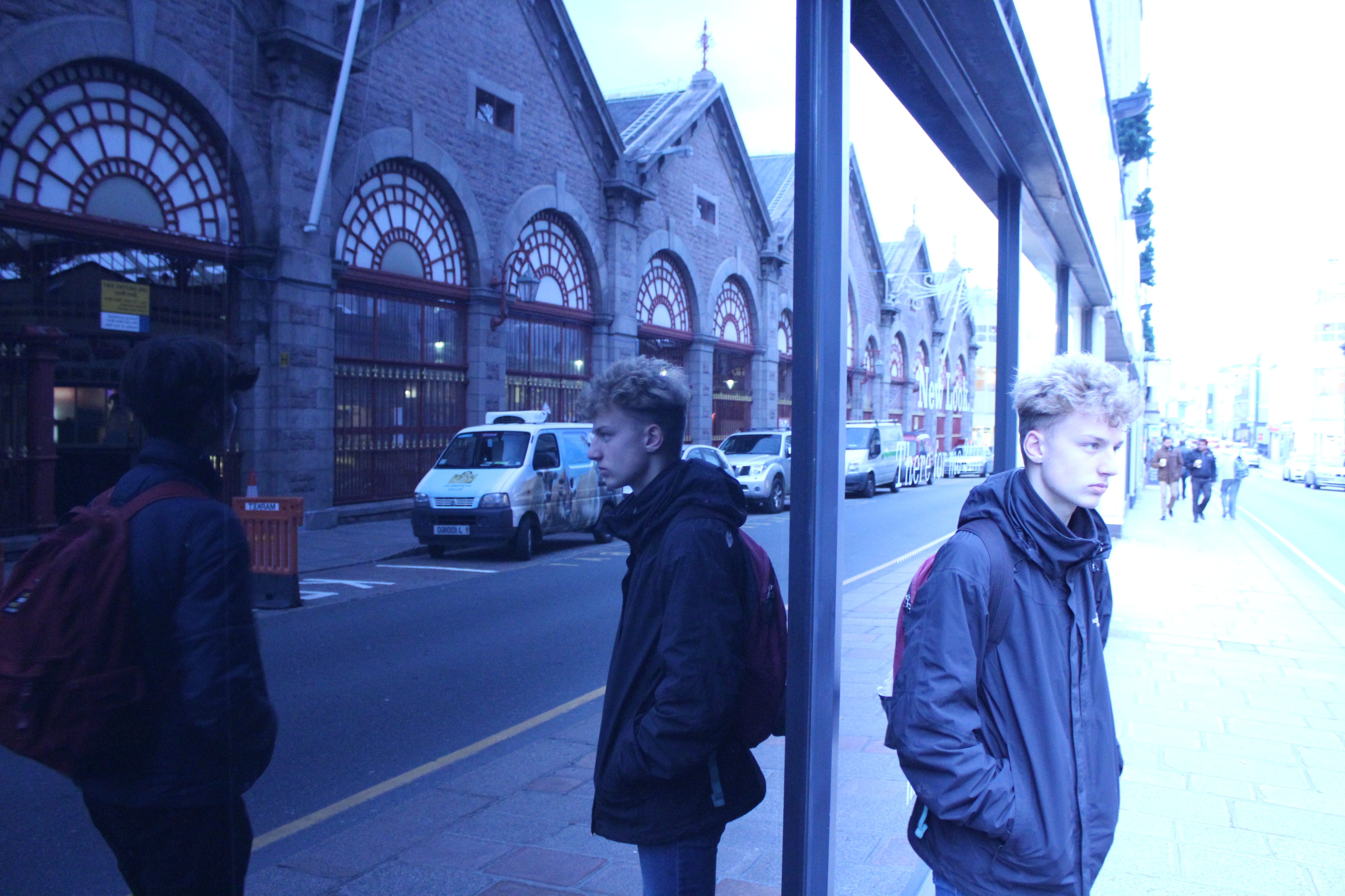
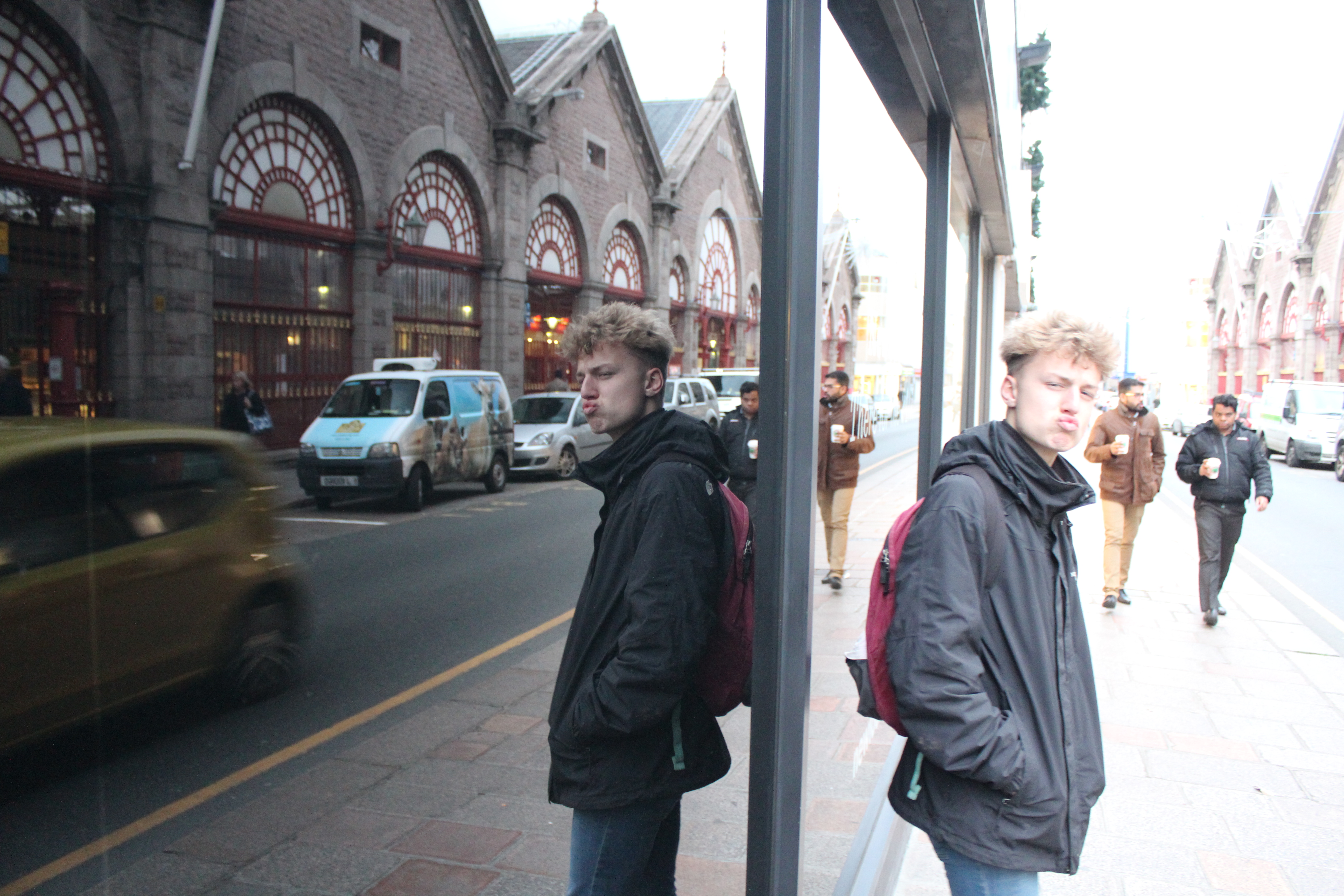
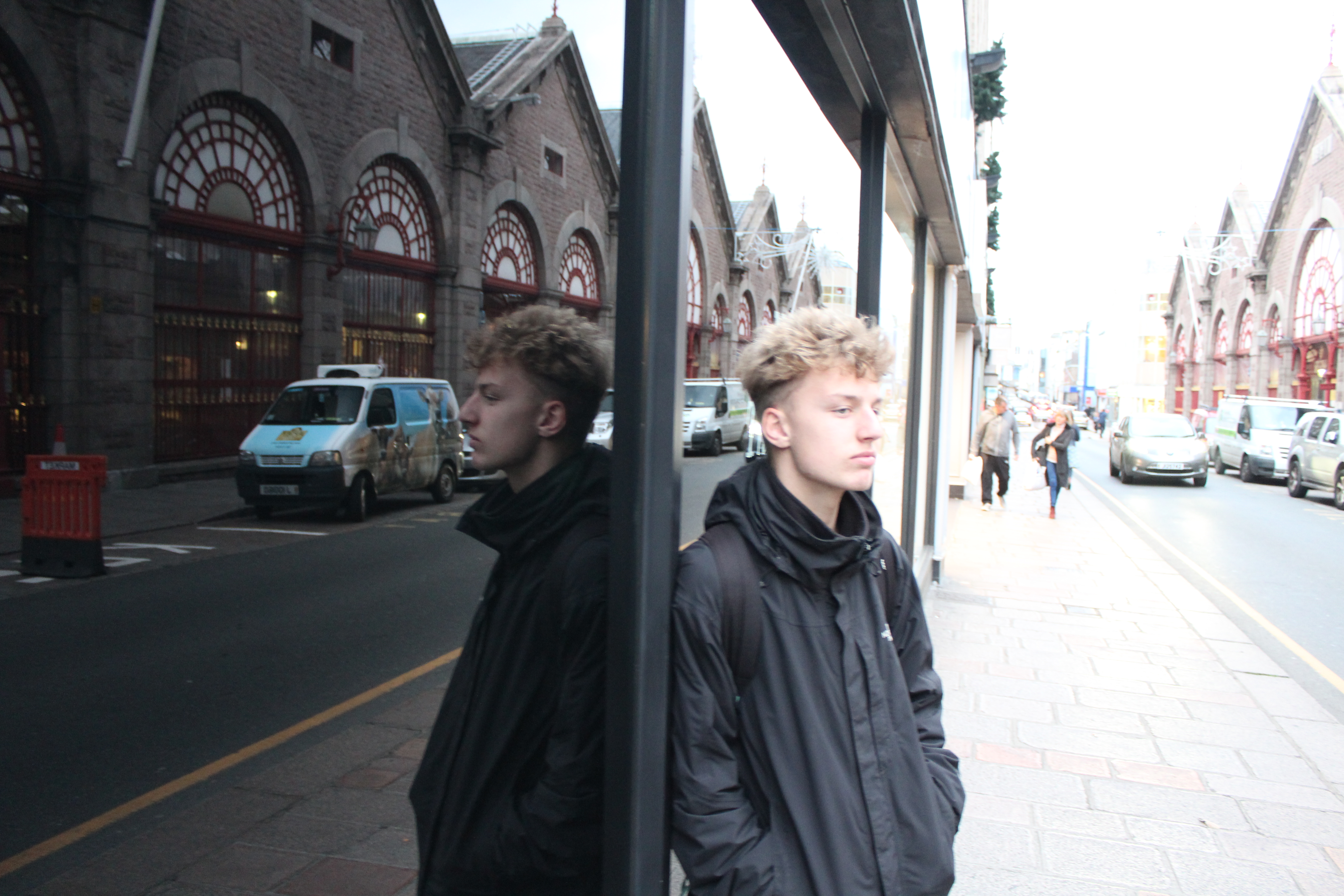
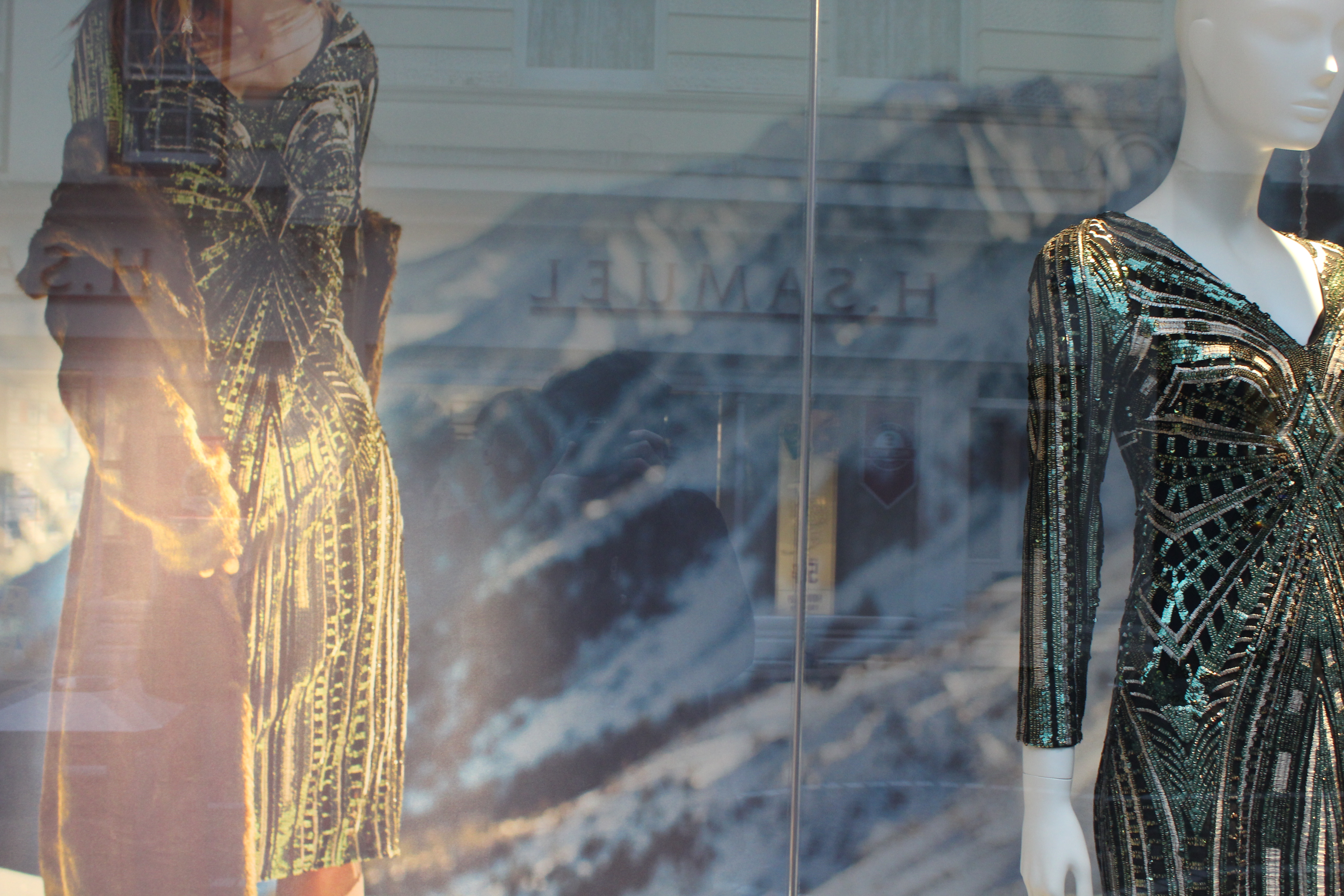
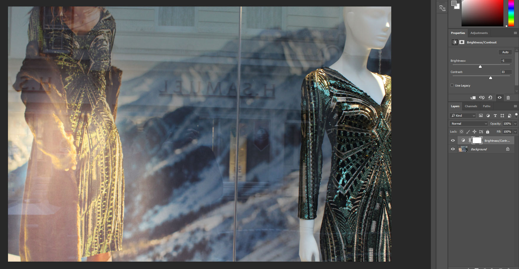
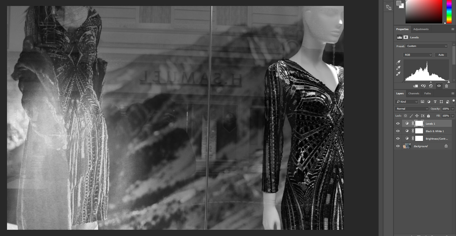
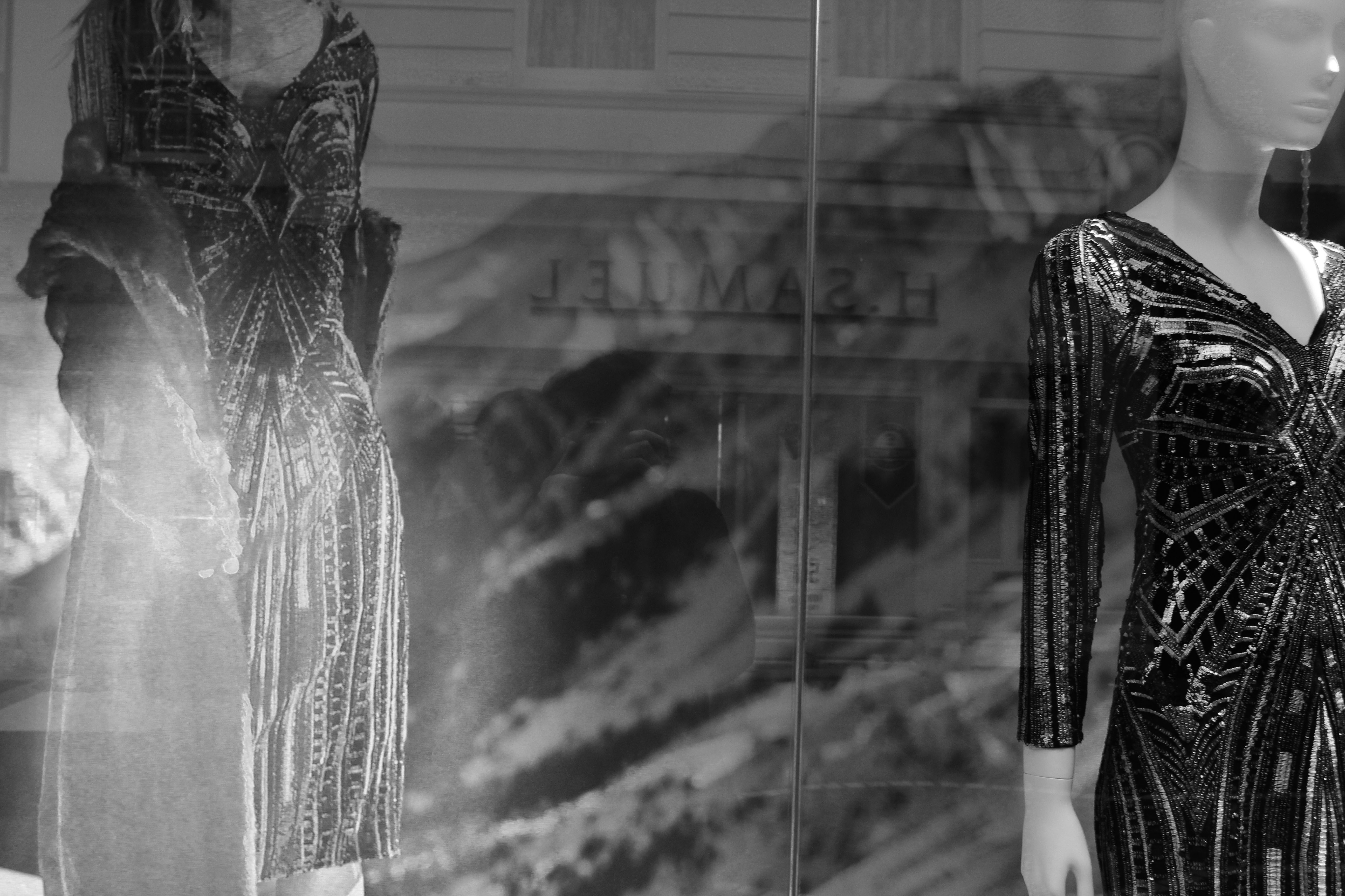
This was my favorite image out of my shoot and also my selected edits as it reflected Lee Friedlander work the most  and was the one I was most happy with.  This setting was perfect as the reflection from the building behind and myself where clear and it contrasted well with the mountains and the manicans in the shop window.

Week 10 | Studio Lighting | Creative Portraits

Concept : Rankin on “beautiful portraits”

Rankin : Joe Strummer : Destroy Project

Exploring Technique

Natural Light

Remember >>>Photography is completely dependent on the availability of  light.

In most cases we can make use of natural or available / ambient light…but we must be aware of different kinds of natural light and learn how to exploit it thoughtfully and creatively

  • intensity of the light
  • direction of the light
  • temperature of the light and white balance
  • Using reflectors (silver / gold)
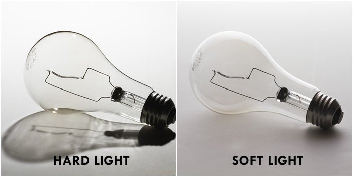
Hard light vs soft light
  • Using diffusers , tissue paper, coloured gels, tracing paper etc
  • Front / side / back lighting
  • High Key / low key lighting
  • Shadows / silhouettes
Casting shadows across the face / body

Studio Lighting

Using artificial lighting can offer many creative possibilities…so we will explore

  • size and shape of light
  • distance from subject to create hard / soft light
  • angles and direction…high, low, side lighting
  • filtered light
  • reflectors and diffusers
  • key lighting, fill lighting, back lighting, 3 point lighting
  • softboxes, umbrella lights, spot lights and floodlights
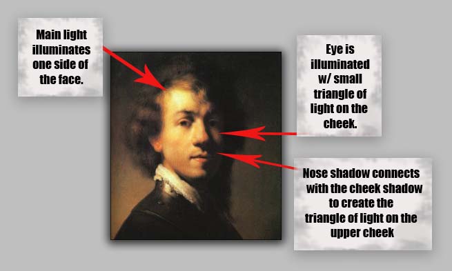
  • chiarascuro and Rembrandt lighting
  • high key and low key lighting techniques
  • backdrops and infinity curves

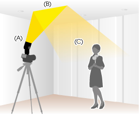
An example of “bouncing” the flash to soften the effects and create a larger “fill” area…try this wherever there are white walls/ ceilings

Using Flash

Flash units offer a range of possibilities in both low and high lighting scenarios…we will explore

  • flash “bouncing”
  • fill-in flash
  • TTL / speedlight flash
  • remote / infra-red flash (studio lighting)
  • fast + slow synch flash
  • light painting c/w slow shutter speeds

Evidence of Your Learning

During this weeks we would expect all students to complete 2-3 blog posts  detailing how you are experimenting with various lighting techniques eg CHIARASCURO / REMBRANDT LIGHTING

Rembrandt Lighting

Add information / links showing how Chiarascuro has been used since the Renaissance in painting…but also how it used now in photography and film

You must describe and explain your process with each technique…add your images to your blog as you progress, print off your successful images and evaluate your process using technical vocab and analysis skills. Think carefully about the presentation of your ideas and outcomes…compare your work to relevant portrait photographers as you go eg

Annie Leibovitz, Irving Penn, Rankin, Richard Avedon, Yousef Karsh, David Bailey, Mario Testino, Steve McCurry, Jill Greenberg,  etc

Expected Final Outcomes this Week

  • Case Study and Practical Responses to Rankin
  • 1 x Final Portrait using natural light + analysis and evaluation
  • 1 x Final Portrait using artificial light (1, 2 + 3 point lighting) + analysis and evaluation
  • 1 x Final Portrait using flash + analysis and evaluation

Make sure you ANSWER THESE QUESTIONS IN YOUR BLOG

  • Why do we use studio lighting?
  • What is the difference between 1-2-3 point lighting and what does each technique provide / solve
  • What is fill lighting?
  • What is spill lighting?
  • What is Chiarascuro ? Show examples + your own experiments

Try a range of techniques…like this to adapt your lighting

Bouncing the flash to soften its effects

Or use light painting techniques…

  • Slow Shutter speeds (1/30th sec or BULB setting)
  • Illuminate an area / person with a torch , car headlights etc…

HOMEWORK

Refer to your tracking / planning sheet

  1. You must complete a range of studio lighting experiments and present your strongest ideas on a seperate blog post
  2. Remember to select only the most successful images
  3. You should be aiming to produce portraits that show clarity, focus and a clear understanding of a range of lighting techniques
  4. Editing should be minimal at this point…we are looking for your camera skills here


Street Photography – Homework

Planning

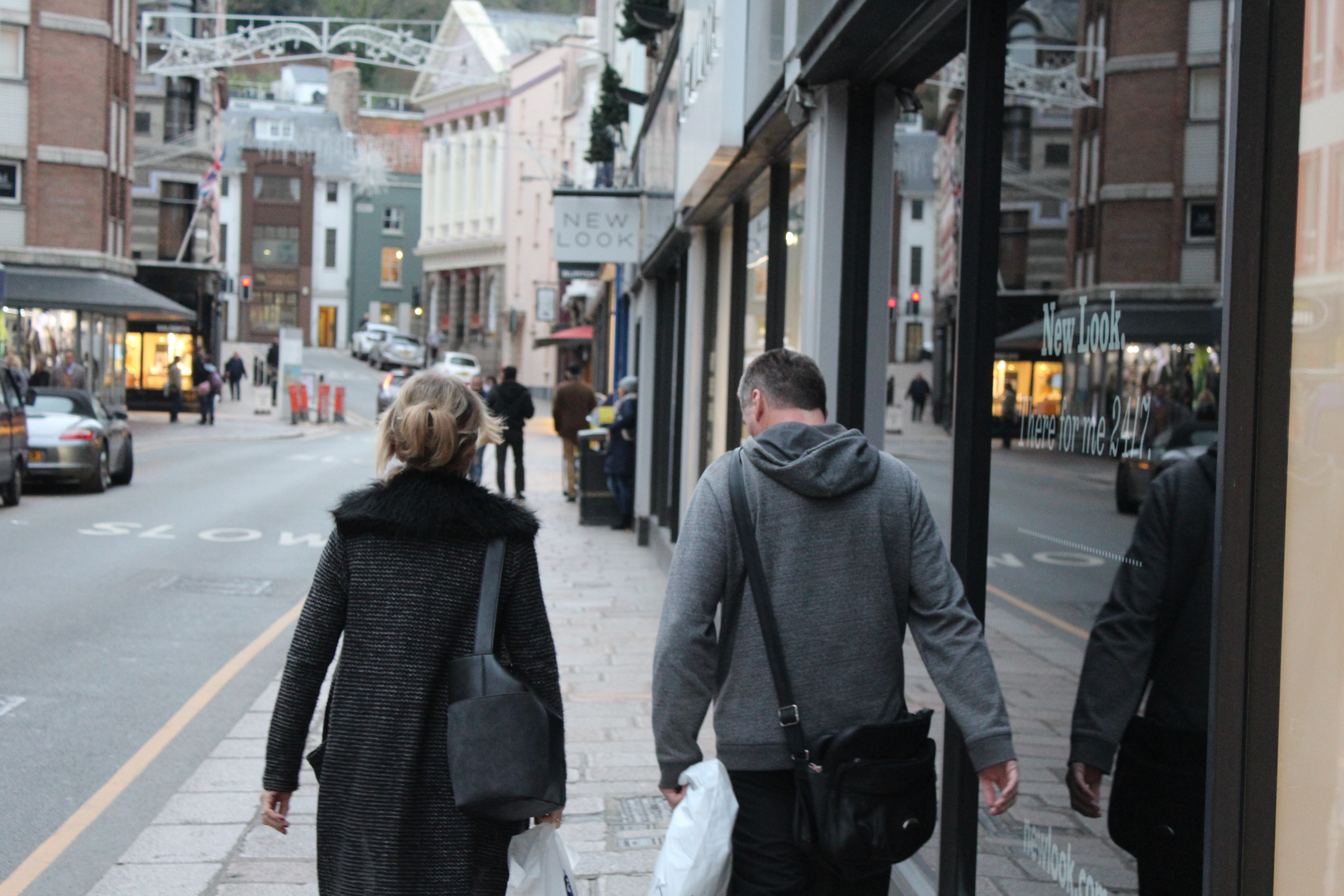
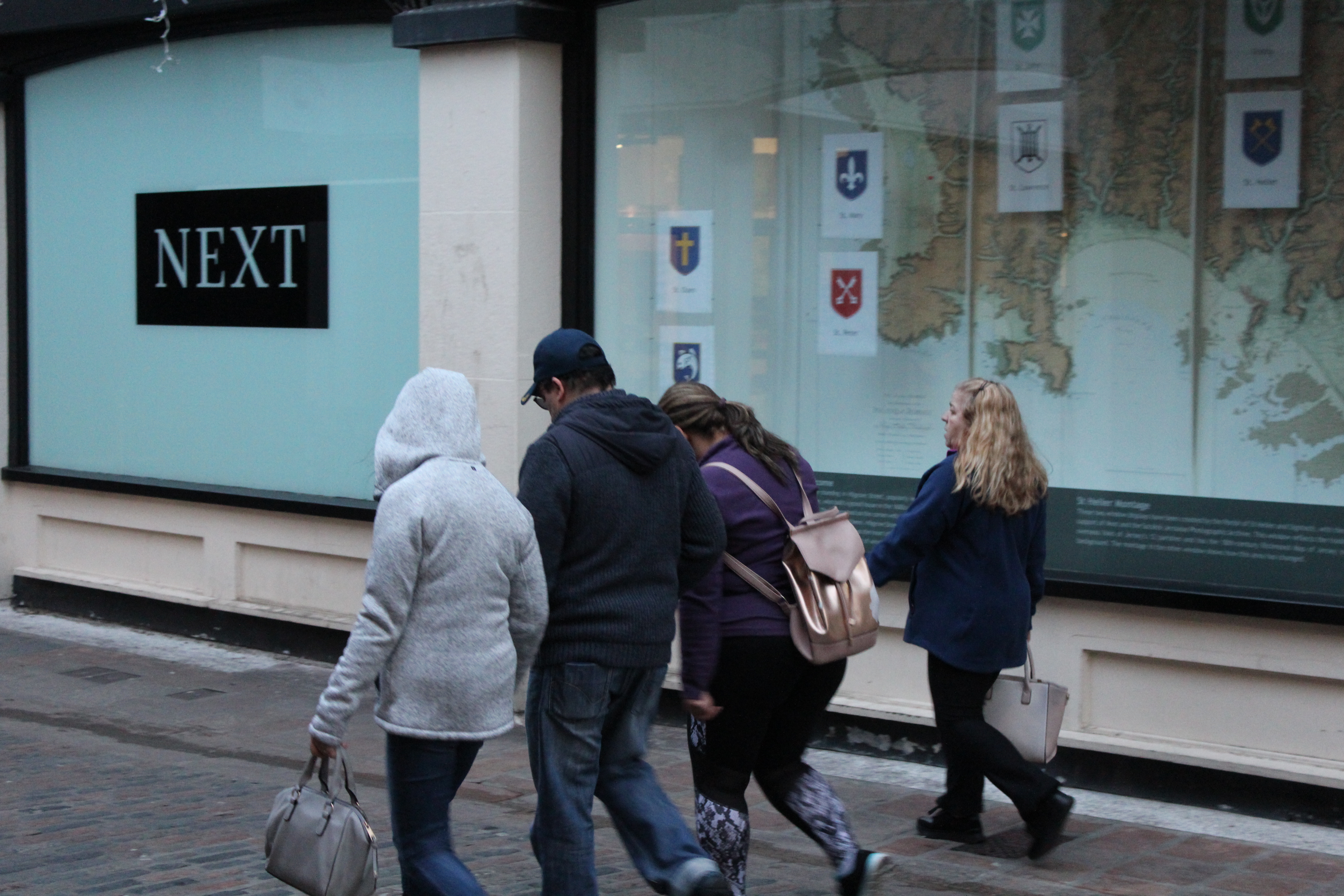
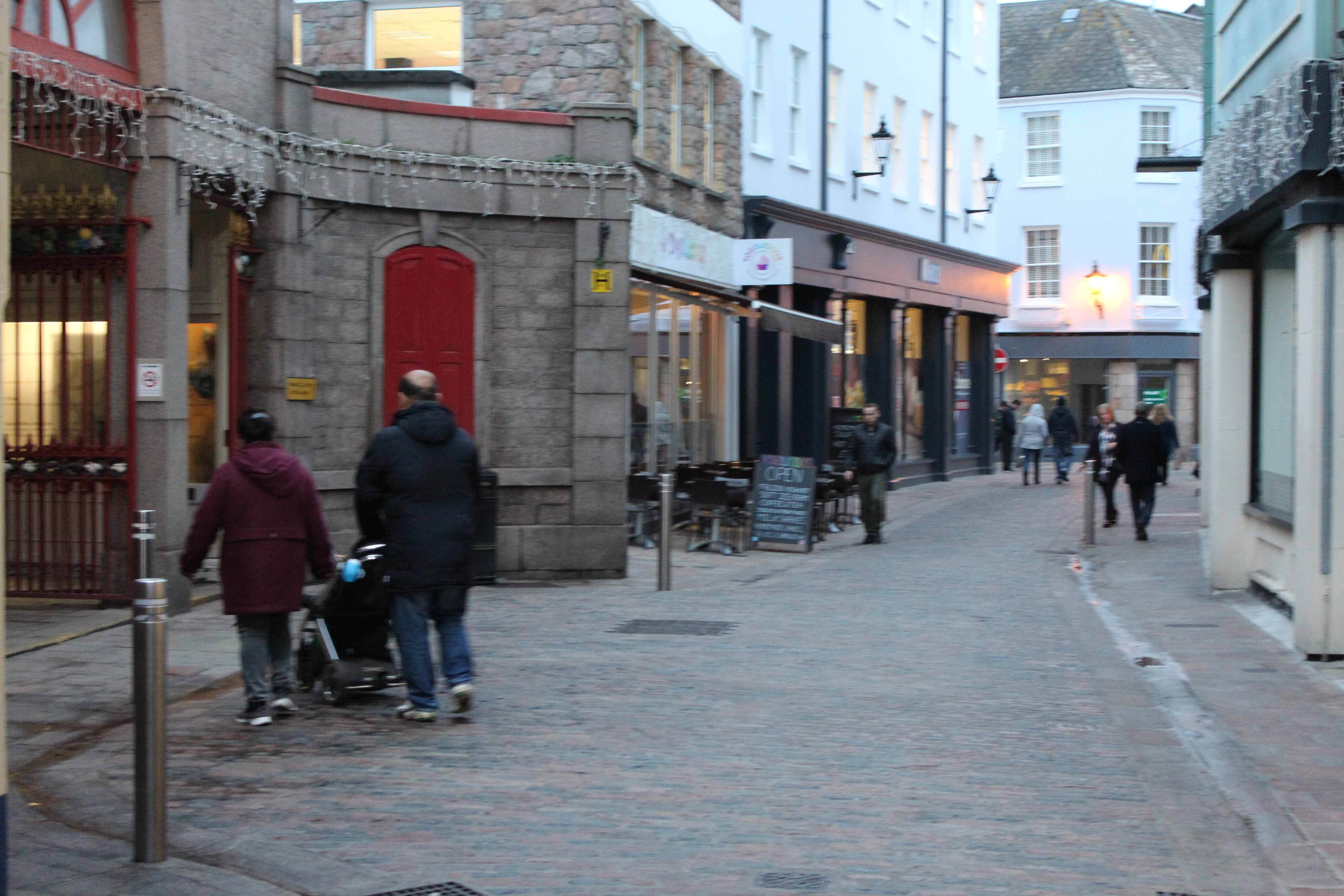
Task – Take 100-250 photos in an urbanised environment with people as the main focus.

Models/Props – Friends and strangers

Camera Settings – I will use a quick shutter speed of about 1/100-1/500 depending on how fast the subjects are moving as I plan on photographing them whilst they naturally move around. I will use a low ISO as the area I will take photos in will be well lit with street lighting.

Lighting – Natural lighting will mostly be used however may be necessary to use a flash to highlight key aspects in my models face

Location – In town as this is an urbanised area

Context – Photographing strangers and friends without them aware of the photo being taken in order to capture a realistic view of how they would be behaving.

Concept – To capture street photographs in the style of Vivian Maier and Robert Frank.

Vivian Maier

Vivian Maier (1926-2009) was an American street photographer born in New York City. Her work was unknown and unpublished during her lifetime. In 2007,  collectors found some of her prints and negatives in boxes. Her images were first published on the internet in 2008. Her work has now been exhibited in North America, Europe, Asia and South America. A lot of details about Maier’s life remains unknown.

Image result for Vivian Maier

Image result for Vivian Maier

Image result for Vivian Maier

Robert Frank

Robert Frank (born November 9, 1924) is a Swiss-American photographer and documentary film maker. His most notable work, the 1958 book titled The Americans. His style of work is classed as photo journalism and documentary/street photography.

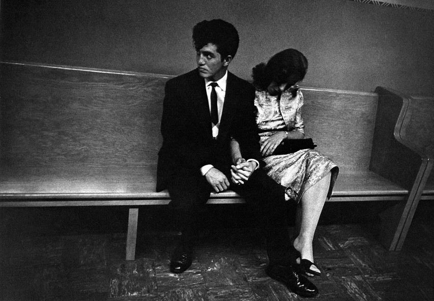
Image result for robert frank

Image result for robert frank

Photo Analysis

Image result for robert frank

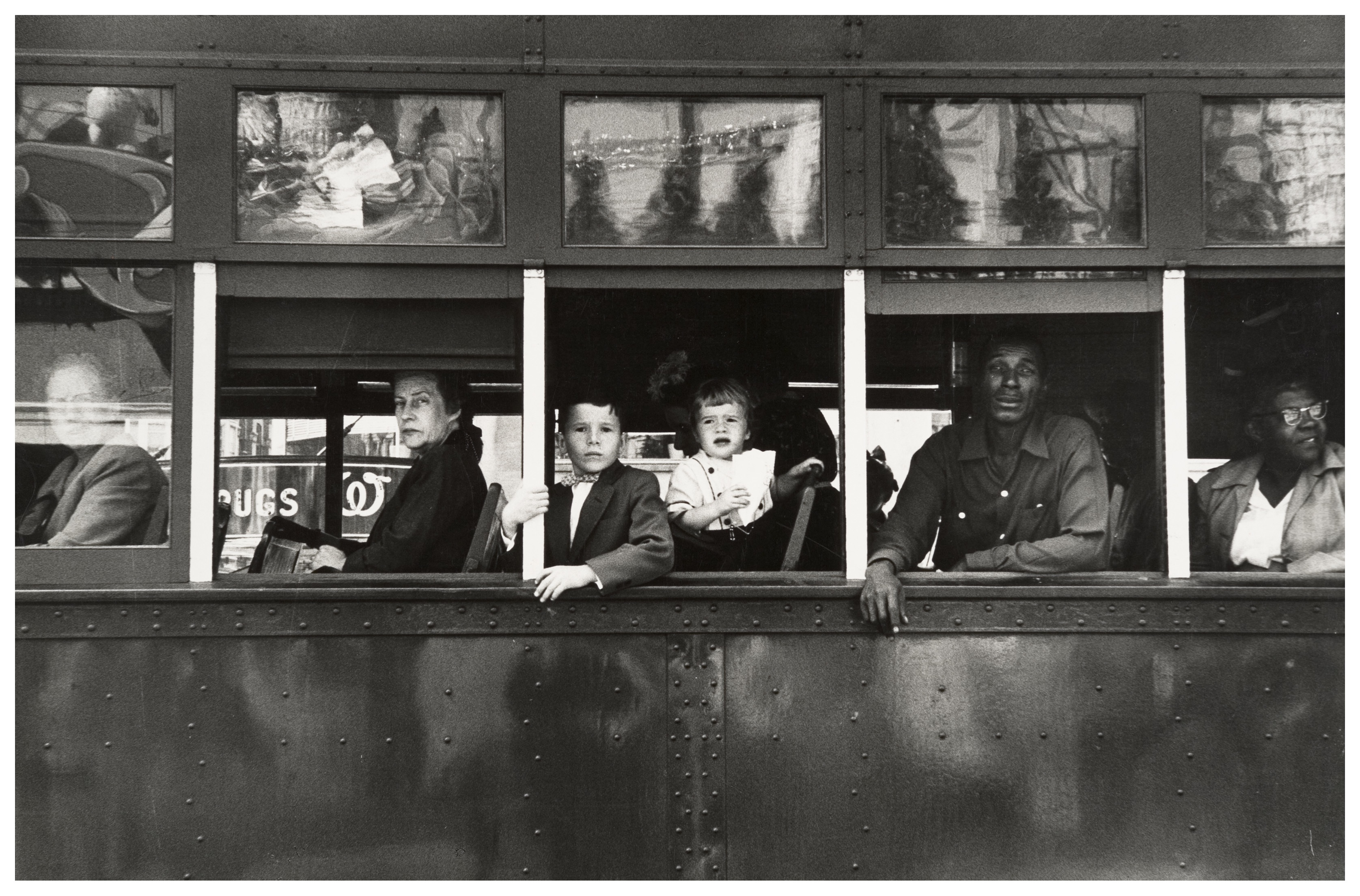
The first thing which caught my eye when observing this picture was the clear use of the rule of thirds. The bus itself create natural lines almost along the horizontal lines when following the rule of thirds. I believe this helps the viewer the see how the picture is made up of several portrait pictures. There is a large tonal range within this picture, with lighter tones towards the top and darker tones towards the bottom. The tonal range can also be seen within the skin tone of the people on the bus, from the left hand side a white man is presented and on the right hand side we are presented with a black person. We can clearly identify that Robert Frank would have used a fast shutter speed in order to take this photograph. This is because the picture is of a moving subject and would require a fast shutter speed to prevent a blur in the image. With a fast shutter speed he was able to capture a sharp photo.There is also multiple textures inside of this image, for example there is the texture of the trolley at the bottom of the image. The blots on the trolley also add another texture to the image.  Moreover, there is the texture of the windows at the top of the image, these look smooth.

This image is split into 3 main sections, the top middle and bottom. The middle part is the main focus which contains the main subjects of the people. Where as the top and bottom contain some interesting textures and reflections but this is not what stands out and catches the viewers eye immediately. There is a definite contrast within this image, with the black and whites exaggerated. There is a clear contrast between the white poles/bars separating the people and the rest of the bus, perhaps influencing us that they are a main factor of the image. This photo has been captured in natural light which is expressed in the reflections at the top of the image. I think that the use of the picture being in black and white emphasizes the different races.

This image taken by Robert Franks was captured in the 1950’s. This image was also taken in America, New Orleans. At this time period,  America experienced marked economic growth – with an increase in manufacturing and home construction among a post–World War II economic expansion. At this time period it was uncommon for photographers to tackle the issue of racism which is a key theme portrayed within this photo. The time period when this photo was taken was a time of racism and prejudice. Although the photo may have been an ‘accident’ as Robert Frank himself said, it may have been a powerful and strongly influential picture to help the problem with racism.

It looks as if the different races are separated from each other. The white man is at the front of the trolley while the rest are sat behind him. This can connote the fact that at this time people like that where protected by society and had more ‘privilege’. The different facial expressions of the different people can say quite a lot about the image. They all have the same serious look about them. This can represent the lives of these people. The layout of the characters in the image also represents the different classes, for example the man at the front could be a higher class than the one at the back however we do not know this it is just interpretation. The white bars can again also show the separation between the different classes.

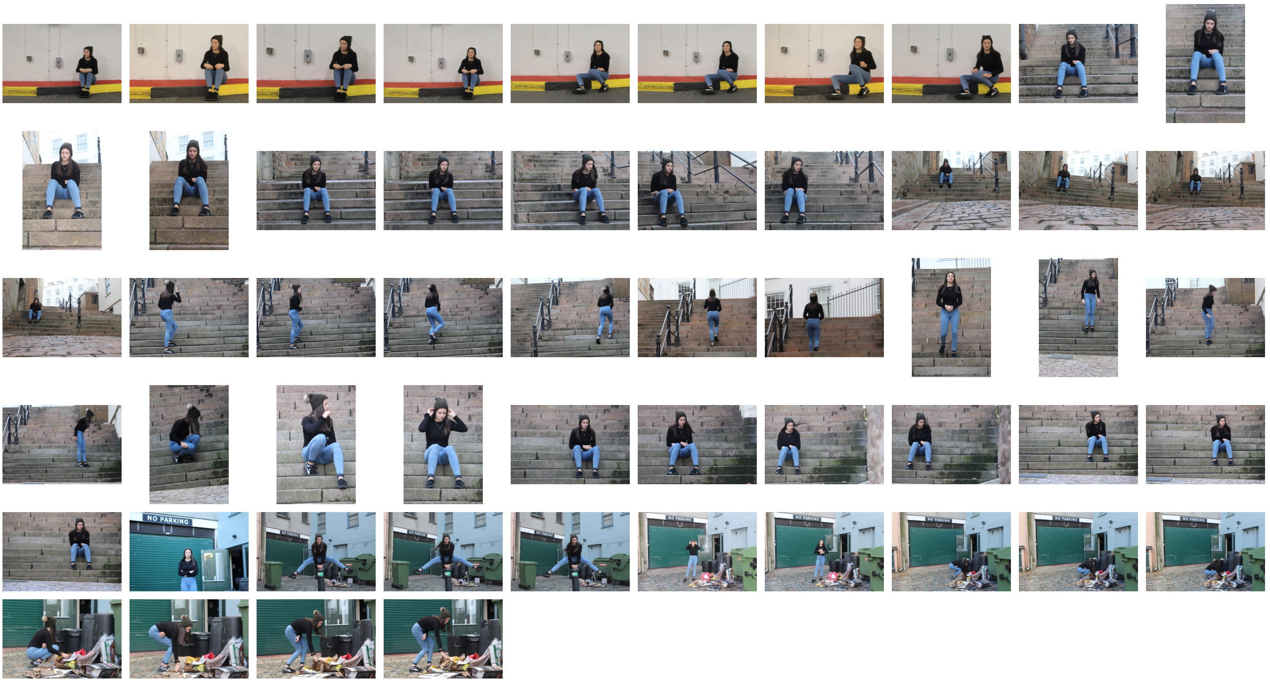
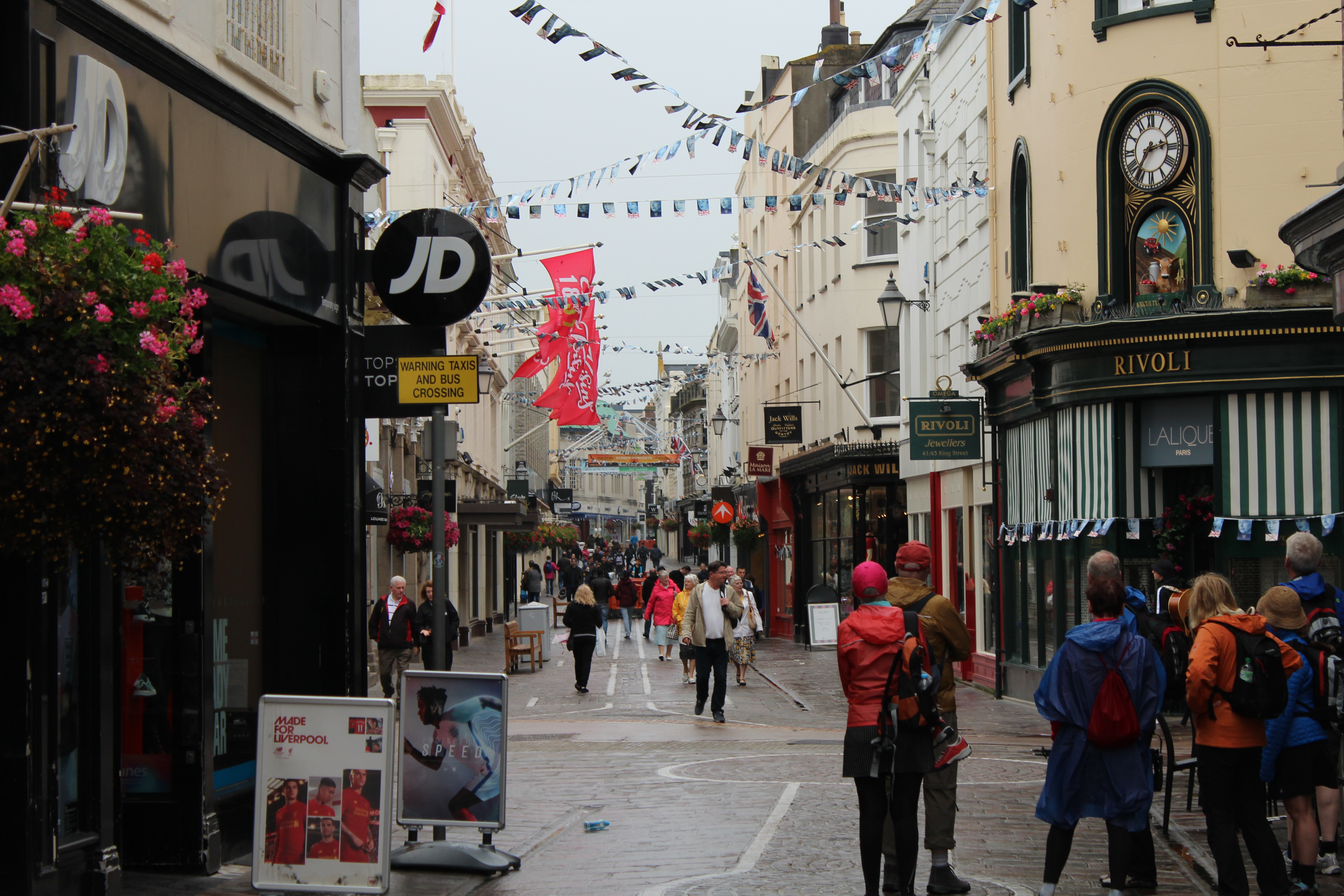
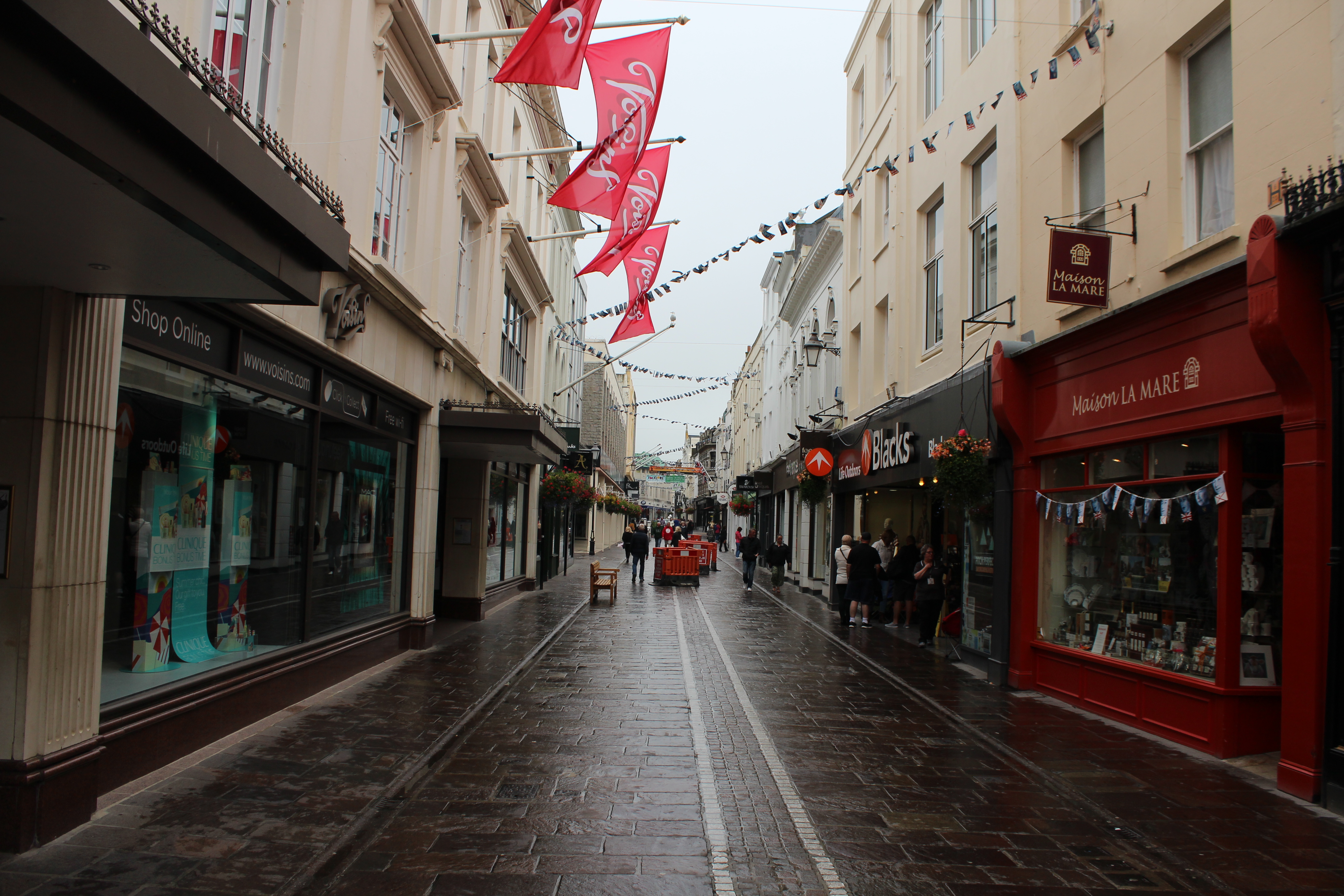
My Photoshoot
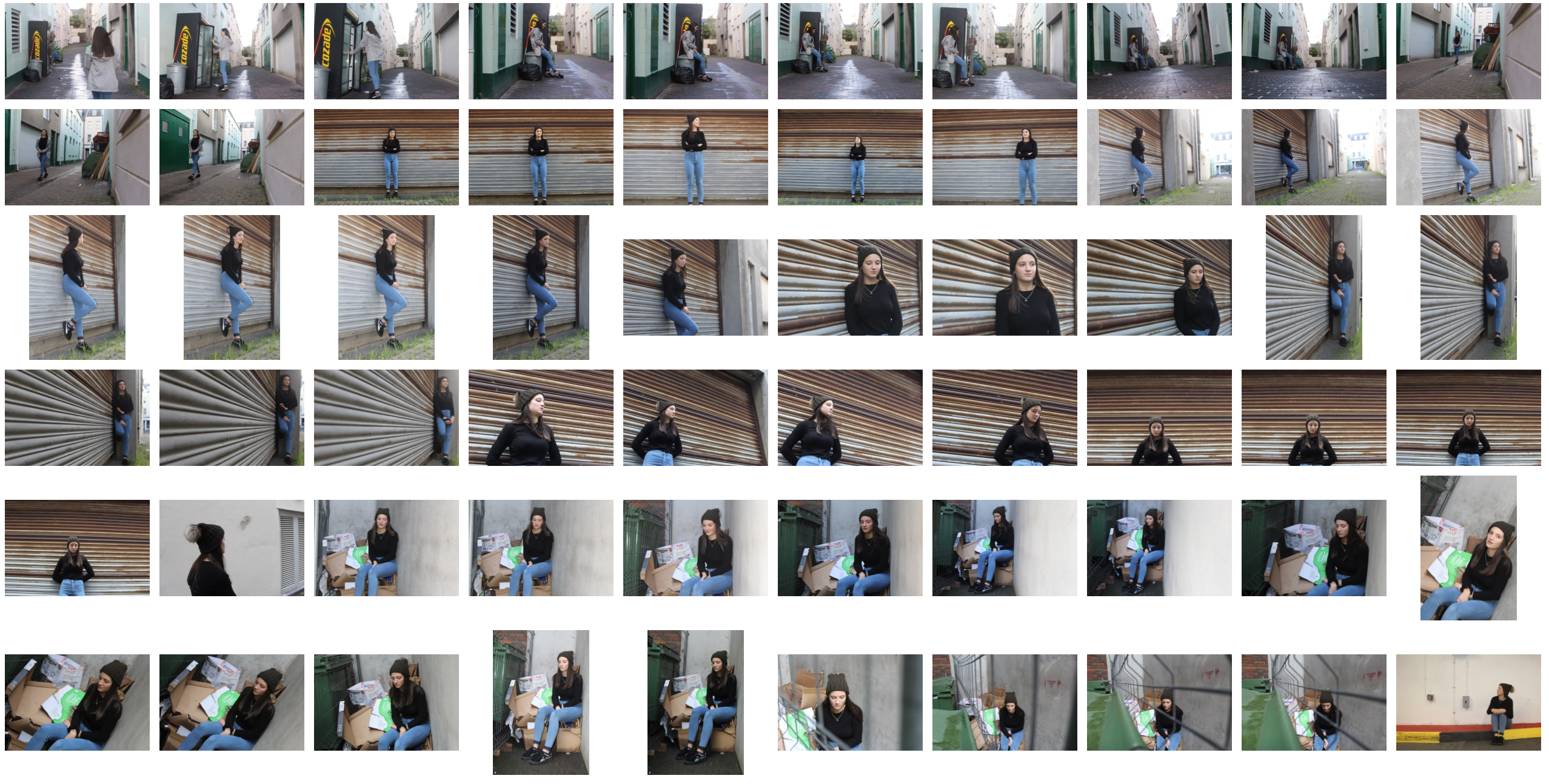


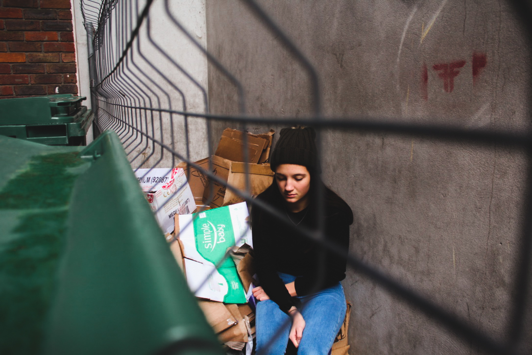
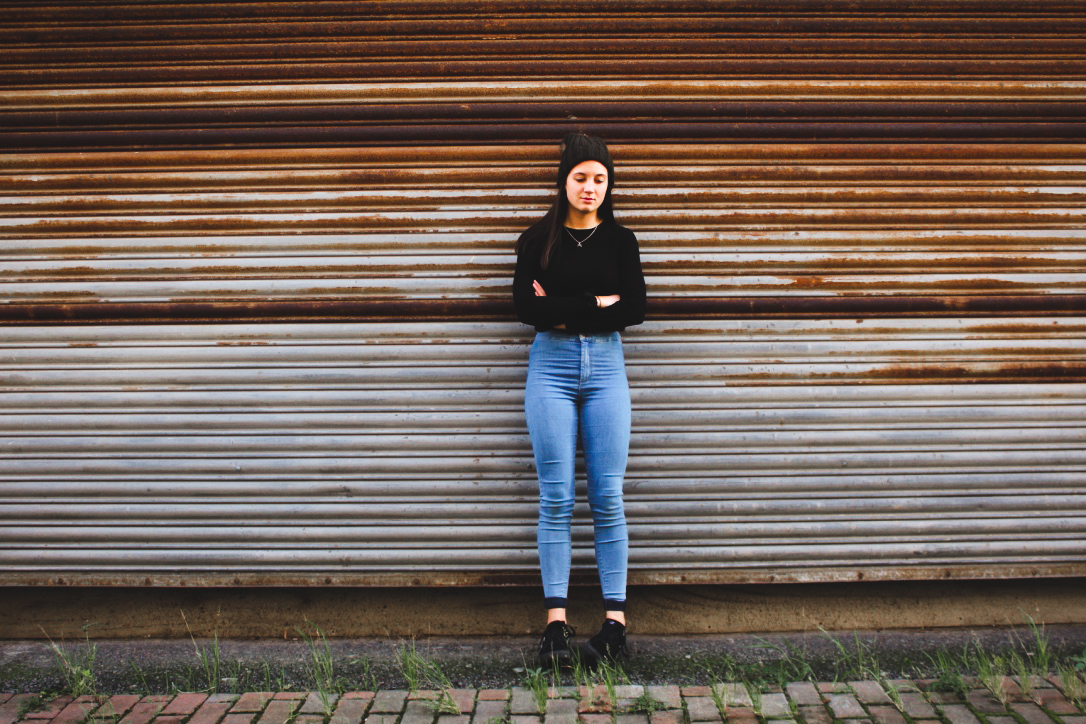
Edited Images