what is tableau photography:
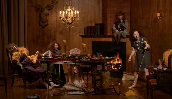
Tableau photograhy comes from Tableau vivant, it is French for ‘living picture’, is a style of artistic presentation, often shortened to simply tableau. It most often describes a group of suitably costumed actors, carefully posed.it is seen to be somewhat romantic and symbolic.It is meant to be short and dramatic.It is all about his the environment reprints a whotle sotry and as to how everything is put in a. place for a reason and everything has a symbolic purpose altogether.it is highly creative and can be used to present a scenario of more surrealistic ideas or even in order to create a historically famous artwork,into a Modern day photographic presents the Modern struggles presented throughout the work. The key characteristics of the contemporary photographic tableau according to Chevrier are, firstly:
“They are designed and produced for the wall. summoning a confrontational experience on the part of the spectator that sharply contrasts with the habitual processes of appropriation and projection whereby photographic images are normally received and “consumed”
creative photography ideas :
For creative photography I wanted to focus more upon interesting concepts rather than artists themselves. I want to portray many aspects of illusions that can be achieved through composition and further editing.Lots of ideas that I have seen that inspire me,are images surrounding water,and the development of color and the dripping of lighting and also reflections within the water. This can be seen within the following:The second Idea I have would be surrounding a movement of slow shutter speed,this allows a sense of movement that is create and allows a sense of duplication of faces which is effective. There is also an additional sense of illusion within the work that allows further experimentation within reelections and editing to the images themselves.furthermore the third creative idea I have is using mirrors,in order to show repetition within the face and also to show illusions of lack of body or interesting angles to capture a hand holing a mirror which clearly shows a face.these were all inspire by my artists seen below.
first artist Aaron Nace:
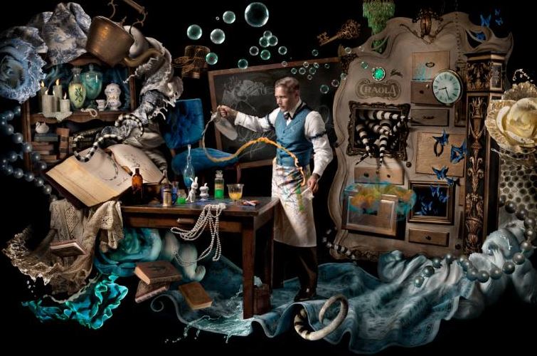
Aaron Face is a photographer who uses tableau photography very much in his work.His images resume surrealistic and used in order to show a more imaginative world and more expression shown continually throughout. is a self taught artists,who specializes his work by using Photoshop and using many levels in order to create an almost abstract feel. He said he enjoys using Photoshop in order to act much like a paint brush,this creates a free flowing feel to his images.
lots of the images from below are from an exhibition called ‘visions of whimsy’ This is used to demonstrate a world in which there standards and expectation revolved and also highly creative and surreal imagination and also highly creative altogether
. 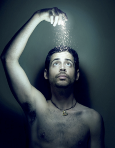
I chose this image because of the light and how it enhances all the elements of the photo itself, furthermore it also presents ways in which magic can be repressed in a more realistic circumstance and also masculine standards presented and who he is and his contextual beliefs too.
I think this artists will help in benefiting my work because it has many abilities of imagination creative aspects too enhance people and how their conceptual thoughts are shown throughout themes like their personality.The attachment within this identity is less to do with a lack of identity but more to be finding their identity in a surrealistic way in how represents them as a whole.I want to continue to show they are diverse but within a more surrealistic way and perhaps less stereotypical and sad.
Second artist Cristina Otero:
she is a Spanish photographer and a well known artists best known for her individuality within exhibited portraiture.she is the youngest of three and founder love and passion for photography at just the age 13,this was due to the fashion photography show Americas next top model, this was due to her being intrigued within makeup and styling and ways inward which lighting had such a large impact .she further specializes within close up portraits,she was exhibited at just the young age of 15 and this is what started off her very creative sense of style.all her work varies very much, making no piece quite exactly other,but she does always have a strong continuation of a sense of abstract and creativity within makeup,composition and the coloring used thought out.throughout her work you can Clearly see a more gruesome and perhaps more vulnerable she to herself throughout her photography. Although these pieces are not my favorite I can see how a sense of hardship has inspired her throughout all of her work.I have chosen work from three of her exhibitions in which I feel I could further use these creative ideas and as to what was inspired by them;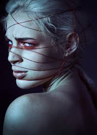
I like this image due t the interposing sense of medium on her face,which creates a sense and molding depth of field and a sense of interest and substance to the piece itself,furthermore the color gradually darkening successfully compliments the background and creates a mysterious and possibly sinister tone to the piece itself.the red under the eyes creates a color contrasting also draws a directness of attention also emphasized with the direction as to where her eyes face, the string itself allows the conceptual concept that she herself is stuck and show the artists cretaive ideas to symbolize a more dark meaningful representation to people.
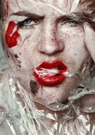
In addition I was also inspired by this piece, due to the juxtaposing sense of textures and create a scorched sense of movement within the case itself, it creates an interesting tone of effect too as it is see throughout so from a way of exaggerating colour. This look was a inspired by her conceptual concept of beauty standards and was in order to show a sense of everyday clown effect, and how it is a hunoures matter in which people worry about their representation within society today.i think her expression is quite powerful and it furthers the kind of the almost ragged sharp plastic covering hermit shows strength and I find this intriguing within her work.
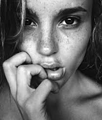
I chose this image lastly due to it being unlike any of her previously seen workout shows a sense of natural meaty within her work but while also having really deep tones that create a larger sense of persona to the piece itself. the composition of a very strong close up on hr hand is changed within how her hand shows a sense of delicacy but also obstruction from within the rest of her face,again creating an interposing composition to the piece.
From her work ideas that I will use: I want to show a large divertsity of color ideas and interesting concepts that she includes in her work, such as power and also a sense of sinister toning.inspiration for shoots: I would like to do a shoot using light and string in order to create an exaggerate persona and connote a struggle while also showing an interposing conceptual concept and visual aspects. ,furthermore I would to focus on direct close ups on portraiture aspects, and also use this to enhance a tone and persona to the image itself.
This work could be further linked to the idea of loss of unity throughout the struggle and hard pressure that are seen to be under, such as the rope wrapping around the face preeners the idea of struggle and also thatch is contraindicated,this shows how they feel lost and toed up within their emotions not known how they themselves are and almost use the rope as a metaphorical device that they are and unable to continue.

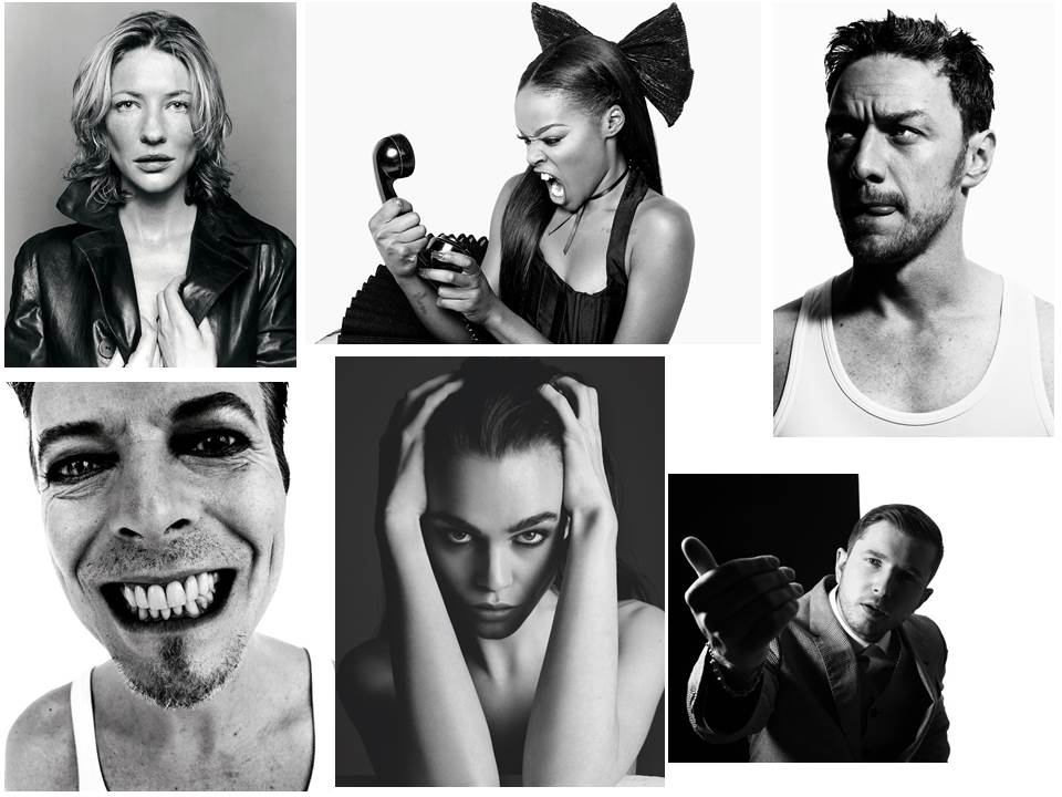


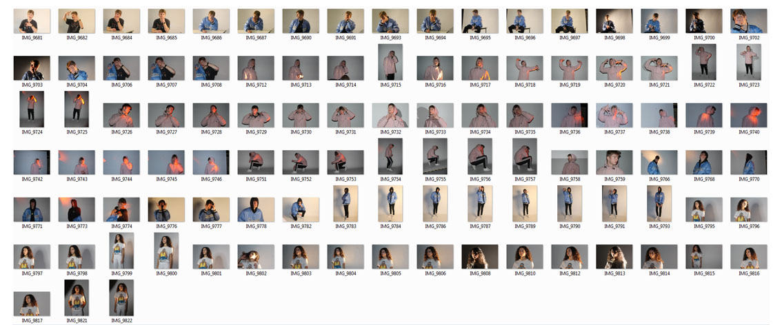
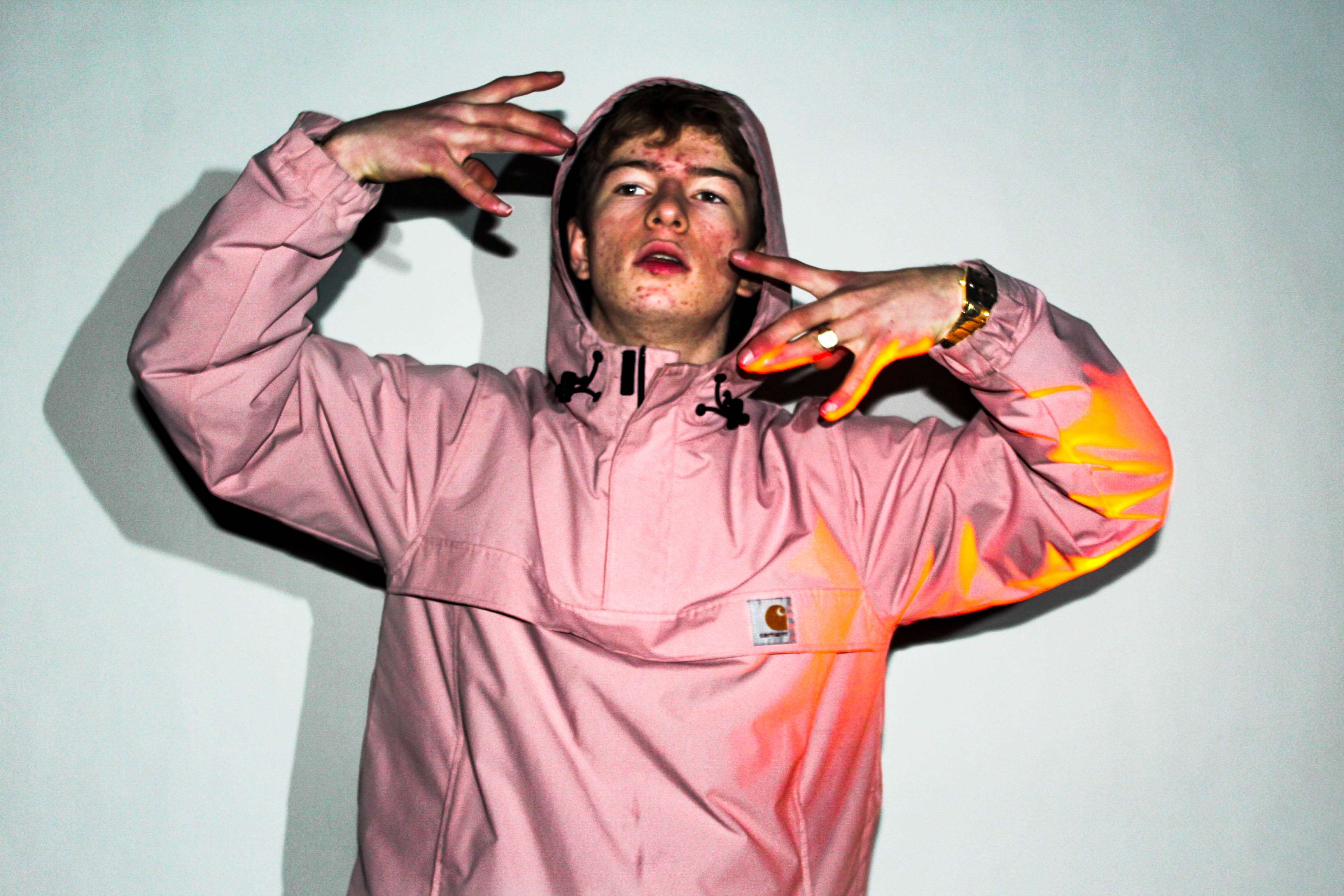
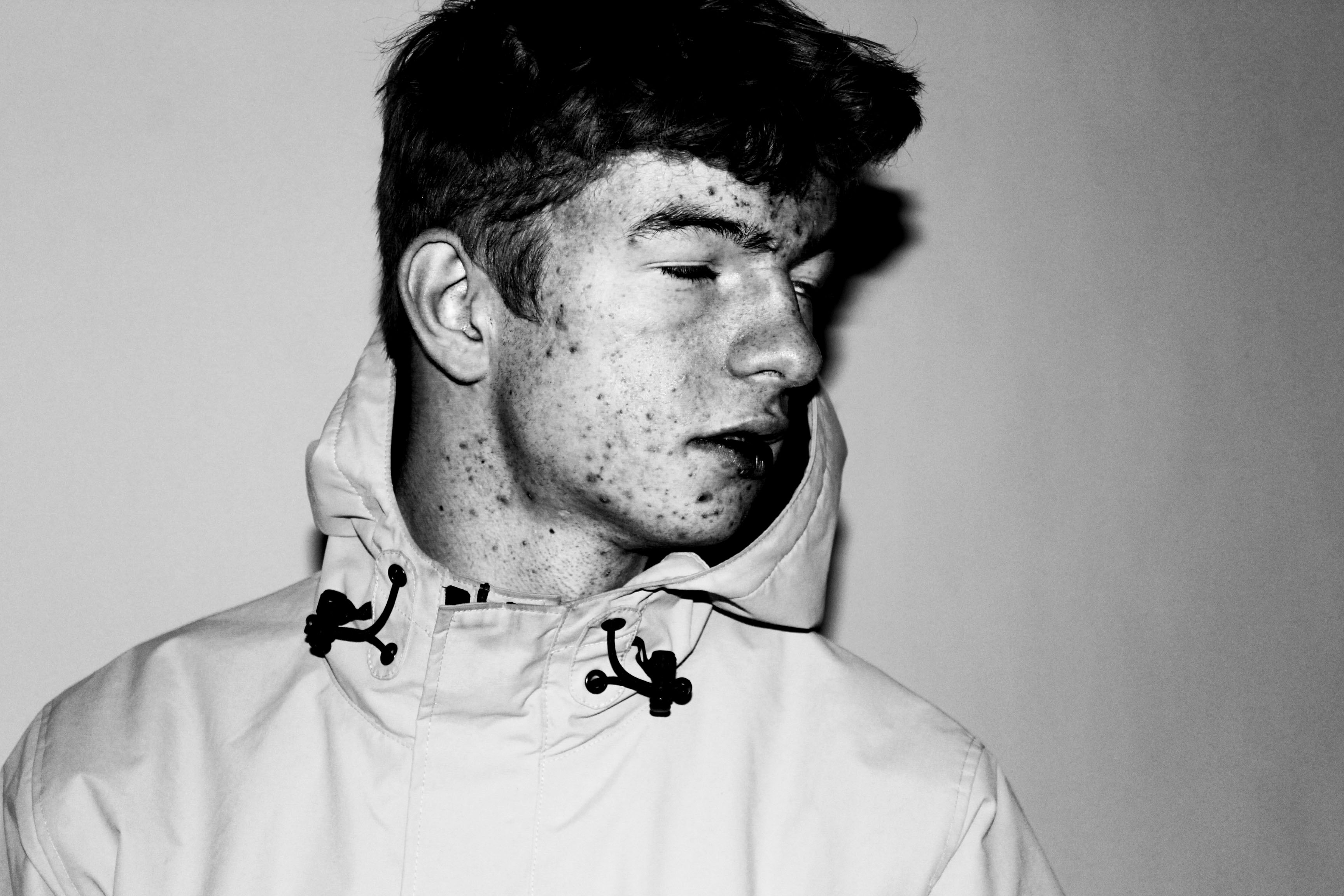
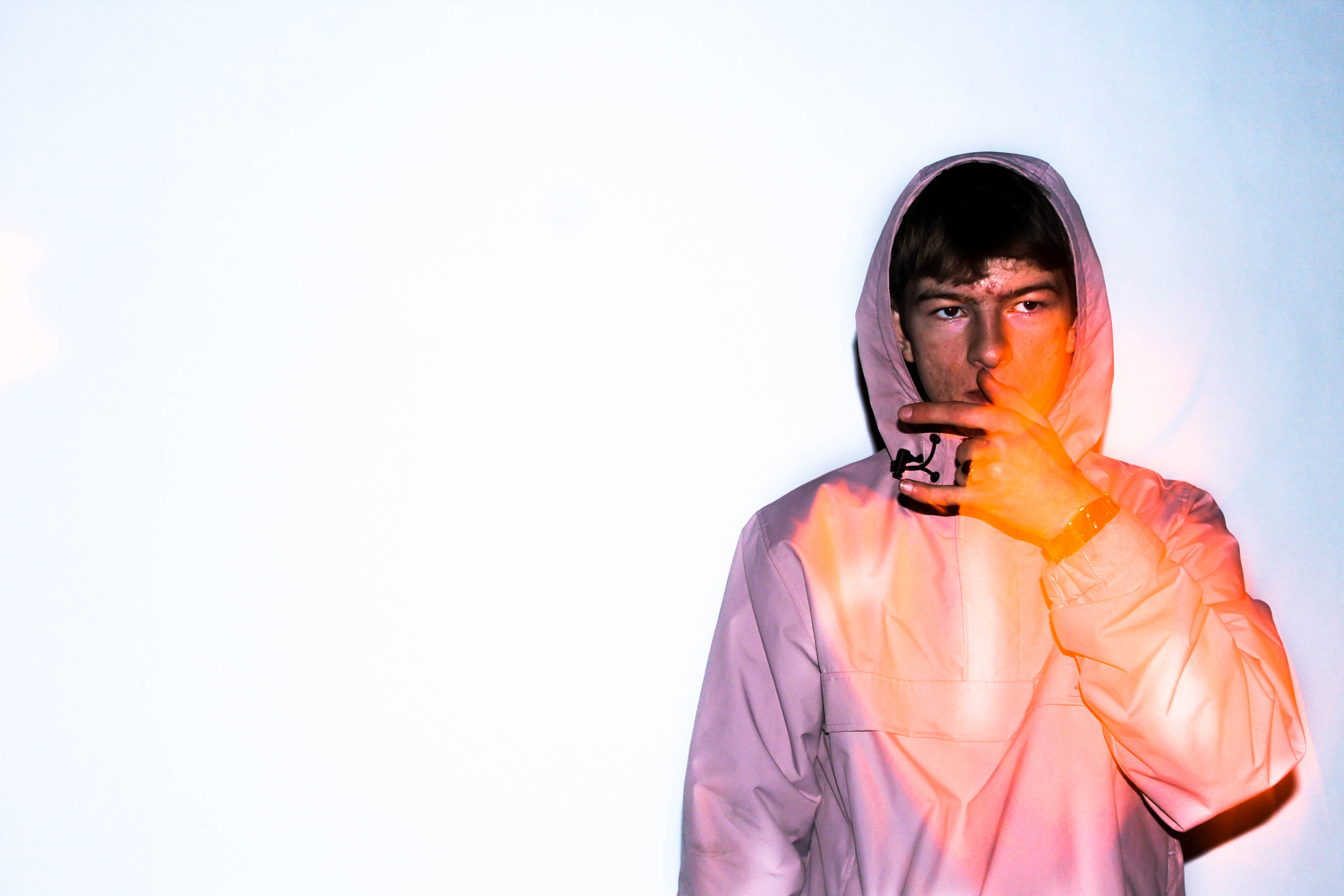
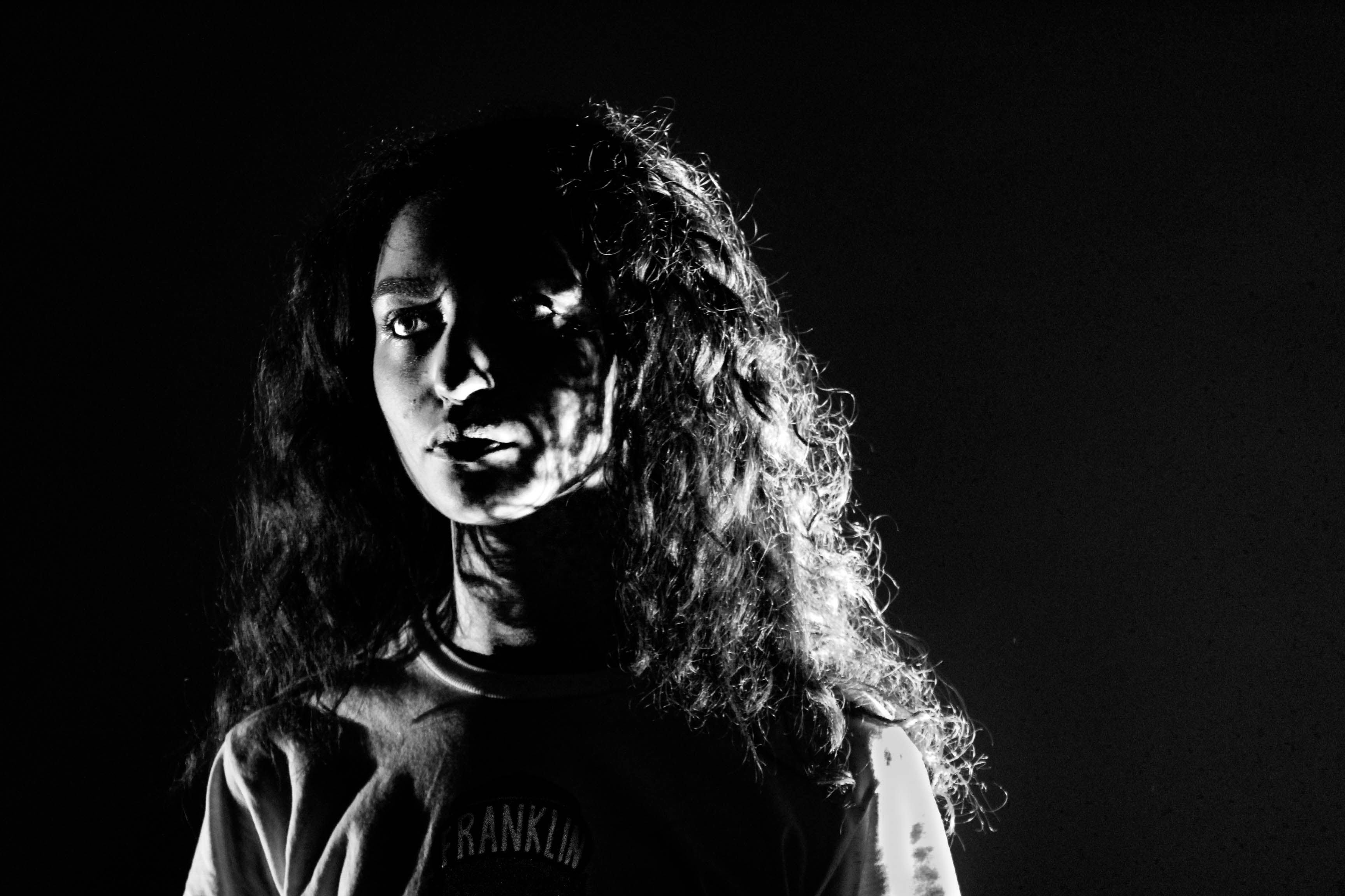










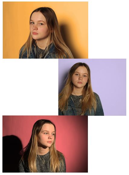
 During the studio photo shoot we played with lighting and created portraits with the same concept of light and dark using light - creating the effect of Chiaroscuro.
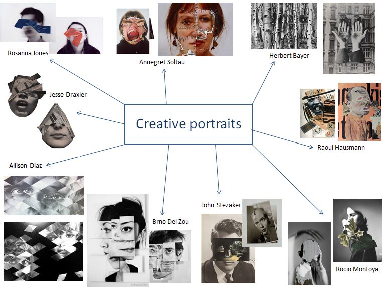 I first created a mind map of photographers that interested me and that I thought related to the concept of identity. The manipulation of paper and the way we perceive the photograph was also important when deciding which photographers I would take inspiration from when doing my photo shoots.
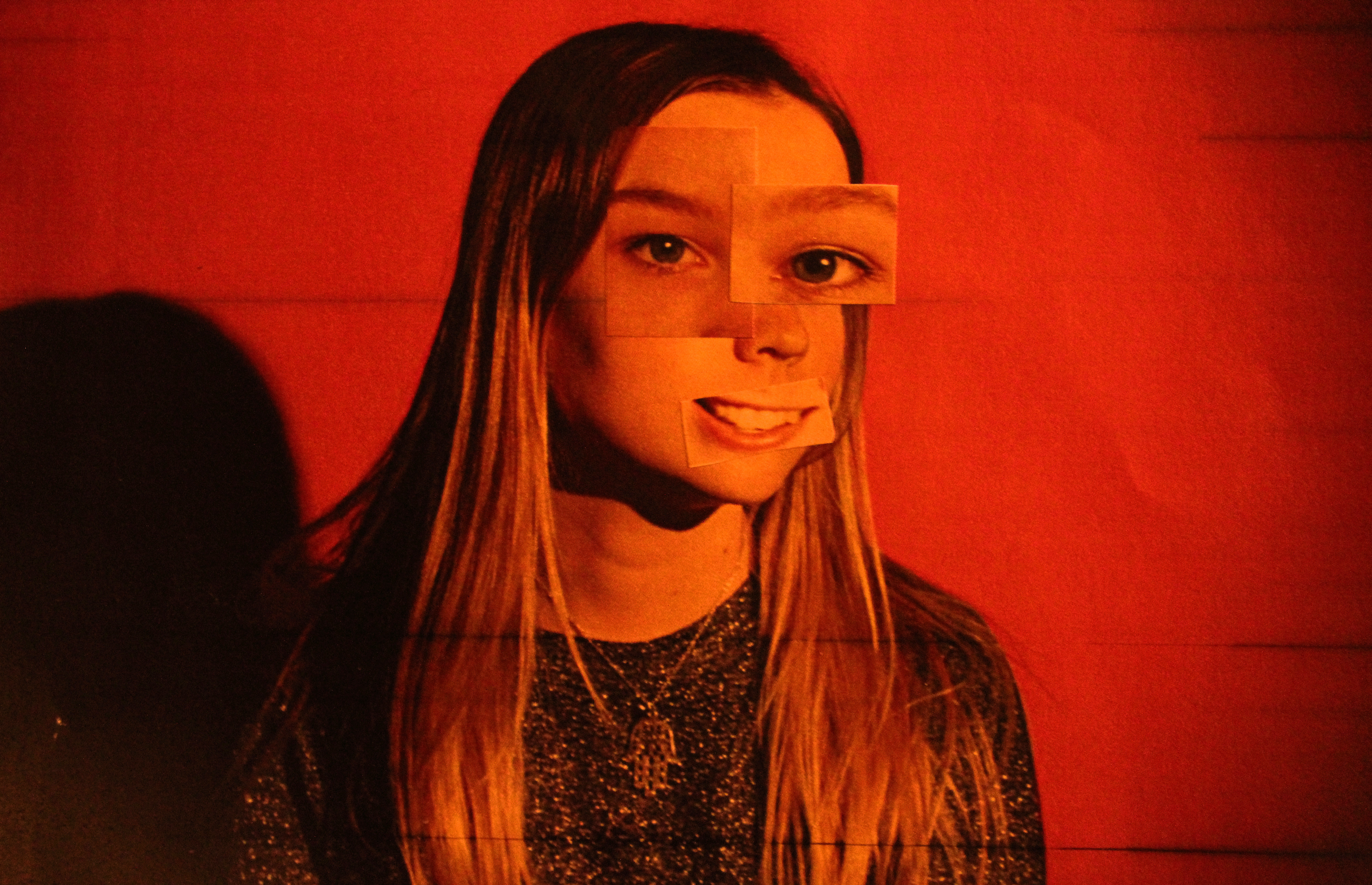
 I tried to interpret his style by creating images by layering different sections from different cropped photos.
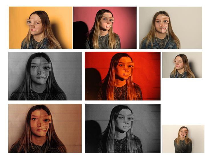 I edited some of the photographs on photo shop and some by cutting the paper and physically sticking on the different angles of the face to experiment which way worked best. I found that the better effect was when i physically stuck on paper on the printed out face as the images edited on photo shop looked too artificial, whereas the stuck on photos looked developed and well experimented.

 John Stezaker’s work may, in several respects, be part of the continuity of the collage activities that marked 20th-century art, but they stand out in particular by the way they broach the construction of meaning.
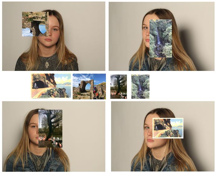 I tried to interpret John Stezakers work by editing photos onto images of my subject. I tried to select images that would make for an interesting photo and tried to connect lines in the attached photo to lines and sections on the original photos. For three of the images i edited my own photographs onto the image and the forth one i used a picture of an postcard I found online to interpret John Stezaker’s work the best i could as he used postcards in his photos, which i think is the most effective out of the four.


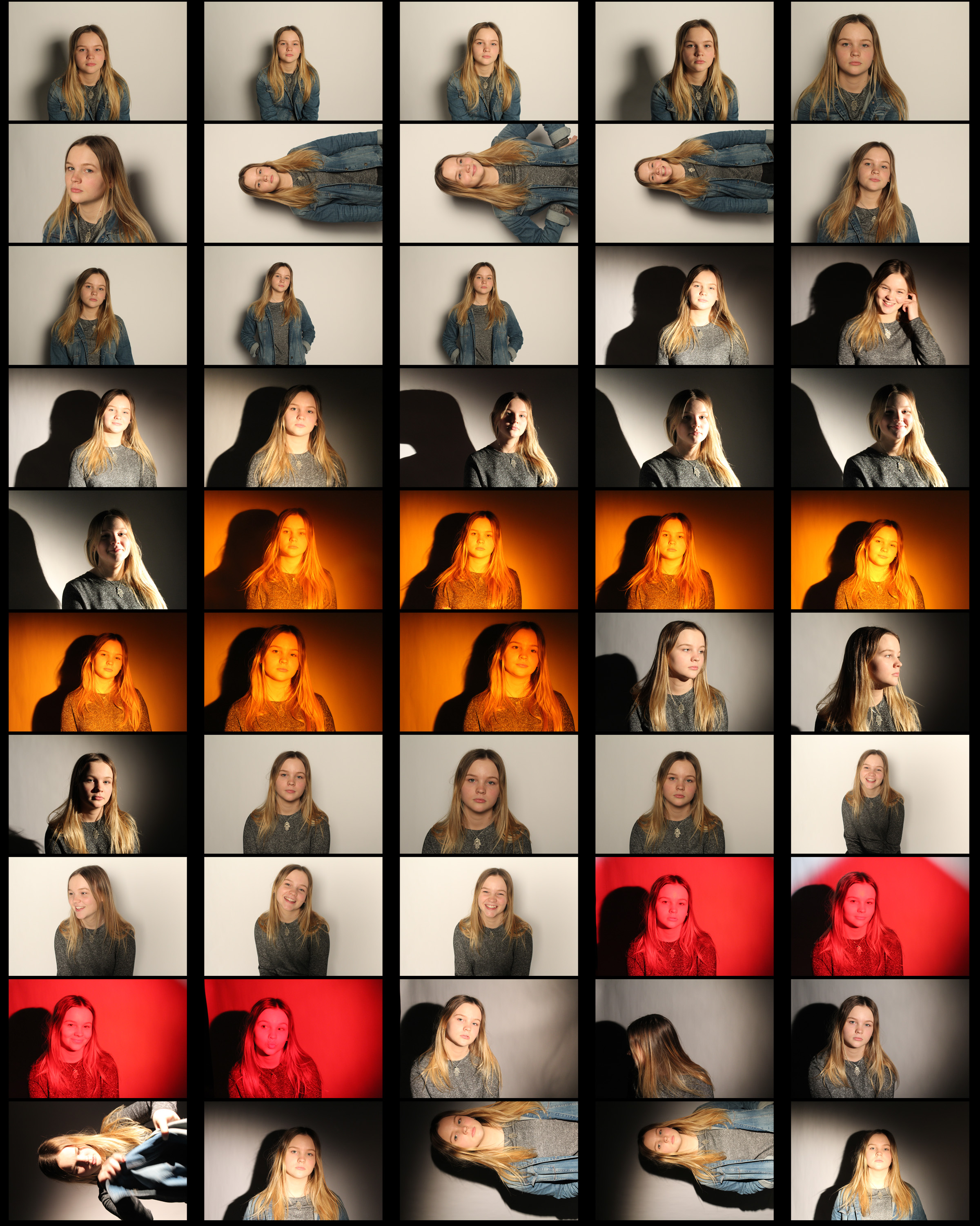
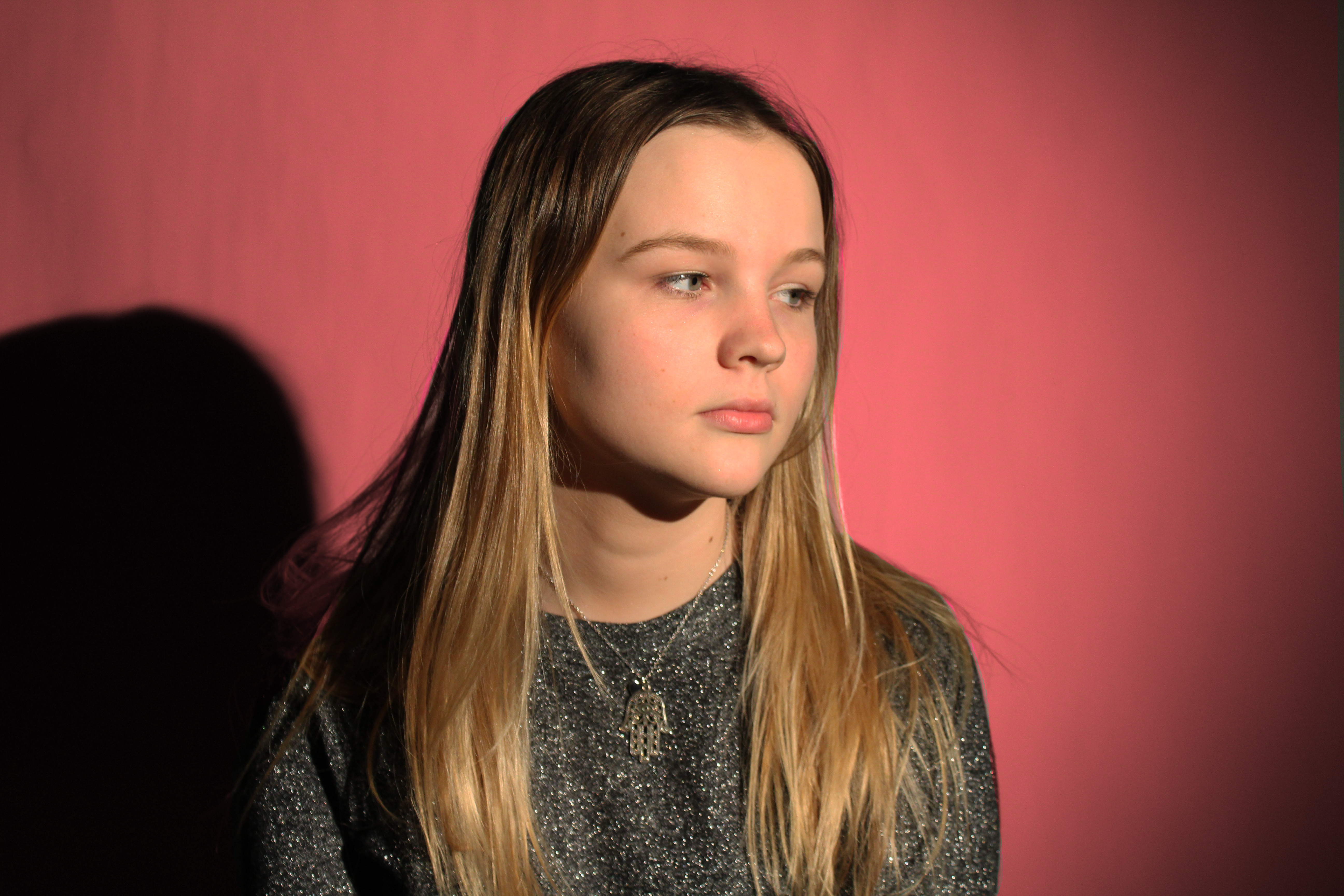
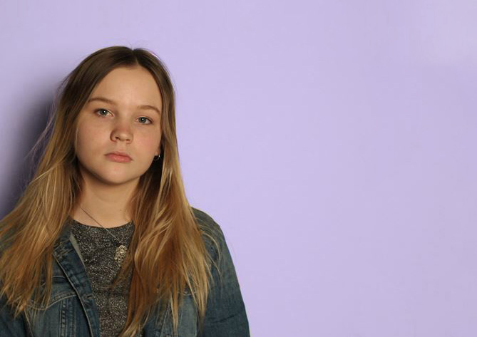
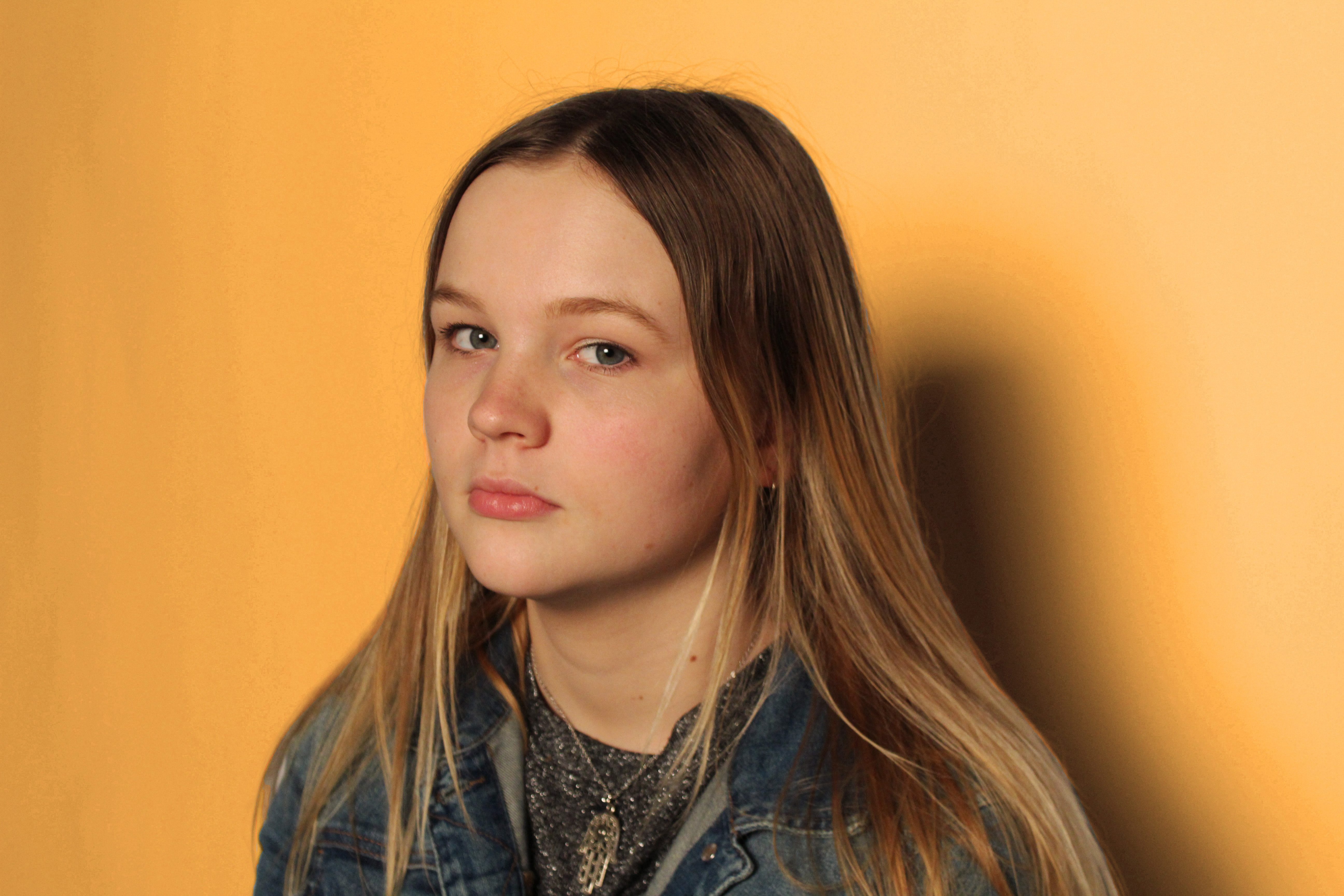 I edited the background on photoshop as the lighting produced in the studio was not as bright and colourful as i wanted it to be. I used the original image of my subject (with adjusted brightness and contrast) and only edited the background a different colour to make the subject stand out and to create separation from the two parts of the photograph. My subject has a neutral face in my final four images as i think they are most effective like this. I also selected images that were taken at different angles to create variation within the four and so the photos could be displayed individually or together. For example:
