Zun Lee

http://www.zunlee.com/streetportraits
file:///H:/Downloads/Street-Photography_2%20(2).webp
Zun Lee is an award-winning Canadian photographer, below I have included some photos from his street portraiture project. "I can’t explain nor predict what exactly I’m looking for or who I'll be drawn to as I roam the streets. It’s any combination of their personality, their energy, their appearance, etc. but subconsciously I know it’s deeper than that – and my subjects often know that, too. It doesn’t matter whether they last a few seconds or several minutes, the encounters I experience share a common theme: Strangers will open up to me as if to say “I don't have a clue who you are but I trust you”. And that’s invariably a two-way street: I have to give up my own secrets in order to receive theirs. In reality, the people I photograph are therefore neither random, nor strangers. I find I gravitate towards them for a reason: The portraits often have an undercurrent of self-discovery and identity exploration, and so they're every bit about myself as they are about the subject" - Zun Lee talking about his street portraiture.

Portrait Final Outcomes

These 3 portrait photographs are my final 3 photographs. They are all linked by the theme ‘lack of identity’. I have removed the faces to show that without our characteristics we are all the same. The black and white with the slight noise helps to create a sense of blandness and helps to emphasise how boring we would be without our identities.

Photograph 1
Photograph 2
Photograph 3

These three images were created using artificial light. I used a redhead light to provide some soft light across the models’ faces and I used a spotlight to create a slight chiaroscuro effect to create a more dramatic image with more contrast and shadows. I used a shallow depth  of field (4.0) to create focus on the front model in photos 2 and 3 and to mildly blur out the background. I used a slow/medium shutter speed (1/20) to allow more light to enter the lens from the dark environment, I used this along with a low shutter speed of 200 to keep the quality of the images as best as possible.

I used a black and white filter over these photographs to create more contrast and I increased the amount of noise to create an old-fashioned portrait photograph effect, this helped to emphasise the idea that as individuals we are boring without our identities.  There is a wide range of tones in these photographs ranging from the darkness of the shadows to the highlight of the faces. There is a 3D effect to images 2 and 3 due to the positioning of the models and the slight blurring of the back model, this brings the photograph to life and gives it a more intriguing appearance. In photograph 1 there is less of a 3D effect due to the plain white background and the lack of facial features. I have placed the models in the centre of the images to create an uneasy effect in the images.

These photographs were taken in the studio with the work of Ducruix in mind. I took the photographs then edited them in lightroom to create an old-fashioned effect by using a filter, changing the white balance and increasing the noise. I then used photoshop to remove the features of the faces by using the spot repair tool. The aim of this photograph is to show something unnatural and make the viewer uncomfortable.

I took these photographs with the plan of using it for the topic of lack of identity. It shows that there is not much distinguishing each of us other than characteristics and features.  It shows how bland and boring the world would be if we did not have our individual identities as everyone would have the same aspirations and personality traits.

Laurence Demaison

Laurence Demaison is a french photographer born in 1965. She spent most her early life training to be an architect and completed formal training in 1988. after this she became interested in photography and started making self portraits. she was self taught and enjoyed how photography could free her from using words, and made it possible for her to express herself. this is the reason for her using herself as a model because she didn’t need to direct anyone to show her vision. She would conceal, modify and destroy parts of the image using interesting techniques such as smoke, water and long exposures which often created a eary atmosphere. she manipulation of images is done when the photo is taken and not in post prediction.

I want to study this photographer for my final identity shoot because of the way she conceals and changes the identity of herself in the images. we can still tell there is a person in all of her images however they have been worpped in different ways. Although most of her images are self portraits I want adapt her idea and use her style but I will take photos of other people  so I have more control over them. none of her images are edited after they are all appear as they were taken. I will try to take my photos in her original style however I will also develop it and try to create some using modern editing methods.

https://www.all-about-photo.com/photographers/photographer.php?name=laurence-demaison&id=65

Laurence Demaison

Technical: the lighting is this photo is very focuses on the smoke which is closer to the lens, the background is shadowed and blurred however there is enough light for us to see the shape of a human figure. From this we are lead to think that the lighting is controlled and that this photo was taken in a studio set up. Although the detailed smoke is what our eyes first see the blurred figure pulls our focus through this and makes us inquisitive about the person.  A fast shutter speed would have been used to capture the smoke in action. This is a black and white image however it has a high contrast between the black background and bright smoke.

Visual: The textures and pattern in the smoke are exaggerated by the blurred background and although it is very simple his image is very effective. The shape of the smoke perfectly covers the face and frames the mouth.

Conceptual: instead of using a model she preferred to use herself as the model so that her artistic image could be presented exactly how she wanted it. although she enjoyed this she struggled  to confront the image of her own body. Rather than portraying her body as it was, she sought to conceal, modify, even destroy it and reconstruct it in a form more acceptable to her. The result is a series of self-portraits which expertly use the reflective and distortive qualities of her materials along with the shadowy effects of light and negative images to create “paper phantoms”, ghosts of herself that are there, yet disappear in an instant.

Her struggles with self acceptance links in with the theme of identity and is one reason why people may chose to conceal or change their true self.

Final Images from all three shoots

I chose all of themes images because I think in all their independent ways they successfully contribute to portray lack of infinity but have contrasting of both illusions,vibrancy and editing to make them all effective as a whole.I believe that all these images show an array of editing planning and developing techniques to make them all successful and demonstrate successful imagery within them all. I will though explore more ways in which i can edit them to demonstrate a larger range of techniques that i explored within my previous editing brainstorms.

displaying the images:
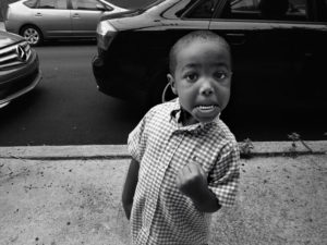
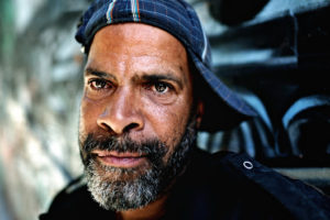
 

1st Display

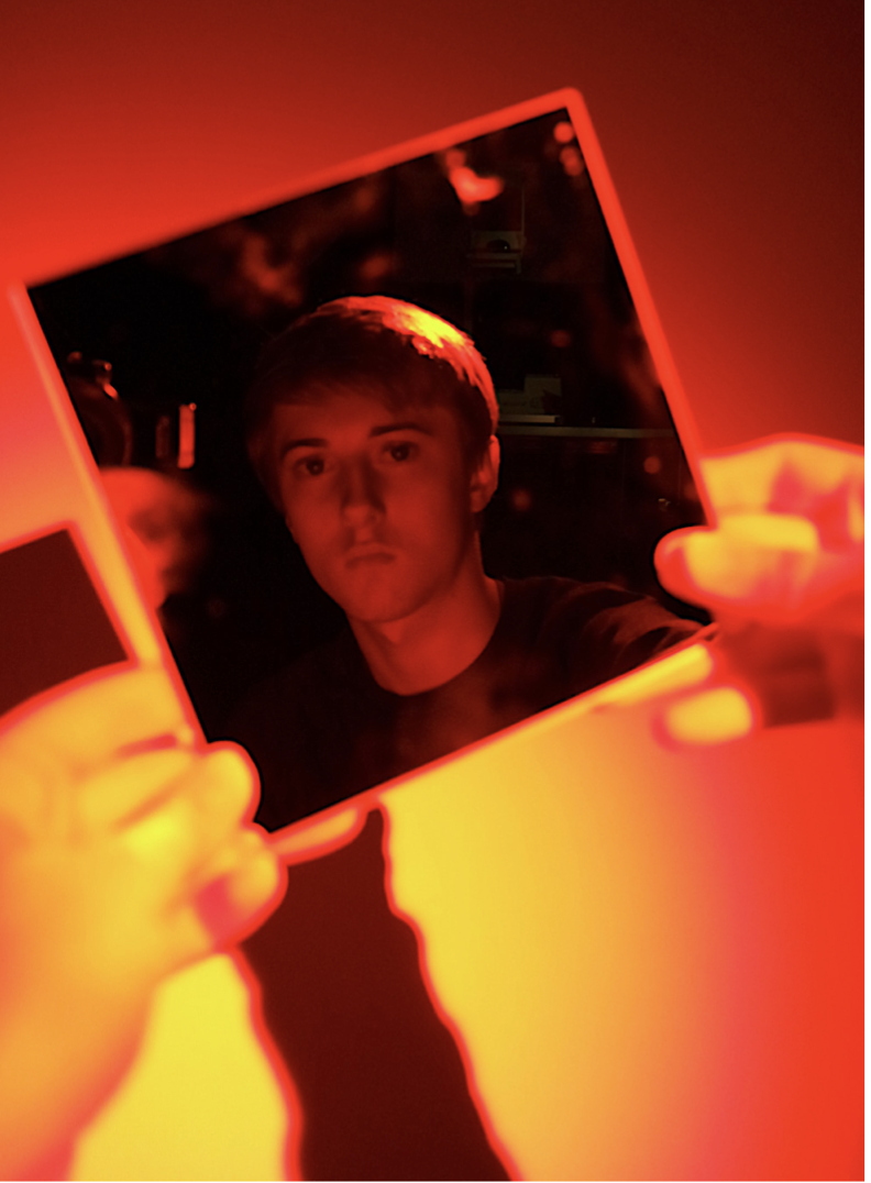
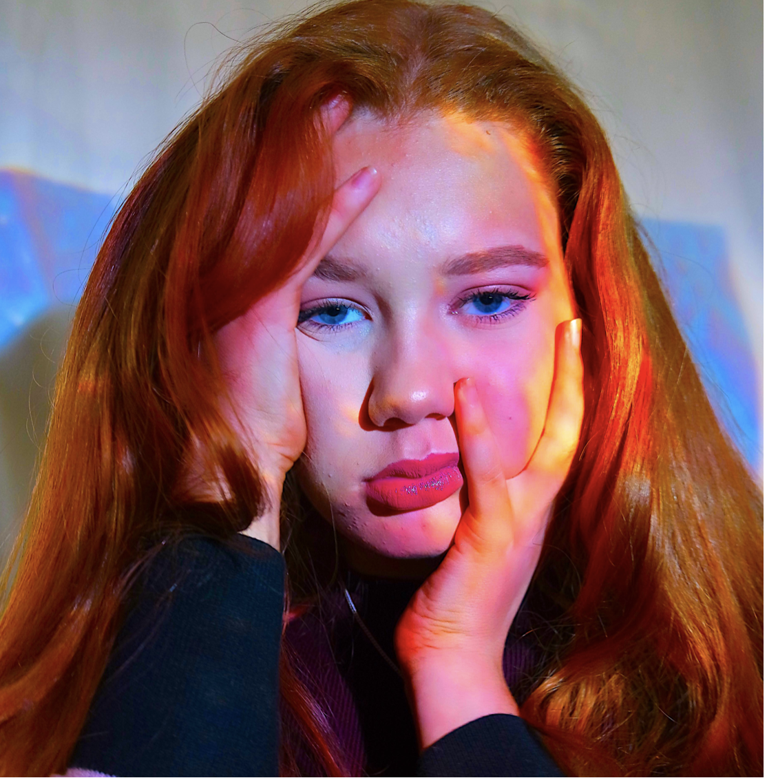
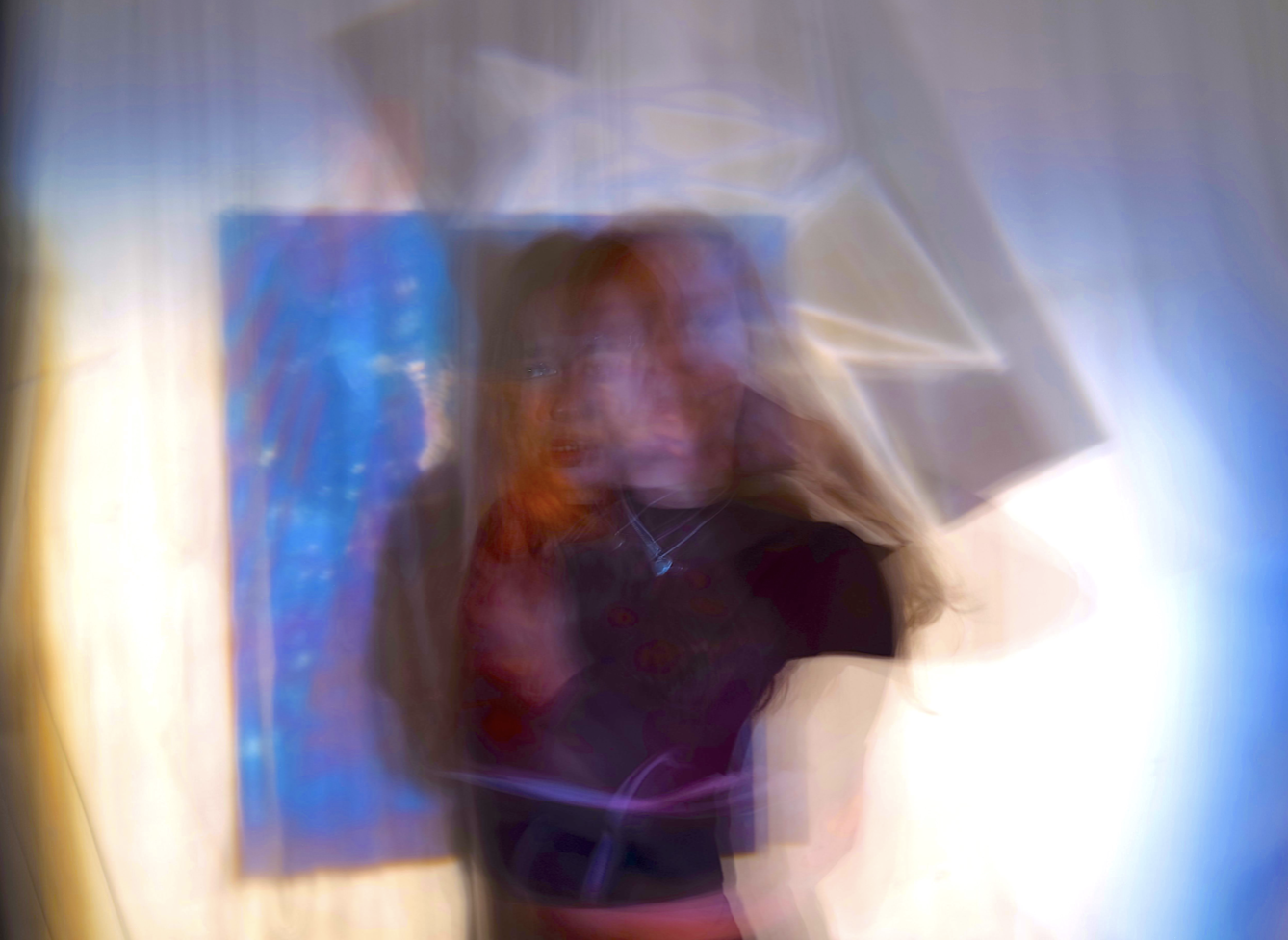
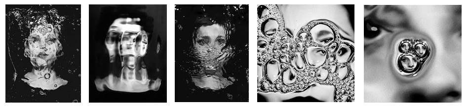
For these three images I will  simply them upon one piece of paper.I have chosen to do this because I believe that the colors and meanings are all equally as relevant and would work successfully in syn within each own.For my display I will present these images all in large squares of equal proportions and then explore many ways in which they look most effective on the paper.

I think it would be quite dynamic and in keeping within the  vibrant tones if I gradually put the images from top left,middle, and then to bottom right,this slow diffusion would be unique and allow a dynamic composition to the piece itself.In addition I think it would be successful to use white paper with thin boarders,this allows a color that will not remove the vibrancy from the images and also not defect attention to a harsh surrounding color.Although these images are not all from the same shoot they all should connote the same successful properties.

It has become clear that all my images will be unable to be in the same proportions so i have experimented within changing my middle image,to an image that still has the same effect but would also work overall successfully.
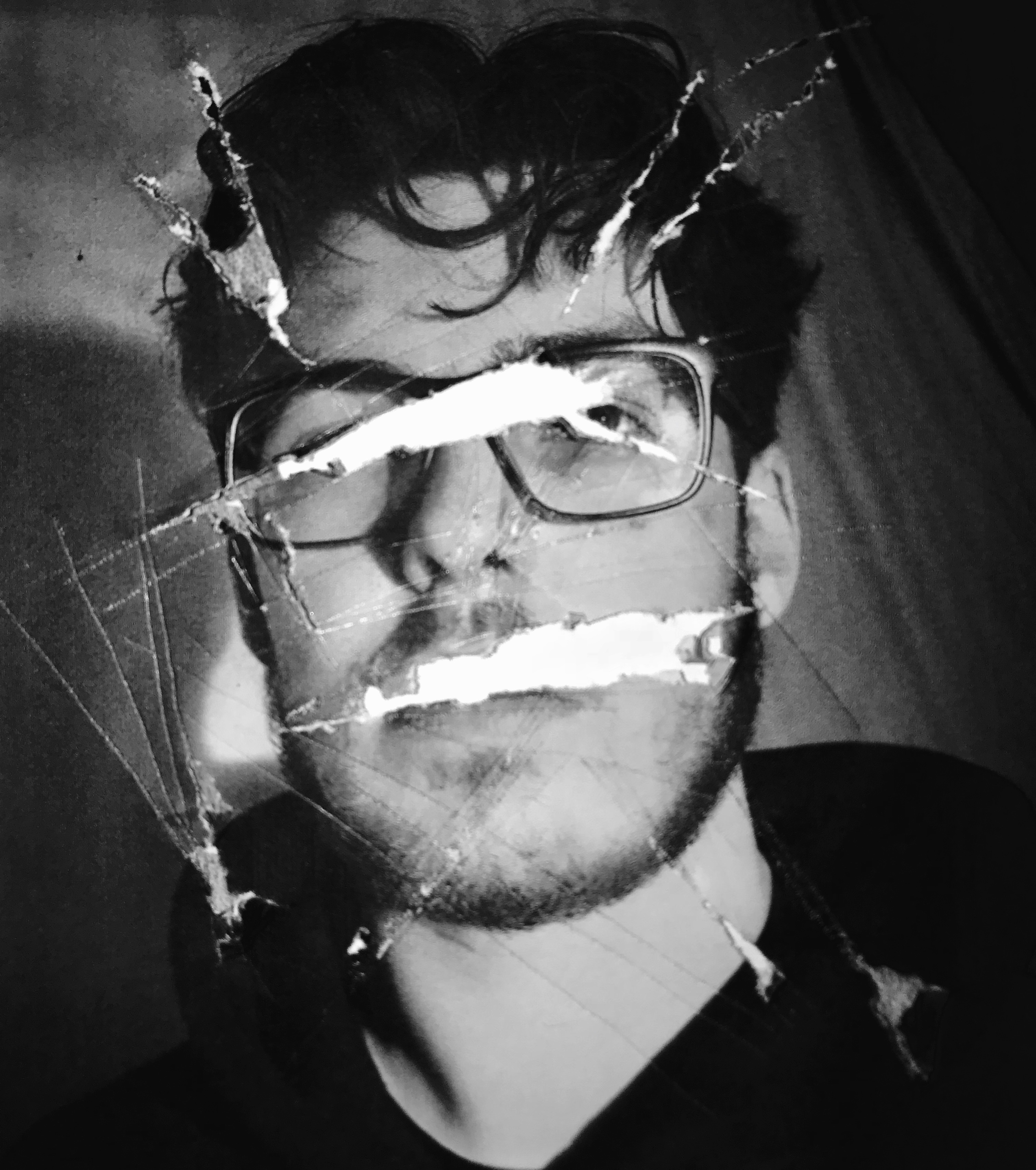
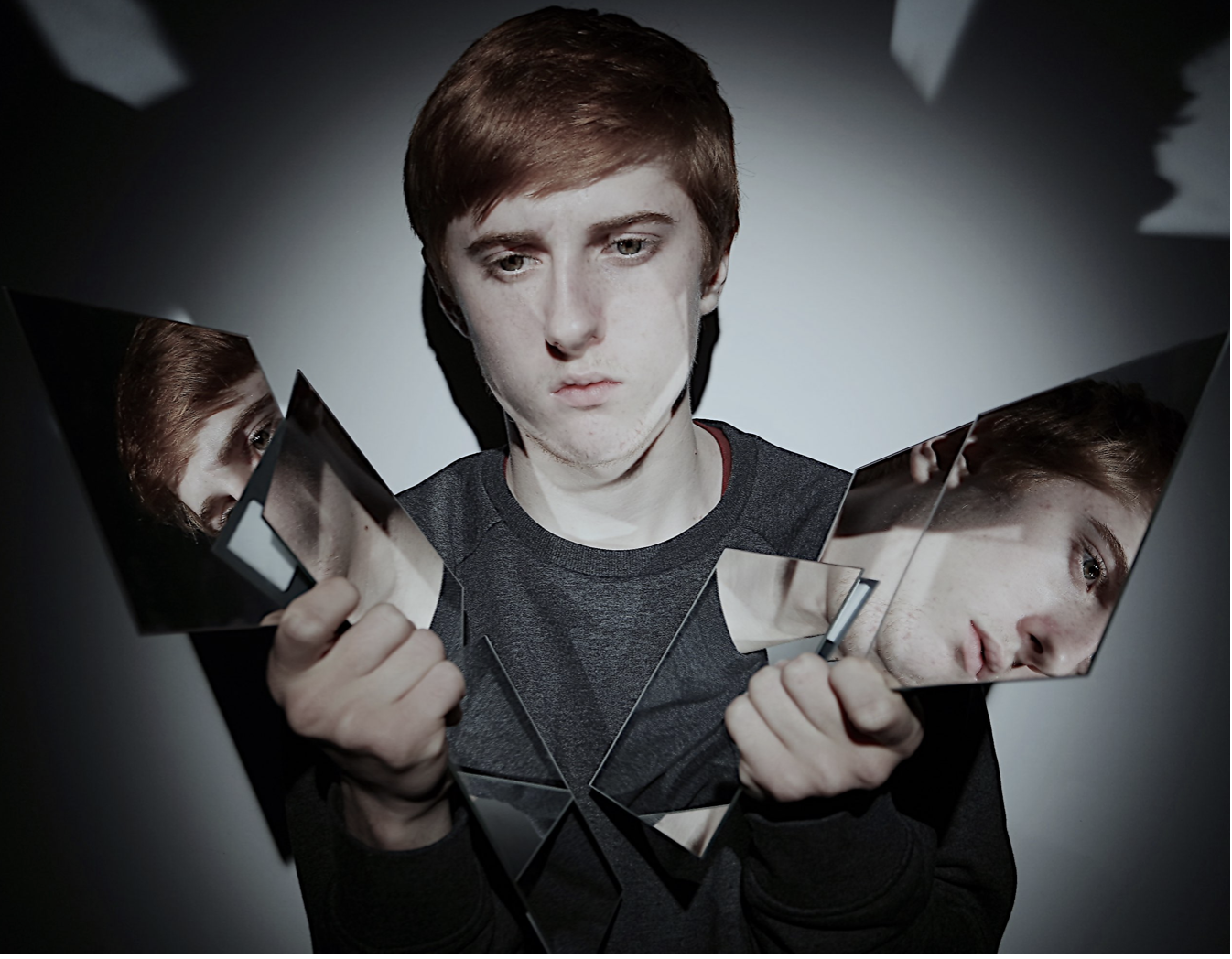
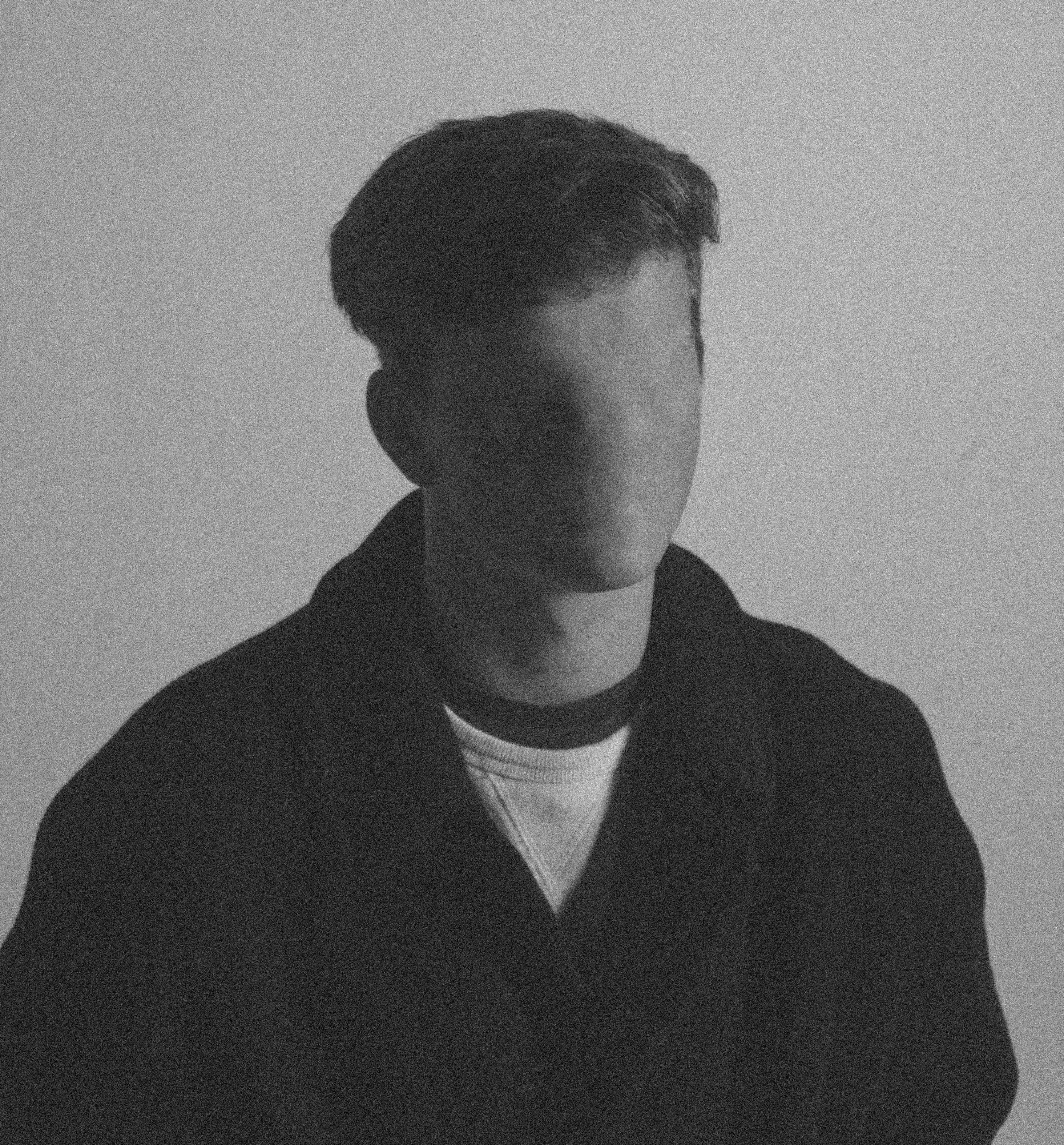
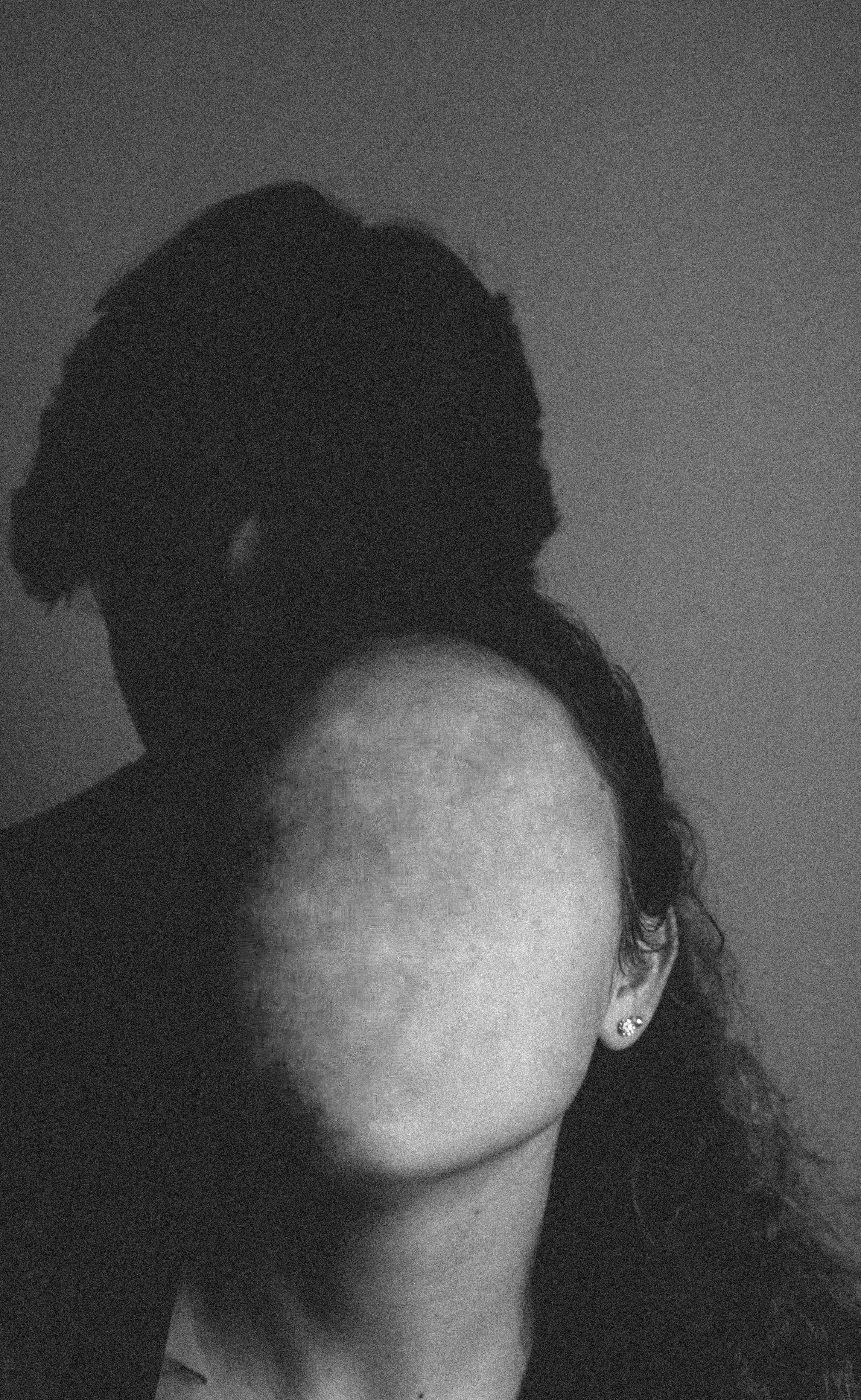
2nd Display

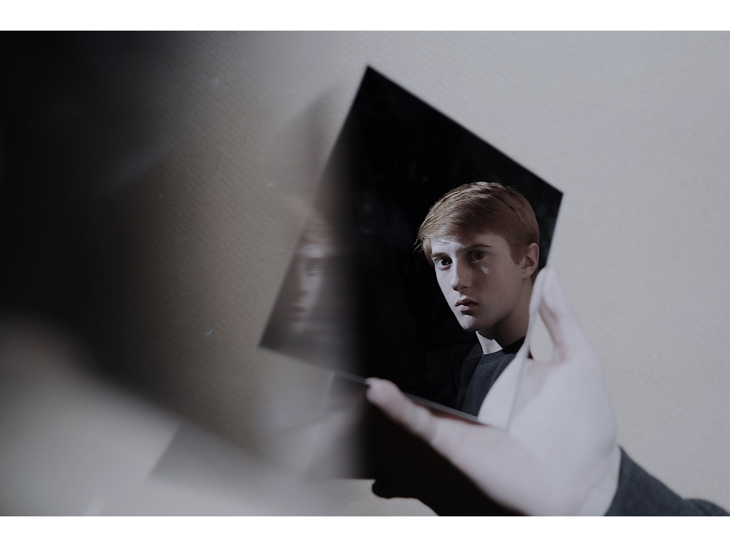
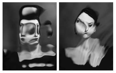
For these two images I will again use a large piece of paper,but I will enlarge these images in order to take up half the space,Due to the same of these images being more rectangular I will but one on top of the other but on a long piece of paper so then reduce the size of the paper so it only has these two images them-self. I chose these images because they both use mirrors in order to reflect a confusion of identity and also have the same tonal range.I would also want to photo shop the first image above and develop a darker tonal range as it is too light in comparison to the second.For these images i would also want a black background as they too are dark but have a lighter surrounding edge so would still have a fine overall cut to the images. I might use a white boarder in order to shoe the in keeping light theme to the pieces,and this too might make a more dynamic composition.

3rd Display

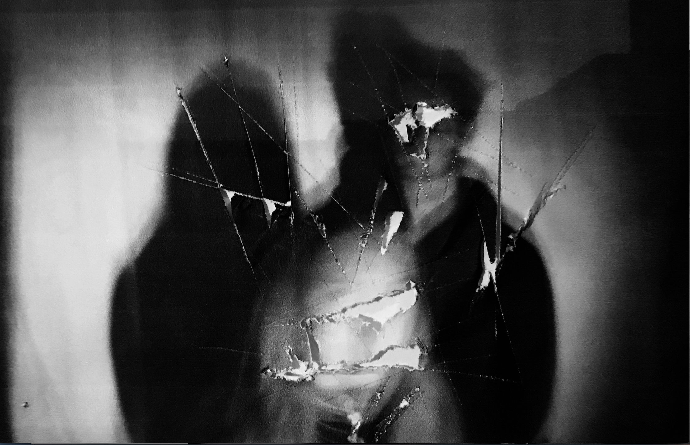
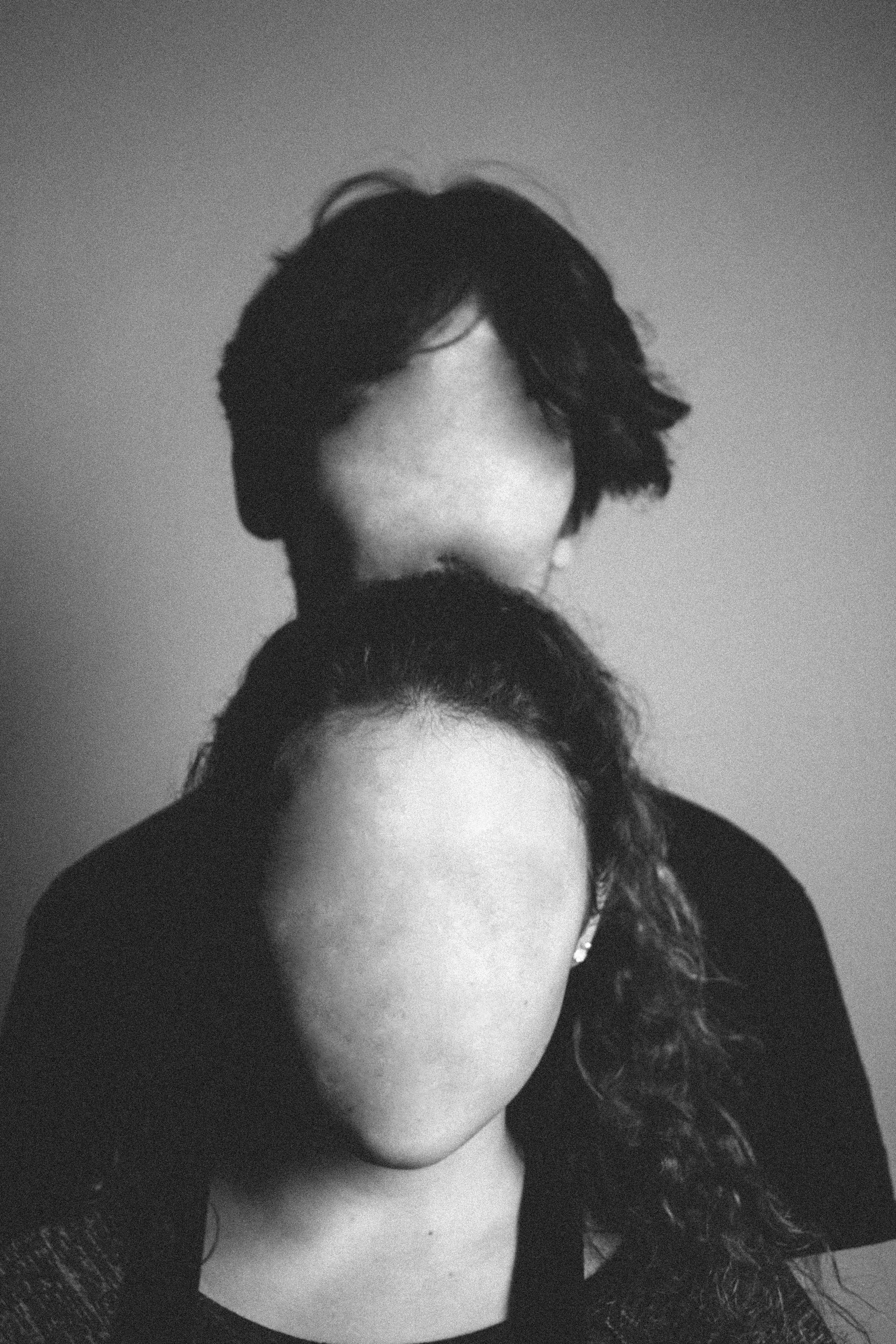
For the final display I wanted to show the darkest tonal range so far.I am unsure whether I should use two or three,but think two images would be more equally effective.I want a more interesting unique way of demonstrating this piece.Due to this being very strong removal of body parts and any subjective demonstration of who they are i think it would be fitting if they were on a structure of hanging as this would well sync within how they are only seen as an object and not a clear demonstration of a person. I could hang them suspended and framed next to each other,or even further the ripped ideas and tear up the piece but still show the piece within a square that is the same size on the same piece of paper,this would be interesting as it is unlike both of the previous and would use the same editing technique.I will experiment within the rips,but if they do not work and do not accomplish an overall successful image then I would use one image and cut this into four parts,this is so it still successfully shows the division and then my presentations develop from three images to two and then one last one just  divided into four which would create an interesting display overall.I would also want to Photoshop these images in order to make sure they are both the same shad of black,over wise the very similarly themed images would have a contrast and separate the overall composition.

I Know have edited all the images so they are all the same size and so an accurate presentation of a composition.