
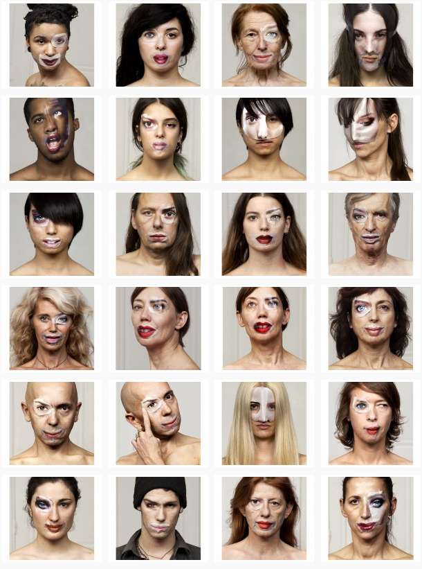
The exploration of both Bruno Del Zou and John Stezaker led to me the idea of experimenting with visual perception, linking to the way we see ourselves. When researching this idea I came across a series of photographs called ‘The Identity Project’ taken by the French photographers Bruno Metra and Laurence Jeanson. They created a series of portraits that deal with the concepts of identity, beauty and otherness. Experimenting with our visual perception, they apply cut outs of facial features from glossy magazines onto their subjects faces to create a new form of facial expression, like they appear to have cosmetic surgery.
http://www.123inspiration.com/plastic-surgery-with-magazines-by-metra-bruno-and-laurence-jeanson/
“Magazines, cinema, television, keep creating and imposing codes that become social references. What one must look like, how to make up, what clothes to wear, how to behave… We are fascinated by the power of media to influence people’s identities.”
The series provides a compelling visual juxtaposition between everyday humans and the images seen in advertisements, taking a hard look at our identity, as each subject in the photograph de-faces and destroys her or his own image.
To explore this I planned to do an experimentation, taking inspiration from Bruno Metra and Laurence Jeanson , incorporating images from magazines on peoples faces. First, I would try having printed images and attaching faces from magazines and re-taking the picture and secondly physically attaching the cut out facial features over their eyes, lips, and noses to my subjects face, like Bruno Metra and Laurence Jeanson did in their series.
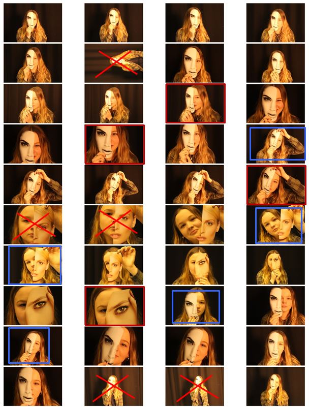
 In my photo shoot I used a few different heads cut out of magazines and found that the one I used in the images that I’ve decided to experiment with was the most effective out of them all. This is because the cut of was the closest to the size of the actual model head.
 I then chose my favourite 6 images and displayed them next to each other so i could compare them. The pictures already had an yellow/orange tint when I took them which is what i wanted but i then decided to edit them to experiment with colours.
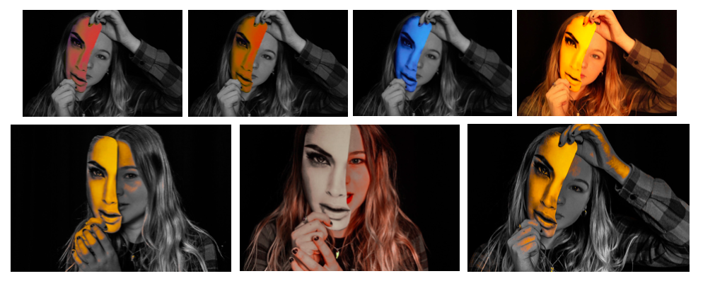
Although i do like the images edited with colour I decided my final 3 images for this shoot be in black and white as it gives them a dramatic effect that is not achieved in colour.

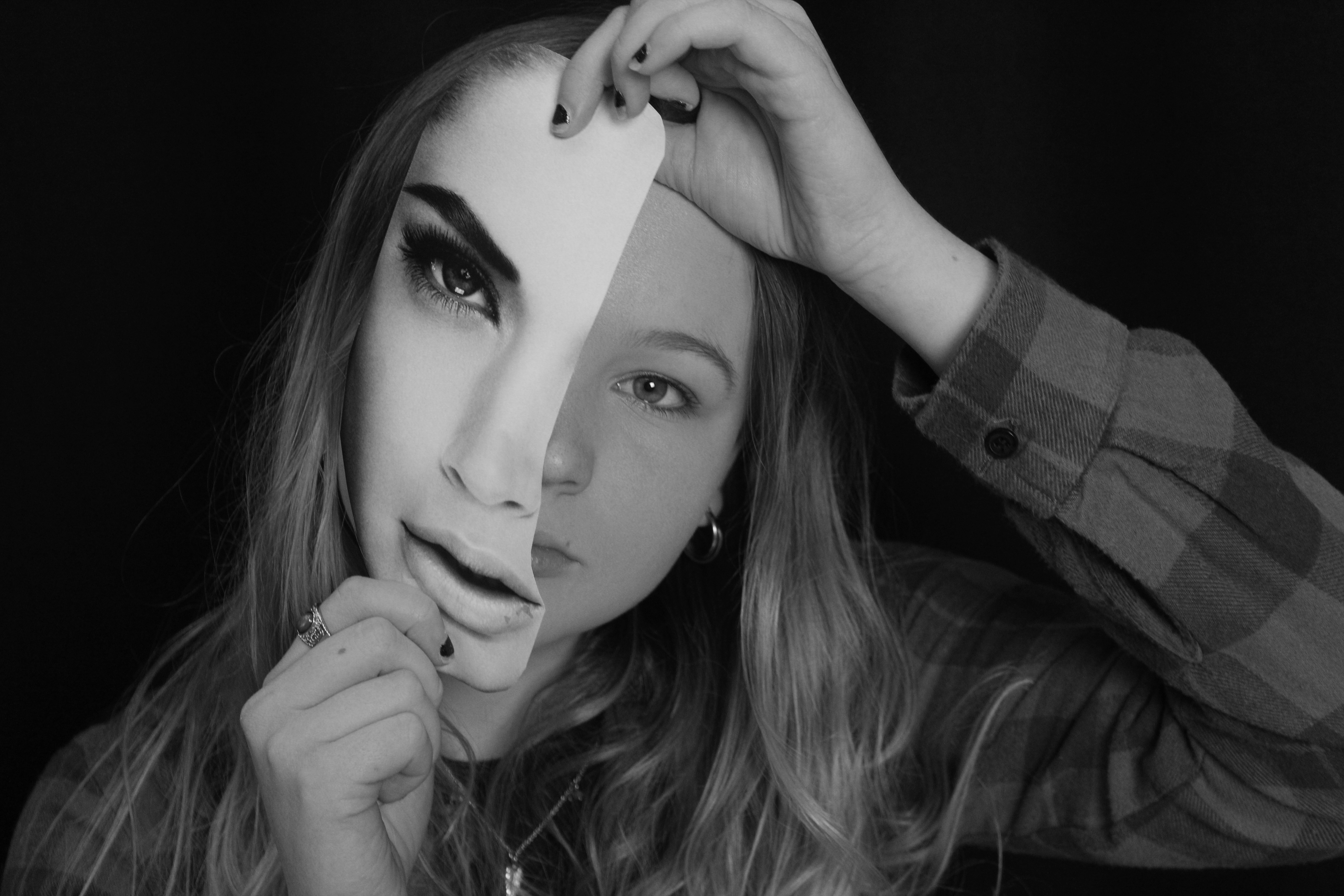
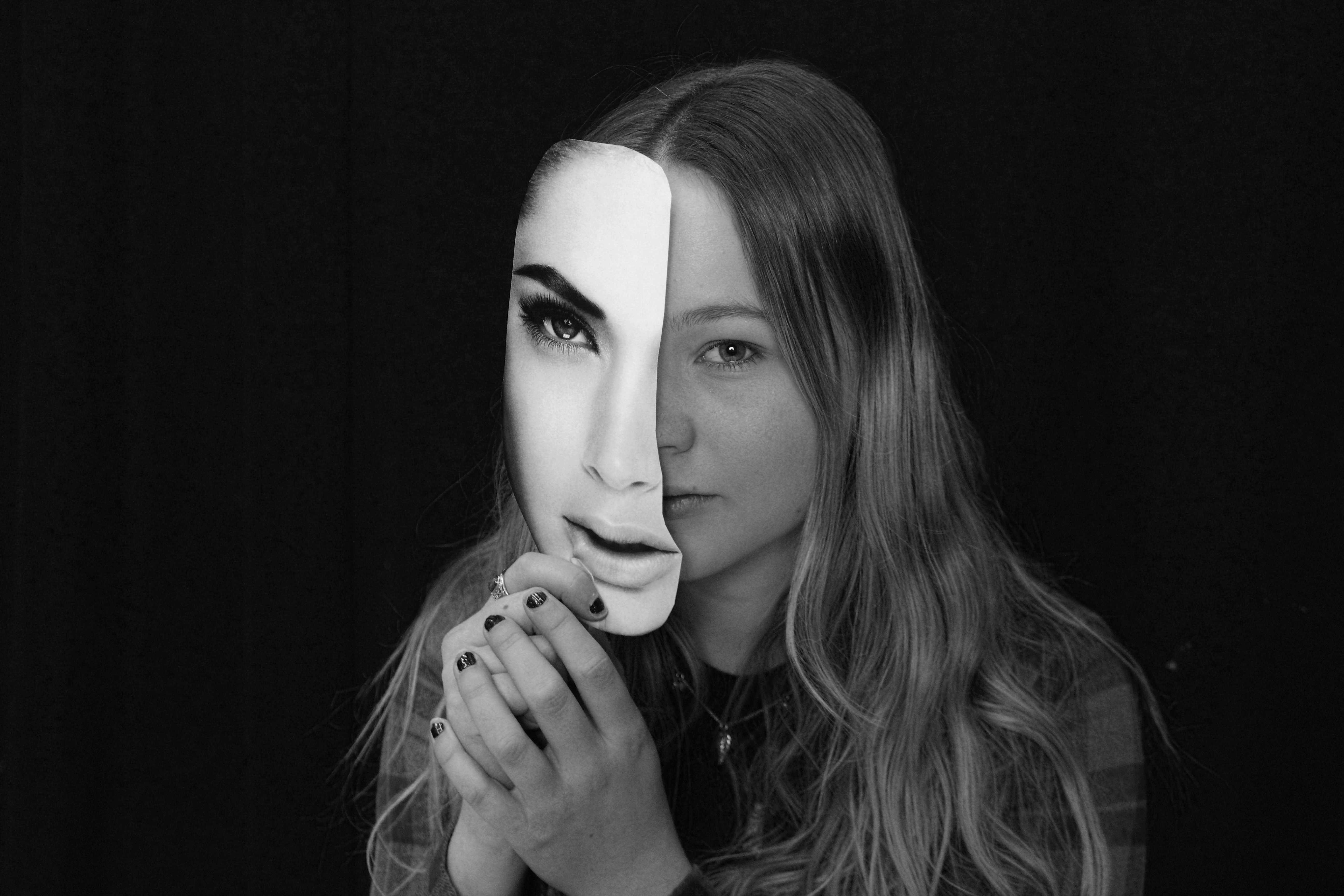
To edit these images i turned them black and white and increased the contrast to make the magazine cut out stand out even more compared to the subjects face. Doing this highlights the cutout and emphasises the shadow between the face and the paper creating a mask-like effect (especially on the 3rd image) and creates a clear division between the two. I decided for my final images to be in black and white as i did not want them to look over edited and too unnatural. I think I did a good interpretation of Bruno Metra and Laurence Jeanson photography linking to the visual juxtaposition between everyday humans and the images seen in advertisements and their exploration of identity.
To complete the unit successfully you must complete all tasks as per blog instructions :
Final images, analysis, compare and contrast, and evaluation to be published.