My third and final shoot will be a projection of colors and lights all over the body and face.
aim:To show a conceptual insulation of color and personality and a vulnerability of exposure to express within themselves,also the contradicting blend of themselves hidden within the background of the piece itself.
edits:
1)To show a vibrancy and blending of colors
2)Transparent sheet with paint to show levels and abstract sense of movement.
3)A blur of movement added.

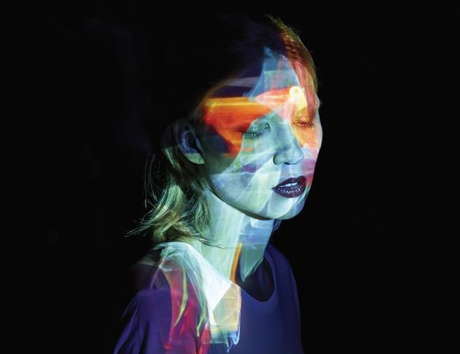
These two ideas of projection ideas allow a vast amount of abstract color and also patterns to form a sense of structure,I chose this because of the vibrancy and how it could possibly be used to reflect a persona of personality within the images themselves.This idea could also be furthered to cover and or hide the persona within the light,this can be used to present the destructive idea that they are not seen or perhaps the environment surrounding them is always moving and creative and they themselves are purely an observer.
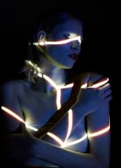
This idea is highly surrounding more structure and form,much like my previous artists it suggests rope and being tied and constricted not knowing of how they are and or made it be,furthermore the structure highlights and enhance certain specific arts of the face itself. These pieces also always have an interesting angle to the piece itself,to further presents and over exaggerate the use of the light,this is interesting because the position being highly centered and not free connotes their body attitude and as low sense of esteem. 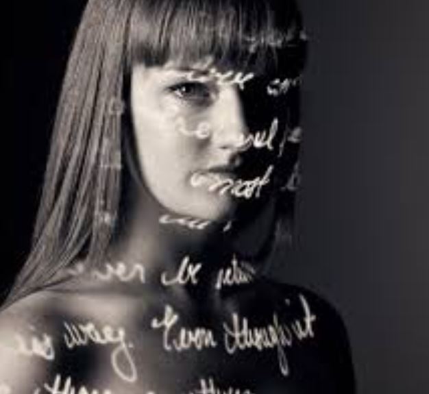
This idea allows writing that symbolizes the persona and what they the,selves inside are feeling,this suggests their suffering and journey as to what they are going throughout,this can also be used to develop more tonal work within the portrait.
An additional artist who uses the projection technique was: by Lee Kirby. who’s project is called ‘pro-ject’ and is clearly surrounding that of projection onto the body,he was inspired throughout when he grew up to become a passionate painter, with large influences form his mother.he then continued to study fine art in Norwich ,
His way of working has always interested me, creating a painting that resembles a photograph. Richter focuses on photographic techniques when painting, even down to how photographic paper has a sheen to it, which he uses in his work.After finishing a Fine Art degree I started to study photography. Three years ago I had the idea to try and work like my hero Richter but in reverse, this is when Pro-ject was born.
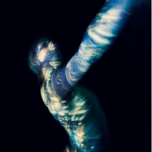
within this image I really love the The composition of all of the images, the colours used, the placement, everything. You get a real sense of movement and emotion when you look at these images even though you do not know exactly what they are trying to represent, through the composition, body language and imagery projected, you get an idea.I was inspired by the way in which he uses light and creating the movements within the piece itself,it shows a hidden figure that is usual’s moving in a highly creative format perhaps trying to leave the lack of identity that they are currently within.This is my favorite image due to the blurred movement,and also how the color is so vibrant and how this presents the idea to be freeing but still unable to see a face.The color only attaching to the body and not the background is also interesting because it allows a direct contact and vision of the project purely surrounding the human form and lack of it.
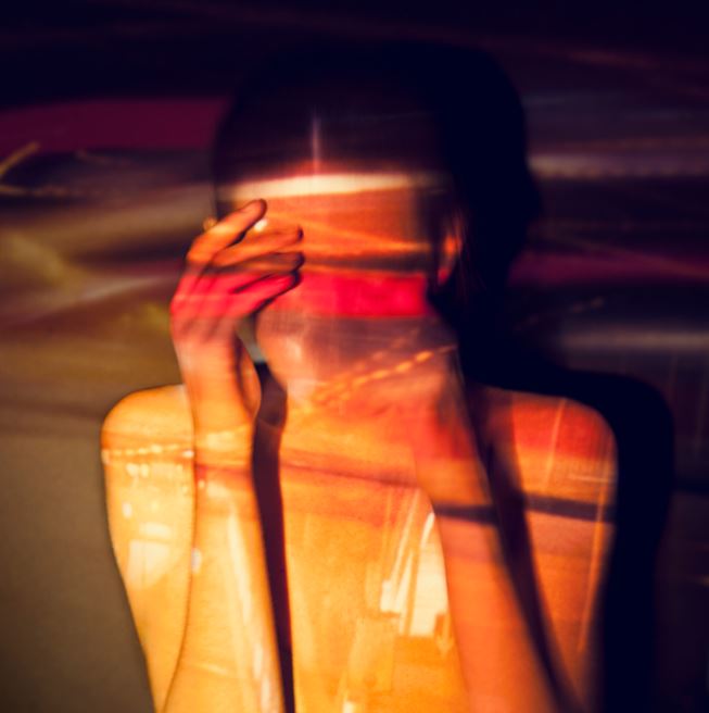
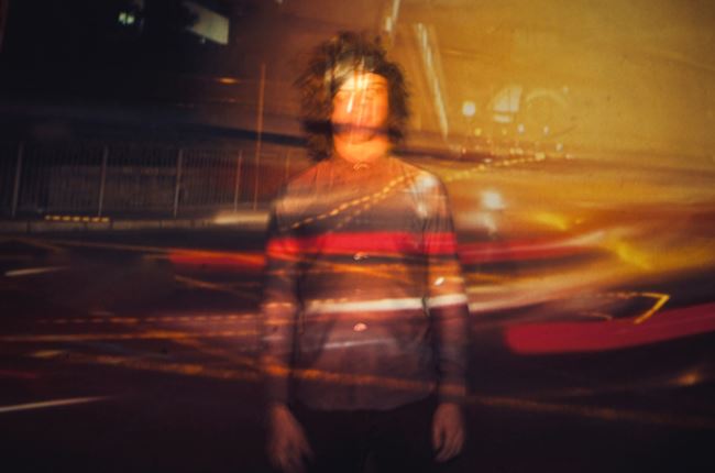
These images are very inspired by cars and a slow shutter speed attracting light shown over the top of the persona to symbolize how they are always ignored and again showing the technique of blending him into the background of the piece itself.
So overall I want to experiment within the lighting to cover everything and then develop it to form the conceptual concepts of illuminating a persona underneath and such.
best images:

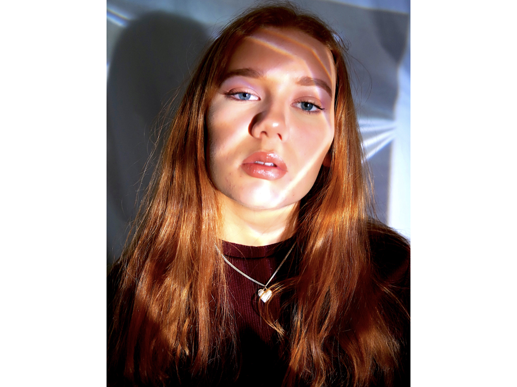
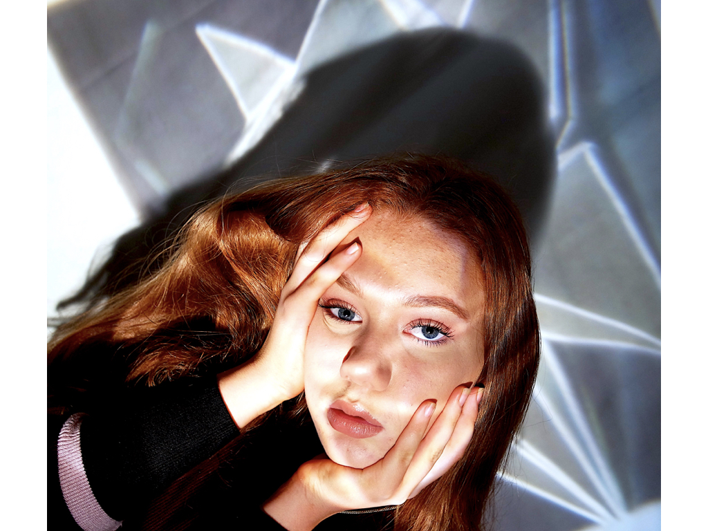


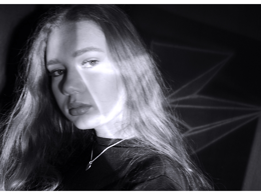
For this section I used an image of a strong vibrant 3d shape in order to successfully show highlight so lines segregating the face into pieces, used to symbolises either e rope of constraint or a sense of dazed confusion and categorising of people.


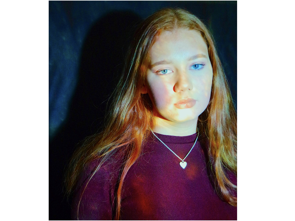
For these images I used a vibrant sheet of paper in order to show an almost space theme of colour over the face,This reflects a vibrant persona to which they do not share with anyone or how the space is used to denote a vast mass of unused space so showing a lack of knowledge as to what their identity really is.


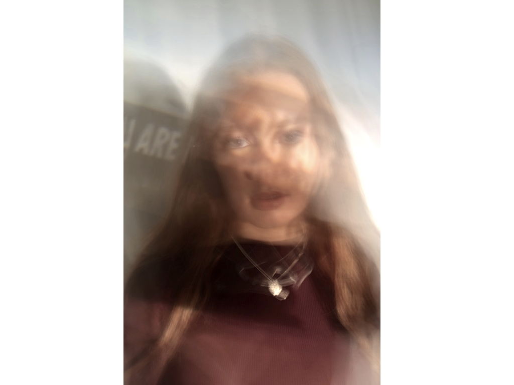
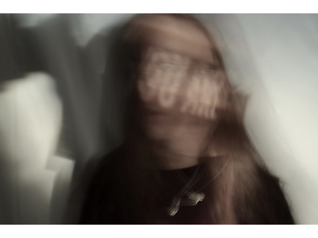
Here I wanted to show a reflection go insecurity that the person has, covering thecae with negative wording of what she describes herself as, this was ‘you are my own’ and ‘breath’ it reflects an insularity of who they are, but in addition also within the slow shutter speed shows a confusion with only a four on the words and not accurately who she is.


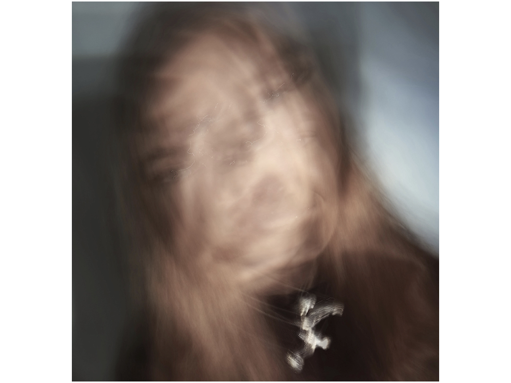
for this area I had a large spiral effect that I thought would be further edited by the idea of a slow shutter speed, it shows a reaching out movement that has a strong colour showing a reflection of struggle and also, faces continually overlapping and moving showing an act of confusion of identity and lack of self worth.
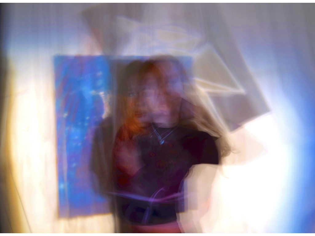

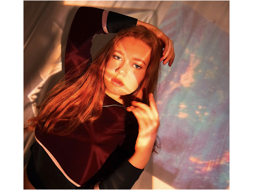
For these images I used a mixture of multiple backgrounds to exaggerate light and colour at the same time,with the first image I wanted to show a sense of frustration and display how she is unhappy and capture many forms of herself to show the side she shows to people and then who she is. the second sheets highlight a warmth and also a clear direct view of the person and almost an evolution of who she is.
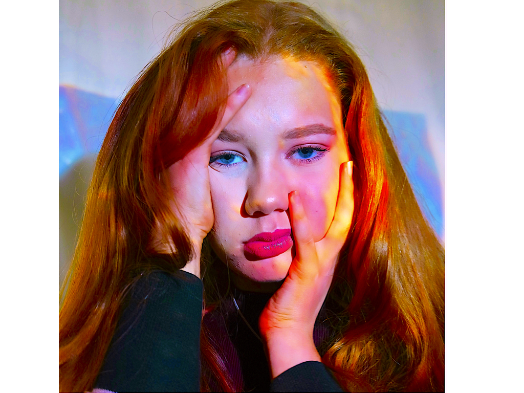
I edited this image by furthering the colour and making it more variant and circulated into specific areas.The composition of her grabbing her face also allows her grabbing onto the aspect of space within herself. 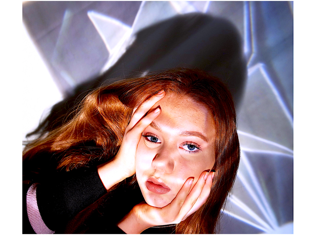
This image I chose because it has an interesting compassion and angle it shows due to the camera being onto that she has less authority and is controlled,the segregating lines also show a sense of being trapped ad contained into aspects that ‘create’ herself.
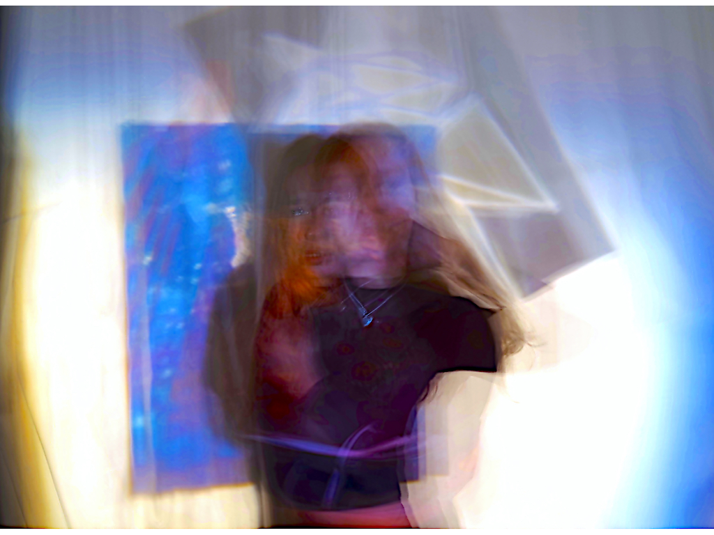
I chose this image because you can see an emotion and a struggle within the images, there are multiple attitudes and beings in the image and you can see a focused sense of movement and also colour.
within all the previous three images I edited them by enhancing the contrast and adding more structure to allow more detail within the images. 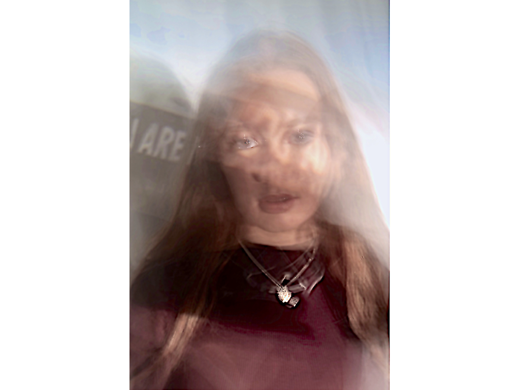
lastly I chose this image because I liked how there is a clear focus on the face but then a distorted amount of wording over it again reflecting what she thinks of herself is overly too important, furthermore that is also a clear focus on the words next to the image itself,which cause a change of focusing dynamic composition. 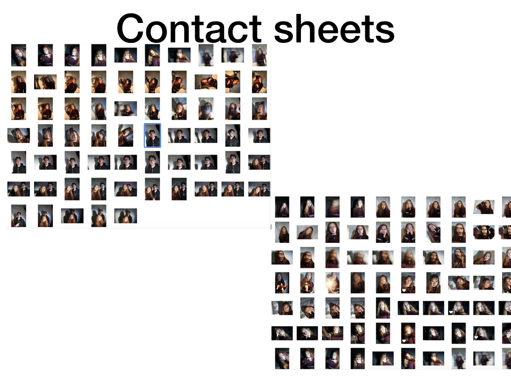
Overall this shoot was a different way in which to capture loss of identity ink a slightly more colourful and perhaps positive way.Although I do think theses themes are quite far and I do not more applicable photoshoots and colours theatre less related to abstraction.
