
Identity, ideas and influences:
when I hear the word identity I instantly think of visuals, a passport picture for example which clearly shows a persons information and formal identity. however a persons identity can be much more than this, it could include their past or life experiences. people can change or hide their true identity for many reasons such as self doubt or the pressure of society. i am interested in the visual side of identity for part of this project because i think it is so relevant in modern culture. people often change what they look like due to idealistic expectation and in a world where looks mean so much no wonder there are problems. stereotyping can also link to this idea of identity in the sense of nationality, we assume so much about people from their looks. I think this is an interesting area to focus my photography on because it is so versatile yet extremely relevant.
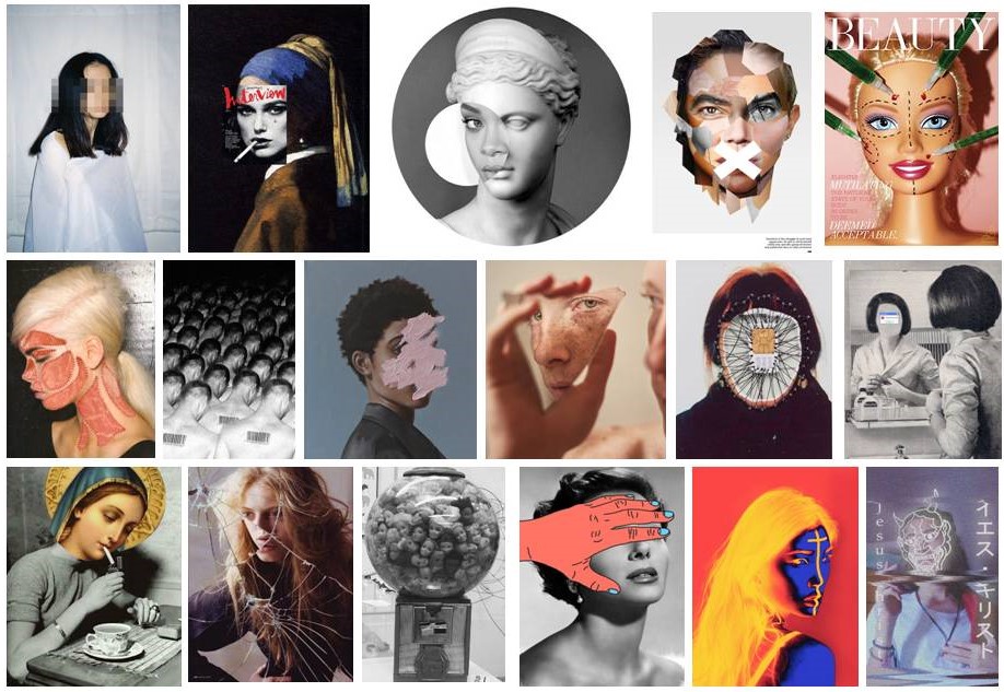
Visual Influences:
Daily Archives: November 23, 2017
Filters
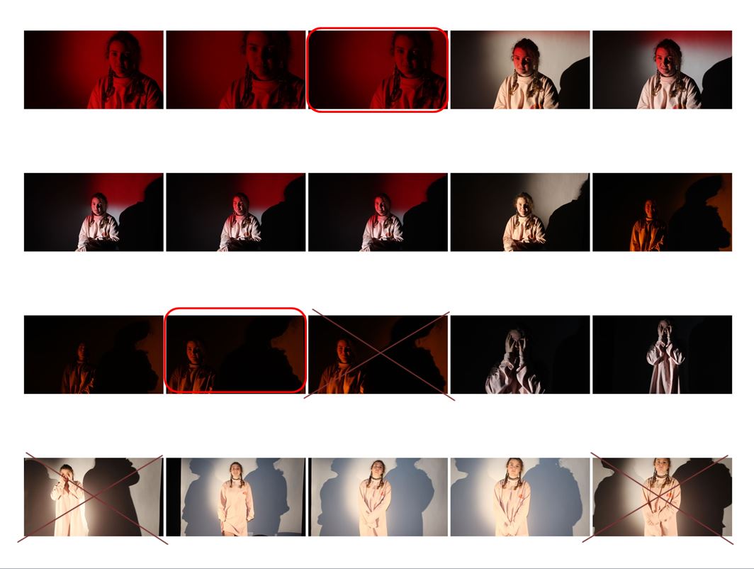
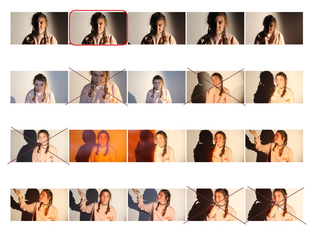
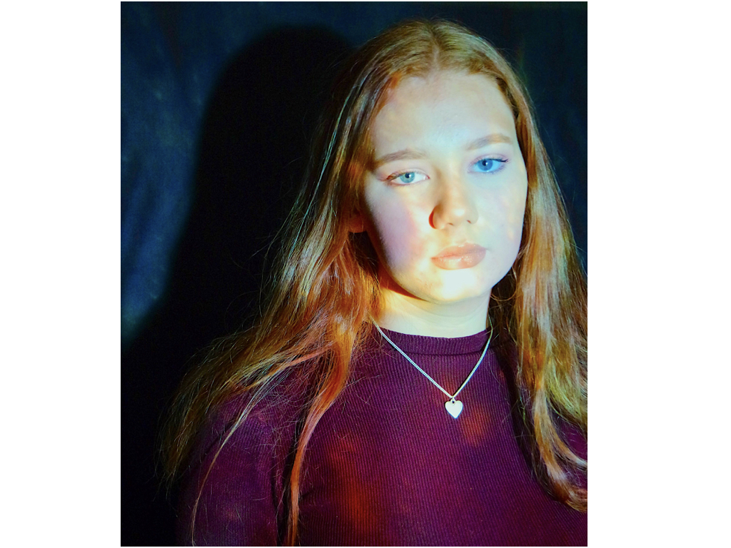
Studio Lighting | Response
My Studio Portraits

Edits
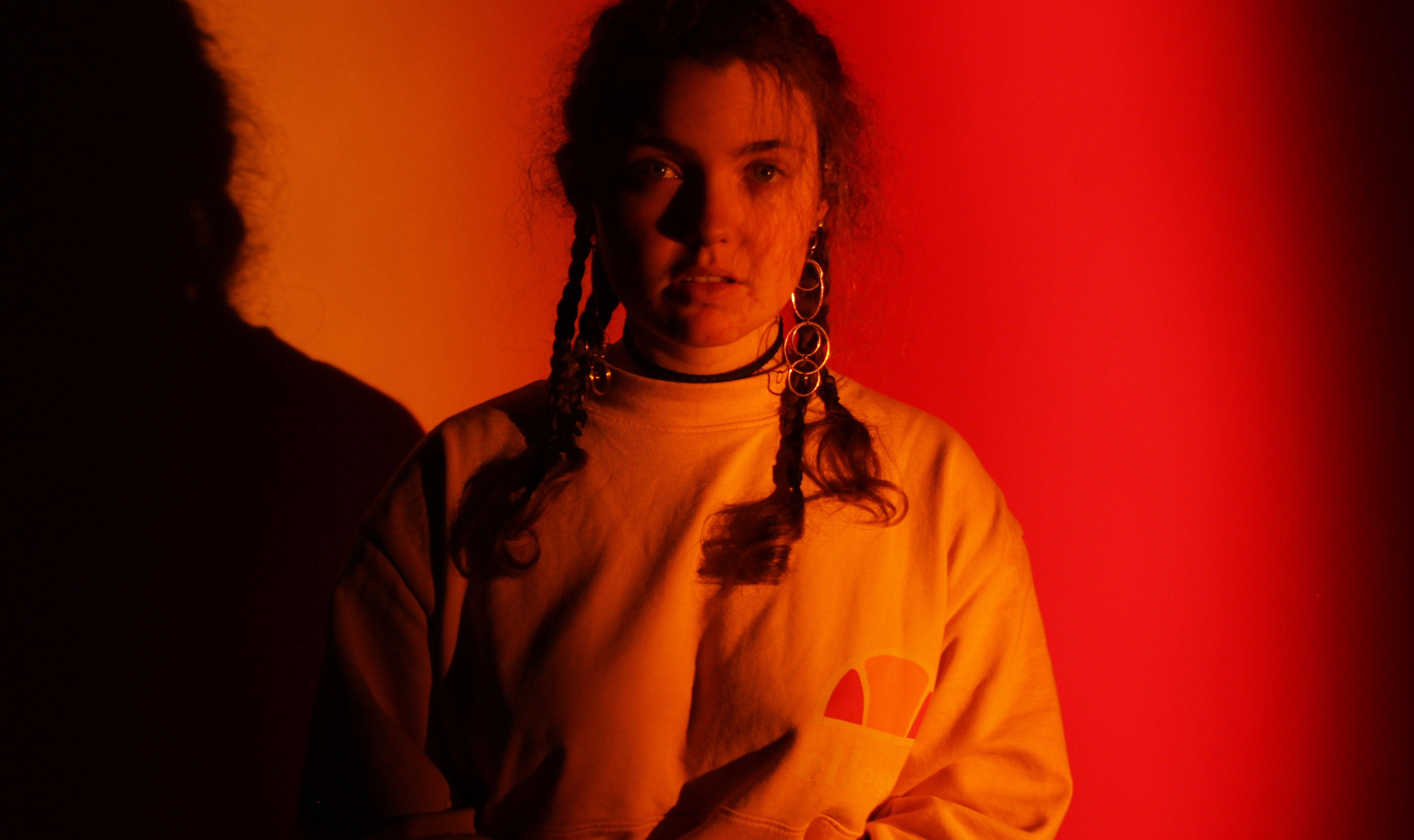
For this image, I got someone to hold the red and orange gels on either side of the light. I did not use the softbox as I did not want the light to be diffused, and felt a harsher spotlight would allow for nice shadows. When editing, I cropped the image a little bit on either side and increased the brightness to 45 on Photoshop to give more vibrance to the colour.
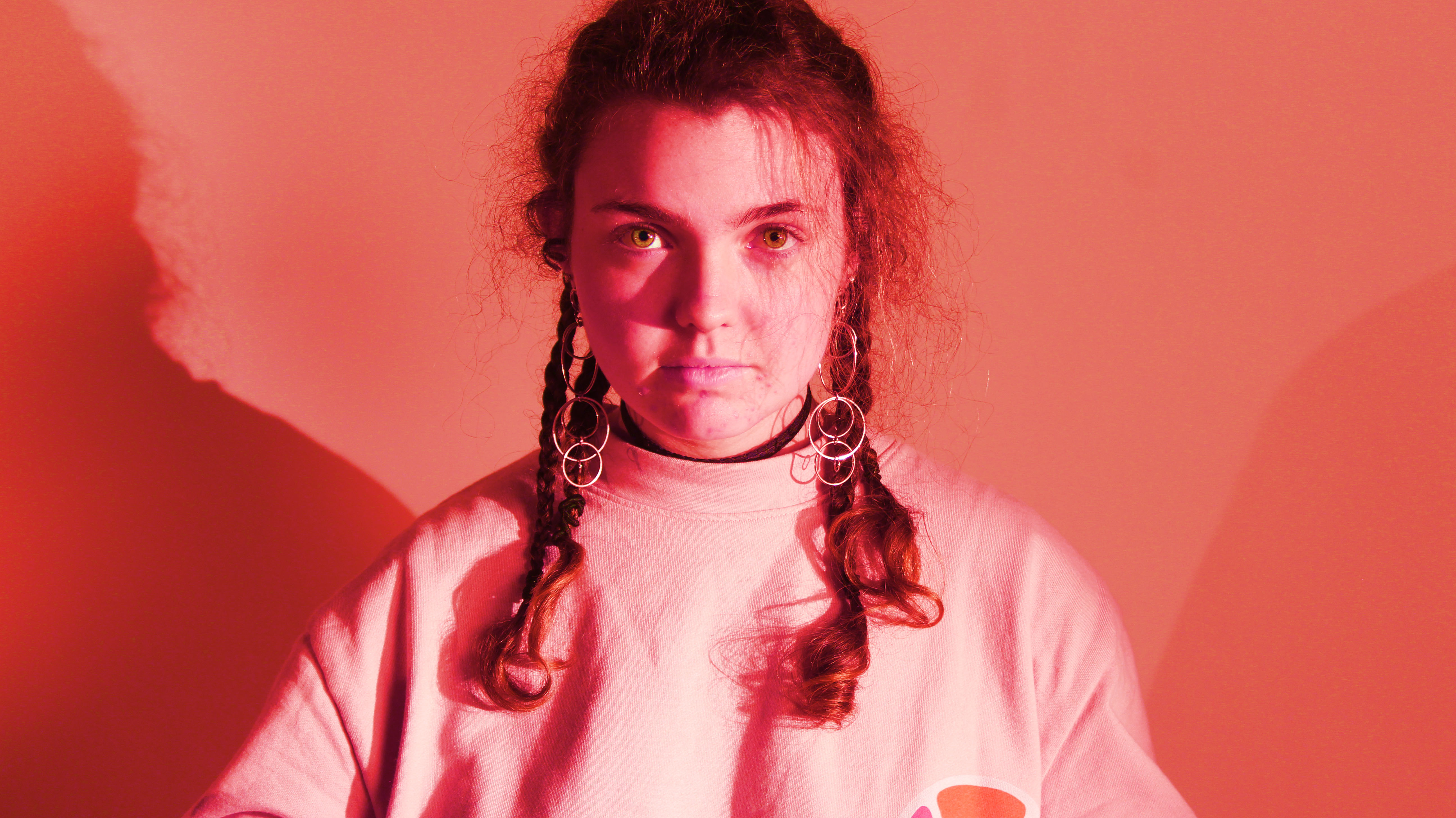
This image I used the softbox so that the light was more even throughout the photo, however I also placed spotlights on both sides of the subject to give some shadow. In Photoshop, I altered the hue to -33, and increased the saturation to 100 to make the colour more powerful.


For the above 2 images, I placed only one spotlight on one side of the subject so that half their face was lit up and the other half was not.
I reduced the saturation for both images so that they were black and white, then increased the brightness to 74 in the first image and decreased it to -88 in the second image. I also adjusted the contrast to 44 in the second image.
RANKIN
John Rankin
John Rankin Waddell was born in 1966 and is known under his working name as Rankin. He is a British portrait and fashion photographer.
Rankin attended Thirsk school and sixth form collage. Whilst studying accounting at Brighton Polytechnic, he realized that his interests lay elsewhere and dropped out, taking up the study of photography at Barnfield College Luton and then London collage of printing. During this time, Rankin met Jefferson Hack, with whom he formed a working relationship. In 1992, the two decided to start a magazine together called Dazed and Confused after they graduated.
In December 2000 Rankin launched his own quarterly fashion magazine, Rank. He also publishes another magazine called, Another Man and more recently Hunger, biannual fashion and lifestyle magazine and website.
In addition, Rankin has donated his services to publicity campaigns for the charitable organisation Women’s Aid, providing photographs for use in the Whats it going to take? and Valentine’s Day campaigns


I like the way in which Rankin incorporates a sense of color and vibrancy within his photographs to add a fun and interesting vibe into his studio photographs. This is different and in my opinion more interesting than the typical studio photographs which have little expression and often are in black and white. Rankin ensures that within every photograph the model displays an interesting facial expression to create a story and a realistic view of their personality. The use of painting upon the face of the models brings a sense of individuality and creativity to reflect the unique personalities of the people. I believe Rankin’s photos are trying to portray the fact that we need to be different and its good to be unique. In a world of clones, Rankin has noticed this and is demonstrating how it should be through his photographs.
Tableau Portraiture
Tableau vivant , French for 'living picture', is a style of artistic presentation, often shortened to simply tableau. It most often describes a group of suitably costumed actors, carefully posed and often theatrically lit. By extension, it also applied to works of visual art including painting, photography and sculpture, featuring artists' models in similar arrangements, a style used frequently in the works of the Romantic, Aesthetic, Symbolist, Pre-Raphaelite, and Art Nouveau movements. Jean-François Chevrier was the first to use the term tableau in relation to a form of art photography, which began in the 1970s and 1980s in an essay titled "The Adventures of the Picture Form in the History of Photography" in 1989. The key characteristics of the contemporary photographic tableau according to Chevrier are, firstly: "They are designed and produced for the wall. summoning a confrontational experience on the part of the spectator that sharply contrasts with the habitual processes of appropriation and projection whereby photographic images are normally received and "consumed".

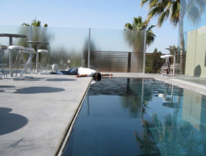
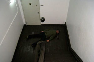
The Dead Photos
http://thedeadphotos.com/index/

“The Dead Photos”, an on-going series by Tom Phillips. Featuring a set up scene of a dead man in multiple locations all over the world, since 2007 over 50 images have been uploaded to the series website, which is linked above.


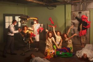
Final shoot:Projection onto body;final images and development
My third and final shoot will be a projection of colors and lights all over the body and face.
aim:To show a conceptual insulation of color and personality and a vulnerability of exposure to express within themselves,also the contradicting blend of themselves hidden within the background of the piece itself.
edits:
1)To show a vibrancy and blending of colors
2)Transparent sheet with paint to show levels and abstract sense of movement.
3)A blur of movement added.

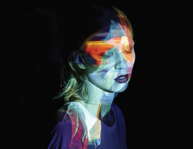
These two ideas of projection ideas allow a vast amount of abstract color and also patterns to form a sense of structure,I chose this because of the vibrancy and how it could possibly be used to reflect a persona of personality within the images themselves.This idea could also be furthered to cover and or hide the persona within the light,this can be used to present the destructive idea that they are not seen or perhaps the environment surrounding them is always moving and creative and they themselves are purely an observer.
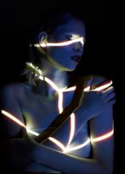
This idea is highly surrounding more structure and form,much like my previous artists it suggests rope and being tied and constricted not knowing of how they are and or made it be,furthermore the structure highlights and enhance certain specific arts of the face itself. These pieces also always have an interesting angle to the piece itself,to further presents and over exaggerate the use of the light,this is interesting because the position being highly centered and not free connotes their body attitude and as low sense of esteem. 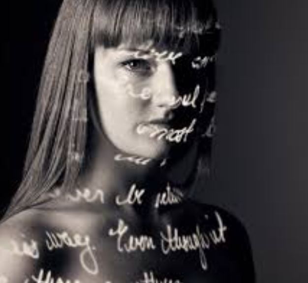
This idea allows writing that symbolizes the persona and what they the,selves inside are feeling,this suggests their suffering and journey as to what they are going throughout,this can also be used to develop more tonal work within the portrait.
An additional artist who uses the projection technique was: by Lee Kirby. who’s project is called ‘pro-ject’ and is clearly surrounding that of projection onto the body,he was inspired throughout when he grew up to become a passionate painter, with large influences form his mother.he then continued to study fine art in Norwich ,
His way of working has always interested me, creating a painting that resembles a photograph. Richter focuses on photographic techniques when painting, even down to how photographic paper has a sheen to it, which he uses in his work.After finishing a Fine Art degree I started to study photography. Three years ago I had the idea to try and work like my hero Richter but in reverse, this is when Pro-ject was born.
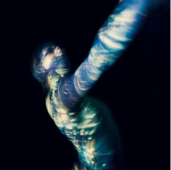
within this image I really love the The composition of all of the images, the colours used, the placement, everything. You get a real sense of movement and emotion when you look at these images even though you do not know exactly what they are trying to represent, through the composition, body language and imagery projected, you get an idea.I was inspired by the way in which he uses light and creating the movements within the piece itself,it shows a hidden figure that is usual’s moving in a highly creative format perhaps trying to leave the lack of identity that they are currently within.This is my favorite image due to the blurred movement,and also how the color is so vibrant and how this presents the idea to be freeing but still unable to see a face.The color only attaching to the body and not the background is also interesting because it allows a direct contact and vision of the project purely surrounding the human form and lack of it.
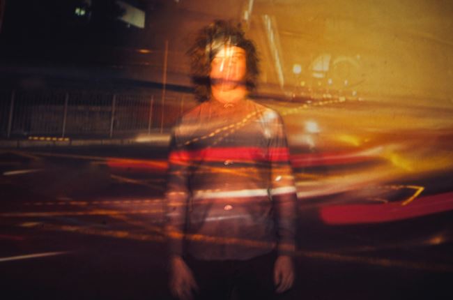
These images are very inspired by cars and a slow shutter speed attracting light shown over the top of the persona to symbolize how they are always ignored and again showing the technique of blending him into the background of the piece itself.
So overall I want to experiment within the lighting to cover everything and then develop it to form the conceptual concepts of illuminating a persona underneath and such.
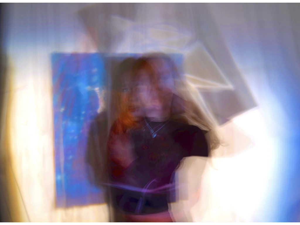
best images:

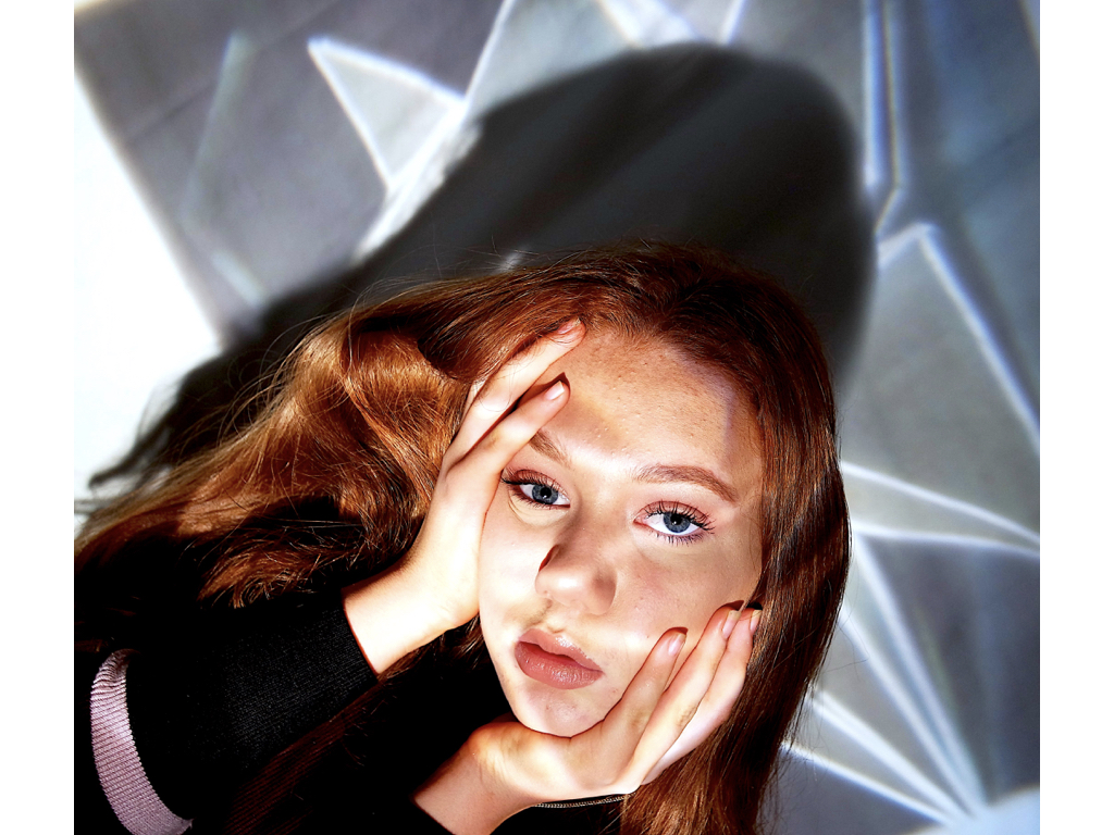


For this section I used an image of a strong vibrant 3d shape in order to successfully show highlight so lines segregating the face into pieces, used to symbolises either e rope of constraint or a sense of dazed confusion and categorising of people.


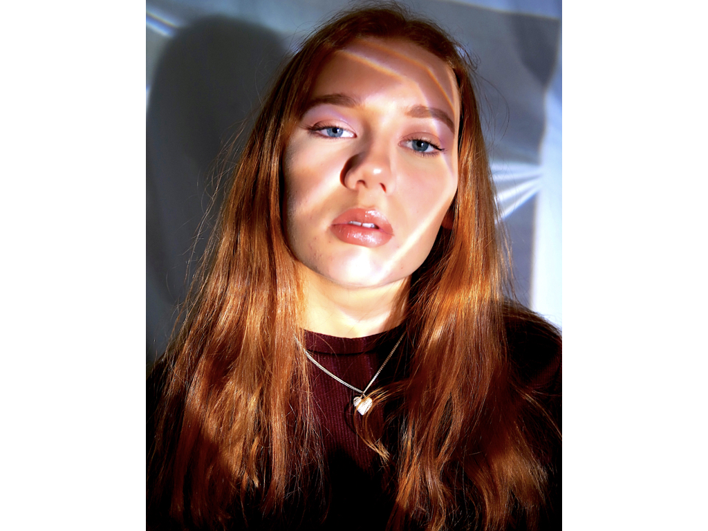
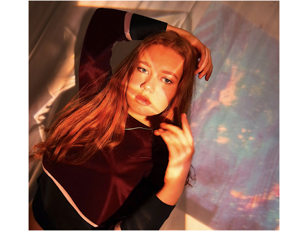
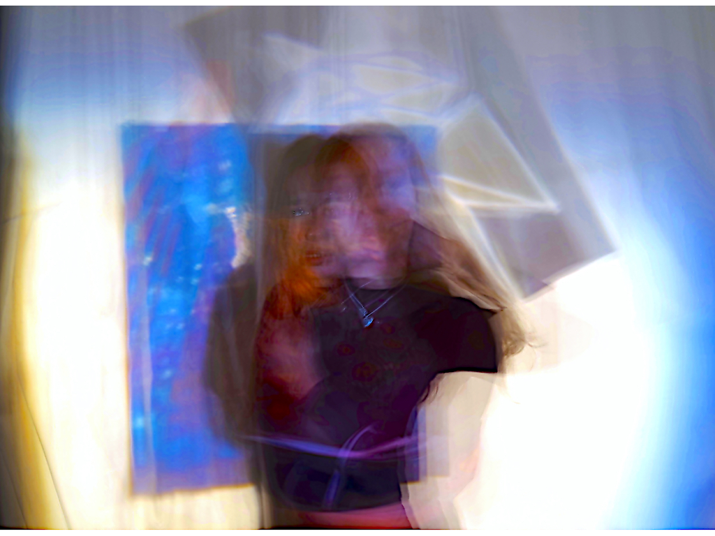
For these images I used a vibrant sheet of paper in order to show an almost space theme of colour over the face,This reflects a vibrant persona to which they do not share with anyone or how the space is used to denote a vast mass of unused space so showing a lack of knowledge as to what their identity really is.


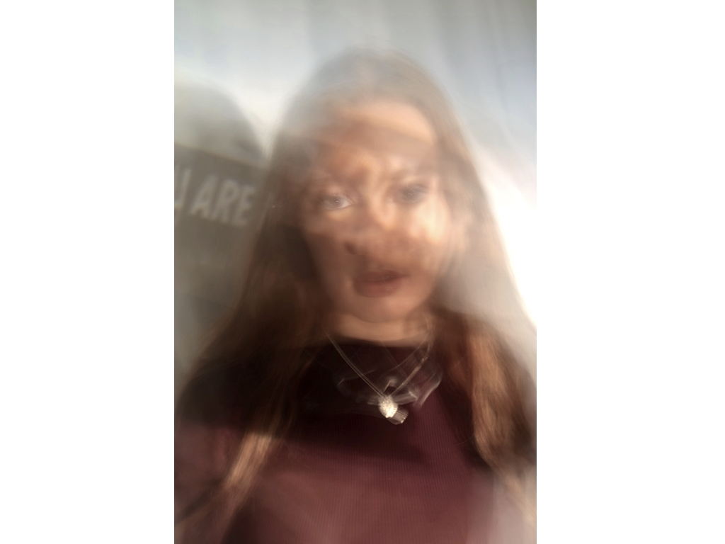
Here I wanted to show a reflection go insecurity that the person has, covering thecae with negative wording of what she describes herself as, this was ‘you are my own’ and ‘breath’ it reflects an insularity of who they are, but in addition also within the slow shutter speed shows a confusion with only a four on the words and not accurately who she is.


for this area I had a large spiral effect that I thought would be further edited by the idea of a slow shutter speed, it shows a reaching out movement that has a strong colour showing a reflection of struggle and also, faces continually overlapping and moving showing an act of confusion of identity and lack of self worth.

For these images I used a mixture of multiple backgrounds to exaggerate light and colour at the same time,with the first image I wanted to show a sense of frustration and display how she is unhappy and capture many forms of herself to show the side she shows to people and then who she is. the second sheets highlight a warmth and also a clear direct view of the person and almost an evolution of who she is.
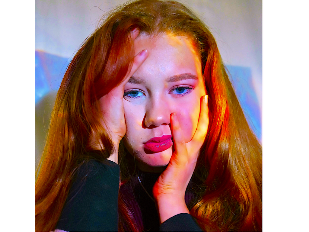
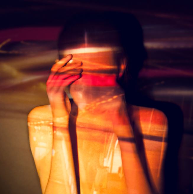
I edited this image by furthering the colour and making it more variant and circulated into specific areas.The composition of her grabbing her face also allows her grabbing onto the aspect of space within herself. 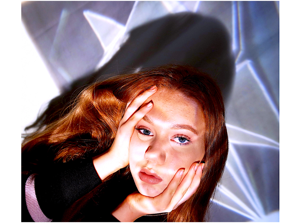
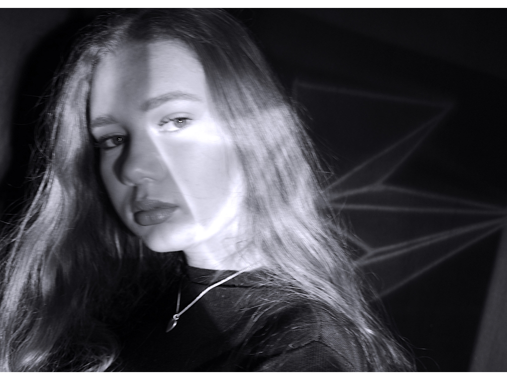
This image I chose because it has an interesting compassion and angle it shows due to the camera being onto that she has less authority and is controlled,the segregating lines also show a sense of being trapped ad contained into aspects that ‘create’ herself.
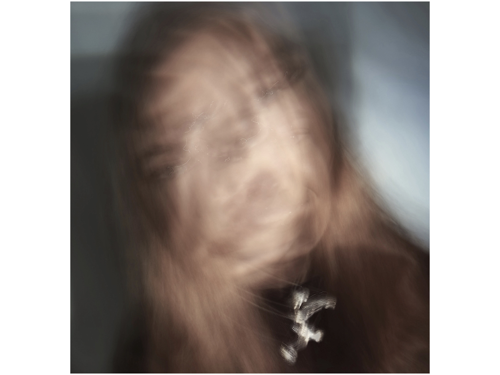
I chose this image because you can see an emotion and a struggle within the images, there are multiple attitudes and beings in the image and you can see a focused sense of movement and also colour.
within all the previous three images I edited them by enhancing the contrast and adding more structure to allow more detail within the images. 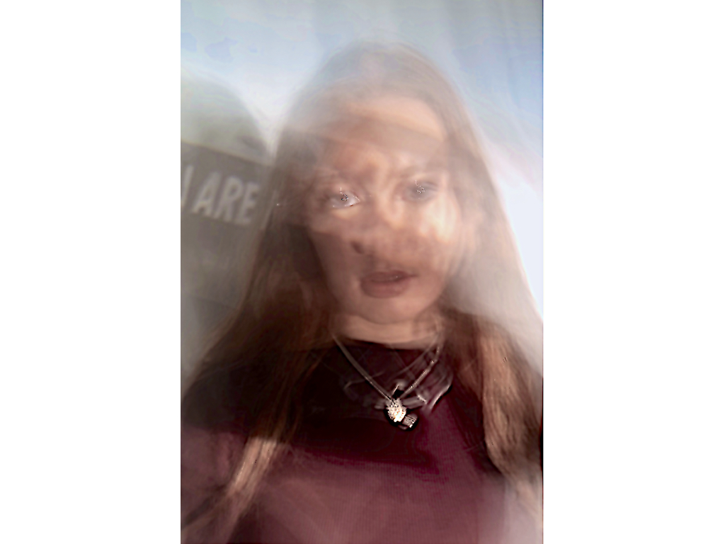
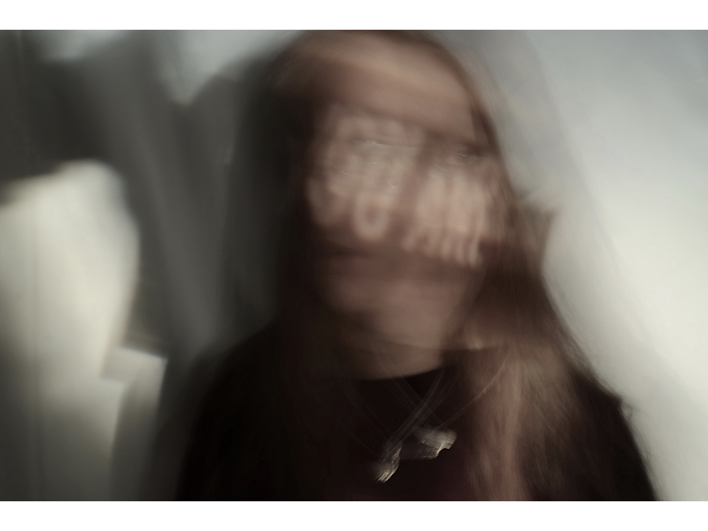
lastly I chose this image because I liked how there is a clear focus on the face but then a distorted amount of wording over it again reflecting what she thinks of herself is overly too important, furthermore that is also a clear focus on the words next to the image itself,which cause a change of focusing dynamic composition. 
Overall this shoot was a different way in which to capture loss of identity ink a slightly more colourful and perhaps positive way.Although I do think theses themes are quite far and I do not more applicable photoshoots and colours theatre less related to abstraction.