David Bailey And Rankin

David Bailey

David is considered on of the best pioneers of contemporary photography,he is credited with photoghing such compelling images whit the last 5 decades .he became famous when when making new generation models famous for many impresses roles in order to inspire critics.He is seen continually never failing to impress and captures Manu icon images within famous icons such as the Rolling Stone and Kate moss.although he has a simple style is does not lesson his large impact go tones that generate their own light and personality to the people themselves.

David Bailey was born in East London,to Herbert Bailey, a tailor’s cutter, and his wife, Sharon, a machinist. From the age of three he lived in East Ham. He enjoyed his dads more creative fashion of creating something with power and purpose that also helps define a person in a style in which they want. Although Bailey soon developed a more educational love for history in which led him into photoghy,despite suffering form dslyexia and school being a highly troubling time for himself, he seen attended a prestigious school in which they taught him the basics.His children all later in life have too be surrounding thmslevs in creative works this gene is seen to run whiten the family. 

He was soon contracted to be a fashion photogher for vogue magazine, and undertook many freelance work.he later became a swing photogher in order to cpature many celebrities photos due to them having a large self persona in which he could easily show throughout his own work.An unusual and unique commercial release. It reflected the changing status of the photographer that one could sell a collection of prints in this way. Strong objection to the presence of the Krays by fellow photographer, Lord Snowden, was the major reason no American edition of the “Box” was released, and that a second British edition was not issued.for his work he hs know won many awards,bsed upon excellence,and his work is now even seen within the partite gallery.

My favourite image anylsis:
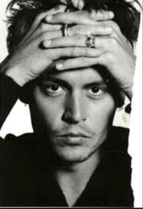
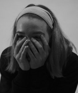
I then chose this image due to the dynamic range id dark and light contrasting tones that further the appearance of the structure upon his face, and also the dynamic and interposing composition of how the hands are placed and then how this forms an almost frame two the piece itself,allowing every tone and shape to work together effectively.

overall I would want to use his work of framing  and angles in order to exaggerate lighting  and reflect a personal theme to a piece.

Rankin

Rankin is a photogher and has been for around 20 years, he was training to be a lawyer but decided that he wanted to investigate more around the create side of photo journalism and soon moved to a more controlled studio photoshoots.he know has many class renowned books upon the illusion of photoghy and how you are able to also physically change an image with your own self creativity. he attendedLondon collage of painting with to him was his optimal of fine art and found that their fisilities unabated him to achieve great accounts of photoghy and inspire him fornhis future career.

He then met Jefferson Hack, with whom he formed a working relationship. In 1992, the two decided to start a magazine together called Dazed and Confused after they graduated, this magazine was inspired  by many studio shoots further developed into such interesting designs full of extraordinary  photography . he always donates many of his success from his work to charity such as the woman organisation,furthermore has work is known to have change fashion and how it is seen and also developed throughout his own work. he now has many biographies  and sometimes you are able to see him teaching young teens like himself when he started his photography journey.

Within his work he also wants to be able to capture interposing people within a vibrant personality and not be condoned to only working on shoots in which he is paid. rankin has such diversity within each photo, he chooses scenarios and angles with suit the persona of the subject and does not have a specific style inn hich he sticks to

my favourite image analysis:
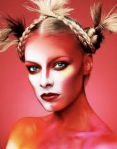
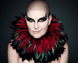
This image is a fashion based image in which he is trying to connote a-sense of unity of life throughout the vibrancy of the colours and ways inward which they are used to represented the darker tones but do not lessen the achievement of highlight within the image itself. the model herself is seen complimented by the colours and not overwhelmed in presents a personality of confidence which is suiting for a fashion magazine. furthermore her hair create a. juxtaposing raggedness that also highlights the darker red tones, this bring s an aspect of unity to the image. his conceptual thought foe this piece was a new intense side of beauty and how it can be shown in a large variety of ways in which I think he haw achieved.

From looking at his work I too would want to bring a sense of individuality and creativity,and not be compressed to a specific style of achievement. I think his work has such a large range of ideas and authenticity I could look at many different angles of colour and compoktionig that I would be inspired by his work.

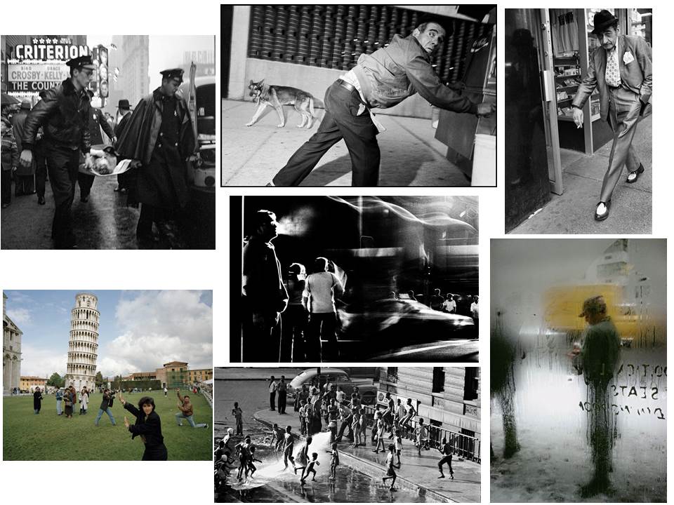
Henri Cartier-Bresson | Street Photography Homework 2

Henri Cartier-Bresson 

  • Henri Cartier-Bresson was born on August 22nd, 1908 and was a French humanist photographer considered a master of candid photography, and an early user of 35 mm film.
  • He pioneered the genre of street photography, and viewed photography as capturing a decisive moment. His work has influenced many photographers.
  • His father was a wealthy textile manufacturer, so Henri got the financial support he needed in order to pursue his photography ambition.
  • Henri was given his first camera by a man named Harry Crosby who convinced the commandment to release him into his custody from a House arrest for hunting without a licence. They both shared an interest for photography.
  • He died on August 3rd, 2004

Image Analysis

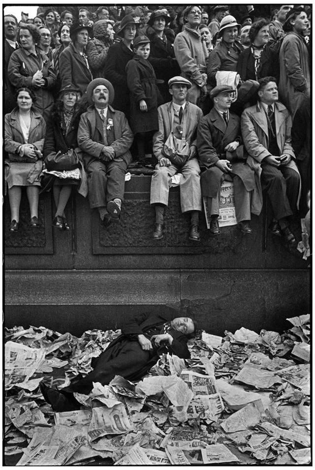
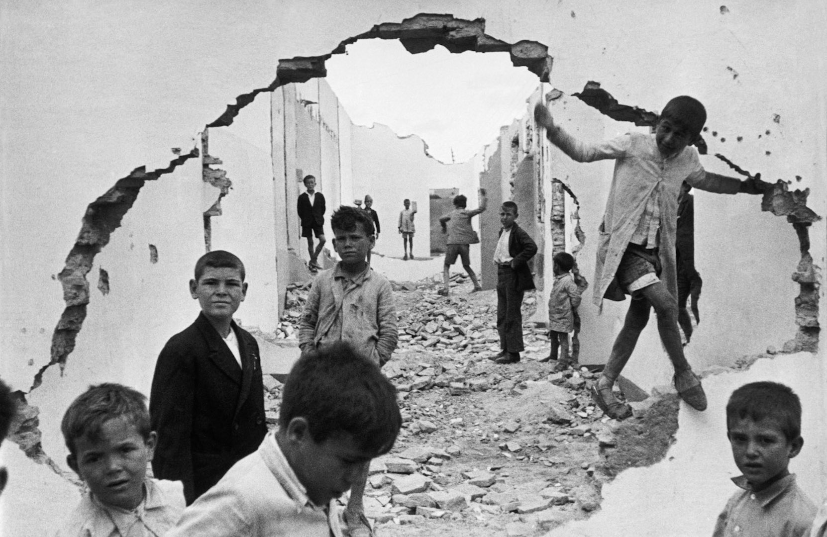
Technical: The image uses natural daylight to give a balanced tonal range that may consider it to be apart of the Ansel Adams Zone System.

The image appears to have used a wide lens and angle to allow for the majority of the image to be in focus, where it has a slight blur in the background. This also gives the whole image a feeling of stillness.

I believe it would have been taken with a fast shutter speed to capture the business of the street.

Visual: The image is presented in a Black and white 2D appearance. It is arranged to feature the repetition of the cattle.

Contextual: Cartier-Bresson was driven by a sociological impulse to India to convey the post-colonial development. He went at a turning point in his career as he had a “curiosity about what is going on in the world, a respect for what is going on and a desire to transcribe it visually.” The curiosity would drive a long career in photojournalism, for which his India trip was an apprenticeship.

My Images

Edits

I reduced the brightness to -40, and increased the contrast to 53.

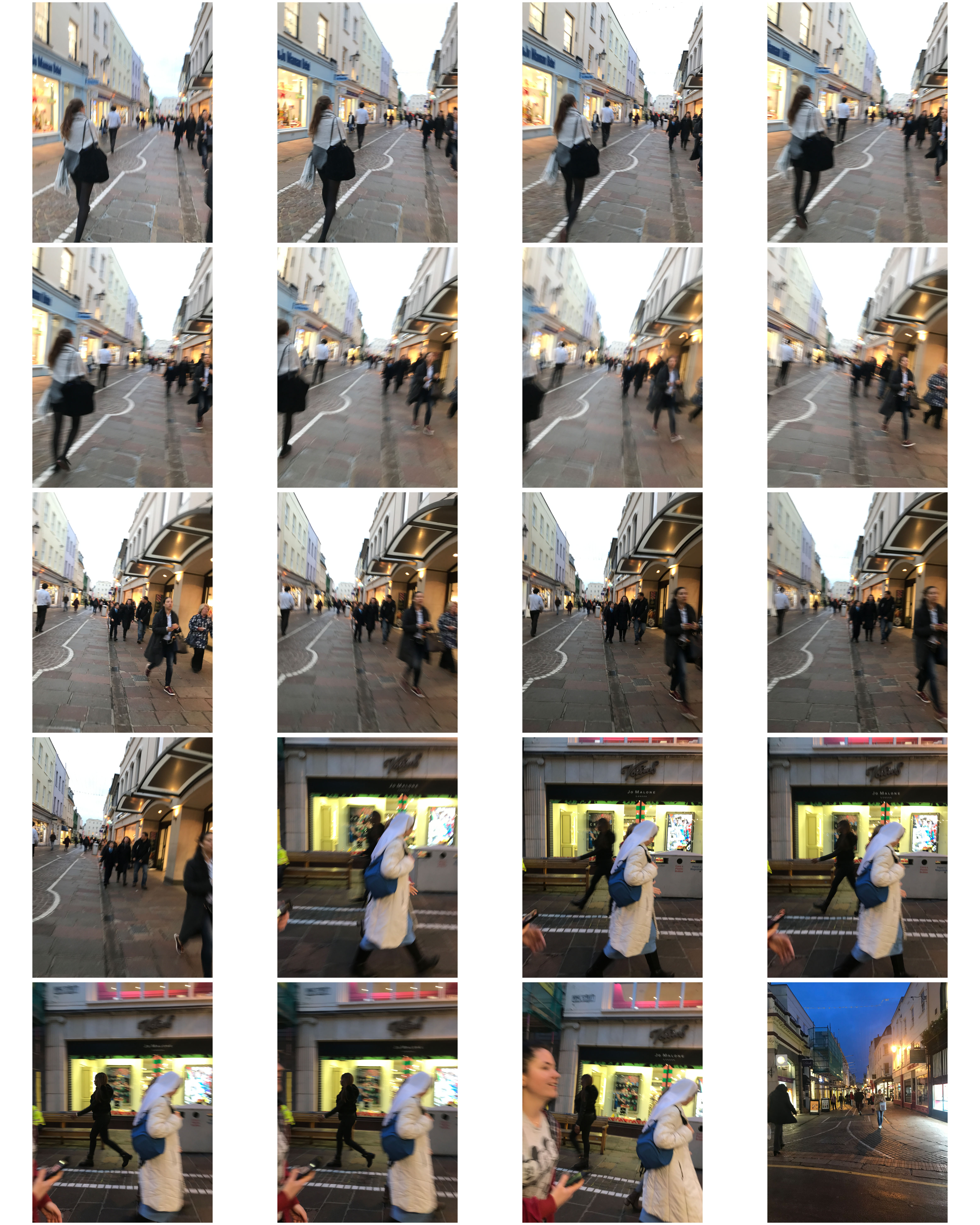
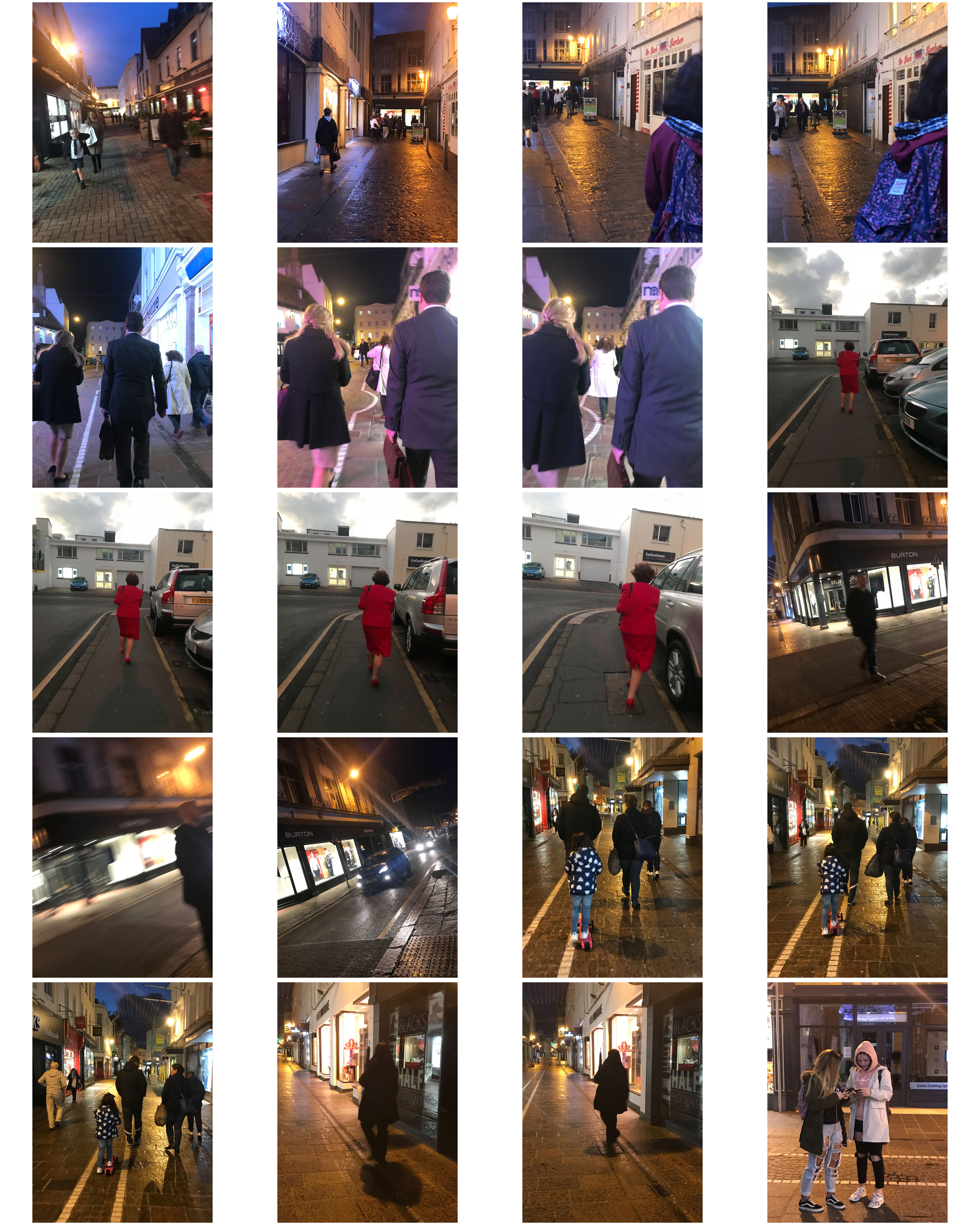
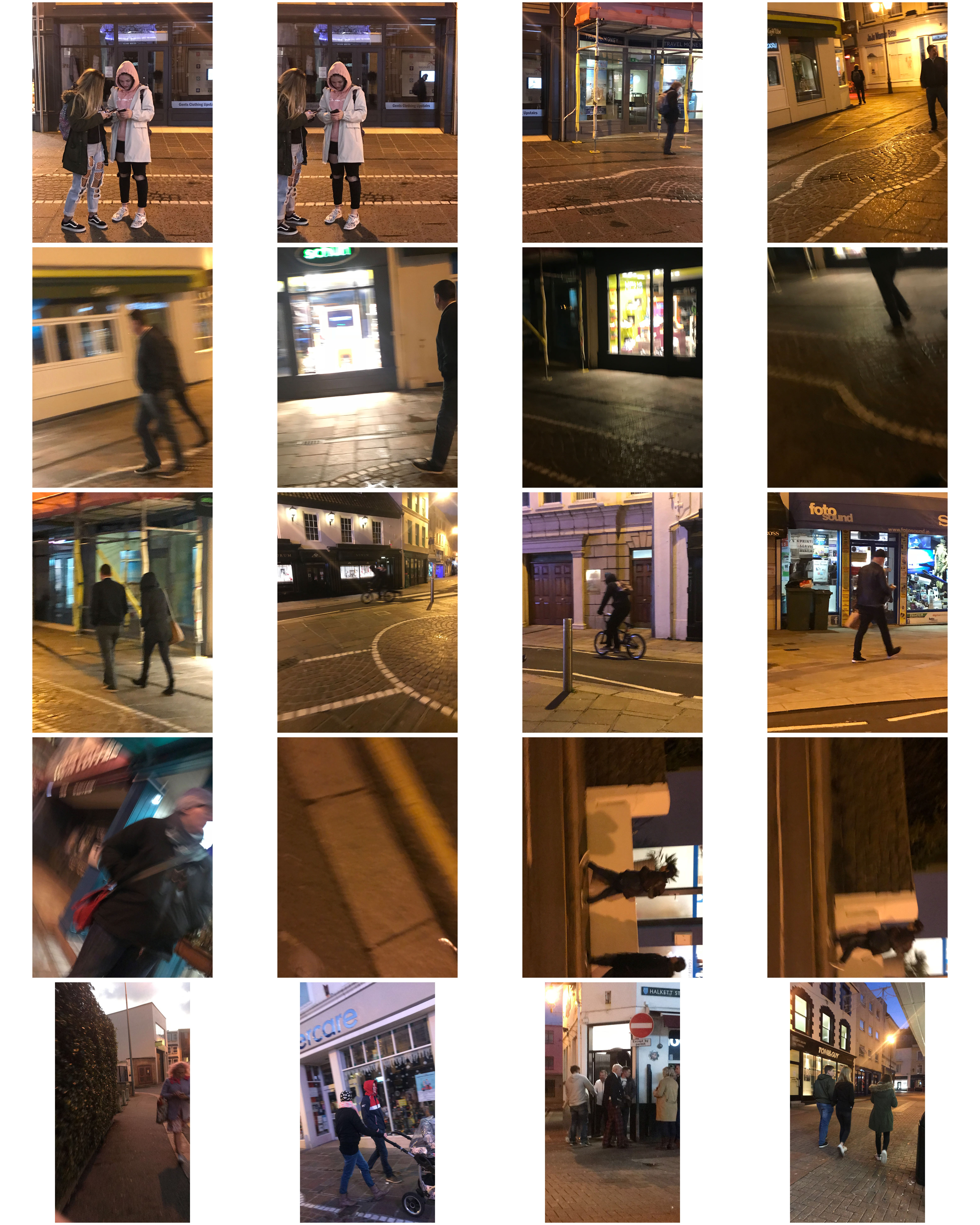
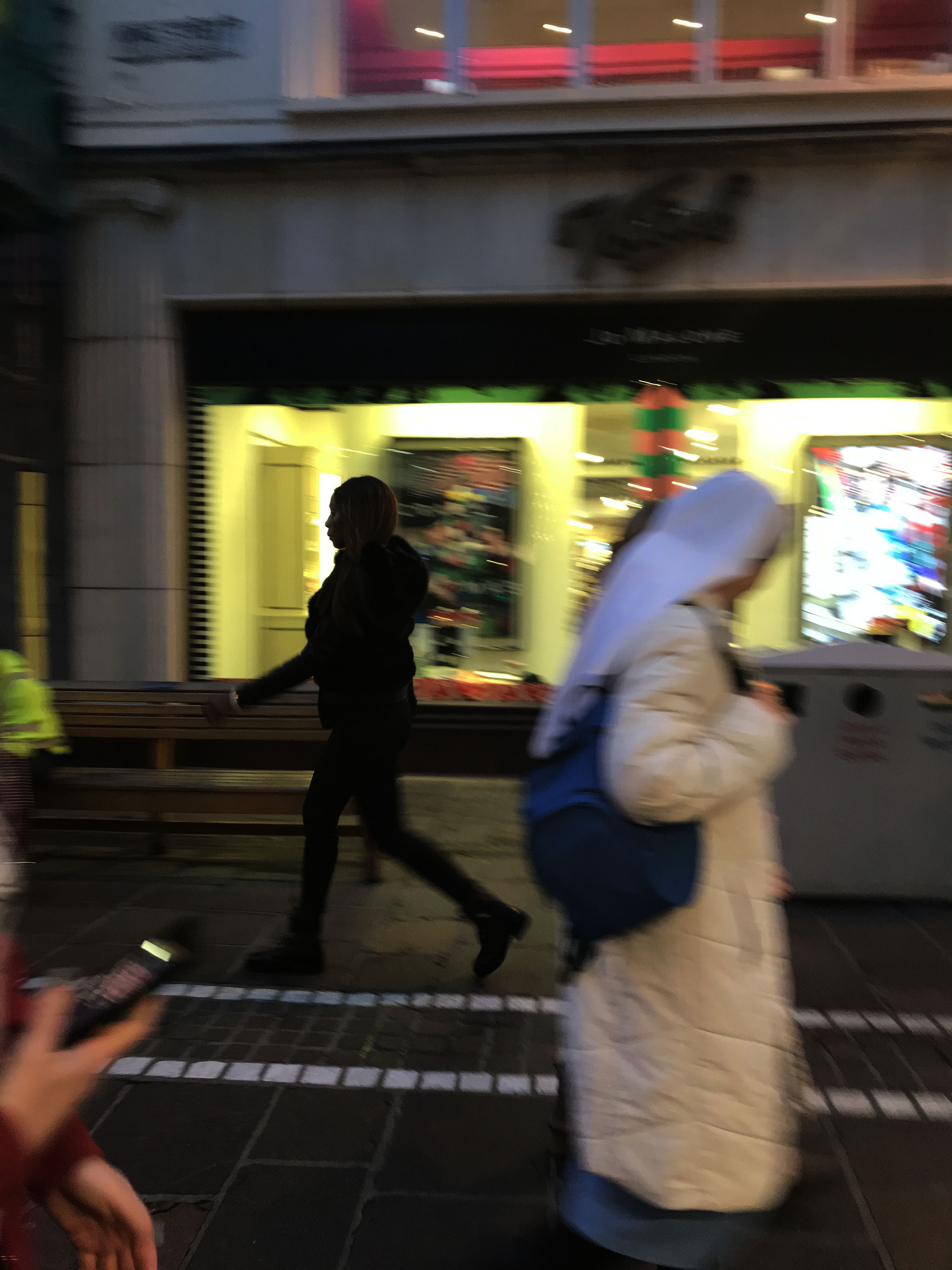
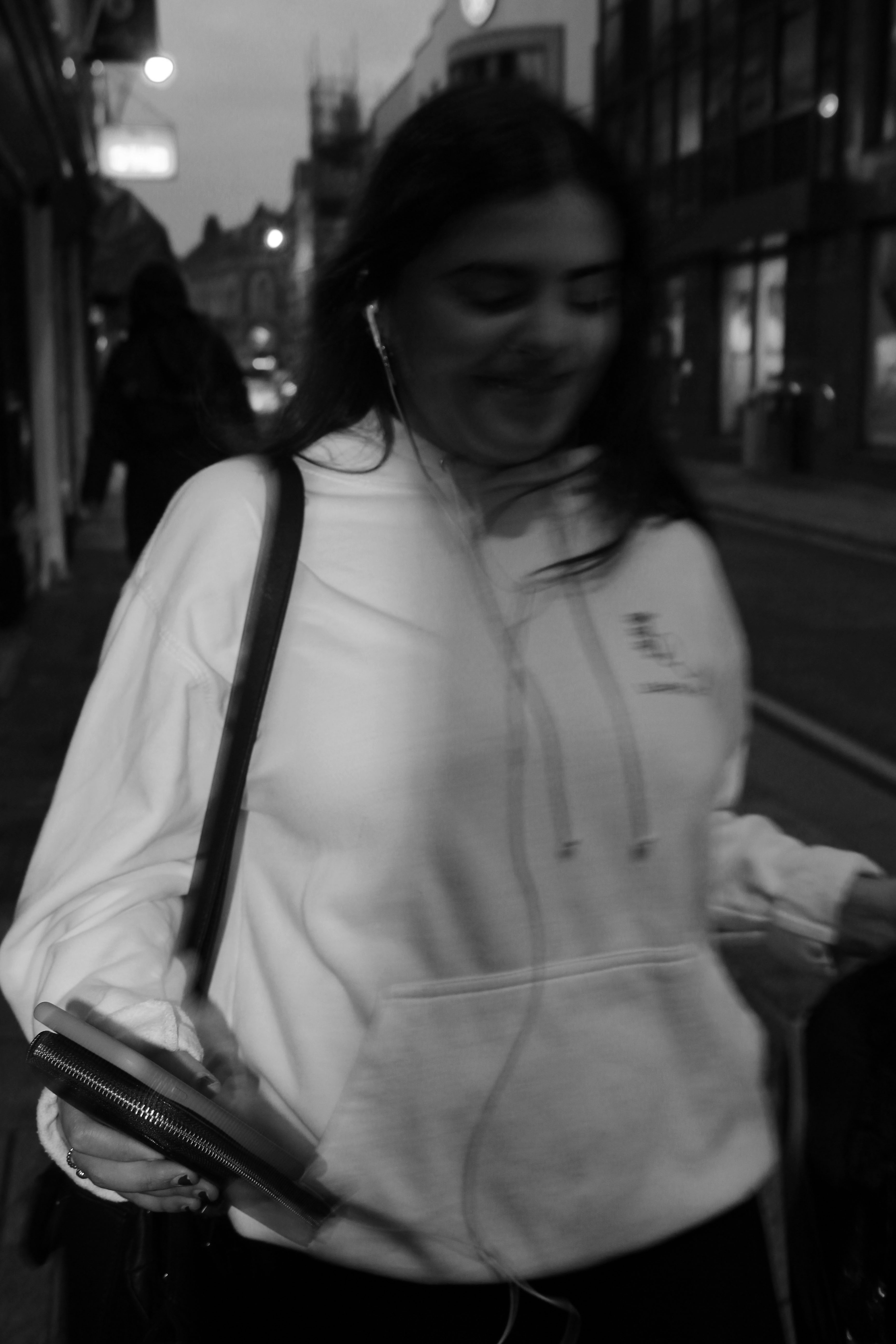
For the above 2 images, I took inspiration from Bruce Gilden’s technique of street photography and took photos of my subject by their suprise.
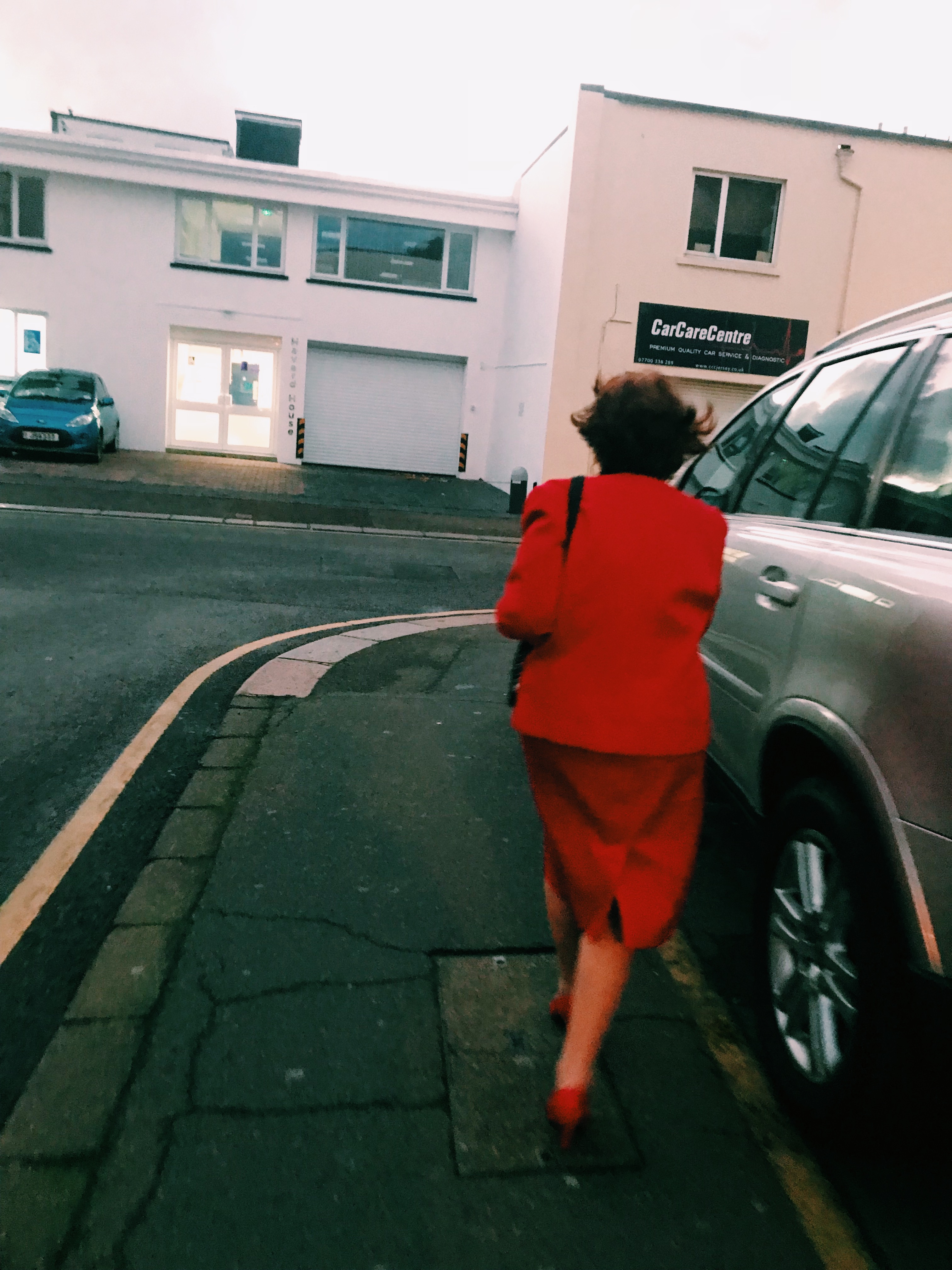
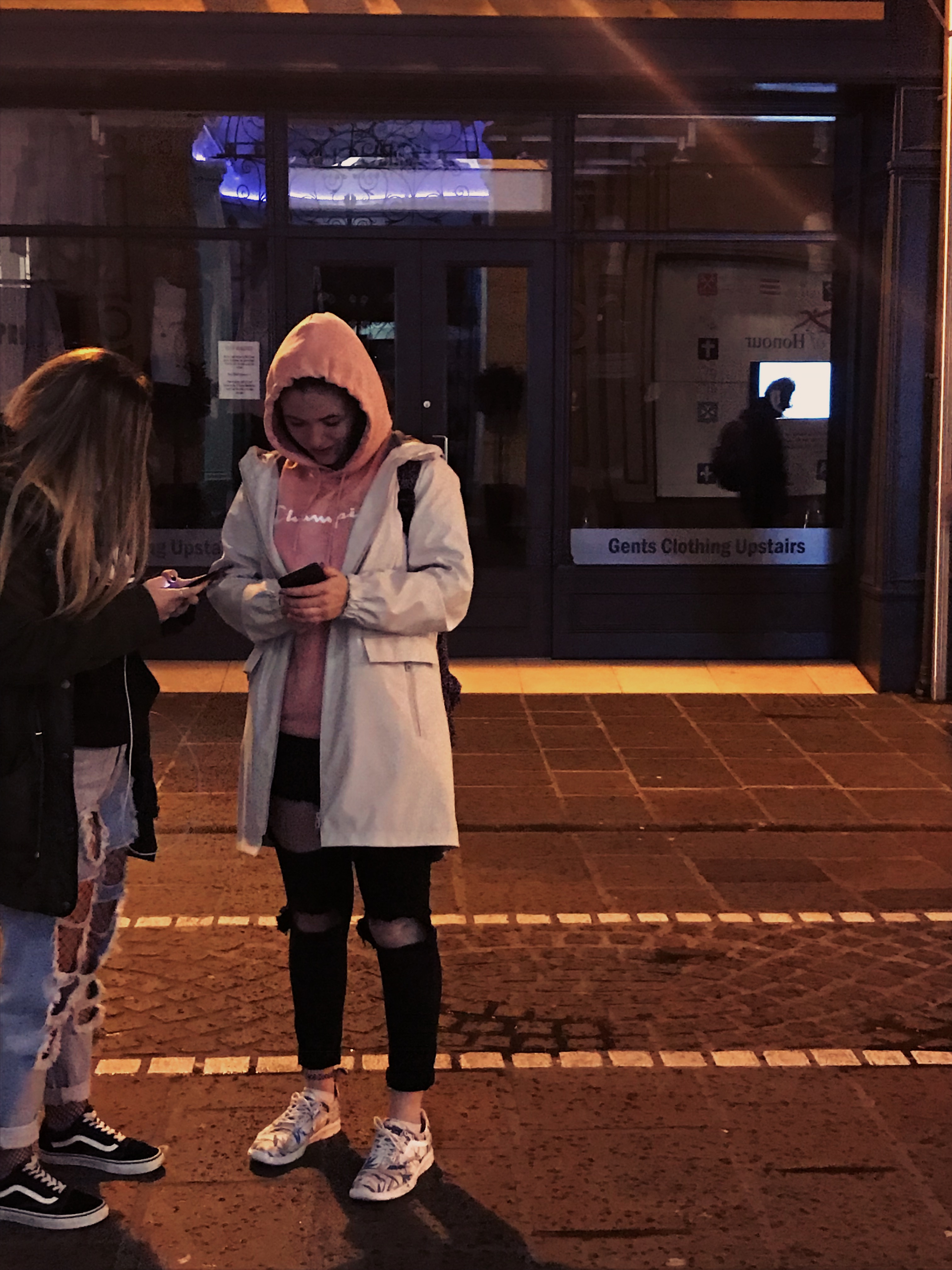
With the coloured image, I only increased the contrast to 56 on Photoshop. However, for the black and white image, I reduced the saturation before increasing the contrast to 20 and also decreasing the brightness to -12.

Processed with VSCO with c1 preset

For this Image, I looked at the colour schemes of Martin Parr’s work and decided to incorporate this in my edit. This filter on the ‘VSCO’ app gave a similar feel.

I also used the ‘VSCO’ app for the image below however this time I also reduced the exposure.

Processed with VSCO with nc preset

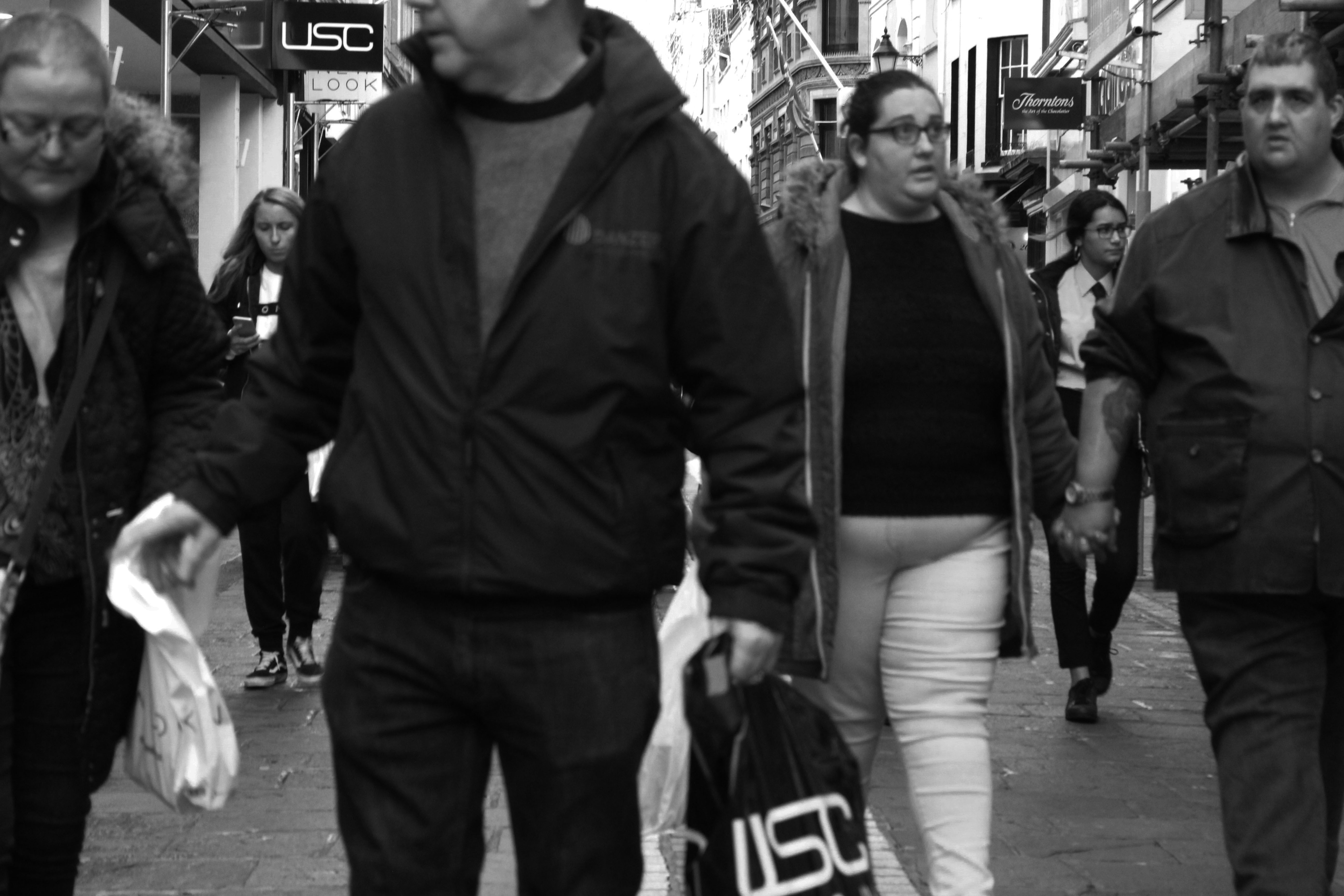
I liked the style of Henri Cartier-Bresson so decided to edit some of my images in black and white by reducing the saturation. I reduced the brightness and increased contrast to present different tonal ranges.

This is one of my favourite images as it was taken in St Malo, France. I feel as if this makes the image more interesting than an image just being taken in Jersey. I reduced the brightness to -70 and the contrast to -21 as I felt the original image was too bright and warm, and I wanted to show off the shadows.

Arnold Newman & Anthony Kurtz | Environmental Potraiture Homework 1

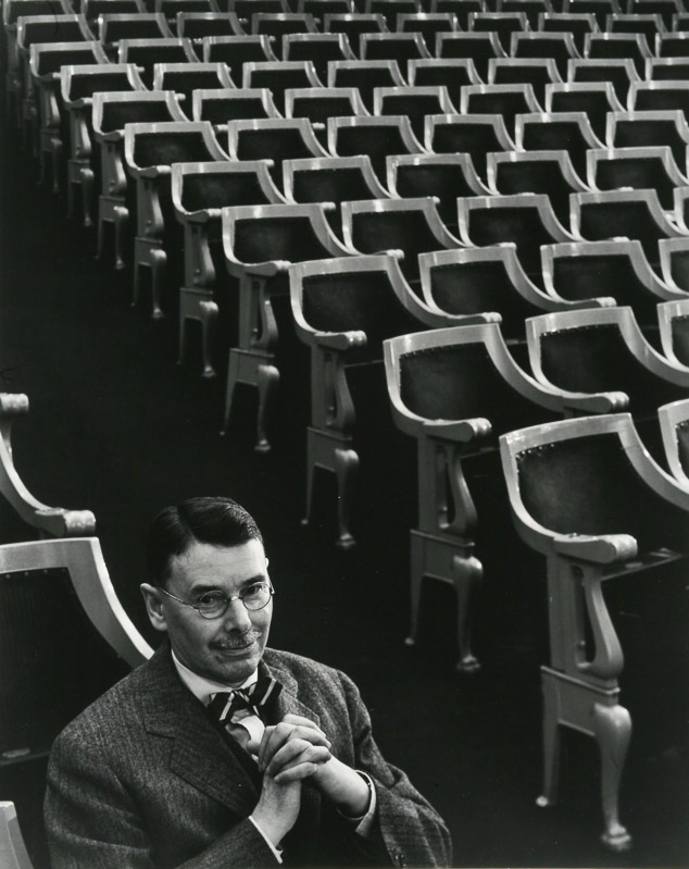
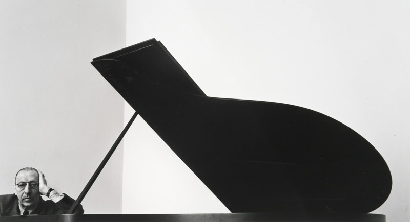
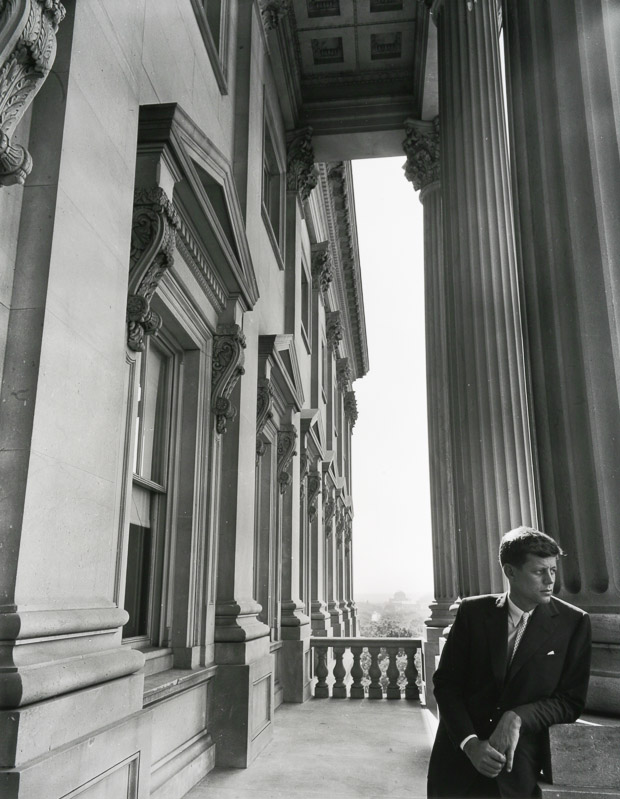
Arnold Newman

  • Arnold Newman was born March 3rd, 1918 in New York City.
  • He was raised and attended schools in Atlantic City, N.J. and Miami Beach, FL. He studied art under a scholarship at the University of Miami, Coral Gables, FL from 1936 to 1938.
  • Newman began his career in photography shortly after working at chain portrait studios in Philadelphia, Baltimore, and West Palm Beach. He immediately began working in abstract and documentary photography on his own.
  • He then went on to work in Environmental Portraiture where he would normally capture his subjects in their most familiar surroundings with representative visual elements showing their professions and personalities.
  • Arnold Newman found his vision in the empathy he felt for artists and their work. He photographed many famous people such as John F. Kennedy, Pablo Picasso, Marilyn Monroe, Ronald Reagan, and Audrey Hepburn.
  • However he also  maintained that even if the subject is not known, or is already forgotten, the photograph itself must still excite and interest the viewer.
  • He died in New York City on June 6th, 2006.

“I didn’t just want to make a photograph with some things in the background,”

 “The surroundings had to add to the composition and the understanding of the person. No matter who the subject was, it had to be an interesting photograph. Just to simply do a portrait of a famous person doesn’t mean a thing.”

Image Analysis

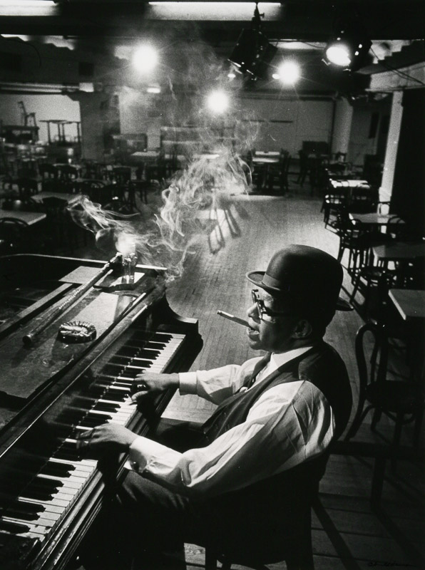
I believe he may have used a fast shutter speed as he was able to capture the smoke in the air of the image.

All light in this image is artificial which gives it a staged feel, this is suitable as the musician in the photo is on a stage where he would normally be in his career.

The image as a whole is in black and white with a high contrast that features all shades from light to dark. This could be considered to be included in the Ansel Adams Zone System.

The image is under exposed as it appears darker. This shows off the contrast of the image. Focus is down the centre of the photo where the subject is lit up.

The camera used may have had a wide depth of field and a small aperture which gave the  background a slight blur.

The man in the photo is Willie ‘The Lion’ Smith who was  an American jazz pianist at the time the image was taken (1960). He is considered to be one of the three greatest practitioners of the genre in its golden age, from about 1920 to 1943.

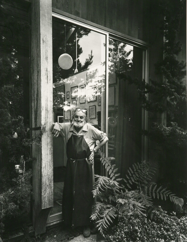
Anthony Kurtz

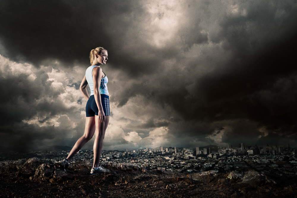
Anthony Kurtz is a Swiss-born photographer who currently lives in San Francisco. He specializes in environmental portraitures and landscape photography and strives to create beautiful and unexpected photographs of people and the spaces they occupy.

Combining both natural light and studio strobes, Anthony sculpts light to create a mood, an atmosphere, a photograph that tells a story and, hopefully, sparks curiousity in the viewer.

Kurtz has studied subjects from Science to Graphic Design, and New Media to eventually Photography. But no matter what the medium, he believes that his ability to meet extraordinary people is the best reward.

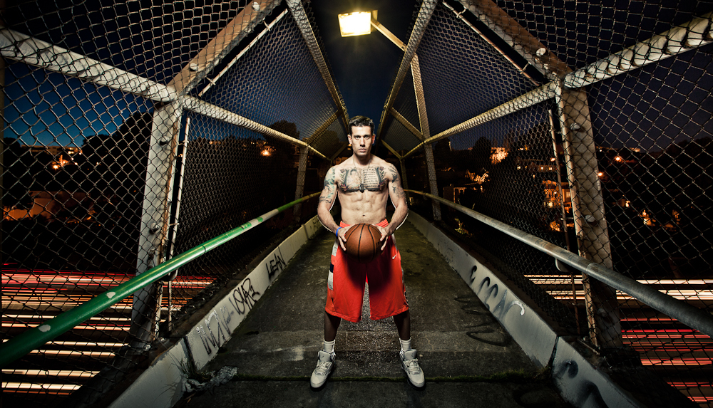
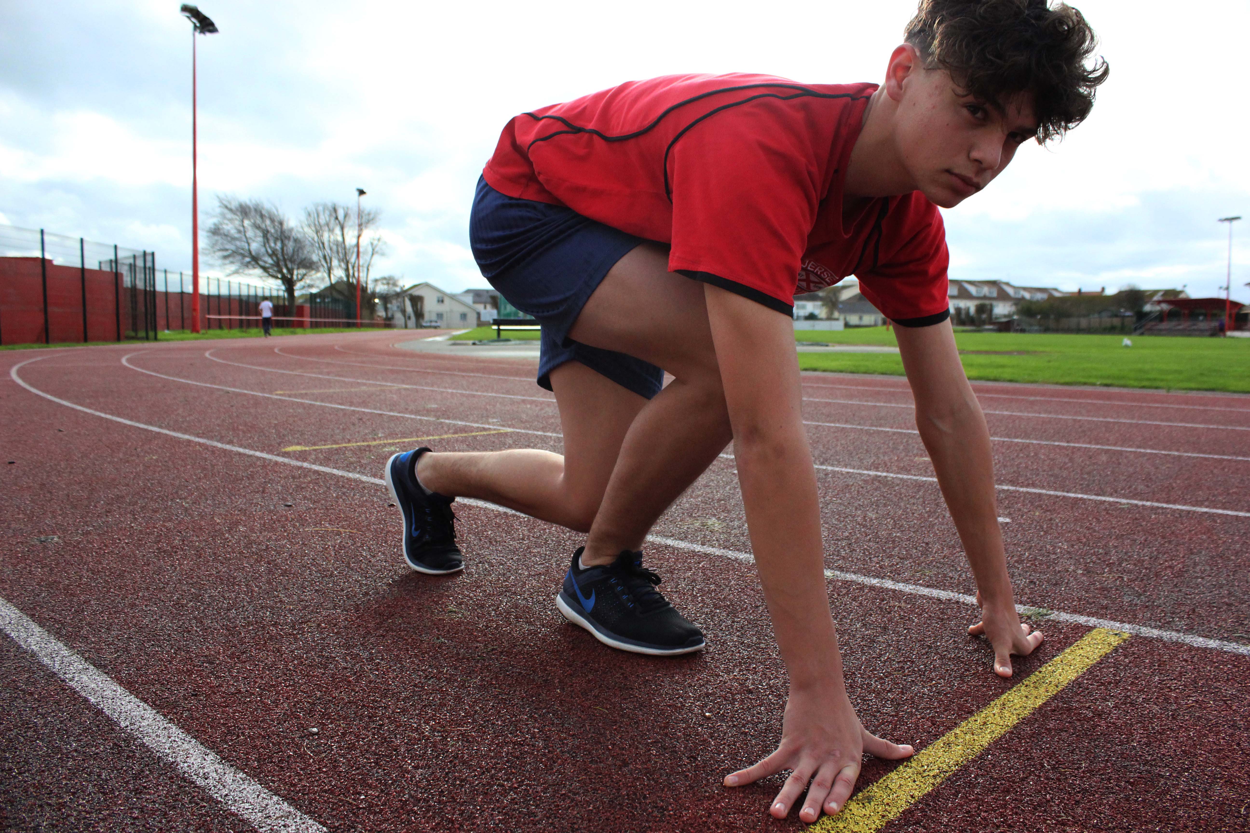
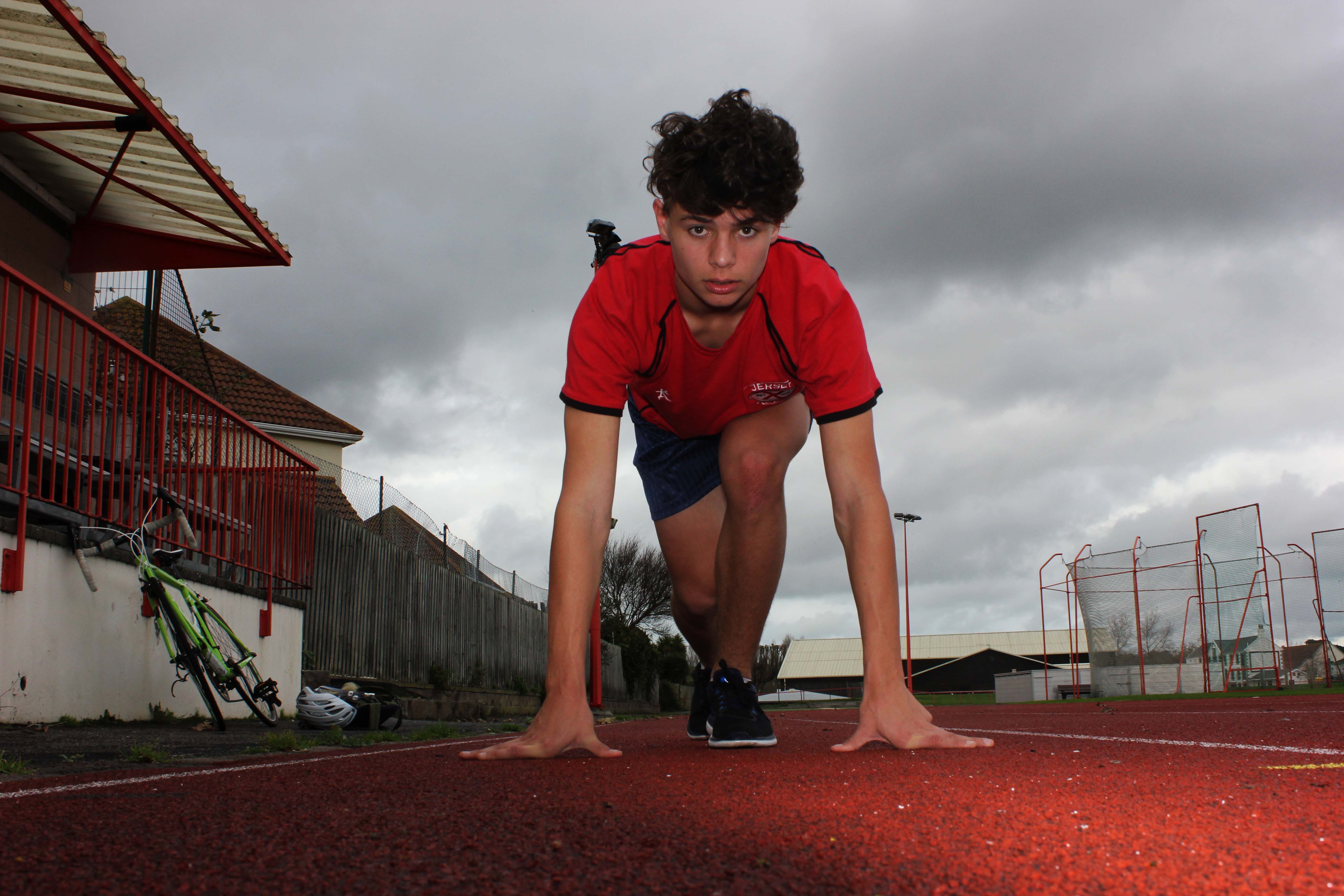
The above image inspired me to carry out a similar style photo of an athletic person with a dramatic sky.

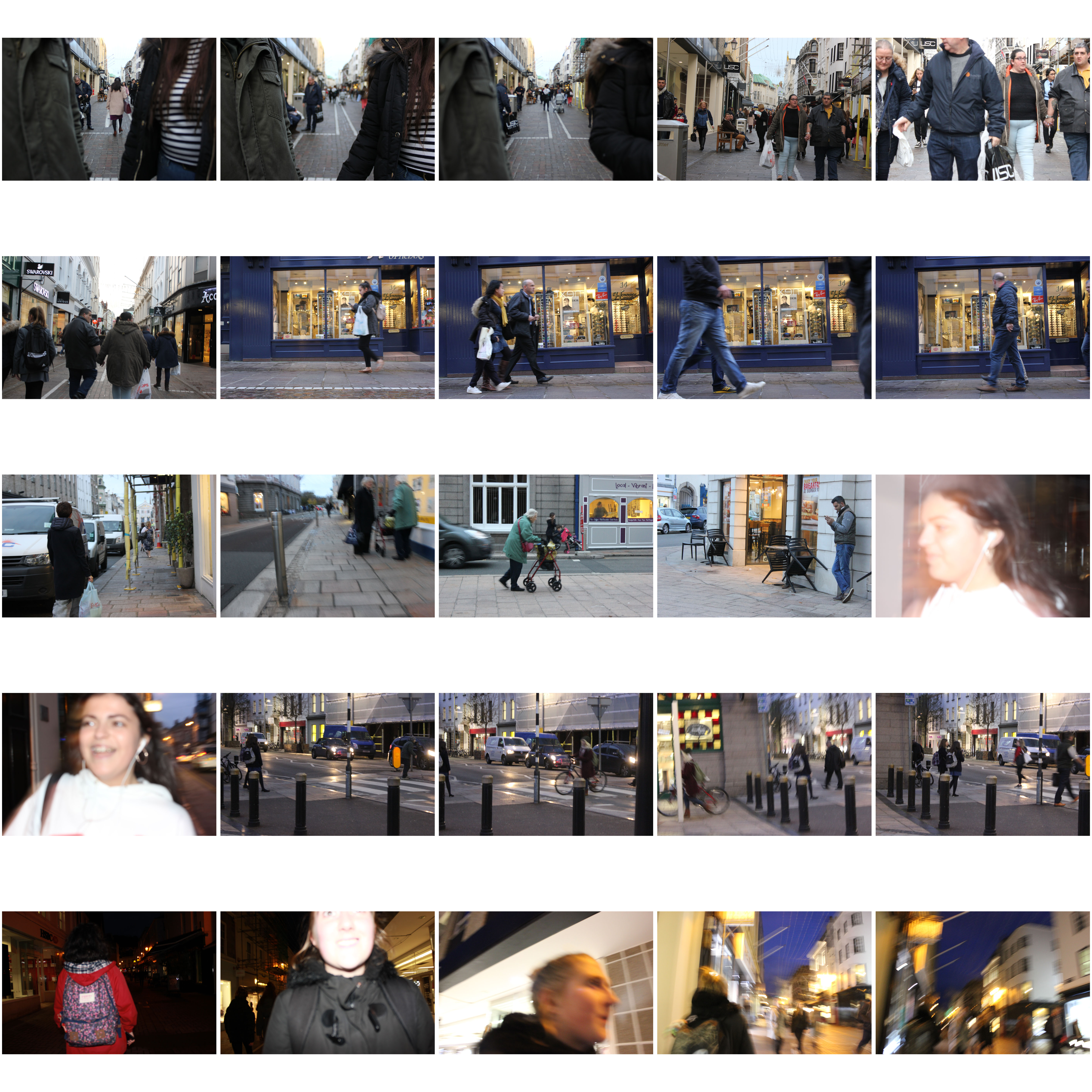
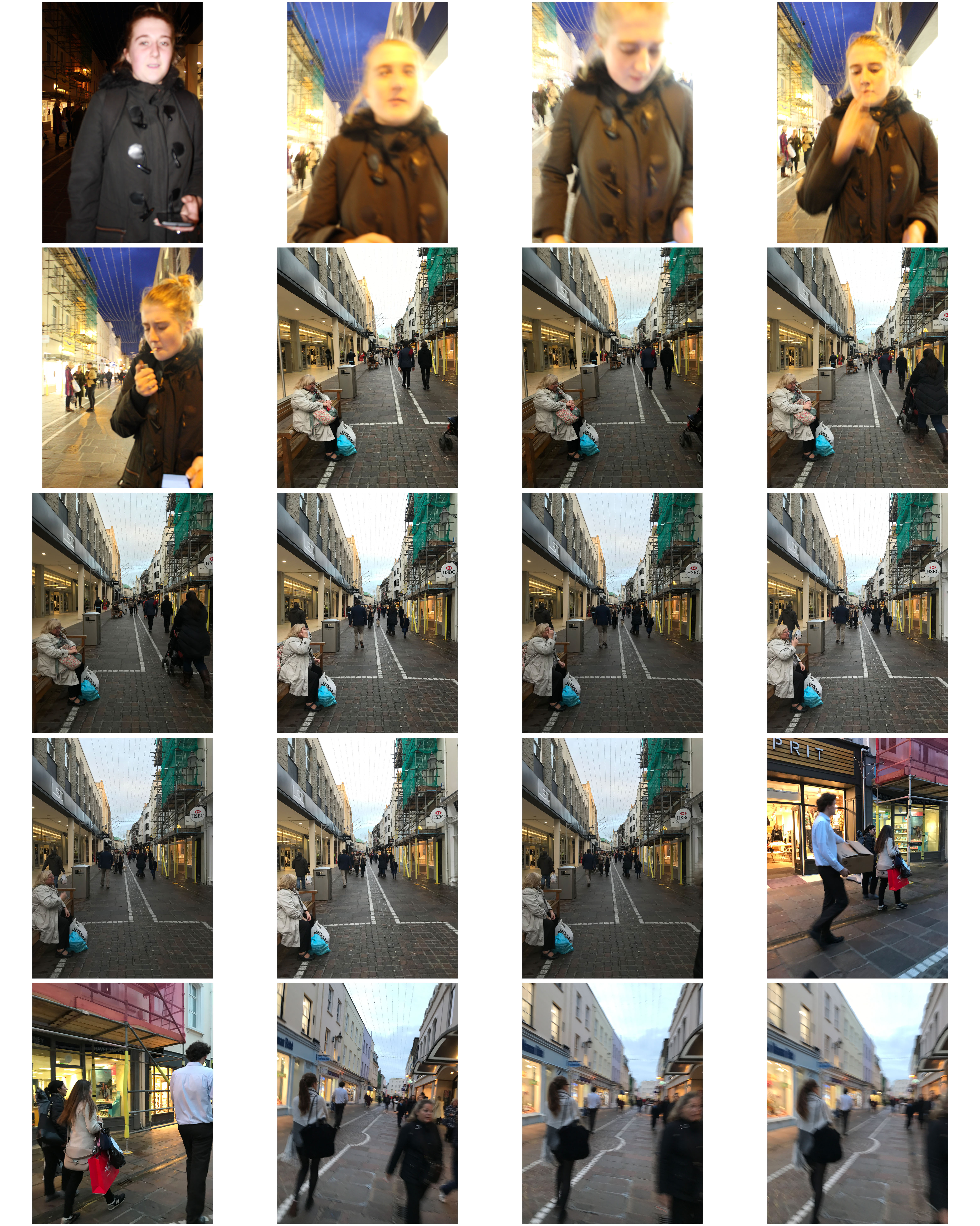
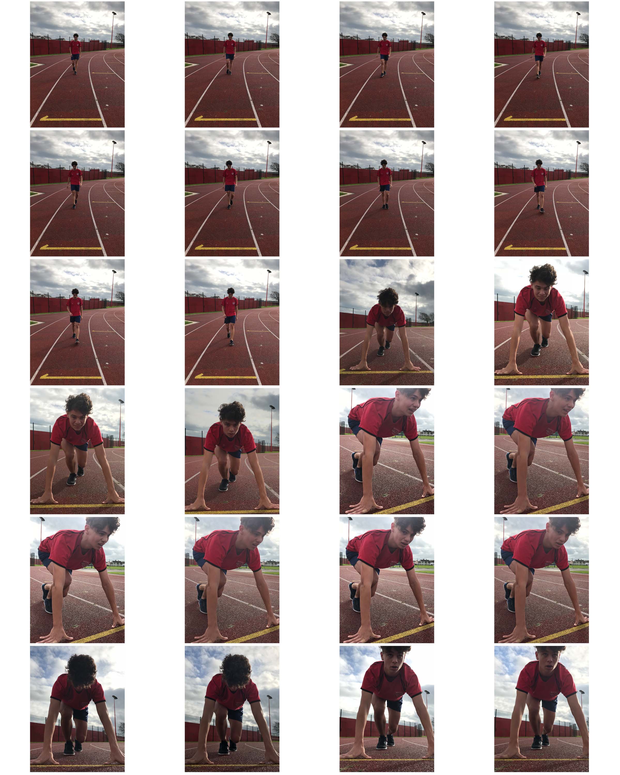
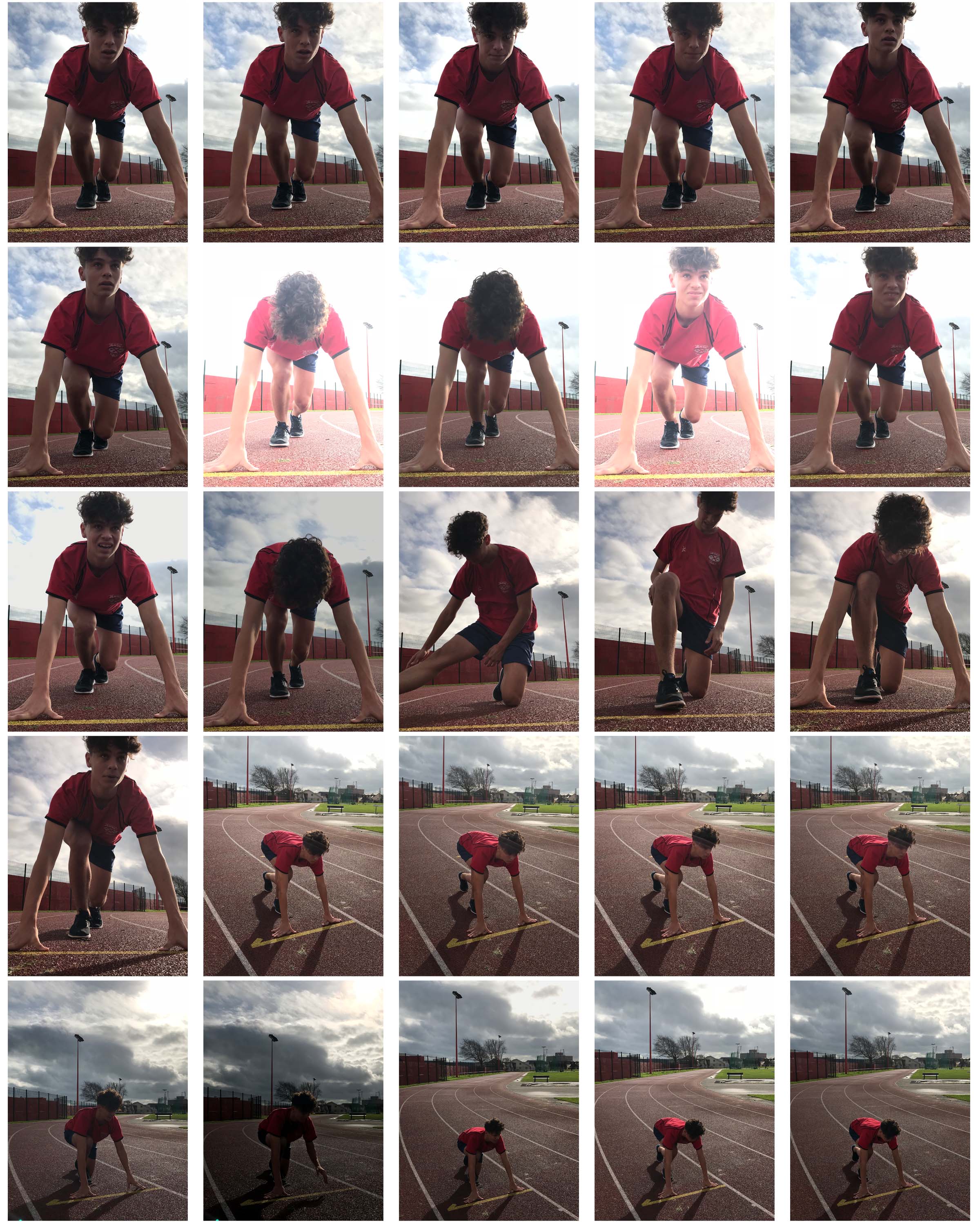
Contact Sheets

Final Images

I edited the above images in a collection so that each photo added to the story of the subject in the photo, an athlete preparing to run. I brought down the brightness and increased the contrast to give the sky a dramatic effect behind the subject.

For this image, I edited it simply by increasing the contrast and reducing the brightness.

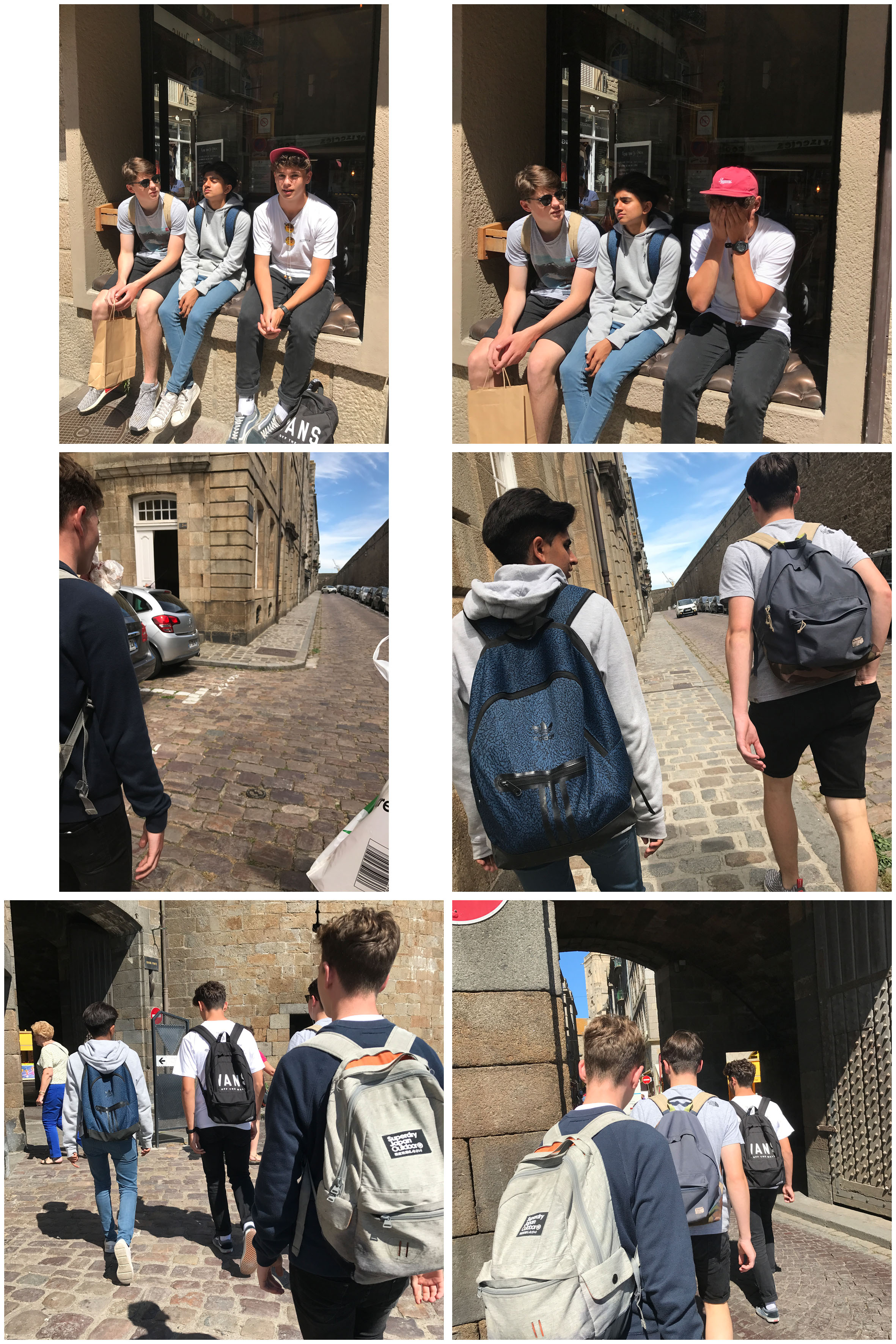
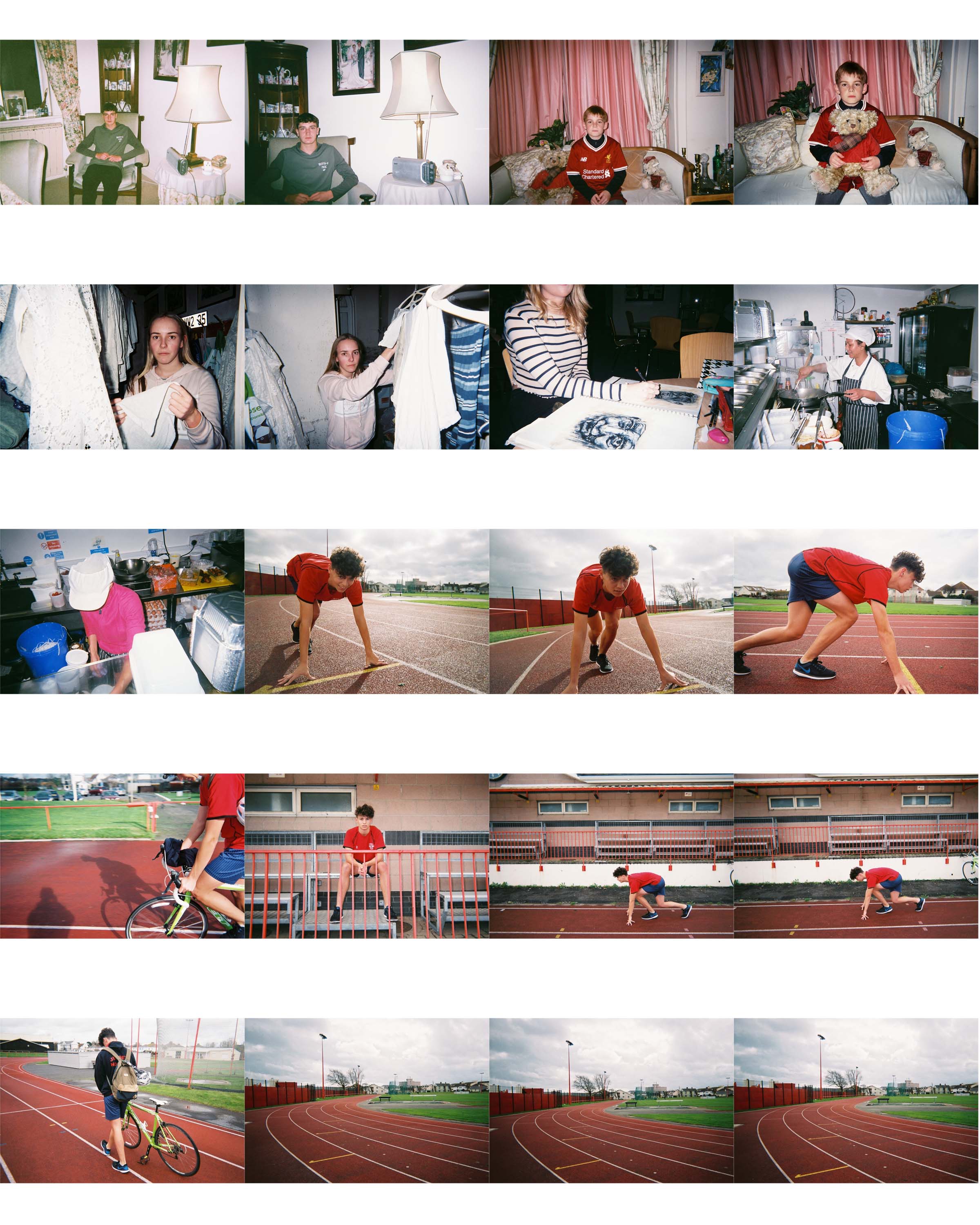
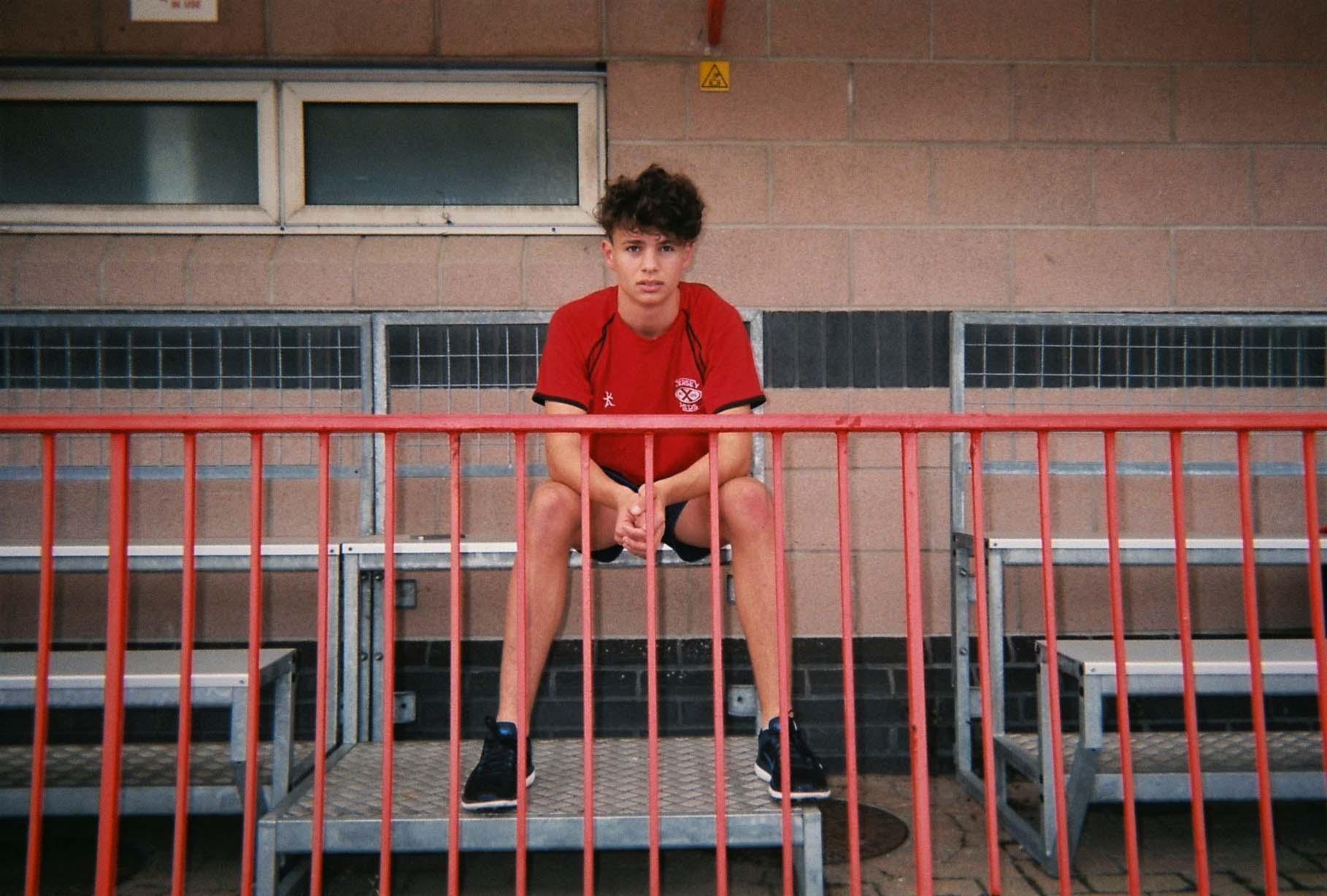
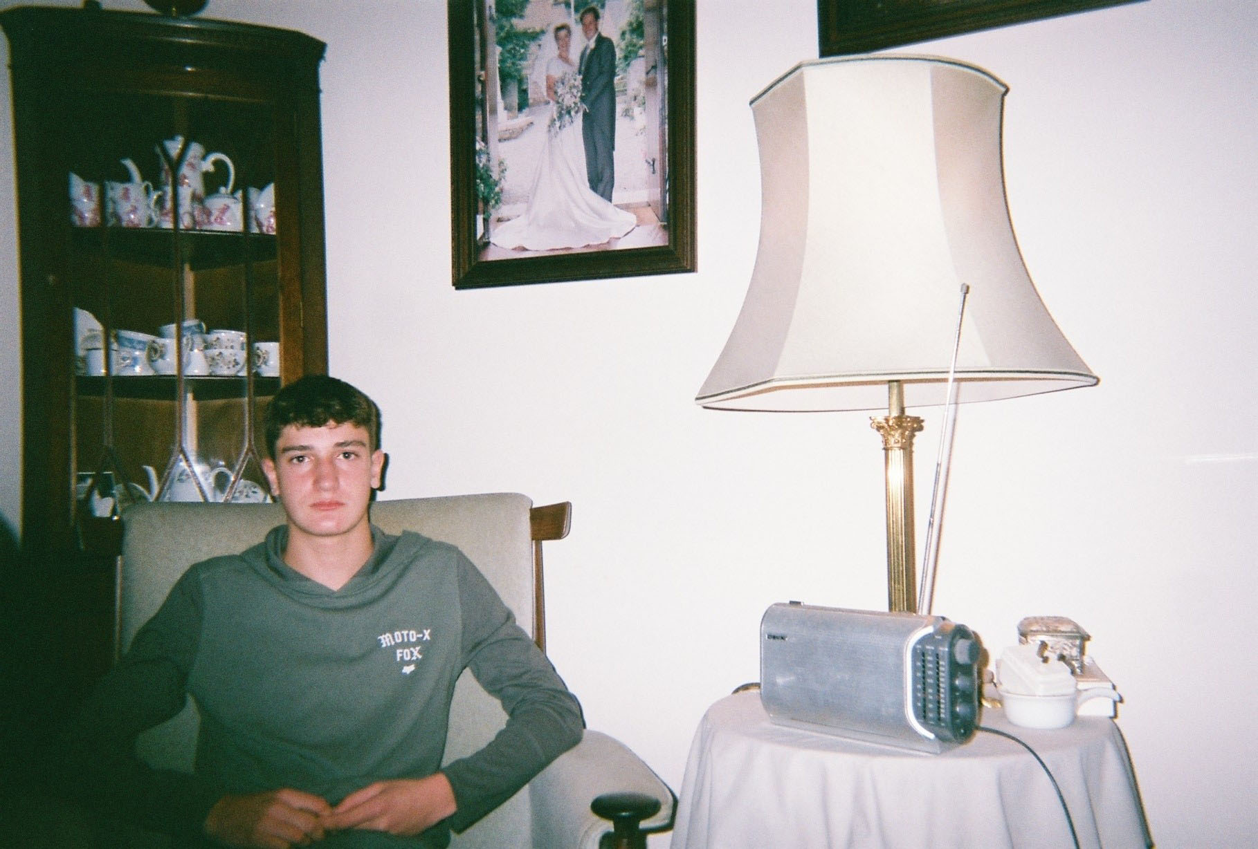
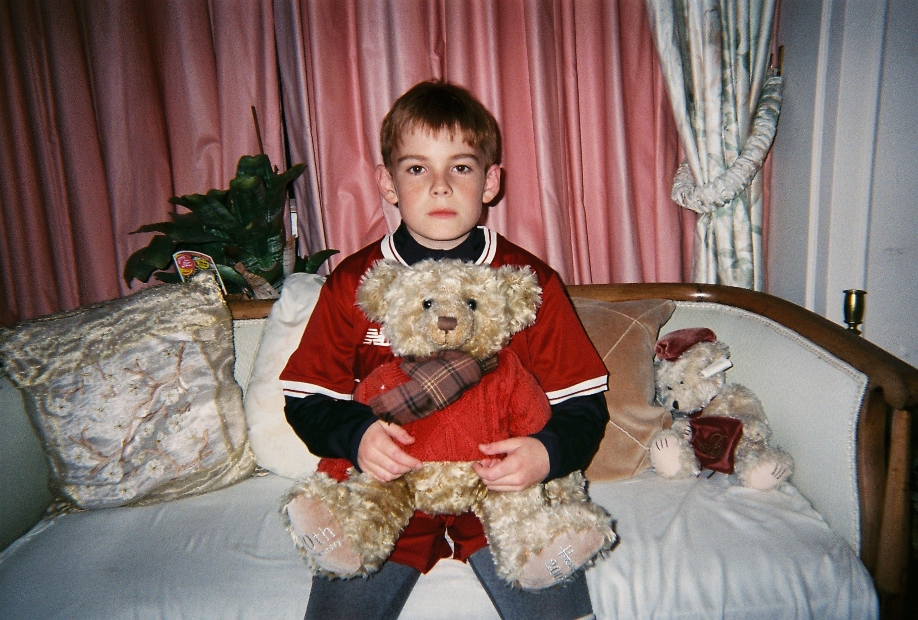
I took these images on a disposable camera as I liked the quality of them (an older family footage-style) and felt it would be suitable to take pictures of people in their environments anytime that I saw something interesting.

I did not edit these photos except to remove red eye from the camera flash, and reduce the contrast and exposure whilst increasing the brightness in the middle image.

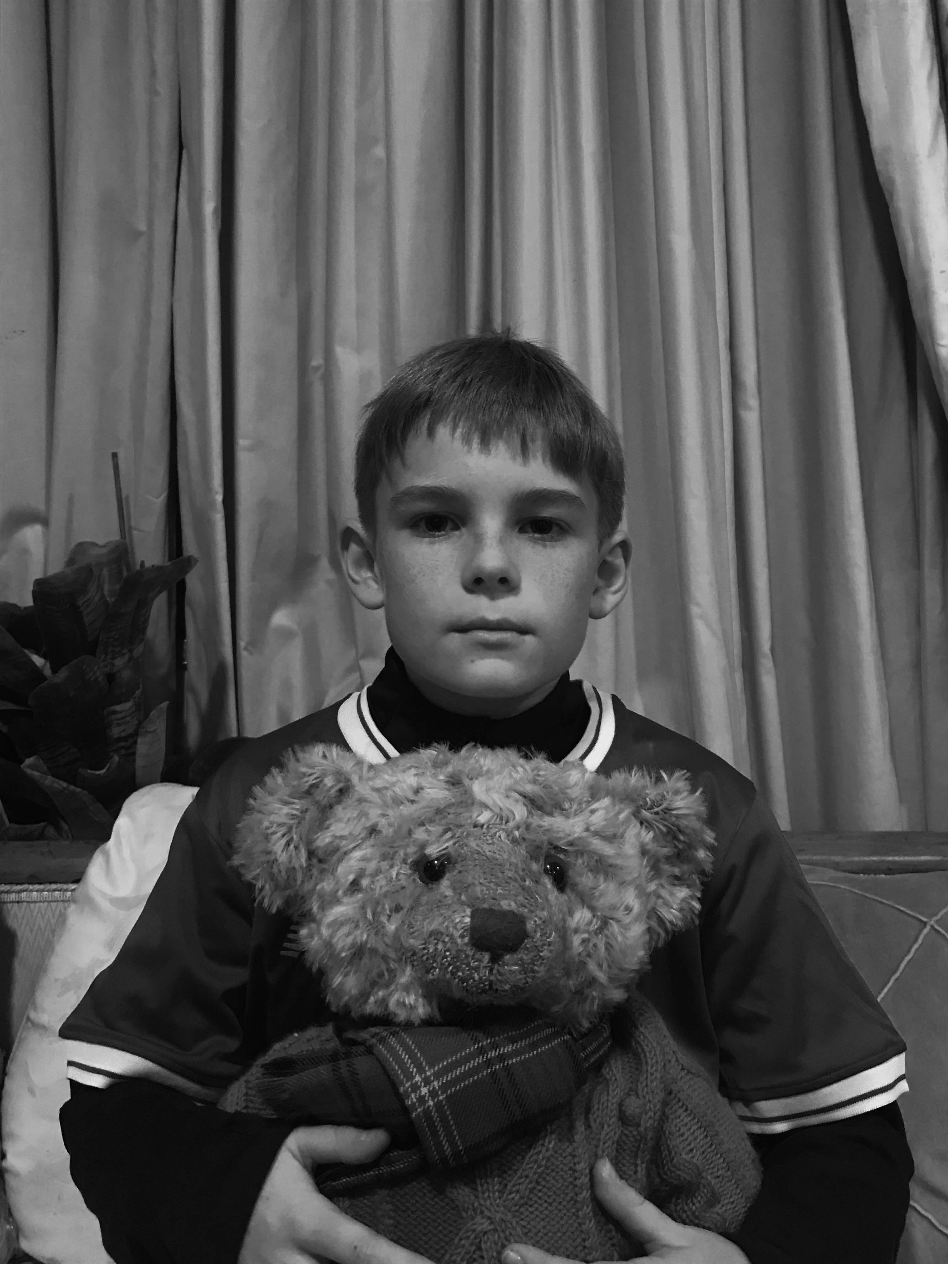
For these Images, I took inspiration from Arnold Newman’s famous black and white images. I reduced the saturation then increased the contrast and decreased the brightness to show off the different light and dark tones.

Studio Lighting

Why do we use studio lighting?

Studio lighting is used by photographers to capture images in ways that would very difficult in natural lighting and so that they can have total control over the environment. Studio lighting gives a photographer the freedom to control everything in the environment form the intensity of the light, the angle that they are at and the way that it highlights the subject and number of light sources. It the photographer to change the environment in any way that they wish and to also add in a different thing that could become part of the shoot such as backdrops and props.

What is the difference between 1-2-3 point light and what does each one do?

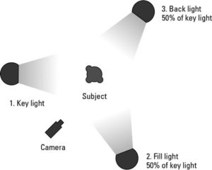
Three-point lighting is a method used in studio photography that uses three separate light sources being positioned in any way so that the photographer can illuminate the environment in any way that they chose.

The fill ligha so shines on the subject, but from a side angle relative to the key and is often placed in a lower position than the key. It balances the key by illuminating shaded surfaces and lessening or eliminating chiaroscuro effects, such as the shadow cast by a person’s nose upon the rest of the face. 

The backlight shines on the subject from behind, often to one side or the other. It gives the subject a rim of light, serving to separate the subject from the background and highlighting contours.

The keylight is a specialized lamp or a camera’s flash. In outdoor daytime shots, the Sun is used as the key light.

What is fill lighting?

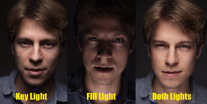
Fill light is any source of light that lightens ‘fills in’ areas of shadows created by other lights. Fill light is used to lighten the shadows created by the main light.  Some images, especially those requiring a dramatic mood, are best with little or no fill lighting. Most images will require some form of fill lighting to keep the image shadows and highlights in the image

What is spill lighting?

Light spilling is where light falls where it was not intended to fall


Rankin

Who is Rankin?

John Rankin (born 1966) is a British portrait photographer and fashion photographer. He made his name in publishing and founding the seminal monthly magazine Dazed & Confused with Jefferson Hack in 1922. The magazine went on to forge distinctive marks in the arts and publishing spheres, whilst developing a cult status forming and molding trends, bringing some of the brightest lights to fashion. And today is one of the leading online fashion and cultural brands.
Image result for RankinRankin creates landmark editorial and advertising campaigns, with his work being some of the most celebrated by the biggest brands, charities etc. Rankin has published thirty books, and has his work exhibited around the world. In 2011, Rankin Film Productions was made to make music videos, commercials, and short films. Some of his work consists of:
I found that when Rankin captured the subjects features, he tended to base them around the head, making a certain aspect pop out (eyes, teeth and mouth). Through this it showed what defined them as an individual rather than what people saw them as.


Studio Lighting Final Outcomes

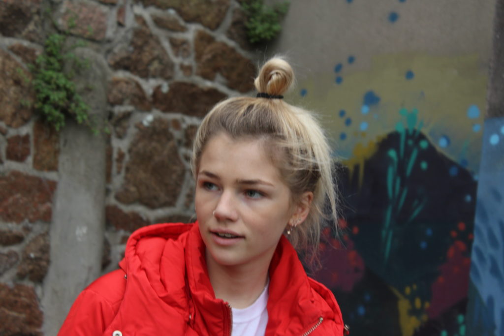
Portrait With Natural Lighting

In this photograph I used natural lighting. This allowed me to position the model so that the light was directly in her face and so that the shadows on her face are minimised. I used a shallow depth of field in this photograph so that the background was blurred out whilst the model was in focus. I used a shutter speed of 1/100 to capture a clear image of the model. I used a low/medium ISO of 400 to capture a light image whilst keeping noise minimalised.

The colours in this image are quite saturated and they bring the portrait to life – especially the contrast between the colourful wall and the stone wall. There is not a massive tonal range in this image as there is no pure black or pure white. There is a slight 3D effect to the image as the background has been blurred with a shallow depth of field. I placed the subject in the centre of the image to divide the colourful wall and the plain wall to make the image appear more appealing.

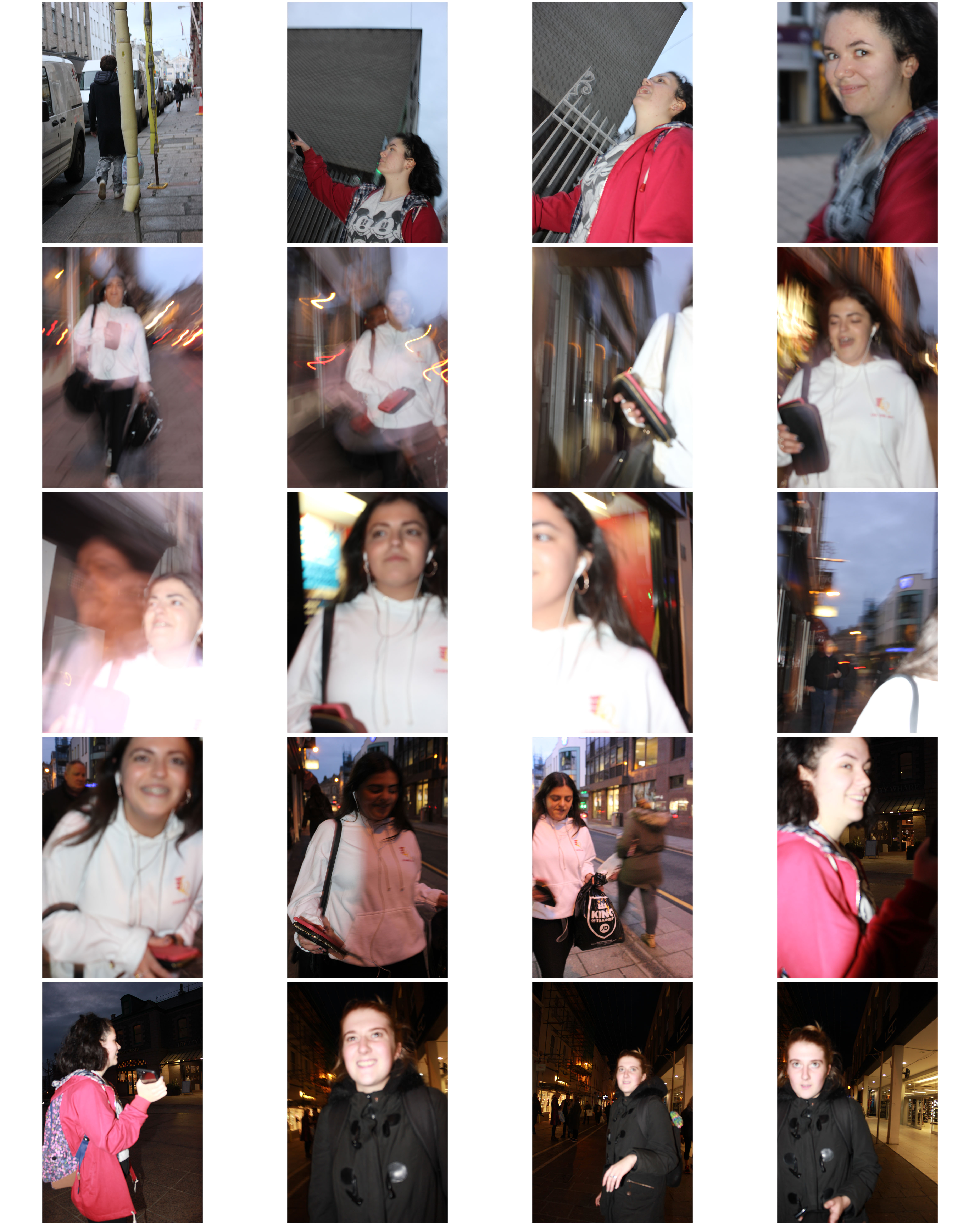
This photo was taken next to a mural in town, it was taken during my street photography homework assignment and takes inspiration from Vivian Maier in the sense that the photo is fairly close up and the model is conscious that the photo is being taken.

I used this photo to separate the colourful and the bland. This photo shows very well the mixture of environments and styles in town – in this photo it shows the mixture of the two, broken into two only by the model.

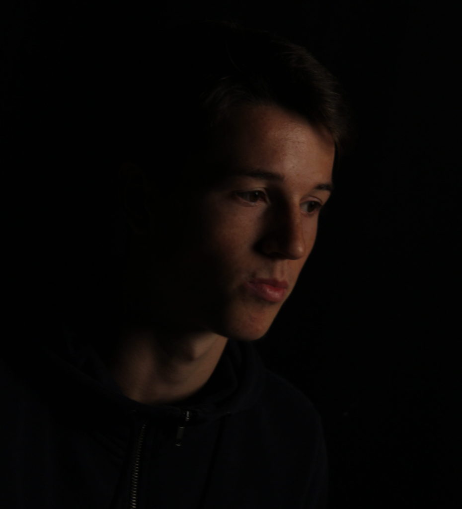
Portrait With Artificial Lighting

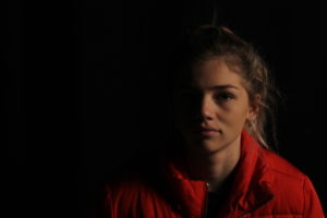
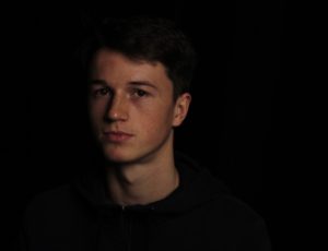
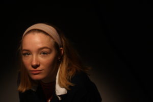
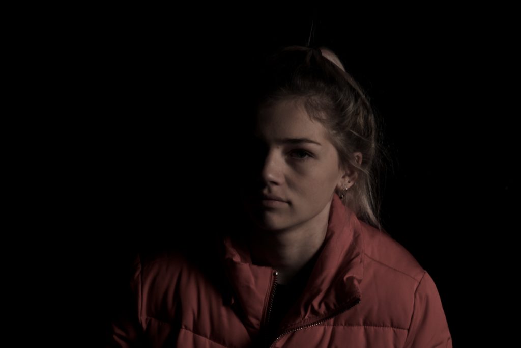
In this photograph, artificial lighting was used to create it in a dark and dramatic manner. I set up the environment to use chiaroscuro in the photograph, I did this by drawing a black curtain over the backdrop and then using one spotlight to put light on one side of the models face to cast shadows across the other side. I used a deep depth of field to keep all of the photograph in focus. I used a relatively slow shutter speed (1/10) to allow more light to enter the lens from the dark environment along with a low ISO to create a photograph with minimal noise.
I increased the saturation of the image to give it a warm undertone that will blend in with the black background. There is not a wide tonal range in this photograph as the majority of the image is dark. It has a 3D effect as the model appears to emerge from the background. The eye is straight away lead to the models face due to the contrast with the background, especially the brightest part on the forehead.

This photograph incorporates chiaroscuro which is a an oil painting technique (more modernly a photography technique) that developed during the Renaissance period. It uses strong tonal contrasts between light and dark for a dramatic effect. Some artists best known for developing the technique are Leonardo Da Vinci and Caravaggio.

My aim whilst creating this photograph was to capture an image in the style of Rankin’s chiaroscuro photographs whilst creating a more gradual fade of the model to the background. I took multiple photos using this technique to capture one where the light falls just right on the face with a more gradual fade and a highlighted spot on the face.

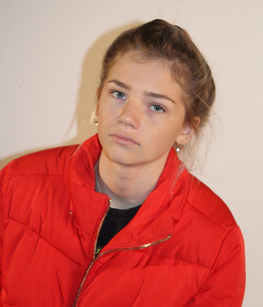
Portrait With Flash

In this photograph I used flash light from the top of my camera to distribute light evenly across the subjects face. This reduced the shadows on the subjects face and exposed her features such as her eyes to the camera more. I set up a red head light on the side to create a soft light across the subject and to illuminate the environment better. It also created a sharp shadow in the background for dramatic effect. I used a deep depth of field to keep the whole image sharp and in focus. I also used a quick shutter speed of 1/60 to ensure that the image was sharp and none of it was blurred. I used an ISO of 400 in this image to allow enough the image to be bright enough whilst keeping the noise minimised. I also had someone holding a reflector with a golden foil over it to create a warm undertone to the image.

There is a warm undertone to the image along with the saturated colour of the jacket with the whiteness of the background. There is not a massive tonal range in this photograph – it is mostly light apart from the black top. There is a slight 3D effect in the photograph because of the shadow behind the model casted by the flash. I placed the subject slightly off the centre of the image so that the shadow would be in the centre of the image.

This photograph was taken in the studio whilst I was trying out a range of techniques with light. I experimented with the flash light, the red head light, the spot light, the rig light and different gel filters and backgrounds. This allowed me to find how to capture the ideal image with flash on.

I took inspiration for this image from Annie Leibovits work, who focuses on contemporary studio photography and street photography. I took inspiration from her more plain photoshoots in which it is simply the subject with no props, I will be looking into creating more creative portraits next week.

Rankin

Rankin

John Rankin Waddell (born 1966), who works under the name Rankin, is a British portrait and fashion photographer. Rankin founded the monthly magazine called ‘Dazed and Confused’ in 1992. It provided a platform for innovation for emerging stylists, designers, photographers and writers.  Rankin’s body of work features some of the biggest brands and celebrities, he has shot covers for Elle, Vogue and Rolling Stone along with many others. Rankin’s work has always questioned social norms and ideas of beauty.

Image result for rankinImage result for rankin

My Response

I have taken inspiration from the above photo to include chiaroscuro into my response to Rankin’s photography. I have used the strong shadows and contrast that Rankin has used in his photography. In the bottom image, I tried to replicate Rankin’s style by getting close up to the subject and using black and white.


Techniques in the Studio

Why Do We Use Studio Lighting?

Studio lighting is used to create a controlled environment to capture the exact photograph that you want. It allows you to completely control how hard/soft the light is, the intensity of it and the direction of which it is coming from.

Image result for studio lighting

What is the Difference Between 1-2-3 Point Lighting?

Three point lighting is a method used in studio photography. It uses three separate positions so that the photographer can illuminate the subject in the exact way that he/she wants to. The first light is a key light, which is usually the strongest light and sets the lighting of the scene. The second light is a fill light which helps to fill the shadows that the key light casts. The last light is called a back light and is used to create contour and separation.

3-point-lighting

What is Fill Lighting?

Fill lighting is a light used in the 1-2-3 point lighting technique.  It fills the shadows that the main light cast.  Below is an example of the effects of fill lighting.

A photograph using the main light only
A photograph showing the effects of combined fill and main light

What is Spill Lighting?

Spill lighting is where light falls where it was not intended to fall, an example is light on a bedroom wall from across the street. It can be used in photography  to create different light effects and it can be controlled by re-positioning the lights.

Image result for what is spill lighting

What is Chiaroscuro? 

Chiaroscuro is a lighting technique that uses strong tonal contrasts between light and dark to model 3D forms with a dramatic effect.  It creates lots of drama and mystery in the photograph. Below is an example of my own work.