I chose this image due ti the interesting composition of round sections of light, its creates a highlight and direct sense of attention to the highlighted features upon her face. it creates a sense of suspension and also perhpas the development of how one side of her face has a much larger exaggeration of highlights. I edited this image to be in black and white as it would compliment the darker shadows yet still have a large view of standing out.

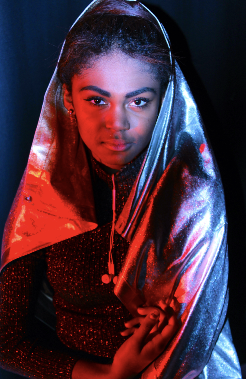
I chose this image due to the large juxtaposition of red harsh colour I wanted to capture compared to the lighter harsher highlights of the other side of her faces, we also used silver surrounding her in order o cause a further reaction to be seen within the reflection of her face.

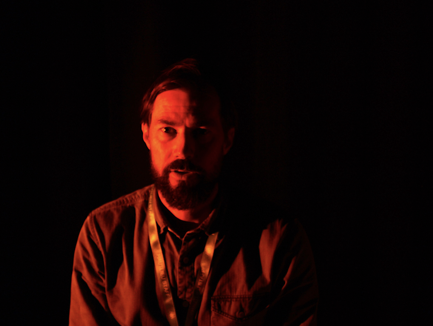
I chose this final image as it has a clear demonstration of again harsh dark light compared to a warmer brighter side. I chose red as it compliments the black and all combines to create a tone which create a line directly through the face itself. When editing this image I just wanted to further over exaggerate the red as it creates a vibrancy to the image as a whole.
