Why do we use studio lighting?
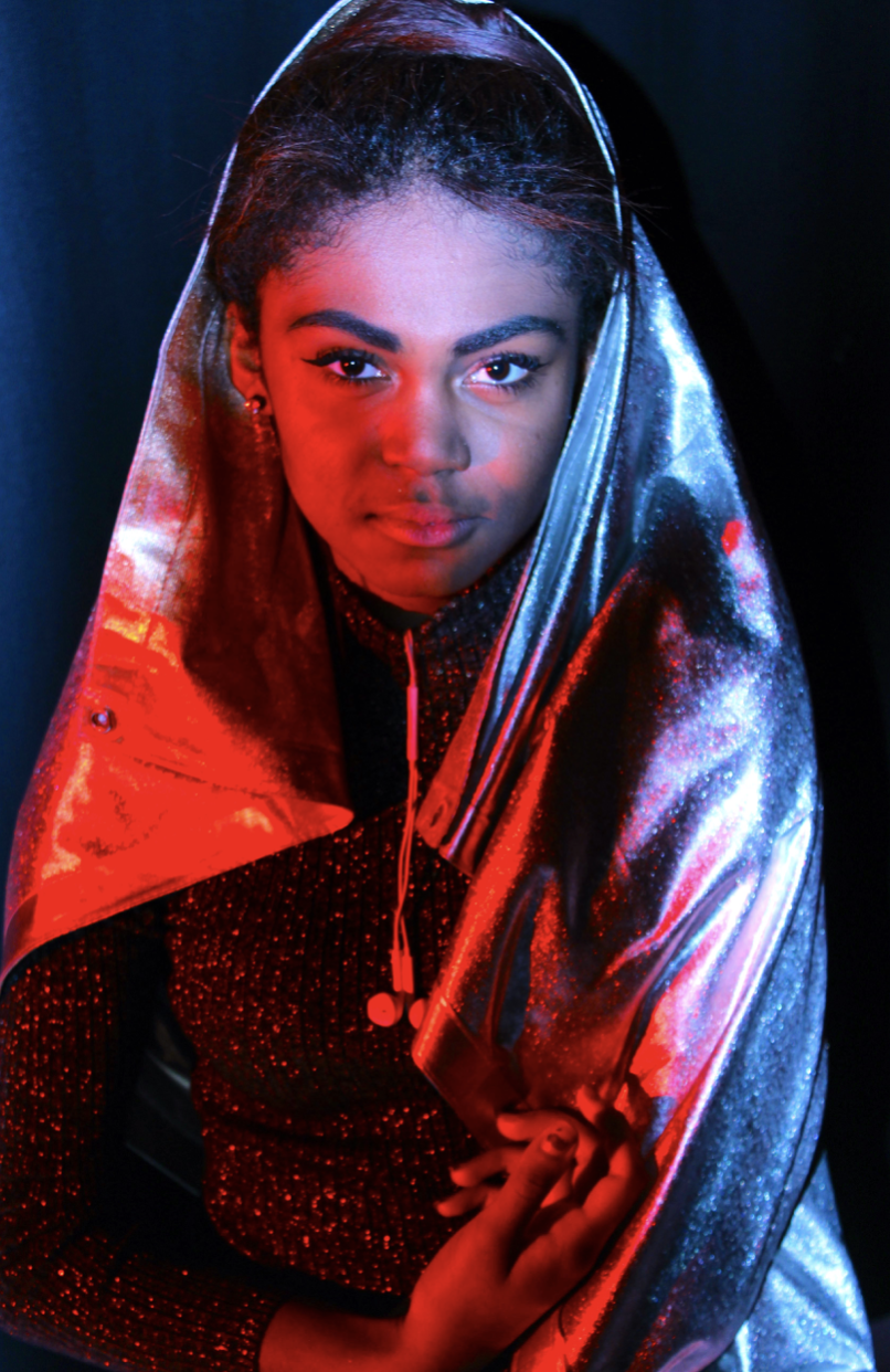
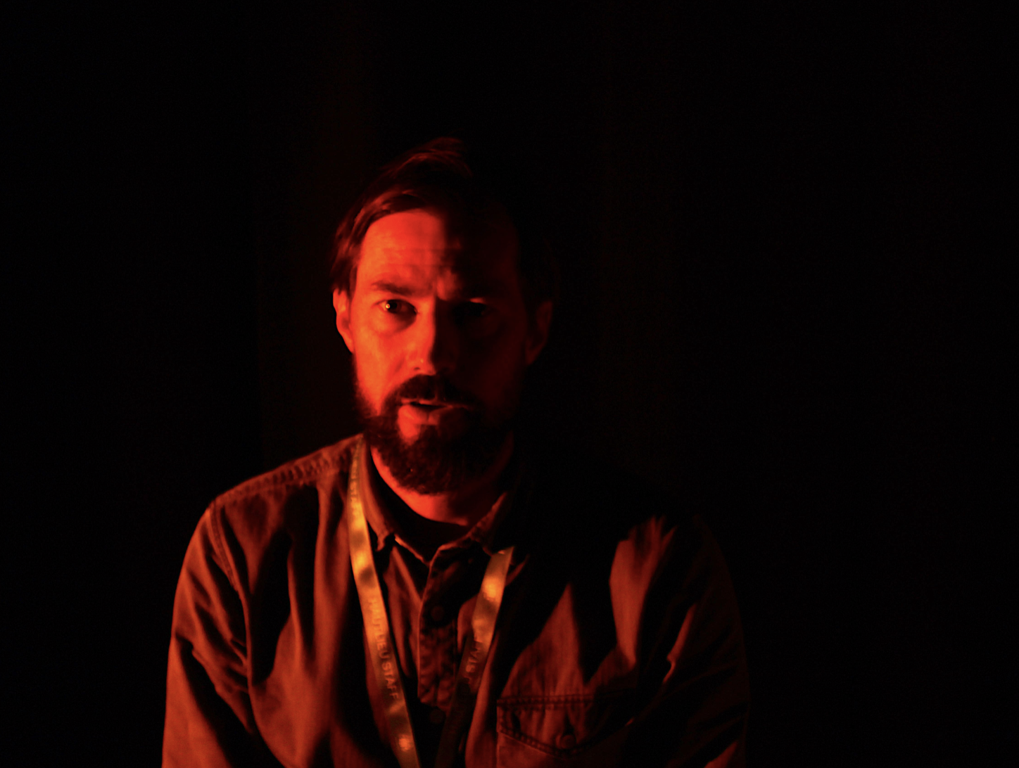
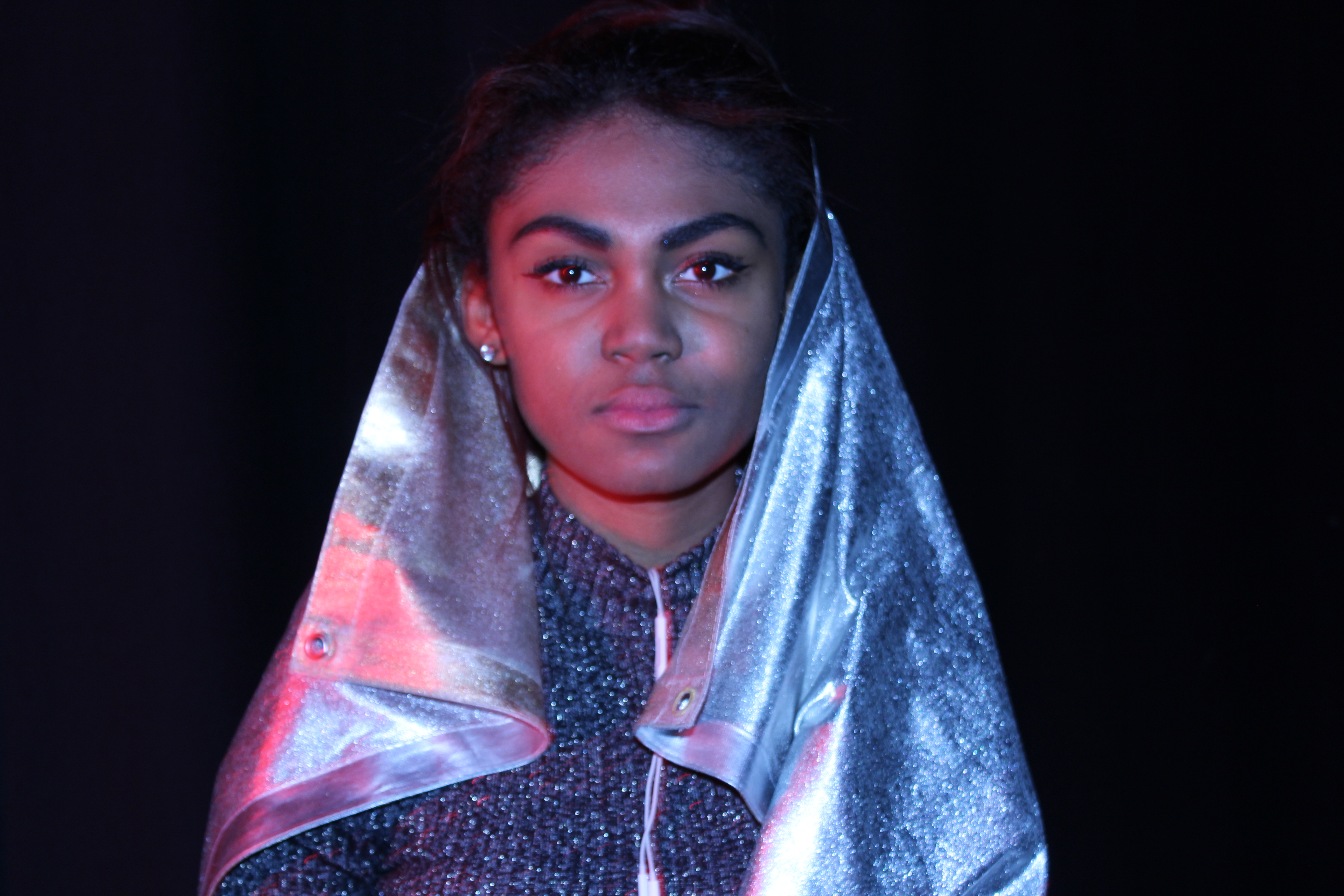
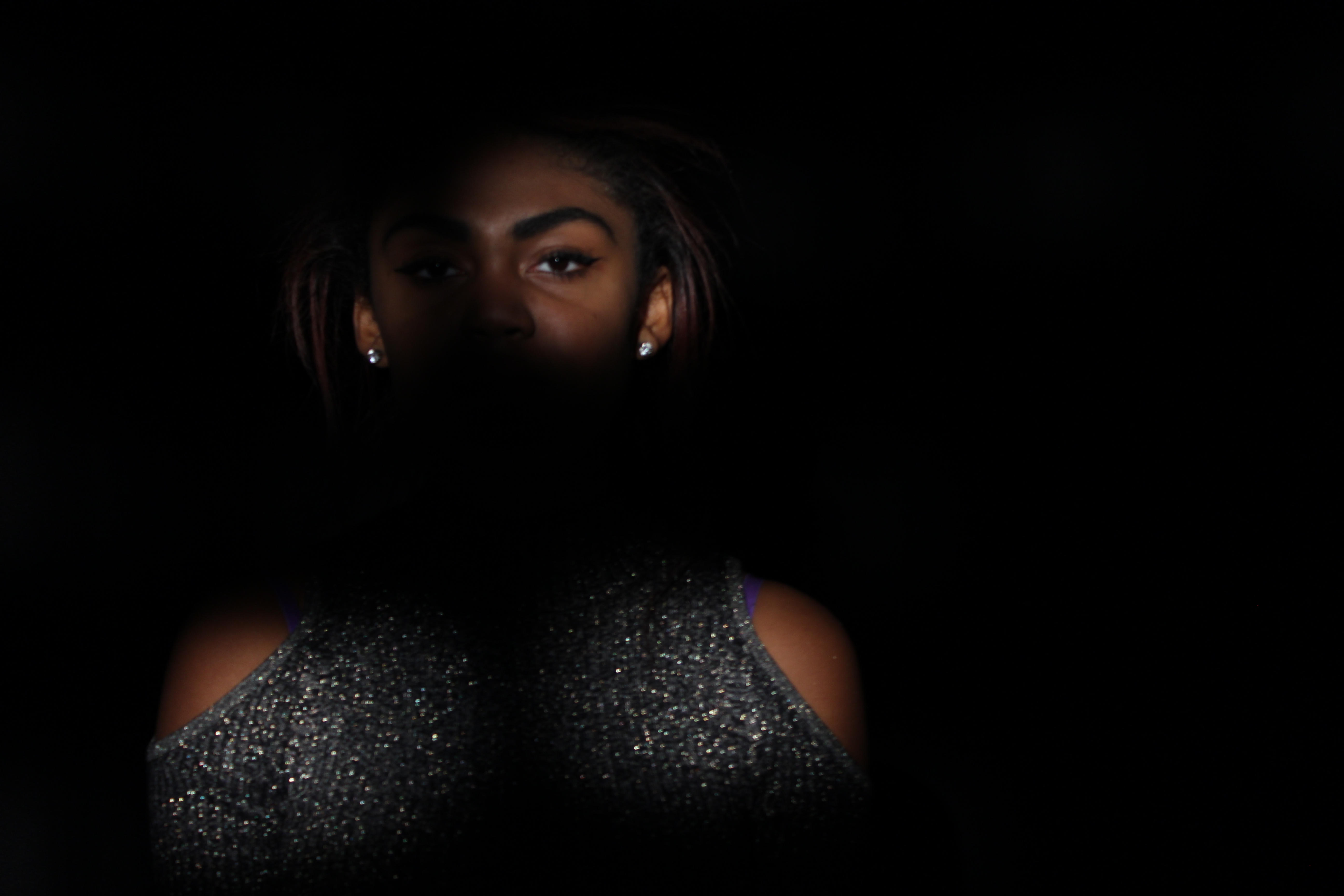
Studio lighting is used to be able to completely control and create the environment most suitable for the photo you are trying to capture. it can also be used to create a sense of persona and feeling to the image, wether it be a softer fashion imager a strong harsh darker image in order to create ambiance to a candid portraiture.
What is the difference between 1-2-3 point lighting?
Three-point lighting is a standard method used in visual media,By using three separate positions, the photographer can illuminate the shot’s subject , while also controlling the shading and shadows produced by direct lighting.this allows them to use light their advantage and produce many different images from the same shot.
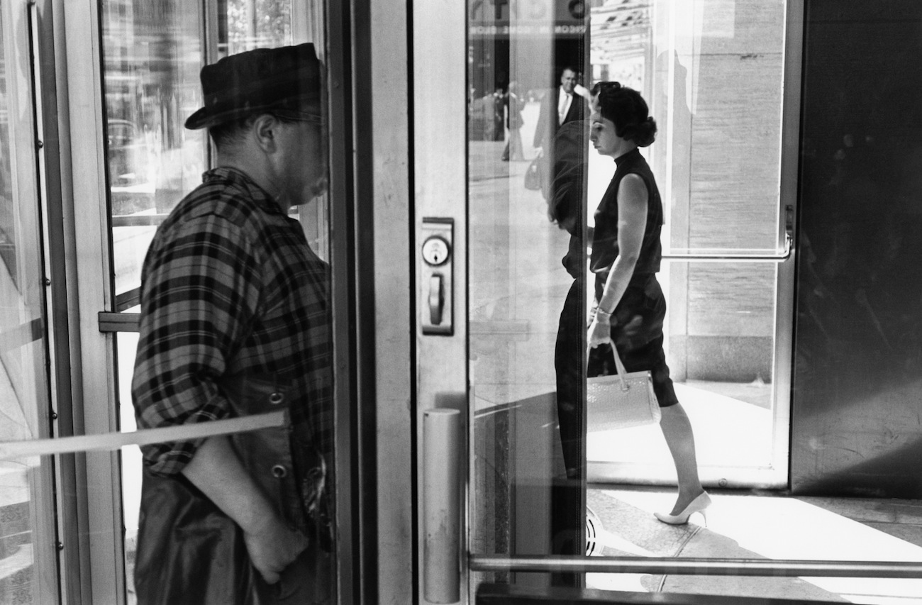
What is spill lighting?
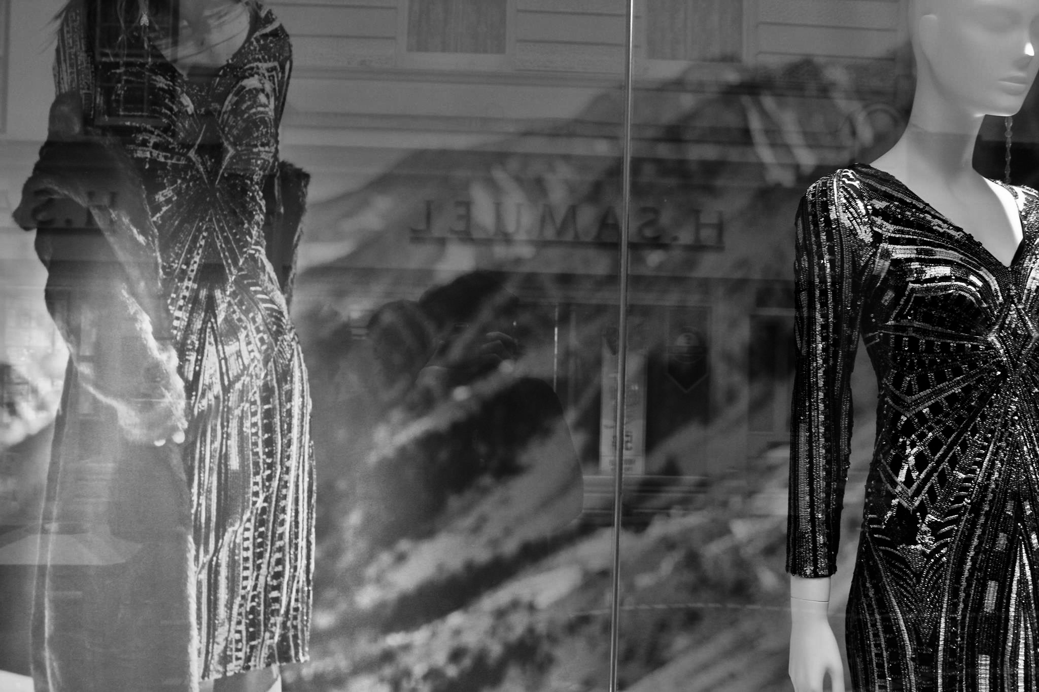
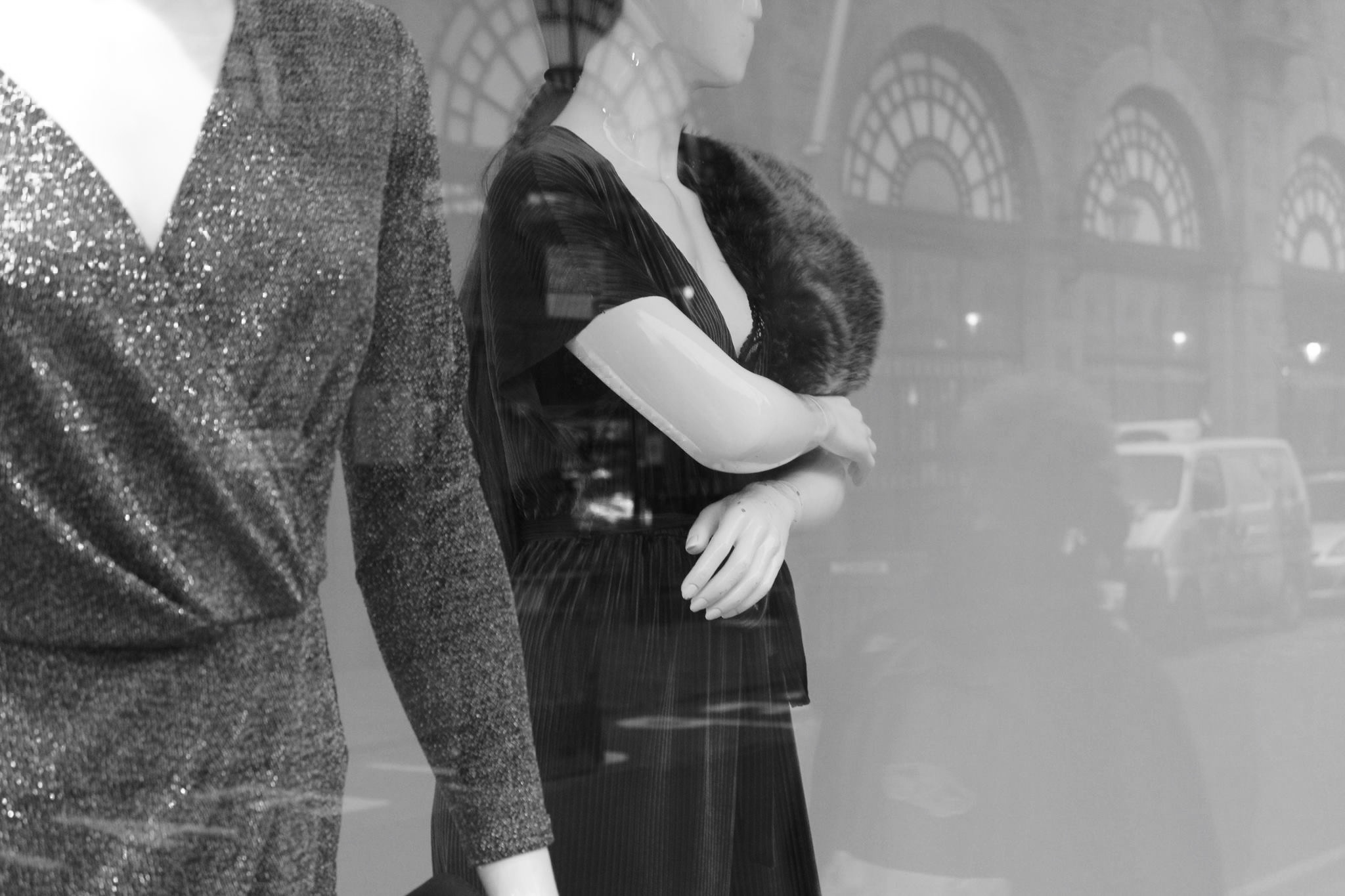
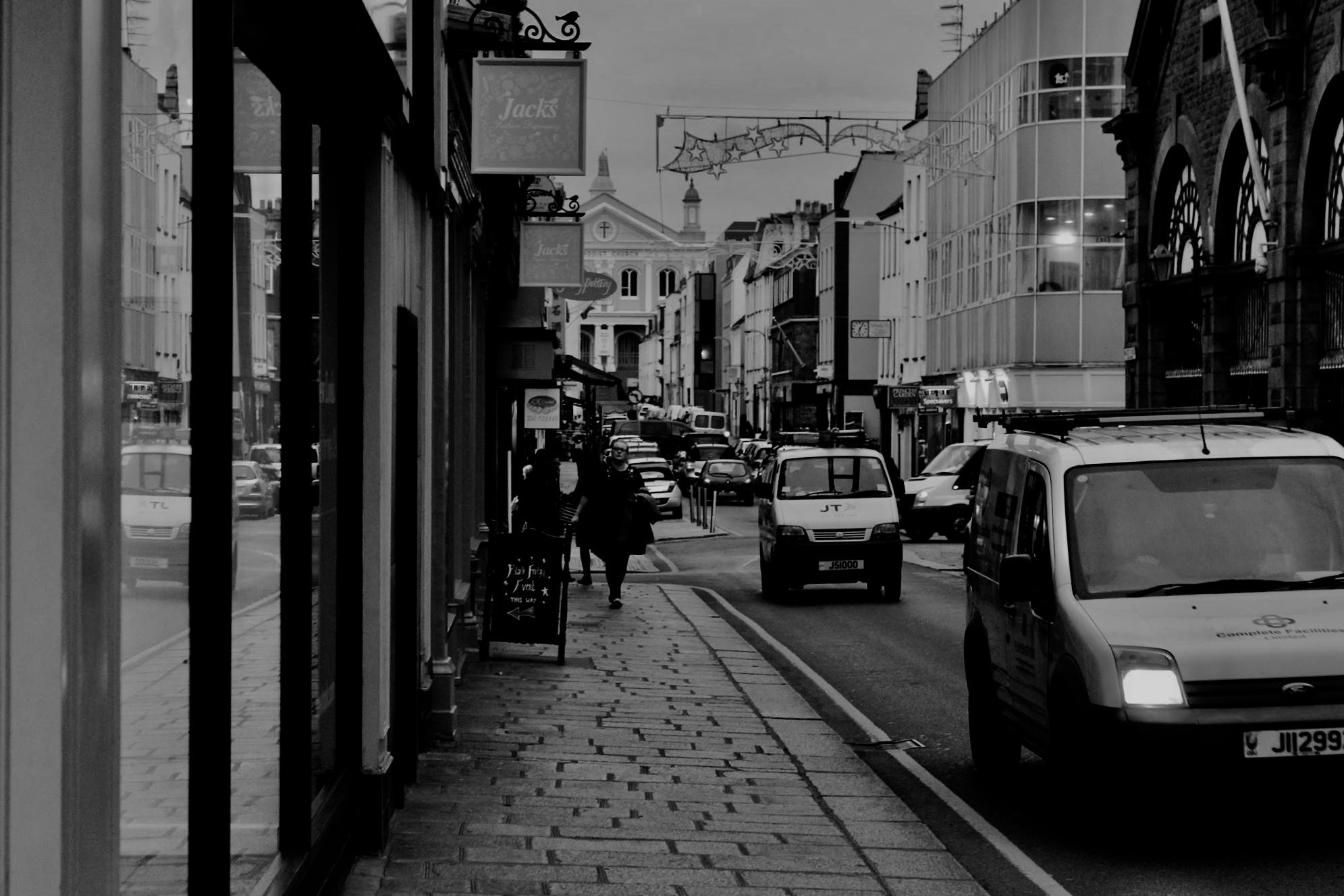
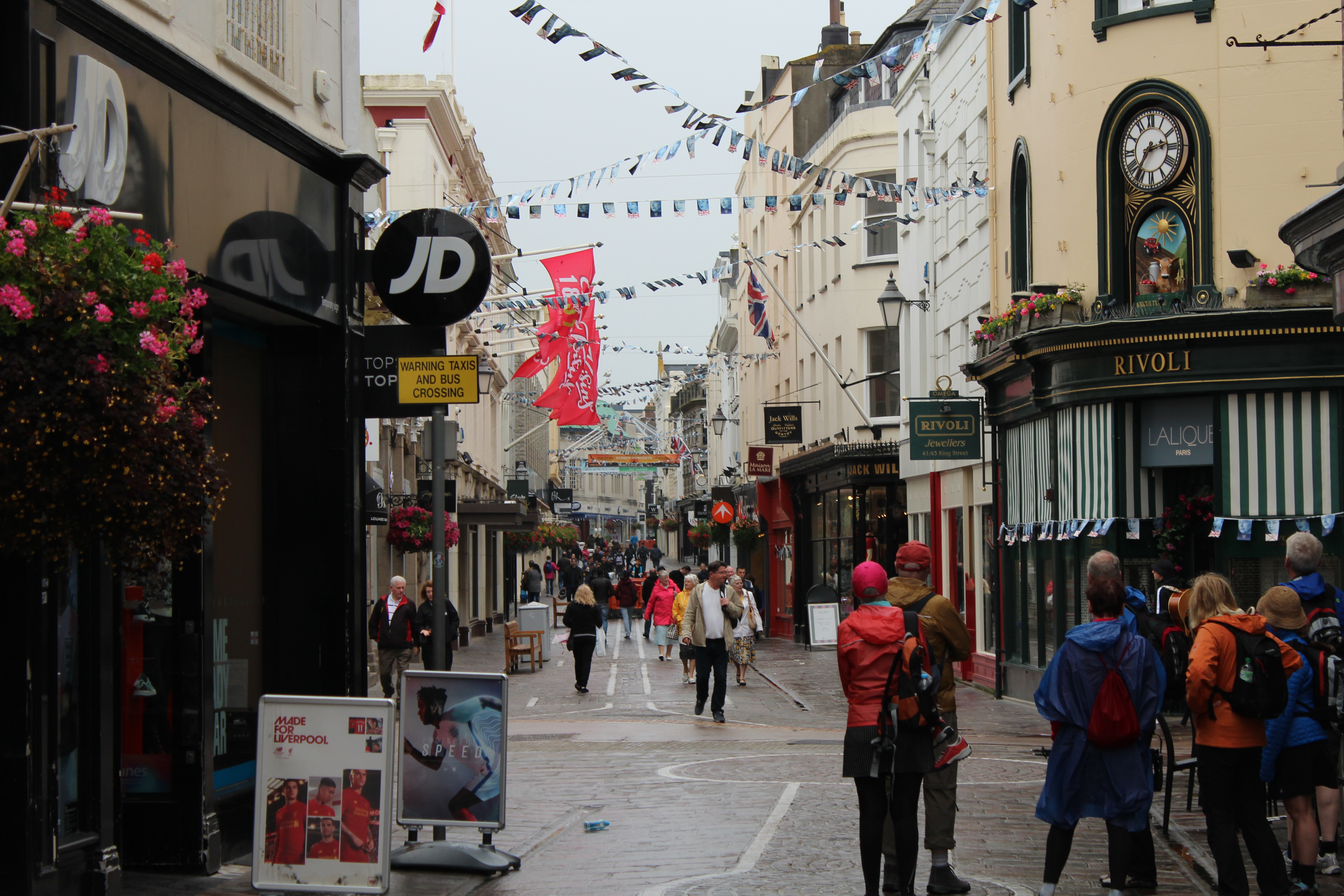
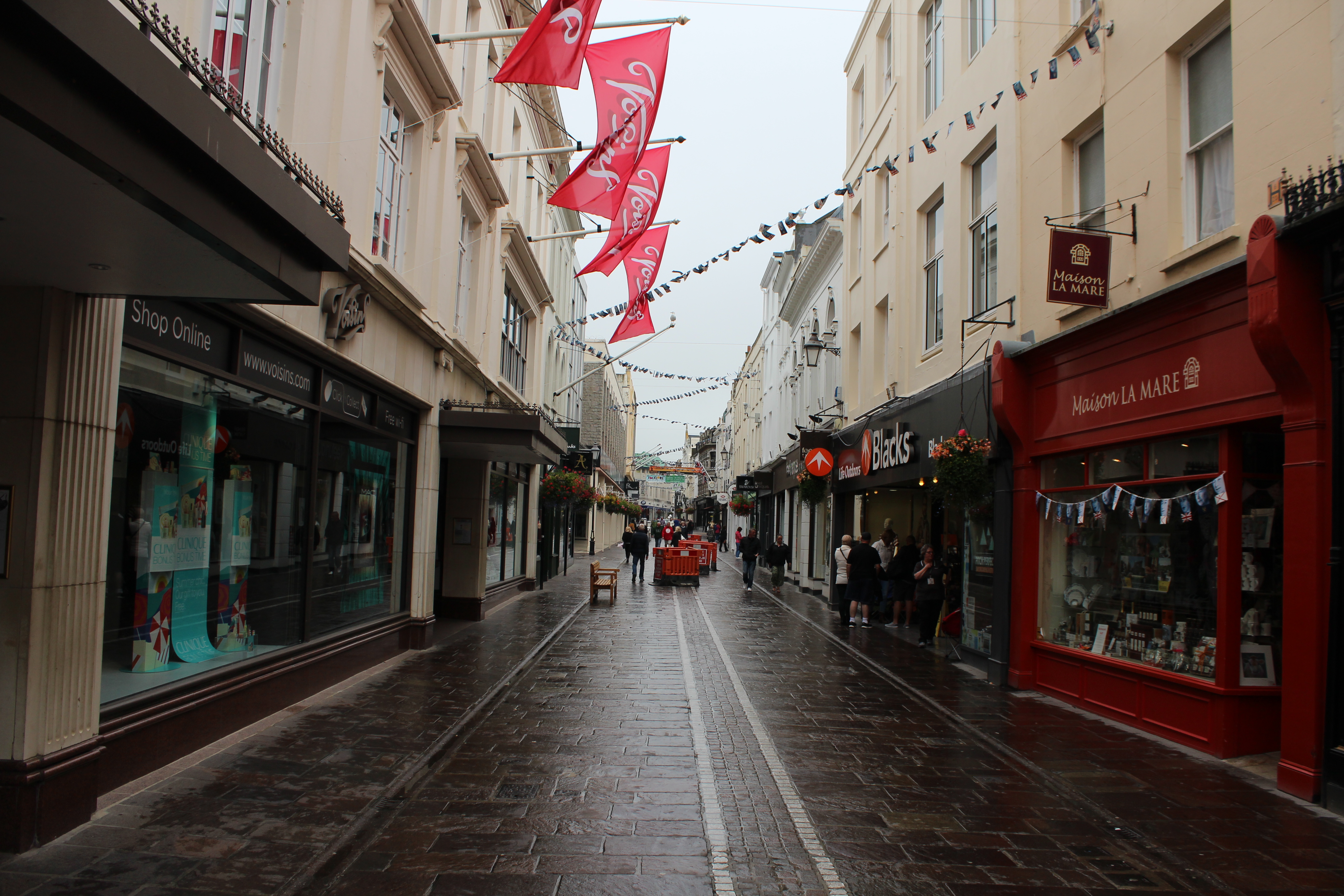
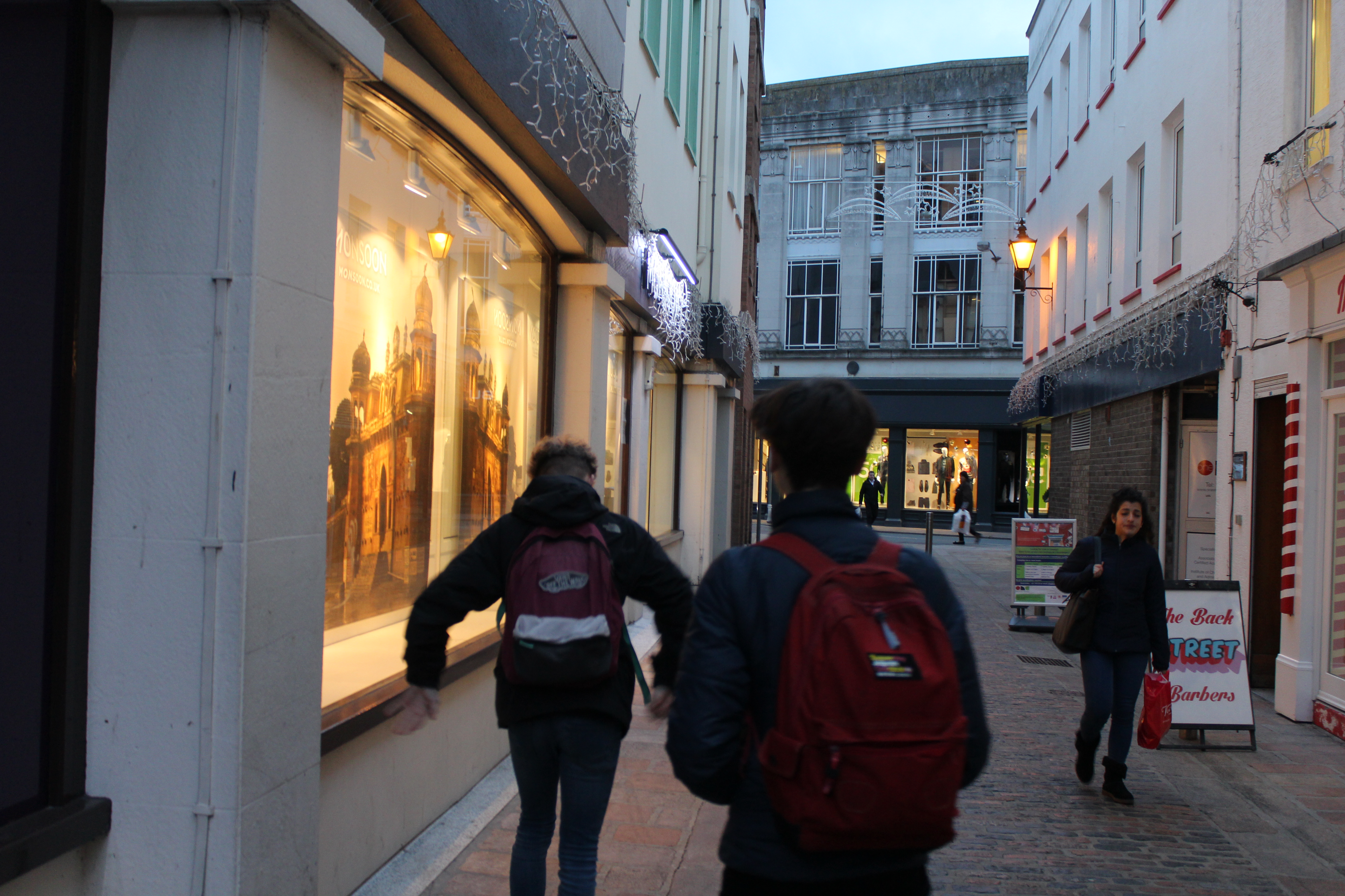
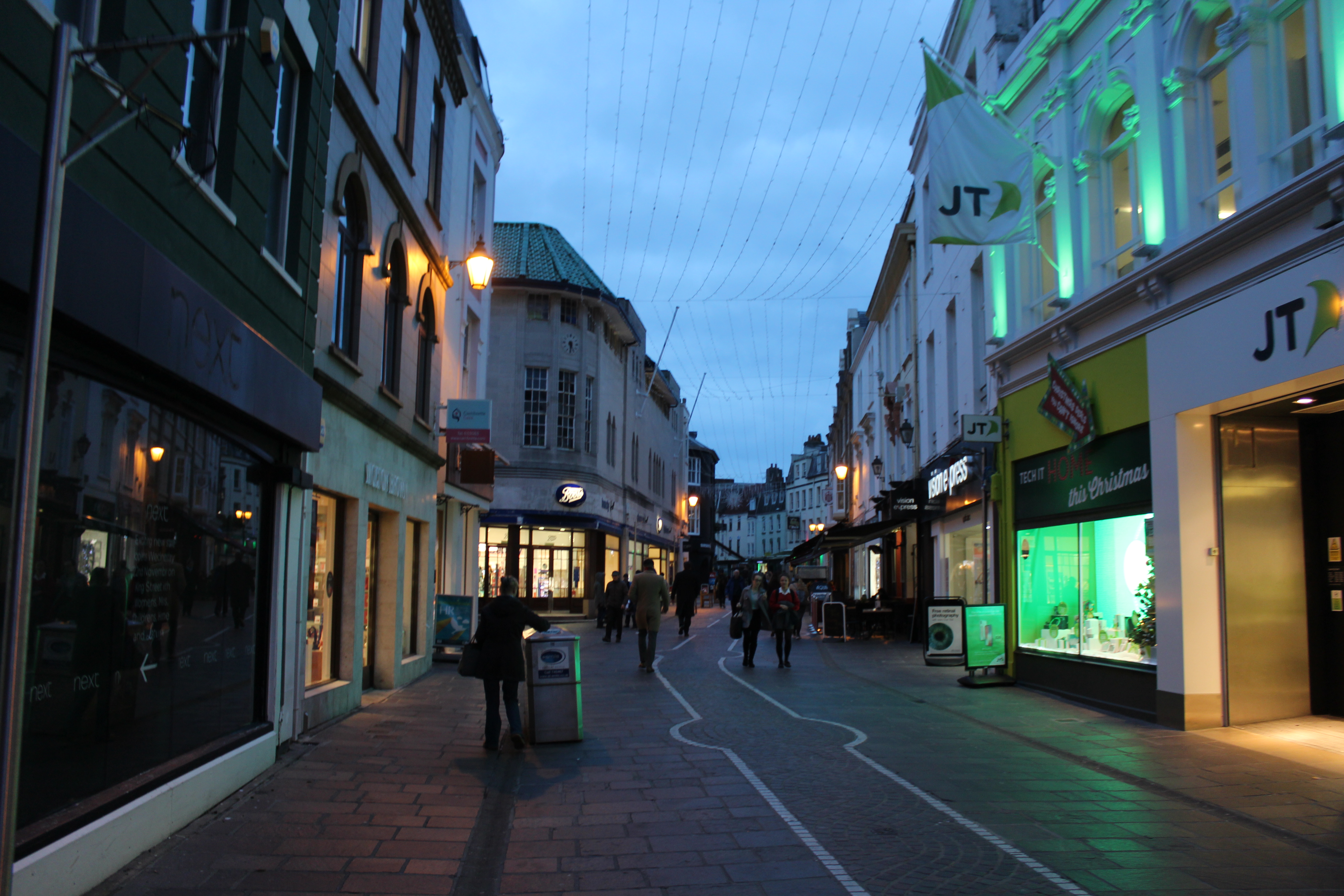
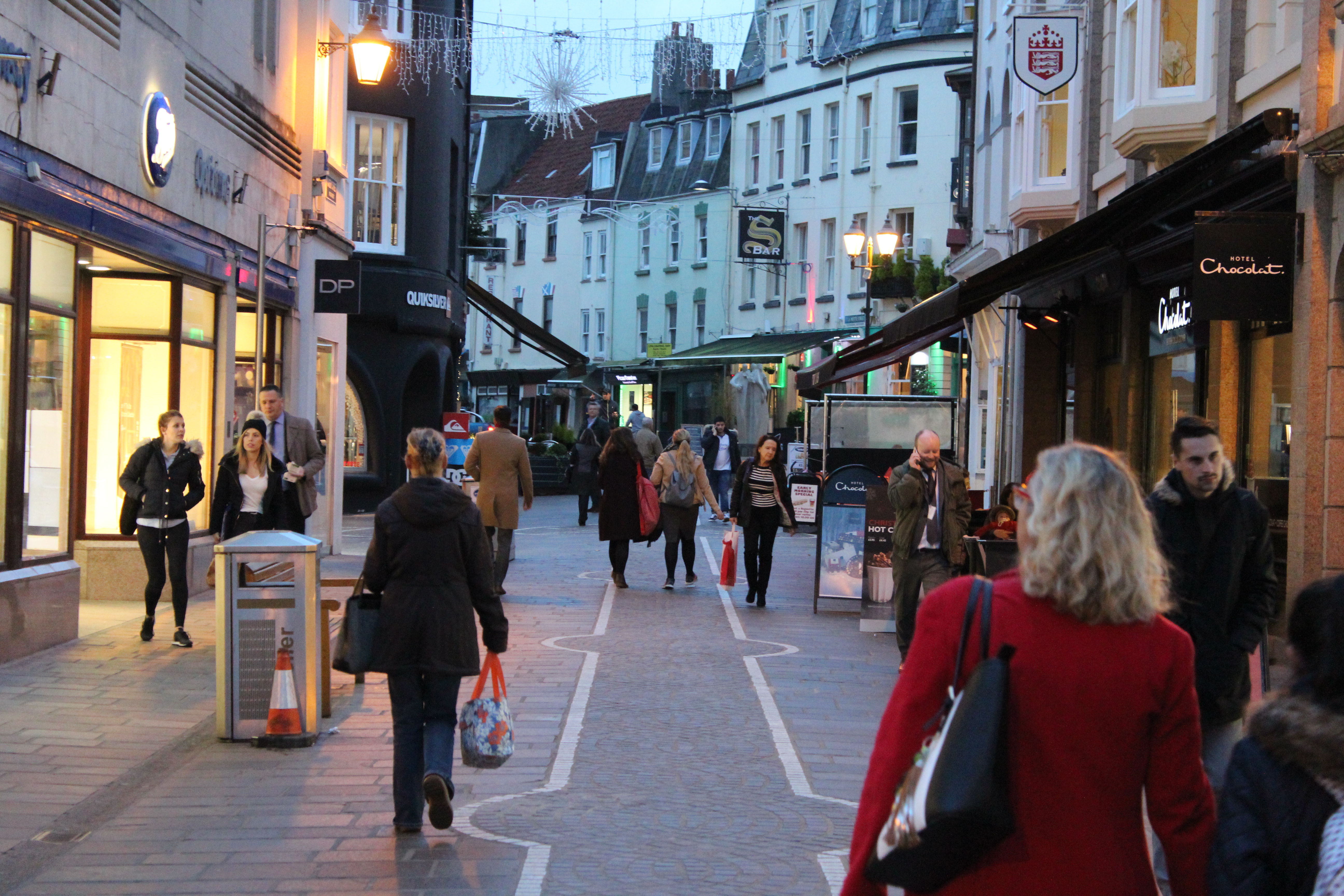
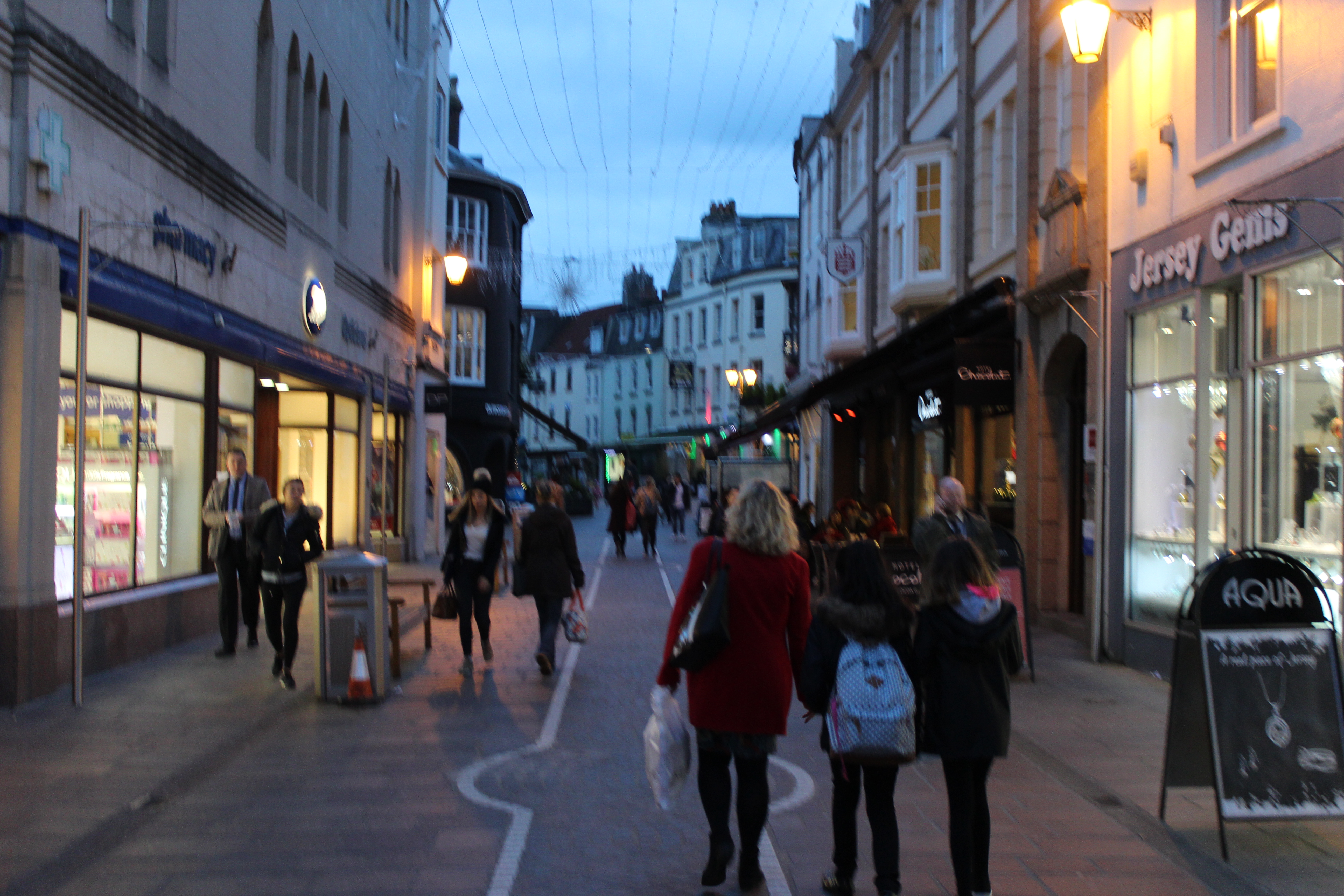
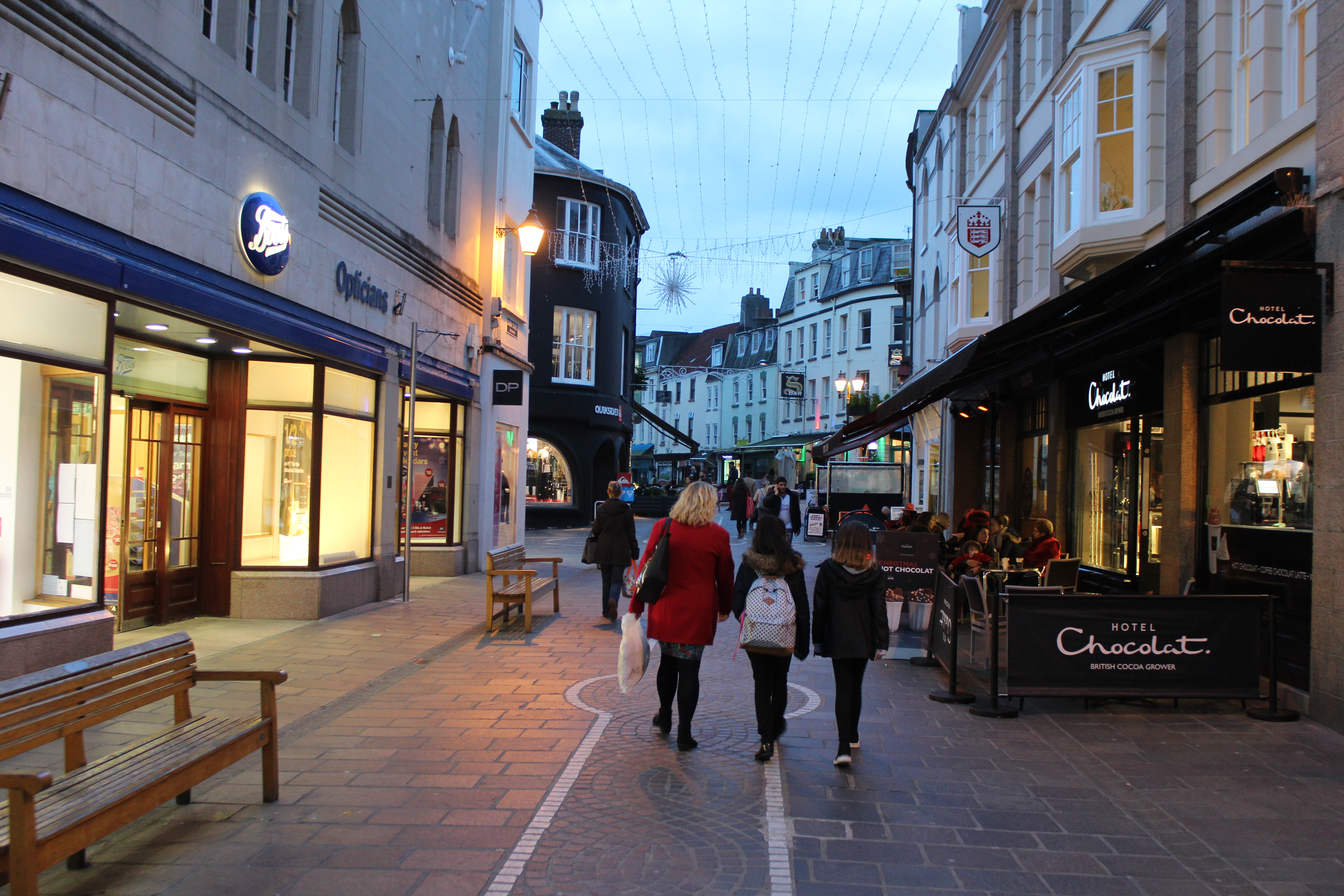
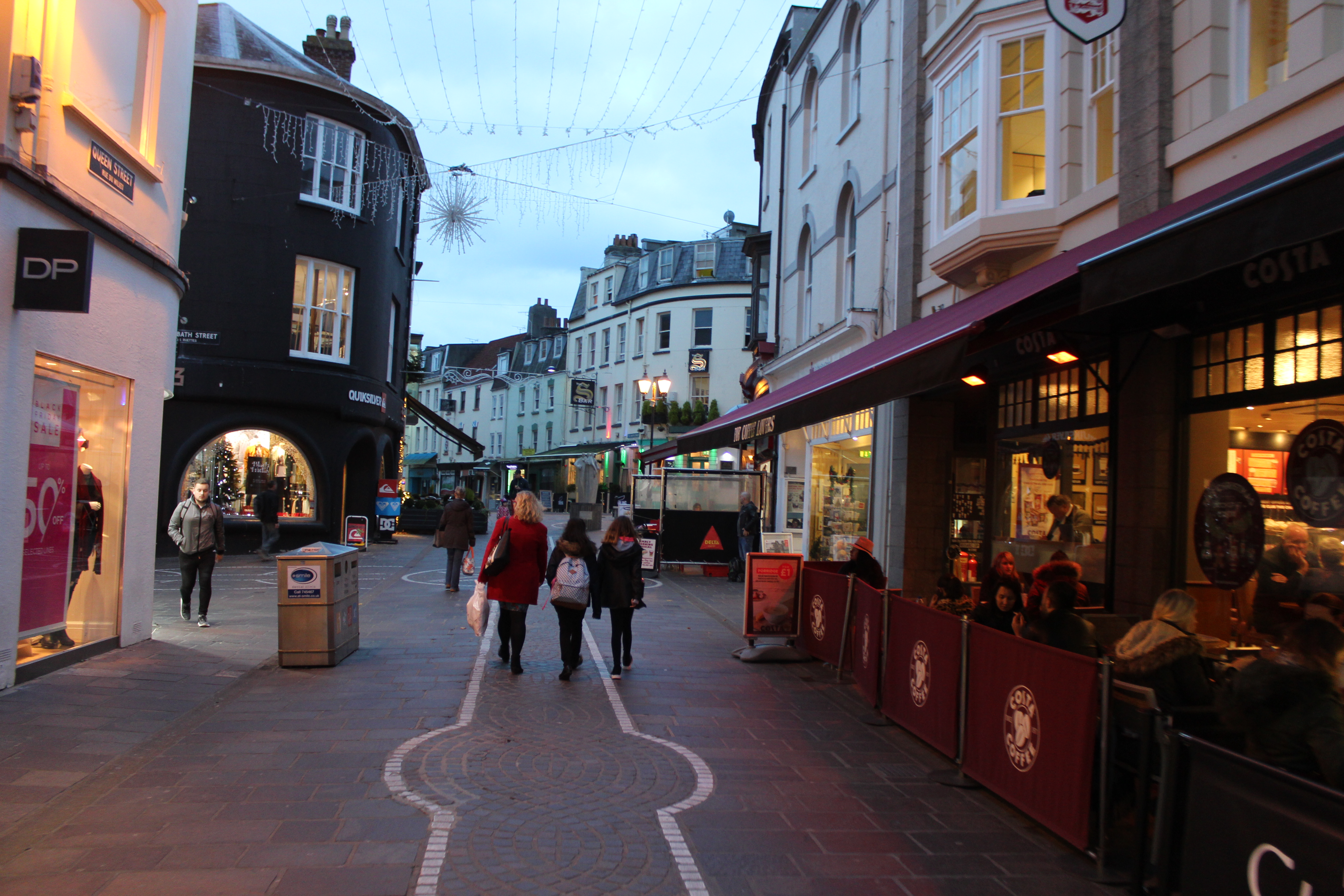
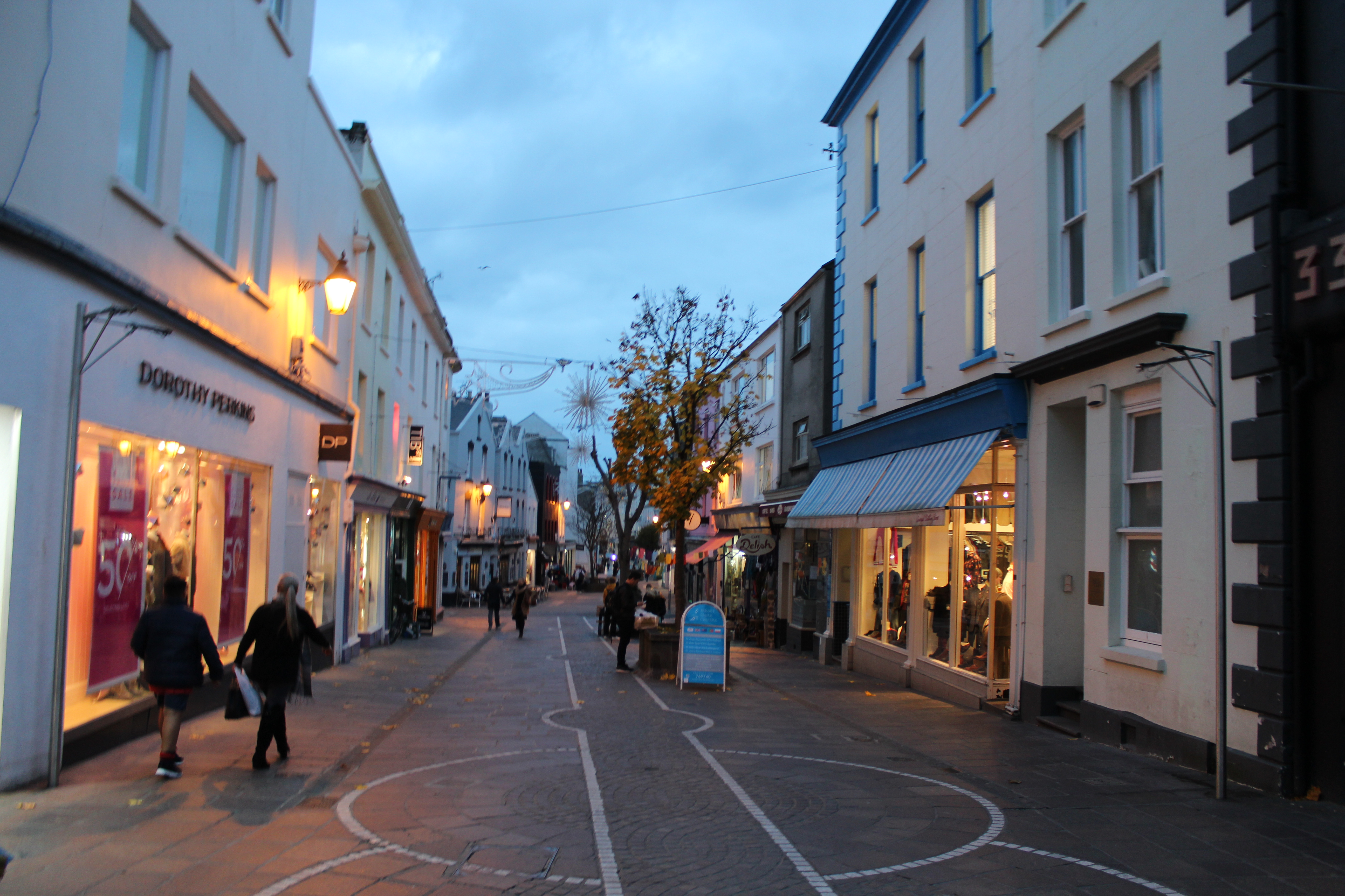
spill lighting is a light that illuminates a surface behind a certain line, such as a light illuminating a bedroom being seen through the window from outside, it can be used in photography in order to couture a sense of life and also vibrancy of lights that also create structure whiten a street.
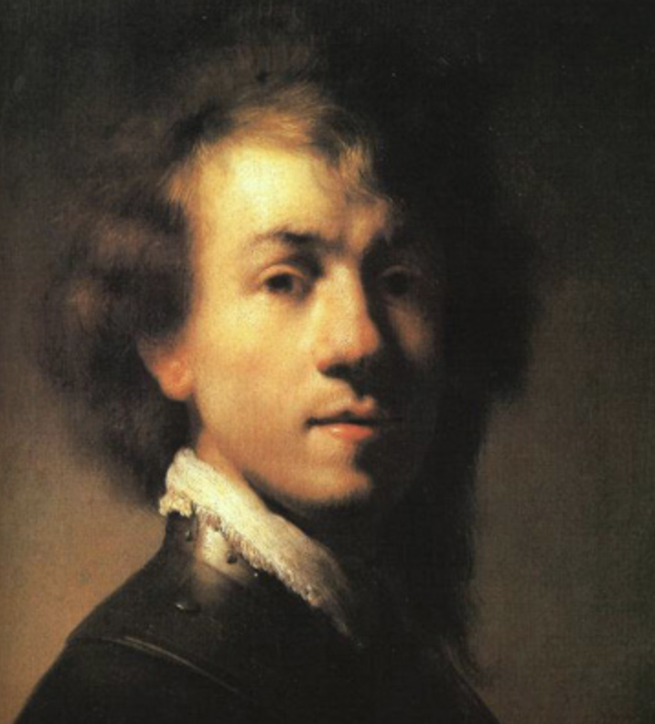
What is Chiarascuro ?
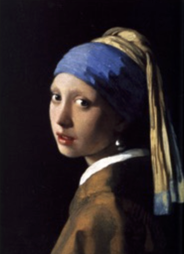
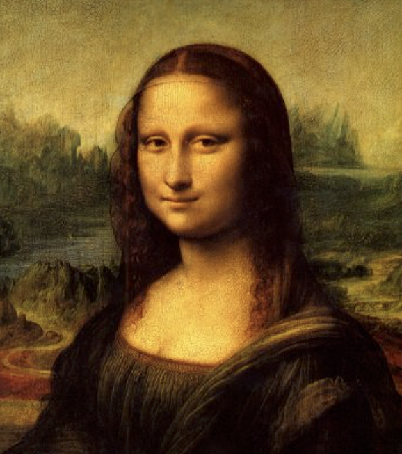
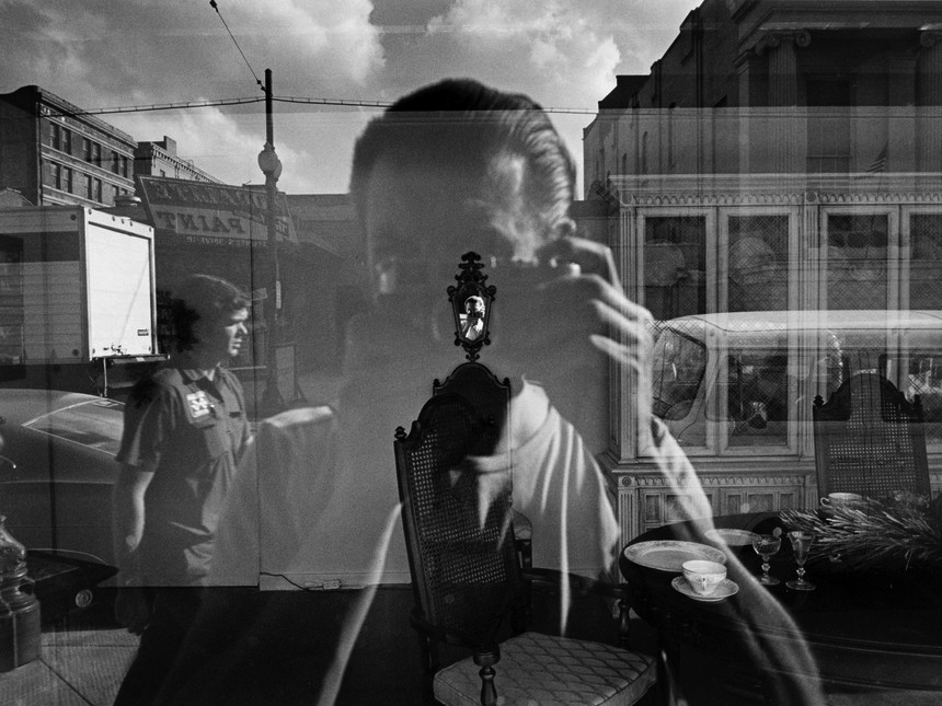
The treatment of light and shade in drawing and paintingThe underlying principle is that solidity of form is best achieved by the light falling against it. Many famous older artists have used this in their work, that is highly effective to create s sense of place and composition within a piece.
examples:


Why is light so important?
photography is completely reliant on the availability of light in in which ways the light can be developed to further an image.Usually natural light is available or ambient within the use of it, but we are mostly aware of the surrounding of different types of light, this is due to t how we can use it to exploit and create an aspect which is more creative.
The other types of lights commonly used to enhance images within photography are:
intensity of the light:
The intensity of light is simplistic to understand, this is due to the the least amount of creative consideration necessary to achieve a successful photo. Rather than thinking of bright or dim think about the exposure of the photo itself and what effective f a dim shot or a harsh light you wield want to develop. A camera’s exposure settings (shutter speed, aperture, and ISO) are based largely on the overall intensity of the light in the scene. For any given amount of light, there are many combinations of shutter speed, aperture, and ISO that can be used (these are called equivalent exposures). This is done in order to show a development of opposite directions to show a juxtaposition of tonal lighting and the overall controllable effects in the piece. These three camera settings work in opposite directions—meaning that if you change one to be bigger/faster, then you have to change another to be smaller/slower to keep the overall exposure the same.
direction of the light
light has many characteristics of being harsh and light,but also being softer and diffusing instead of being sharp.in addition their is directional quality that can either enhance the subject or perhaps allow a sense of direction to the images, there typically three directions that we look at when discussing the direction of light.such as front lighting does from a source behind the photographer and is usually a softer light in order to present unwanted shadows.light has a string tendency to flatten out a subject, this font lighting ill illuminate everything but will however offer a highly defined image and defined subject.
temperature of the light and white balance
The temperature of lights allows a warmer more red tones compared to that of the harsh light that is occasionally seen, this is used in order to show a clear juxtaposition of heat and perhaps suspense whiten the photo compared to that of a fashion photo or one to show strong shadows within the images. white balance is important in order to create a reassurance that everything is intact white and does not differentiate depending on the lighting used.
Using reflectors (silver / gold)
The silver is used in order to reflect the white light and create a strong bounce back onto the face and create an additional sense of lighting. whereas the gold shows a warmer tone and perhaps gives a more pinky skin colour effect and highlight the already existing tones within the image itself.

