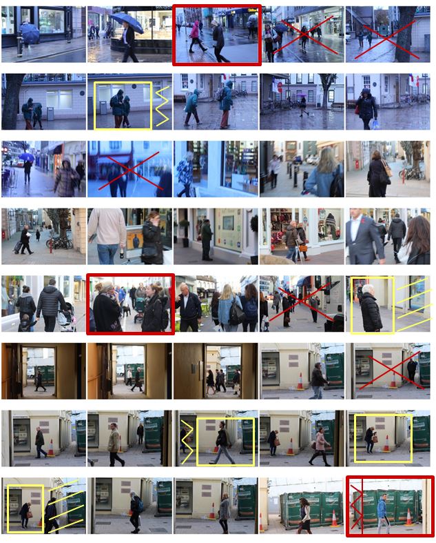
 I selected the images from my photo shoot that I thought have a clear subject and a good angle at which the photo was taken and displayed them below. I have highlighted the photos I definitely want to use in red and highlighted them in yellow if they need editing.
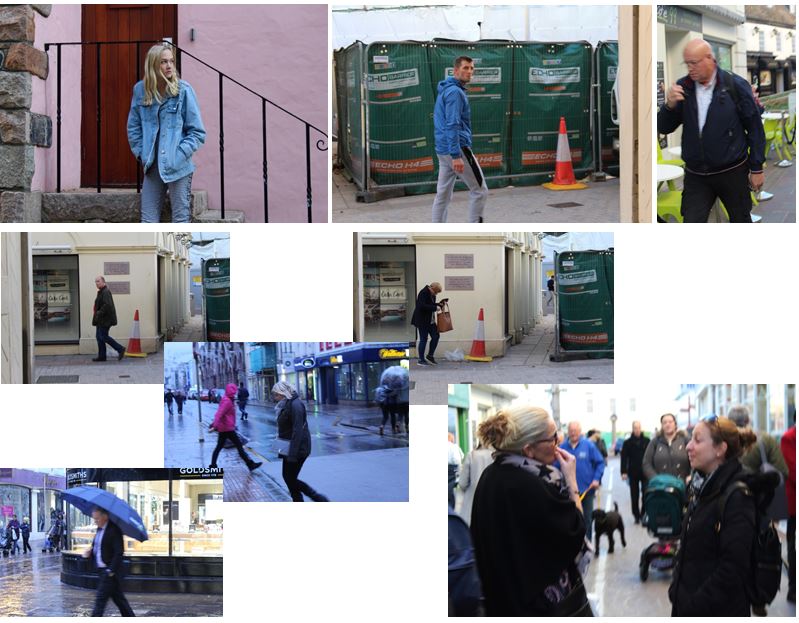
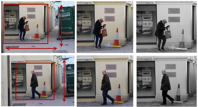
I have chosen these photos and have cropped them to make the overall photo more aesthetically pleasing and so you can see the person more clearly and distinctly. The photograph was candid as i took it at an angle in which the subject did not know they were being photographed, making it more natural. My favourite photo out of the two is the first one as it is more interesting as she is looking for something and is not just walking down the street.
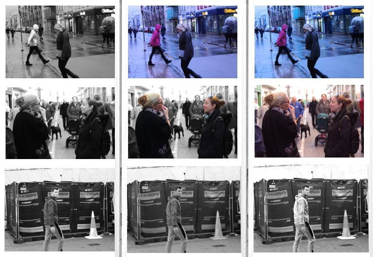
I chose another three images which I liked out of my photo shoot and experimented with the colours and tones. This process allows me to see my photographs next to one another and compare them with each other so i can effectively chose my final images. My favorite image from the first row is the 3rd image as i set the white balance to fluorescent light in order to create a blue tint. This creates the effect that the photo was taken in the evening. I also like the colours in the background as i think it gives the photo more atmosphere.
These are my final two images from the photoshoot.
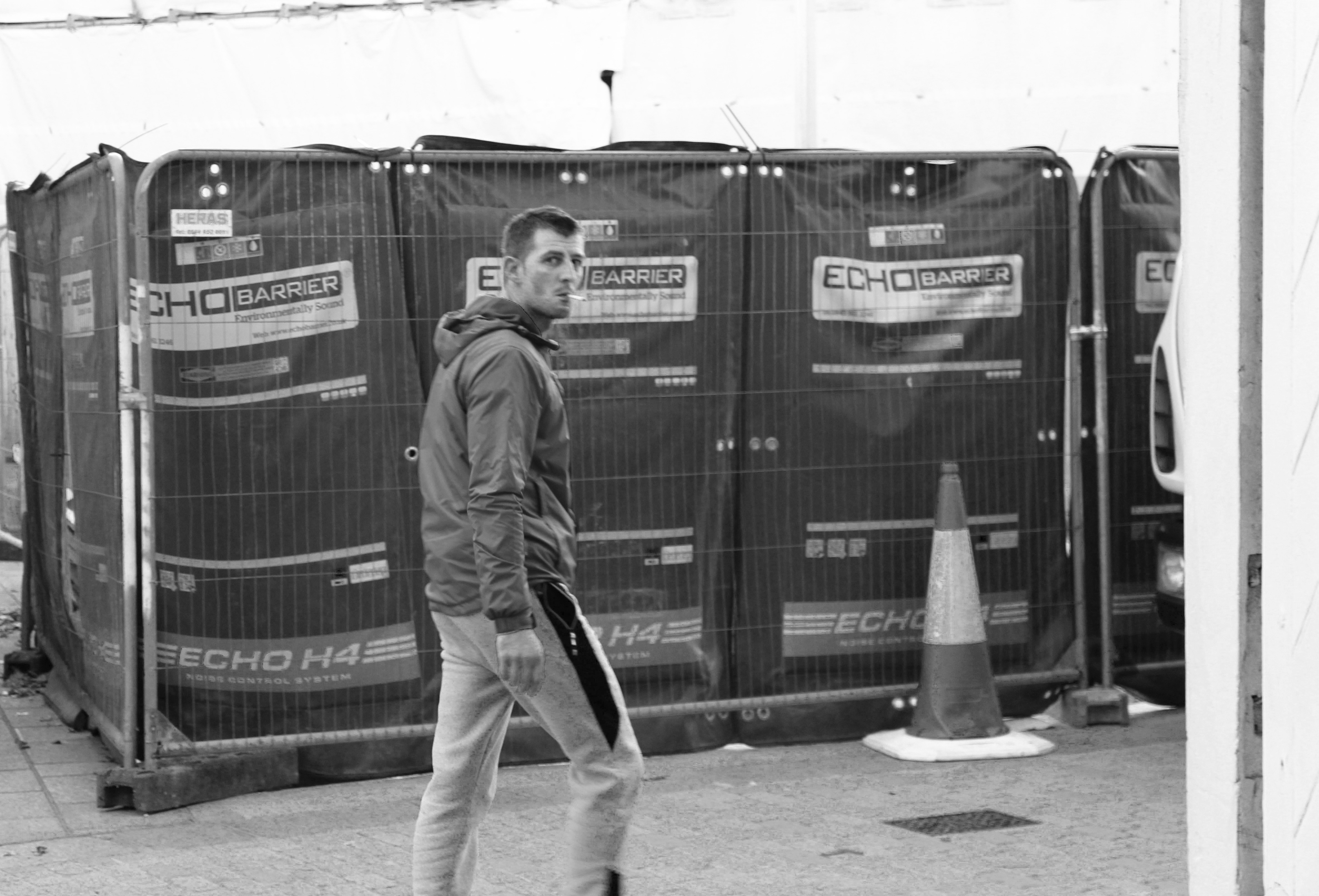
The first image i like as the subject is completely natural which makes the photo candid. I also managed to capture the photo the moment in which he realised he was being photographed which is why his face is confused. I edited the photo in black and white to emphasise the the contrasts in colour and so the subject and the street are in similar tones. I like the background in the photograph and i think it portrays a street well, the fencing and the traffic cone create a sense of the loud atmosphere when the photograph was taken.
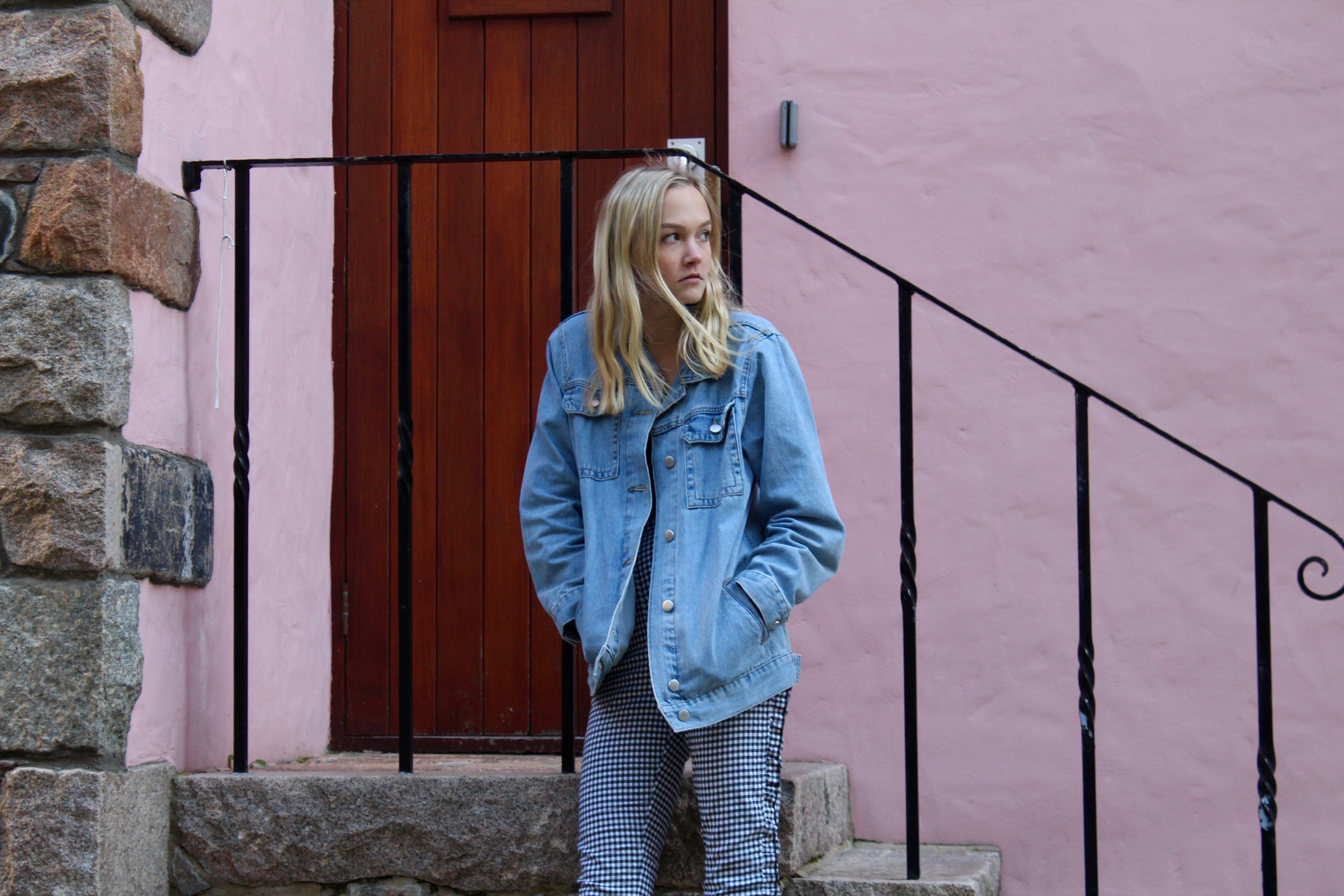
I chose this as my second final image as the atmosphere of the photograph contrasts a lot with the first image. The first being loud and busy, and this photo being more calm and relaxed due to the colours in the background of the photo. I edited the photo to emphasise the pastel light pink wall in the background and the railings behind her. The composition of the photograph is good as it is split up my straight lines showing the rule of thirds. The photo is also candid and natural as the subject is unaware that the photo is being taken making it ideal for street photography.


