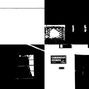
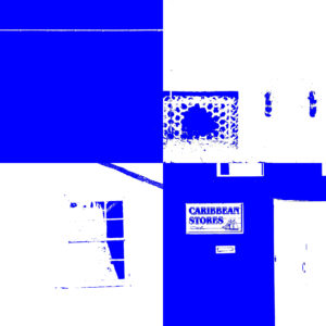
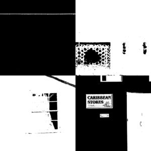
Keld Helmer Petersen - A danish Photographer who focused on shapes and kept his photographs very minimal. Some of his work uses very high contrasts. This moves the focus to the shapes and structures in each photo and strips away all the tones and shadows that a camera would usually capture.I used this technique on the images below by using Photoshop. I used 'threshold' and changed the levels of black and white that you could see in the image. I then inverted the image to see the opposite of the images. I also added colour instead of black for a similar effect however it looks more like to pop art:
Monthly Archives: October 2017
Filters
Photoshop Skills – Editing Colour into photos
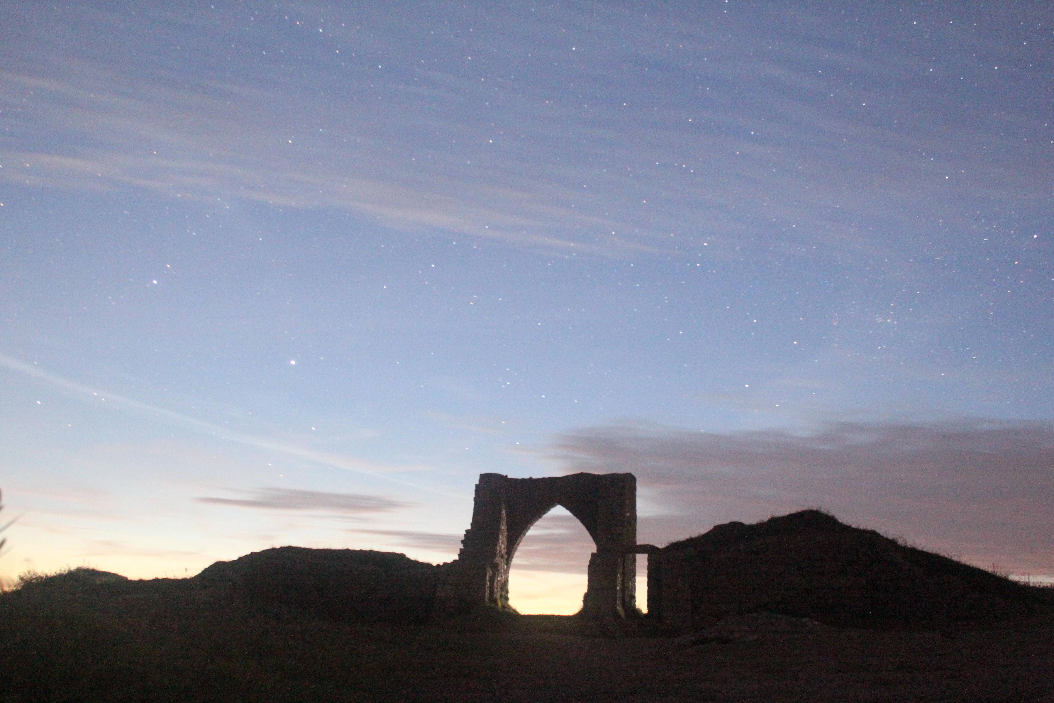
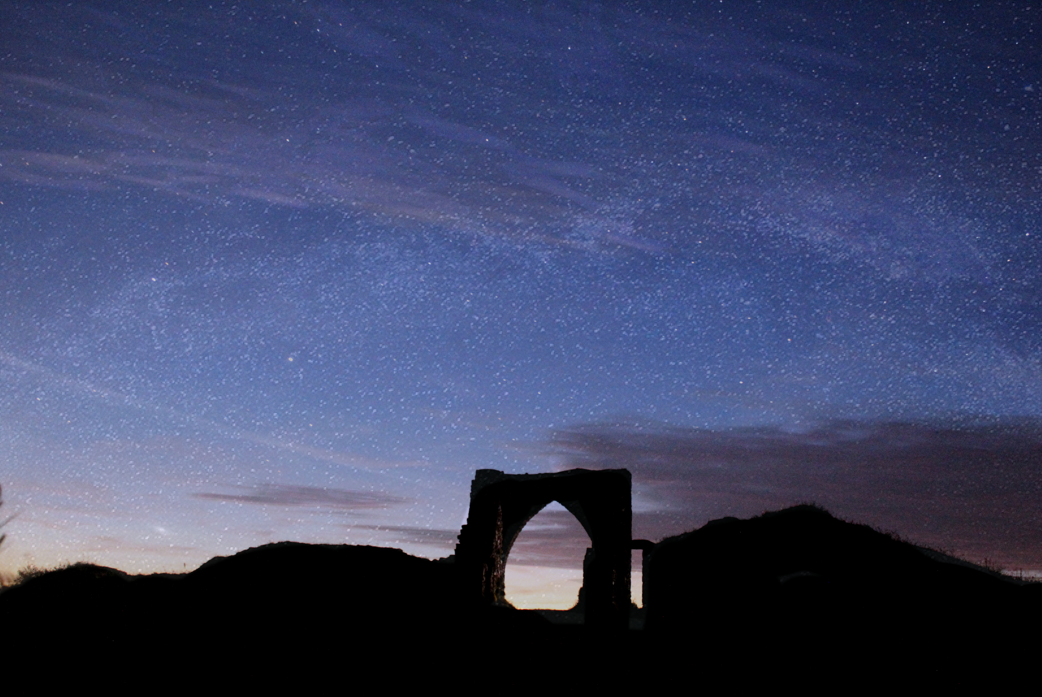
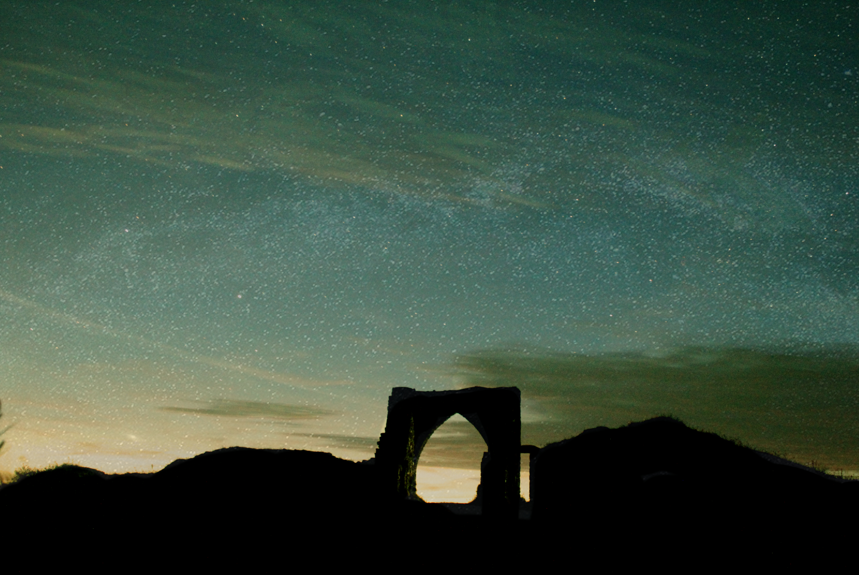
This image of Gronez castle was taking at nighttime, when it was completely dark. The aim was to capture the beauty of nighttime when inflicted with clear skies allowing visibility to see the millions of stars which surround us. Also to capture the colours which are seen through the skies at night time which often can be quite extraordinary. This photo below was taken with a 30 second long shutter speed and an ISO of 6400. I used these settings to allow as much light sensitivity possible into the lens.
This is the original photo
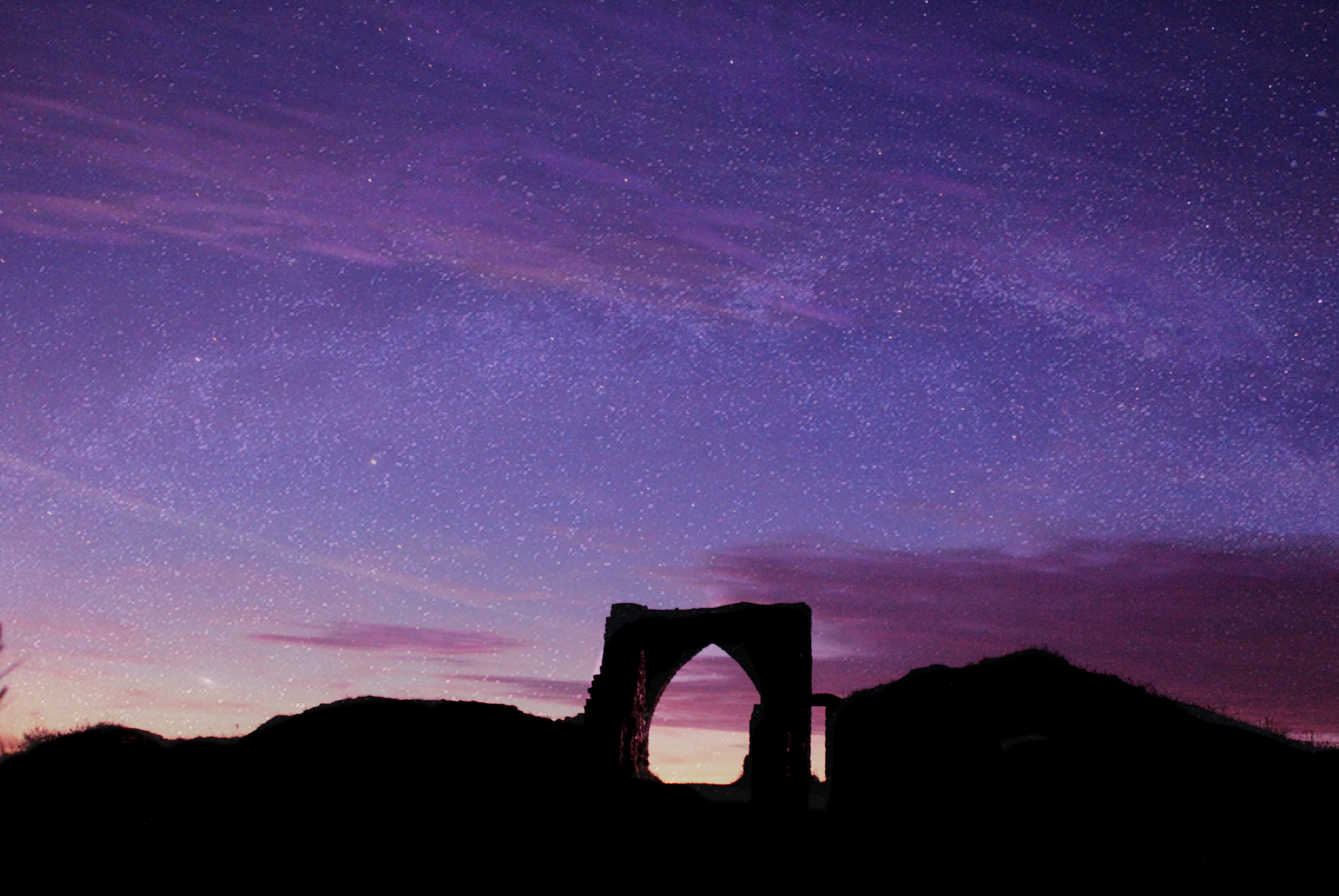
On Affinity photo, by adjusting the white balance and giving the photo a tint of different colours I was able to bring the night sky to life with vibrant and interesting colours. Much of the night time photography I have come across appears to have these unrealistic colours added which I believe is extremely interesting and is very beneficial in creating a photo in which people will take their time to look at. By adding the colour i was able to turn an ordinary picture not something which is eye catching and engages the audience more.
Tamara Lorenz and Franco Fontana
Franco Fontana

Tamara Lorenz

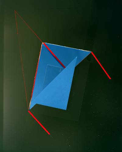
Tamara Lorenz uses geometrical shapes with solid colours to photograph. She cuts and folds the paper to achieve the shape that she wants. This photograph mainly consists of triangular shapes to give the impression of a 3D shape when in reality its only pieces of card. The folds within the photograph creates darker tones and shadows. The green background starts lighter in the top left corner and ends much darker in the bottem right, showing that the light is coming from the left. The thin lines of red create more geometrical shapes in the photo and outlines the other shapes. contrasting with the colours. At first glance, it is unclear whether the photograph itself is the artwork, or just a photograph of an exhibition, this directs attention to the tradition of photographic reproduction of artworks and its impact on the development of art and the art history since the nineteenth century.
Final Composition
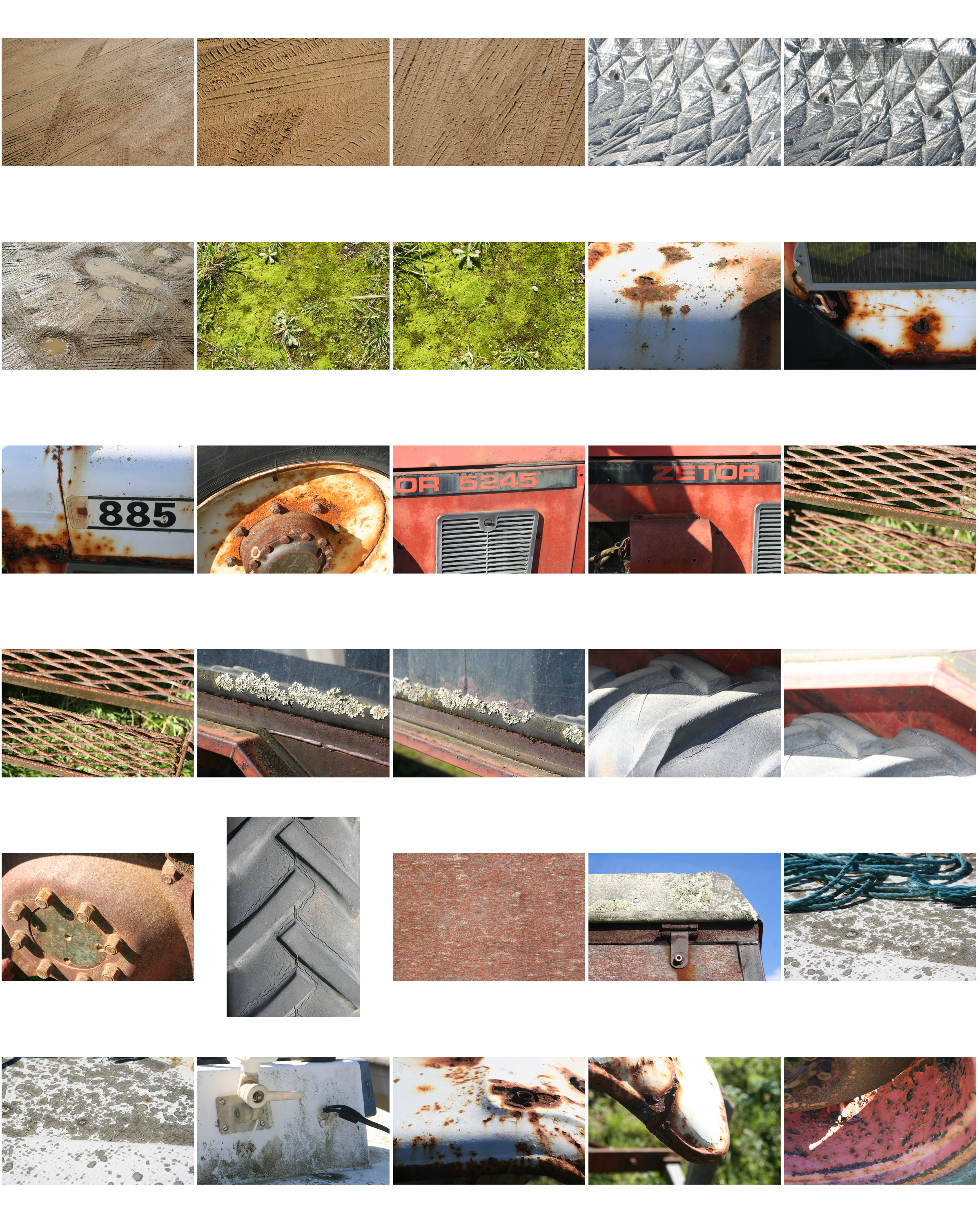
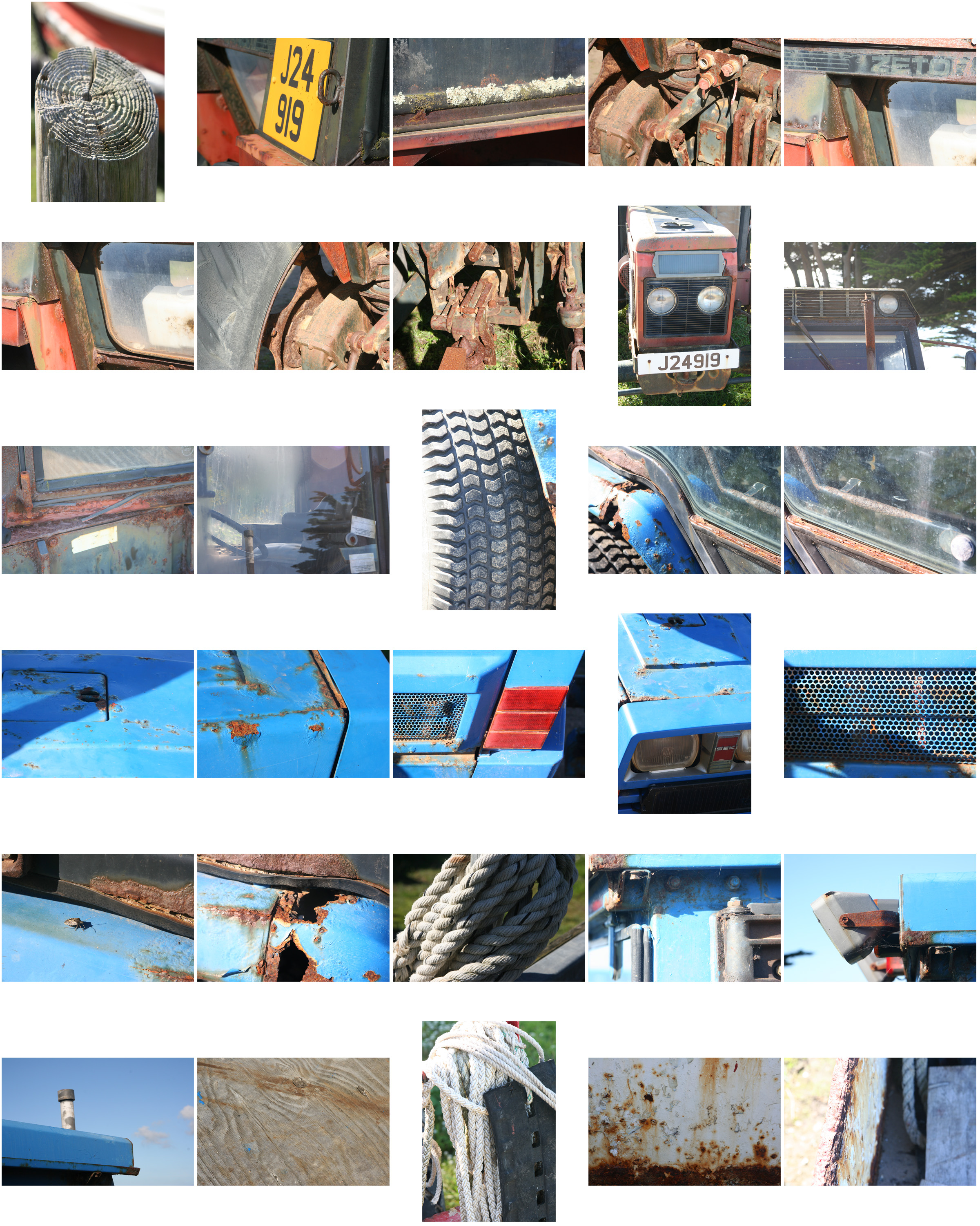
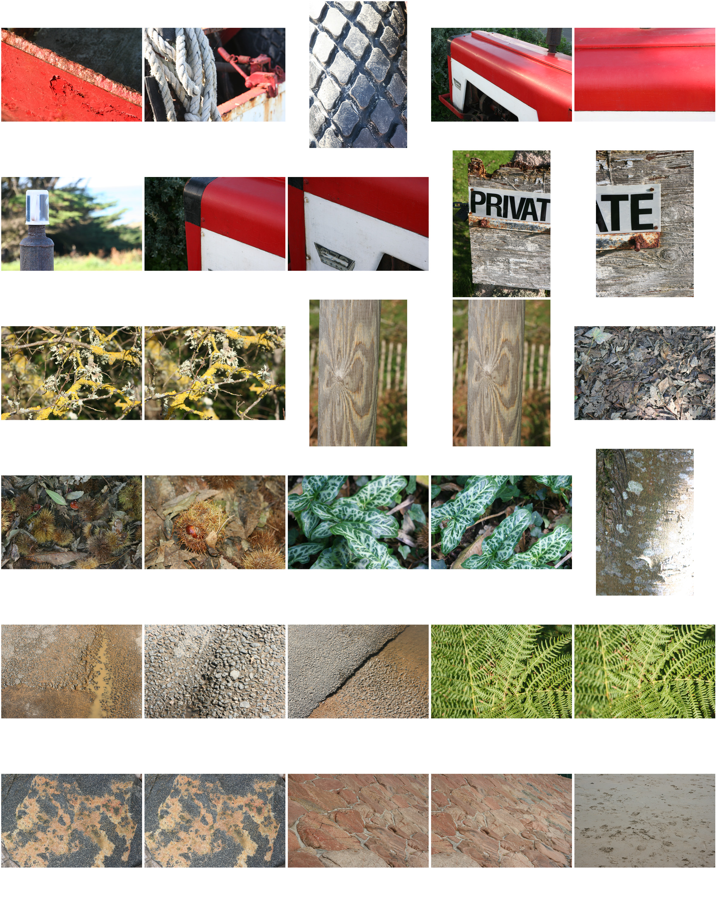
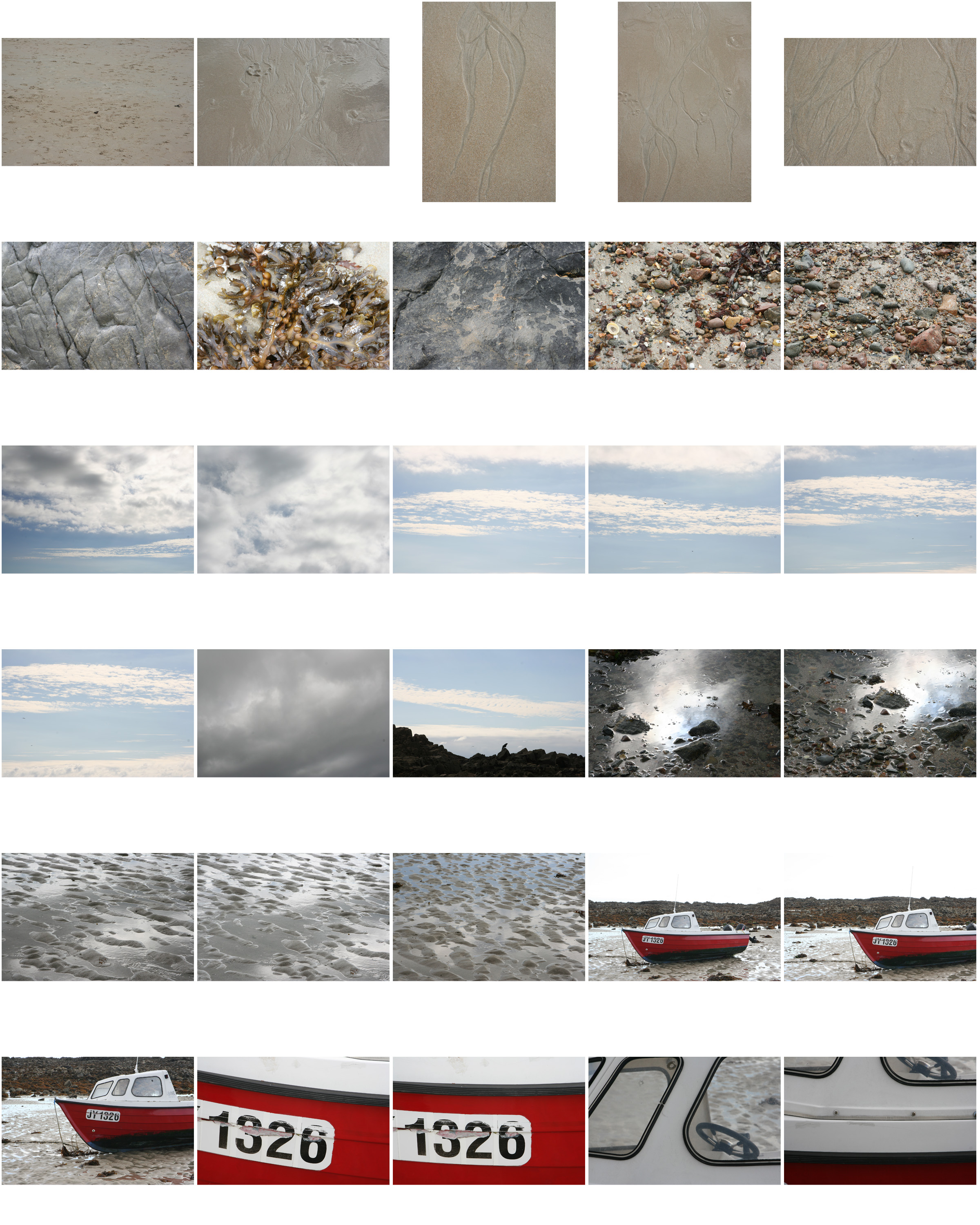
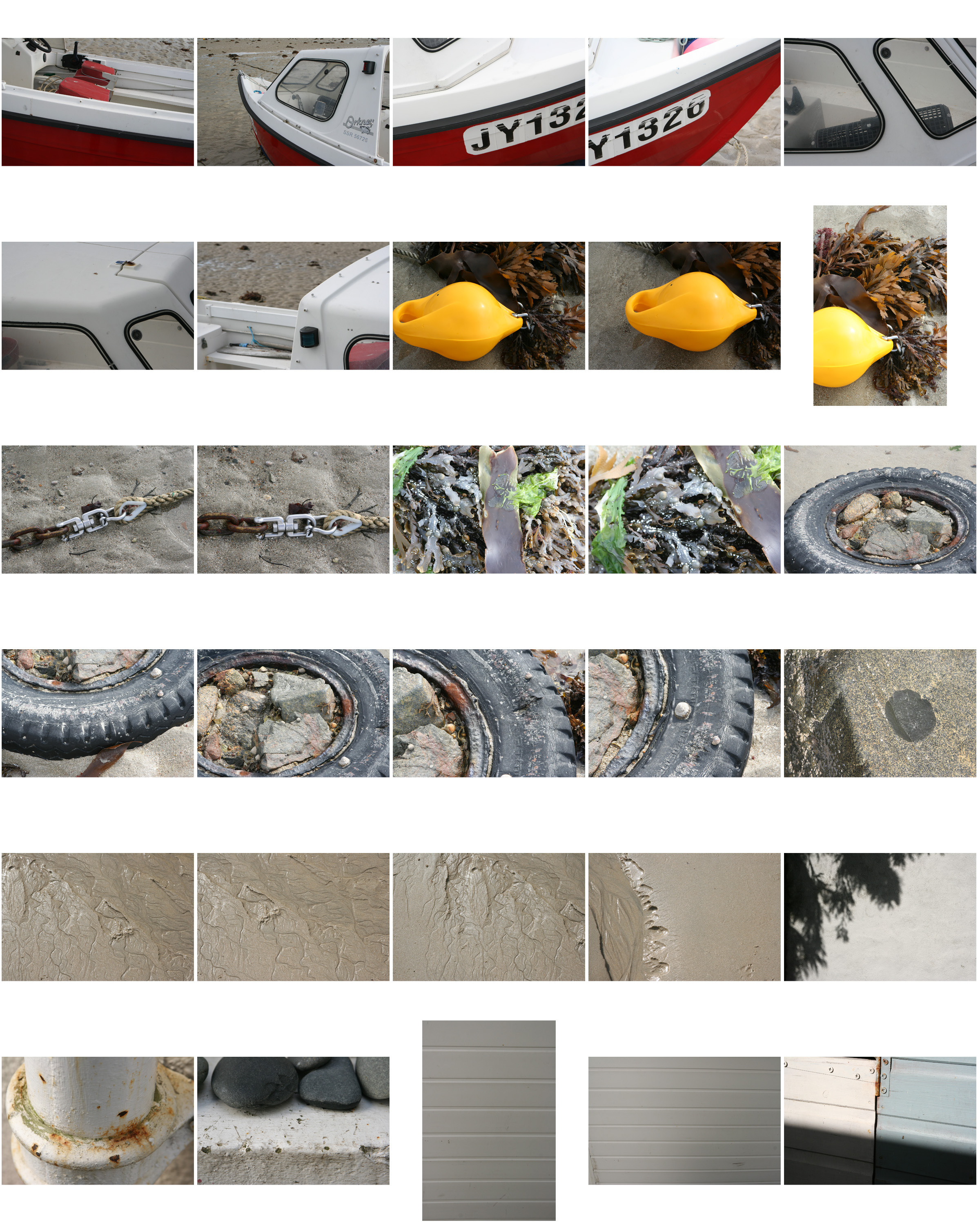
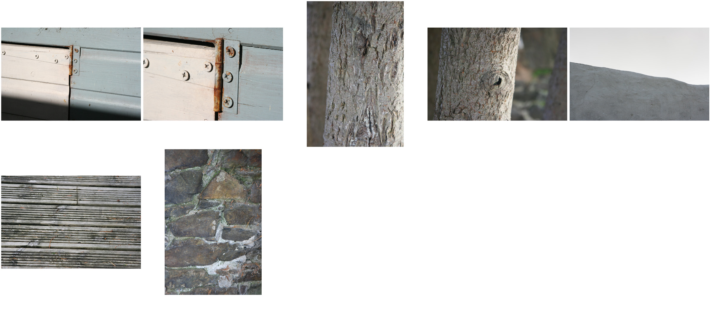
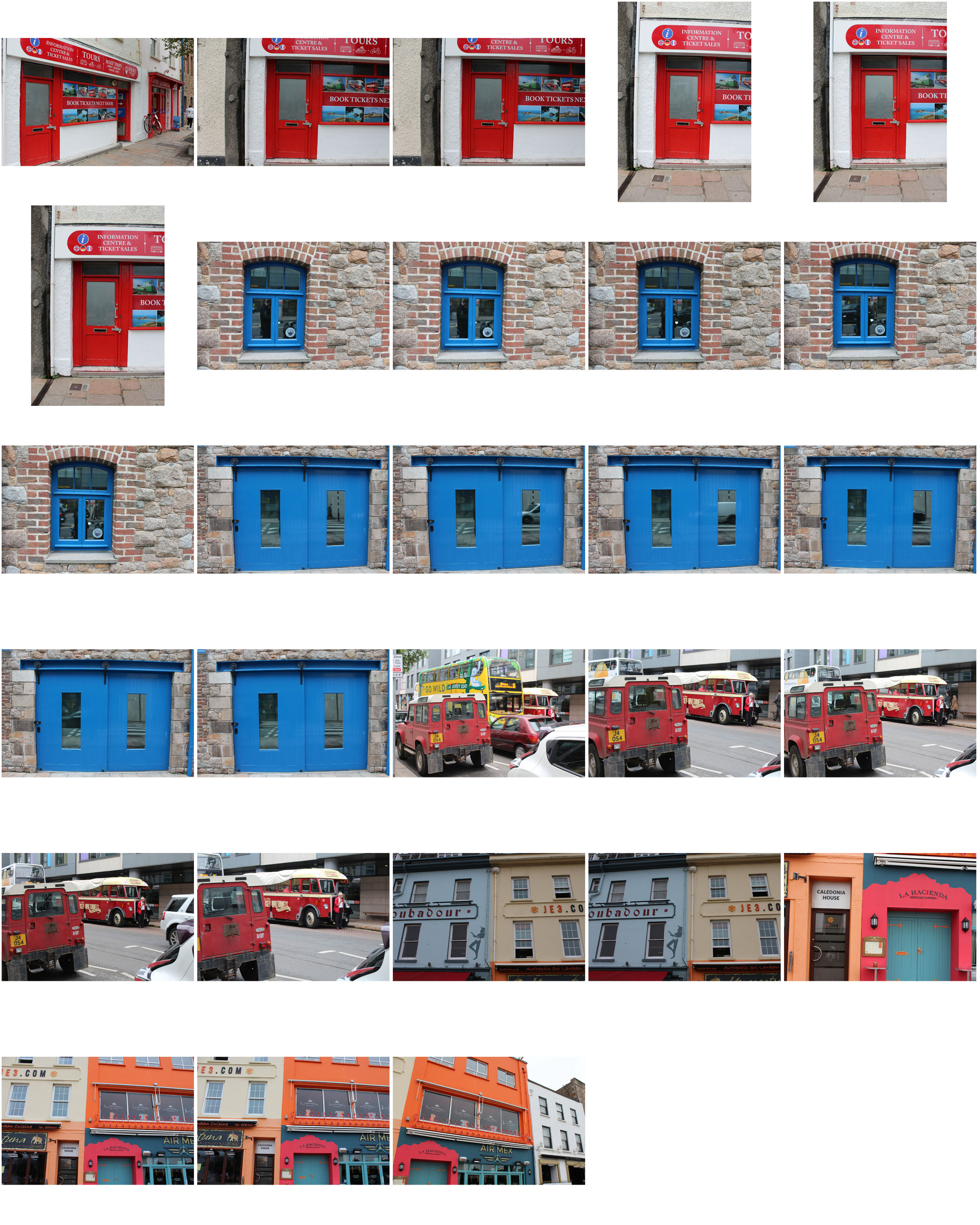
The below selection of photos are my final photos and composition. I have chosen these photos as they all link into each other and link to genres such as typology and minimalism whilst exploring colour and texture.
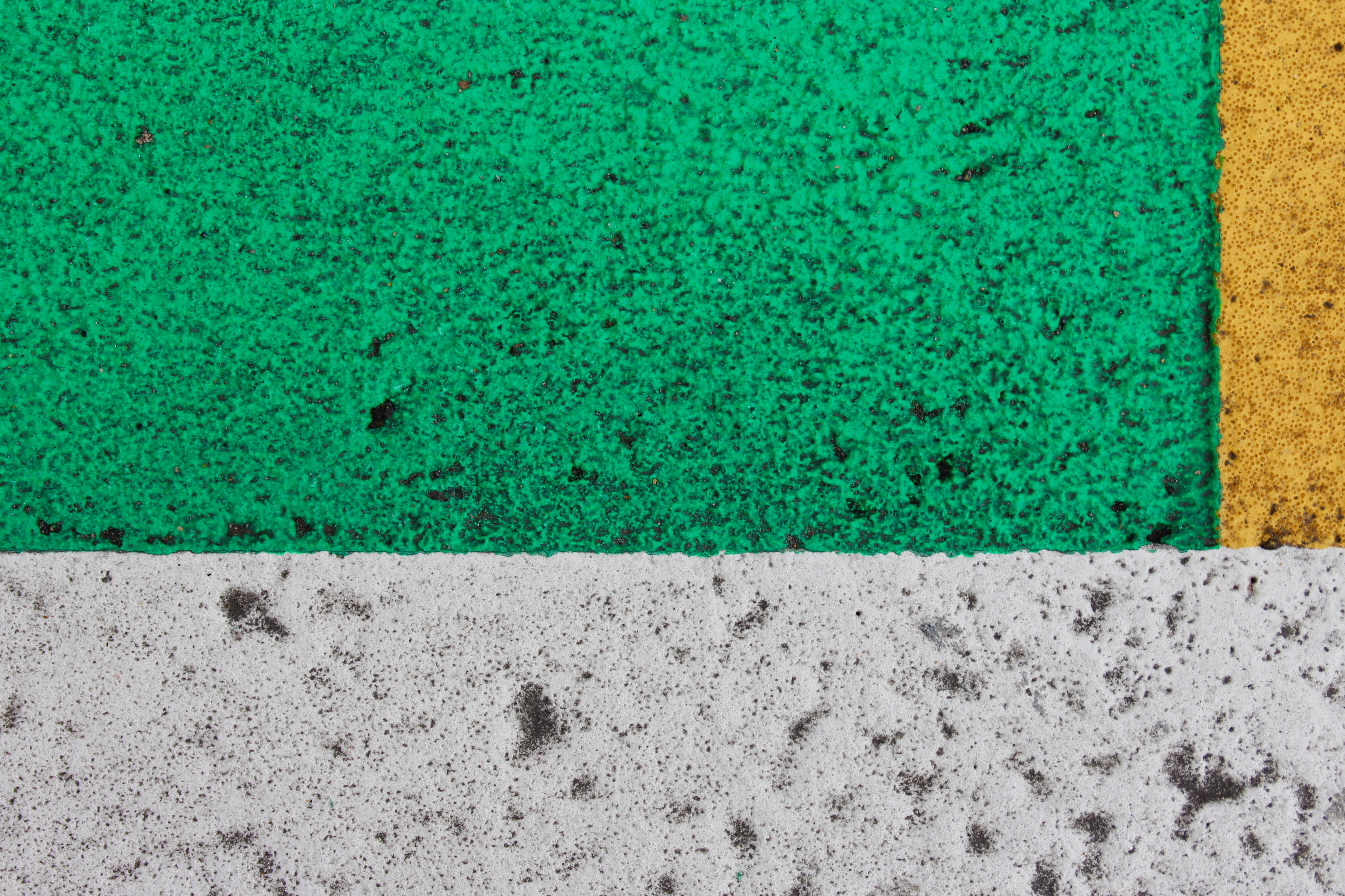
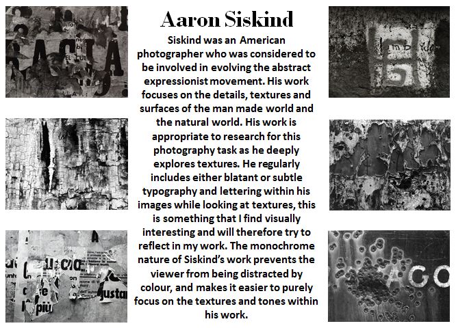
I took inspiration for the bright colour scheme from Franco Fontana and the idea for the use of texture from Aaron Siskind. The idea to present my work as a typology of similar photos came from Bernd and Hilla Becher. I tried to present these images in the same style as Mark Rothko – blocky images stacked on top of each other with spaces in between.
I chose this composition above the others due to the way it makes the photos look more collective and together than the others. The repetition of the lines and continuous direction makes the composition appealing to me. By using this composition, the pictures remain abstract but intriguing.

Homework Assignment 5 – Color
Julian Schulze
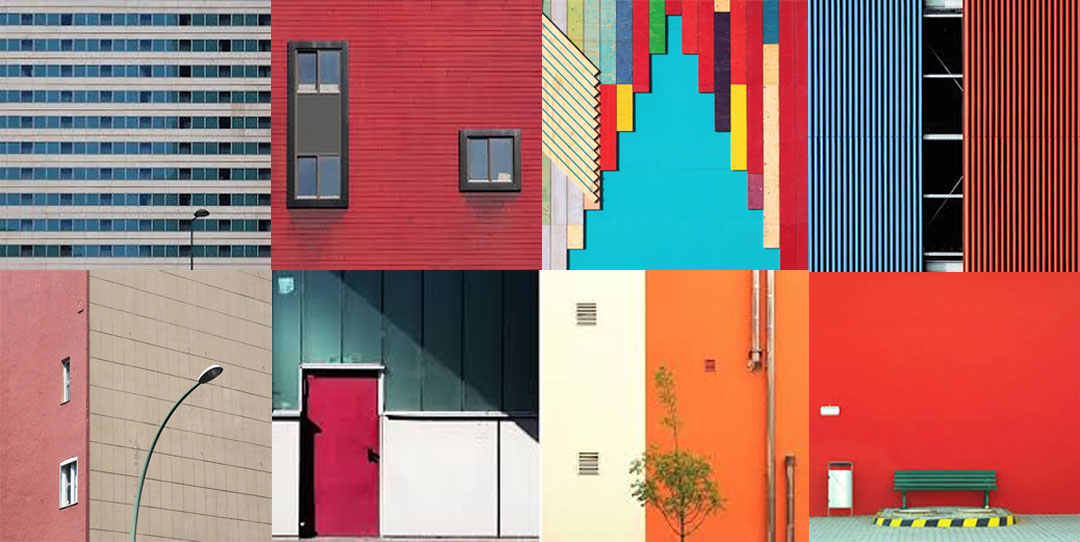
Julian Schulze is a Berlin based photographer which has an abstract and minimalist approach to photography. He is mainly focusing on the Abstract & Surreal genre of photography and it appears that he loves bold colors as well as color combinations and compositions. “I like the simple things in everyday life”. One of the most important things seen in Schulze approach is to identify freedom.
Analysis Of Photo
![]()
This image clearly shows a supposedly isolated man in what looks like an urban area between some interesting and abstract architecture. This image is aesthetically pleasing to view as it has a clear use of the rule of thirds. The image is split into three sections, the patio making up the bottom sector, the first part of the wall creating the second and the different part of the wall creating the third. Located within the bottom right box there is a fence which is used as a natural line to focus and lead us to the main subject of the man. Also the end of the fence is positioned of one of the focus points within the rule of thirds which helps to further guide the viewer deeper down the picture. This image has used natural lighting and appears that the lighting and colors have not been changed too much in the editing process leading to a extremely ‘real’ picture. I believe this image gives a sense of isolation and intimidation. This is due to the man being all alone and surrounded by buildings which appear to look down upon him creating an almost threatening approach. All this image contains is man made structures, no sights of the natural elements in our earth. I believe this shot is an indication of the rapid urbanization around the world and this is leading to humans destroying nature, plants and vegetation. It appears that the man is walking into the light and moving away from the darker place behind him. This is a clear relation to the contrast between good and bad as lightness relates and good and darkness relates to bad/evil. Perhaps this is suggesting the man has changed around his life and is moving on for the better or he is just heading into a much happier place compared to where he was before. It could also be seen that he has a ‘bright future’ as this is literally portrayed in this photo. However, on the floor we can see how the lighting has created different shaded shadows on the floor along where the man is walking. In the picture, he is walking on the darkest part of the shadow which could imply, he is not currently on the path for success but is heading in the right direction.
Photo shoot for Julian Schulze

Edits ( Minimalistic ) In the style of Julian Schulze
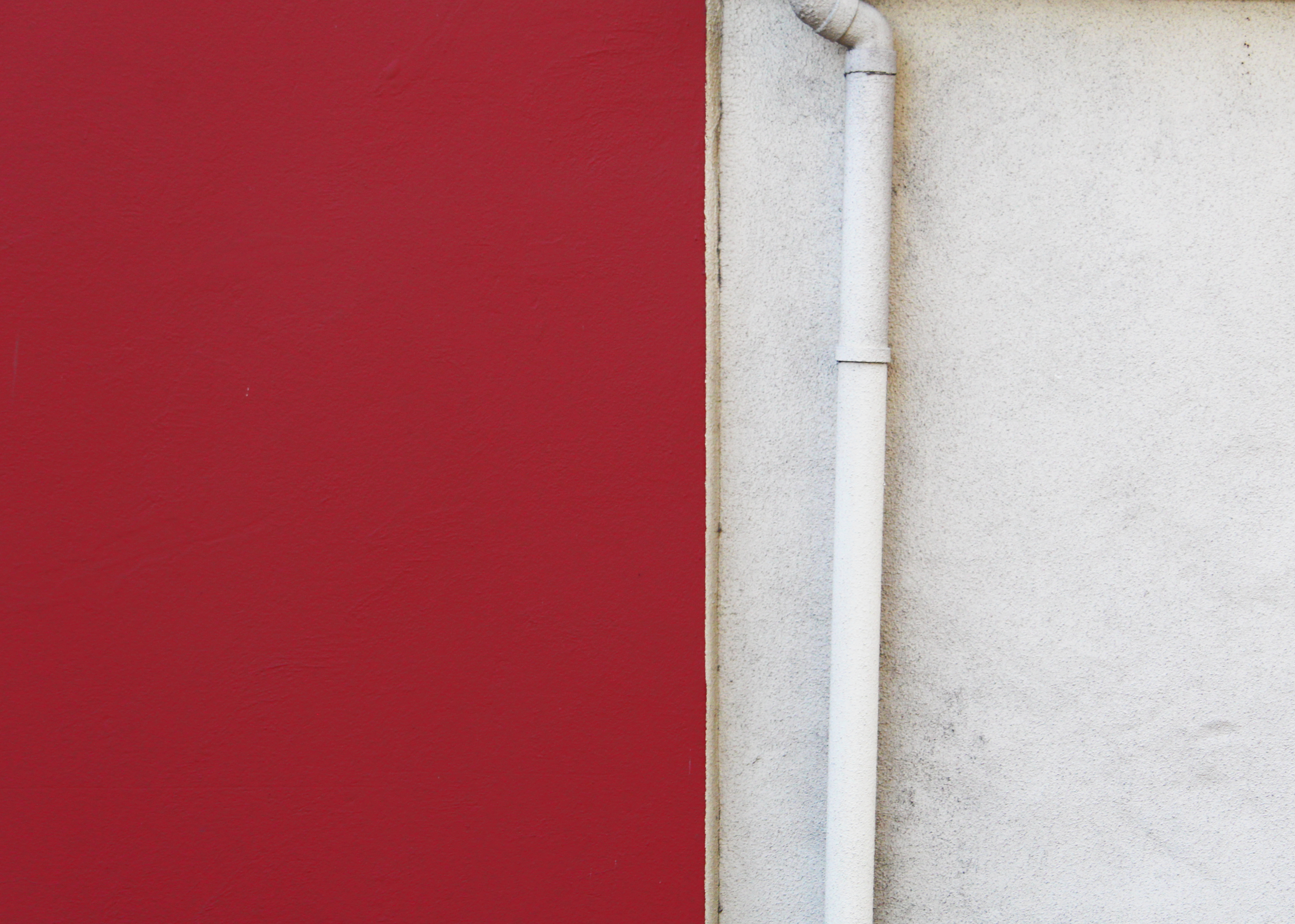


I believe these images strongly relate to Julian Schulz’s work in the sense that they capture a true response to minimalism with a strong demonstration of contrast. Also they have clearly got a sense of color which was the main focus of this shoot. I think what went well with these images is the composition I was able to achieve to allow a much more aesthetically pleasing image and the simply, yet interesting lines which separate color creating a natural, strong contrast. However I believe i could have improved the surrealism within the images to better portray the abstract theme and create an even more interesting photograph.
Minimalism Photography
What is Minimalism photography?
Minimalism is a style used by many 20th Century artists, using a minimum amount of components such as colour, shape, line and texture. Within the art world it is considered an very subjective concept, leaving interpretation and meaning up to the viewers perception of the work.
Examples of minimalism photography

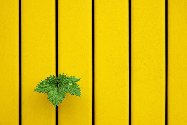
Julian Schulze
Schulze describes himself as “focused on geometric abstraction and minimalist compositions.” His images varey from simple shots of everyday scenes made up of just one or two things to photos where you have to look twice and that will leave you wondering which way is up. Each shot is composed, using light, shadow, and colour to create a 2D picture out of a 3D scene.
Examples of Julian’s work
![]()
![]()
Analysing Julian’s work
![]()
This image is of multiple coloured buildings. The three separate buildings create a sense of depth as it creates layers to the image. However, the bold colours from each building and the way the photo is present on an angle confuses the view as it really makes the viewer think as to which way the buildings are meant to be and which one is at the front. This image effectively exemplifies colour within Julian’s minimalistic work. For example, his use of colour and tone is particularly successful, the orange, red and white all compliment eachother while contrasting with the grey on the windows, this makes me think that Schulze wants the audience to perceive these subjects as three different components of the image.
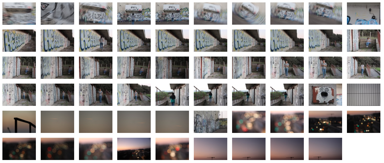
Contact sheet
My interpretations
Bokeh
What is Bokeh? Bokeh, also known as “Boke” is one of the most popular subjects in photography ever. The reason why this technique is so popular, is because Bokeh makes photographs visually appealing, forcing us to focus our attention on a particular area of the image. The word comes from Japanese language, which literally translates as “blur” which is exactly what it is.Basically, bokeh is the quality of out-of-focus or “blurry” parts of the image rendered by a camera lens, – it is NOT the blur itself or the amount of blur in the foreground or the background of a subject. The blur that you are so used to seeing in photography, that separates a subject from the background, is the result of shallow “depth of field”, and is generally simply called “background blur”. The quality and feel of the background/foreground blur and reflected points of light, however, is what photographers call Bokeh.
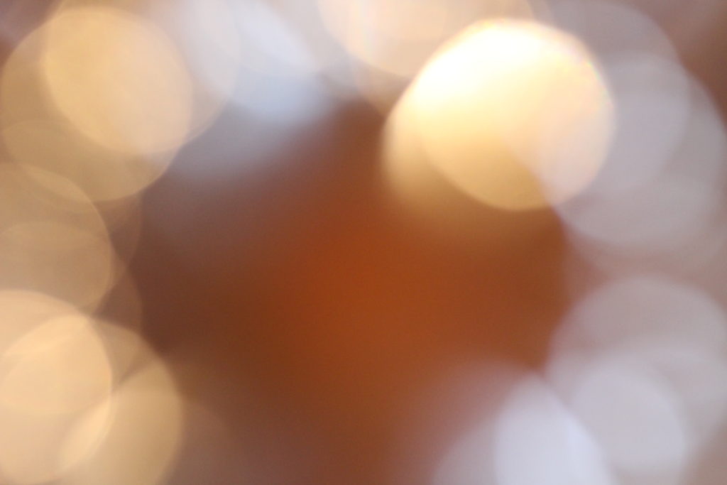
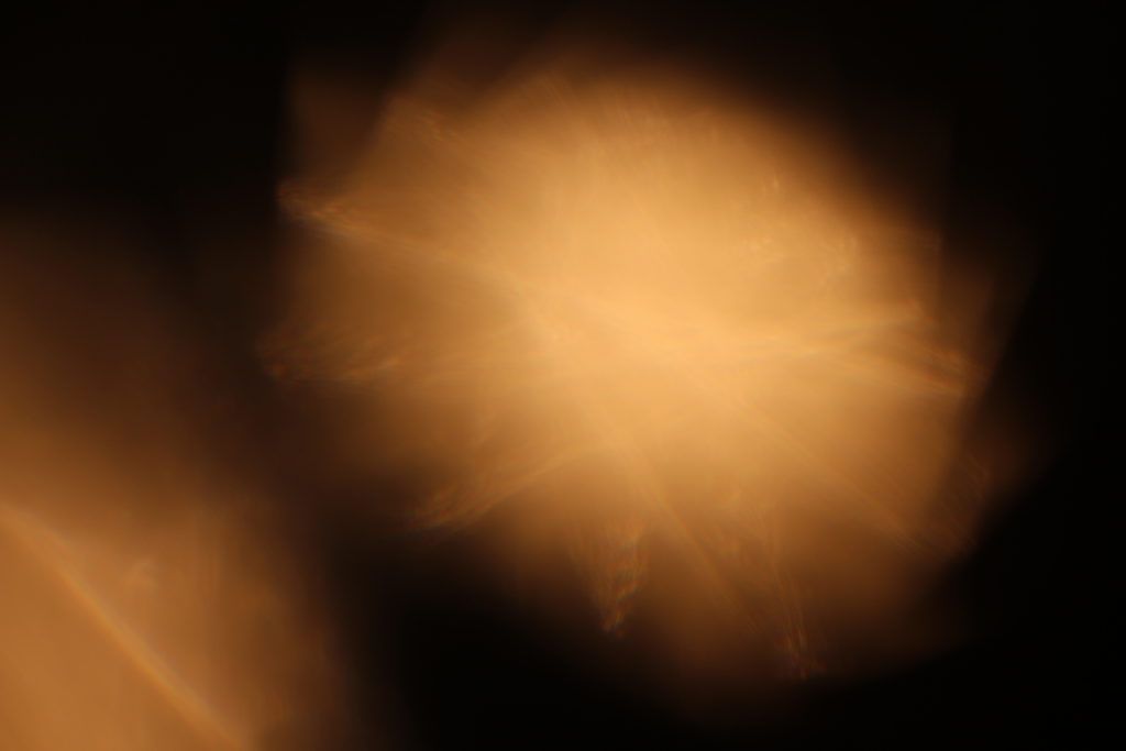
To achieve this effect, you must select a large aperture about f/2.8, 1.8 and 1.4, then get up close to the subject, and focus on what you wish to be 'sharp' whilst making the subject far from the background you want blurred out. I really liked the way many photographers used the use of making lights into almost circular spheres, and decided to have a go at trying out the effect, by putting a clean glass over my lens to take the pictures it created the desired outcome, these were my results:
Experimenting With Layout Composition
In this post I am looking at ways to present my final piece. Below are the three photographs that I am planning on presenting after deciding how I will present them. I am going to look at different ways of cropping and rotating them to find the most effective way of presenting them.
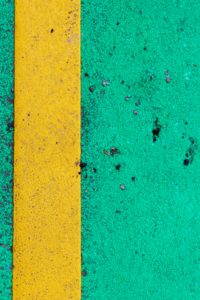
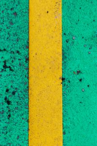
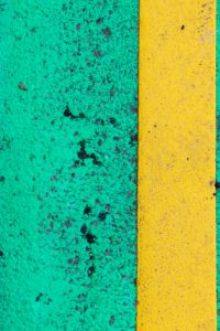
Square Cropping
Here I have taken each photo and cropped them to a square to see how it may look.
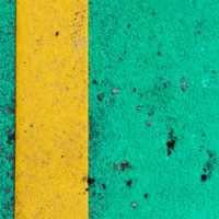
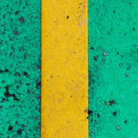
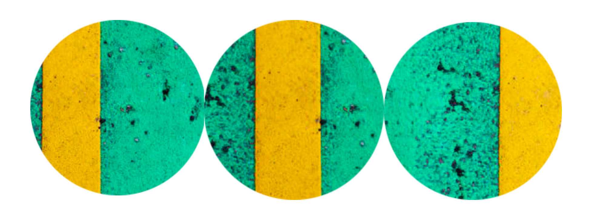
Circular Cropping
Here I have cropped the three images into circles to contrast the round edges of the circle with the sharp lines in the image.
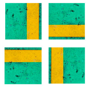
Rotation
Here I have cropped the first image into a square and looked at the four possible ways of rotating it.
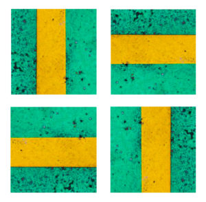
Below is the second image which i have cropped into a square and explored rotating it to see the effects.
The set of images below show the third image cropped to a square and rotated, from these rotations I hope to gain an understanding of how I want to rotate it in my final piece.
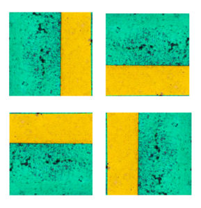
Here I have taken the first image and rotated it in four different ways to see which way works best.
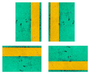
The below images are the second image which I have rotated in four different ways to find the most effective composition.
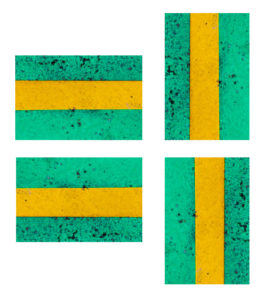
This is the third image rotated in different ways so I can decide which way will be most suitable for my final piece.
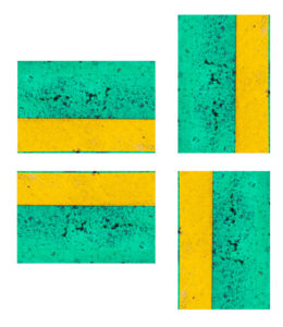
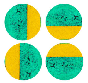
In these images I have cropped the image into a circle and rotated it in different ways to see the different effects.
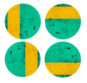
The below images show the second image rotated in different ways to help me decide which rotation I will use.
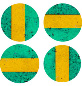
The below shows the third image cropped into a circle and rotated so that I can explore different styles of composition.
Composition
Composition 1
In this composition I took the three original images and lined them up horizontally so the lines were far apart to separate the images from each other. I don’t like how separated the lines are, they appear too far apart.
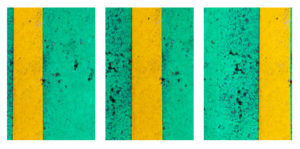
Composition 2
In this composition, I swapped image one and three to bring the lines closer together to create a sense of togetherness and to link the images. Due to this link and closeness between the images, I like this composition more.
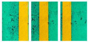
Composition 3
In this composition I pieced the images together to make a continuous line and bring the photos together to be one. In my opinion, this is one of my more creative compositions as it makes one image out of three images.
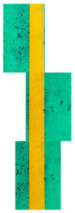
Composition 4
In this composition I rotated composition three to see the effects of the line going horizontally instead of vertically. I think that it looks better standing vertically as when standing vertically it looks less odd.
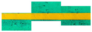
Composition 5
In this composition I rotated composition 2 to make the lines run horizontally to create a different effect. I like this composition because of the togetherness of the lines and the direction of them.
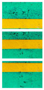
Composition 6
In this composition I rotated composition 1 to make the lines run horizontally to see what it would look like. As with composition 1, I do not like how far apart the lines are.
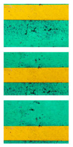
Composition 7
In this composition I have copied composition 1 but cropped the images to squares. I think it looks better in the original form than in square form
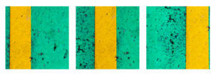
Composition 8
In this composition I have copied composition 2 but cropped the images to squares. In square form I cannot appreciate the togetherness of the lines as much as I believe the lines are cut too short.
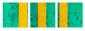
Composition 9
In this composition I have taken inspiration from composition 3, I like the style of it but in my opinion it looks better with the original images as the line appears longer.
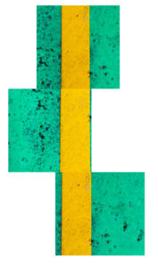
Composition 10
In this composition I have rotated composition 9 to make the line run horizontally. As I said about composition 4, I think the line looks better running vertically.
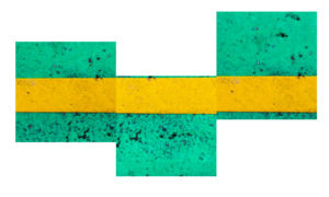
Composition 11
In this composition I have copied composition 5 but I have cropped it to a square. I still like the style but I think due to the square cropping, the lines do not appear longer enough.
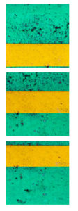
Composition 12
In this composition I have copied composition 6 but the images are cropped to squares. I do not think it works as the lines are too far apart and not long enough.
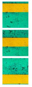
Composition 13
In this composition I have copied composition 1 but cropped the images into circles. I think this helps to reduce the problem with the lines appearing too far apart.

Composition 14
In this composition I have copied composition 2 but cropped the images into circles. I think this takes away from the image as the lines seem completely separated and due to the cropping in the first image, it is not obvious that it is a straight line.
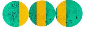
Composition 15
In this composition I have rotated composition 14 to make the lines run horizontally. I think this works better as the middle image is a clear focus point in this composition.
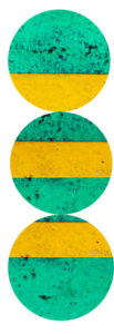
Composition 16
In this composition I have rotated composition 13 the make the lines run horizontally. I think that the images look too separated in this composition due to the cropping and positioning.
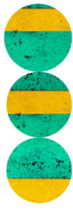
Composition 17
In this composition I have taken inspiration from composition 3 to bring all of the images together to create one image. I like the style of the composition but I think the outline of the shape is too abnormal.
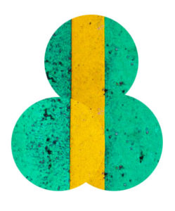
Composition 18
In this composition I have again taken inspiration from composition 3 but used circles instead of rectangles. In my opinion this type of composition works better with rectangles as it gives strong edges and shape whereas the circles don’t.
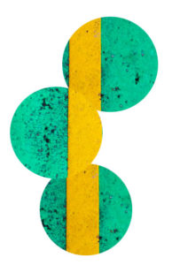
Exploring Minimalism
Minimalism is a style of photography/art that was introduced by many different 20th century artists. In minimalism, the photo is kept simple with the minimum amount of colours, shapes and lines to create a simple but effective photo.
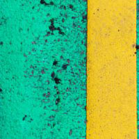
Below is an image that I took in a minimalist style; as you can see there is not much happening but it is bold and eye-catching. When taking this photo, I took inspiration from the strong colours and shapes that Franco Fontana uses.
Mark Rothko
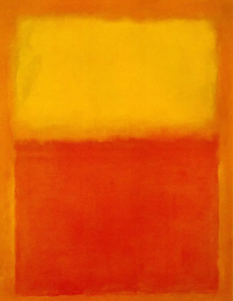

Mark Rothko was a Russian painter born in 1903. His family immigrated to the US in his childhood, here he became part of a circle of New York-based artists who were known as abstract expressionists. Rothko was most famous for his style of work shown above, they were large-scale rectangular paintings that used simplicity to evoke response.
Rothko is a brilliant example of a minimalist artist; his work shows simplicity and colour in the same way that mine does and I hope to reflect on his work in my final pieces.
Texture Homework Task
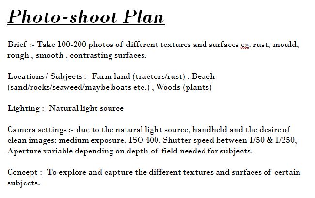
Photographer Research 1
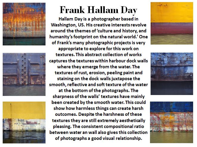
Photographer Research 2
Texture Photo Shoot (My Response)
