
Monthly Archives: October 2017
Filters
Texture- Homework 4
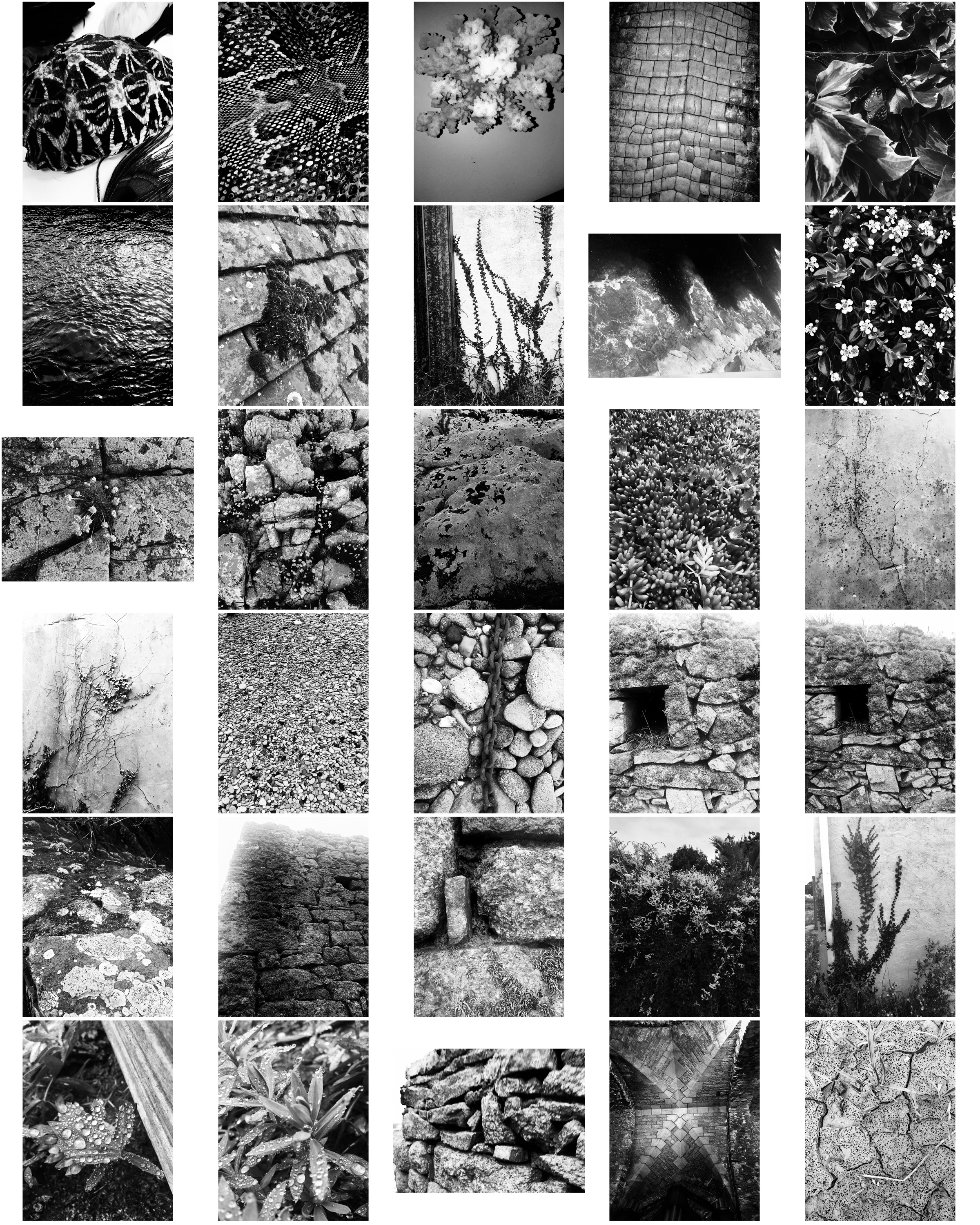
These photos take inspiration from Aaron Siskind focusing on texture, line and visual rhymes.

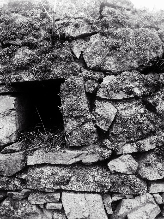
These two photos are my favourite from the shoot as they display texture of the surface, using the Ansel Adams zone system. The stones in these photographs both contain a lot of detail like the moss and weathering, making the photos more interesting. Both images contain contrasts between light and dark, the first image has contrasts from the higher level of rock and the shadows which they create below them, and the second image contains shadows through the gaps in the stones creating varied tones in the photo. Editing the photos in the contact sheet black and white makes them more similar to Aaron Siskind’s style.
These photos show similarities to Aaron Siskind’s ‘Martha’s Vineyard’ photograph:

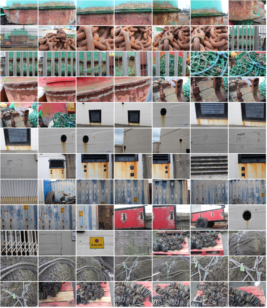
For this photoshoot I looked for objects that had been in the sea or near it so i could focus on the weathering and rusting, like Frank Hallam-Day did in his ship hull photos.
Final 5 Images from Shoot:
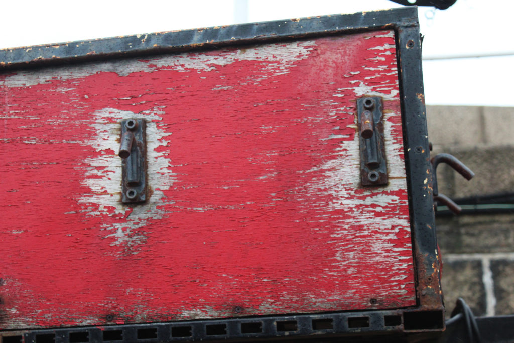
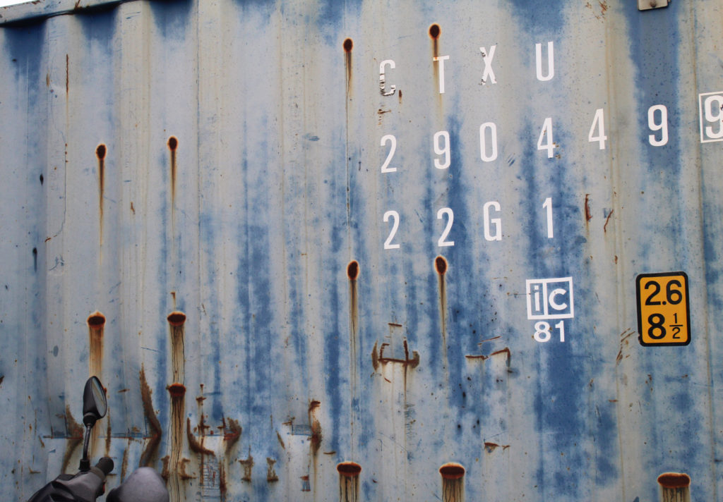


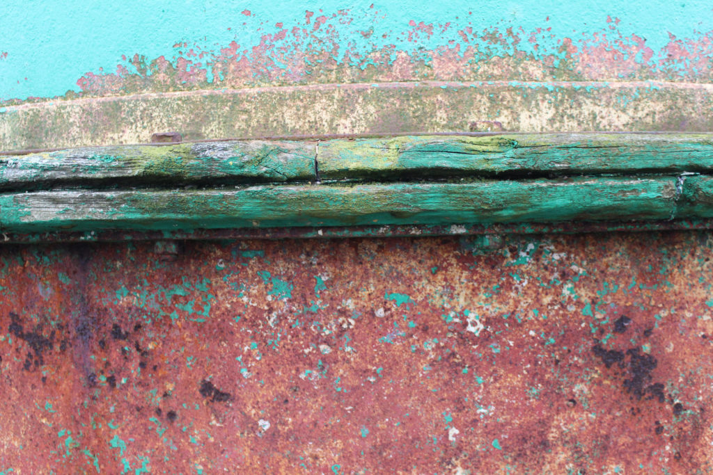
The photo which i think shows the most similarities to Frank Hallam-Days photography is image 5 as it focuses on the weathering and gradual deterioration of a man made object. It has horizontal lines, creating sections with the photo of different texture. To improve this photo i would have photographed the entire ship hull so it showed more similarities to Frank Hallam-Days work.
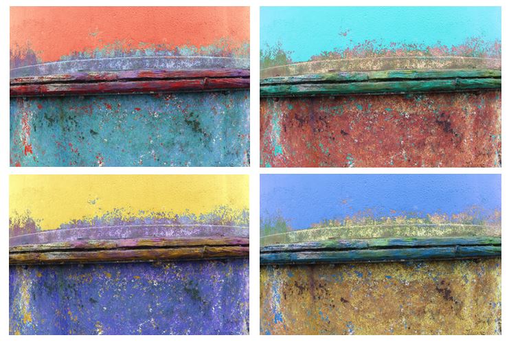
I edited the original picture and altered the hue to create different colours of ship hulls and a more varied range of photos. I tried to capture the way Frank portrays the effect of time on works of man, emphasising the rusting and weathering.
Keld Helmer Peterson


Keld Helmer Peterson was a Danish photographer who took pictures of industrial structures and edited them so that they were completely black and white, this meant there was no grey tones in the images. A more dramatic image is created with his method and it helps individual shaped stand out. he took photographs of everyday and mundane objects creating interesting geometric shapes. These images show a style called reductionism which is where something which was originally very complicated is extremely simplified.
Some of his best known work focuses on the style of minimalism as seen in his book ‘122 colour photography’ which he released in 1948. the book was very simple and included many abstract and minimal photographs often incorporating his interest in architecture. The book was innovative at the time because colour photography was no being used for artistic purposes. unlike other photographers in the 1940’s he made art out of mundane and everyday objects.
Focal Length
The focal length of your lens essentially determines how zoomed in your photos are, the higher the number, the more zoomed your lens will be and the lower the number the less zoomed tour lens will be.
Rule of Thirds
The rule of thirds in photography
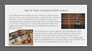
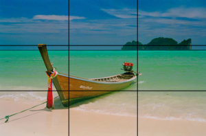
The rule of thirds is a technique that can be used in your photography to improve the composition of your photos. Using the rule of thirds means that the subject isn't centered in the image, it also means that the main focus points of the image meet up along the lines, for example in the image below the horizon approximately meets the top line of the grid and the island in the distance meets up with the cross of the lines in the corner and the boat meets up with the grid on either end of the boat, this use of the rule of thirds create an interesting composition in the photo.
Depth of Field
Depth Of Field
Google definition of depth of field - 'The distance between the nearest and the furthest objects giving a focused image.' The smaller the area of focus is the shallower the depth of field and the bigger the area of focus is the deeper the depth of field, these factors are controlled by the aperture of the camera, a large aperture creates a shallow depth of field meaning that fewer things are in focus, and a small aperture creates a deep depth of field meaning more things are in focus.
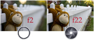
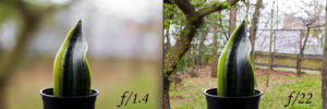
Below are some of my experiments using aperture to create different depths of field.
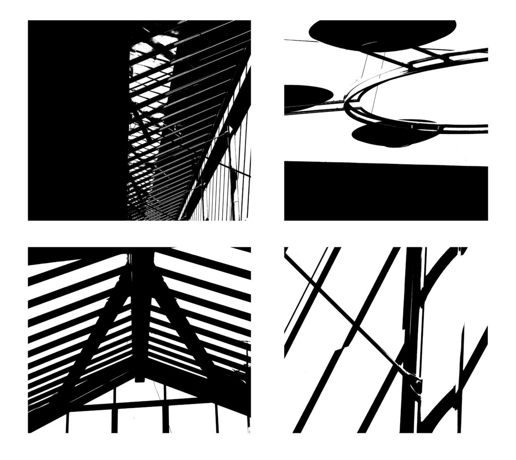
editing with threshold: keld helmer petersen
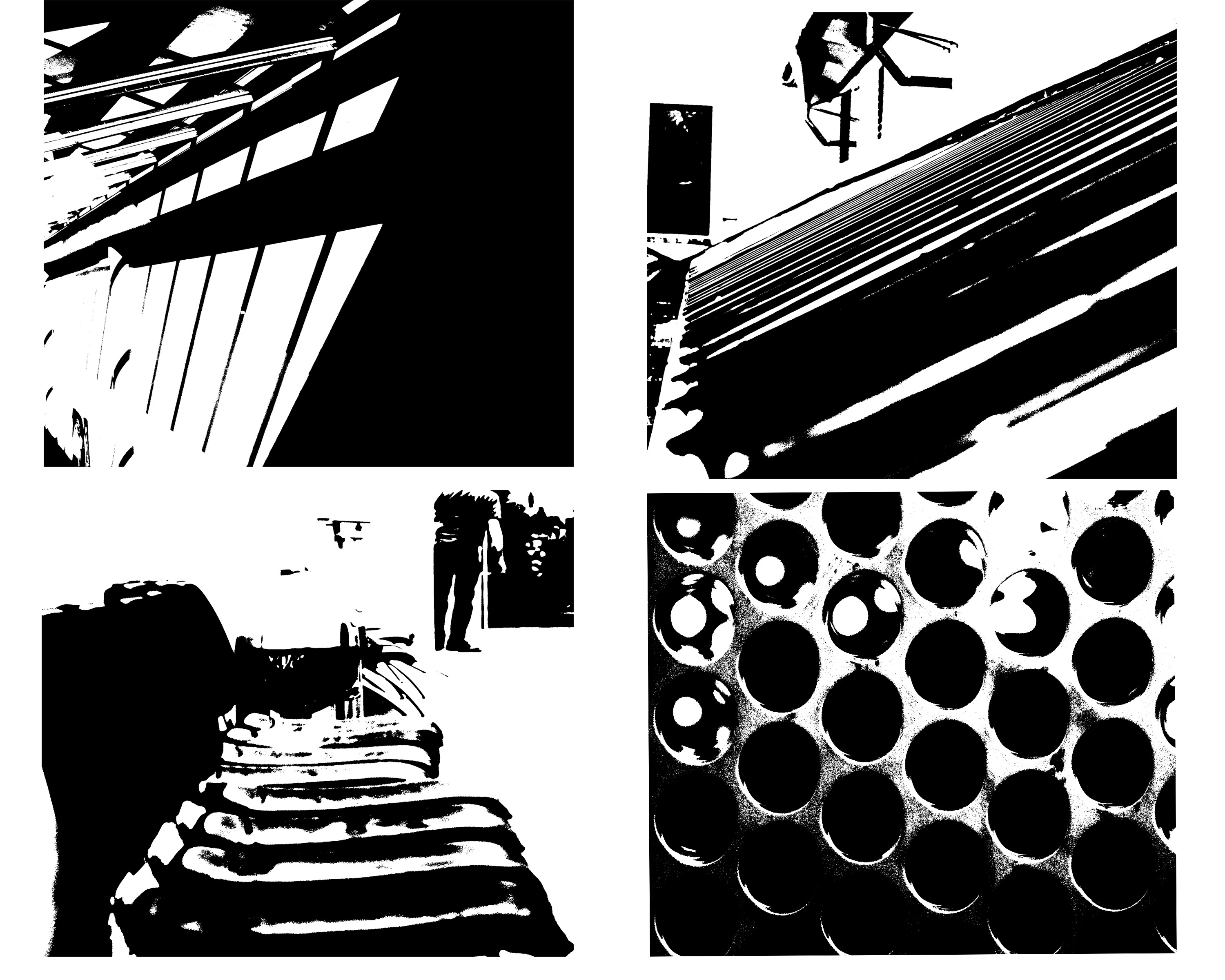
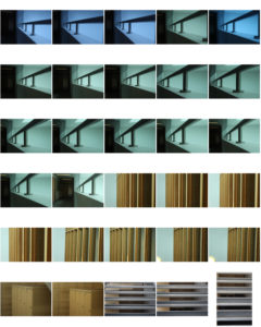
within this image it is edited to show black light within high saturated edits,then also turned into squares for an even overall finish.I was inspired by the artists Keld Helmer Petersen who wanted to achieve an international collection of experimentation shapes inspired by ranger patsch. He also developed poetic realism within his work and modernism within photography.
He eventually adapted and developed the intellectual structuralism to art and photography,he liked to capture leafs and trees against grey light and patterns created within nature.He started to become more abstract within the enlarging of his images focusing on the microcosm of nature.
I chose these images due to their defined lines and shape within the pieces. I thought the compositions of the pieces where also quite interesting as there are many dimensions and angles to the piece themselves.
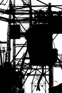
this is a clear example of his work and how he different from using more simplistic images to more complex lines but overall still achieved the same tonal range and detailed effect of the image.
Threshold Editing
Keld Helmer Petersen
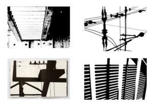
Keld Helmer-Petersen was a Danish photographer, born in Copenhagen, Denmark in 1920, he achieved his international breakthrough in 1948 when he published 122 Farvefotografier/122 Colour Photographs, a collection of experiments with shapes inspired by Albert Renger-Patzsch. Below are some examples of his work.
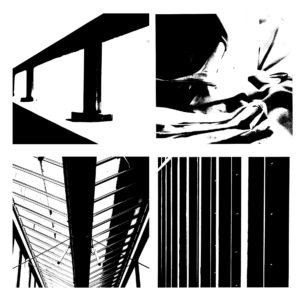
Below are some experiments that I did with my work inspired by Keld Helmer Petersen, to achieve this style of photo i used Photoshop, I began by firstly cropping the images to get rid of any negative space and improve the composition of my photos, i then used the threshold tool to make the images only two tones of white and black.
Threshold Editing
Keld Helmer Petersen
Keld Helmer Petersen was a Danish modernist photographer. Keld was internationally acclaimed for his images of structures, patterns and details found in industrial areas, city scapes and nature.
These are examples of his work


These are my attempt at editing photos in the style of Keld Helmer Petersen.

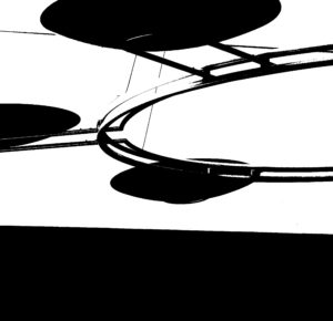
The first image was the original image without any edits or manipulations. The second image was my attempt to create a photo in the style of Keld’s.
How I created a photo in the style of Keld Helmer Petersen
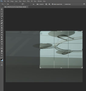
Firstly, I cropped the image to make it square and to make this chosen image follow the rule of thirds.
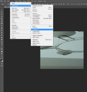
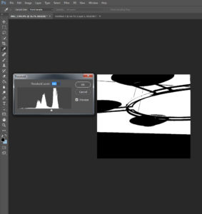
Once I was happy with how I cropped the image I clicked on the image tool at the top of the screen where there were multiple options for me to use where I could edit my image. I then went to the adjustment option where it gave me another drop down option which I then scrolled down and clicked on the threshold option. Once I had clicked the threshold option it changed the contrast of the picture massively as well as changing the image to black and white. I played around with the threshold option until i was really happy with it. This was my Final image.
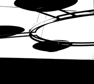
Keld Helmer-Petersen
Keld Helmer-Petersen born the 20 August 1920 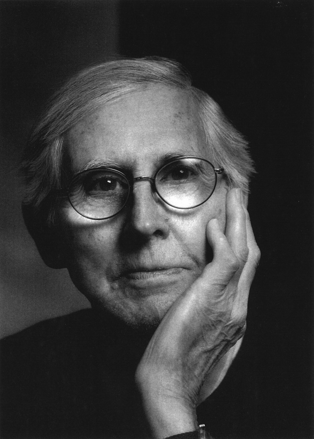 was a Danish photographer who got his breakthrough in the photogrpahy world when he published 122 Farvefotografier/122 Colour Photographs, this was a collection of experiments with shapes inspired by the work of Albert Renger-Patzsch and Neue Sachlichkeit. In the book was a collection of photos that he thought would only work in colour and not black and white.
Keld Helmer-Petersen was born and grew up in the Østerbro quarter of Copenhagen. He started taking photographs in 1938, when he received a Leica camera as a graduation present.[1] At an early stage, he became aware of the trends in international photography; in the 1940s he subscribed to the US Camera Annual and in this period became familiar with German inter-war photography, which had developed at the Bauhaus and in the Neue Sachlichkeit (The New Objectivity) movement. In his later life he released a series of other books which focused on a different light to other work in colour, as the books only contained black and white images.

