Edit 1
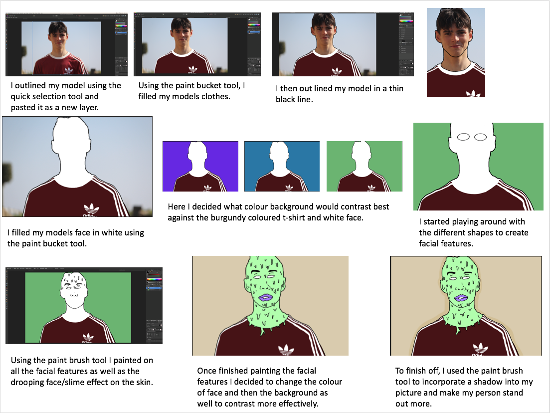
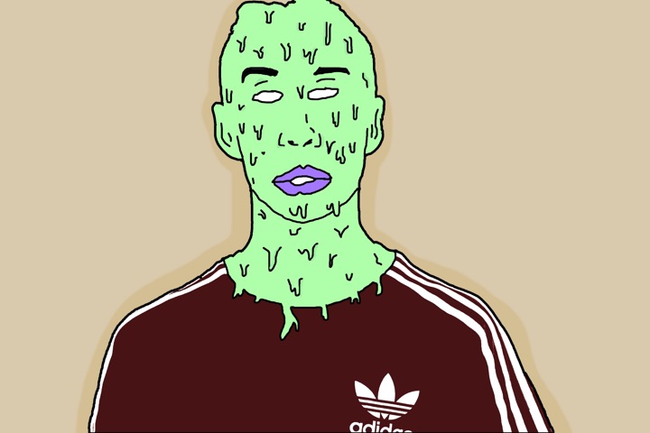
I belive this edit is good and has a strong relationship with my inspirations work. There is a strong contrast emerging between the persons skin colour and clothing with the background. The composition is effective as the main subject is dead in the centre making the viewer view that straight away, and the background is plain therefore it is beneficial to have the main subject in the middle. I believe this edit portrays the idea of hidden identity which I intended to do however I am not pleased with the image as a whole due to the background. I believe if I change the background to have a street or wall it would be more effective in revealing a story and creating a more surreal feeling/look.
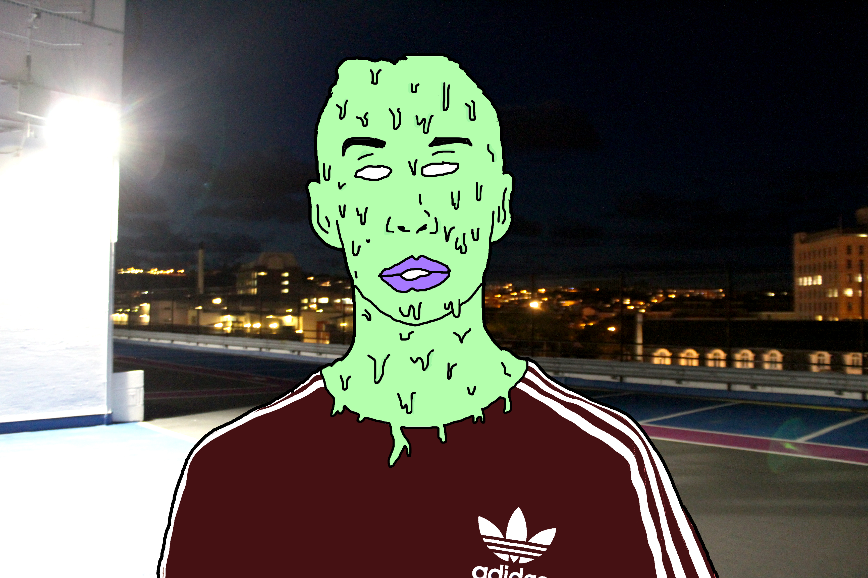
This is the final edit for photo 1. I believe that changing the background from plain to this sinister looking carpark roof image has completely changed how people may interpret the image. The background has connotations of crime and badness as it is taken at night, which is when most crimes happen and the light on the left appears to hide part of the image relating to a person hiding their identity when causing a crime. However the over exposed light on the left can reflect goodness, contrasting with the darker side on the right relating to badness. This may reflect the person in the centre who has to decide his path to take, the good path or bad path. Due to the fact I have edited the person in such way to distort any facial expression it leaves the viewer to decide what the person’s identity is like and how the background may or may not relate to it.
Edit 2
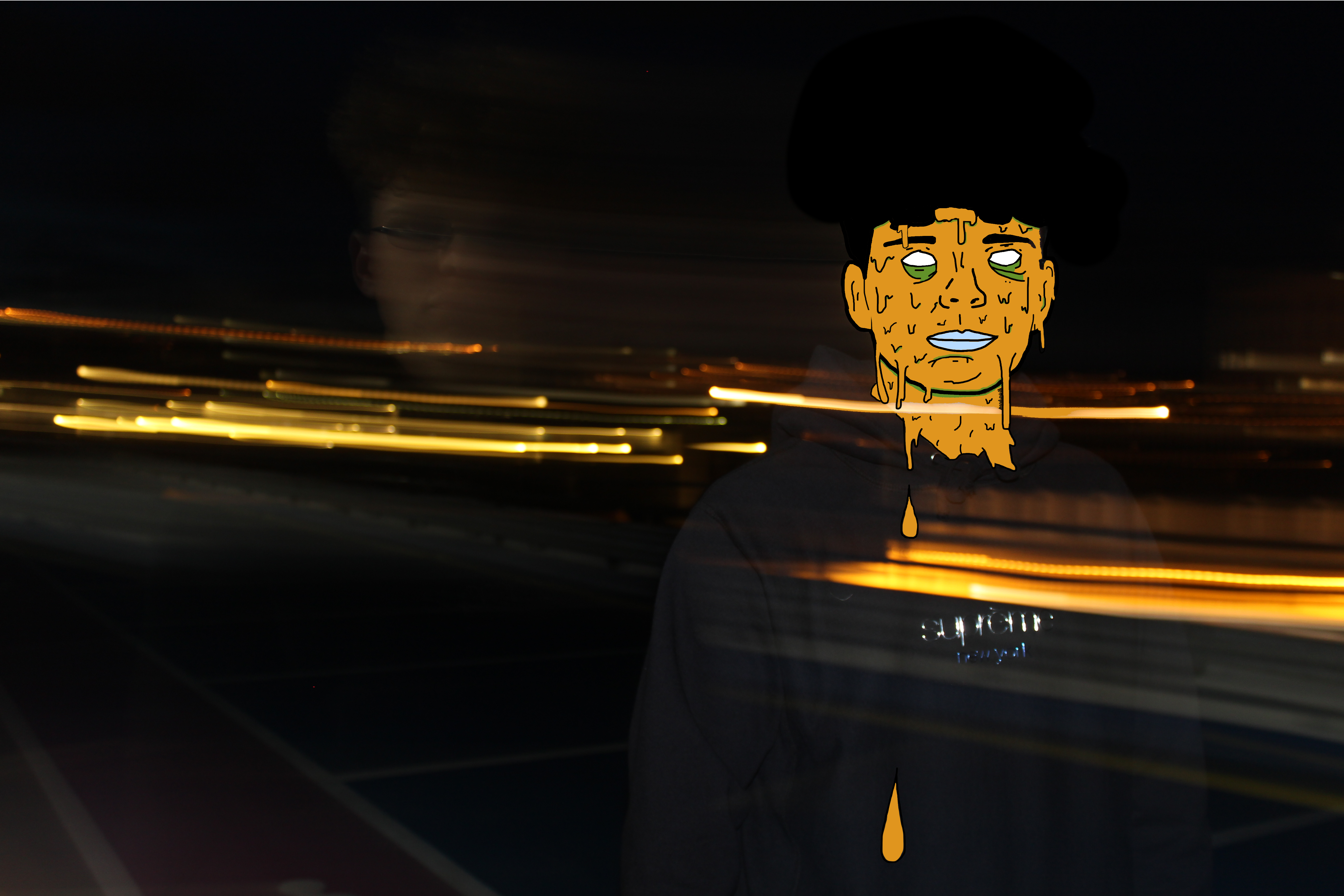
Using the same method as the edit above I was able to achieve another successful surreal image. Firstly I chose to use the colour orange as it fits in with the motion blurs which were created when I originally took the photo. These motion blurs were created by taking a photo with a long shutter speed, around 2 seconds, and panning the camera to the side. I was able to get my model in focus by holding the camera still for the first second facing him and then panning for the other second. In my opinion these motion blurs create a sense of movement which fits in well with my edit as the slime is moving as suggested by the falling droplets.
Edit 3
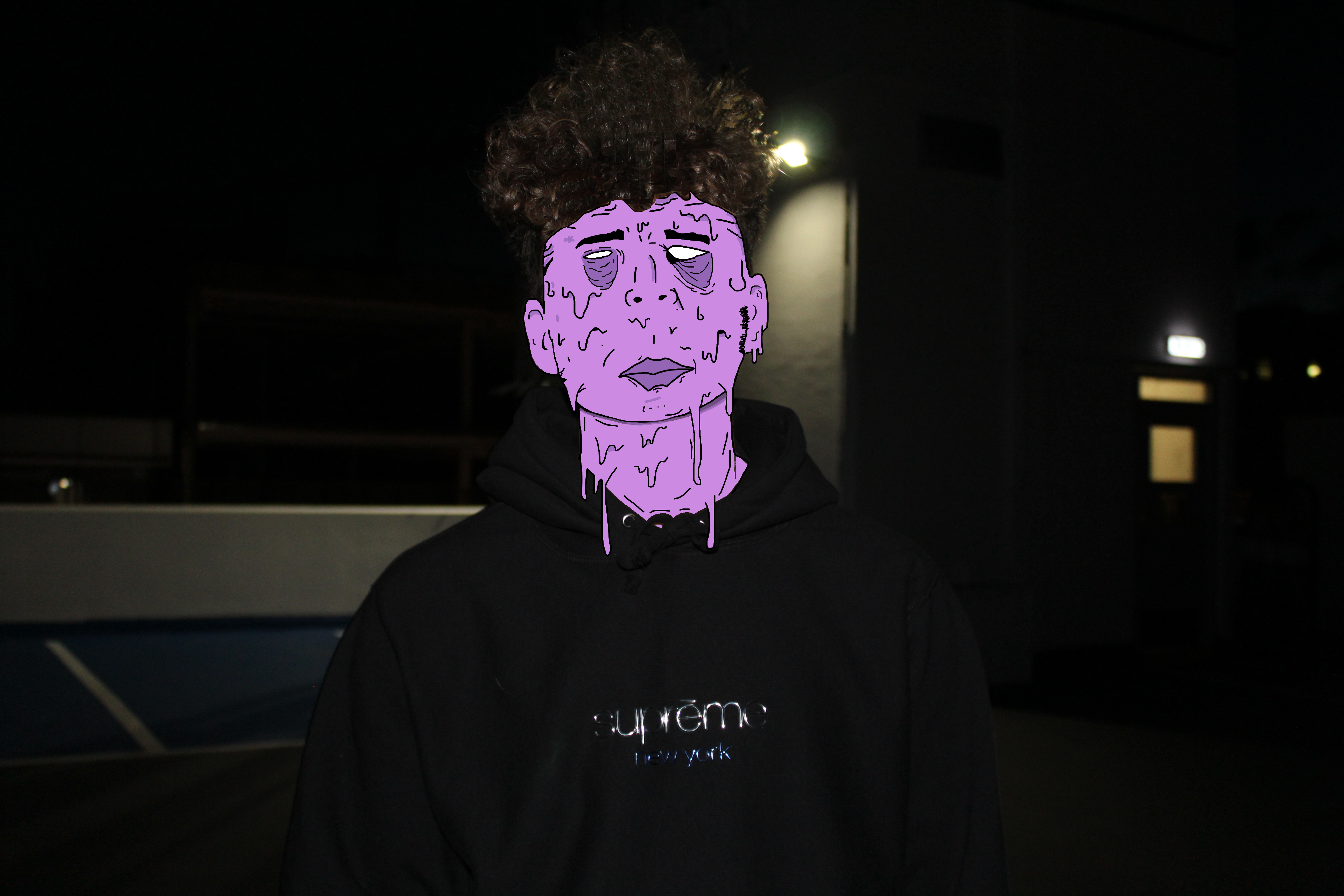
I believe this is my strongest edit. Not only is the digital manipulation at a high standard but the meaning and feelings portrayed are also very strong. Again, to some extent I have incorporated the running theme of blank identity however slightly altered this image to produce some sort of facial expression. In my opinion the facial expression, mainly within the eyes and how they appear to be bruised, reflects upon the theme of child abuse again crime. I believe the underexposed background gives the image a sinister and almost haunting feeling. The dark background is strongly contrasted with the color of slime upon the models face which focuses the attention on the person.
Edit 4
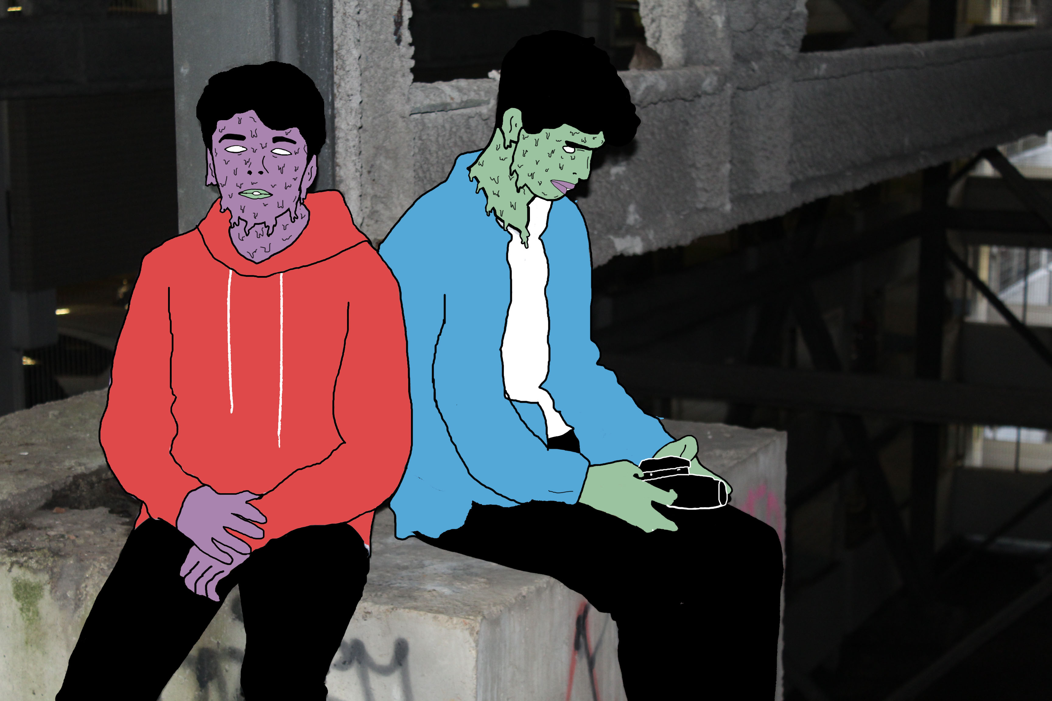
I like this photo due to the emotion and story it creates and tells us. I believe this photo has a sense of imprisonment as it appears the people are stuck in this enclosed area. The background within this photo is de-saturated to some extent which I think helps to add to the dark and depressing atmosphere. This photo uses the technique of leading lines within the structural features leading us away from the models deeper into the picture to view the rusty and old man made structures. The vibrant colors of the models create a strong contrast with the background relating to the opposition of light vs dark or good/bad.
Presenting My Work
After having reflected my images I have come to the decision that I will use only two of the original 4 images I intended on using. The edits I have selected to use are shown below. I have selected only these images as I think they are my strongest edits in representing abstract photography and telling a story. Also they pair well together as they are of similar colors and tones. These images link to abstract photography in the way it is a piece of art that does not attempt to represent external reality, but rather seeks to achieve its surreal effect by using shapes, colours, and textures. I think that the image with the motion blur lines relates directly to the photographer Ernst haas which was on of the photographers I researched as part of this abstract project. Ernst haas often includes motion blurs within his photographs to indicate a sense of movement and chaos which is what i have incorporated within my final piece. The motion blur lines not only work well with the dripping effect on the persons face but they add to the abstract effect in the way that it is not a usual and commonly seen thing.


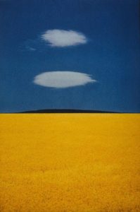
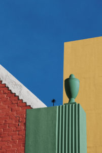
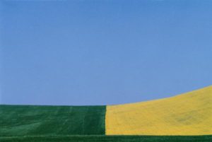 His work focuses on the enhanced colours that contrast and compliment each other. Visually, his photographs are aesthetically pleasing and minimal, yet the mise-en-scene in some photographs have a unnatural and toxic feel because of the intense colours.
 This image stood out to me because of the repetitive use of red is almost like the scene was composed to fit together for the photograph. However the image was probably edited after it was taken to create a perfect scene of red.
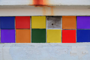
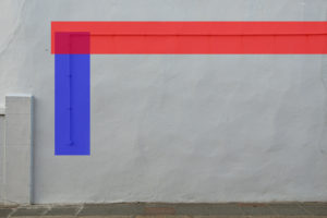
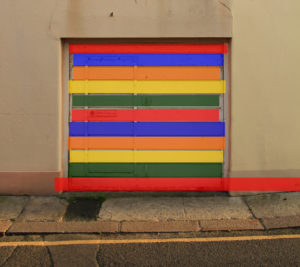
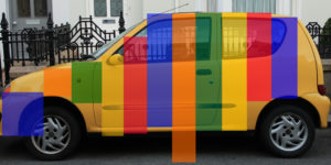
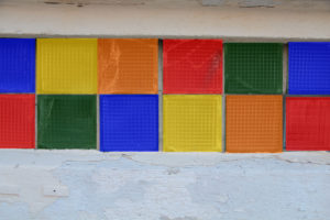
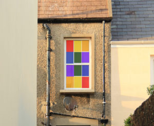
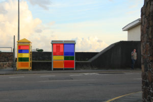
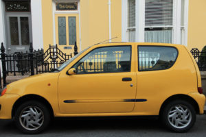 I used Photoshop to edit all these image to give eah of them unordinary colours that make the photographs stand out more. I kept the same colours in each photograph because I think the photos as a collection present a better response for Fontana. I used these photos because I wanted to bring ordinary photos onto another level.