My Final Piece
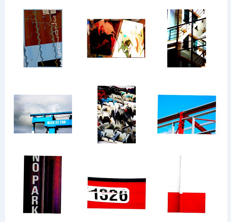
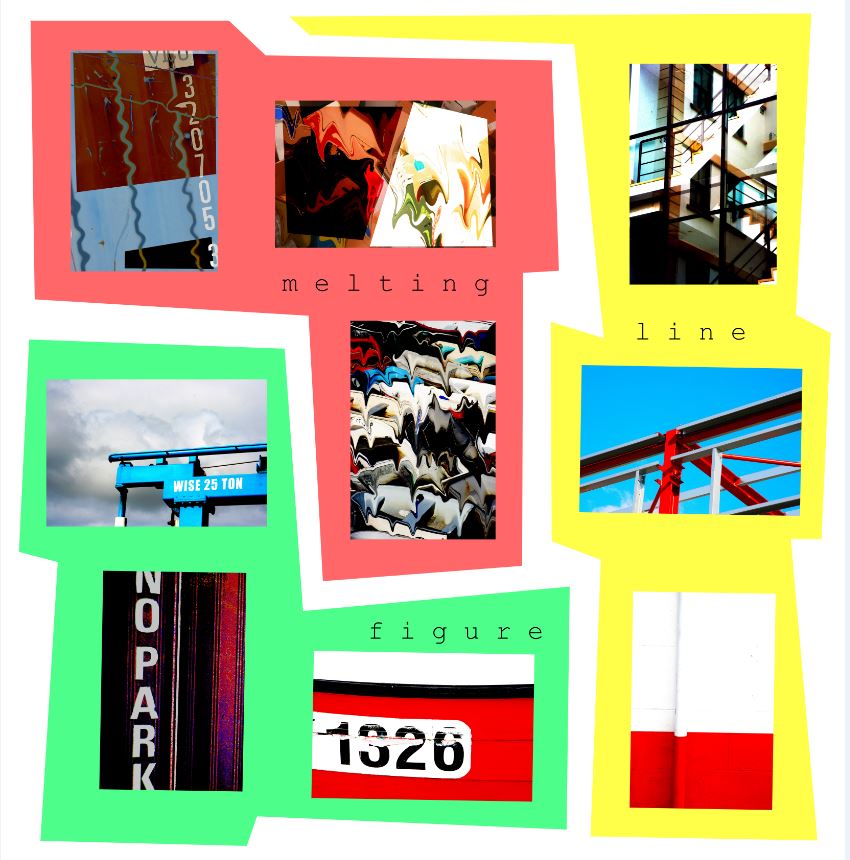
For my final piece I have chosen to go with a composition of 9 images (3 groups of 3.) This is because I believe that rules of 3 look very aesthetically pleasing to a viewer.
I believe that the images strongly portray a sense of abstraction through the use of color, minimalism, PhotoShop, composition and structure.
Original Images
Here are the 9 images that I have chosen to use as my final piece…
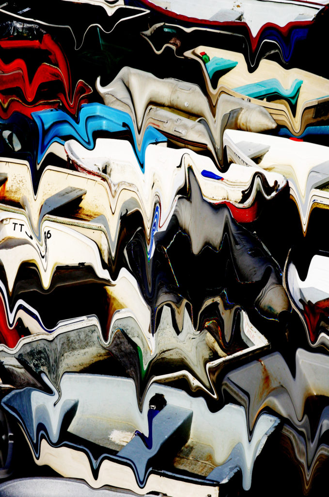
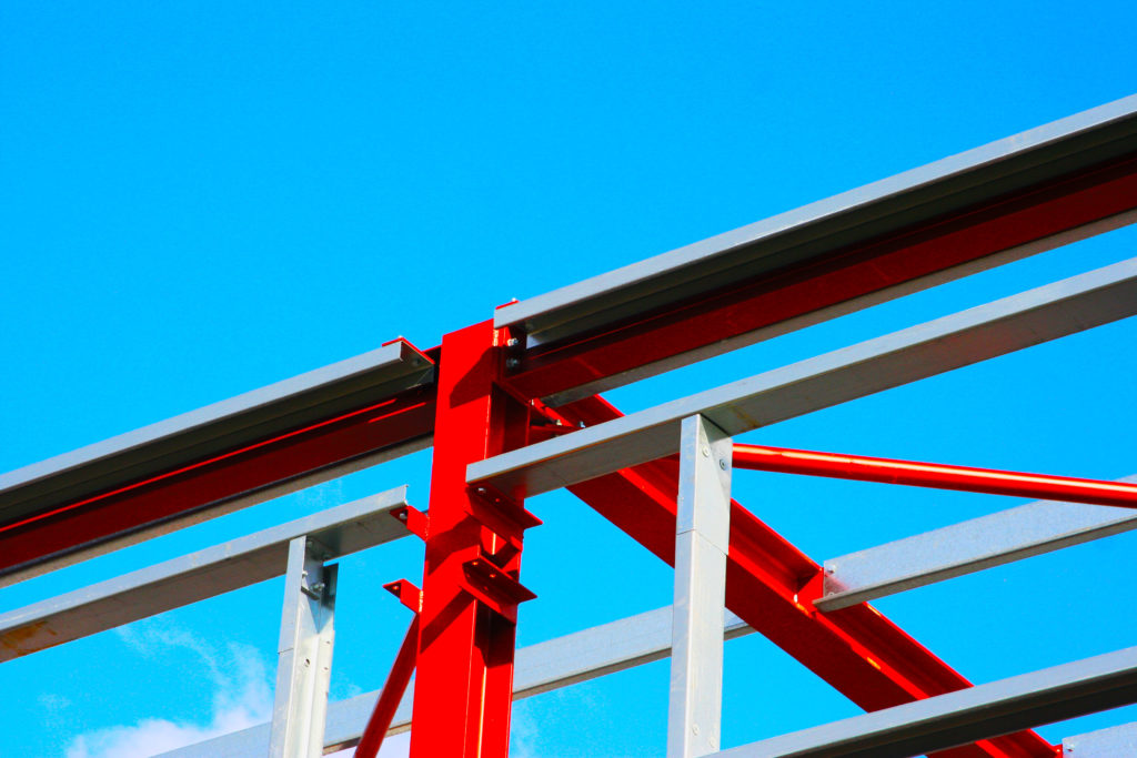
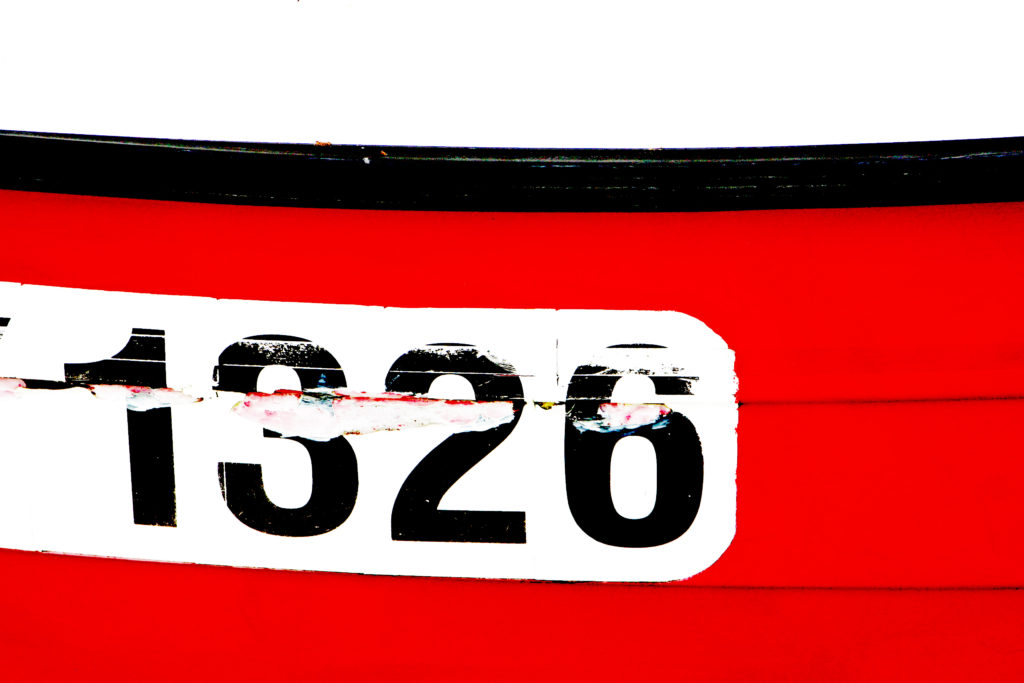
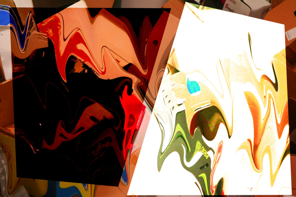
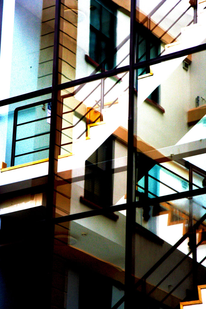
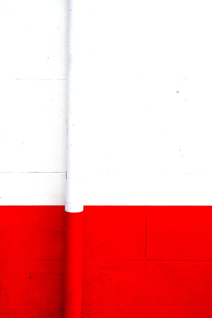
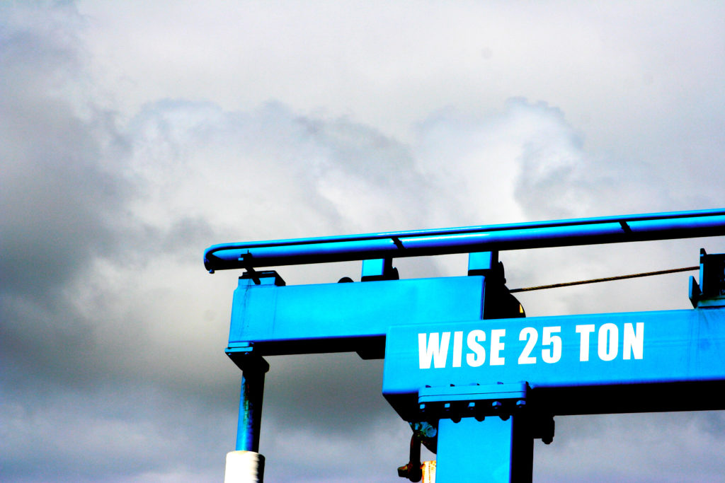
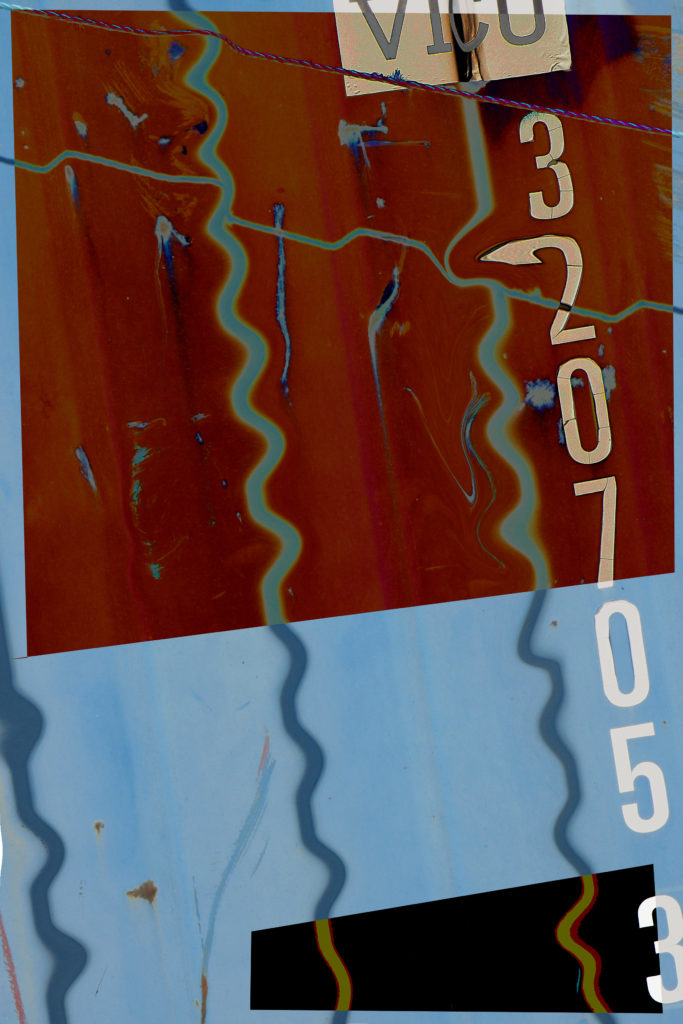
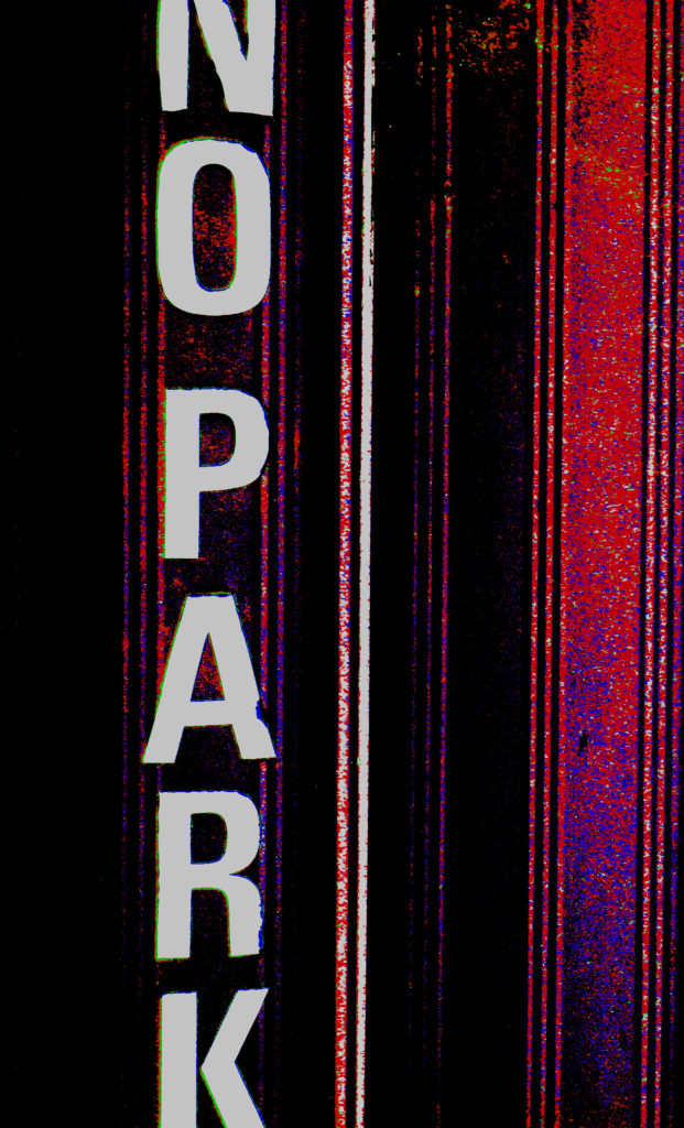
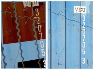
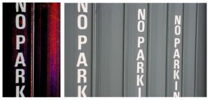
All of these images have been edited using PhotoShop, some more than others. I would have considered all of the images to have been abstract before editing them however I believe that the PhotoShop editing that I have done has increased how abstract the images are.
Originals & Edits
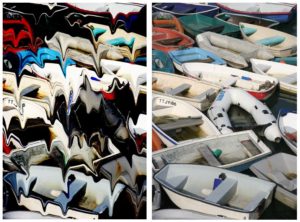
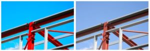
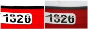
Here are the original images against the edited images that I have produced…
Edits (LEFT) Originals (RIGHT)
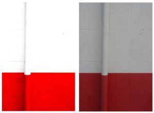
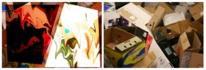
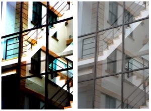
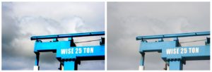
Grouping
For my final composition of photographs I have decided to group them into 3 groups of 3 (9 all together.) This is because I believe that visual threes work very well visually therefore 3 groups consisting of 3 images would hopefully work very well.
I wanted the organisation between portrait and landscape images to be symmetrical therefore I composed the portrait images in a cross (X) and the landscape images on each ends of the across sections (+). I believe that this gave a very visually pleasing result.
Here is my original basic composition of images (3×3)…
Further Improvements (inspiration)
I was happy with how this appeared, but I wanted my final piece to be slightly more interesting to the eye.
One of my favorite abstract artists, Keith Haring‘s bold, minimalist and colorful work is what inspired me to group of the 3 groups of images using colorful polygons. The 3 groups that I sectioned my images off into were: Visually Melting, Visually Minimalist and Visual Text.
Here is some of the work of Keith Haring to give an idea of how it is reflected in my final piece…

Here is what my piece looked like after adding the colored sections…
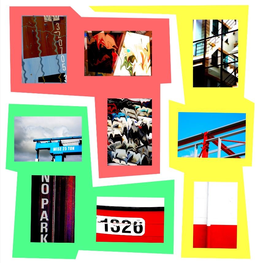
However I was still not 100% satisfied with the full aesthetic of the piece. I wanted to add titles/names to the 3 groups of images. I wanted to do this without the writing distracting the viewer from the images themselves, so I decided to go with a basic ‘typewriter’ style font called ‘Rod Regular’.

So all together with all final improvements and edits here is my final piece on the work of abstraction…
FINAL PIECE

Well done…a through and creative unit.
Aim to exploit your lens based skills and limit over-editing in key places : image selection demands care and time plus a process of elimination