Photo 1
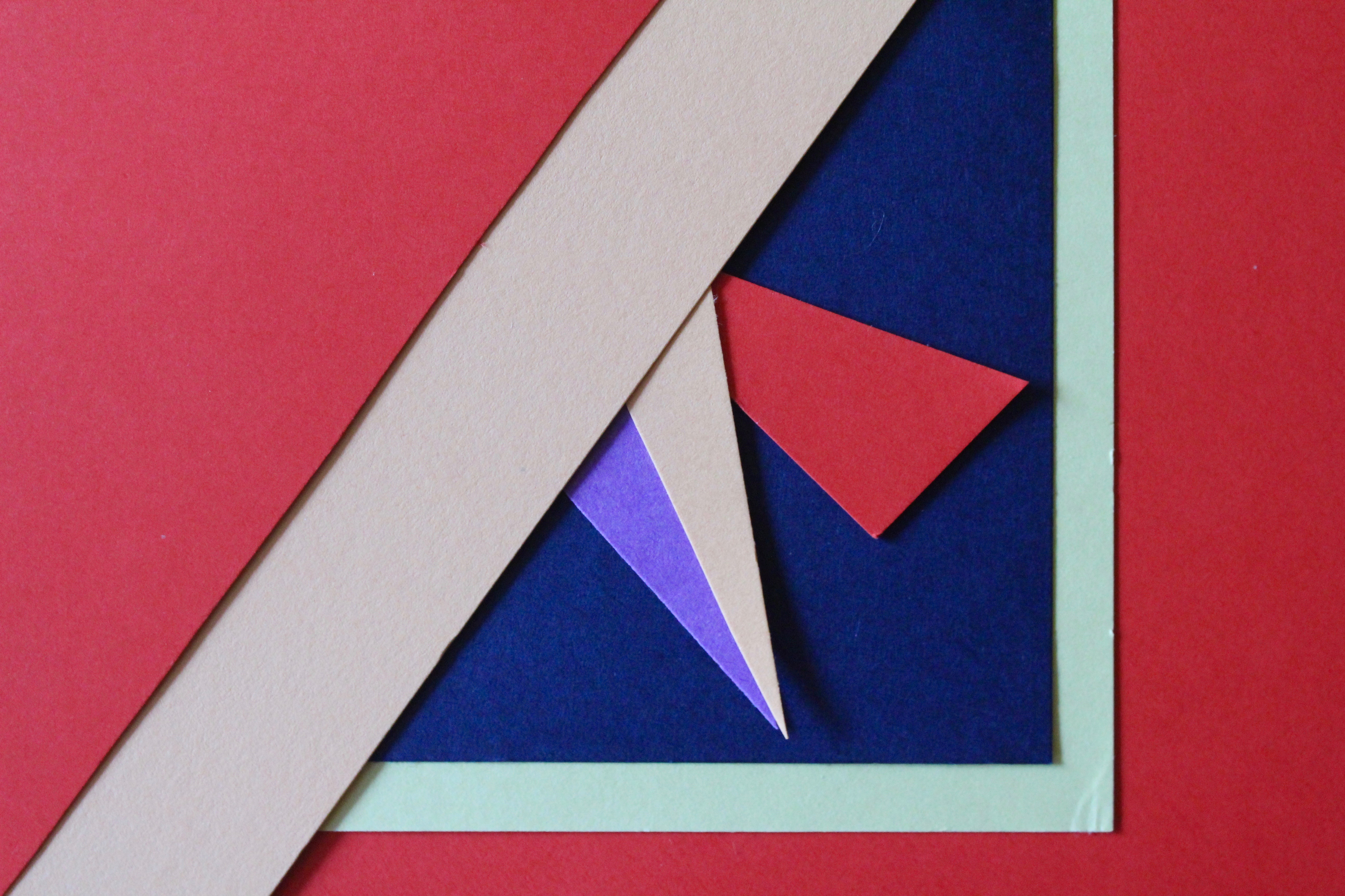
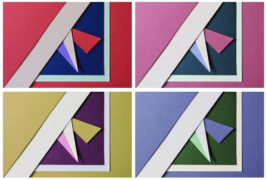 I first experimented with colours and changed the hue of the photos in photoshop and decreased the brightness so the colours weren’t too vibrant. I chose this photo as I think it represents abstract photography well through the solid bold colours and geometrical shapes I created by layering and cutting coloured pieces of paper. I tried to focused on creating contrasts between light and dark pieces of card to emphasise there colour. I personally like the red and pink coloured photos as I think they are the most bold and striking images.

I chose my two favourite photos that I think are the most aesthetically pleasing and experimented by flipping them horizontally and vertically trying to find the best composition and found that I preferred my original composition out of them all.

I also experimented by using circular frames which focused more on the middle section of the images, giving them a different appearance
Photo 2
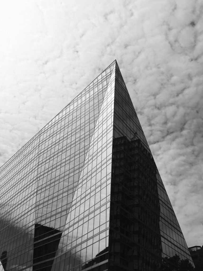
This photo was one of my favourites from my typologies exploration in London, when taking inspiration from Hilla and Bernd Becher. I found that it worked better as a single image, rather than together with others as it contained so much detail. I like the geometrical aspects it has and the repetition and pattern it shows, as well as the tonal variations.


I experimented with the original image, seeing if the photo looked more aesthetically pleasing in colour or in black and white and thought that both worked well as an overall image but decided that black and white was more powerful.
Photo 3
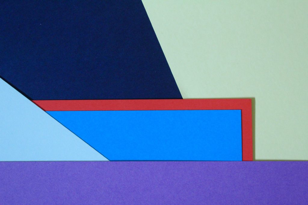
I chose this photo as one of my final images as I think it is a good interpretation of Tamara Lorenz’s work. I like the arrangement of the coloured paper and how I layered them to create distinct shapes with bold colours.
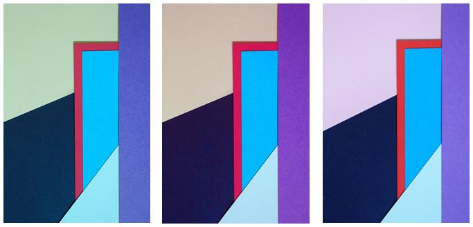
I experimented with the photo, adjusting the hue and I found my 3 favourite edits. The colours I found complemented each other the most were in my original image where the cooler colours (light green, navy and blues) contrasted with the warm colour red, giving a bold outline, which is the point where your eyes are drawn to in the photo.

I experimented with one photo by flipping it to create different layouts and creating symmetrical arrangements. I found that my favourite composition was the photo in landscape:

I like this composition as it contains horizontal lines as well as diagonal lines, with different sized shapes which are emphasised when the picture is landscape.
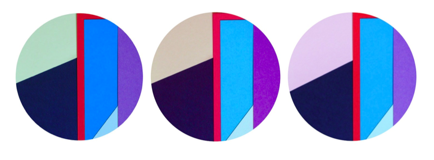
I also used circular frames to see if the images look more effective and found i preferred my images in a rectangular frame, following the geometrical design of the photo as the contrast of straight edges to circular edges is not aesthetically pleasing.
