My Research and Chosen Images For My Final piece
The Research
After having researched Pinterest I came across a selection Images under the hashtag ‘desolateputoface’ which really was intriguing in my opinion. I liked how the images portrayed a surreal and unrealistic approach yet still contained an understanding of what the image is. These Images present us with unreal representations of a persons face and they link to the idea of hidden identity. Below are a couple examples of the photos created by the anomonys photographer/graphic designer.


Analysing This Work
The thing which first inspired me to take a closer and more detailed look into this style of work was the vibrant colours used to create the surrealistic figure. Not only does this image look interesting and creative but it give’s an impression of hidden identity. It appears that the editor/photographer has purposely covered the person in slime to portray a sense of equality and that we are all humans no matter your skin colour, race or religion and therefore meaning we should be treated equally. A lot of the images appear to be males in the streets which may be referring to gang members and in this case the dripping slime relates to the fact that they are ruining and destroying their lives by doing bad. The part of the images that are not slime are fairly basic and unedited, contrasting with the slime.
Choosing my Images
At this point, I didn’t believe that many of my images from the several shoots i have collated were suitable for this theme/genre of photography. I decided it would be best to do a photoshoot to ensure that i could get the best possible images that could relate to this style of work and best portray a sense of surrealism and abstraction. The intention for this shoot was to capture portrait shots with an abstract background to further relate to the theme of the project. Thus in mind, i intend to take photos behind pier road carpark where there is some great structural features which hold the carpark together. Also I will collate images on streets to link to my inspirations images.
Photoshoot

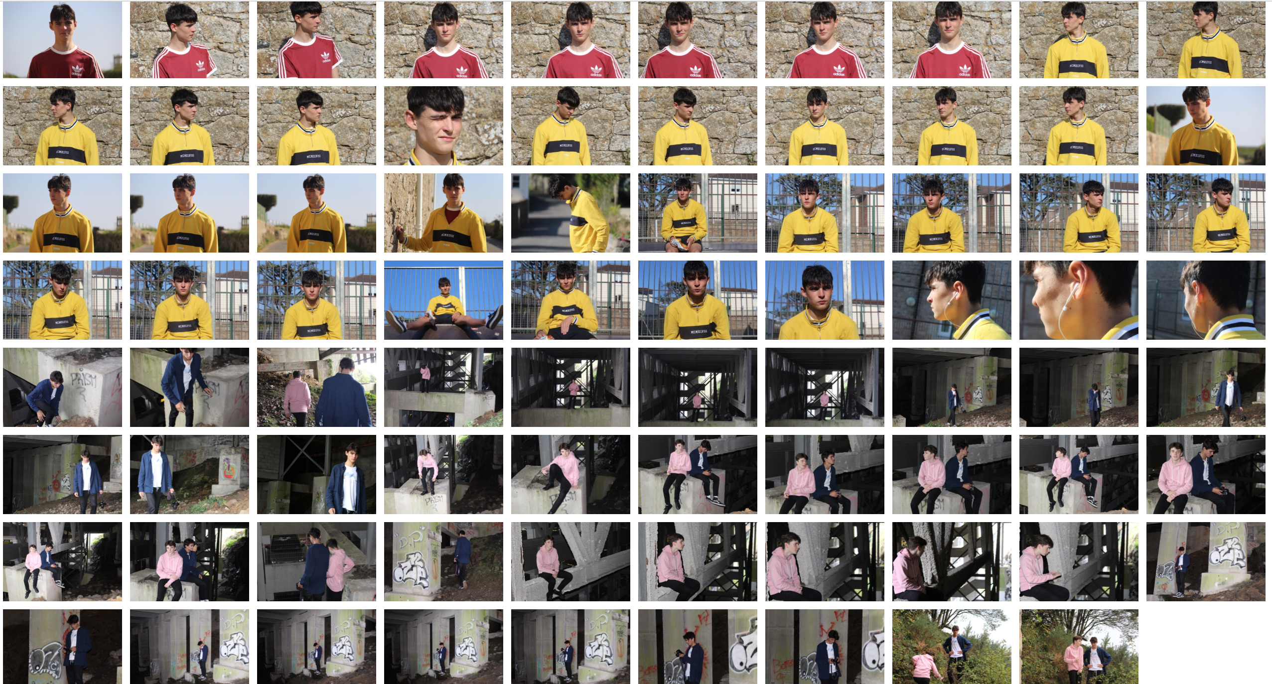
I believe this photoshoot was highly effective in achieving the aims I set out to do. Thus being getting some quality portraiture shots which could be further adapted to replicate a similar yet personalised image to my inspiration. I believe the natural lighting in the daylight photos was very helpful in allowing me capture the detail in my models face and the background too. The flash which was used in the nighttime and darker locations was effective in creating a focus on the model/models as the flash highlighted the foreground, being the model, and not the background.
Selecting My Images
In the process of selecting my images, I had to carefully go through this last photoshoot and start narrowing down my images to the best 50 then 25, 10 and then finally to arrive at the ones I intended on using. I wanted to select the images that showed a good understanding of using the camera for example using ISO and shutter speed and those that of course had the best lighting composition and were most appropriate to reflect a sense of abstraction whether it be in the editing process or the photo how it is.
Selected Images


 I wanted to incorporate this effect into many of my photos taken, and do decided to do this through corners of color paintings and instruments to mimic this style.
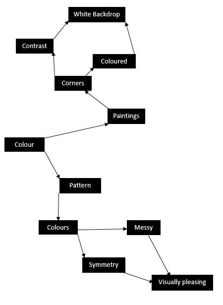 I used this mind map as my basis for the shoot, where I would occasionally use this to find what I needed to focus on most importantly. From this these were my results in the shoot:

 From here I decided it would be best to cut the shoot down into ten images, through this it would make it easier for me to identify the photo I think is best in the shoot. These are my top ten images of the shoot:


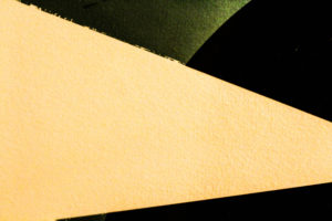


 I chose this image as my final photo, as I thought it best matched with the style of photography I wanted. Which incorporated an element of graphic design into the imagery, making it simple but visually pleasing to the eye.

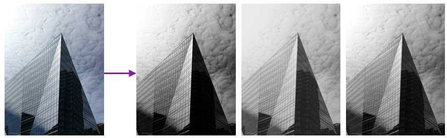
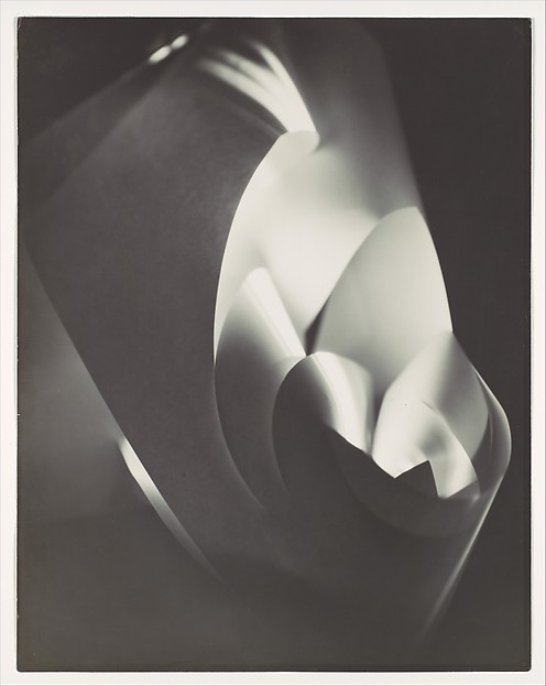 This enables a clear definition between the lights and darks to the photo, whilst it being very simplistic at heart, the scrunched effect makes an almost complicated look to the image.
This allows us to experiment as a photographer with not only composition but in a way our artistic creativity as well, due to how we are able to warp the materials given to form structures which we are able to use to our advantage.
This enables a clear definition between the lights and darks to the photo, whilst it being very simplistic at heart, the scrunched effect makes an almost complicated look to the image.
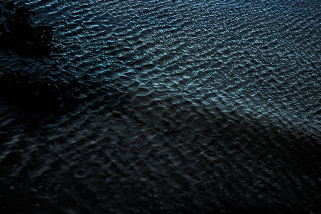
This allows us to experiment as a photographer with not only composition but in a way our artistic creativity as well, due to how we are able to warp the materials given to form structures which we are able to use to our advantage. As much as I liked his work, I decided to mainly focus on reflections made by the water, and since I lived next to the beach I thought this would be an ideal idea to do.
 I used this as a basis for my shoot, so when taking the pictures would know what to specify on.


 From these images taken, I chose the top ten out of the shoot, to narrow down and edit which one overall I think should be my final picture.


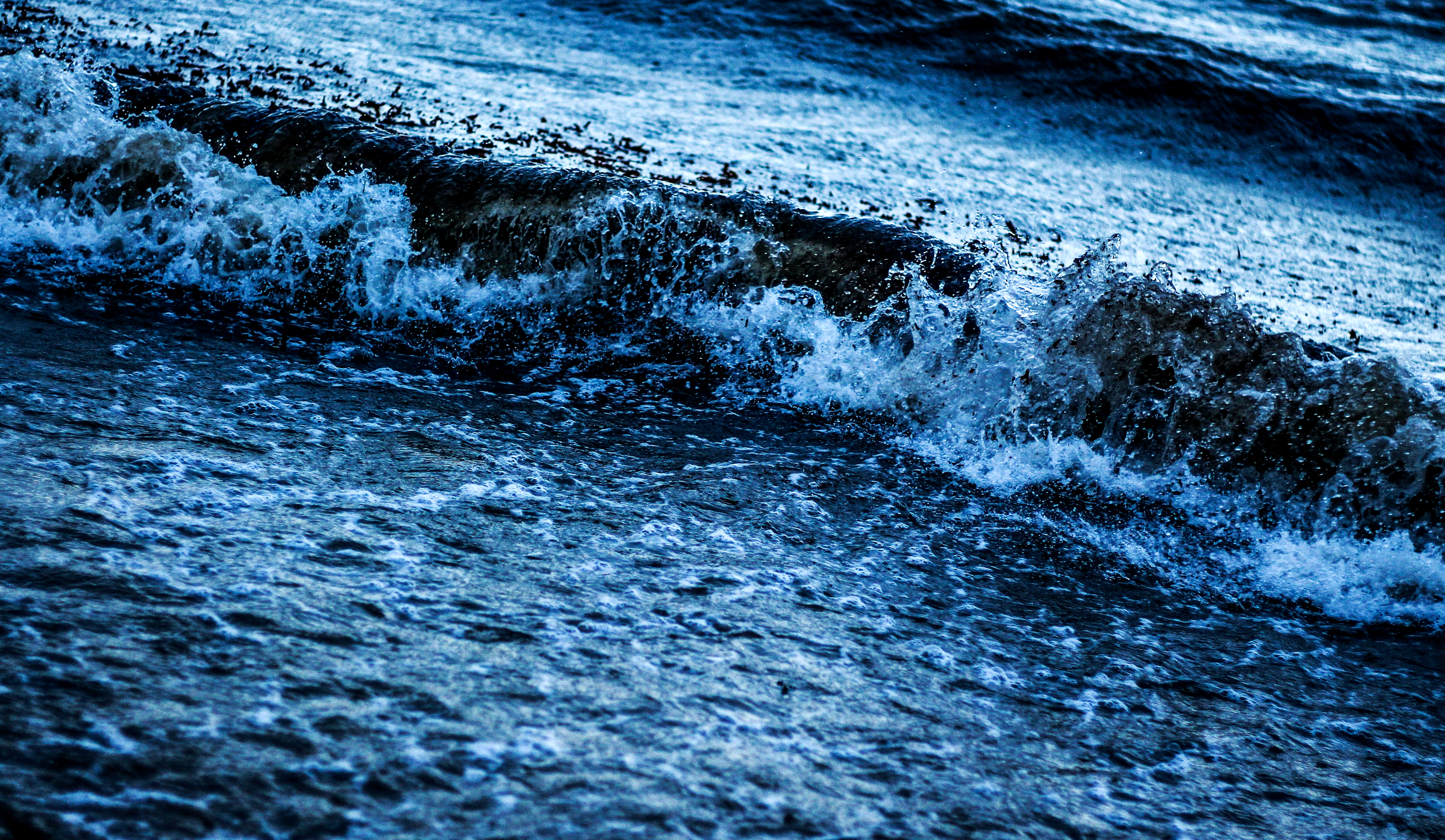 I chose this image because I loved the detail within the crashing wave on the shoreline, whilst the contrast between the darkness of the wave and the foam in my opinion make a dramatic effect. I also loved how the composition of the wave slanted across the frame, creating an almost abstract effect to it all.


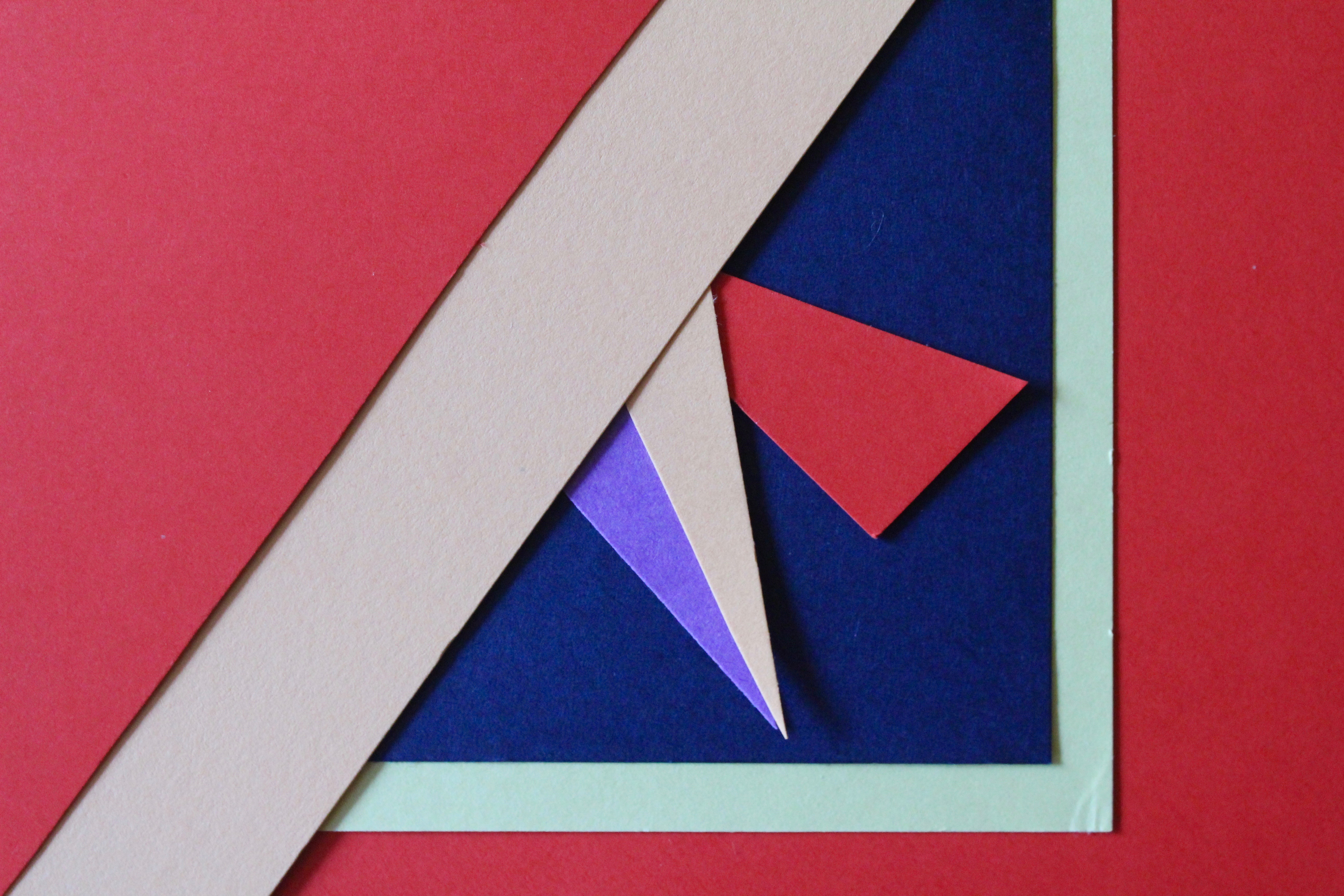
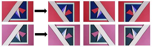
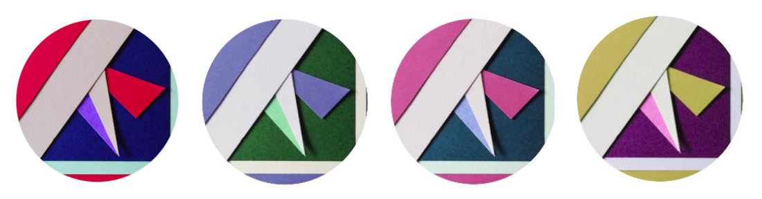
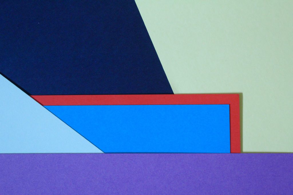
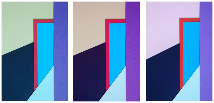
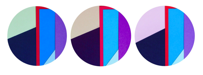
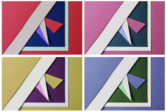 I first experimented with colours and changed the hue of the photos in photoshop and decreased the brightness so the colours weren’t too vibrant. I chose this photo as I think it represents abstract photography well through the solid bold colours and geometrical shapes I created by layering and cutting coloured pieces of paper. I tried to focused on creating contrasts between light and dark pieces of card to emphasise there colour. I personally like the red and pink coloured photos as I think they are the most bold and striking images.