
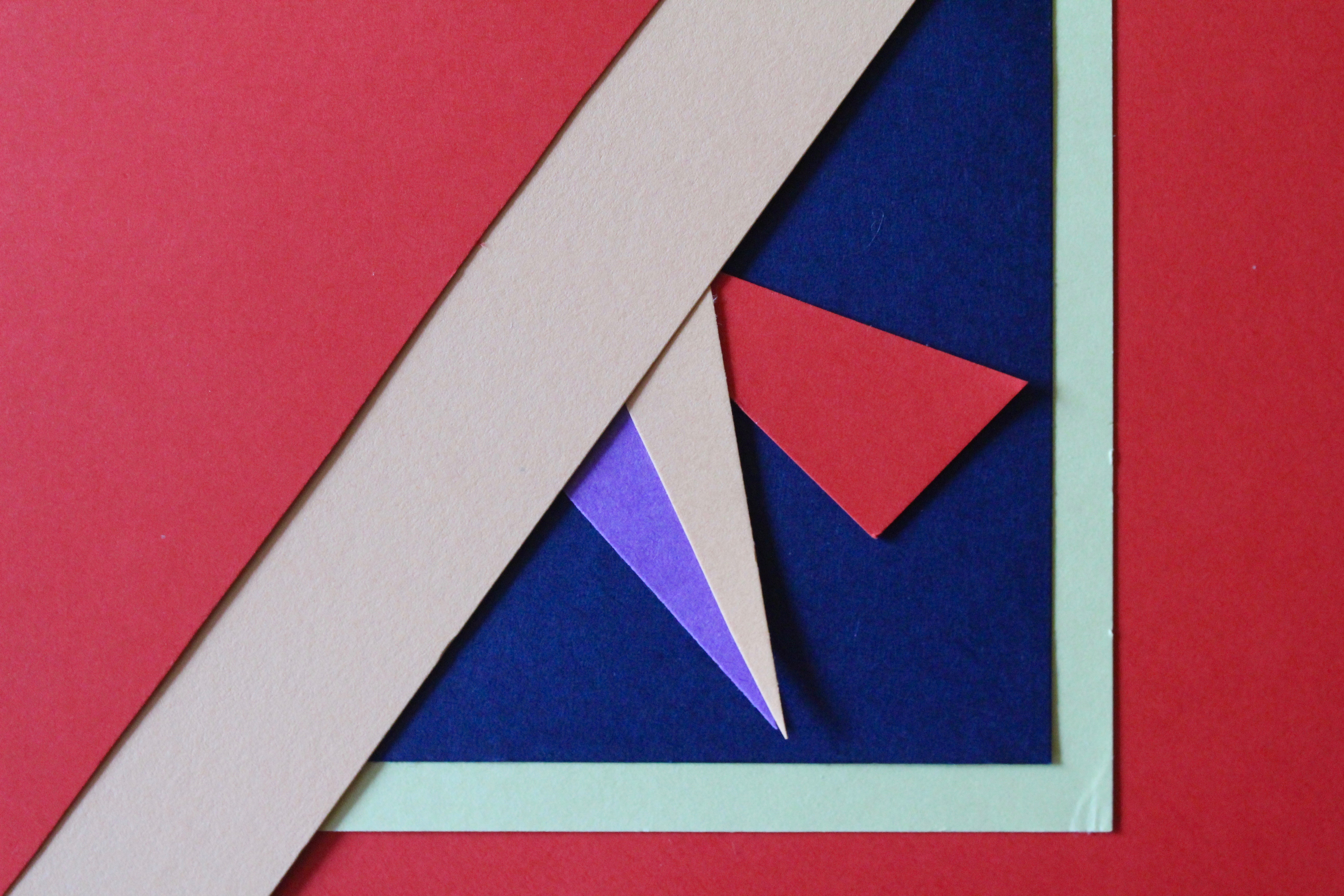
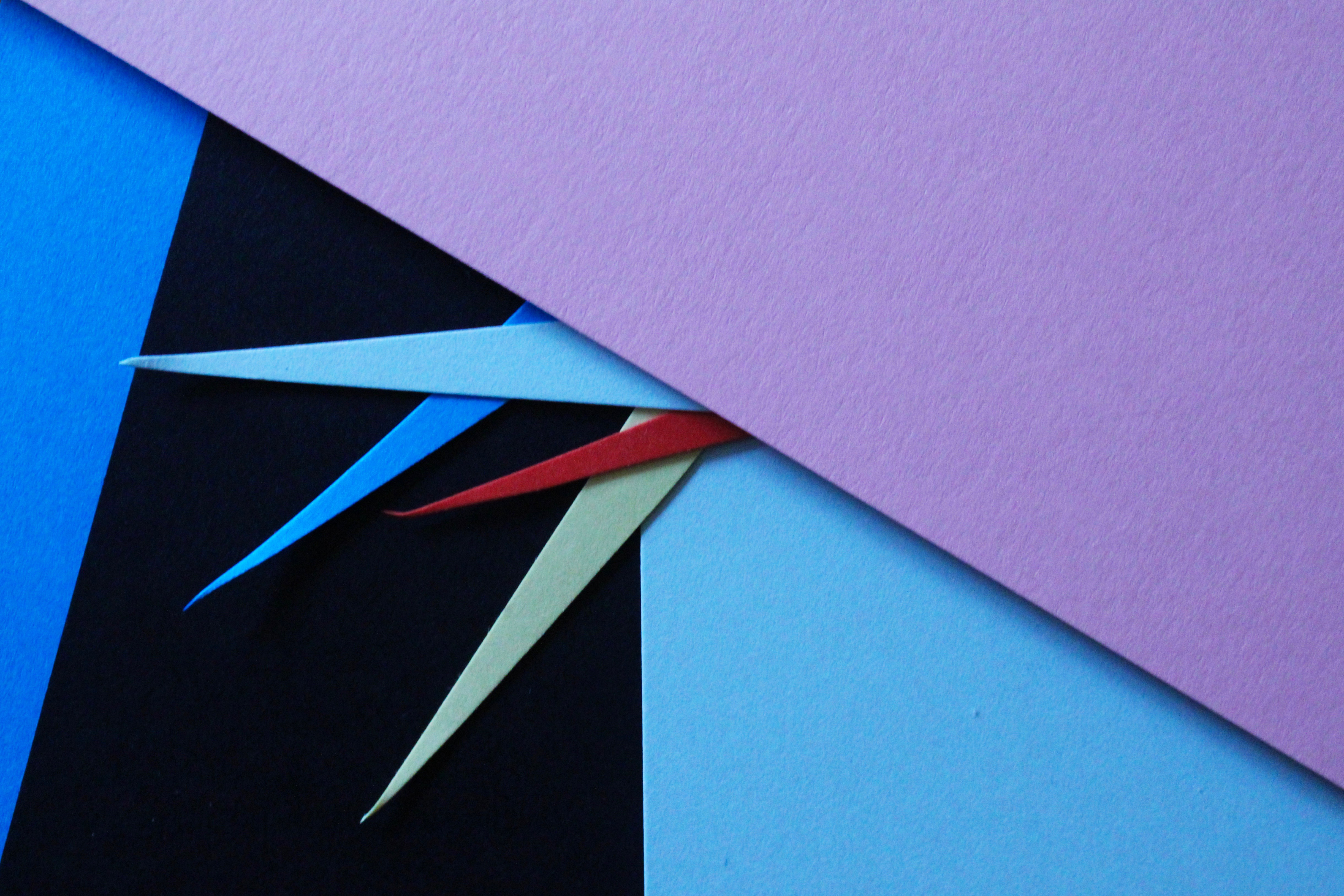
Taking inspiration from Tamara Lorenz, I tried to re-create her abstract photography using sheets of coloured paper and arranging them in different ways. I selected colours that complemented each other and cut pieces of paper to create traingles and other shapes to make the photos more interesting.
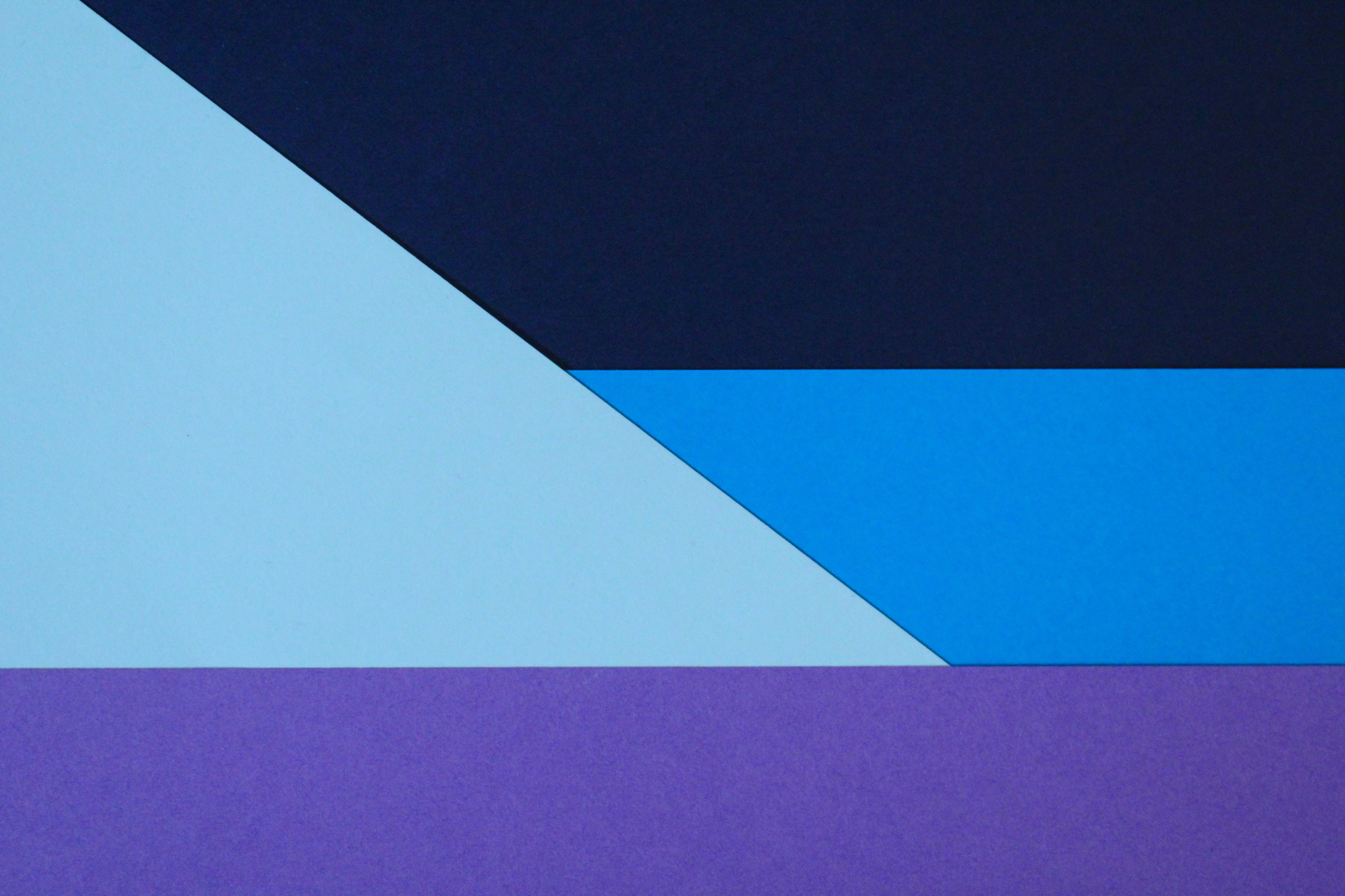
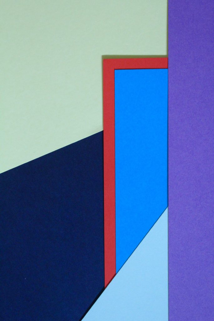
I especially like this photo and the colours I used to create the pattern. The red sheet of paper with the blue layered on top creates a bold outline and is the point where your eyes are drawn to. Like Tamara, the addition of strong planes of colour provide another source of contrast in addition to those of line, shape, tone and texture. The cold colours paired with the warm colour creates a contrast between the sheets. The paper layered behind is arranged to create distinct geometrical shapes, emphasising the straight lines. I experimented with different angles to place the paper and tried to find the most aesthetically pleasing arrangement. I experimented with flash and natural light and decided that natural was better. This work also shows similarities to Franco Fontana’s work using bold, vivid blocks of colour to link into abstract photography.
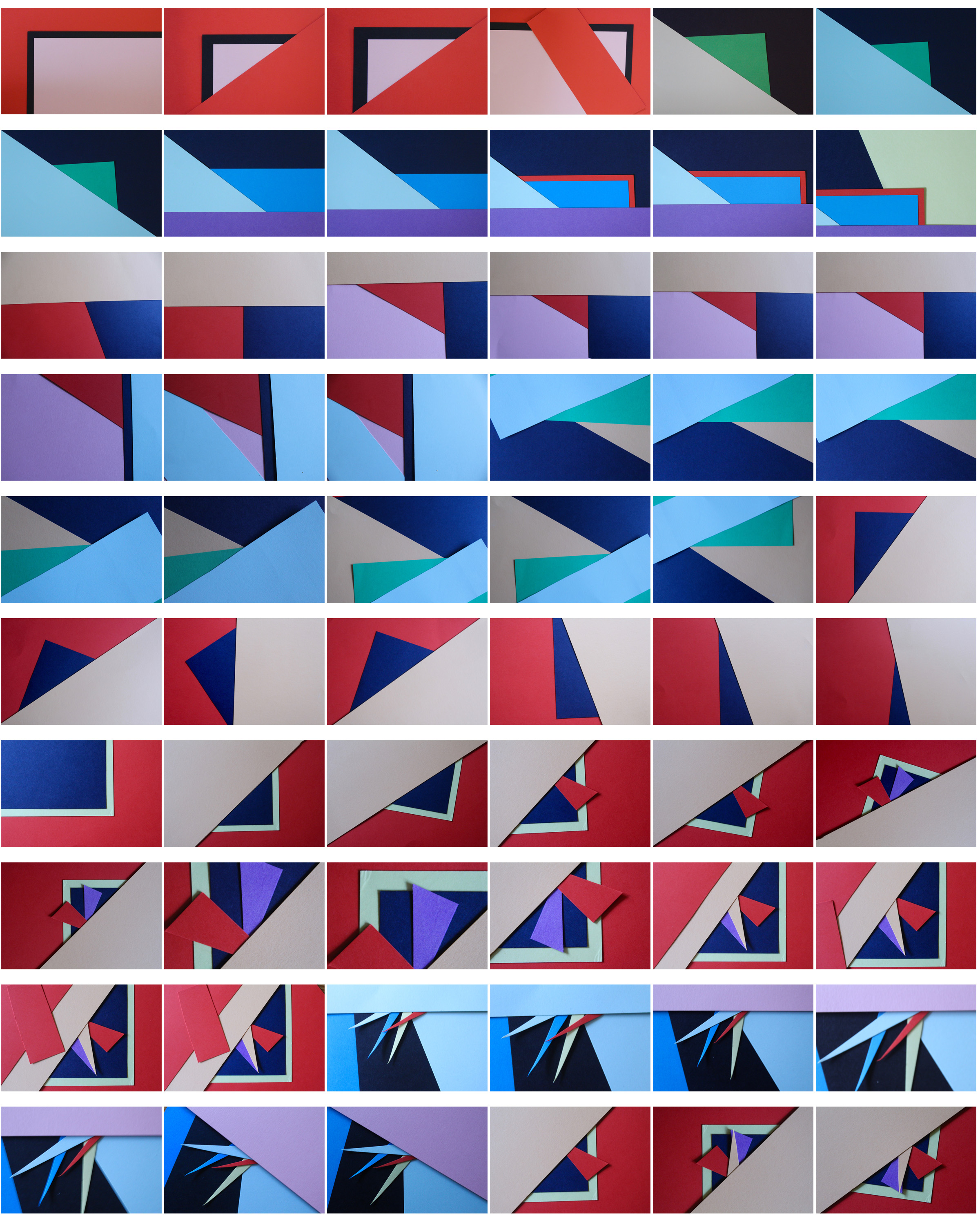
To further develop these photos I could arrange them in a different shapes, e.g. a circular shape, to frame the photos even more.