William Eggleston
William Eggleston (born 1939) is an American photographer. He is credited for increasing recognition of colour photography as a legitimate artistic medium.
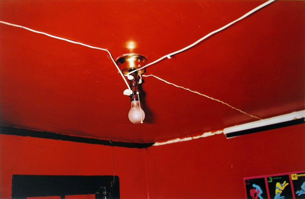
This photo below is one of his most famous pieces of work, it appears that flash was used to take this photo as you can see the reflection of the flash above the light bulb. The light bulb has been positioned to be almost in the centre to make it clear that it is the subject. There is high contrast in this image between the white light bulb/wires and the colourful red background. The photo is quite saturated as colour is one of the main focuses of the photo. A shallow depth of field appears to be used as the bottom right of the image is out of focus whilst the centre is in focus. A quick shutter speed along with a low ISO appears to be used as the image is sharp and doesn’t have a lot of noise.
Colour is a major element of this photograph as it floods it all around except for the subject. There is a mixture of light tones in the wires and dark tones in the photo. There is a 3D effect in the photo as the light club is obviously closer than the corner of the room. It is quite a minimalist photo as there aren’t many different components – the only ones that stick out are the light bulb and the plain red background.
Eggleston was a pioneer in the use of colour in photography and in this image he is expressing his skills and showing how colour can bring an image to life and have an effect on the viewer.
Eggleston is trying to show that when a lot of colour is used, there doesn’t have to be a lot happening in the photo as the colour makes up for it and gives the viewer something appealing to look at.

Fred Herzog
Fred Herzog (born 1930) is a photographer known primarily for his photographs of life in Canada. He grew up in Germany but was evacuated in the second world war. His work focuses primarily on working class people and their connections to the city around them.
In the below photo, natural lighting appears to have been used as it is in a street. The photo has been set up so it is minimalistic – one third is the plain red door and the other two thirds are curtains with an arm poking out. There is not a massive range of tone in the image and the only real contrast is between the shadows and the curtains. A deep depth of field appears to have been used as the whole image is in focus. A quick shutter speed (possibly 1/60) appears to have been used along with a medium ISO as it is a sharp image with a small amount of noise.
The photo has been planned so that there is minimal colour – the only colourful item is the red door, this provides contrast of colour in the photo. There is a change of tone as it goes from light in the curtain to dark in the shadows. It is a very flat photo with no subjects appearing in the foreground. The eye is lead to the mysterious arm coming from behind the curtain.
The image is from his collection of images taken of the working class in the city of Vancouver. It shows the conditions and type of life that they live on a daily basis.
I think that by doing this Herzog is trying to express the differences in peoples lives. Someone living in the upper class in England may live in completely different conditions to the working class in Vancouver and this is Herzog’s way of making the world aware of everyones different situations.

Trolley - New Orleans 1955

Named The Trolley, this became one of Robert Frank's most famous photos released from the book The Americans. The picture captures the fleeting moment that conveys the brutal social order of the postwar America. Frank was originally shooting a street parade when he saw a trolley passing, in which he quickly spun round and took a picture before the trolley disappeared from view.

Visual

The picture consists of a small amount of tonal range but a large contrast between black and white throughout. The picture is obviously taken at a slightly angled position, with a balanced symmetry across the entirety of it. This image has been cropped from the original taken with a huge contrast between the white poles and the people next to each one, instantly drawing your eye to them.

Technical

A natural light is used within the image as it was taken on a bright sunny day creating a warm tone to the overall piece, but has been slightly manipulated with evidence of the Ansel Adams zone system used throughout. The whole image seems to be in focus with no blur at all with a big depth of field, whilst telling us that Robert must have used a high shutter speed to capture the moving trolley so clearly without the traces of blur. From the reflection in the glass above the trolley windows, it is clear to say that it was taken head on allowing for the effect to occur.

Contextual

The picture perfectly captures the racial separation between the people at that time period within America in which classes were divided (In one window there is an old white woman, the next are two white children and the last are two black men), whilst also revealing and documenting the truth behind what the Americans saw as 'The American Dream' in which not everyone was equal with similar opportunities in life


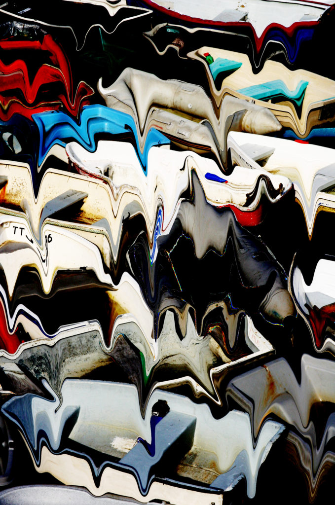
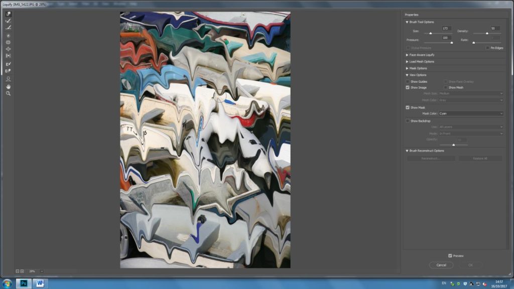
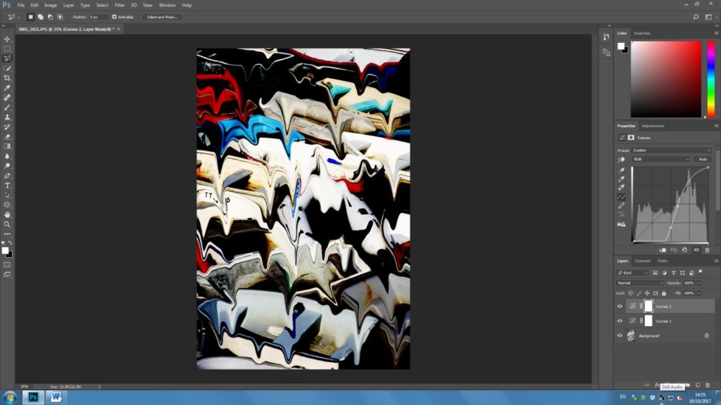
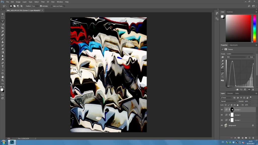
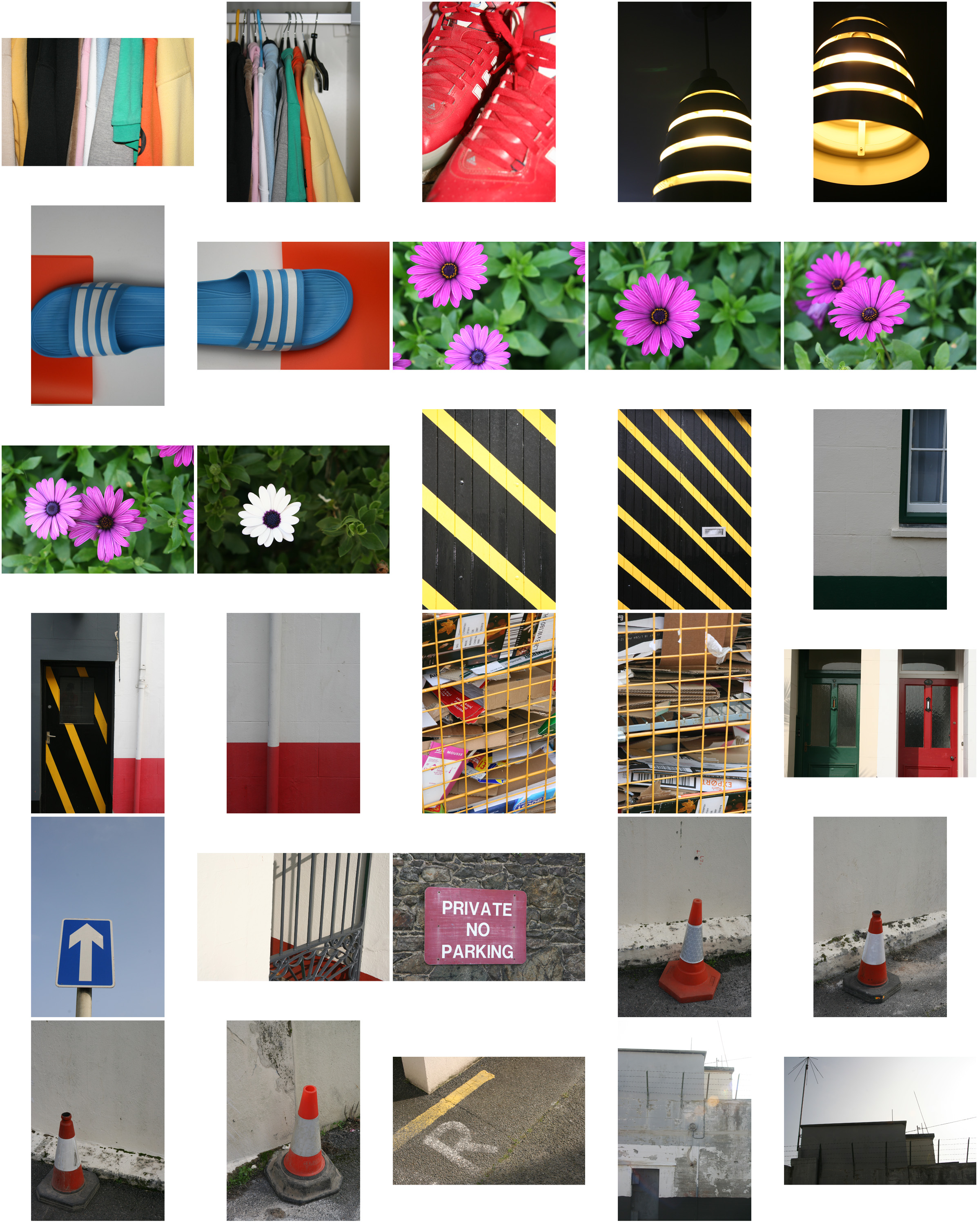
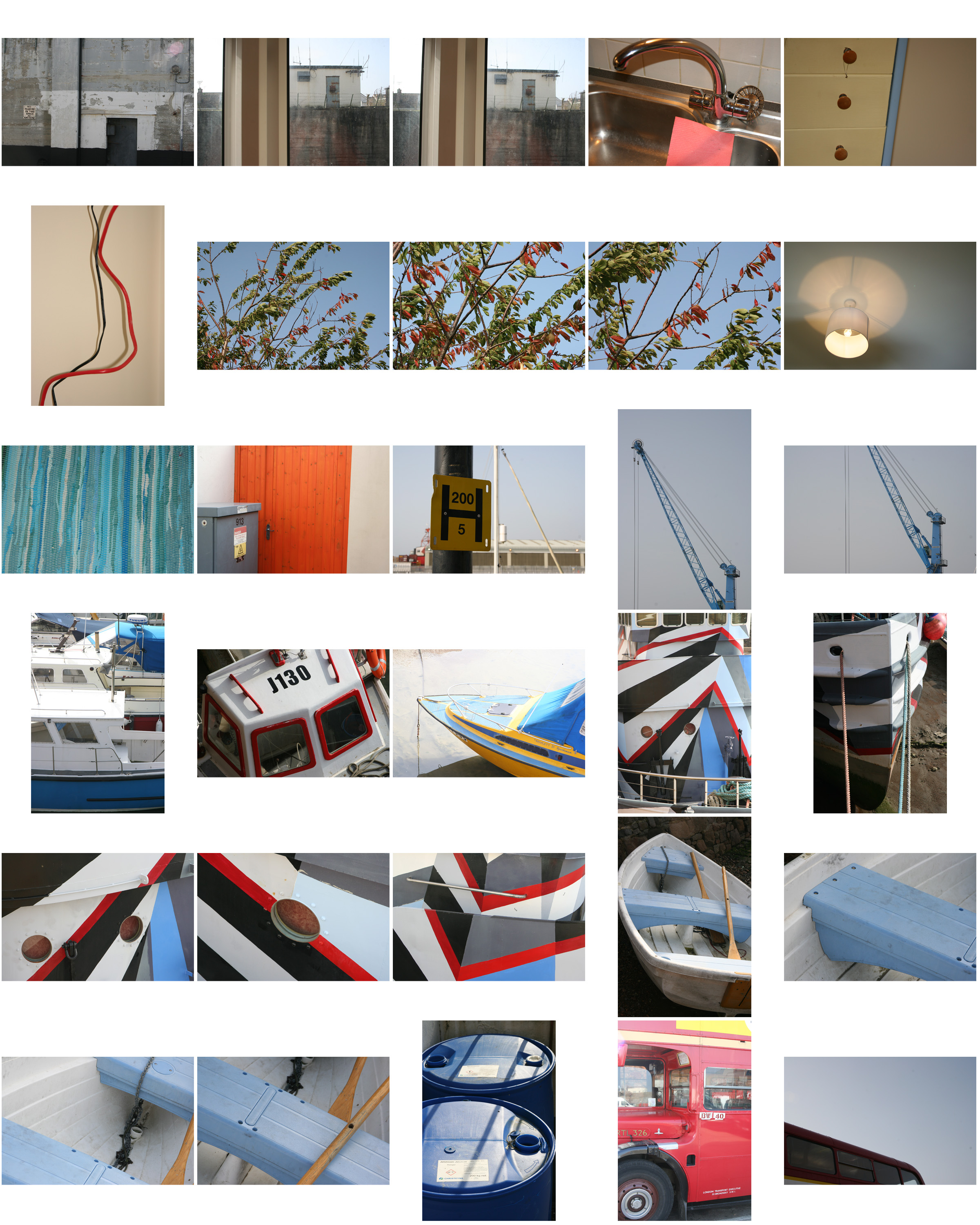
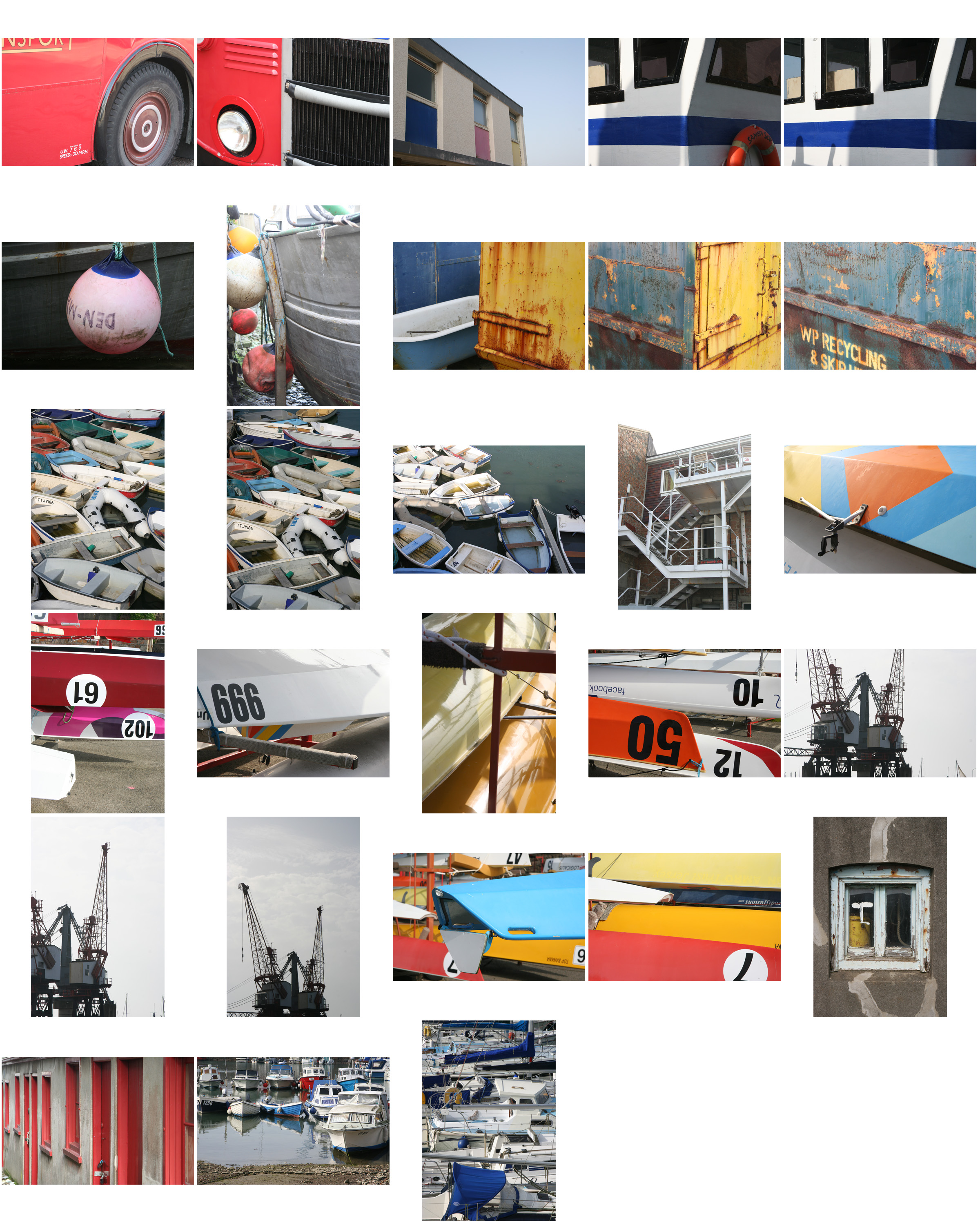
 To really create the effect I desired, I drove round jersey to and from destinations, taking pictures of lights that interested me as a photographer, as I thought they would capture the eye of the viewer. Some of the techniques I would incorporate into the images were motion blur and low shutter speed zooming, I specifically made sure not to use a tripod, as I wanted to create a disrupted effect to most of the pictures taken.
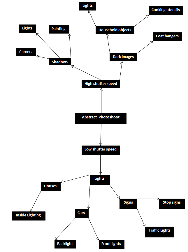
I decided to make a mind map of the objects and ideas behind them, that I could take in the shoot to help me along. From there I would be able to section off individual images from each segment, and choose the best image from each. This is what it looked like:
 From here I went ahead with the photo shoot, and these were my results from this experiment below:
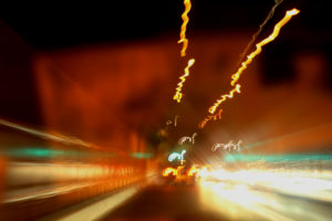
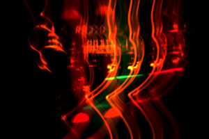
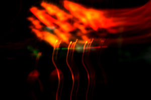
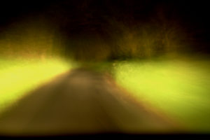
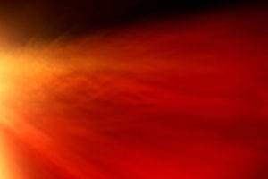
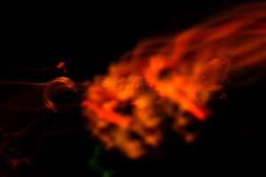
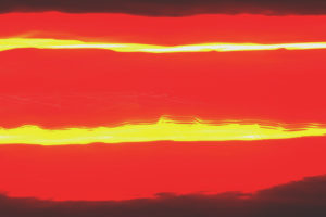
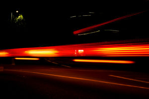
 From this selection of my top ten images, I decided to single them down even more to a top five, to really distinguish the good pictures from the rest. These are my top five:
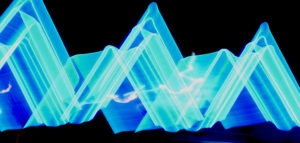
 I chose this image as I loved the triangular effect created by the outskirts of the blue lights at night when driving by, with a long shutter speed (1.8 seconds). I also thought that the contrast between the blue, really stood out from the rest of the image, making it very visually pleasing to the viewer, as seen by all the underlying shades of blue present within. What I really liked, was the fact that the image was an unbroken pattern, creating symmetry throughout the piece allowing for a greater effect.


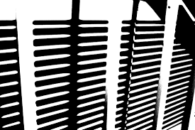 This style of photography inspired me to create my own small contact sheet, in which I would incorporate this threshold idea into some of my picture taken previously, using the software Photoshop. This would really make certain aspects of the image that I desired to stand out from the rest, by reverting the image to a black and white only state. However with certain images, I decided to invert the colors as I believed it made the image more aesthetically pleasing to the eye, and in some circumstances made the object I wanted to pop out.
This is the outcome of my experiment:
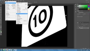
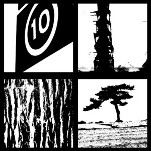 The method in which I created these images on Photoshop are below:
1. Locate the Image tab above, and click the adjustments section, which will reveal the Threshold section.
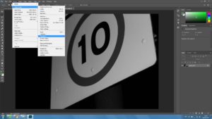 2. For some pictures I then had the idea to invert my image colors, allowing for a completely different picture to be formed.
