Planning
Task – Take 100-200 photos of different textures and surfaces eg rust, mould, rough , smooth , contrasting surfaces
Locations – Garage, garden, my house, school
Subjects – different types of flooring, hair, different textures on household objects, nature, clothes
Lighting – natural lighting to keep image natural
Camera settings – low depth of field so corners are blurred, quick shutter speed – 1/60 to 1/100, ISO 200.
Concept – to exploit different textures in household objects and show them in a way they are not usually seen.
Frank Hallam-Day
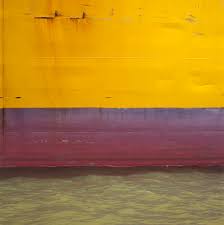

Frank Hallam-Day is a photographer based in Washington whose most notable work is his photographs of ship hulls. He described these images as “an afterthought to what I thought was a more interesting series; images of wrecked ships”. People were living on these shipwrecks when he was photographing them. He edited the colour balance of the sea to match the colour of the hull.
Hallam-day also teaches photography in several institutions in the US. He majored in social science at university and completed a masters in sociology.
Frank Hallam-Day Favourite Photo:
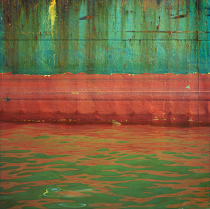
In this photograph, Hallam-Day uses natural lighting from the sun to capture a natural but abstract image. It is a very sharp and saturated photo that captures the texture and colours of the rusted hull. A fast shutter speed may have been used to capture this photograph – possibly 1/60 of a second as the photo is focussed. An ISO of 200/400 appears to have been used due to the brightness and clearness. It is a warm image with vibrant colours to catch the viewers eye.
Hallam-Day uses the rule of thirds in this photograph; the three layers of the image lie across the horizontal planes of the rule of thirds structure. The tone in the image is mostly light except for the contrasting dark rust. The eye is lead straight to the vibrant top two layers of the image. The pattern of layers makes for a better viewing. The cropping of the image makes it more abstract and therefore more interesting for the viewer. Due to the matching of the image to the rule of thirds, it appears to be almost 2D.
The original aim of this photoshoot was to picture shipping wrecks but an afterthought of this was to create abstract images photographing the typology of ship hulls. This work turned out to be one of his most famous pieces.
The way that the colours from the hull reflect on the water as if it was merging into the sea suggests that Hallam-Day is trying to show that the shipwrecks have been moulded into the sea.
Aaron Siskind
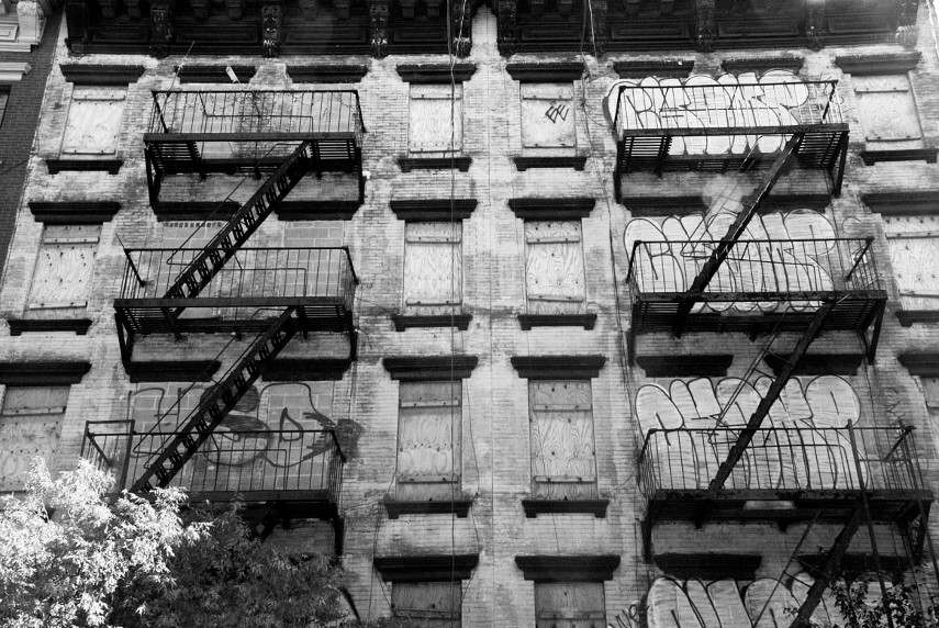
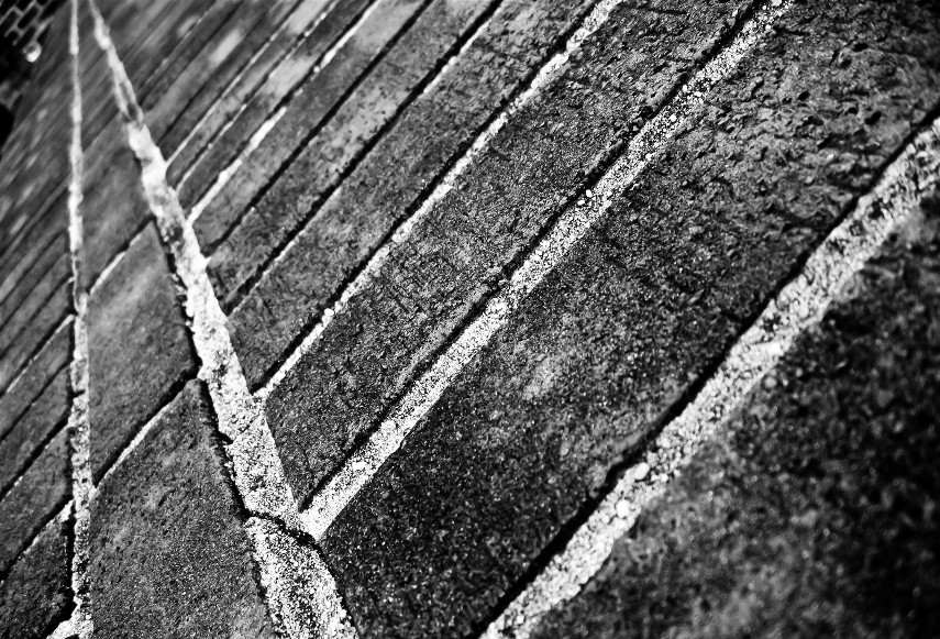
Siskind is a photographer that identified with the ideas and styles of the abstract expressionist artists in New York in the 1940’s. He tends to emphasise texture and lines to create abstract images of the real world. He turned away from the social/political world-post world-war 2 and looked at seeking meaning in inanimate forms around him.
Aaron Siskind Favourite Photo:

In this photograph, Siskind uses a dim lighting to create a dark and mysterious photograph. There is a wide tonal range – going from the darkness of the shadows to the brightness of the material. A short depth of field appears to have been used along with a quick shutter speed (possibly 1/60) and a low ISO because it is a dark, sharp image with a low amount of noise.
The grayscale colour and the cropping of the image creates an abstract image as you cannot tell what it is – especially without the colours. The texture of the image makes it appear to be of something that has been burnt or in a fire, which leaves the viewer to wonder what happened. There is some 3D elements in the photograph as you can see some pieces of material hanging off the wall and creating a shadow behind them. There is not a massive amount of contrast, balance or structure to this image which makes it even more abstract than it already is.
After researching further, I discovered that this image is called “Jerome, Arizona 21” and shows peeling paint from a decaying wall. Sisking would often take pictures of fragments of walls, architectural details and disintegrating signs and posters.
In this photograph, I believe that Siskind is trying to show that something considered ugly and discovered can be explored in detail and be considered intricate and intriguing.
Keld Helmer-Petersen
.jpg)
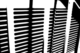
Helmer-Petersen was a Danish photographer who looks at shapes similarly to Albert Renger-Patzch. His work, especially his book “122 Colour Photographs” brought modernism to Danish photography and earned him a grant for a years study at the Art Institute of Chicago. He looks at the natural shapes and pattern in the world around us and creates something attention-grabbing out of it.
Keld Helmer-Petersen Favourite Photo:

In this photograph there appears to be harsh lighting due to the editing but I believe that is it natural lighting. There is a large tonal range, ranging from the white of the posts to the black of the shade. This is a high contrast photograph as the spikes contrast with the background. It is a sharp, focused photo so it must have a fast shutter speed with a low ISO and a shallow depth of field.
It is quite a cold photograph due to the contrast along with the black and white. There is lots of repetition and patterns within this image; the spikes are repeated along with the shapes in the fence. The post sits along one of the vertical lines of the rule of thirds with the circle of the post being at the intersection of two lines. This means that Helmer-Petersen planned this to create an appealing image for the viewer.
I believe that in the image Helmer-Petersen is trying to exploit the beauty within things designed to keep people out. He looks at the patterns in the fences which are supposed to be menacing and he shows them off in a way in which they were not meant to be seen.
My Photographs:
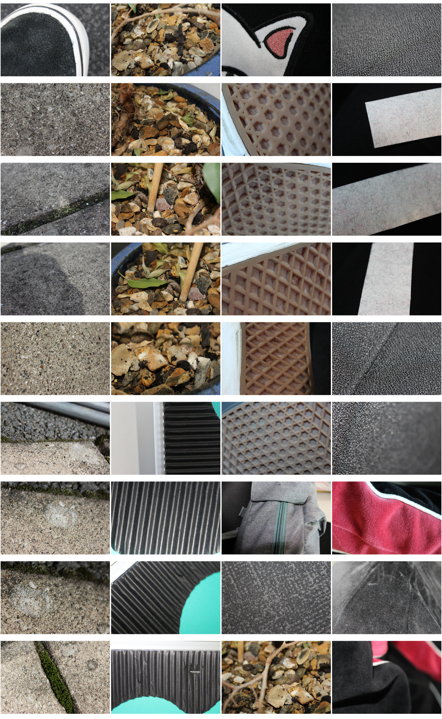
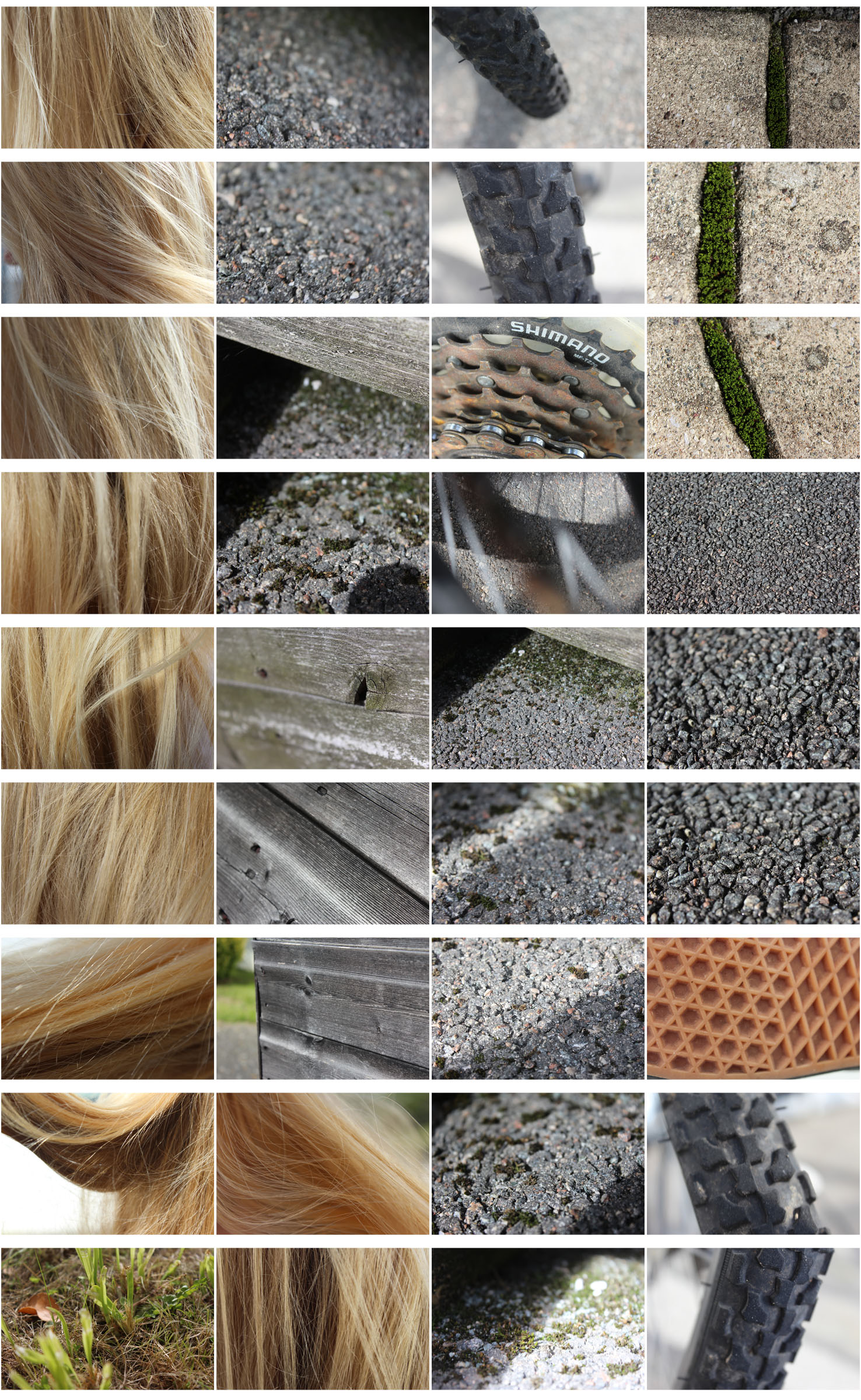
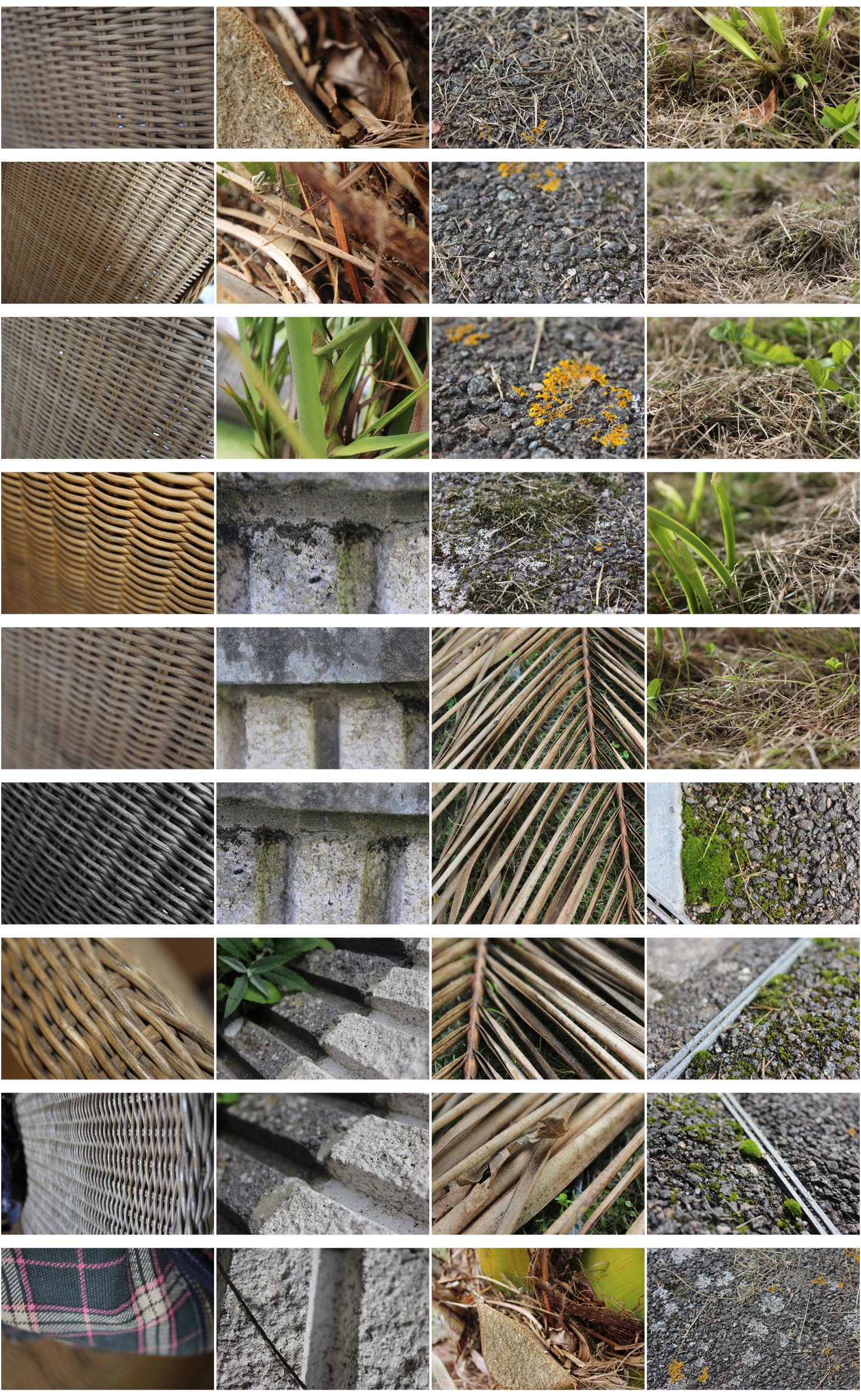
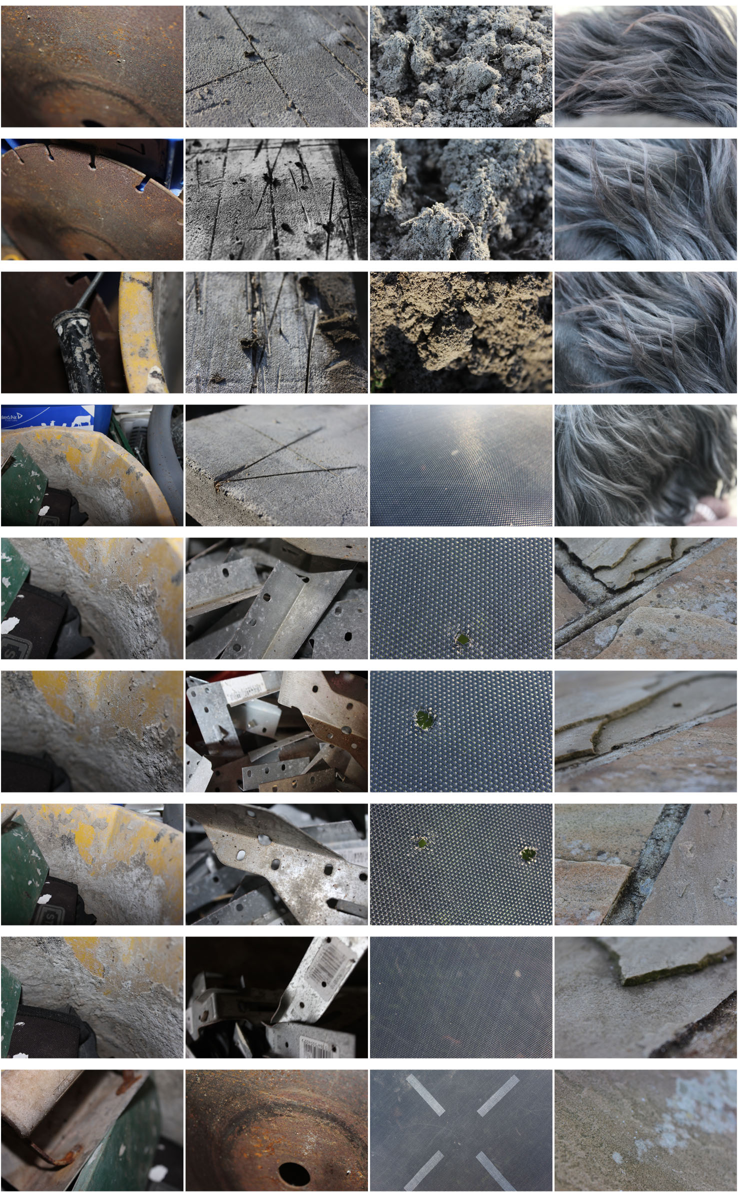
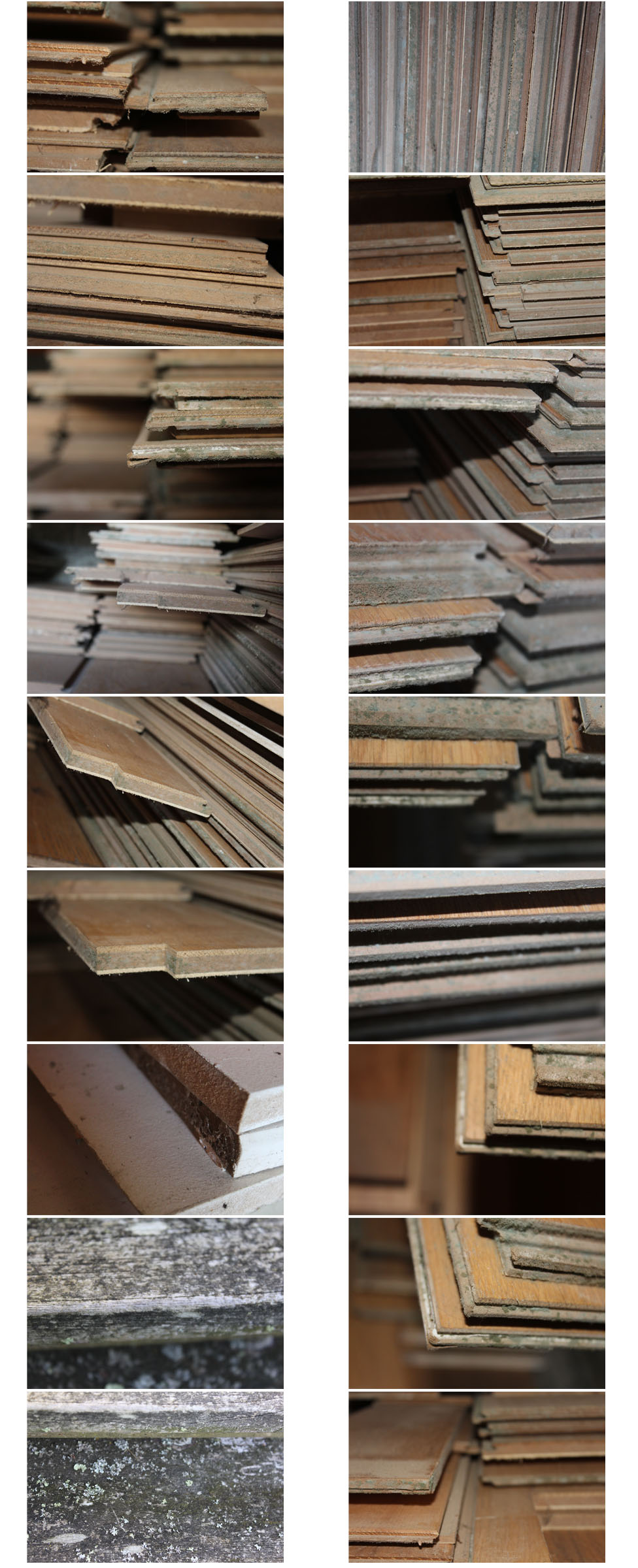
My Favourite Photographs:
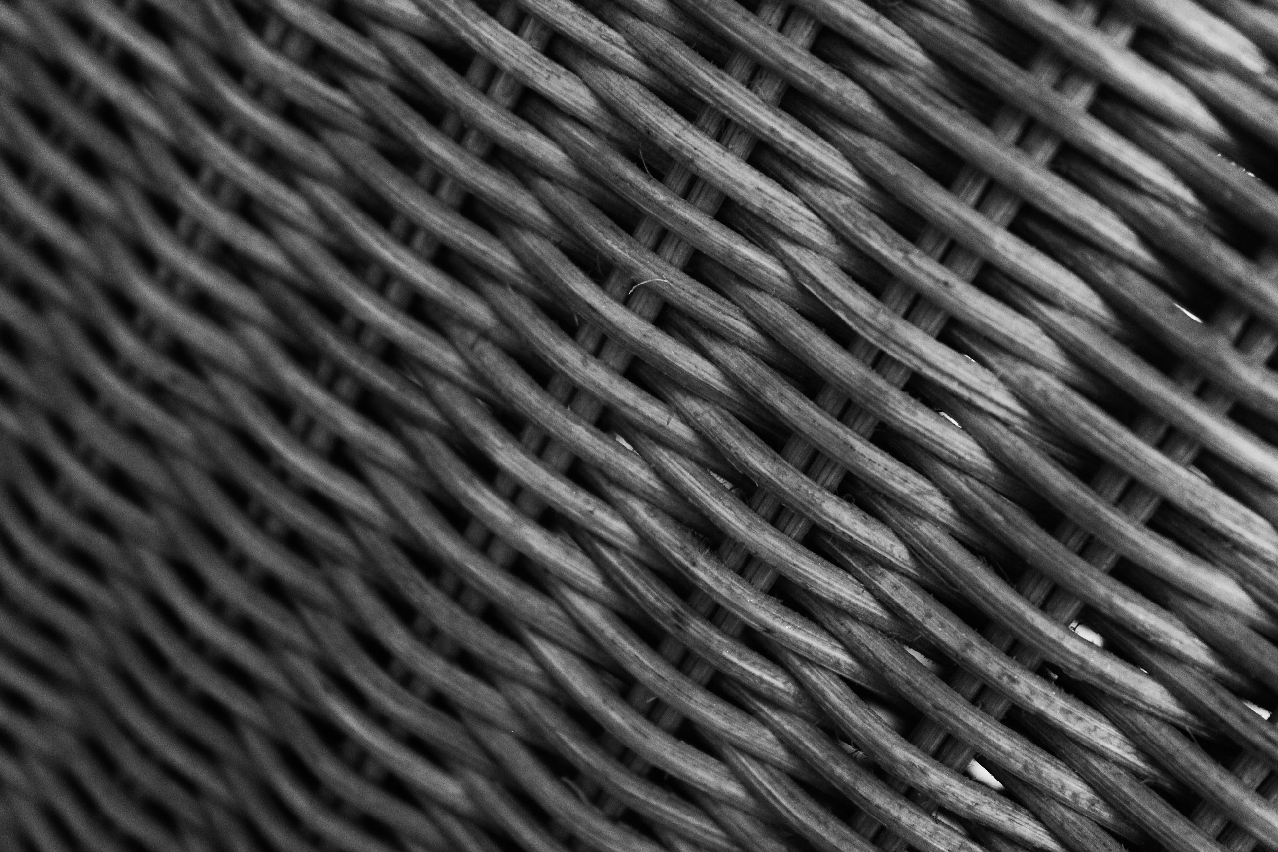
In this photo flash was used to introduce contrast into the photo to create a wider range of tones. The flash allowed the details of the material to be seen better. A macro setting was used to take this picture so that I could show the texture of the material. A low depth of field was used to create a blurred effect at the edge of the photo to emphasise the detail in the part that is in focus. A low shutter speed (1/60) was used to catch a sharp image. A low ISO was also used.
Both light and dark tones run throughout the photo, this allows the details of the material to be emphasised because of the contrast. A rough texture can be seen along each part of the photograph. The image has a slight 3D effect due to the low depth of field and the high contrast. The pattern of the material runs throughout the photo and creates an abstract image.
Because of how these techniques work so well together, this is one of my favourite photos from the shoot. One thing that especially stands out to me from the photograph is the texture and the 3D effect.
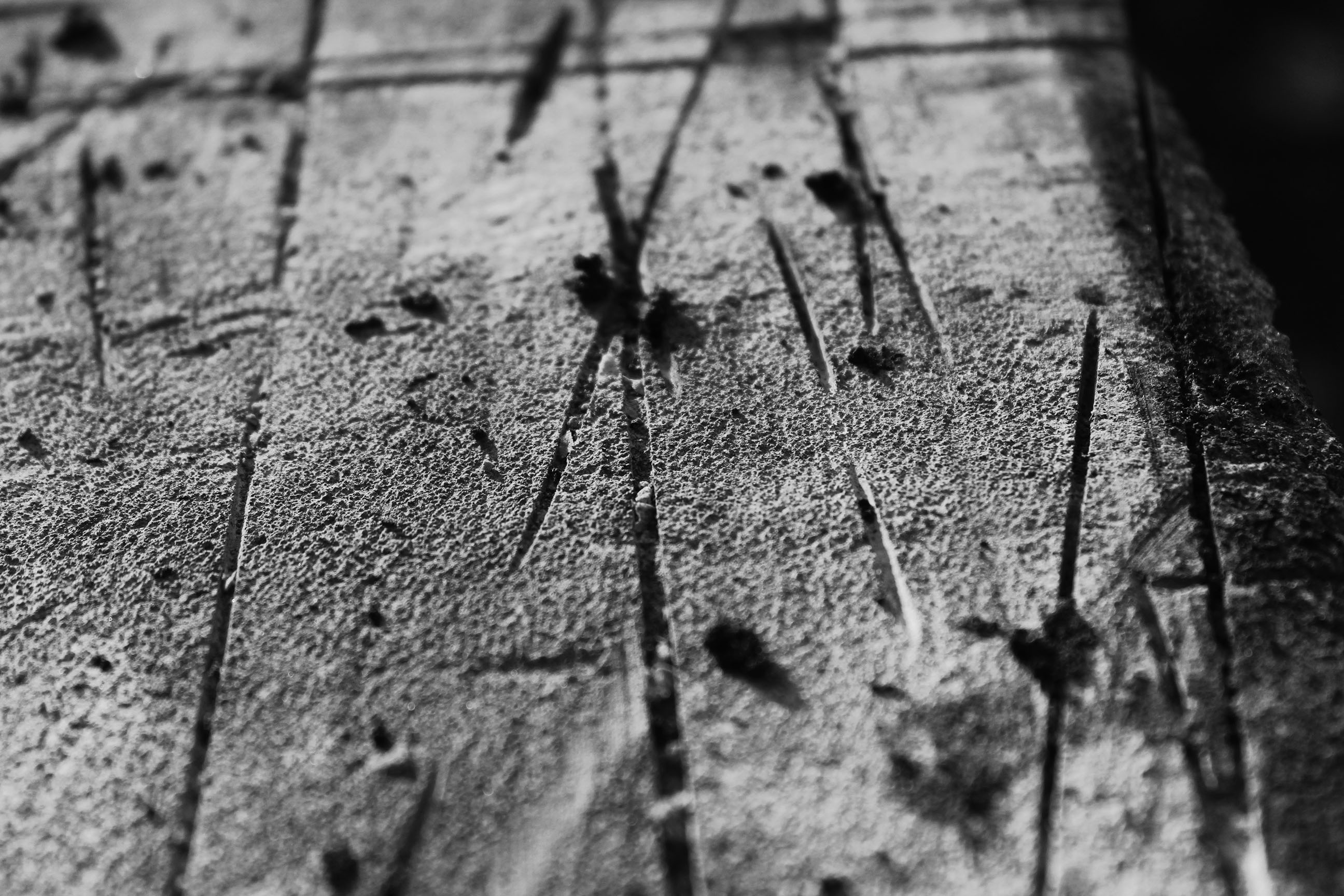
In the below photograph natural lighting was used to allow me to catch the natural shade of the subject. There is a wide range of tones between the surface and the cuts in it to create a dramatic and contrasting photo. A macro setting along with a low depth of field was used to create a blurred effect around the edge to allow the viewer to focus on the centre of the photo. A quick shutter speed was used to catch a sharp photograph. A low ISO was used to create a dark, dramatic image.
The black and white helps to increase the contrast in the image to make it stand out more. The cuts in the surface create a slight 3D effect in the photograph. The random cuts and lines contrast with my other favourite photo in which everything is a set pattern, this works well with the abstract theme..
For the above reasons, this is one of my favourite photographs from the shoot, especially because of its abstractness.




.jpg)


 As you’re taking an image, you would have done this through your viewfinder or in the LCD display, that you use to frame your shot. With this grid in mind the ‘rule of thirds’ now identifies four important parts of the image that you should consider, placing points of interest in as you frame your image. Not only this, but it also gives you four ‘lines’, that are also useful positions for elements in your photo.
 The theory is, that if you place points of interest in the intersections or along the lines, your photo becomes more balanced and will enable a viewer of the image to interact with it more naturally. Studies have shown that when viewing images, people’s eyes usually go to one of the intersection points most naturally, rather than the center of the shot – using the rule of thirds works with this natural way of viewing an image, rather than working against it.

 In addition to the above picture of the bee, where the bee’s eye becomes the point of focus. The next time I went out I decided to try this within my photos, to really get the viewers attention to the object of my choice, these were my results:
