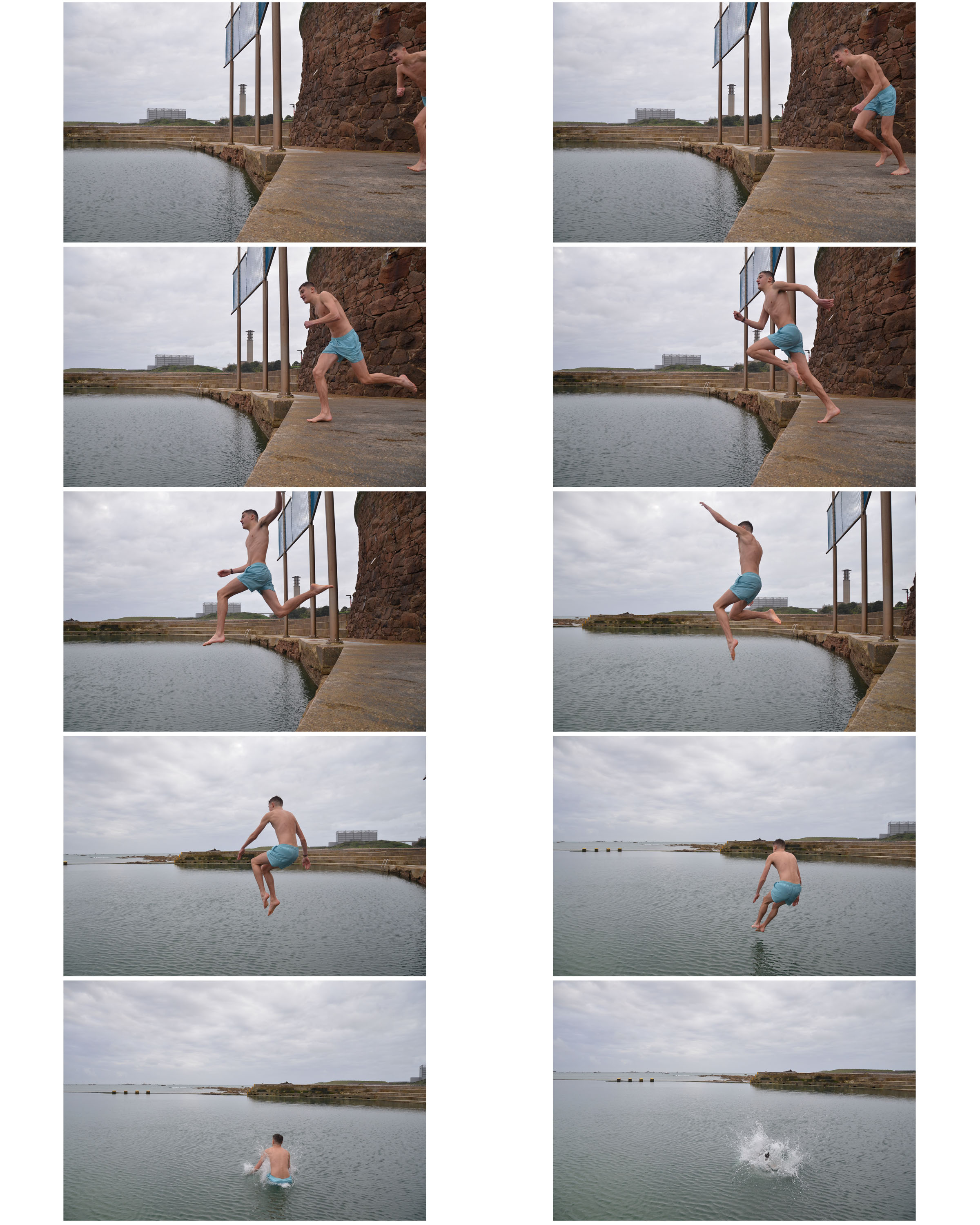
Minimalism is a style employed by many 20th Century artists, using a minimum amount of components such as colour, shape, line and texture. Within the art world it is considered an extremely subjective concept, leaving interpretation and meaning up to the viewers perception of the work.
Daily Archives: October 5, 2017
Filters
Ernst Haas and Moholy Nagy Homework
Ernst Haas
- Ernst Haas was a photojournalist and a pioneering color photographer born on March 2, 1921 in Austria.
- Haas was uninterested in learning photography as a child, though his father tried to share his interest. Upon his father’s death in 1940, Haas first entered the darkroom, learning to print old family negatives. His interest grew, and he soon began to take his own photographs.
- Haas was inspired and fascinated by the natural world, and took photographs of the elements throughout his career. He used abstract elements such as shapes, textures and line and then edited his works using different colours by colour correction.
- In addition his coverage of events around the globe after World War II made him an early innovator in color photography. His images were the subject of the first single-artist exhibition of color photography at New York’s Museum of Modern Art.
- His book The Creation (1971) was one of the most successful photography books ever, selling 350,000 copies.
- He died on September 12, 1986
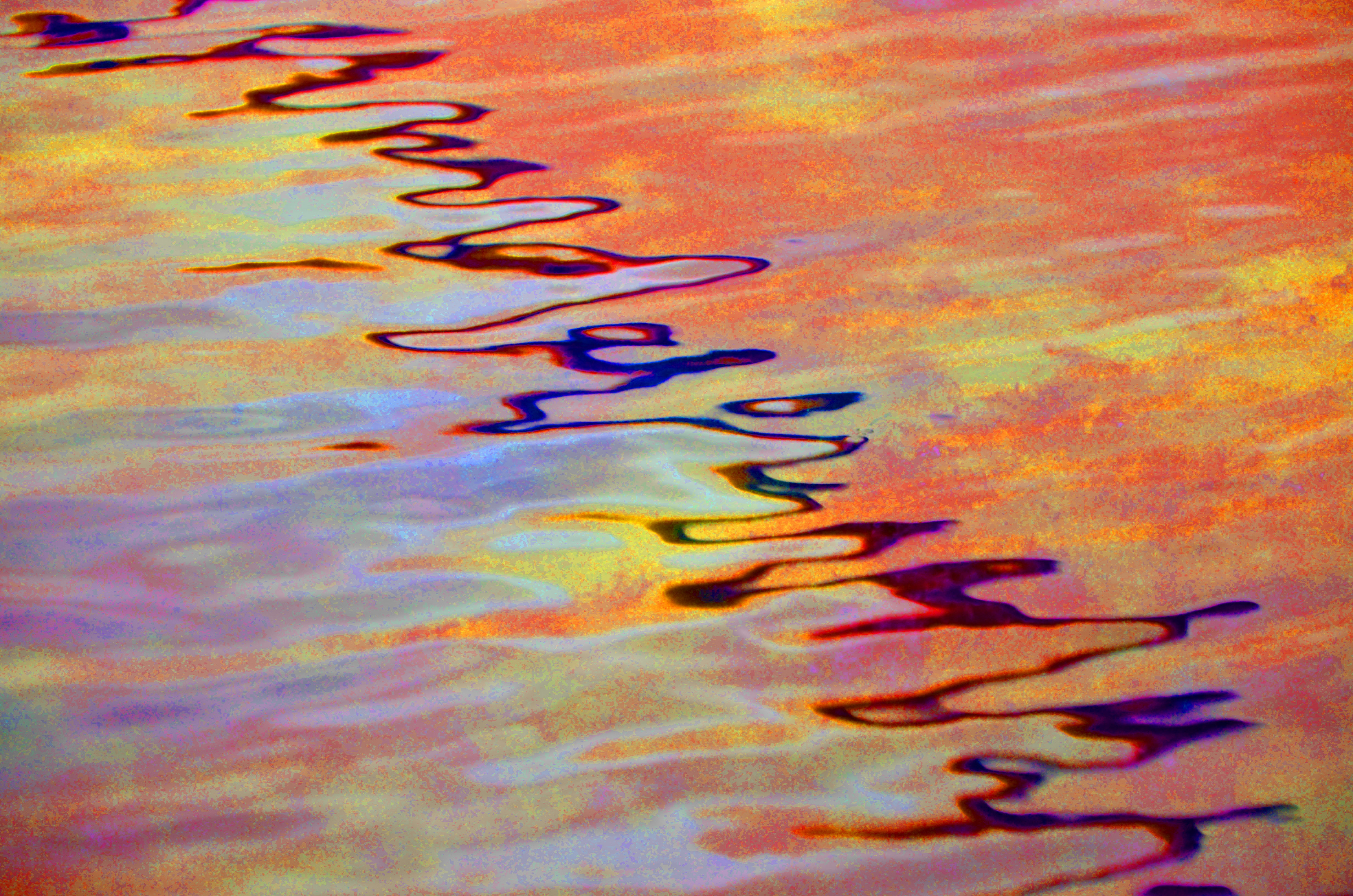
I was inspired by his use of light in reflections on the water to recreate the same style.
Moholy Nagy
- László Moholy Nagy, born on July 20th, 1895, was a Hungarian painter and photographer as well as a professor in the Bauhaus school.
- He served in the Austro-Hungarian army during World War I and realized quickly that neither law nor military suited him.
- After leaving the army, he began to take evening classes in life drawing and soon moved to Vienna to join a group of artists. Although he had taken class’, Moholy-Nagy knew very little about art. A group of artists and activists named “MA” became his teachers.
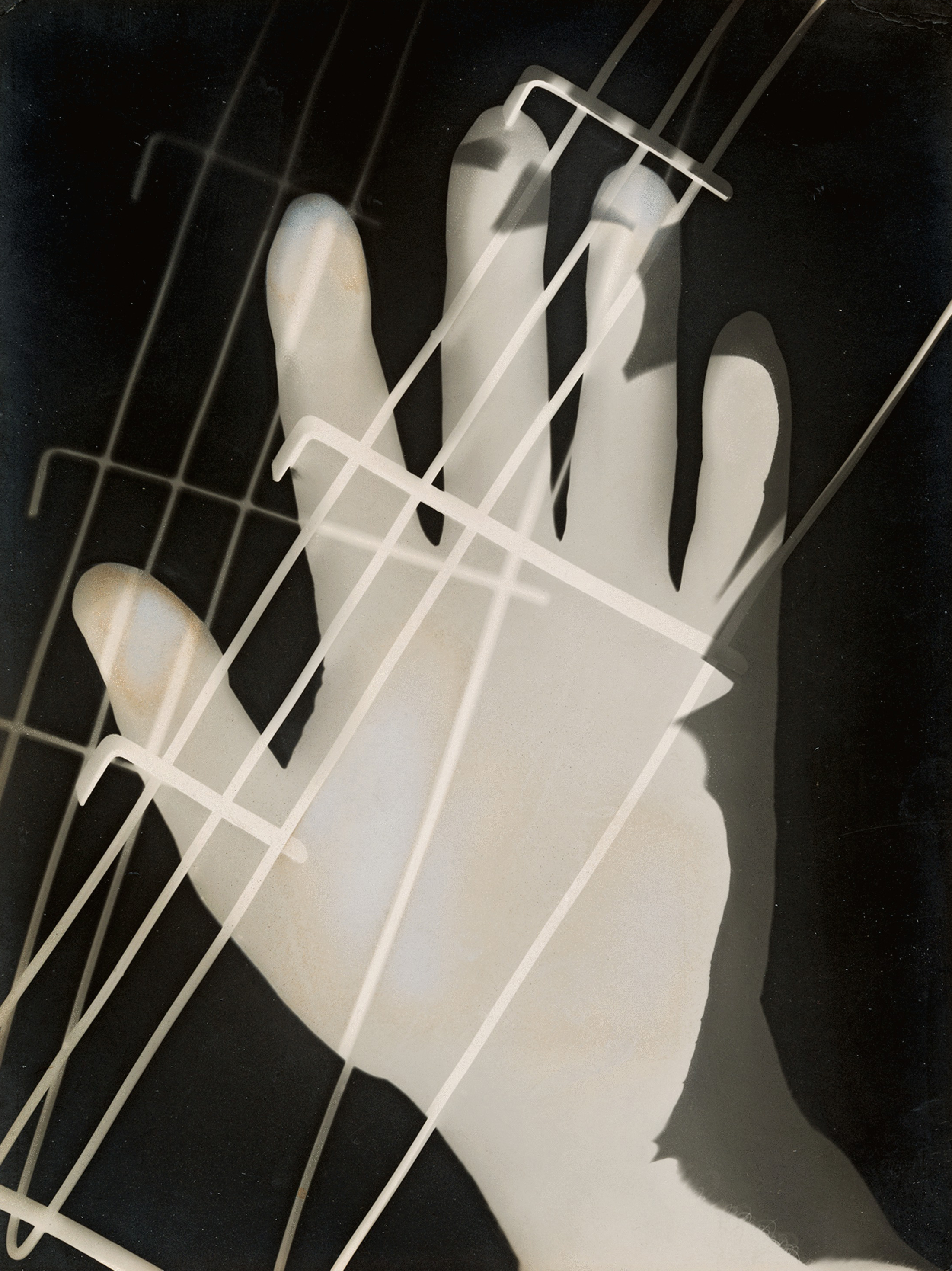
- By 1922 he had started his experiments in photography and his first experiments were with photograms. His work was in collaboration with his current wife at the time and his friend, Man Ray. Only a year later, he was invited to teach at the Bauhaus School in Germany.
- Moholy-Nagy’s interest in qualities of space, time, and light were presented throughout his different media’s. He was ultimately interested in studying how all these basic elements interact.
- He died on November 24th, 1946
- After his death, in 1947 his book Vision in Motion was published. His thinking and style advanced photography as an art and even got his work into the International Photography Hall of Fame and Museum in 1984.
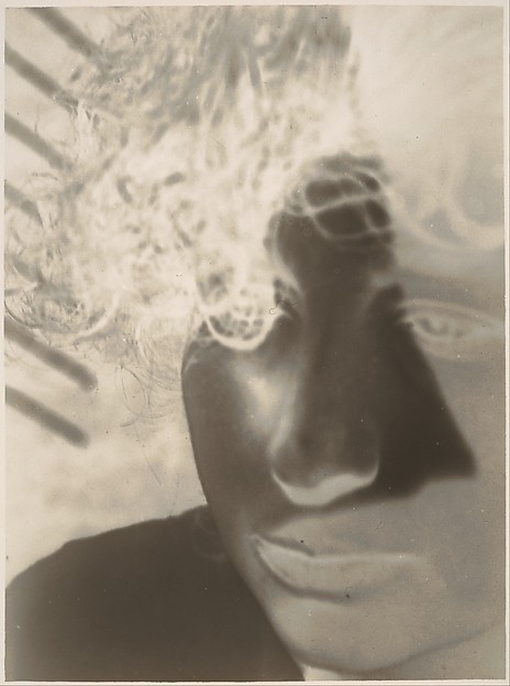
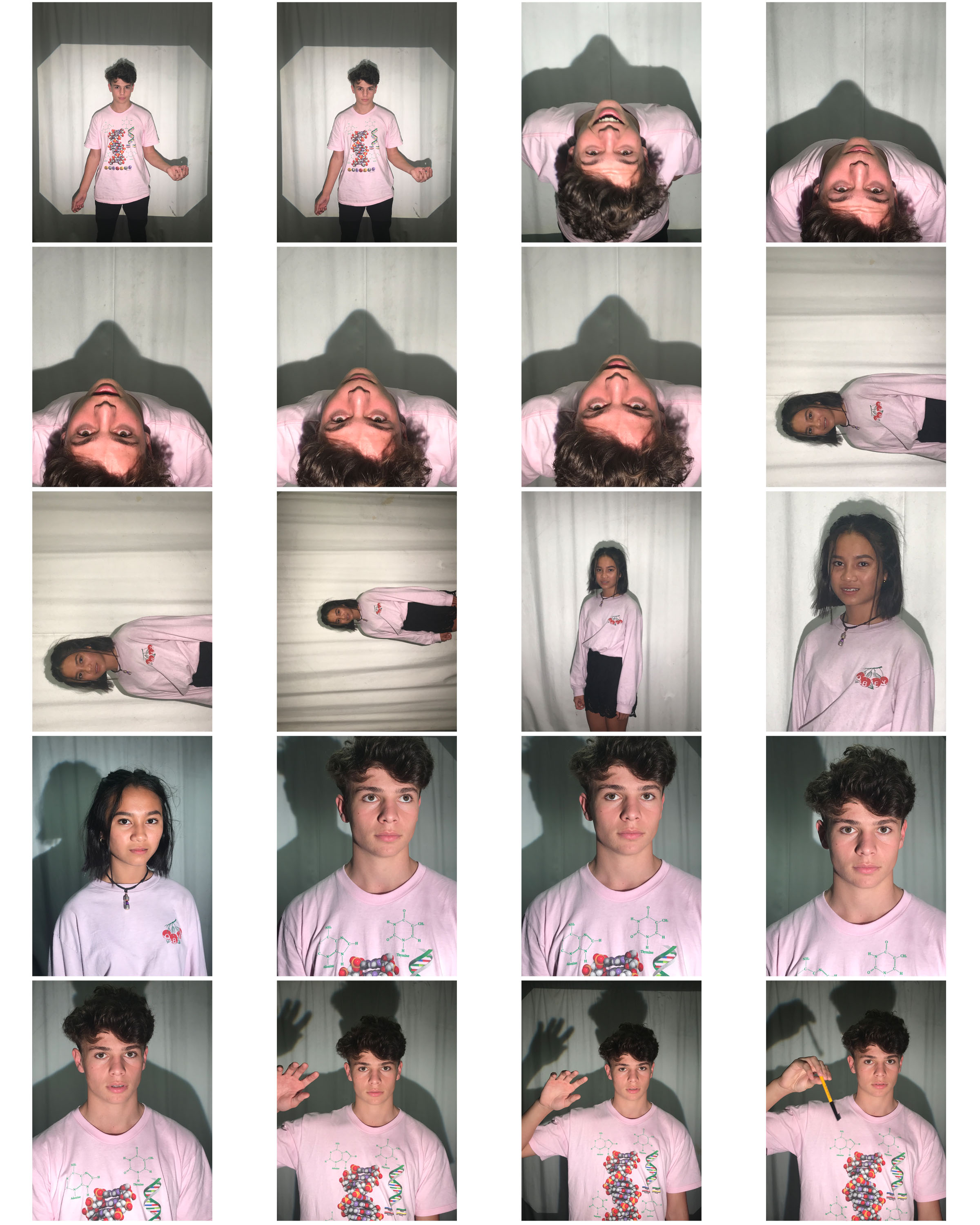
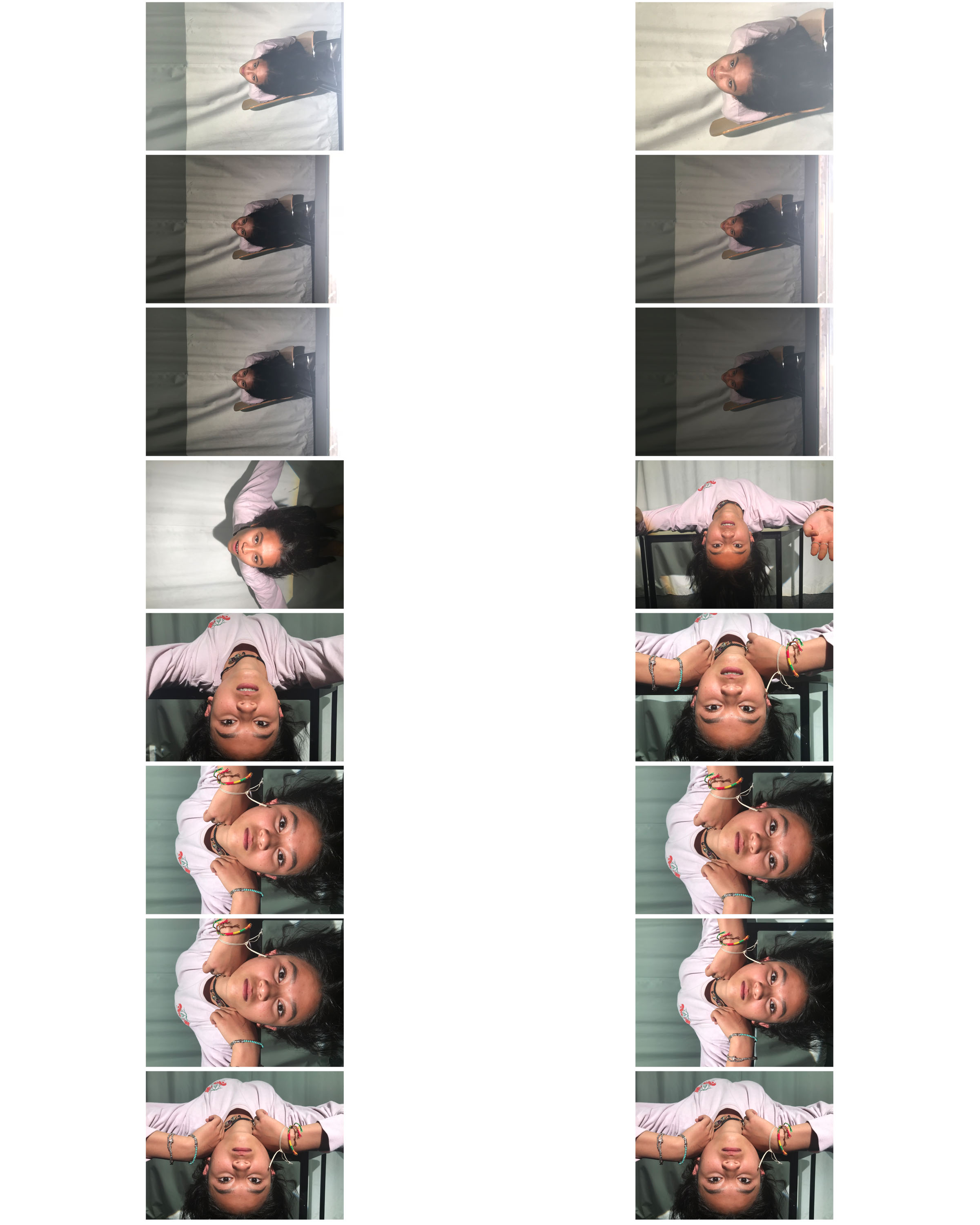
I was inspired by his use of the negative effect in his photos, especially when used on portraits to portray the style of abstraction.
Image Analysis
In the image above, Ernst Haas applies the Rule Of Thirds method to give the image an off-center composition. This gives the image a more natural feel which is appropriate as the photo is of a street scene. It creatively makes use of the negative space by having the shadows of the man and cart to the left.
Edits
I liked the two images above and decided to edit it into one as if the legs had gone through the water and came back out at the top of the photo.
I made two versions of this image. On one I used the rule of thirds to make use of the dark negative space in the background to give the subject the focus. I cropped the other to show off more of the abstract detail in the facial features.
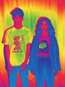
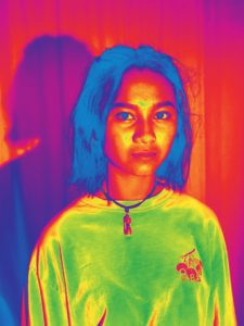
I decided to play around with other filters like the negative one such as infrared.
I used overlays of shapes with less opacity , like Moholy Nagy’s work, on a simple image like this one to emphasize the wooden planks that can be seen through them
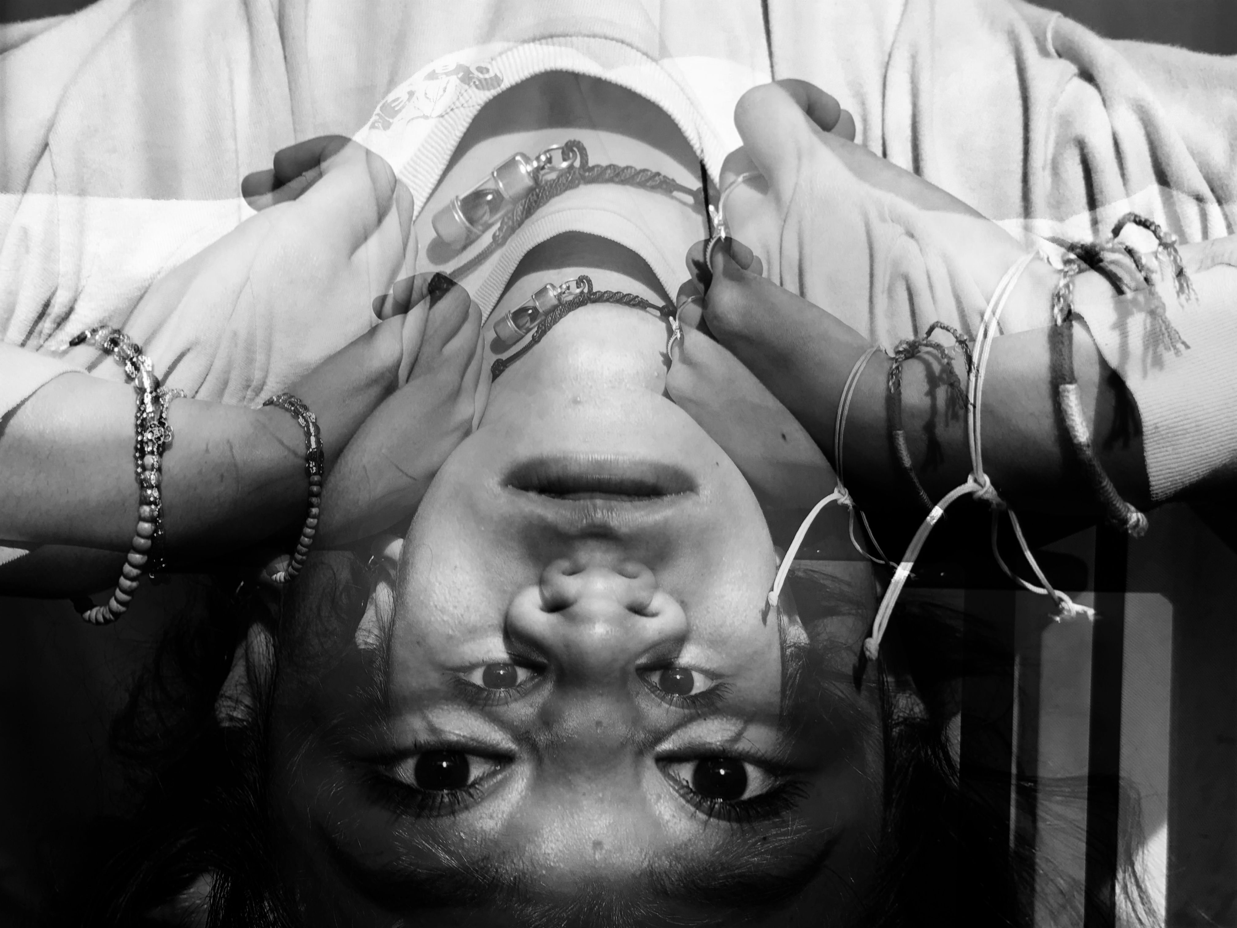
I also used overlays of the same image like the one below but brought them closer to give a double vision effect.
I decided to see what this image would like if I made it negative.
I feel this image has an older looking style due to its grain. The shadows of the subjects push them forward allowing the focus to be on them.
When creating this image, I changed the hue to an orange tone and increased the saturation. I felt it emphasized the wavy line that crosses the center of the image.
Homework Task 04 – Texture
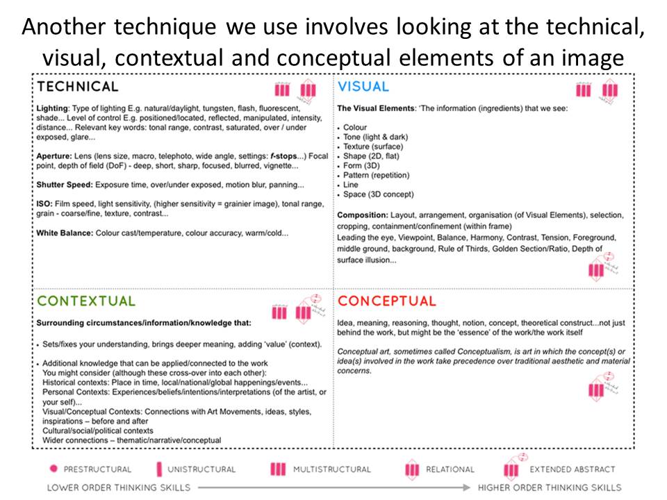
Analysis Techniques
Bokeh
What is Bokeh?
In photography, bokeh is the aesthetic quality of the blur produced in the out-of-focus parts of an image produced by a lens. Bokeh has been defined as “the way the lens renders out-of-focus points of light”.
To achieve the Bokeh effect you should:
- Set your camera to Aperture Priority mode (A or Av on the program dial).
- Select the smallest possible aperture (f) number for your lens.
- Switch your camera to manual focus and manually adjust the focus to the closest setting.
- Zoom your lens to somewhere around 50mm.
- Take you photos, taking photos of light sources will work best.
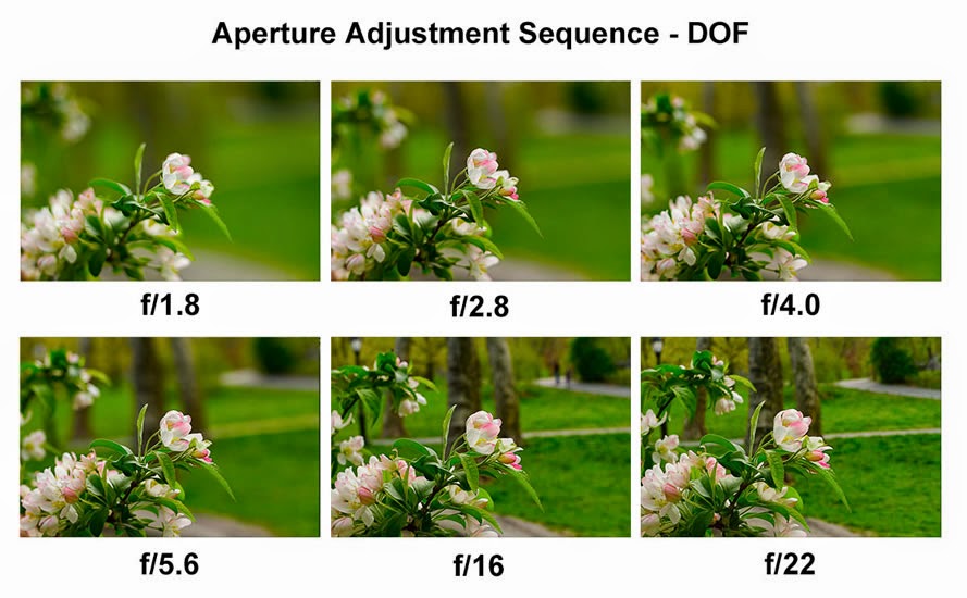
Depth Of Field
What is Depth Of Field?
Depth of Field (DOF) is that amount of your shot that will be in focus. A large depth of field means that most of your image will be in focus whether it’s close to your camera or far away, whereas a small (or shallow) depth of field means that only part of the image will be in focus and the rest will be fuzzy
The size of the aperture has a direct impact on the depth of field. A large f-number such as f/32, (which means a smaller aperture) will bring all foreground and background objects in focus, while a small f-number such as f/1.4 will isolate the foreground from the background by making the foreground objects sharp and the background blurry.
Aperture
What is Aperture?
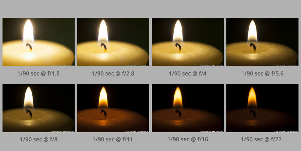
Aperture is ‘the opening in the lens’ to allow a certain amount of light in. The aperture that you set impacts the size of the hole in the lens. The larger the hole the more light that gets in – the smaller the hole the less light.
Aperture is measured in ‘f-stops’.
A smaller f-stop means a larger aperture, while a larger f-stop means a smaller aperture. For example, f/1.4 is larger than f/2.0 and much larger than f/8.0.
Formal Analysis
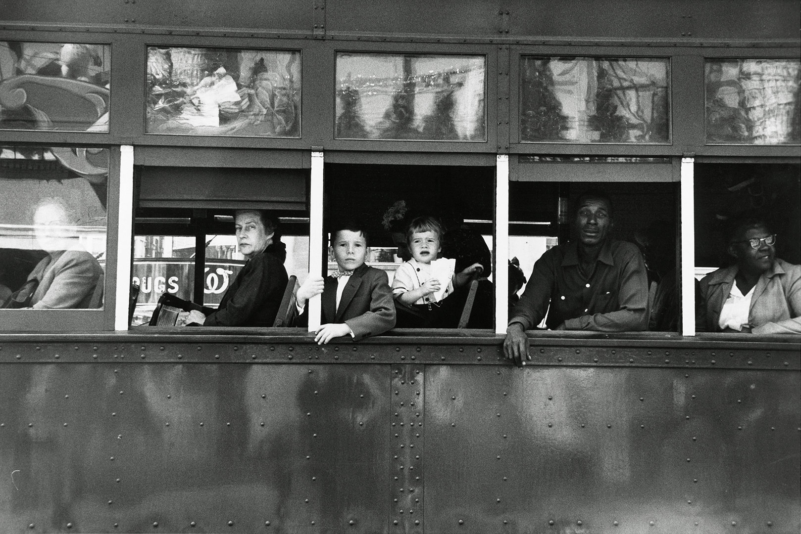
The genres for this photo are street photography, journalism, documentary photography and portrait.
Technical
The photo had a long exposure time and therefore this created a high contrast image. The lighting at the scene is predominately natural daylight. The shutter speed must have been fast in order to capture the moving trolley full of people- however, it’s possible that the trolley stopped for a period of time and therefore the shutter speed could have been longer. The image is black and white with a vast tonal range (Ansel Adams zone system) which supports both the darkest black [000000] and the whitest white [ffffff]. Finally, the image uses the rule of thirds and as a result of this, the eye is drawn into the centre most part of the image.
Visual
The image is naturally split into three sections due to the rule of thirds; the top, middle and the bottom third. The image is also naturally framed due to the background and white stripes. Although the image is tilted slightly it doesn’t lack the aspect of symmetry. The texture of the trolley is successfully portrayed in this image along with various patterns such as the bolts in the lower half of the image. Furthermore, the contrast between white and black in both the photo and the social situation is extremely vivid.
Contextual
This photograph explores the divide between black and white people in America at the time. It also shows the difference in classes and ages; the older woman looks as if she’s turning her nose up at the photographer whereas the kids look very interested, this could be due to the fact that they’ve never seen a photographer before and are fascinated by the equipment and concept of taking a photo. The photo was taken in 1955, the year of the African-American Civil Rights Movement (a movement that sought to challenge the views of society on people of colour and rebrand America as the land of equality).
Typologies HW
What are typologies?
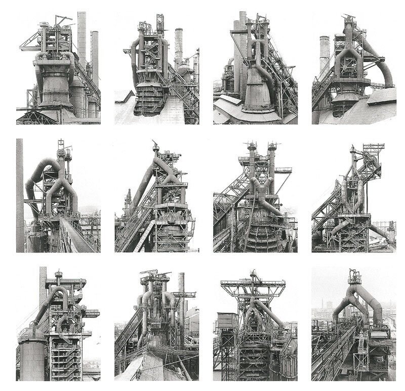
Typology is the study of types, and a photographic typology in a set of images or related forms, shot in a consistent, repetitive way.
Bernd and Hilla Becher
The couple where conceptual artists and photographer who worked together. They were best known for their extensive series of photographic images, or typologies, of industrial buildings and structures, often organised in grids.
Each series of images are capturing typologies, types of things. Each image is taken from the same perspective, angle and distance from the subject, this is an essential reason for why the series’ are so effective. All the images in each series have something in common which links them together, for example the images below the darkest part of the image is always in the middle of the building.
Contact sheets
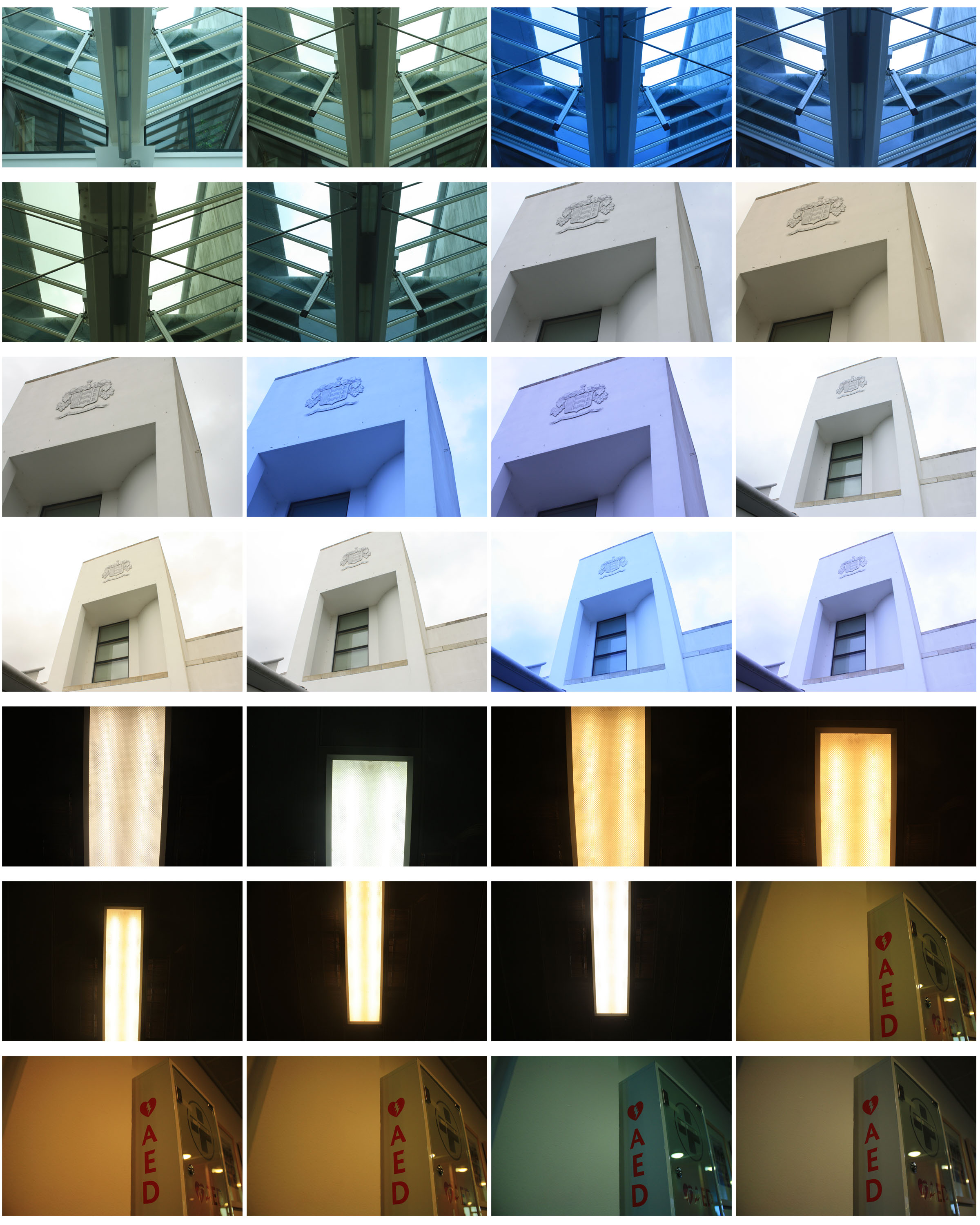
My interpretation
White Balance Photography
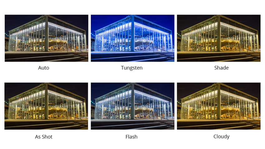
Different sources of light have a different ‘colour’ (or temperature) to them which can change the overall colour of an image. White Balance helps to get rid of of this and replace it with its more accurate temperature.
Here are some of the basic White Balance settings you’ll find on cameras:
- Auto – this is where the camera makes a best guess on a shot by shot basis. You’ll find it works in many situations but it’s worth venturing out of it for trickier lighting.
- Tungsten – this mode is usually symbolized with a little bulb and is for shooting indoors, especially under tungsten (incandescent) lighting (such as bulb lighting). It generally cools down the colors in photos.
- Fluorescent – this compensates for the ‘cool’ light of fluorescent light and will warm up your shots.
- Daylight/Sunny – not all cameras have this setting because it sets things as fairly ‘normal’ white balance settings.
- Cloudy – this setting generally warms things up a touch more than ‘daylight’ mode.
- Flash – the flash of a camera can be quite a cool light so in Flash WB mode you’ll find it warms up your shots a touch.
- Shade – the light in shade is generally cooler (bluer) than shooting in direct sunlight so this mode will warm things up a little.