Abstract photography concentrates on shape, form, colour, pattern and texture. The viewer is often unable to see the whole object. The subject of the photo is often only a small part of the idea of the image. Viewers may only know the essence of the image subject or understand it by what is implied. However, it could be argued that all art, including photography, is essentially abstract. I first set out to look for straight bold lines and found that the bright yellow works well.
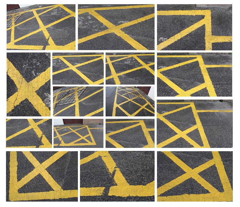
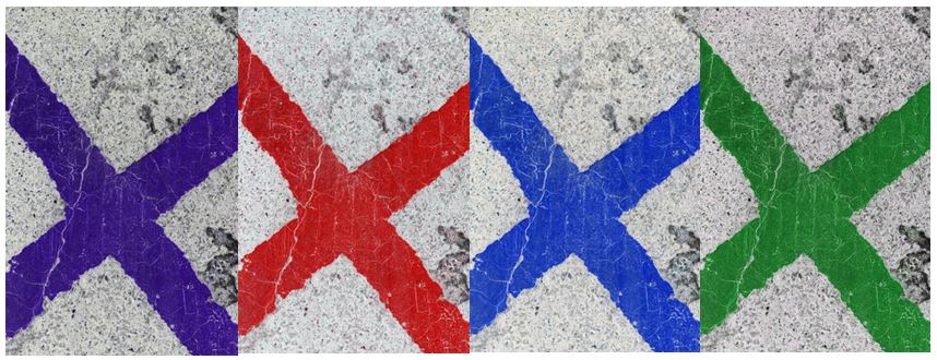
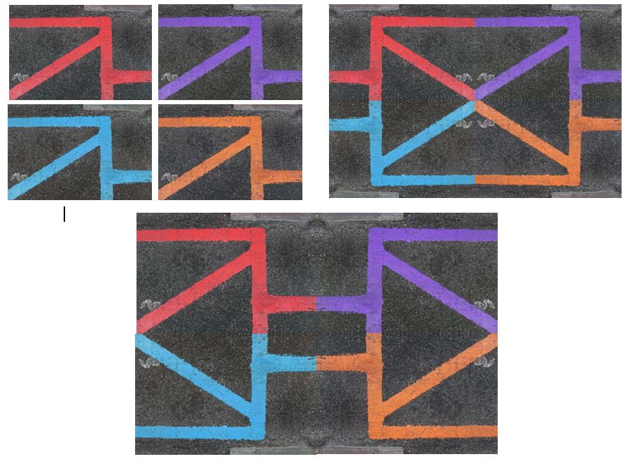 I edited these photos in photoshop by adjusting the hue and increasing the contrast to create different coloured lines to achieve more interesting, abstract photographs. I also experiemented with different layouts, creating patterns and geometrical shapes by flipping the photos vertically and horizontally.
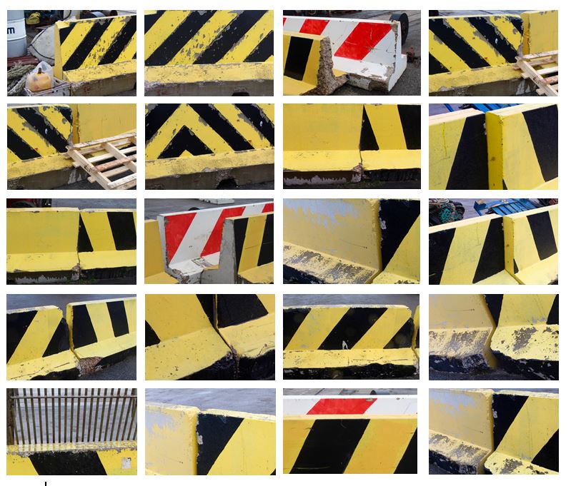
I tried to explore the contrast of colour between the yellow and black and the texture they presented. Using natural light and photographed different angles of the wall to create variety within the collection. To improve this photo shoot I would edit the photos to make them more abstract so the viewer would not be able to see that it was a wall and would emphasise the pattern and texture.
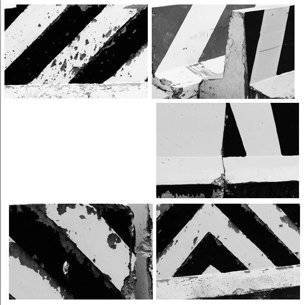
I edited these photos in photoshop to develop them further by turning them black and white and making the lines more bold. I like how the black and white emphasises the texture within the wall and the weathering that has occurred over time. I think it is now less clearer to the viewer that the photograph is of a wall and is now more abstract.
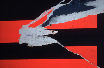
I think the photos I have taken are similar to this photo (Torn Poster II—Redbird) Ernst Haas photographed in 1960. Both photos contain bold, straight lines and texture within that. The black lines frame the picture and are the points where the eyes are drawn to. Similarly, both contain horizontal, vertical and diagonal lines.


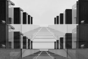

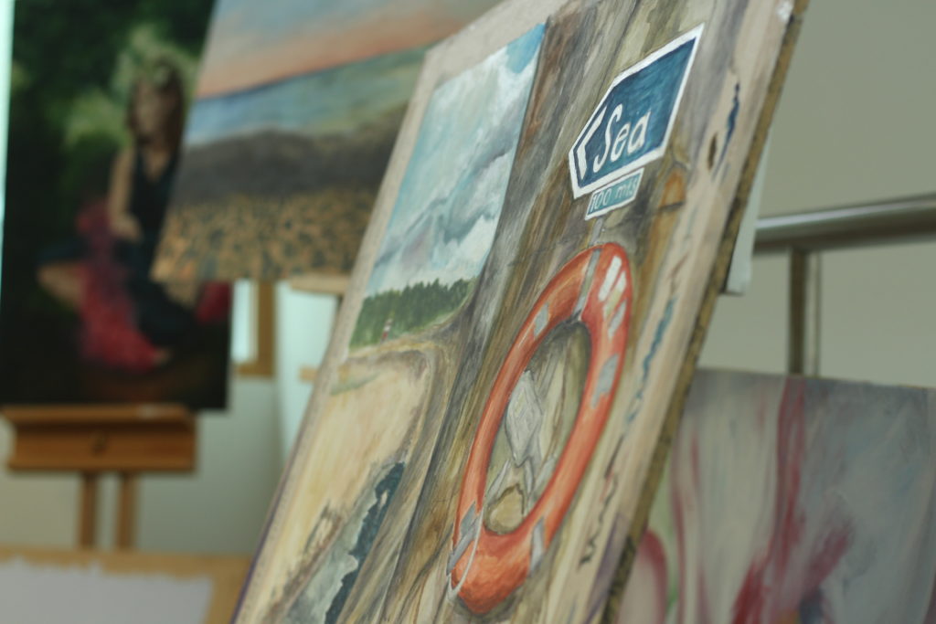
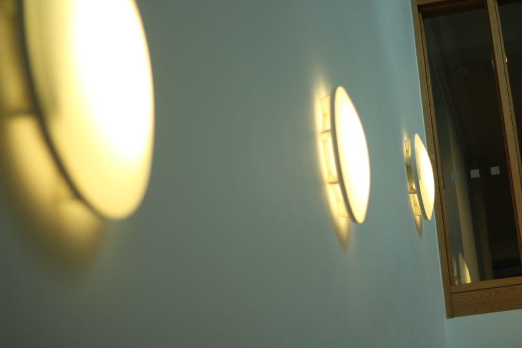
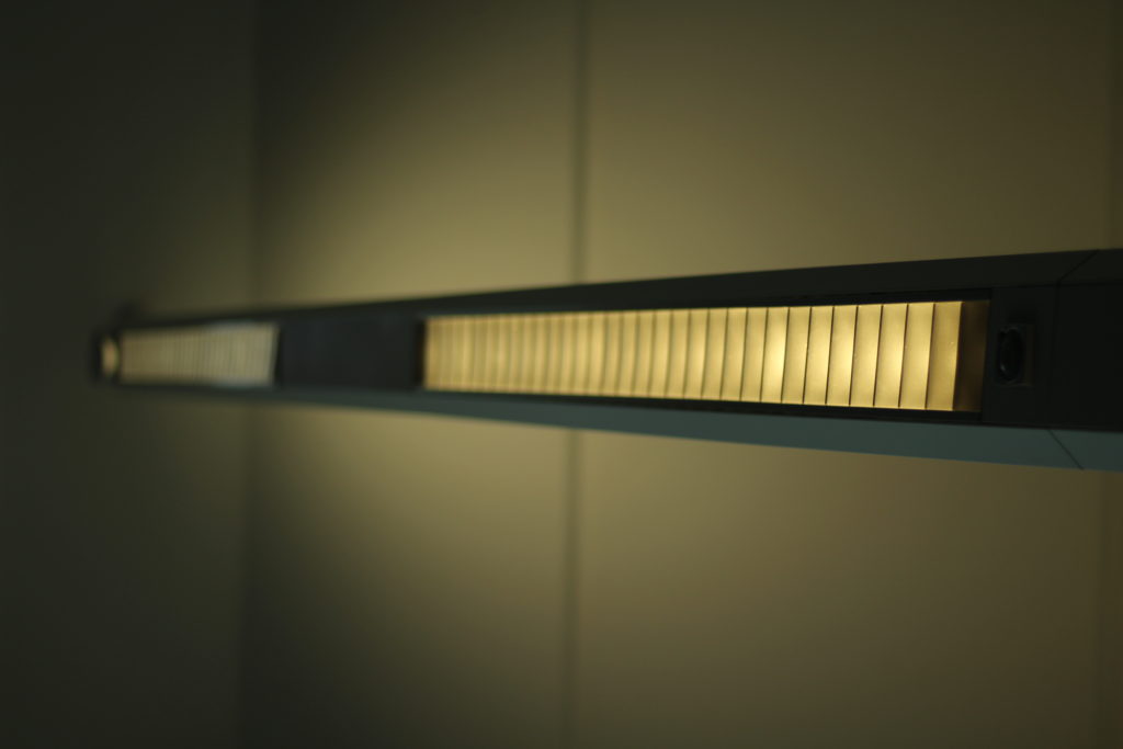
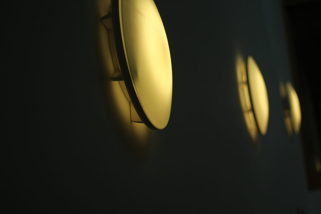
 After reading up about the ways in which I could use my point system on my camera, I went out with a few friends to incorporate this into my photos, these were my results:
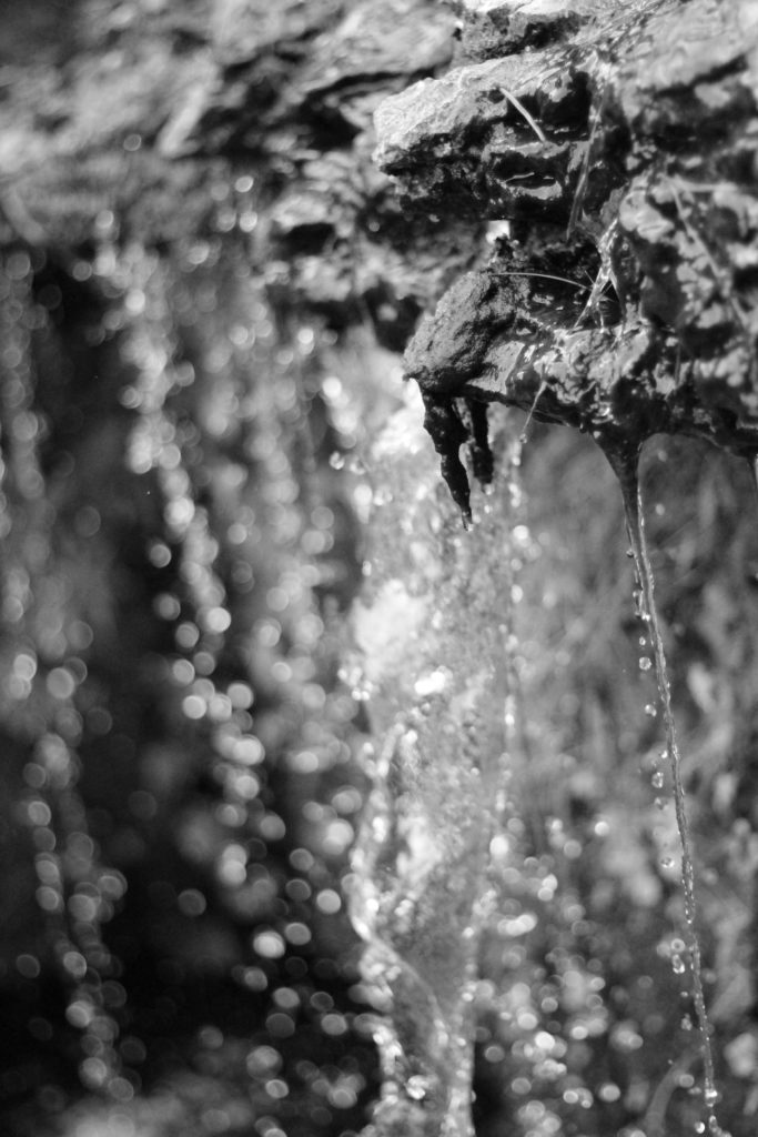
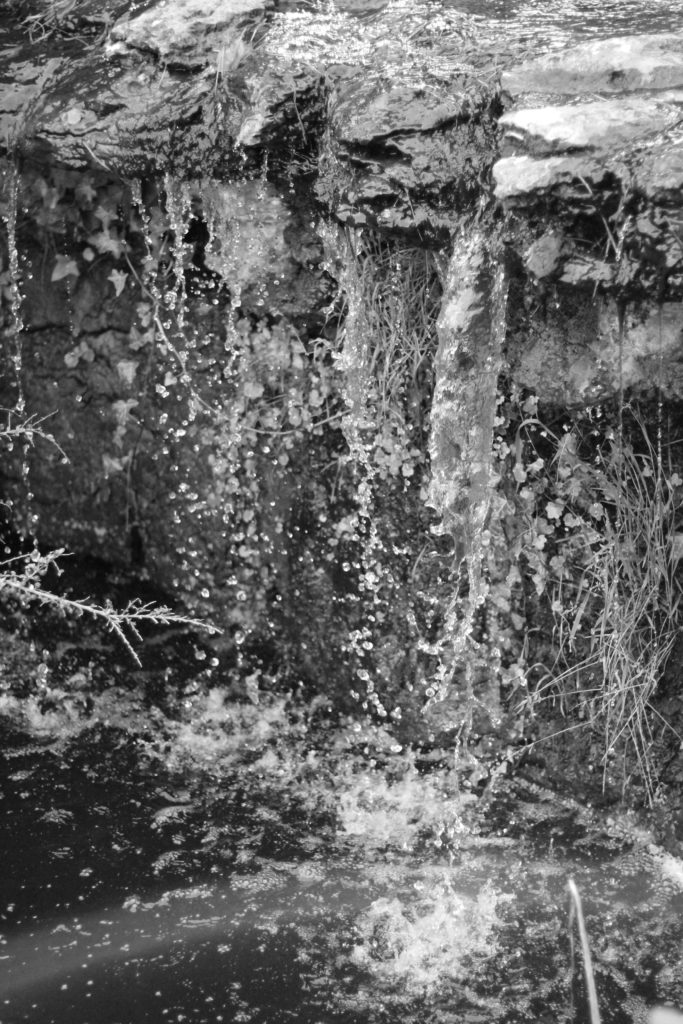
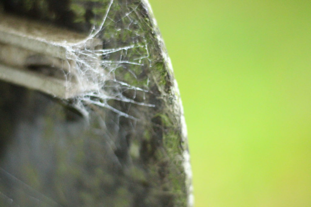
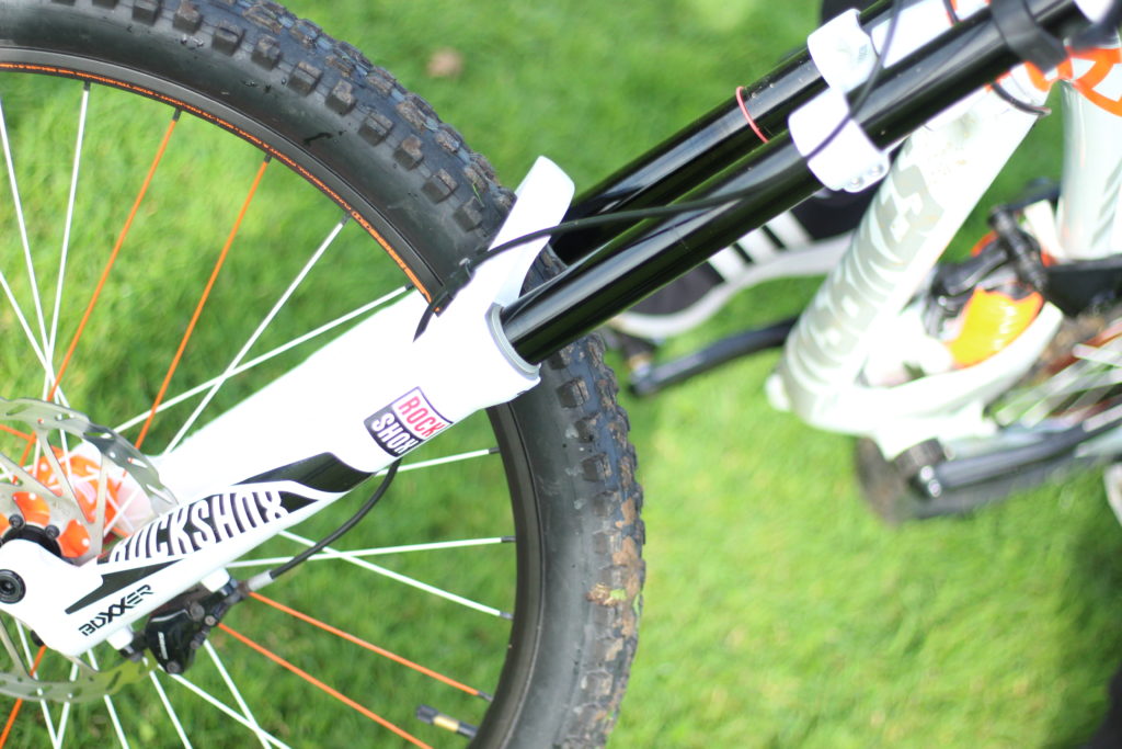
 I decided to have a go with the method in a few of my photos, and so walked around school experimenting with it, these were my results:
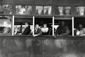 Robert Frank - Swiss-American photographer and documentary filmmaker:'Trolley, New Orleans', 1955.
Visual
In this photograph a selection of people sit, and are naturally framed by the white bars of the trolley - this could be viewed as a series of separate portraits. The rule of thirds brings the focus to the middle third of the photograph. The windows of the bus are directly on the center lines which naturally draws the attention to the people in the bus. This photograph clearly demonstrates the divide/segregation between the social classes.
Technical
The photograph was most likely to have been a very quick snapshot with little thinking time about the image. With these assumptions the photograph would have been shot with a fast shutter speed due to the clarity of what would have been a fast moving object.
There is a high contrast in tonal range which creates a deep image with many layers - the darker foreground and the lighter background behind the bus. The reflections in the top windows suggest that the light was shining towards/on the object which is why there is a lot of tones and depth.
Conceptual
I believe Robert Frank selected this photograph because of how much it represented the social hierarchy at the time. The photograph clearly documents the segregation between races - white people at the front of the bus and black people at the back. The white bars that frame each portrait of the individuals also symbolizes this. The white bars in the photograph are very bold and stand out a lot, due to the high tonal range and contrast of the dark bus. The white makes a bold statement of the authority and power white people had over black people and reinforces segregation between the two races.

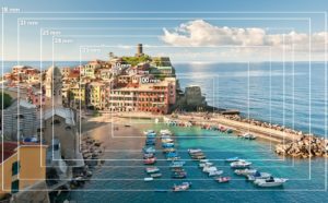 Depth of field
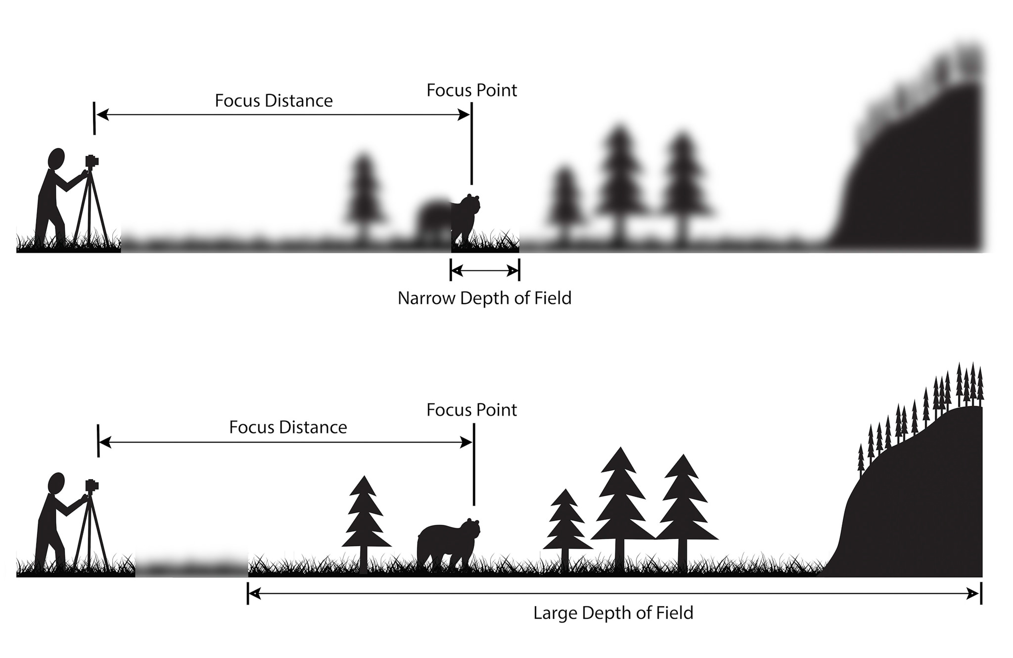
Definition: the distance between the nearest and the furthest objects giving a focused image.
There are two types of depth; shallow and deep. Shallow focuses on a closer object / subject while the background image is out of focus creating a blurred effect. Deep depth of field focuses on the whole frame so everything in the photograph is in focus.
Aperture is used for depth of field. A smaller aperture [f22] focuses on the whole frame and a bigger aperture [f2.4] focuses on a particular object in the frame and blurring out the rest.
Focus and focus points
Focus allows the camera to take a picture in detail. A sharp focus will produce a photograph with sharp detail in the whole frame or a point in the frame. A soft focus produces the opposite effect.
The point of focus can be changed by aiming the camera at what you would like to focus or changing the settings. The point of focus can be changed by pressing the AF button where 9 dots are displayed on the display screen. Choosing different points changes what the camera focuses on.