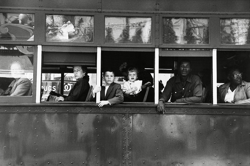
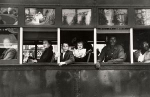
This image is taken from Robert Frank's book 'The Americans' which focuses on post war American photography and society at that time. This image named, 'Trolly' which was taken in New Orleans, 1955 focuses on the citizens of New Orleans. The subject of the photo, the people, is made clear from the composition and framing in the photo, Frank's has made a deliberate choice to crop out any other surrounding objects that may distract from the subject, another factor is the way that the windows frame each of the intended subjects which makes them more focused, the use of the rule of thirds also creates an interesting composition. At a first glance the photo seems as if it is just showing people going about their every day lives, but there is much more of an intention than that, during the 1950's there was a clear racial segregation between white and black, this is shown through the seating on the trolly, with the white people at the front and the black people at the back and I think that it was Frank's intention to show this. Frank's has used a fast shutter speed to capture all of the detail and to create a clear image of the people and trolly, the image is also has a high contrast and deep depth of field both of which add to the atmosphere of the photo.
Daily Archives: October 2, 2017
Filters
Analysing Robert Frank’s Work
Robert Frank
The analysis of photographs consist of 4 elements these are:
-Visual
-Technical
-Conceptual
– Contextual
Analysis of Robert Frank’s ‘Trolley’
Visual: This photograph consists of various visual aspects. One of these aspects is the tone of the image due to the time it was taken. The monochrome tones allow the viewer to focus more on what the photograph is trying to capture rather than it’s details, and also shows a contrast between the races in the photograph. The photo consists of various natural frames, these natural frames surround the different goings-on within the photo allowing the viewer to look at each part separately without the distraction of another. The window frames of the train represent a separation between different classes and races, showing the hierarchy of power at the time, from the left to right. The rule of thirds is present in the image as it is split up into 3 sections from top to bottom, which gives the image extra focusses other than the main one in the centre. Although the image does mainly consist of foreground (the train) There is still an even depth of field as Robert Frank still keeps the background of the image clear.
Technical: The image has been taken using a natural light source, this could be a contrast between the nature and the unnatural social and racial issues of the time. There is a low aperture that is used to capture the background of the image sharply and to ensure that the entire image is focussed. The image would have probably been taken with a considerably fast shutter speed in order to capture the movement of the train sharply rather than the motion being evident. The image overall has a large tonal range, with the top of the image containing mainly light tones the centre containing a balance of tones and the bottom containing mainly dark tones, which could also represent the racial hierarchy of the era with white people believing they were above people of other race.
Conceptual: The white man is separated from the other passengers on the train as he is covered by the transparent window, this represents how he would’ve been protected by society at the time. The order of power at the time is shown from left to right which links in with the contextual side of things. The white bars between the separate frames/windows represent the power of white at the time, and how it was them who were separating themselves from black people during that era.
Contextual: This photograph was taken in the 1950’s. At this time the US was suffering from massive racial issues of segregation. This is due to the fact that equal rights hadn’t been introduced and racism was heavily influenced by the general public through political and governmental actions. This caused a segregated system on public transport, which is why in this image the African-American people are situated at the back of the train and the White-Americans are situated more forward. There was also issues with gender equality, as at the time of this photograph the US was a patriarchal society, that is why the males are situated in front of the females within each gender. So overall the image shows the massive social changes in society since the 1950’s.
The Ansel Adam’s zone system
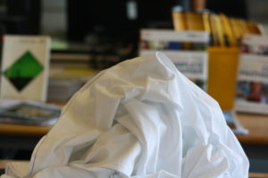
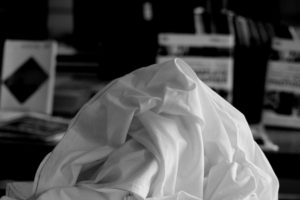
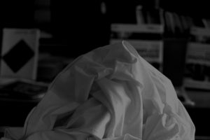
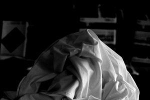
The zone system was a technique that was created by Ansel Adams and Fred Archer in the 1930's, the technique can be help determine the correct exposure for any lighting conditions that you may encounter when taking photographs. The zone system consists of 11 different zones ranging from 0, pure white tones, to 10, pure black tone.
Original image
Edits using zone system
Tanja Deman and Jonny Briggs at CCA gallery
On Wednesday the 19th of September we visited the CCA gallery in St Helier to see some work by photographers Tanja Deman and Jonny Briggs.
Jonny Briggs
http://www.jonnybriggs.com/ "In search of lost parts of my childhood I try to think outside the reality I was socialised into and create new ones with my parents and self." Jonny talked us through each of his pieces, the impression that his work gives is that he is trying to question what we actually know and is trying to question perception often politically/war related. Here are a few examples of his work.
Tanja Deman
http://www.tanja-deman.com Tanja Deman's art is inspired by her interest in the perception of space and her relationship to nature. Here are a few examples of her work.
Rule of thirds
what is rule of thirds?
rule of thirds is applied by aligning a subject with the guide lines and their intersection points, placing the horizon on the top or bottom line, or allowing linear features in the image to flow from section to section.This is on order to create a successful and visually pleasing formatted composition. It can allow a direct view of a subject or the type of depth you would like to capture. It can also exaggerate editing within blurring and also subjects such as ISO.
Using the rule of thirds
The rule of thirds is applied by aligning a subject with the guide lines and their intersection points, placing the horizon on the top or bottom line, or allowing linear features in the image to flow from section to section.It can be used by using a visual of tow lines formatted at each angle on the screen or possibly within dots for slight dissidence as to where to place the main subject of the image.
The rule of thirds was written by John Thomas Smith,this was written back in 1797 in order to find the perfect way in how to capture rural scenery,
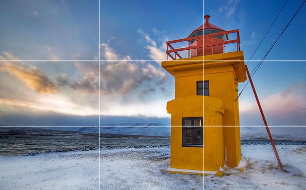
You can clearly see the horizon and how it sits equally in the middle throughout the lines.,this divides the image into thirds of the lower two sections. The tower is the point of interest directly in the middle of the second line.The sky also develops with color over the horizon.
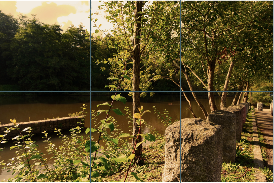
within this image you can see the rule of thirds of how the rock is alined within the first line with the rest entering back to become equal with the second horizontal line.There is also a tree centre and this achieves an even overall effect.
Abstract Homework Task
Photographer Research
Phtoshoot
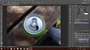
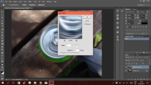
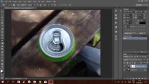
Motion Blur
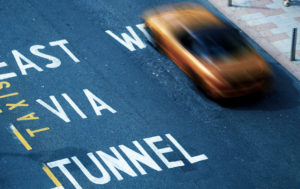
Motion blur can be adapted in many areas of photography; to create a sense of movement in the image or to blur out the background and bring the viewer’s attention to a certain part/detail of the image.
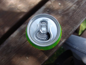
Side By Side Before vs After Image
Although I used Photoshop to create this image and effect, it’s possible to achieve this using the camera. A way to do this would be slowing down the shutter speed, using a small aperture and decreasing the ISO. These things combined would create a naturally blurred photo with a subject in focus.
Often, in Photography, motion blur adds movement and a lively atmosphere.
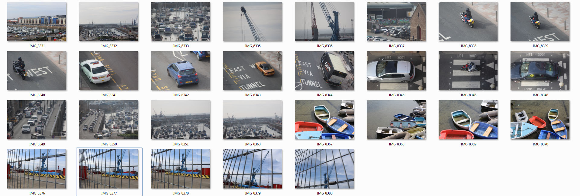
Homework 3 ( Ernst Haas ) 2nd Shoot
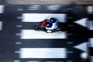
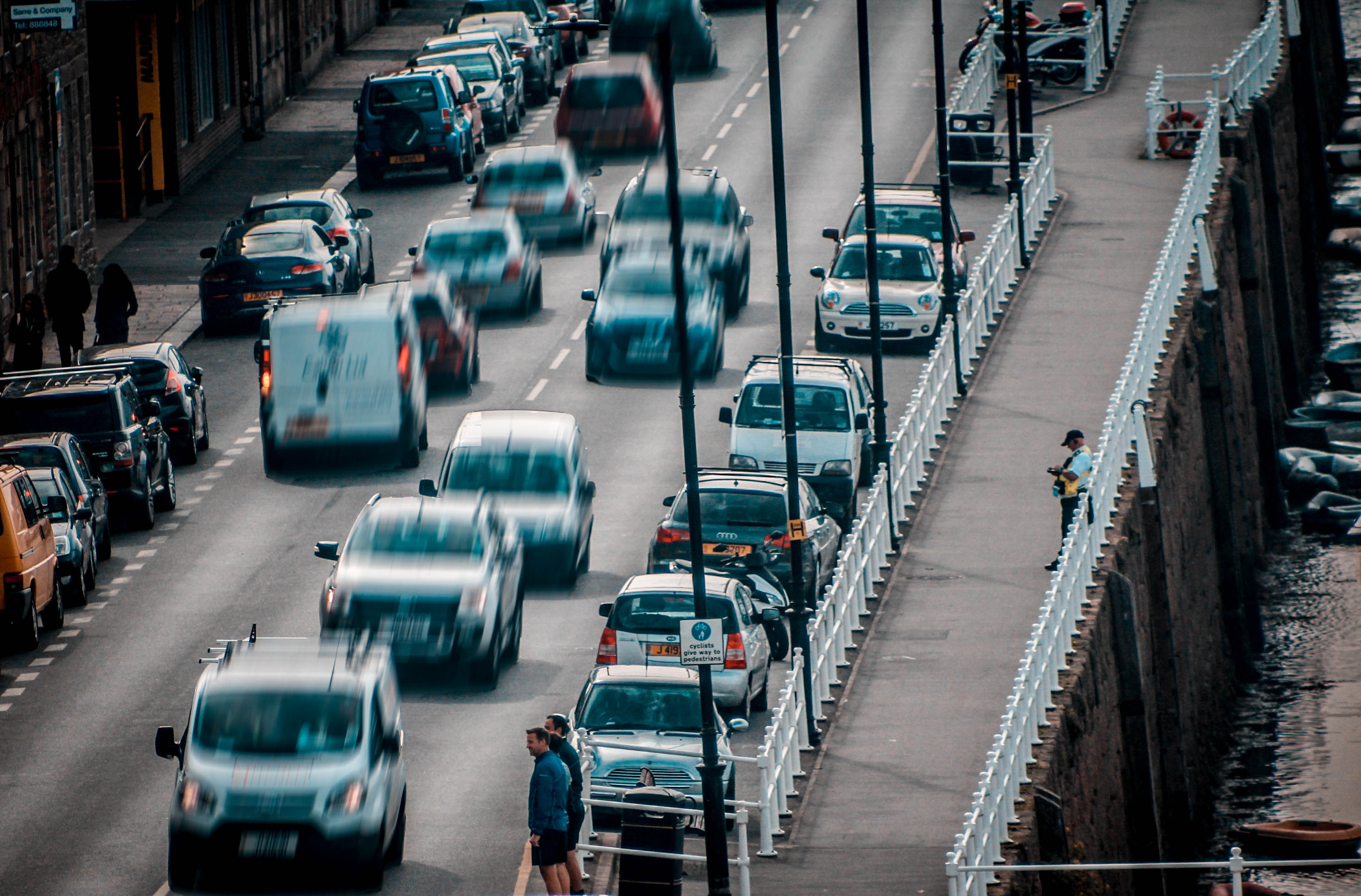
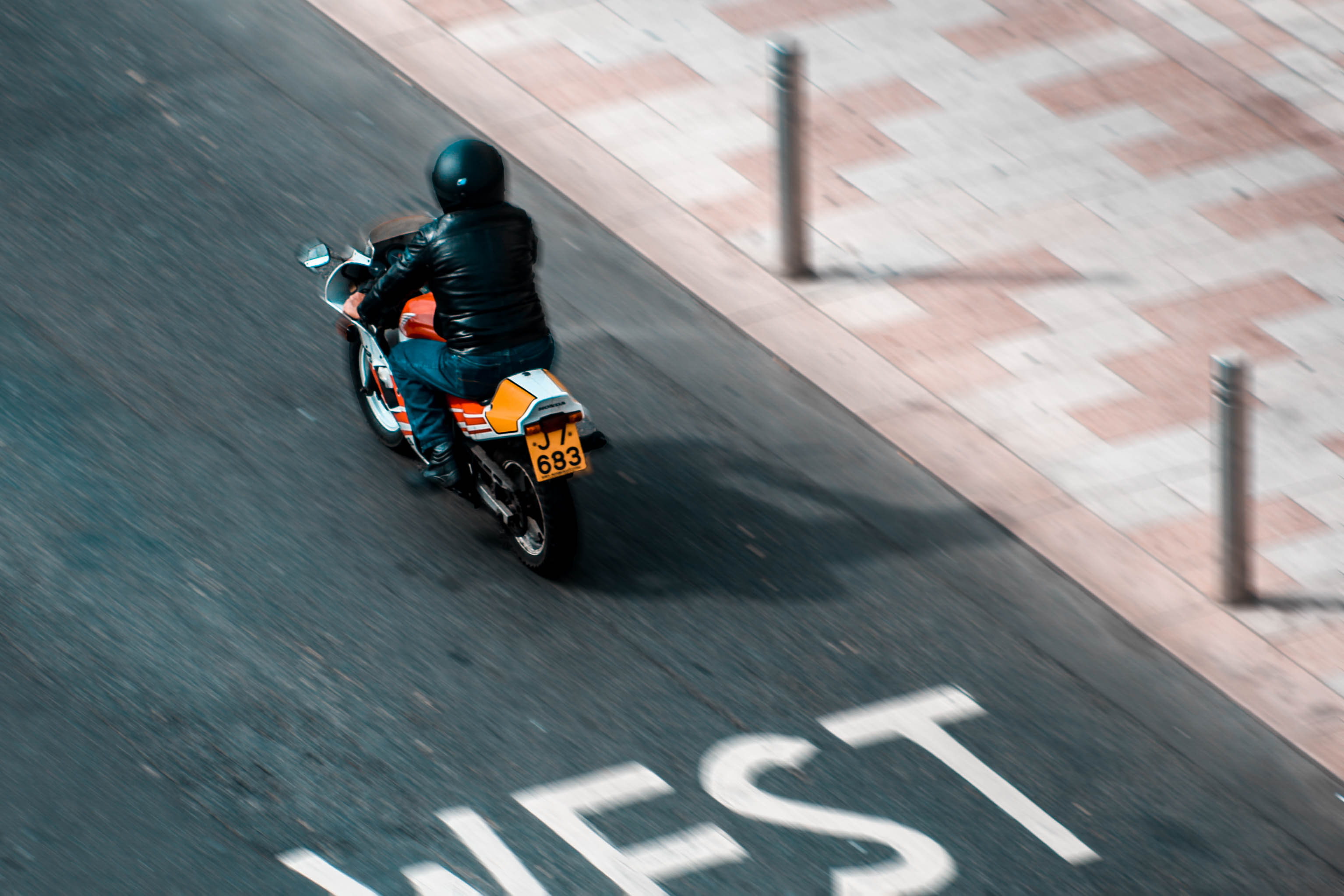
After having done a photo shoot, which contrasts with the ideas portrayed through Ernst Haas photos, i decided to also do one in which has similar connotations within the urban areas and really capture the sense of movement and hurry in these areas.
Edits
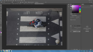
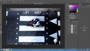
This is the original image which was taken by myself on a rooftop.
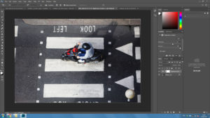
I then simply increased the brightness to make it stand out and increased the contrast to create a differentiation between light and dark.
This stage shows the rest of the editing that took place prior to the motion blur which includes an increase in vibrancy and saturation and a slight change in the black and whites.
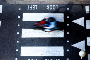
In this edit i used motion blur only on the biker to create a sense of rush within the biker himself to create a sense of rush within the biker himself. It appears that he is in a rush to get somewhere.
In this edit I used motion blur around the biker and kept him in focus to create a sense of chaos. Rather than inflicting a sense of rush within the biker I did it around him to suggest that urban areas are pure mayhem.
Robert frank analysis
The type and style of genre of his work: this is photojournalism and street photography in order to demonstrate and develop how Americas is presented throughout time and his own view that is conceptualized by race and other cultures within america that created a large impact within the time. He is highly evolutionary and has loaded meaning and metaphorical advances within the piece itself.
technical:
Throughout this image there is an array of tonal and developed lighting within tone.He is highly creative within the composition using many reinfections to mimic and mirror the effects of images and personality within the pieces. you can see that this piece was taken with a fast shutter speed due tot ht movement of the bus and also a low iso to create all the detail and realism within the piece itself. There is also a large depth of field within the sharp focused image,this is possibly in order to produce an accurate representation of the time and as a metaphoric device to be able to see the whole image itself. He has also successfully captured and interesting composition of rule of thirds within this image as you can see clear lines and levels within the bus itself,this almost accentuates the man leaning out and the detail and main couscous on him and possibly the emotions he is going through.
contextual:
This image again has a significant historical factor,of that of racial segregation and the development of how black people were detained for their own rights they were seen as lesser.The positioning of the black man towards the back also emphasized how he has less authority then the white man positioned throughout the front. The man looks also most desperate and the direct address to the camera almost demonstrates his need for help and his non understanding for why this is an occurrence of race and lack of opportunities. The is lso a very industrial inspired image,perhaps this has strong connotations to the neighborhood and the time period they are in and how this portrays poverty but perhaps only within the black areas of town,This also shows how the deteriation of the bus shows that again the movement going backwards is a continuation of fewer rights. The young also are a metaphor for how they could be raised differently to ignore race and not be ignorant like the former generation and that this exposure does not have to be a negative experience for the young.
visual:
you can see a continuous pattern throughout the visual effects of lines and reflection and again how this is attached to that of the segregation of race and perhaps it shows a balance within the tones and also the display of the overall composition of the pieces itself Again this demonstrates how it follows the zone system and also how the light follows a specialty and how it is also a reflection of the piece itself. There is also a sense of naturalism and nature of how it was a coincidental image again suggesting his more journalistic theme and how if it accourance in front of him it is an accurate representation of america and the people within it.
conceptual:
once again this shows the divide between race and the significance that this ouccre within america. The whiter people abuse there privilege within this image almost turning their heads up as if better than the photographer and due to their positioning in the front of the bus,again portraying the social significance and demand of authority. It shows that this is not the american dream,there is rebellion and suffrage and in a state of change and confusion within america,and this is his way of capturing the image and he is documenting this as he is face to face and to portray that america is not an idealistic journey in a juxtaposition in how it is represented,This image also portrays how society treat each other.
from a more modern perspective we would what to expect these standards of living to be completely different,but it is not.There is still a accurate continuation of suffering and also a demand of violence and it still has a harsh light of day that is still captured within photographers works today.
Analysing Robert Franks Photograph
Robert Frank
Robert Frank is a Swiss-American photographer and documentary filmmaker. His most notable work, was his book ‘The Americans’, this earned Frank comparisons to a modern-day outsider’s view of American society. Critics said that ‘The Americans’ “changed the nature of photography, what it could say and how it could say it”. The book remains the most influential photography book of the 20th century.
This was on of his most famous pieces that was in ‘The Americans’.
Trolley, New Orleans, 1955
Analysis
Context
This photograph was taken in the 1950’s in New Orleans. It shows how the American society used to travel and it clearly shows the division of the whites and the blacks. we can see that the white people are sat at the front and the black people are sat at the back, at this point in time the equal rights for blacks where nothing like what they are like in the current generation so this image almost documents that equal rights for blacks where very poor.
Conceptual
Racial segregation is shown in Frank’s photograph. There appears to be a social hierarchy from left to right. The white frames in the image separate everyone on the tran. On the left of the image you can see a white man partially hidden by a window; his separation and cover from the photograph represents how the whites were protected by society but the blacks weren’t.
Technical
In this image, Robert Frank uses different techniques to create the photo that he wanted to take. A fast shutter speed was possibly used due to the sharpness of the moving tran. Frank also uses a low ISO to create a darker image. The natural lighting of the sun also helps to create a natural looking image that captures Americas society in the middle of their day. A deep depth of field is used as well to keep the image sharp and focused.
Visual
In the photograph a high contrast is used in the black and white image to create a more dramatic image. The contrast comes from the white bars on the tran which cleverly breaks up the image into different sections as they act as natural frames. This influences the viewer to see the photograph in more detail. The large amount of tones between the black man and the white people adds even more contrast and drama to this image.