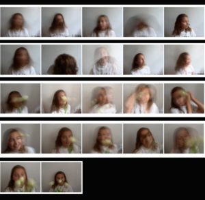
Tanja Deman and Jonny Briggs at the CCA Gallery

CCA Gallery

We recently visited the CCA Gallery to see some of the extraordinary work taken by Tanja Deman and Jonny Briggs. We were taken on a tour around the gallery in two groups. Firstly, Tanja took us round  and told us to independently look through all her work and pick out our favorite and least favorite and think of a reason for our final decision. One we had finished and spoken to Tanja about our thoughts on her work she wanted us to ask her questions and what we though of the concept of her work. Once we had all asked her question we then moved on to Jonny. Jonny’s work was very different to Tanja’s work as his work was very peculiar and different but he always had a perfect explanation for each piece of work which made it interesting. He took us round the gallery showing us his work and telling us about each piece of work in great detail and also giving us a clear reason for all of his ideas.

Tanja Deman and Jonny Briggs work

Image result for jonny briggs photographerImage result for jonny briggs photographerImage result for tanja demanImage result for tanja deman


Shutter Speed

What is it?

While Aperture is responsible for controlling how much amount of light passes through the lens, the Shutter Speed is responsible for controlling the length of time that the light is allowed to hit the camera’s sensor.

The shutter speed controls the amount of time that the shutter curtain is left open. The shutter speed gives you control over how motion is captured in your photograph.

Shutter speeds that are faster than your moving subject will create a photograph of the moving subject in a ‘frozen’ state. The photograph will come out with the subject being very sharp, in focus and seemingly in a stopped motion. You are basically capturing a split second image of the moving subject.

If, on the other hand, your shutter speed is slower than the moving subject then you will create a blurred image of your subject which generally represents a subject in motion.

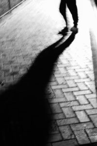
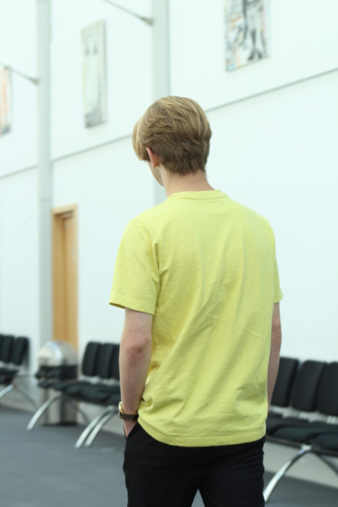
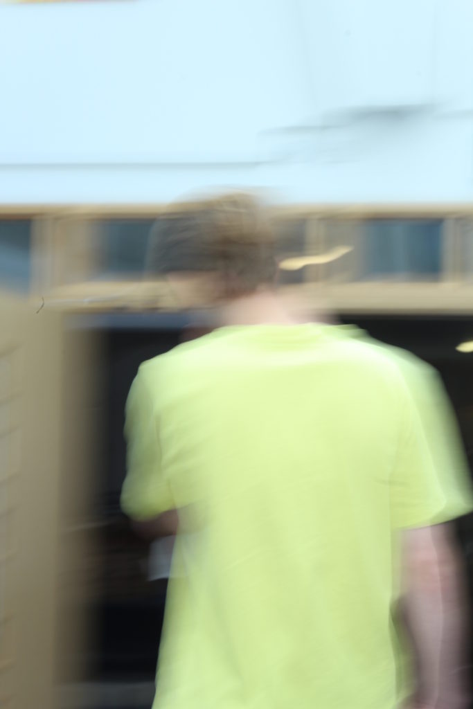
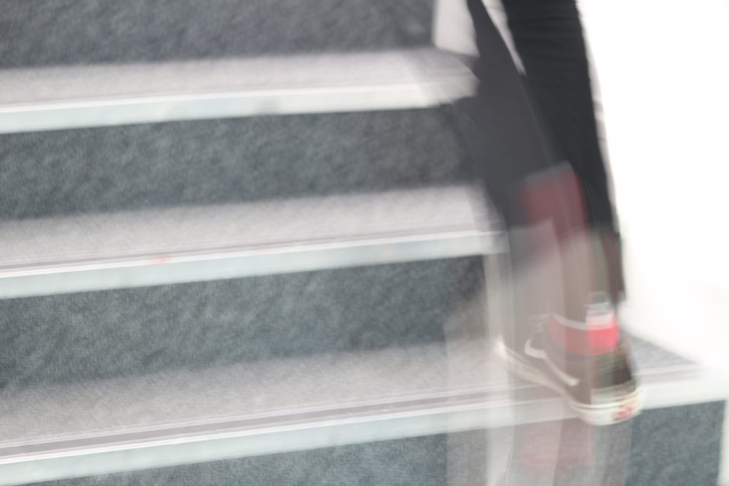
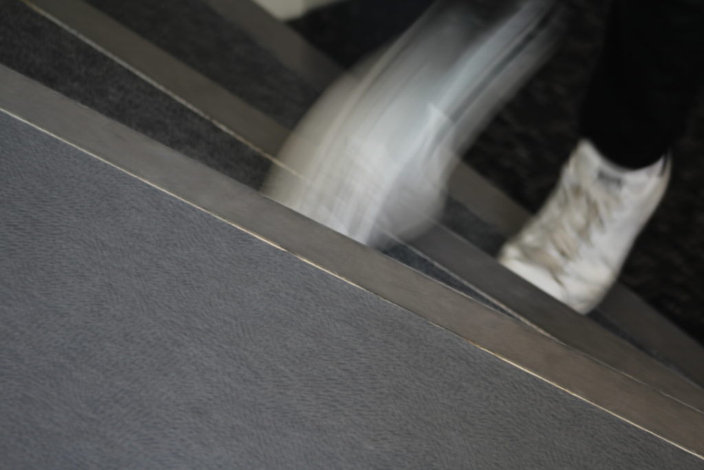
Experimenting with long shutter speed:


Robert Frank Photo Analysis

Robert Frank (born November 9, 1924) is a Swiss-American photographer and documentary film maker. His most notable work, the 1958 book titled The Americans. His style of work is classed as photo journalism and documentary/street photography.

Technical

The first thing which caught my eye when observing this picture was the clear use of the rule of thirds. The bus itself create natural lines almost along the horizontal lines when following the rule of thirds. I believe this helps the viewer the see how the picture is made up of several portrait pictures. There is a large tonal range within this picture, with lighter tones towards the top and darker tones towards the bottom. The tonal range can also be seen within the skin tone of the people on the bus, from the left hand side a white man is presented and on the right hand side we are presented with a black person. We can clearly identify that Robert Frank would have used a fast shutter speed in order to take this photograph. This is because the picture is of a moving subject and would require a fast shutter speed to prevent a blur in the image. With a fast shutter speed he was able to capture a sharp photo.There is also multiple textures inside of this image, for example there is the texture of the trolley at the bottom of the image. The blots on the trolley also add another texture to the image.  Moreover, there is the texture of the windows at the top of the image, these look smooth.

Visual

This image is split into 3 main sections, the top middle and bottom. The middle part is the main focus which contains the main subjects of the people. Where as the top and bottom contain some interesting textures and reflections but this is not what stands out and catches the viewers eye immediately. There is a definite contrast within this image, with the black and whites exaggerated. There is a clear contrast between the white poles/bars separating the people and the rest of the bus, perhaps influencing us that they are a main factor of the image. This photo has been captured in natural light which is expressed in the reflections at the top of the image. I think that the use of the picture being in black and white emphasizes the different races.

Contextual

This image taken by Robert Franks was captured in the 1950’s. This image was also taken in America, New Orleans. At this time period,  America experienced marked economic growth – with an increase in manufacturing and home construction among a post–World War II economic expansion. At this time period it was uncommon for photographers to tackle the issue of racism which is a key theme portrayed within this photo. The time period when this photo was taken was a time of racism and prejudice. Although the photo may have been an ‘accident’ as Robert Frank himself said, it may have been a powerful and strongly influential picture to help the problem with racism.

Conceptual

It looks as if the different races are separated from each other. The white man is at the front of the trolley while the rest are sat behind him. This can connote the fact that at this time people like that where protected by society and had more ‘privilege’. The different facial expressions of the different people can say quite a lot about the image. They all have the same serious look about them. This can represent the lives of these people. The layout of the characters in the image also represents the different classes, for example the man at the front could be a higher class than the one at the back however we do not know this it is just interpretation. The white bars can again also show the separation between the different classes.
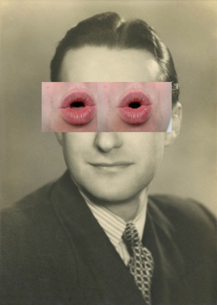
Homework-1

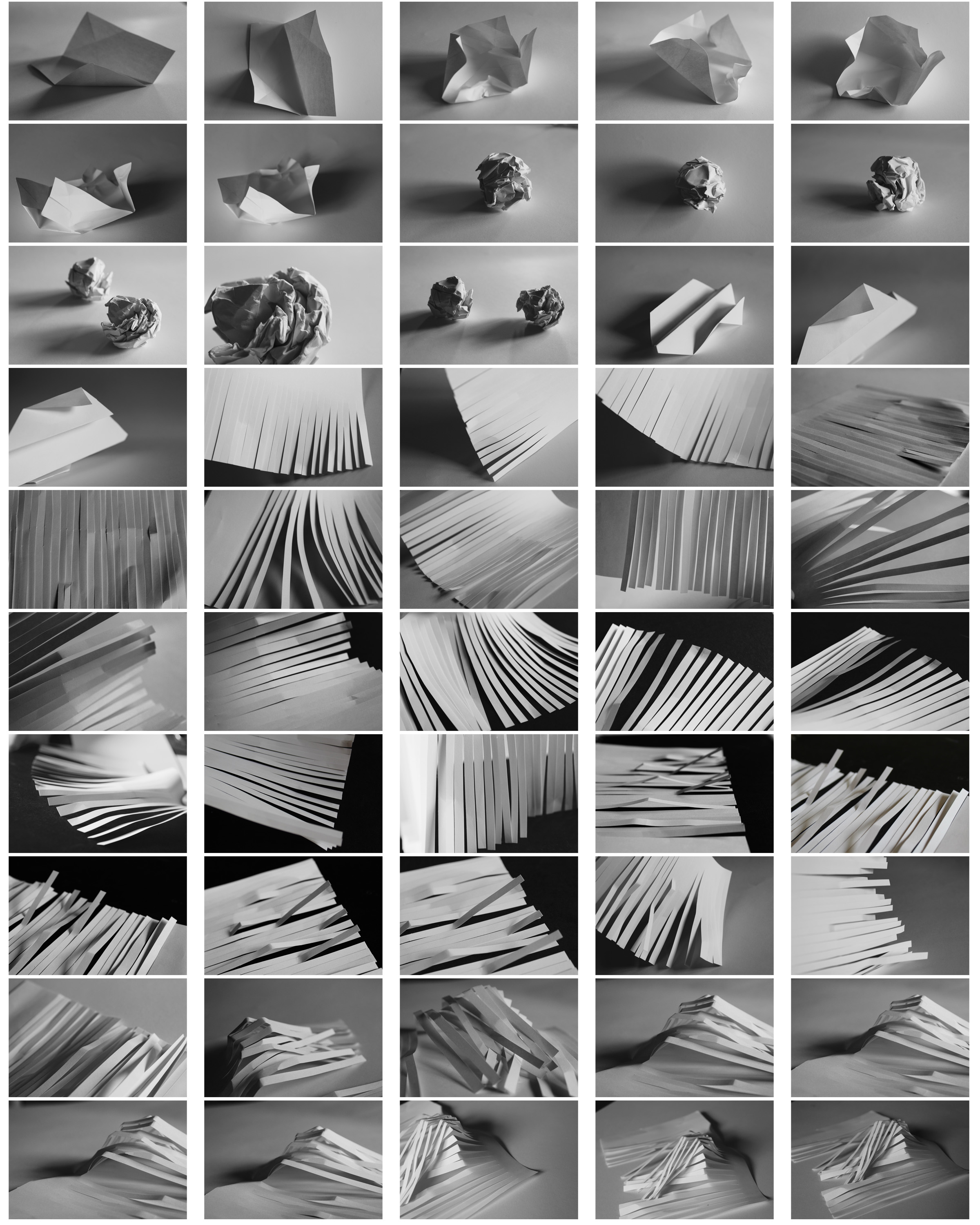
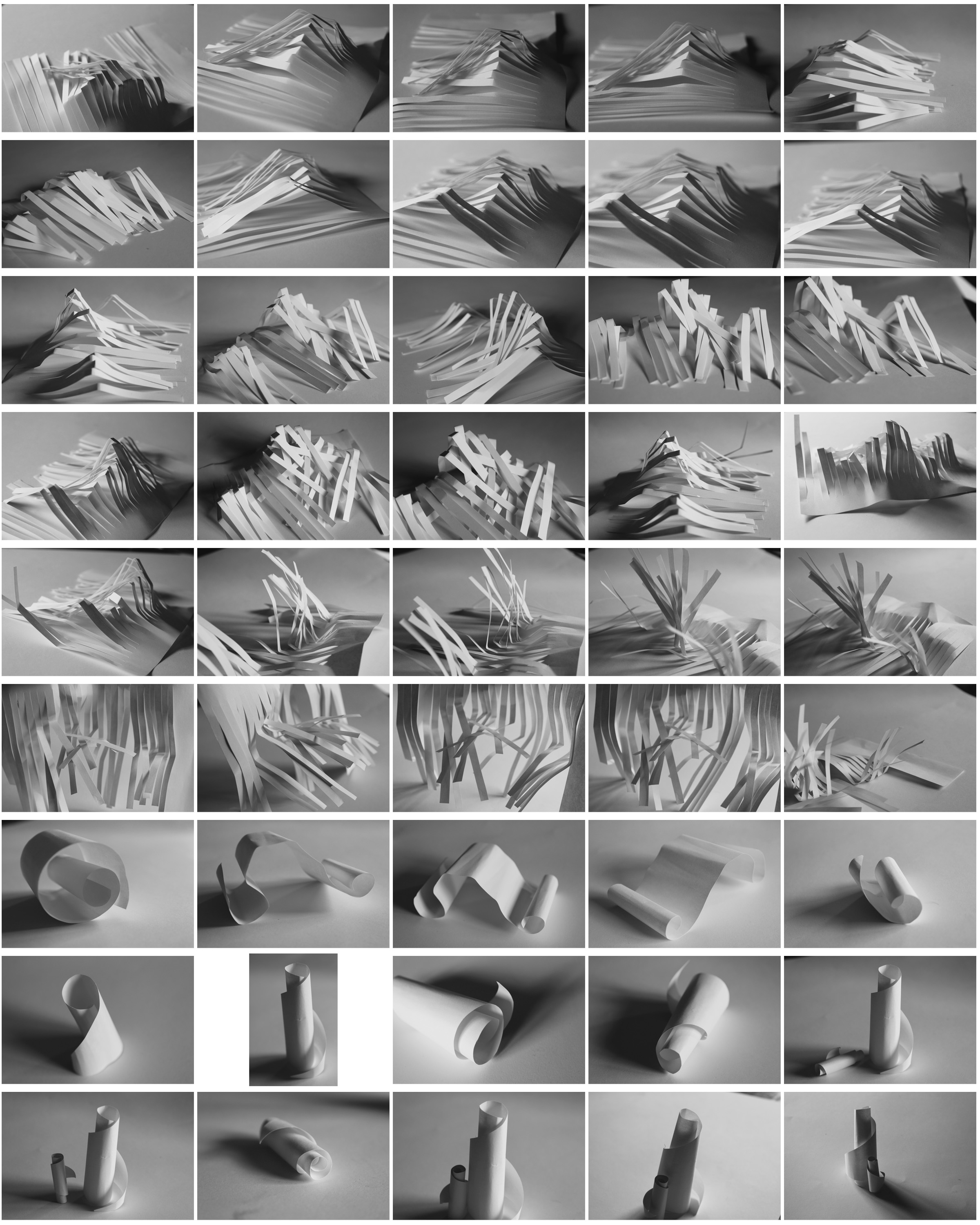
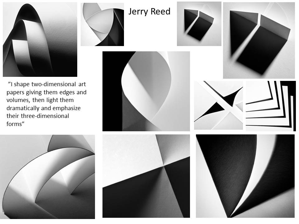
I have taken inspiration from Jerry Reed and Jaroslav Rössler as they show lines, repetition and tones  effectively. I used folded and cut paper to create shadows and effects like them.

I chose my favourite photo from the photoshoot:

I especially like this photograph out of the shoot as i think it demonstrates shadow, line and repetition well.  I cut the piece of paper into strips to show repetition and bent it to create edges to show shadows and tones. This photo is a good demonstration of Ansel Adams zone system. The middle right area has the darkest tones of grey and the bent paper at the top is the lightest as the natural light is coming in from the left side. I arranged the strips purposely in an uneven way to make the photograph more interesting to look at. The way it is arranged could be interpreted as resembling a mountain because of the irregular heights at which the pieces of paper are placed. The focus point of the photograph are the creases of the paper, that being the main subject of the photo. The photo gradually becomes more out of focus towards the outsides of the photo and the right middle side is so out of focus that it is blurred so you cannot see where the paper ends.


Shutter Speed

What is Shutter speed? 

Shutter speed or exposure time as it is also known is the length of time when the sensor inside the camera is exposed to light it is when the shutter of the camera is open

As you can see in the image above the speed of the shutter can greatly effect the outcome of the final image.

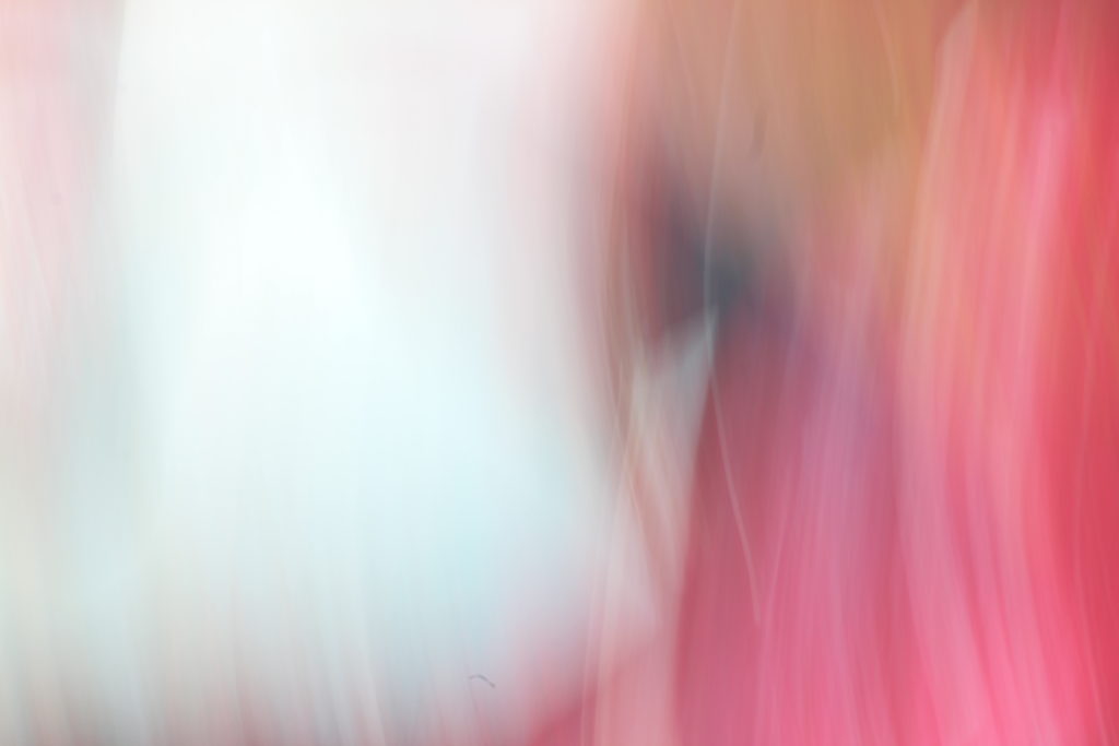
In the images that i had taken on a previous photo shoot you can see the massive change in the final look of the image. The second image that was taken on a shutter image speed of 4 second I created the pattern that you can see in that image by moving the lens of the camera in a certain pattern, the other image was taken on 1/8 of a second. Using slow shutter speed is one of my favorite techniques that in photography as you have unlimited possibilities that you can do.

Image result for shutter speed]

Editing Using Photoshop

Editing Photos In Photoshop 

I had a go at editing some photos with the software called Photoshop, to see if I could enhance the looks of certain pictures with a few tweaks to their settings.
These were my results:


Before and after the picture has been edited (Edited top and unedited bottom).
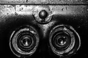


Before and after edited on Photoshop (Top image edited bottom unedited).

How did I edit them?

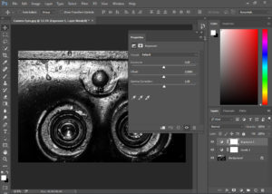
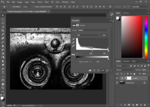
To edit my photos I went into the image and adjustments tab, located at the top of the screen, and selected what I wanted to edit

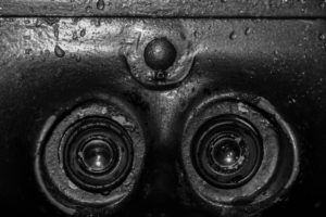
BRIGHTNESS/CONTRAST
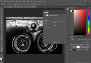


EXPOSURE


LEVELS


Zone System 


Above I used the Ansel Adams zone system (seen beneath), to identify the different areas of types of exposure, meant allow the photo to have the best contrast between light and dark as possible within the picture.

Image result for ansel adams scale

What is the Ansel Adams 'Zone System'?

The Zone System is a technique that was formulated by Ansel Adams and Fred Archer back in the 1930's. It is an approach to a standardized way of working that guarantees a correct exposure in every situation, even in the trickiest lighting conditions, such as black lighting, extreme difference between light and shadow areas of a scene, and many similar conditions that are most likely going to throw off your camera's metering, giving you a completely incorrect exposure.
ISO

What is ISO 

ISO is the level of sensitivity of your camera to available light. The lower the ISO number, the less sensitive it is to the light, while a higher ISO number increases the sensitivity of your camera. The component within your camera that can change sensitivity is called “image sensor.” With increased sensitivity, your camera sensor can capture images in low-light environments without having to use a flash. But higher sensitivity poses a problem as it it adds grain or “noise” to the pictures.

ISO 200 and ISO 3200 Comparison

The difference in this image is clear – the image on the right hand side at ISO 3200 has a lot more noise in it, than the one on the left at ISO 200.

low ISO speedLow ISO Speed

high ISO speedHigh ISO speed

Exploring Tone and Contrast

Ansel Adams, an American photographer who took landscape photographs in order to capture the beauty of nature. He enjoyed taking pictures of National Parks and mountains. His photography includes  a range of tones in which he believed brings his photos to life., creating a more memorizing picture. His use of tone and contrast brings out the detail in all areas of the picture whether it is over or under exposed.

Related image

Within Ansel Adams photographs he ensures he that he displays all and reflects all the shades within the zonal system. This is split into 10 different shades varying from sark grey to white.

Image result for Ansel Adams zone system

Following from Adams work i used Photoshop to increase and improve the tone and contrast trying to ensure i displayed all shades from the zone system.

What Is Tone?

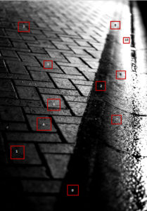
Tone is the lightness/brightness  of a patch in a photograph, dark tones correspond to shadows, light tones correspond to bright or highlight areas.

What Is Contrast?

Contrast is a tool that photographers use to direct viewers’ attention to their subject. There are two types: Tonal Contrast and Color Contrast. Contrast more or less refers to the difference in tones from the lightest tone to the darkest tone.


Experimenting with shutter-speed

SHUTTER-SPEED

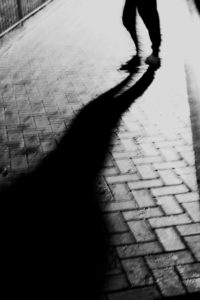
Faster camera shutter speeds are used in order to capture fast moving objects/elements of an image such as Athletes or the motion of water. However slow shutter speeds are used for capturing detail especially in dark environments as it allows a lot of light to enter the camera. But slow shutter speeds can be used to create visual blurred effects on single elements of an image while allowing the rest of the image to remain still.

Most cameras range from a 30 sec shutter speed 1/4000 sec.

Here is an example of how the use shutter speed can be executed…

Image result for SHUTTERSPEED

Myself and Jonny Phillips went out into the Hautlieu Street In order to experiment with different camera shutter-speeds. The majority of the photos that we took used movement of the camera itself, meaning that the whole image was blurred. In future using a tripod or a still surface to support the camera would be useful as it would mean that moving elements of the image will appear blurred however fixed/stationary elements would remain appearing still.