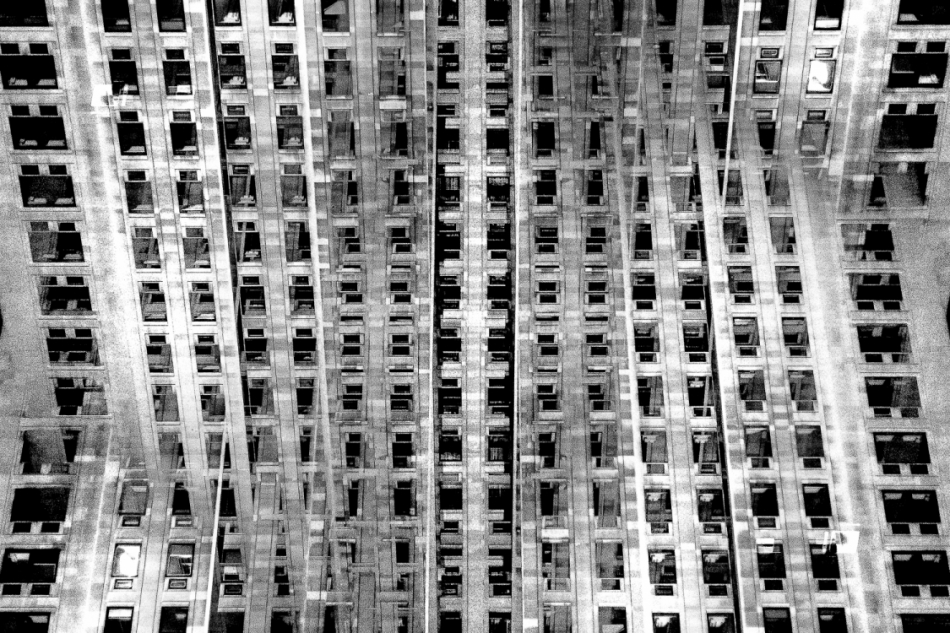
 Lewis Bush (born 1988 in London) is a British photographer, writer, curator and educator. Bush studied history at the University of Warwick and gained a master’s degree in documentary photography from London College of Communication, where he lectures on photojournalism and documentary photography. In his work bush seeks to draw attention to forms of invisible power that operate in the world – such as finance. Bush has the standpoint that ‘power is always problematic because it’s natural resting state is arbitrary and untransparent’. Bush’s projects tend to incorporate writing and he has written about photography for a range of national and international print and web titles.
In Bush’s ‘The Memory of History‘ from 2012, he travels through a range of European countries to document the way in which the past was being politically manipulated in the context of the economic crisis and recession.
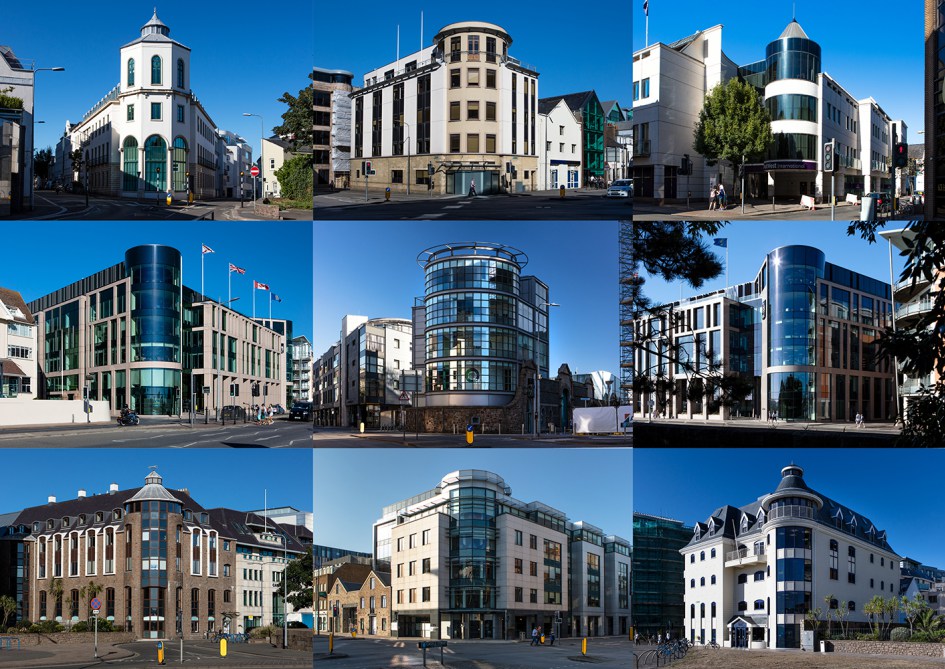
Bush is a photographer in residence at the Societe Jersiaise in Jersey where he is working on his project ‘Trading Zones‘ in which he looks at the international finance industry. It looks at the global economic crisis that began ten years ago and the resulting financial sector. Finance has been very unrepresented in documentaries due to its complexity and stature meaning that there is plenty of potential for investigation for documentary photographers such as Bush. The project ‘Trading Zones’ is a result of six months spent as the 2018 Archisle photographer in residence at the Societe Jersiaise in Jersey, which is currently undergoing huge renovations in the financial sector. Bush says he has used this time to “establish the foundations of what I anticipate will be a long term photographic inquiry into the financial services industry” as the project comes under documentary photography so this project will be ongoing over a long period of time.
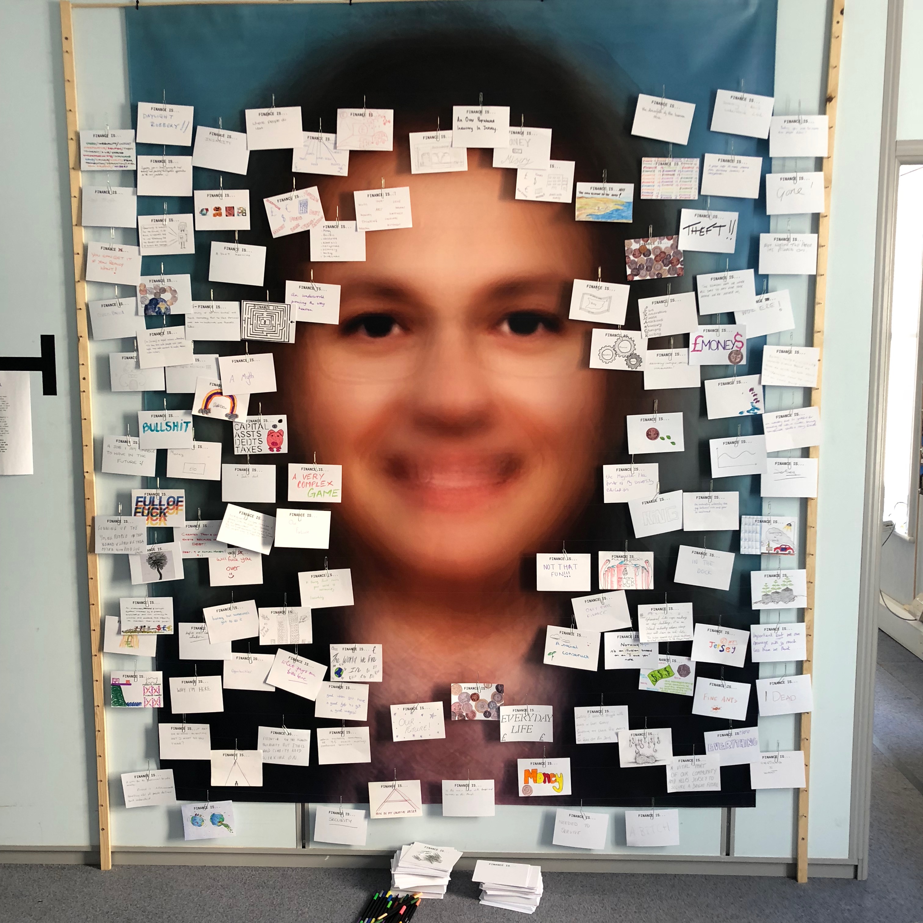
Bush’s work on ‘Trading Zones’ interest me as he had a section in the gallery in which he showcased cards showing what the public though of finance. This idea drew inspiration from a project by EJ Major, who sent out cards asking ‘what love is’, expecting people to respond in whichever way they felt appropriate. I could possibly respond to this idea as I have considered exploring the variety in people’s handwriting – everyone has their own unique style of writing and especially ways of drawing specific characters. I believe that by asking multiple people to write down what ‘Variance and Similarity’ means to them I will be left with a collection of cards covered with unique handwriting styles and so will be able to show how characteristics as small as handwriting can show the differences in people’s personality traits.
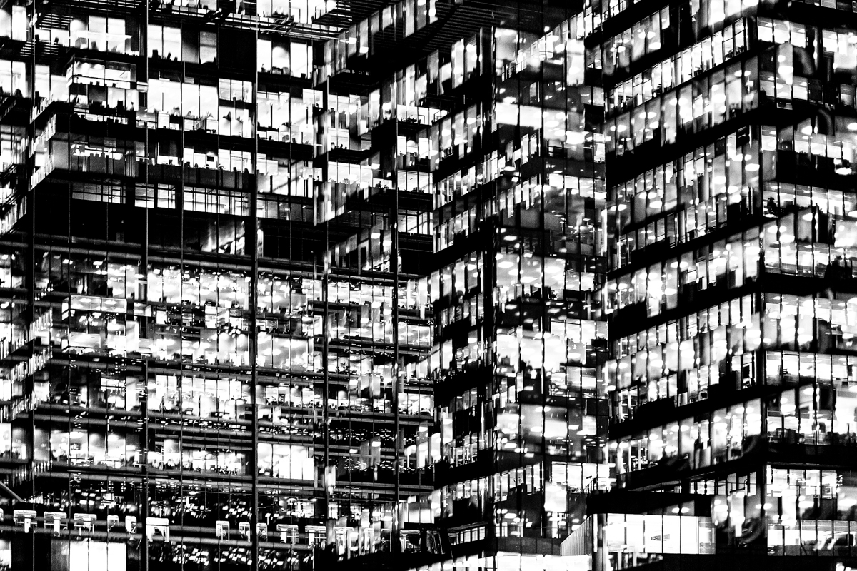 The main project by Bush that interests me is ‘Metropole’ in which he used a technique of double exposure. The project looks at the collapse of the British Empire and how in its place globalised capitalism grew as London has been rebranded as “a city of demolition, cranes, and glittering new high rises”. ‘Metropole’ aims to record the effect of this on London through the form of documentary photography. This appeals to me and links to the theme ‘Variance and Similarity’ because it explores the fact that there are an increasing amount of large buildings for offices or flats taking away from green land and so the landscape in which we live is turning into a repetitive view of similar flats and offices leaving citizens with a feeling of monotony as everything is being redeveloped to serve the same purpose. Bush’s work on ‘Metropole’ shows a lot of emphasis on the repetition between buildings due to his double exposure effect. I intend to respond to this work by capturing blocks of flats or offices, both in day and at night and then altering the photographs in photoshop to replicate the buildings and create a pattern of repetition throughout the edits. These edits will show how buildings can look different individually but a lot of them can be very boring and repetitive.
Analysis
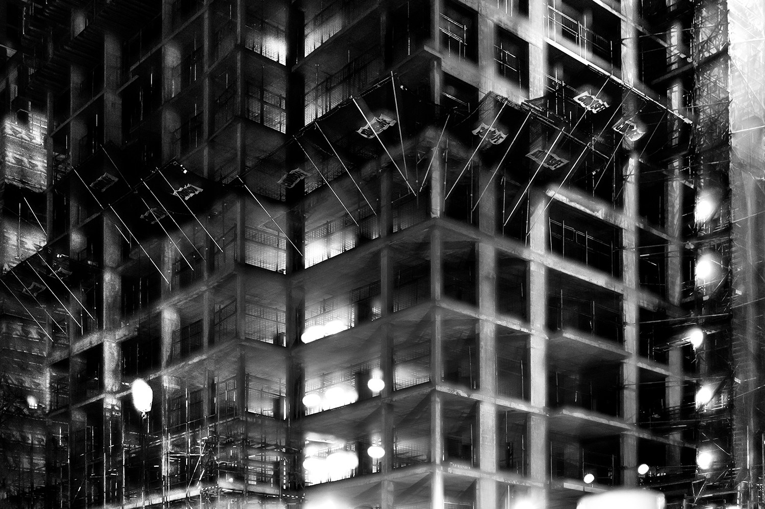
In this photograph it appears that lighting from within the inside of the building was used in what is possible night photograph. The use of this light is used to Bush’s advantage advantage as he uses double exposures to layer building over building creating a disorientating viewing along with contrast between the over-exposed lights and the dark shadows within the building. There is a wide tonal range within the photograph thanks to the range of shadows and lights within the photograph – this wide tonal range makes the photograph interesting in whichever segment the viewer looks as it creates intricate shapes and shadows throughout. The lights and shapes are very intense as the viewer has to try piece the photograph together in order to understand it. It is unclear whether a short or deep depth of field will have been used in this photograph due to the disorientating nature of it – this adds to the mysterious elements of the photograph. A fairly slow shutter speed will have been used along with a low ISO in order for enough of the light to enter the lens from the dark environment whilst keeping the quality of the photograph as high as possible.
There is no colour in this photograph – only black and white along with the shades in between. This black and white approach to the photograph is very effective as it allows you to focus on the structure of the photograph and the buildings rather than being distracted by colours. The black and white effect also adds to the disorientating effect of the double exposure technique. Another addition that the black and white effect brings to the photograph is more contrast between the tones – especially between the bright white lights and the black shadows. The bright lights may be representative of a light at the end of the tunnel due to their glow in comparison to their environment. The photograph seems to have the texture of a graphite drawing which creates a really interesting viewing as what the viewer is seeing seems almost surreal. There is quite a 3D effect to the photograph due to the blending of photographs in order to create platforms coming out towards the viewer from the building. This 3D effect is complimented by the wide range of tones within the photograph. There are two points in the photograph to which the eye is initially drawn – these are the bright heaven-like lights and the platforms extending from the buildings – this is due to the lights contrasting in tone to the rest of the photograph and the platforms providing different shapes to the rest of the image. The platforms are also placed along the higher horizontal line of the rule of thirds meaning they add aesthetic to the photograph.
This photograph was taken from Bush’s project titled ‘Metropole‘. This project looked at the collapse of the British Empire and how in its place globalised capitalism grew. London has been rebranded from “an investment opportunity” to “a city of demolition, cranes, and glittering new high rises”. ‘Metropole’ aims to record the effect of this on London through the form of documentary photography. The project is titled ‘Metropole’ as London was once known as the Metropole meaning it was the mother city at the centre of a vast empire. These photographs were produced “during numerous winter night walks through the city”.
On Bush’s website he says that he used double exposure to create “increasingly disorientating and threatening as the series progresses” in order to create the “sense of loss that many Londoners feel” in the big city. This theme of a feeling of loss within the city emphasises how cities such as London have changed with the arrival of these repetitive blocks of flats – possibly for the worse. Bush continues this theme in his work on ‘Trading Zones’ in which he studies the Jersey financial sector. I think that through this exploration of disorientation and change Bush is trying to show that people often feel that the world is moving too fast for its own good as people get lost in temporary trends and patterns of life, ultimately resulting in repetition.

 Lewis Bush (born 1988 in London) is a British photographer, writer, curator and educator. Bush studied history at the University of Warwick and gained a master’s degree in documentary photography from London College of Communication, where he lectures on photojournalism and documentary photography. In his work bush seeks to draw attention to forms of invisible power that operate in the world – such as finance. Bush has the standpoint that ‘power is always problematic because it’s natural resting state is arbitrary and untransparent’. Bush’s projects tend to incorporate writing and he has written about photography for a range of national and international print and web titles.

 The main project by Bush that interests me is ‘Metropole’ in which he used a technique of double exposure. The project looks at the collapse of the British Empire and how in its place globalised capitalism grew as London has been rebranded as “a city of demolition, cranes, and glittering new high rises”. ‘Metropole’ aims to record the effect of this on London through the form of documentary photography. This appeals to me and links to the theme ‘Variance and Similarity’ because it explores the fact that there are an increasing amount of large buildings for offices or flats taking away from green land and so the landscape in which we live is turning into a repetitive view of similar flats and offices leaving citizens with a feeling of monotony as everything is being redeveloped to serve the same purpose. Bush’s work on ‘Metropole’ shows a lot of emphasis on the repetition between buildings due to his double exposure effect. I intend to respond to this work by capturing blocks of flats or offices, both in day and at night and then altering the photographs in photoshop to replicate the buildings and create a pattern of repetition throughout the edits. These edits will show how buildings can look different individually but a lot of them can be very boring and repetitive.
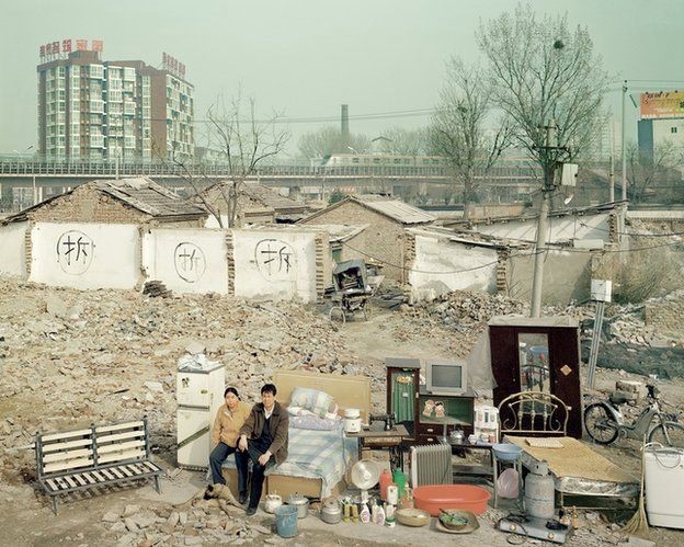
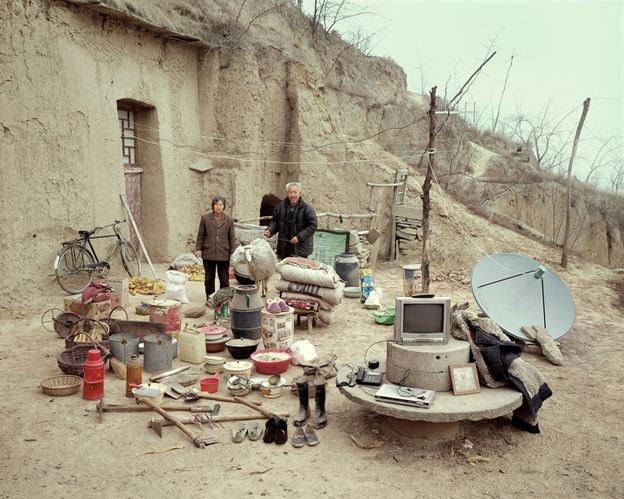
 Huang Qingjun is a Chinese photographer who has photographed families posing with their possessions amid China’s dash to become rich. He has spent nearly a decade travelling to remote parts of China to persuade people who have never been photographed to carry outside all their household possessions and pose for him. The results of this product are glimpses of the different lives and belongings of different families within China. The pictures have not been widely seen outside of China although some have been shown at exhibitions in Paris and New York.
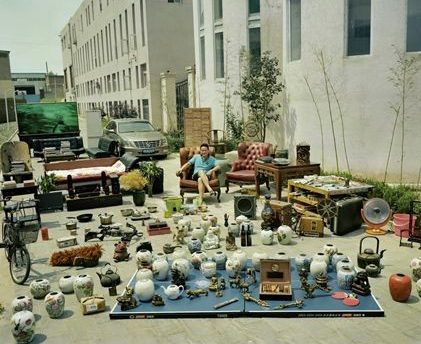 Huang was inspired as a teenager by an uncle when the typical hobbies for the Chinese youth were calligraphy and singing. The idea for the series about people’s material good, called ‘Jiadang’ (family stuff). first came in 2003 with some photographs that he took for the magazine Chinese National Geography but the project didn’t start properly until three years later, when Huang started travelling around China looking for suitable people. Huang says that “Most people thought what I was proposing was not normal” but most people understood the point at the end of it. Most of the people in these poor, remote areas did not have many possessions making the project both simpler and more interesting. Some of the projects took a couple of days whereas others took several months. Next year marks the 10th anniversary of the first photograph, and Huang plans to mark it by returning to the places he visited to see how they have changed. Huang also hopes to broaden the project’s range upon revisiting it by including people from a wider range of backgrounds, such as government officials.


 The German artists Bernd and Hilla Becher, who began working together in 1959 and married in 1961, are best known for their “typologies” which are grids of black-and-white photos of variant examples of a single type of industrial structure. The couple traveled around Germany taking images of the industrial building from the same distance and angle so when the images where arranged they all looked very similar. At first glance someone may mistake the images for being the same image when in-matter-of-fact they are all different images.
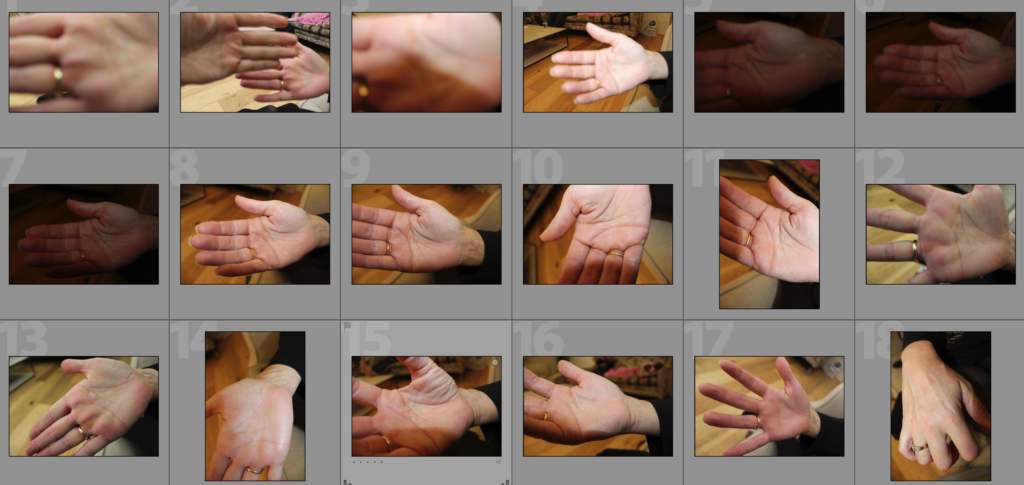

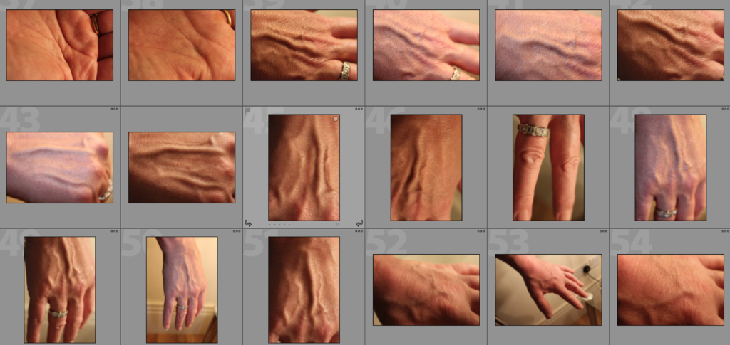
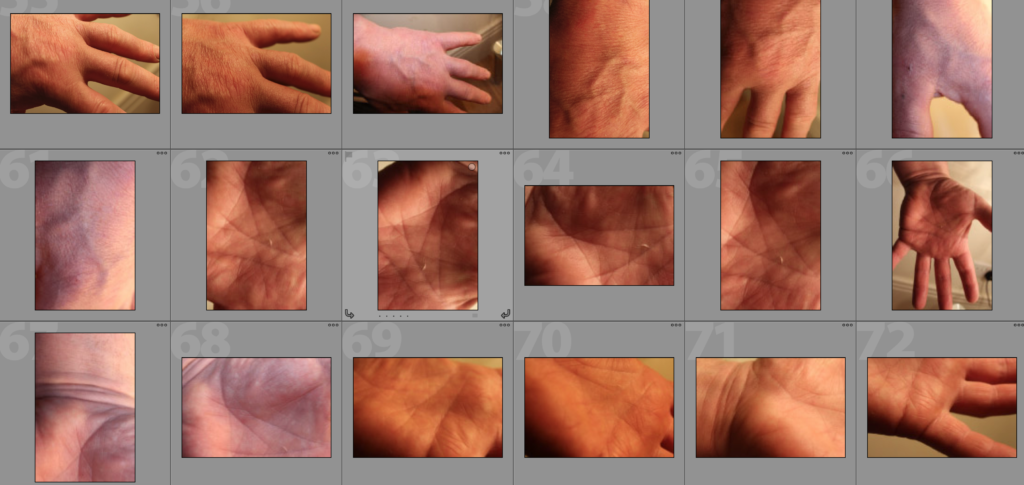

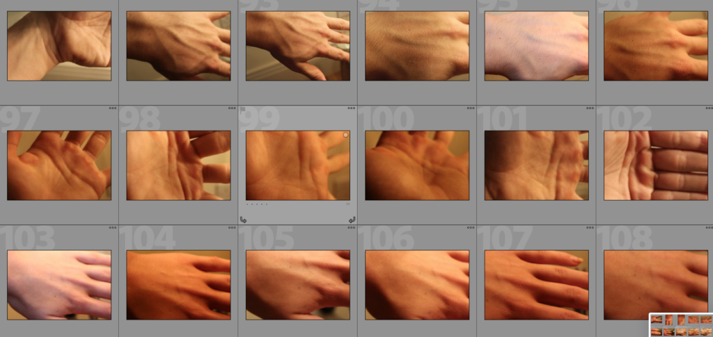

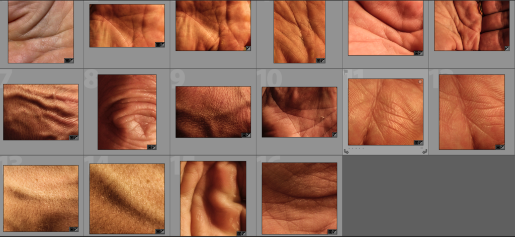
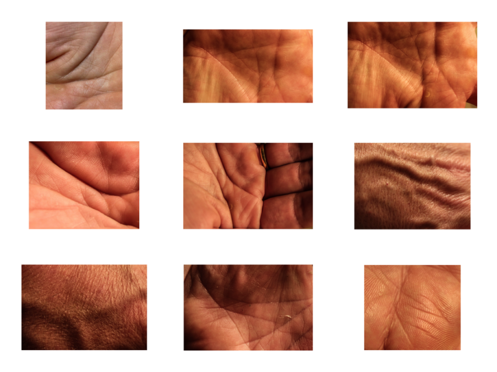
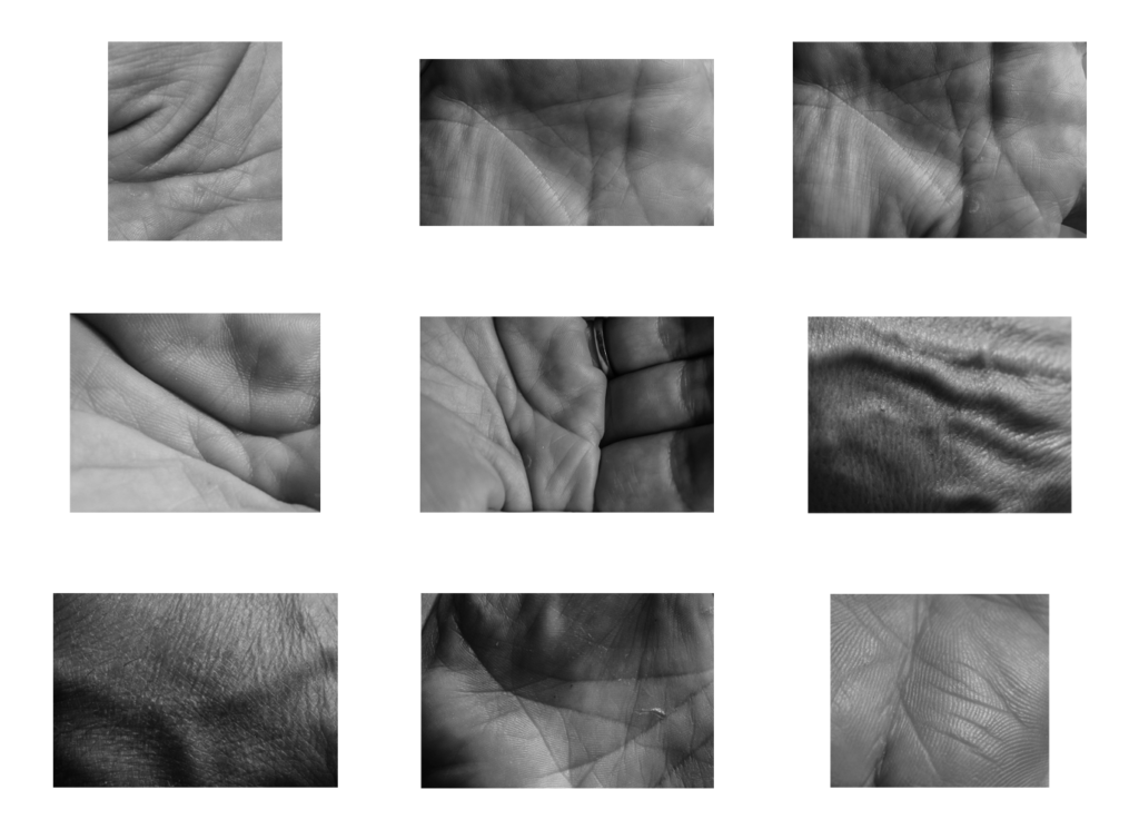
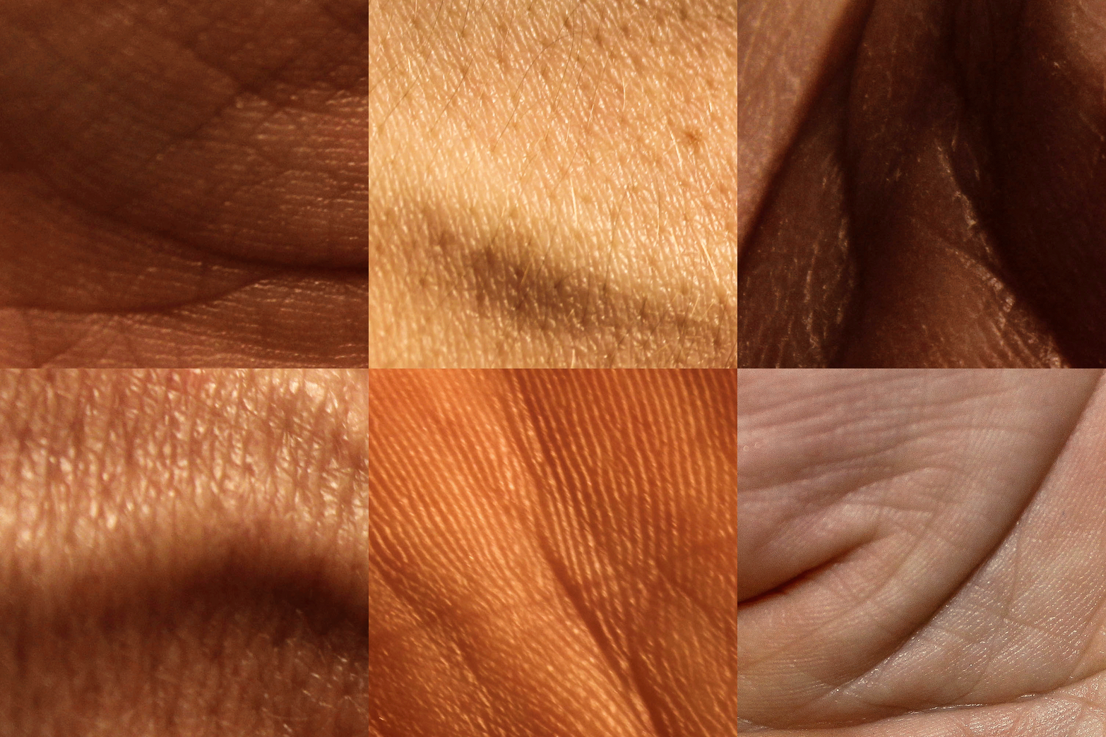
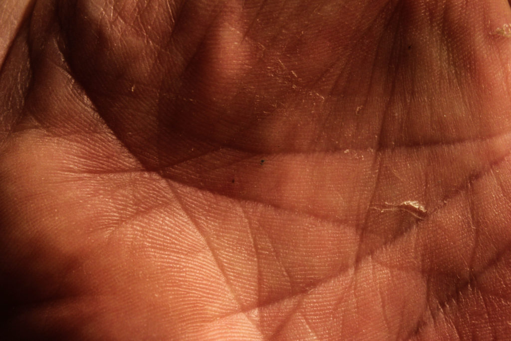
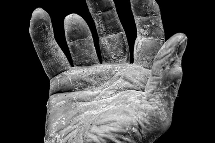 different size and shape of people’s hands and especially the different lines in the palms of hands and possibly fingerprints. This could product some abstract up close photographs or photographs showing the whole hand. I could experiment with colouring the hands with ink in order to emphasise the features of the hands. I could also experiment with printing the photographs then putting materials such as coloured string along the hand lines to emphasise the lines. This could lead me to look at other natural lines on the human body including veins. An artist that I could look at relating to this subject is Tim Booth who did a project titled ‘A Show of Hands’.


