Tommy Ingberg – Artist Reference

Tommy Ingberg

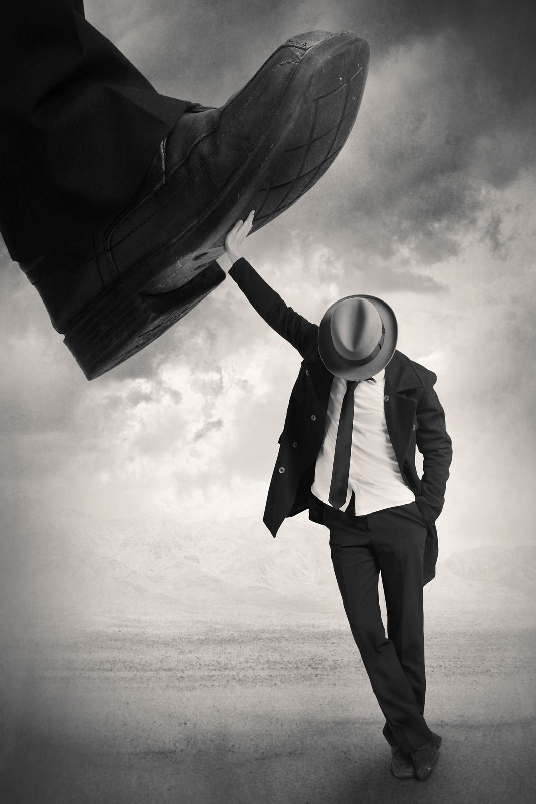
Tommy Ingberg is a photographer and visual artist, born 1980 in Sweden. He works with photography and digital image editing, creating minimalistic and self-reflecting surreal photo montages dealing with human nature, feelings and thoughts. Ingberg leaves the interpretation of his work up to the viewer but says, “For me, surrealism is about trying to explain something abstract like a feeling or a thought, expressing the subconscious with a picture. For my work I use my own inner life, thoughts and feelings as seeds to my pictures. In that sense the work is very personal, almost like a visual diary. Despite this subjectiveness in the process I hope that the work can engage the viewer in her or his own terms. I want the viewers to produce their own questions and answers when looking at the pictures, my own interpretations are really irrelevant in this context.”

Ingberg mainly focuses on people and creating an atmosphere that relates to the them. He portrays the characters feelings through his landscapes, objects and the posture of the model. By using mainly dark, saddening and depressing moods it is clear to see the state of mind that the artist has experienced or is experiencing. The running theme throughout his pictures are that they are all in black and white which links to the ideas of similarity. However each image differs in the story it is set out to create using different props to do so. I chose to study Tommy Ingbergs work because not only does he create extraordinary surreal illusions but the deep meanings and stories which are told through his pictures really influenced me. Also, there is a clear link to our exam title with his ability to keep a similar theme through his works whilst them

 The Photographers Photos

Image result for tommy ingberg

Image result for tommy ingberg

Photo Analysis

Image result for tommy ingberg

The construction of this image has been made to appeal to the audience when viewing it. By using a minimalist approach and centering the character it allows the audience a pleasant viewing experience allowing them to embrace the story being created. It is clear that montage and manipulation techniques have been used to construct this image resulting in a very surreal and interesting composite. It would appear that natural lighting has been used when capturing the elements of this image giving a very natural look. This helps the overall piece feel more realistic as it is clearly not real. There is a large use of tonal range from the very bright tones within the balloons and also dark tones in the sky and rock. There is a large depth of field within this image which allows us to dive deep into the image. The main subject is very sharp, in focus and so is the sky in the background. There is no color within this image as Ingberg has opted for the black and white scheme which I believe helps to convey the feelings and thoughts of the person. Having the image de-saturated like this also helps to bring out more detail in elements of the photograph such as the sky where we can really see the formation of clouds.

I like this photo due to the emotion and story it creates and tells us. The photo clearly tells us that a person wants to escape the place in which they live in however there is something stopping them. The lighting helps to create this sense of imprisonment. The dark clouds are in front of the man as if he is heading into a darker place and putting himself into a bad situation and the bright clouds which suggest goodness are behind him indicating he is drifting away from what’s good in his life. This photo uses the technique of leading lines within the rope leading us up the body to the balloons which is trying to pull the man away from his life on earth. This photo is in black and white which I think helps to add to the dark and depressing atmosphere.

When interviewed about his work Ingberg described his art as “photography and digital image editing, creating minimalistic and self-reflecting surreal photo montages dealing with human nature, feelings and thoughts.” This statement is clearly justified through this image reflecting the struggles that a person is having and theior negative thoughts reflected through all the elements of the image. For example the balloons coming out of the mans head acts as a metaphor for the confused state of mind the person is in. To achieve such amazing art Ingberg says “I proceed by shooting the photographs I need, preferably in studio with controlled lighting. I then put it together in Photoshop.”

INITIAL IDEAS

Having read through the exam paper and exploring the meanings of the allocated words given for this project, I have gathered some  potential ideas on where I could take this project.

Nature – Nature is infinitely variable, with it constantly changing from natural or man made causes it is undeniably differing everyday. There are only four DNA variants but from these the whole incredible diversity of life has evolved. I think within this topic there is a large area to explore but i would specifically be interested in exploring wildlife. It would be interesting to take a look closely into some of the species that exist on this planet and how they are similar yet different from one another. An artist that I could look at in relation to this could be Ernst Haeckel, a German artist who discovered, described and named thousands of new species. Related image

Weather – With the exploration of whether I would look closely into the variations in the time of day, season and of course weather types. All of these factors can instantly transform a familiar landscape into something unearthly. I think the weather is very interesting due to the huge significance it plays in our lives. For example depending on the weather may depend on what someone decides to do that day. However it can also be a lot more powerful than just this, destroying Eco-systems and peoples lives with extreme situations of hurricanes and tsunamis. A photographer that comes to mind within this topic is David Mayhew, a world class photographer best known for taking pictures of extreme weather.

Related image

Facial Features – Facial features display a variety of characteristics and there is an endless amount of human expression and persona that continues to attract artists to the genre of portraiture. I think that portraiture is a really interesting type of photography due to the interaction the model create with the audience in telling a story about themselves. These stories will vary with every person as no one has the exact same path in life. Furthermore, exploring facial features has a lot to do with identity of a person which can be explored in several ways. A photographer which comes to mind for this topic would be Tommy Ingberg, a surreal photographer that shows the emotional interaction of the person through the person themselves and the landscape too.

Image result for tommy ingberg

Seaside – Inspired by Hiroshi Sugimoto’s seascape images, I want to create minimalist seascape images that are differing from the conventional seaside image. This will show variety in the way the sea can be photographed however has signs of similarity though how the images will be of a similar style and of the same subject matter. I have ideas to develop Sugimoto’s style into my own by using motion blurs to create a new perspective of the sea.

Image result for Hiroshi Sugimoto

Image result for hiroshi sugimoto

Architecture – There is endless variety within architecture however also similarity too. I think a possibility within this could be to explore both variations and similarities in order to show a contrast. My main aim when exploring architecture is to approach it in a minimalist way presenting structured and organised composites to reflect our society in modern day. A photographer which links directly with this theme is Werner Mantz who’s work linked with the ‘new objectivity’ movement in German photography before the second world war.

Image result for werner mantz photographer

ESA // Typologies – Bernd and Hilla Becher

Bernd and Hilla Becher are both photogrpahers that look at typologies.

Bernd and Hilla Becher were both German conceptual (installation) artists and photographers. They worked as a collaborative duo and are best known for their extensive series of typographies of industrial buildings and structures.

“The husband and wife team of Bernd and Hilla Becher began photographing together in 1959. Bernd and Hilla Becher documented architectural forms referred to as “anonymous sculpture” for over thirty years. Their extensive series of water towers, blast furnaces, coal mine tipples, industrial facades, and other vernacular industrial architecture comprise an in-depth study of the intricate relationship between form and function.” – Fraenkel Gallery

Variation And Similarity

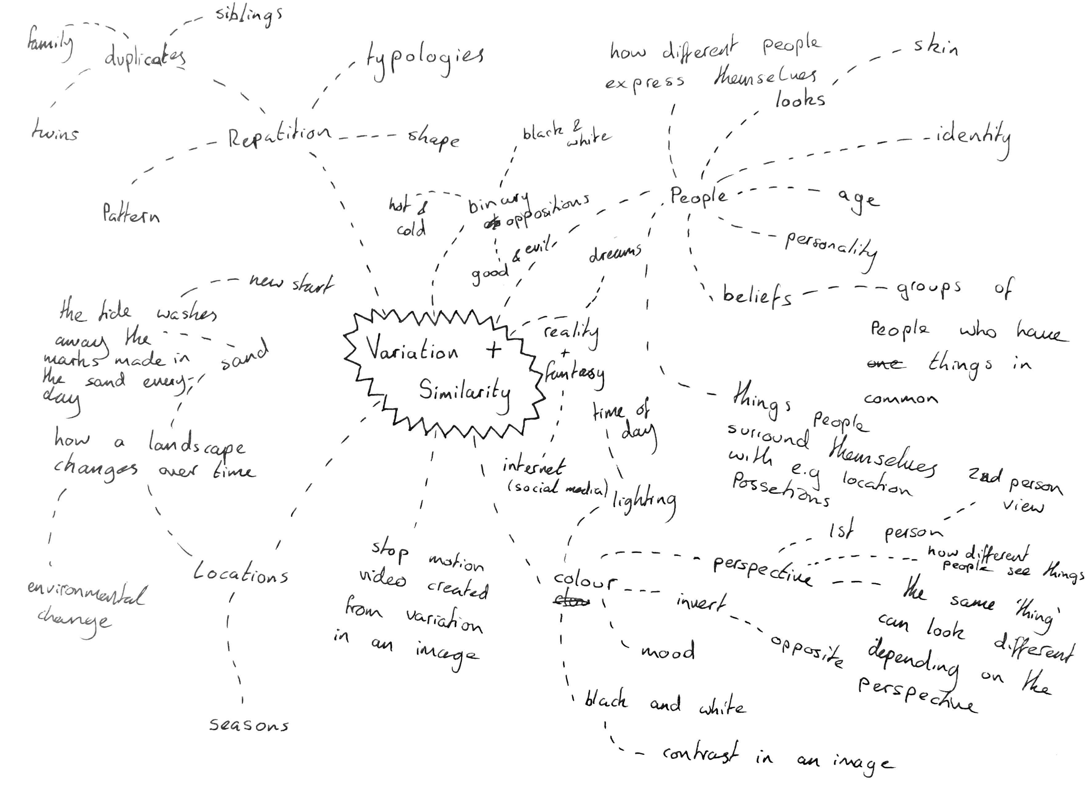
I will begin this project by looking through the exam paper and breaking down the initial title “variation and similarity” I will then look into the starting points given in the exam paper and brainstorming my own initial ideas to create a starting point for the project.

Dictionary Definition: 

Variation – A change or slight difference in condition, amount, or level, typically within certain limits. A change or slight difference in condition, amount, or level, typically within certain limits.

Similarity – The state or fact of being similar. Having a resemblance in appearance, character, or quantity, without being identical.

Synonyms: 

Variation – abnormality, alteration, deviation, discrepancy, disparity, divergence, diversity, difference, fluctuation, innovation, modification

Similarity – parallel, relationship, resemblance, closeness, comparison, connection, correlation, harmony, parity, relation,

when I first read this title I thought of variation and similarities between people, their looks, age, beliefs and backgrounds all the pieces that go together to give each human a unique identity. I would consider developing this idea further through the use of portrait images, close ups of skin and features which stand out on an individual. In an age where people are constantly trying to perfect themselves o think it would be interesting to look behind this to remind ourselves why it is so important that we show our differences.

I also instantly thought about work on typologies which I have previously studied, work by photographers such as Bernd and Hilla Becher who took photos of similar structures such as water towers and collated them together in a grid to show their subtle differences which would otherwise not be noticed or appreciated. This concept could be applied to anything, from packaging commenting on to issue of materialism to architectural structures showing the development of natural landscapes.

ESA // Typologies – August Sander

Photographic typologies are believed to have originated from August Sander’s series of portraits ‘Face of our Time’.

August Sander was a German portrait and documentary photographer. August Sander photo series, People of the Twentieth Century is a great example of Environmental Portraiture. Sander has been described as “the most important German portrait photographer of the early twentieth century.” (cited: Wikipedia [Michael Collins, Record Pictures (Thomas Telford Publishing, 2004), p. 1842] )

He used a large-format camera and long-exposure times. He created hundreds of portraits for a typology of German society during both the World Wars. Many of his photographs are environmental portraits. – sourced from artsy.net “He established a photography studio, first in Austria, then in Cologne, where he settled in 1910 and made photographs of local peasants.” – icp.org. This is what inspired his life’s work.

His work includes landscape, nature, architecture, and street photography, however, he is known best for his portraits

Sander was born in Herdorf, he was the son of a carpenter working in the mining industry. He was working at a local mine when he first learned about photography by assisting a photographer who was working for a mining company. He acquired some financial support from his uncle, with which he bought photographic equipment and set up his own darkroom.

Pastrycook 1928, printed 1999 August Sander 1876-1964 ARTIST ROOMS Tate and National Galleries of Scotland. Lent by Anthony d’Offay 2010 http://www.tate.org.uk/art/work/AL00033

The image of the Pastry cook is a photograph from Sander’s photo series ‘People of the Twentieth Century’. The image depicts a particular type of person, in this case, Sander shows a skilled tradesman working in his kitchen. The round shape of the bowl mirrors the shape of the Cook’s body, this suggests that the subject of the photograph is the type of person to be really involved in their work, almost as if they have become it themselves. By using a sharp focus on the foreground, the subject becomes the priority along with his body language became this is the main focus of the image, the soft focus in the background allows this to happen. Sander has positioned the subject in order to have the most likely natural light reflecting on the side of the face, bowl and shoes. He takes black and white photographs, therefore tone is a big focus when taking the photos. By using a dark background this allows the lighter foreground to stand out more effectively. This also reiterates the subject being the main focus in the photograph and the suggestion that he is a part of his work.


My Response to Lewis Bush/Michael WOLF

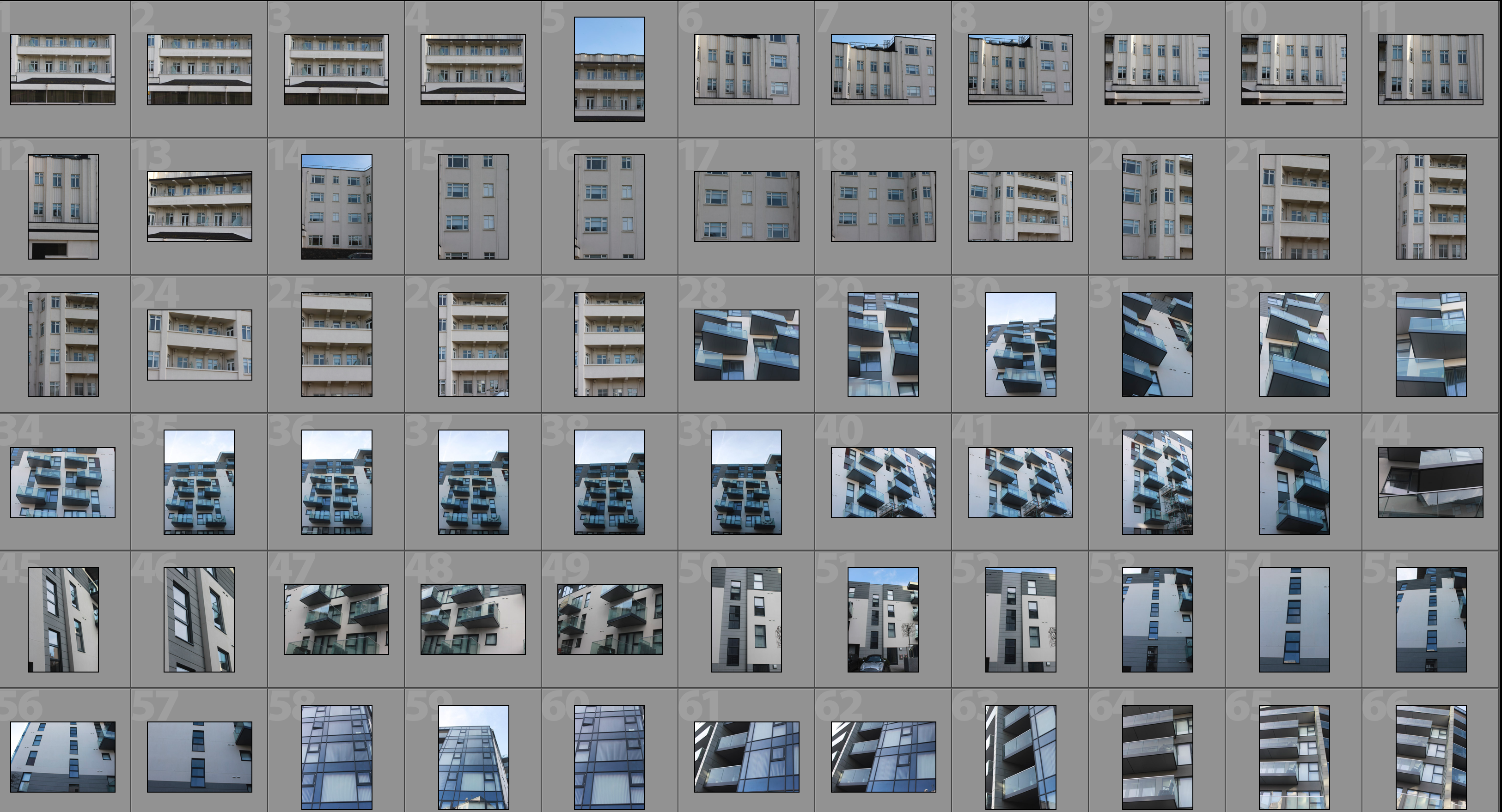
This shoot draws inspiration from Lewis Bush’s ‘Metropole’ as well as Michael Wolf’s ‘Architecture of Density’ and aims to show some of the repetition and symmetry in blocks of flats and offices whilst at the same time showing the difference in designs between buildings.  Going into this shoot I had the vision of photoshopping the photographs that result to create compositions that are full of patterns and are illusion-like.  Lewis Bush’s ‘Metropole’ came to me as an inspiration because it explores the fact that there are an increasing amount of large buildings for offices or flats taking away from green land and so the landscape in which we live is turning into a repetitive view of similar flats and offices leaving citizens with a feeling of monotony as everything is being redeveloped to serve the same purpose.  Bush’s work on ‘Metropole’ shows a lot of emphasis on the repetition between buildings and I have tried to replicate this in this shoot. Wolf’s work has inspired me as he essentially does what I am attempting to do in this shoot but on a much larger scale by photographing the density of high-riser apartments in Hong Kong.

One way in which I could develop on this shoot in the future is by looking at typology, which would involve me researching Bernd and Hilla Bechers, of high rise buildings in Jersey.  I could approach this by finding the 14 high rise apartment blocks in Jersey and photographing these in a similar style to this shoot and then creating a typology page of these different buildings.

Contact Sheet

Edited Photographs

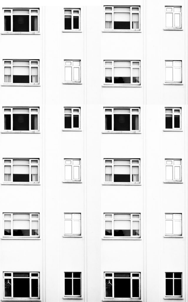
After going through all of the photographs that I produced on this shoot I selected some of the best that I could edit.  I edited these photographs by putting a black and white filter on in order to allow the viewer to focus on the shapes within the photographs rather than the colour.  I then used a perspective crop on the majority of the photographs in order to make the photograph completely straight on in order to further emphasise the symmetry and patterns within the photographs.  As well as the black and white filter I increased the contrast, used high highlights and whites, used low shadows and blacks and adjusted the exposure accordingly to create a composition that is mostly over exposed but the features such as the windows are emphasised to help the shapes within the buildings to come forward.

Edits

After editing the individual photographs I brought the photographs into a blank photoshop document and duplicated it.  After the duplication I then messed around with the layout of the multiple photographs to create illusions that show lots of repetition and some symmetry.  The result is montages that emphasise in blocky shapes and use a black and white filter to bring contrast into the photographs.

#1

#2

#3

#4

#5

#6

Analysis

I captured this photograph in a natural lighting in order to bring out the natural shadows and shapes within the building that I was photographing.  There is a wide tonal range due to both the nature of the building and my editing to the photograph.  The bright whiteness in the walls of the photograph contrasts greatly with the dark black shadows on the balconies.  I took this photograph on a bright day where there was plenty of sunlight so only needed to use a low ISO of 100 along with a shutter speed of 1/60 to capture this photograph.  The low ISO paired with the quick shutter speed allowed for the photograph to be as high in quality as possible as well as not being overexposed (even though I edited the photograph to increase the exposure.  I edited this photograph by using a black and white filter to bring out the shapes in the windows as well as the shadows and then I increased the contrast, highlights and whites whilst reducing blacks and shadows to create a composition that had high contrast between the black and whites.  A depth of field of f/16 was used to capture the photograph which can be seen as the whole of the photograph is in focus.  The photograph has a slightly cold colour cast to it due the bright whiteness throughout it.

I opted for a black and white filter over a colour photograph as it helped to bring out the details within the buildings, especially the contrasts as well as a wide tonal range to create a more dramatic composition.  Due to the deep shadows and edges within the photograph as well as the editing of the photograph the composition has a 3D effect as it appears to have different layers which bring the photograph to life.  There is also a lot of patterns and repetition within the photograph, which I aimed to create when setting out on this shoot.  I have placed the balconies on the two horizontal lines of the rule of thirds as I feel that they are the most interesting parts of the photograph so placing them along these lines creates a more interesting composition as well as helping with symmetry.

The aim of this shoot was to create a set of photographs that showed the repetition of shapes within blocks of flats and offices and how this repetition can be aesthetically pleasing.  The overall results shows how even though there is a lot of repetition within individual buildings, each building has its own unique characteristics and shapes and therefore have variance.  The inspiration for this shoot came from photographs of tall tower blocks in cities such as Hong Kong where each floor and flat are almost identical, which is perfectly demonstrated in Michael Wolf’s work as well as inspiration from Lewis Bush’s ‘Metropole’ in which he looks at the development of buildings through a double exposure technique to create a similar outcome to what I have done.

The concept behind this is that there are an increasing amount of these large and repetitive buildings that make way for office buildings or flats due to the ever rising population and urban migration.  The photographs resulting from my shoot show just how repetitive these buildings that are taking space from nature really are and reflect the idea that some residents may believe that the landscape of cities including Jersey is becoming repetitive and monotonous as lots of land is being taken to serve the same purpose of housing or offices.