This is my final layout for my photo book:
Adding Cover To Books
Once I had looked at the compositions of the fonts and colour of the covers I came to a conclusion of the designs I wanted and proceeded to use them on all three books. Like the compositions I made sure to leave the overall theme of design the same throughout each of the covers as I wanted to enforce the idea of them containing a different style of photography with the same overall theme. Here are the results of the designs and my thought process behind them:
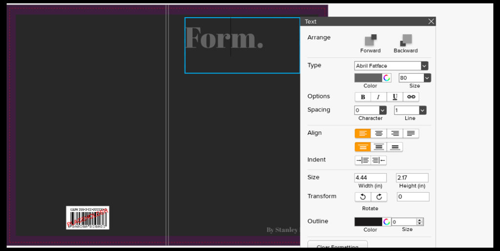
For the fonts on the covers I decided with Abril FatFace, this is because it created a formal font which contrasted well against the grey backdrop and produced an outcome that I had seen present in most of the minimalist abstract covers. Colour wise I went with a lighter grey to the grey used on the cover due to me wanted to blend them together to some degree and prevent the text from becoming too overpowering. This led to my choice of using font size 80 due to how it didn’t take up a huge amount of space in comparison to the rest of the page, but how it also made use of the negative space surrounding it which it used to its effect.

For the font for the authors name I once again went with the same font as the title being Abril FatFace. This is because I wanted consistency throughout the cover and matching all text to the same font was crucial to this. Regarding the font size I went with a size 18, this is because unlike the title I wanted to leave the authors name more or less unnoticed due to how it didn’t provide any relevant information on the subject within each book.
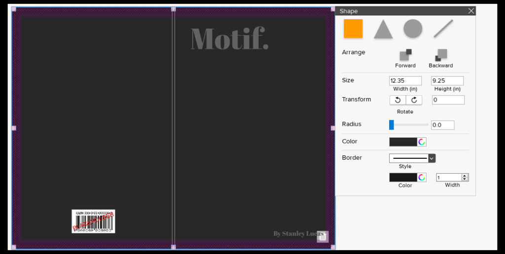
Finally for the backdrop I had created I’d used an enlarged grey square which stretched across the cover. To accompany this I experimented with a variety of colours such as blues and browns present in the books to discover what would work well against the title and fonts used. My outcome was a dark grey that was borderline black, I selected this because of how I found it to be relatively neutral in disclosing what would be inside the book with only the title giving it away, which as a result allowed for the books to work together as a trilogy, stopping designs clashing which could occur when putting them into sleeves.
Final Photobook and Evaluation
A link to my photobook:
Visceral




Analysis of Photobook and Evaluation
In conclusion, I think that I have explored the concept of variation and similarity successfully, developing my ideas thoroughly and consistently throughout. I started off my project with the intention to explore ideas of sublime and beauty within nature, focusing on emphasising light and fragility within the natural world. I wanted to able to express an emotion through my photos, whether that be using shapes, shadows, reflections and light. I explored the work by the Japanese photographer Rinko Kawauchi as I liked how she photographs things that are ‘ephemeral’, addressing concepts like life and death in her work and how photographs everyday situations and objects and emphasises the beauty that most people wouldn’t notice. I tried to take inspiration from this in my first photoshoot where I focused on emphasising the soft shapes and patterns I found in nature, as well as the fragility. This shoot inspired me to keep photographing emphasisng the fragility and nature, but to also build on this linking it to spirituality. I experimented by making videos of the movement in nature and focused on sounds created in the natural landscape which I think was effective in building my concept of spiritual qualities and energies in nature. I then started exploring the artist Wassily Kandinsky, specifically his book named ‘Concerning the spiritual in art’ and his theories on shapes and colour. “This essential connection between color and form brings us to the question of the influences of form on color. Form alone, even though totally abstract and geometrical, has a power of inner suggestion.” He states that shapes have spiritual value which is something I wanted to draw on in my images. I took inspiration from Kandinsky theories in my next photoshoots, particularly photoshoot 4 and 5, and decided that I wanted the concept of warm and cool colours to be a main element in my project. I think that my fifth photoshoot was my most successful as I think that the images produced represent the concept of my project well, where I focused on light, textures and movement, as well as warm and cool colours, expressing the interconnection between aspects of nature and humans. Towards the end of my project I wanted to add another type of image to my collection of images, and discovered the photographer Anna Atkins who was the first woman photographer to make a photobook. The type of image was a camera-less photograph which I decided to interpret. I wanted to create and portray them in a way that is different to how they were seen in the 1900s when they were first created, which was scientifically. I wanted to emphasise the spiritual quality through the fragile and round lines of the objects on top of the light sensitive paper. I thought this was effective which is why i decided to include some of the photographs inside my photobook, and also as some of my framed final prints.
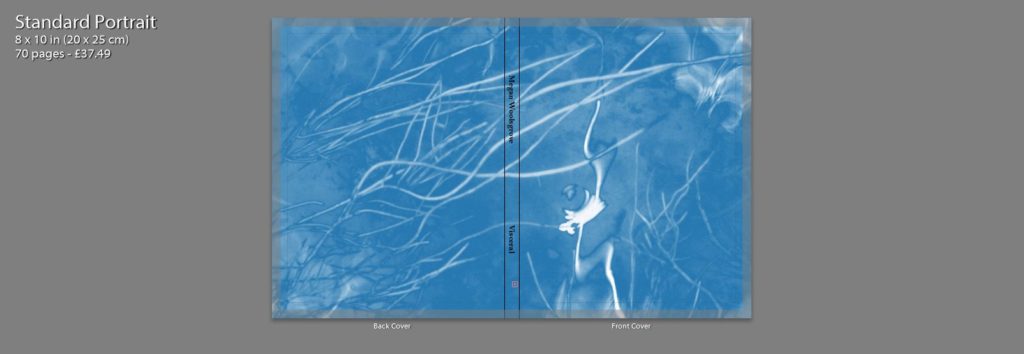
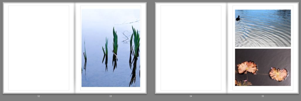
For the front cover of my photobook I decided to use one of my digitally edited interpretations of a cyanotype as I think this image indicates to the reader the spiritual nature of this photobook and it’s focus on the natural world. I like the pale blue colour that contrasts to the white of the plants and ripples in the water, as they’re soft colours that reflect the delicate features within the book. It also links to the physical photograms that will be included in the book, having a similar appearance. I decided to wrap this image around the front and back cover of the book as I think it works best full page, and by reducing it so its smaller on the page, it wouldn’t be as powerful. This is a difference between mine and Rinko Kawauchi’s photobook cover, where she included two smaller separate images on the front and back. The first page inside the photobook has the title: ‘Visceral’ in the middle which i chose as it is ‘relating to deep inward feelings’ which i think links to the spiritual nature and energy of my project and how nature provokes emotions within humans. The first double page spread displayed one image on the right side of the page. I wanted to start the book of simplistically and think that by displaying this image singularly of water falling emphasises it. I chose this image as the first one as I think the centred picture of the drops of water falling has the appearance of a peaceful and undisturbed landscape, starting the book off with a tranquil image that emphasises texture and beauty. On the next double page I also only included one image on the right side, but this time made it a full page image. I chose this image as I think it links to the first images through the ripples and textures on the water, but also looks at abstract colours and shapes. This is through the reflection of the person in the water, which isn’t noticeable a person. It also links to the first image through the branches in the foreground on the image that are out of focus as the first image also shows a section of a plant in top right in the foreground. The next double page spread I decided to use an imagoes both of the pages. The first is a full page image of koi fish, which I particularly liked as it shows the movement of the fish through the ripples in the water, linking the previous image. I think that is is a powerful image as the orange of the fish is greatly contrasted against the black of the water. I think displayed a landscape image of a closeup angle of a leaf, with the background of water. This links to the koi fish image as leafs also orange and both have the background of water. The next pages I have left blank in my design as I intend to physical insert the photograms that I made in envelopes on these empty pages. I think this will give my photobook an interactive aspect the will intrigue the reader by making them have to physically open the envelopes. I have left four blank double page spread throughout my book to put in the photograms.
I decided to use my landscape image of a tree as my first double page image as I think that this emphasises the detailed patterns of the branches that may not be as noticeable if it were smaller. I like how the trees in the centre of the image, so the tree trunk id along the spine of the book and the branches are coming out diagonally onto each page as it creates an interesting composition. On pages 14 ad 15 I used a zoomed in image all a full page image of the ripples on the water were i have reflected the light and have contrasted this with an image of a tree taken through the reflection of a puddle. I think that these images links as they are both focusing on the light and patterns in water. In the first image you can see branches in the foreground which are out of focus which links to detailed branches of the tree in the reflection. Pages 16 nd 17 I added another double page spread of a closeup image of a plant where i have emphasised the warm colours and the light. I think that this is the most effective double page spread through the bold colours ranging from yellow to red on the leaves. On pages 22 and 23 I decided to contrast the cool green colours leaves, with the warm orange tones of the koi in the water. Although these image contrast each other, they are also like through the rounded shape of the leaves in both the image, the second being a lily pad hiding the fishes face. I think that these pages are effective and stand out through the use of bold colours, I used this combination to keep the reader interested. I then displayed an image of mould which i edited to be a soft pink colours on double page spread. I like this image as it took something which isn’t normally considered nice to look at and changed it into something aesthetically pleasing. I also like how the textures and emphasised even more though the edit which is why I decided to display across two pages. Another double page spread that I think is effective is on pages 30 and 31 which I think this has a different appearance then the rest of my images. I like how the dark background of mud emphasises the reflection of the sun in the puddle, making it seem as though this picture was taken at night time when it wasn’t. I think this image is another example of photographing something which isn’t considered beautiful, puddle in mud, and making it aesthetically pleasing. I continued my photobook with combinations two images across two pages and wth double page spreads. At the end of my book i left space for my to insert a photogram. I think this is good way to end the book as it focuses on a different type of photograph that I have physically created, still relating to the spiritual qualities of nature through the delicate lines and shapes.
I think that my photobook is a good representation of my work in this project, the images showing the final outcomes of my developed ideas. By using both natural landscape and camera-less photograms I think this successfully links to my concept of nature relating to spiritual and personal connections. Photographing natural landscapes I think developed my ideas and theories from my last project and made me produce work to a higher standard a having more knowledge of techniques and contextual references.
Constructing diptych and triptych (Nadav Kander inspired)
As well as being great story-telling devices, diptychs, triptychs are visually pleasing and help make use of photos that may not work on their own or perhaps enhances a single image with the method. There is no right or wrong when it comes to these composites so my main aim was to use the method with single images as appose to using multiple images. This idea was inspired by Nadav Kander’s work that I have previously looked at. I am inspired by this method and think it enhances the viewers appreciation for the image due to the fact it is constructed into two or three separate images instead of only one.
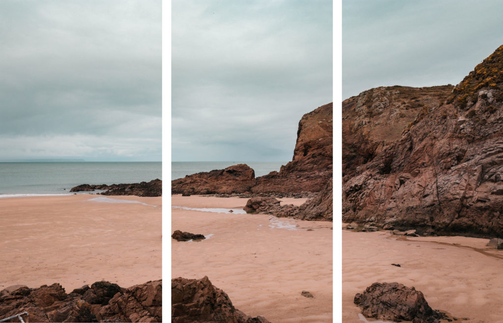

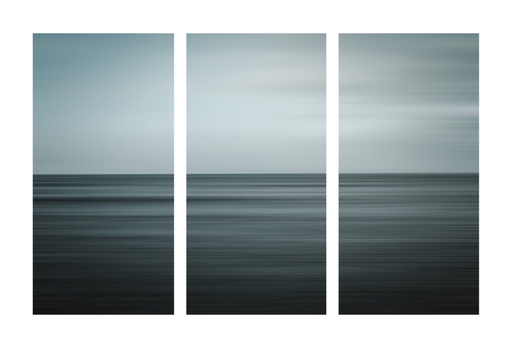


I think that this method of presenting my work, implies the passage of time and timelessness, echoing the oceans perpetual cycle of change and renewal. This idea also reflects how the view we are looking at has been experienced by many of our ancestors despite the change in time period. This shows a sense of underlying beauty in what otherwise would be a rather boring landscape, linking to my studies on zen Buddhism. The notion of time created emphasizes how the landscape is always changing and brings a focus to the external factors that i have tried to portray in this project such as lighting and weather change.
Link To Photobook
This is a link to my complete photo book.
Magazine plan and Layout
How do you want your book to look and feel? I want my book to look and feel like a common fashion, beauty and lifestyle magazine, with glossy pages and masthead on the cover.
Format, size and orientation: portraiture/ landscape/ square/ A5, A4, A3 / number of pages. I will have the format as a portrait Just smaller that A4 size with around 25-40 pages
Binding: soft/hard cover. Image wrap/dust jacket. Saddle stitch/swiss binding/ Japanese stab-binding/ leperello. It will have a soft gloss cover to fit the conventions of a popular magazine
Cover: linen/ card. graphic/ printed image. embossed/ debossed. letterpress/ silkscreen/hot-stamping. The cover will have a printed portrait images which is distorted similar to the other portraits inside. It will also have a masthead of “UGLY” which is a controversial word which is used as a label for people not seen to conform to beauty ideals. It will also have a cover line to introduce it and add context to the title.Title: literal or poetic / relevant or intriguing.
Structure and architecture: how design/ repeating motifs/ or specific features develops a concept or construct a narrative. I will repeat similar page structures throughout the magazine to give it momentum whilst looking through it. This will reduce the chances of it being repetitive.
Images and text: are they linked? Introduction/ statement / use of captions (if any.) I am creating text to overlay over some of my close up images, this text will have various meanings and will link ti the idea of perfection and beauty.


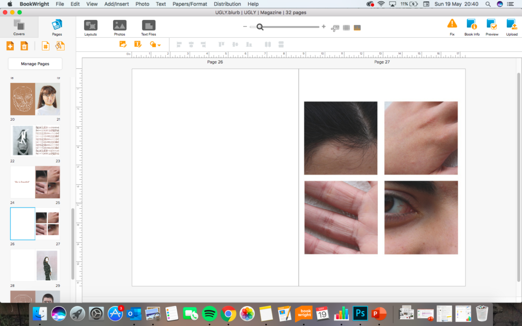


I have chosen this font for the repetitive text because it reminds me of computer code that is used to control and power phones and electronic devices. I have done this to comment on the idea that modern technologies have made pressures on beauty much worse for example social media enforcing ideas of on the ideal body image through influencers and celebrities.


EVALUATION
Over the ‘Variation and Similarity’ Project I have explored photographers, artists and movements that have inspired me when creating my photography and led me to create a final pieces that represent my theme and have had a successful outcome. I Started off with my project focusing on the power of a brand looking at commercialism which then lead me onto looking at Commercialism of which i infused with Typology photography as well as looking at pop art, inspired mainly by the Becher’s photography and Andy Warhol artworks.
When I first approached the topic ‘Variation and Similarity’ I had the idea that I wanted to look at Commercialism and Consumerism as a theme to explore how Brands and products make up everything that we do in our everyday lives. I started this looking at an interesting way of exploring this which was to show how brands end up becoming part of everything and are everywhere to represent this in my photography I created a night-time shoot in a woodland area where i projected brands into the landscape to represent how people are consuming brands so much that they are loosing or forgetting the outside world around them. I experimented the images i took creating GIF’s as well as editing their colours to give asthetic qualities to the images.

These images were successful, however i thought that i could explore this project in another way which was more obvious with the message of consumerism behind it. After Looking at the Becher’s for their Typology I realised that this would be an interesting way to incorporate into my work. I then also explored the pop art movement looking particularly at Andy Warhol and his prints of the ‘Campbell soup tins’ which then led me onto the idea for my next shoot. After this i decided to photograph lots of different products that would be found in everyday homes. To keep the images focused on the products I photographed them with a white background so that it was only the products with a clean background. This fit with the theme of commercialism perfectly as it highlighted the brands which would just be consumed without much recognition of the actual product. In the editing i experimented with typologies as well as creating pop art within photograph editing the hue colours of the images. The overall outcome of this final outcome of this shoot clearly fits with the exam theme ‘Variation and Similarity’ as it shows the variations between the products in the way they are produced to fit to the demand of consumers as well as showing the similarity between the way they package their products.
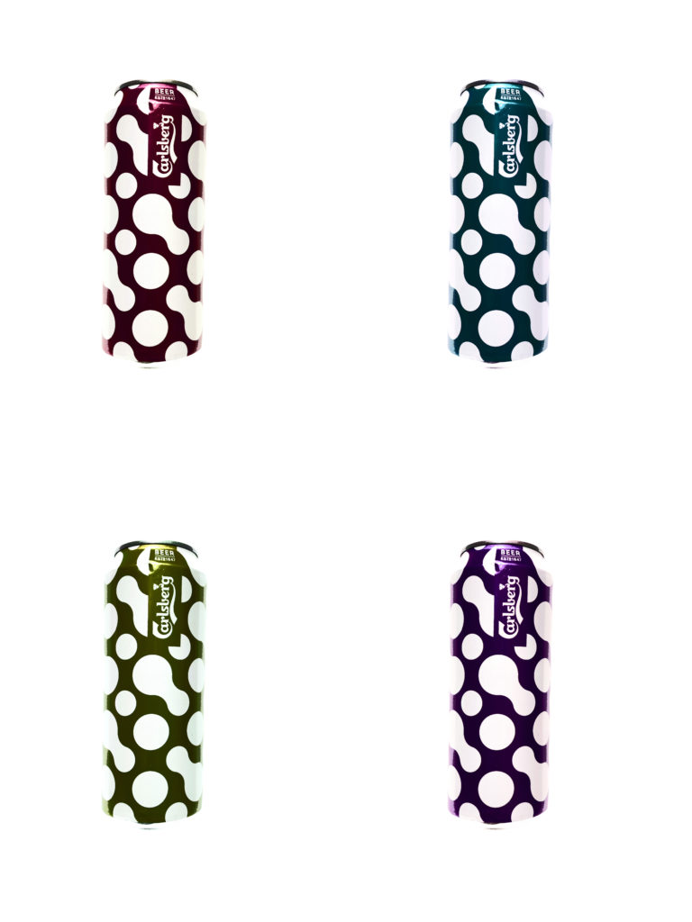
Concluding my project, I believe that my work successfully represents the Exam topic ‘Variation and Similarity’ which is visible in my final outcomes. I feel that my final outcomes and presentation shows an aesthetically pleasing view of everyday products and brands that we all consume without realising and they bring a closer view of these products to the consumers. The use of very vibrant Images as well as presenting the opposite of black and white images shows two different dimensions to the products.
Book title choice
For my book, I have decided to entitle it ‘Moonscape’. Due to the content matter and what I am presenting to my audience through my photographs, I feel it is quite a suitable title and a title that has meaning. Despite my images aren’t actually of moonscapes, it will bring surprise to the audience which will stimulate thought processing of how the moon affects tidal movement. The main idea behind titling it this is because I don’t want to give away the content matter through the front cover. Also it has significant meaning with the scientific way in which the moon effects the ocean movement which is a key idea within my project.
Official definition of the word : a landscape resembling the surface of the moon, especially in being rocky and barren.
Wikipedia explanation – A moonscape is an area or vista of the lunar landscape, or a visual representation of this, such as in a painting. The term “moonscape” is also sometimes used metaphorically for an area devastated or flattened by war, often by shelling.
Scientific explanation :
While both the Moon and the Sun influence the ocean tides, the Moon plays the biggest role because it is so much closer to our planet than the Sun. In fact, the tidal effect of the Moon on Earth is more than twice as strong as that of the Sun, even though the Sun’s gravitational pull on Earth is around 178 times stronger than that of the Moon. The gravitational force of the Moon and the Sun pulls the water in the oceans upwards making the oceans bulge, which creates high tide in the areas of Earth facing the Moon and on the opposite side.
At the same time, in other parts of the planet, the ocean water drains away to fill these bulges, creating low tides. However, the oceans’ water is also constrained by the continents and varying ocean depths. As a result, the tides behave more like water sloshing around in an oddly shaped bathtub than in a smooth and even basin.
EVALUATION OF MY FINAL PIECE
Over the course of the ‘variation and similarity’ I have taken inspiration from many different photographers and sources which I think has helped me to produce one of my best works. At first I was looking looking a variety in weather locations and different times of the day. However I didn’t feel as if the topic was push my photographic ability enough. So I felt my choosing a topic that delved into the realms of the sublime was the right choice for my final project as this was a project that I had never looked at before.
Looking back at my project I feel I have presented an interesting alternative insight of the elements/ nature. And how well they work with one another and the sublime beauty of them which would would miss if we didn’t take the time to stop and really look at what is in front of us. But I also feel that this book represents a sense of a journey and a sense of growth, I feel that all of the images are small passing events that one moment are there and the next are not which conveys a sense of movement, which I reflects the work of Rinko who I have been looking at for most of the project.
To conclude I think that my project reflects the topic of ‘variation and similarity’ as I have taken abstract stance of photographing the the elements and presented everyday landscapes in a way that conveys a sense of beauty and life and is a variation of the way that we normally look at the elements. And I have been able to find a similar link between the four elements and convey a sense of unity.
I have decided to present these images separately from the the others as I think that they work well best together as a three rather than be placed with the others, this is because these images are very different from the others and visually don’t work that well together.
In this final display of my project I have chosen three water images, three earth images and two fire images and visually I thought that they worked well and connected together. I wanted this to be the main product of the project as well as the book. I feel as if the book is more of an in-depth view to the elements, where as this poster of the images is a summary and the smoke images are supporting the project. Looking at the images now I see that subconsciously I have picked the image that feature the colour blue very predominantly. I feel that the images work well as a group together due to the cool contrasting tones of the blue which flows throughout all of the image and in a sense connects them all together. All of them are different shapes and textures that work well juxtaposing each other are as well as complementing the other. I printed off the images at a range of different sizes as I thought that it would bring attention to the images which I wanted the onlooker to look at first and then they would get closer and see the small details in the images. In the central and smallest images, there is a bee pollinating a flower, I wanted this to be the center of all of the images, as I feel as if animals are the 5th element of the planet and I felt that it was a nice way to bring the project together
Final Photobook
Here is a link to my final book,


