

The graphics interchange format (GIF) is a bitmap image forma that was developed by a team at the online services provider CompuServe led by an American computer scientist Steve Wilhite on June 15 1987. It has since come to widespread usage on the World Wide Web due to its wide support and potability. Giffs are less suitable for reproducing color photographs and other images with color gradients, but it is well-suited for simpler images such as graphics or logos with solid areas of color.
Below is an example of a GIF
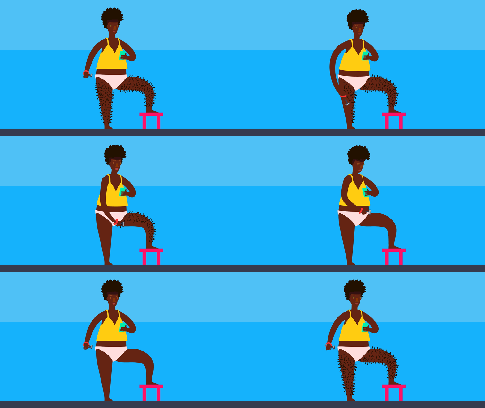
Below is my examples of a GIF


A GIF (Graphics Interchange Format) is a bitmap image format that was developed by a team at the online services provider CompuServe on June 15, 1987. Since then it has been a commonly used image format, usually as an animated loop, on the internet due to its support and portability. This is an appropriate way of creating imagery for this variation and similarity project, as it is a way of displaying typologies (similar objects/frames)
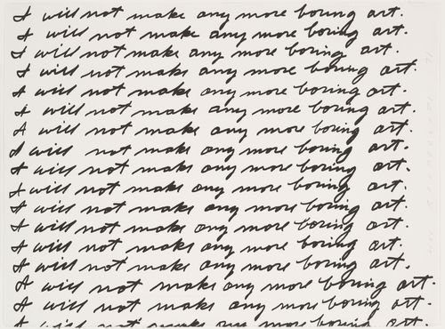
In the early 1970s, John Baldessari made a promise “I will not make any more boring art”. The lithograph image demonstrates his thinking at the time as his interest in Conceptual art developed. The work was created at Nova Scotia College of Art and Design in conjunction with an unconventional exhibition. Baldessari was not present at the “exhibition,” nor at the workshop where the print was made. He simply sent a handwritten page to the students to be reproduced and made a videotape of himself writing the sentence. Prior to the creation of this work, Baldessari, together with friends and students from University of California at San Diego, gathered paintings he had made as a young artist and drove them to a crematorium where they were burnt.
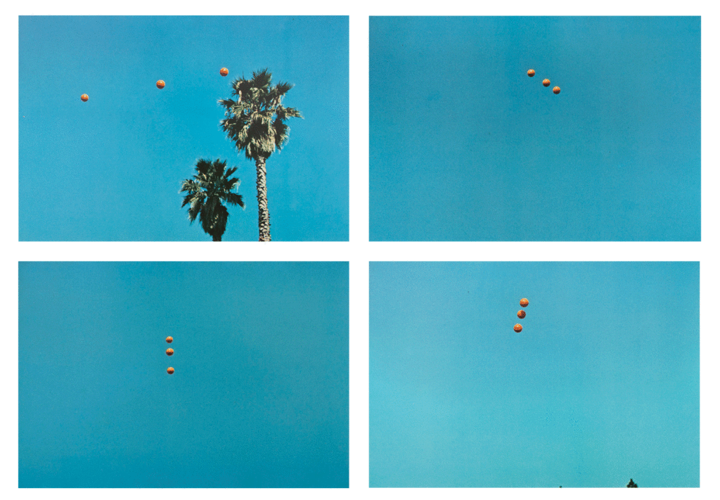
His participation in the conceptual movement lead him to create ‘Throwing Three Balls in the Air to Get a Straight Line (Best of Thirty-Six Attempts)’ in 1973. The images represent Baldessari’s interest in language and games as structures following both mandatory and arbitrary rules. He attempts to fulfill a simple yet arbitrary goal, following rules in a similar manner to a game as structured by the title of his book. There are thirty-six documented attempts in the book–the typical number of exposures on a roll of 35mm film. The resultant images are documentation of Baldessari’s game, but they also border on abstract imagery and bear a resemblance to his later works.
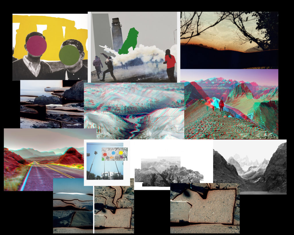
In other works, Baldessari takes archival images, using colourful price stickers to obstruct the viewer from seeing the faces of the people in the image. The viewer is encouraged to analyse other aspects of the image, that would otherwise not catch their attention, such as the clothing of the figures, wealth, era, etc.
“I just got so tired of looking at these faces” – John Baldessari
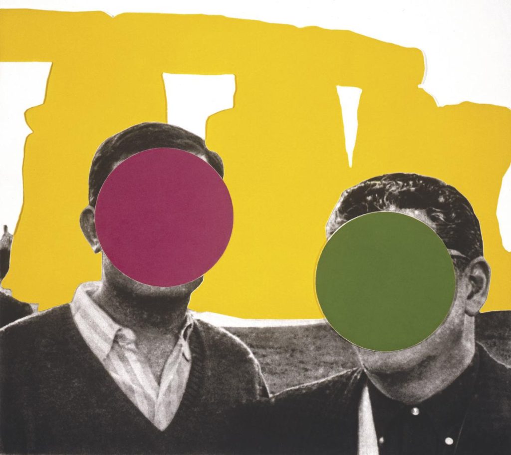
Responses:
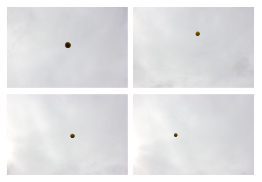
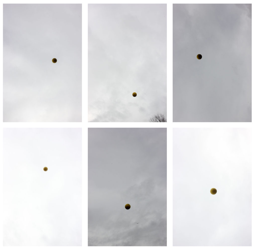
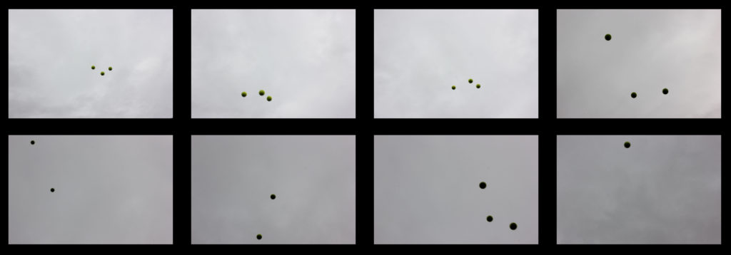
In response to ‘Throwing Three Balls in the Air to Get a Straight Line (Best of Thirty-Six Attempts)’, we took 1 larger ball and 3 tennis balls and took turns throwing them in the air to get a straight line. This was harder than it seemed. The balls were coloured bright yellow or green in order to stand out against the white/grey sky. I found that it was difficult to maintain that the moving items were in focus.
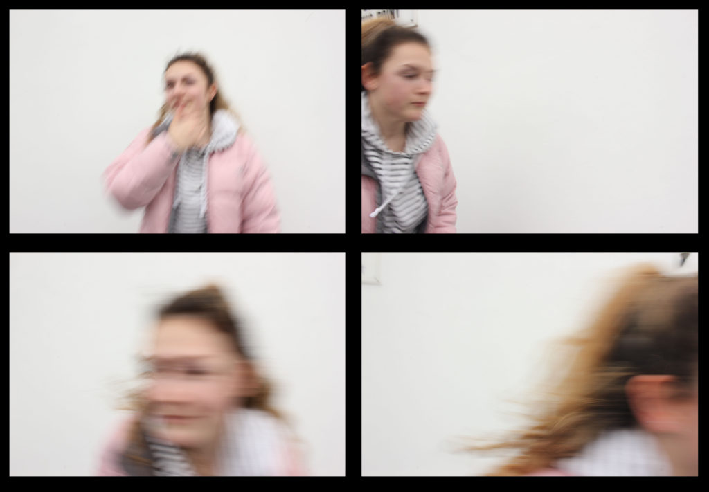
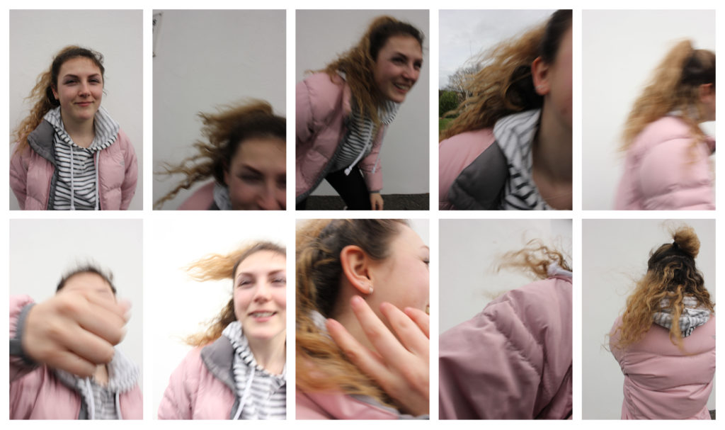
Another experiment we carried out involved dodging the camera. In many of the outcomes, the face of the subject is not clearly seen, reflecting the same ideas of Baldessari.
All images from both experiments were taken with varying shutter speeds of 1/100s to 1/200s to capture the movement of the subjects in different motions.
In a third experiment, we experimented with the use of archival imagery. We used a coin toss to determine where the circles should be cut out on the image.
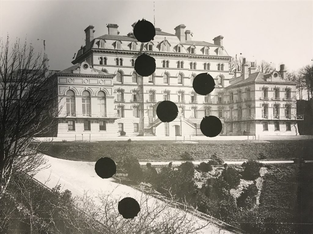
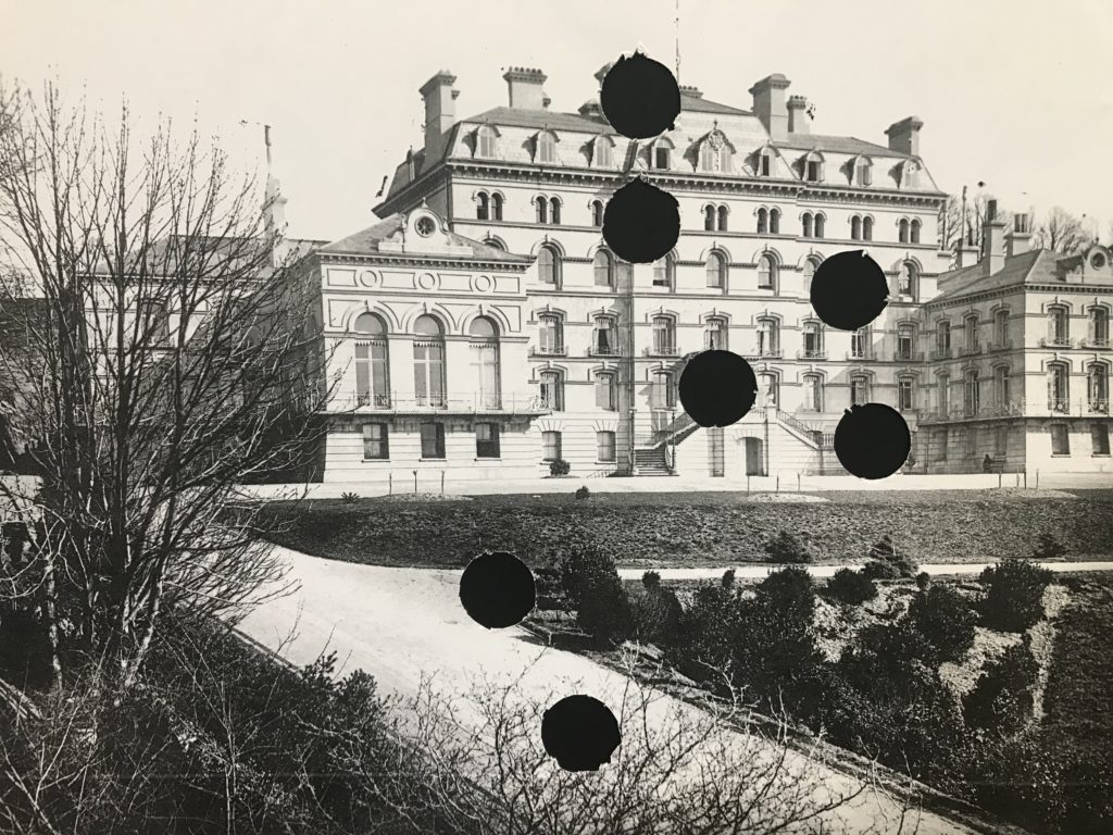
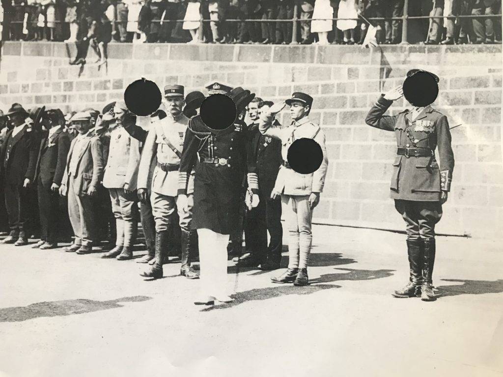
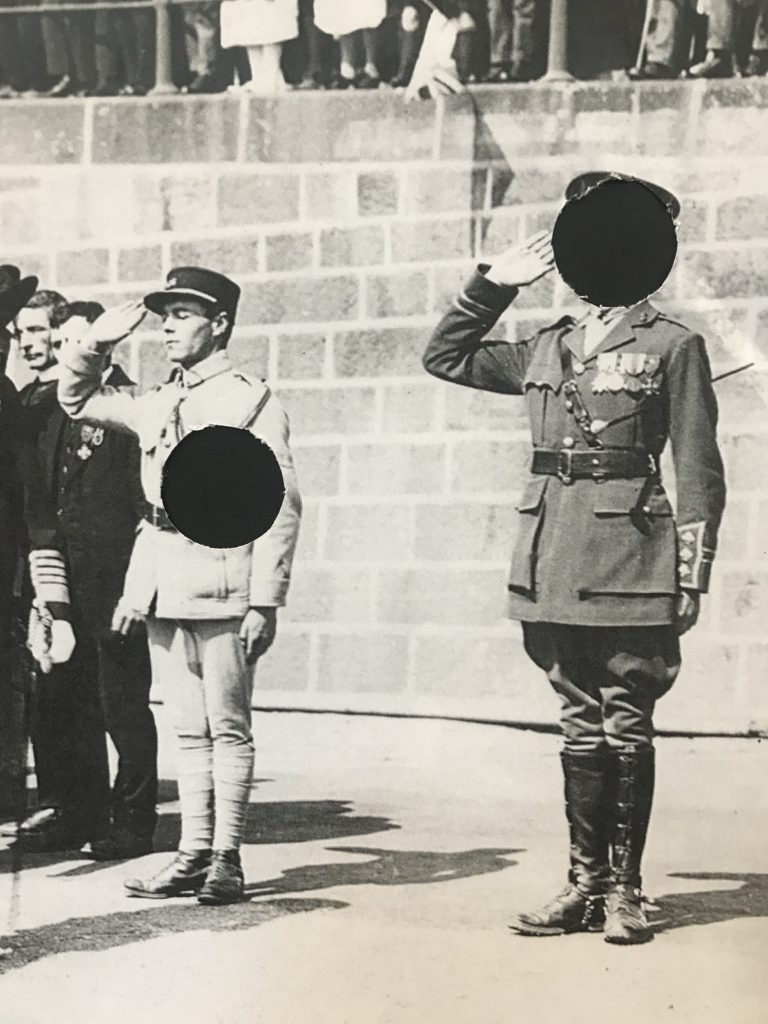
In Photoshop, I edited circles of colour over the already cut out circles. I also painted lines of colour over certain areas where there was negative space.
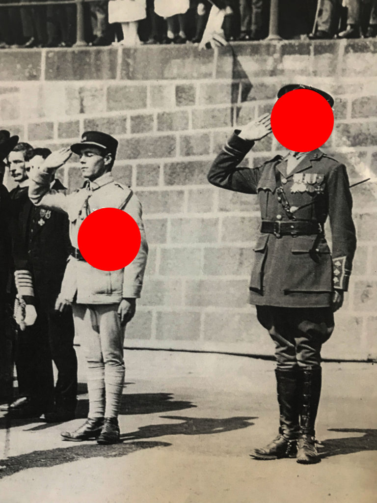
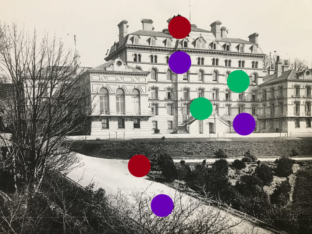
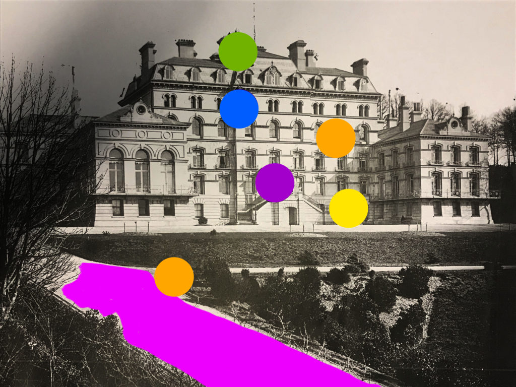
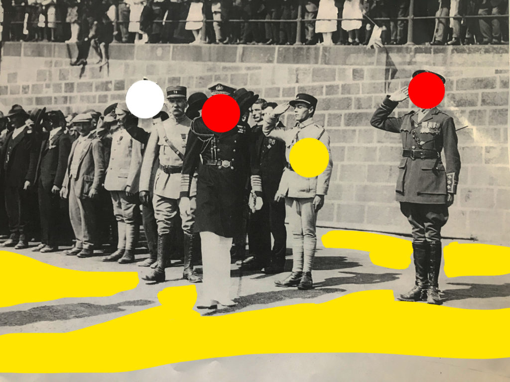
In one image, I used the colours of the Jersey Flag, Red, White and Yellow, as the image depicts Jersey soldiers.
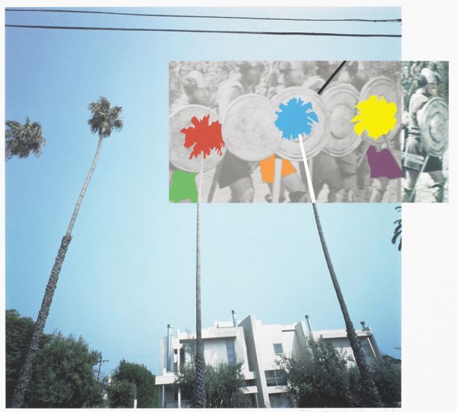
The Overlap Series: Palmtrees and Building, 2001:
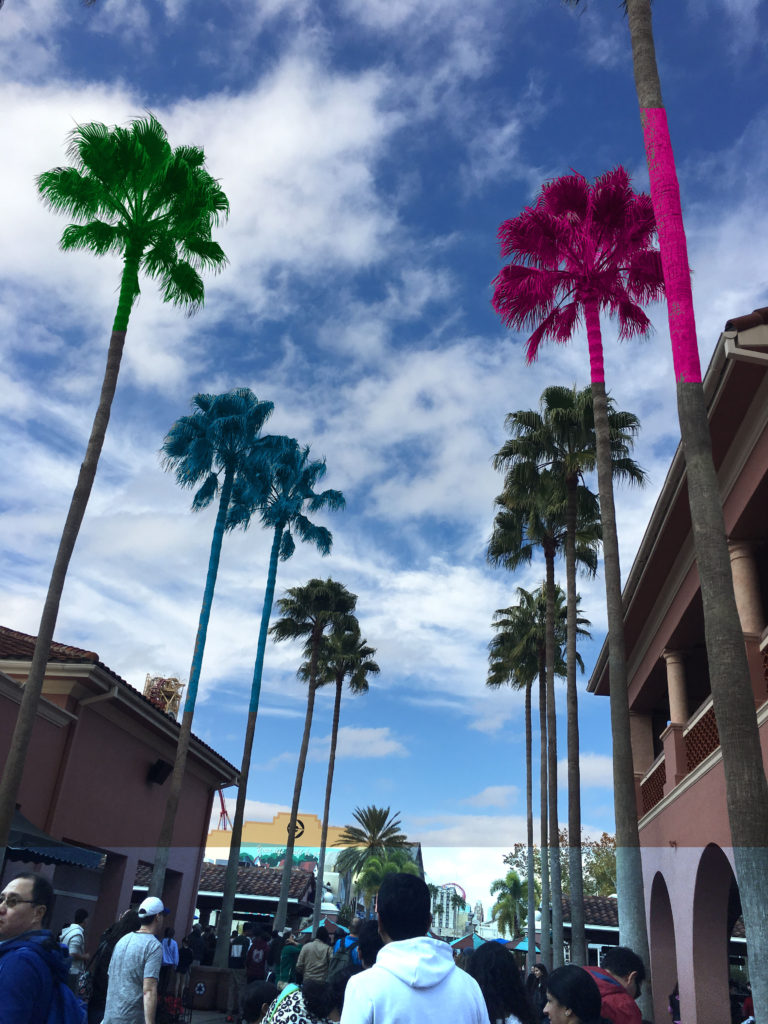
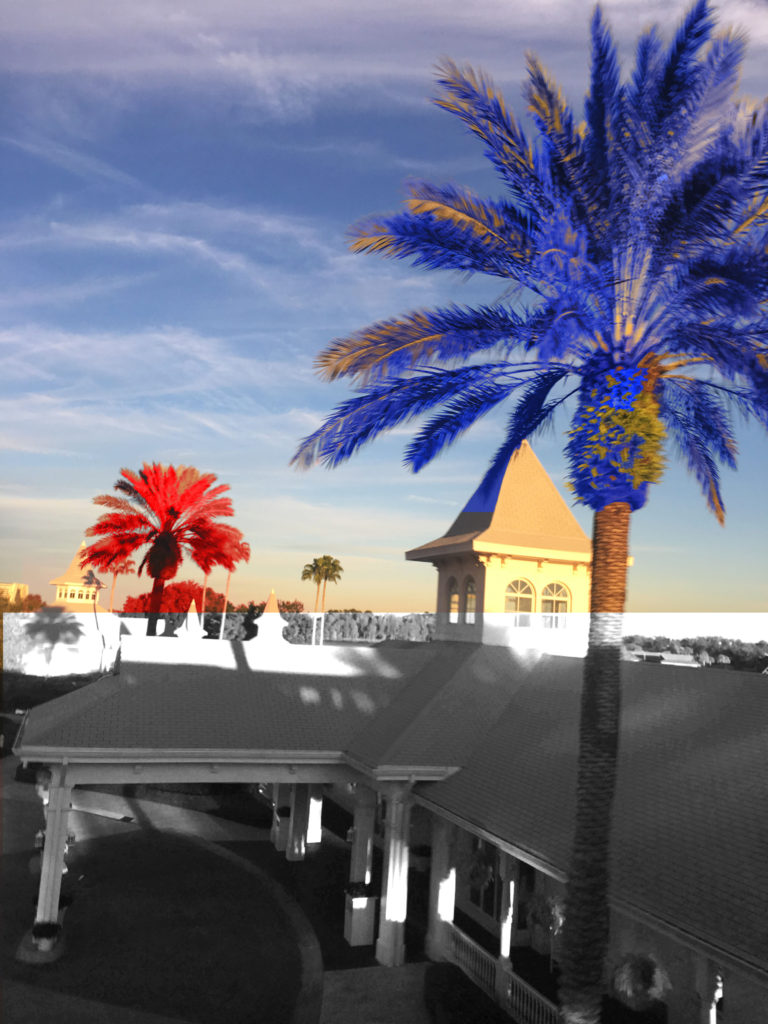
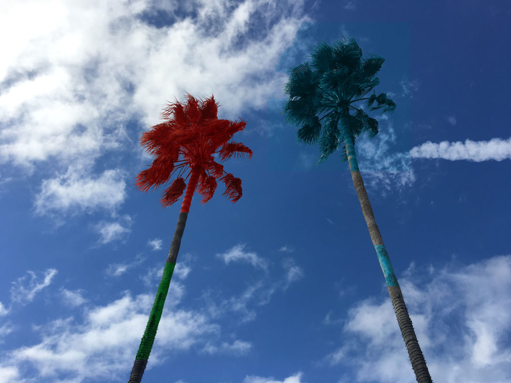
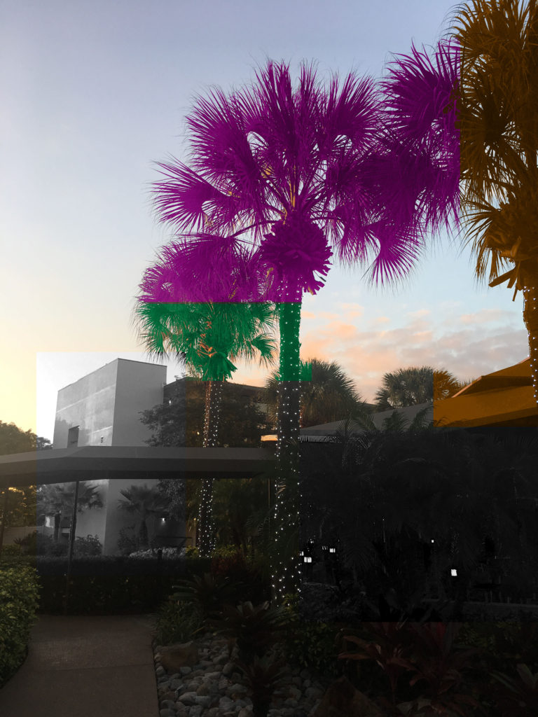
Part of Baldessari’s classic Overlap Series, this piece juxtaposes an urban view of palm trees and a sleek modern building—quite probably somewhere in Los Angeles—with a jazzed up black and white photograph of Vikings, the contemporary colliding with the historical. By extending the palm trees into the space of the smaller monochrome image, the artist ingeniously links the two pictorial surfaces—a classic case of Baldessari montage. I will be responding to this photograph with primary source images I have taken on a recent trip to Orlando, Florida. I was able to gain a collection of photographs of palm trees in Florida, with clear visual similarities to Baldessari’s 2001 Palmtrees and Building. I will be editing these photographs in a similar style using Adobe Photoshop CC.
Primary source images:
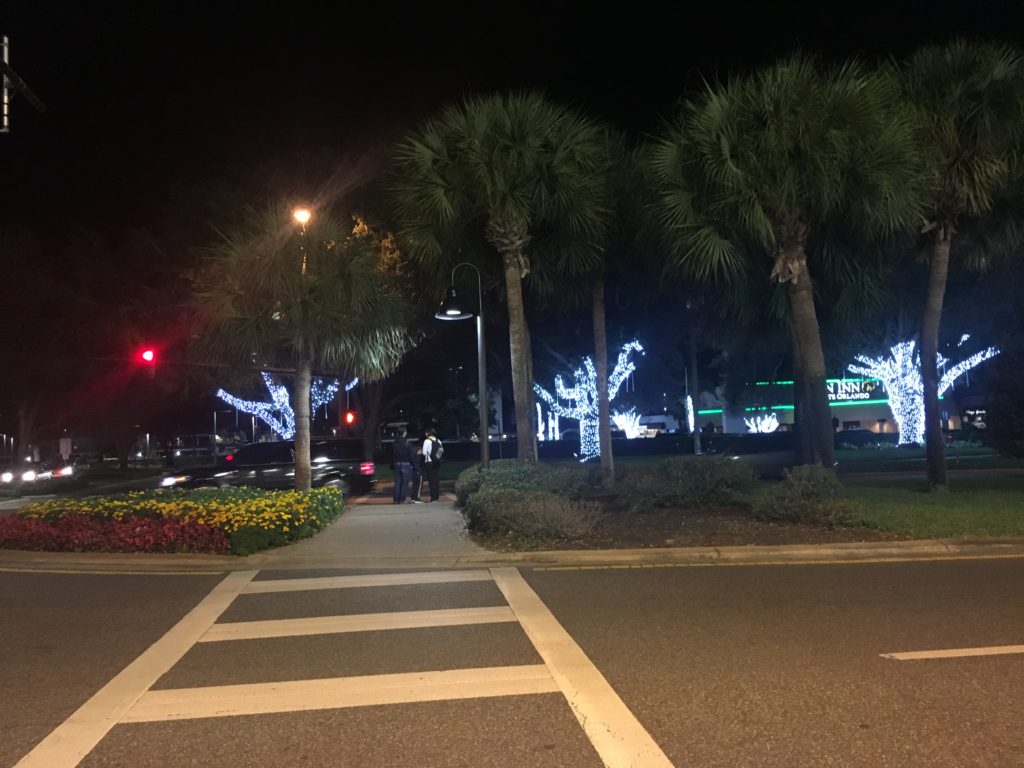
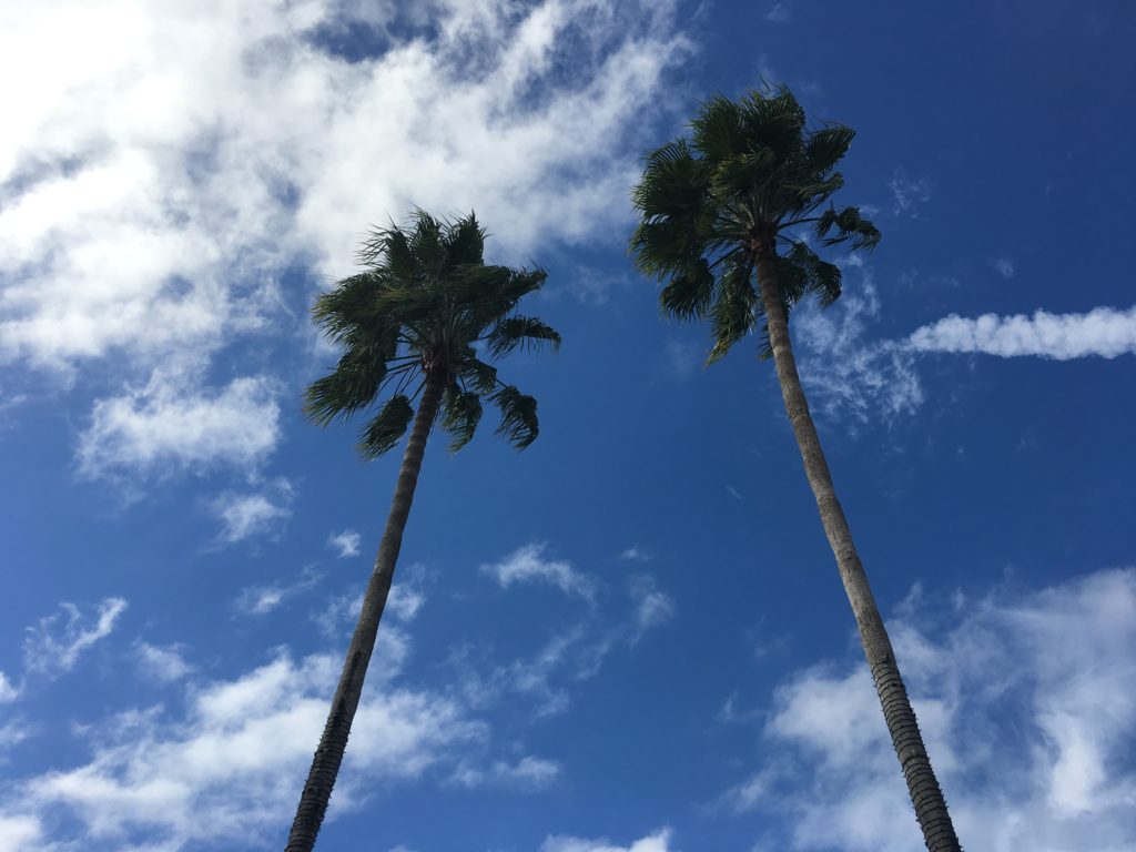
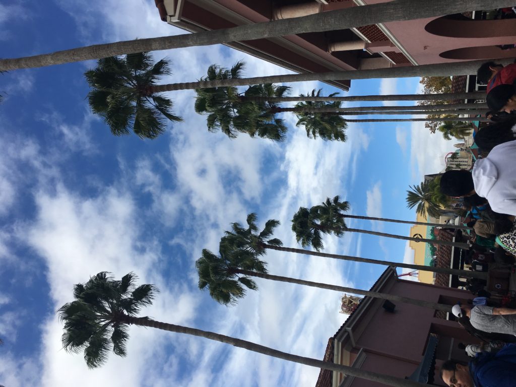

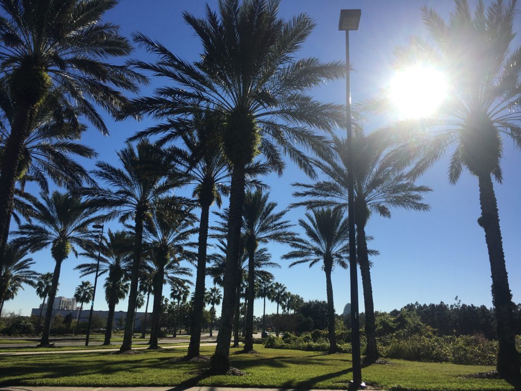
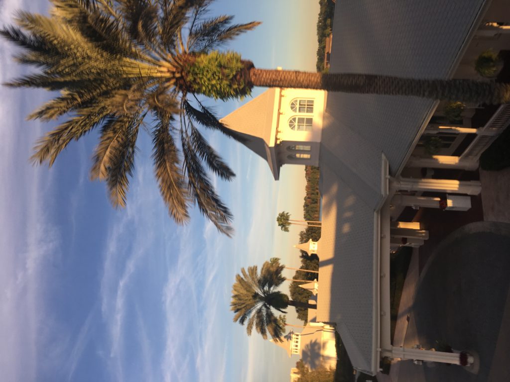
Editing process:
In order to edit my photos in the style of Baldessari, I used the colour replacement tool. I added bold, vivid colours of green, pink, blue, red and orange to 4 of my own photographs. To add the colour to only the select sections I wanted, I used the rectangle marquee tool and guided it over the area of the photograph I wanted. Like Baldassari, I also added multiple sections of monochrome to my images. As a first basis for my project, I am happy with my experimentation. The subject of palm trees correspond to my project aim of photographing the natural world and the variation and sublime beauty within it.
Similarity
some common synonyms for similarity are:
Closeness, comparison, analogy, likeness, association, conformity, homogeneity, identity, parallelism, proportion, relation, similitude, synonymity.
Variation
some common synonyms for variation are:
deviation, variety, fluctuation, diversity, alteration, change, alteration, abnormality, contrast, modification, distinction, dissimilarity, novelty, unconformity.
Explain your process and where your ideas came from RE GIF –Making
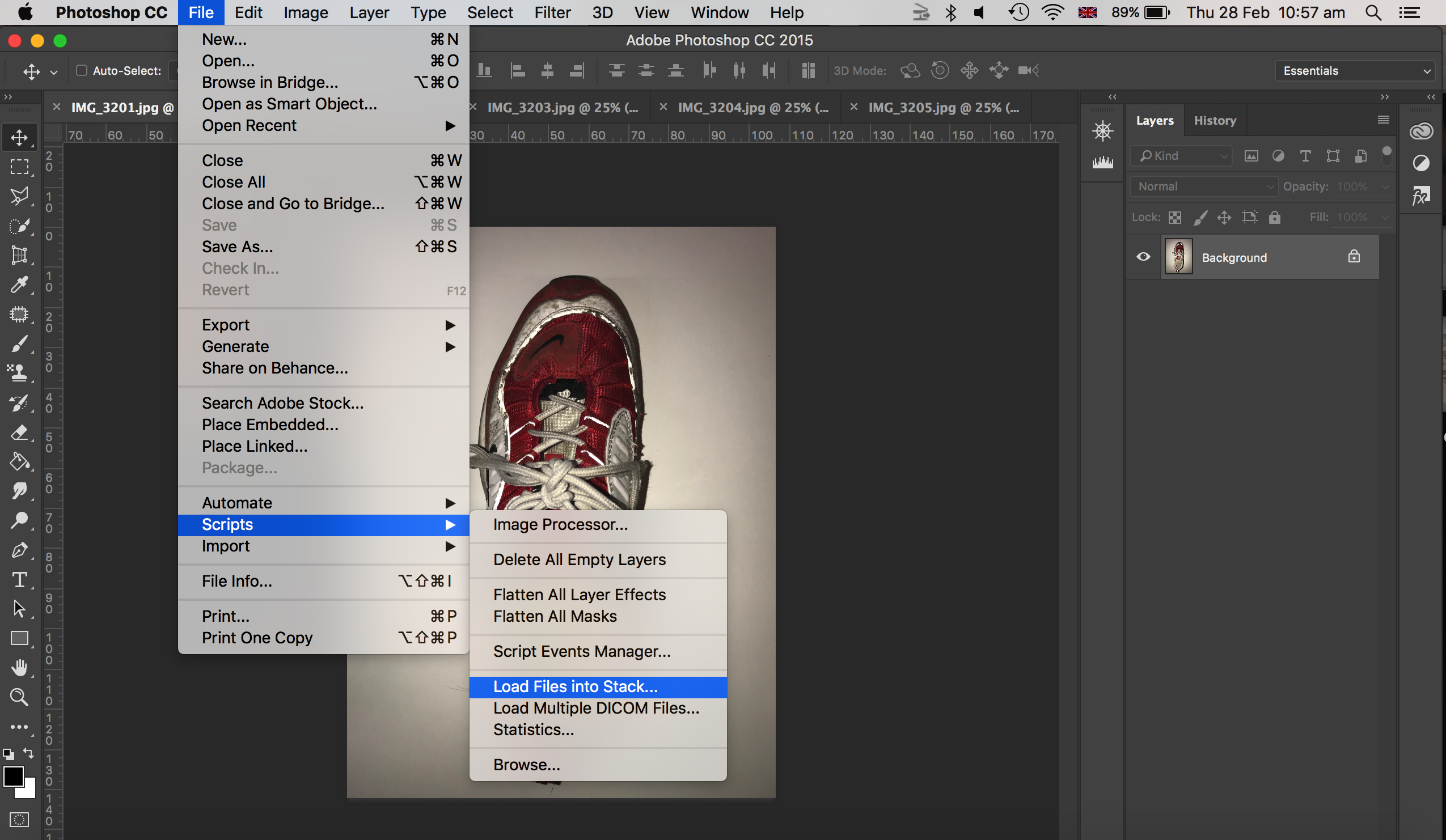
the process of creating a gif: File, Script, Stack, Window- what file , add open files, Okay, Select all layers, Window, Open a timeline, Opens at the bottom, Click arrow to frame animation, Must click it, Me he box in corner, Create new make new, 0 seconds, A delay between frame, How long you want the gif, 0.2 secs, Forever as a loop like a standard gif, File, Export, Save for web legacy, Dialogue box preview, Check file size, 8mg on blog, Might need to trim, In image side bring it down.
• Include your original images to show the starting point of your experiment
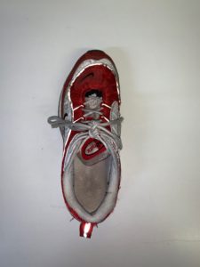
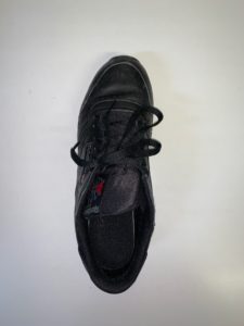
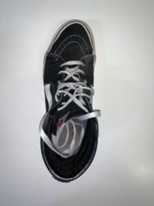
• Define what a GIF is…it’s possibilities and limitations too
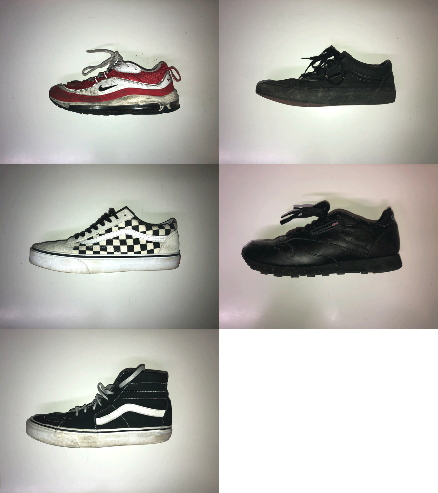

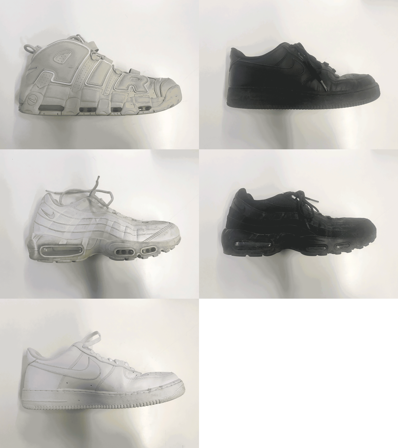
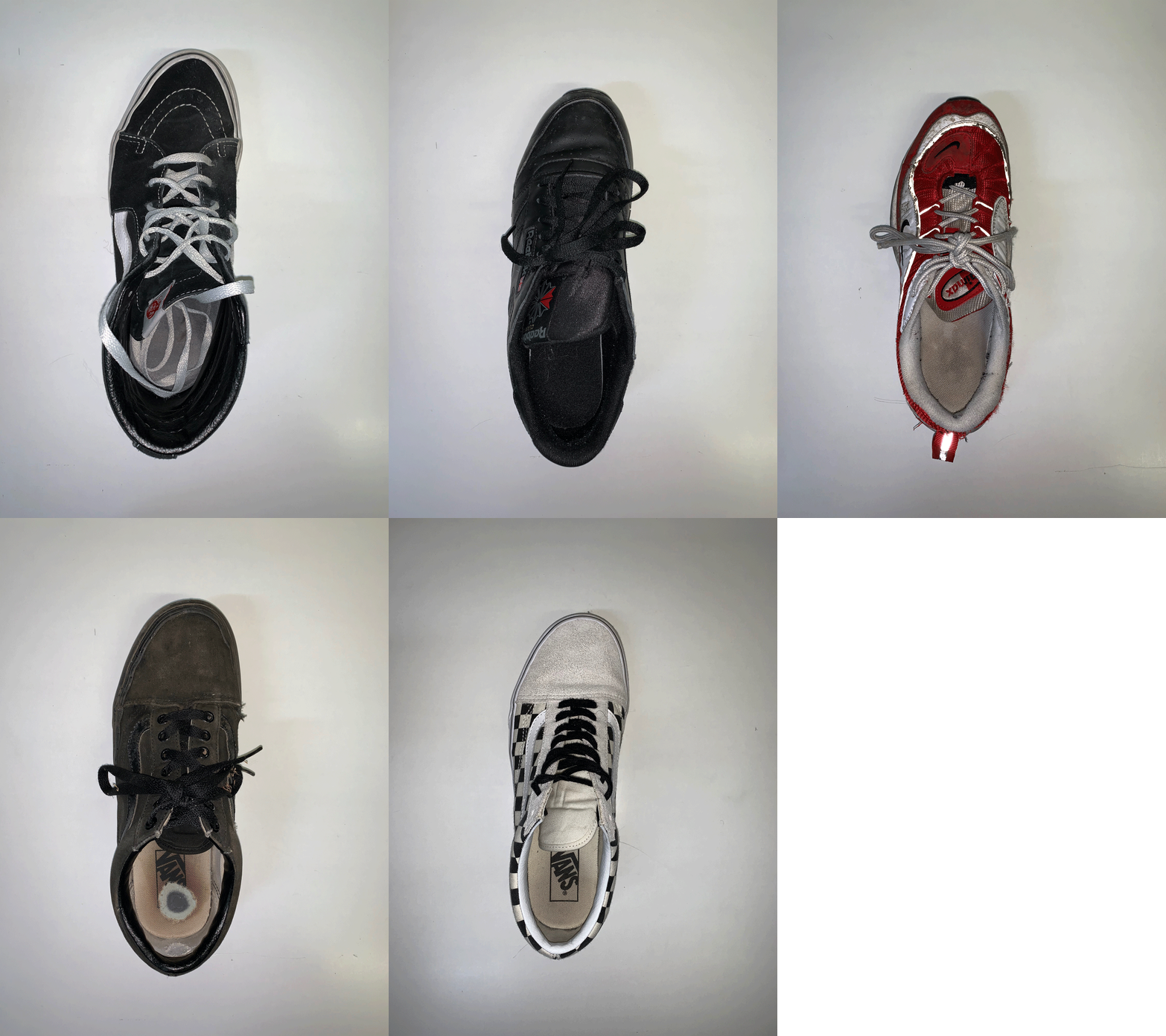
To make this gif, I took a series of images of different shoes as this was an object that are similar. I made sure that each shoe was the left shoe so that they were consistent. I took my images from a face on perspective to create the same type of image. My images I took are below:


To make my gif, I first of all went to file, scripts, and selected load files into stack as shown in the image below.
Next, I went to window, and chose timeline, where this made my image appear on a timeline at the bottom of my photoshop screen.

Then, chose the menu button at the top right hand corner of the timeline bar, and create new layers for each frame and then clicked the same menu button again and selected make frames for layers.
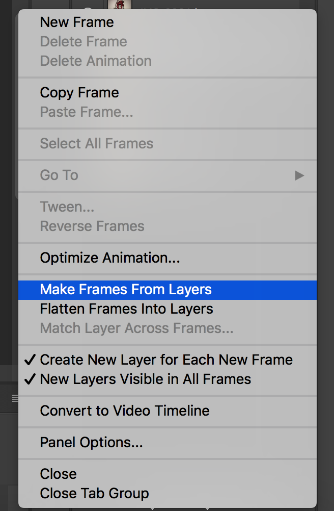
Finally, I chose each frame for each image to be 0.2 seconds (this meant there would be a 0.2 second pause in between showing the next image. I also chose to put my gif as forever, where this would play as a loop.

To export this image, I went to files, export, save for web (legacy).

