FINAL IMAGE PRESENTATION
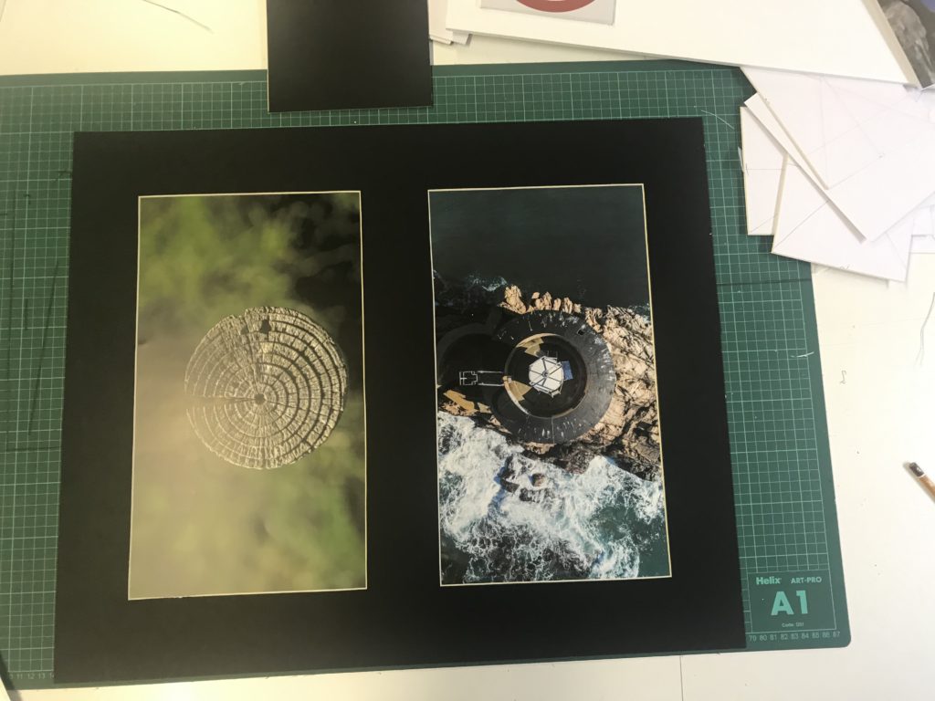
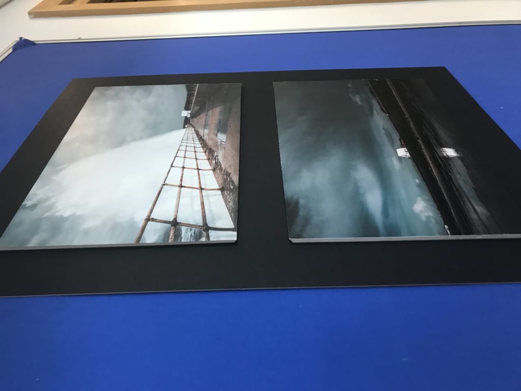
During my exam day three, I mounted up all of my printed images onto black/white card and foam board to make several separate installations of photography to go alongside my photobook.
I had printed out my best images that were incorperated within my book with the intent to create a series of mini stories presented in diptychs and triptychs. This would allow me to create many more narratives alongside my main narrative contained inside my book. I had pre-arranged a layout that I would follow for each board in my previous lessons before the printed images came down.
The images below show the four concepts that i came up with. They are all arranged differently depending on the types of images used, the sizes of the image and what works best to allow them to fit together.
It is good to have both a physical version of the book with all my best images from the shoots I have produced as well as these four boards. Having the physical prints on a large scale, especially shown in the A3 images is very rewarding because it allows me to see my imagery on a large scale and as a series that, personally, I think has worked well. It has allowed me to construct further narratives and stories that otherwise would not have been displayed through my photobook. I used two methods to present my work seen above, one being framing and one using foam board to lift the images out to appear 3D. I think the mounted images have worked better as they reveal a cleaner and more professional look however the foam board images have allowed my landscapes to really stand out, especially the ones on the black board as it compliments the moody skies.
Evaluation
I think overall, I fulfilled the exam title ‘Variation and Similarity’ successfully as the final theme I chose to follow was ‘Light vs Darkness’. This interpretation of variation and similarity was interesting as I found I could use many factors to photograph; it can be anything you see, (since light and darkness can just be a varied amount of light and dark tones).
I started off with following the idea of repetition, where I did a mini experimentation shoot of doors and windows to see if I liked this theme. I started to think I could explore repetition further and start to capture other aspects such as shadows and lighting, reflections, architectural structures (like doors and windows,) sunlight, colour, water, nature, landscapes and seascapes. However, I then took the route of photographing light and darkness as I felt this related more to the exam title. This is because, light and darkness are two polar opposites and so this is a variation of tones. However, they are similar because they can create similar effects, such as shadows.
I did 7 main shoots to explore light and darkness, with 1 mini shoot (so overall, 8 different shoots). I think these went successfully as I planned all my shoots beforehand so I knew what I wanted to achieve. I thought about my composition so that each of my images could be taken from various angles and perspectives to see which worked best. I edited all my images from all my shoots, and then made a narrow selection of 10-30 images that I liked the best; I did this on light-room as I found it easier to make selections from. To select my final images I went onto light-room and changed the filter settings to flagged so I could see all my favourite selection of images. Then I narrowed down to a further 50 or so images that I thought would work well to create a final piece from. I had images of people (from my studio shoot with lights,) as well as coloured glow-stick images from a studio shoot, architecture images, beach images and seascapes, as well as a few images from my boat shoot. In the end, I looked at what I thought my most appropriate images were to fit my exam theme of light and darkness and found that these were my images that included shadows in them. A lot of these were black and white images, however there was 1 boat image in colour. I finally selected 11 images to use (which I displayed in my final image choices blog post). These consisted of 2 boat images, 1 studio image, 1 home shoot image, 5 architecture images and 2 beach images. The only image that didn’t match well with the other final images is the studio shoot photo of the glow-sticks; however, I still selected this as one my final prints because I wanted to show how I explored light and darkness in a creative way. I think that because I displayed this glow-stick image on its own final piece, its worked well because it wasn’t juxtaposed with any other shadow images. Maybe I shouldn’t have included this image because of how unrelated it is to my other images but I still think it was a successful choice.
In terms of artist references, I chose 6 artists to analyse. However, only 4 of these artists was based on my interpretation of the exam title (light vs darkness). The other 2 artists was inspiration for when I first started the exam and I was experimenting with different styles of variation and similarity to see what I preferred. I think the 4 artists I chose to use as inspiration for my exam was an appropriate choice as they all used photography as a chance to explore light and darkness. Initially, the artists I wanted to take a big step to follow was Kanghee Kim, as another idea for mms specification was to explore the sun; as she uses the sun to capture images in her photo-book ‘Golden Hour’, I made an artist reference about her. Yet, as I realised that I wanted to go down the route of light and darkness (not just the sun,) I still thought of Kim as a good artists inspiration. Ray K Metzker was another bold inspiration towards a lot of my images as his images of shadows and street photography really outline the variation between light and darkness. I think I could’ve used more artists for references as 4 isn’t a huge amount – although, because these 4 artists were such big influences on my work, I think only having 4 artists was successful as I really concentrated on shoots that reflected their work and their style of photography, (as shown in my images of mine similar to artists blog post).
Final prints and evaluation
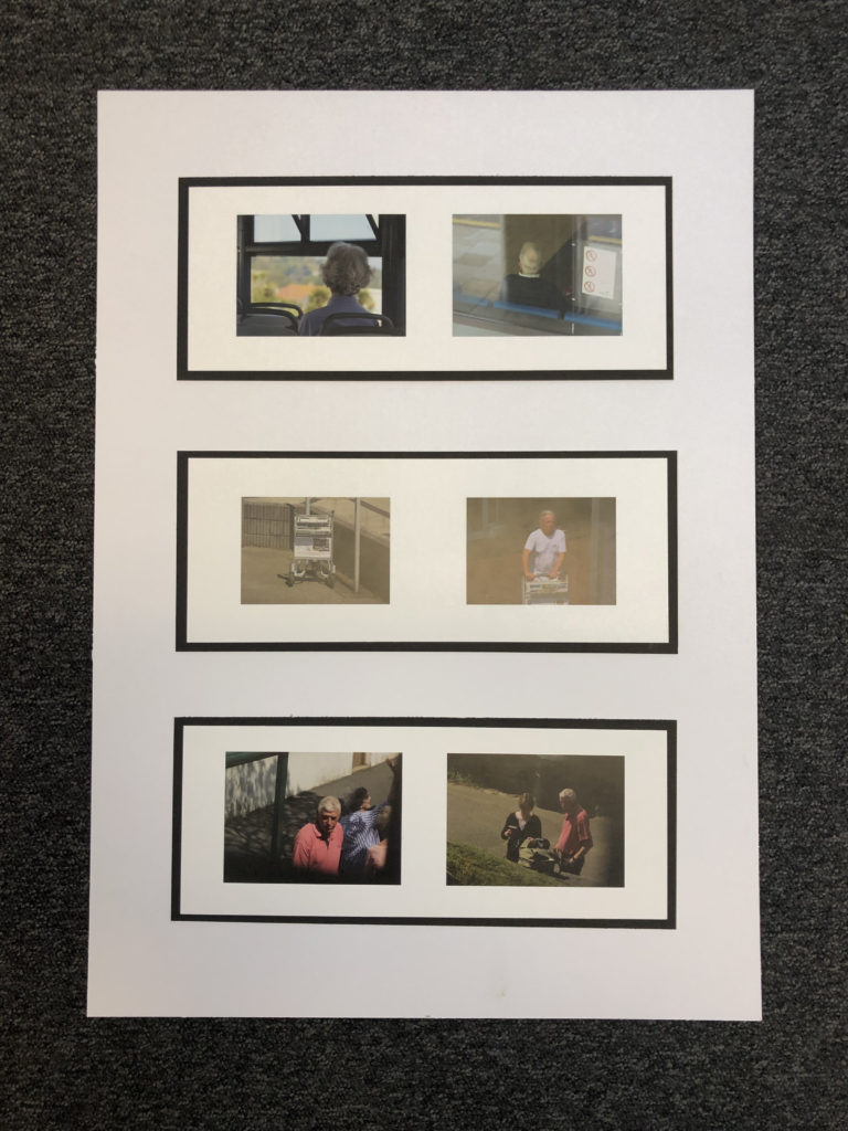
For my final prints I decided to select 6 of my strongest pairs of images, 12 images in total, and display them in sets of two mounted on black and then three sets mounted on white, I felt that this was the best way to display my images as it was simple and each set was divided yet the black made them stand out and created a frame around each set of two.

ESA // THE COMPARISON
In comparison, I think these images are very similar, especially in terms of meaning. They both show a man who lives in a different country to where they originate from. I think the image taken by Mahtab Hussain shows a young man who has changed in terms of dress style and lifestyle in order to fit in with the rest of the English community as there is a lot of hatred and racism, specifically aimed at Muslim men. In my image, we see an older man that continues to live his life as he did when he lived in his birth island, Madeira. Although both men are in different circumstances, I believe that where you originate from, there are various implications when it comes to racism and both culture are forced to commit to their new surroundings in order to live freely.
ESA // MY PHOTOGRAPHIC RESPONSE: HUSSAIN
“Men build a house, women make it a home.”
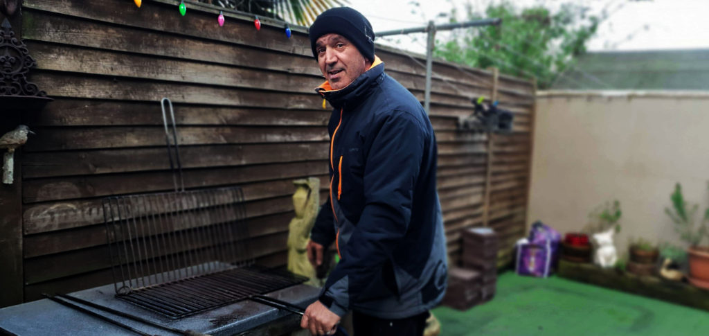
In this image I was attempting to achieve the same contextual ideas as Mahtab Hussain; showing how different cultures live in different countries.
The image is slightly contrasted and brings out some facial features that show ageing; how the older generation live. The aperture used was set at f/4 which means the lens is wider, letting the sensor receive more light and a shallow depth of field. The low f-stop in general makes the background more blurry and makes the background obscure. The shutter speed was most likely around 1/60 as the image is typically quite bright and focused in the foreground which also enhances the textures of the fencing and old objects around him although the background is unfocused.
I captured this photo in natural day light on a cloudy day. The light looks as if it is coming from above and coming straight on as there are no intense shadows created by the man in the photo nor objects surrounding him. The subtle increase in saturation in this image highlights the colour of his clothing. I see a very high level of control of this photo. The man is positioned in the center and he is looking directly at the lens as if he was cleaning the grill and became distracted by the camera for a small glimpse. There are a range of tones from black (fence shadows) to white (highly exposed sky). The middle ground textures are very intensifying and really work as a visual effect. The mans eyes are the main focus in the image.
I took this photograph in my garden, a place that my dad built as my home and which has never been changed. I think this is a very important aspect of the image because it shows that men are typically the ones who build the house but women are the ones who make it a home. This is a strong way of thinking in my family. The older ways of living continue through generations and is an extremely common in the Portuguese culture. The wear and tear in the fence and statues show that this garden has not been refurbished for many years. I think everything in my garden has its own story and for as long as I can remember, my father has always worked for taking care of our family in heavy duty jobs; building and simply being the breadwinner for our family. This traditionally is not the case for many families nowadays, where domestic jobs are shared between a couple.
ESA // RESPONDING TO: MAHTAB HUSSAIN
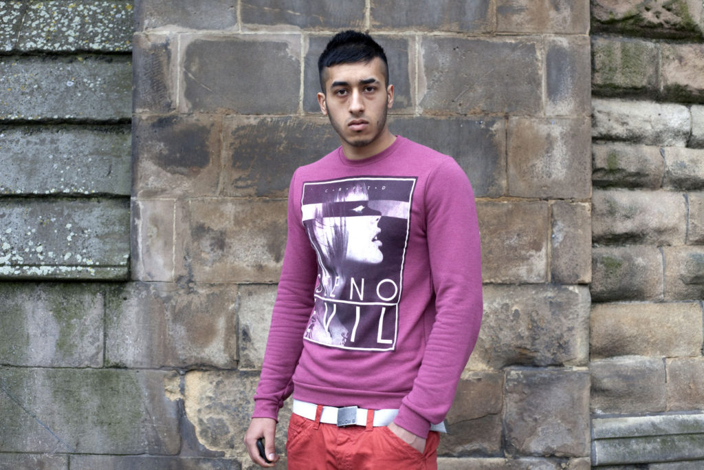
“I feel so invisible. That’s why I became an artist. I wanted to represent this society in artistic space.”
Mahtab Hussain
The reason I chose this image as it is one of my favourite from Hussain’s You Get Me? album and I think it is a very powerful image as the subject is engaging with the camera. I also decided that this would be one of the photos that I wanted to look into as I plan to achieve the same concepts as Mahtab Hussain and thought this would be the perfect starting point.
Hussain seems to have taken this photo in natural day light and the wall in the background supports the fact the photo is taken outside due to the condition that it is in. The light looks as if it is surrounding the whole area and coming straight on as there are no shadows created by the subjects figure however, the patterns in the walls are creating small shades below which reinforces the idea that the natural light is mainly strongest from above. The subtle increase in saturation in this image highlights the colour of his clothing as well as the wear and tear from the walls in the background and the image is not massively light sensitive as it is clear and focused. I see a very high level of control of this photo. The man is positioned in the center and he is looking directly at the lens although his body is slightly turned to the left.
The image is slightly contrasted and mainly enhances the natural shapes in the walls and signs of ware. The aperture used was most likely around f/32 which means the lens is smaller. A smaller aperture allows the middle ground and background to be in focus with the rest of the image. The shutter speed was most likely around 1/15 as the image is typically quite bright and focused, however, not over exposed. The slower shutter speed allows the camera to retrieve more light and makes it easier for contrasts to be seen. The textures are very intensifying and really work as a visual effect. There is a repetition of the same colours red and greenish mold which can be very meaningful in the photograph (see paragraph image No.2). The boys eyes are the main focus in the image as they are horizontally in the middle of the photograph leading the eye to his at first glance. Again, it could be argued that this is another method of manipulation as the viewer can feel more for the image as it tells a story.
Mahtab Hussain captured this image along with many other portraits. His idea behind these photographs was to show how people of his culture (Muslims) lived in a different country. In this case, London.

There is a lot of meaning behind this photograph. For example, in the image above, Hussain has saturated the colours which enhance green and red. These colours are most related to the Muslim culture, for instance, there are many different countries of where Muslims originate from. For example, the image above shows that the man in the image could potentially be representing the Bangladesh flag and how he lives in a foreign country.
Final Evaluation of all works
I am very happy with the final outcomes of my exam project, I am happy with the way that the project had developed and how it has helped me as a photographer. At the beginning of the project I planned to look at the variety of landscapes with changes in the time, weather, and perspective but I feel that focusing on a harder topic such as the sublime pushed me further. At first I was struggling of how to go about photographing this concept and how to view the world in a different way. But then I found the photographer of Laura El Tantawy her work inspired me massively, with her unique perspectives on every situations. I really liked the boldness and how abstract but yet artistic her images where at the same time.
I then found the photographer of Rinko Kawauchi, who’s work really helped to shape the outcome of my project. Her images are very spiritual and purse and have this sense of delicacy to them which is very hard to convey in photographs but come very naturally to her. I mainly looked at her book ‘Illumiance’ to see her way of viewing the world.
I feel that the book focuses on the elements but within that is about stopping and viewing the beauty within the everyday world. But personally for me represent a journey for me not only as a photographer in regards to my photographic skills, but being able to change the focus of my images to a topic that I have never really looked at before. I feel that this shown in the book not only by the images themselves but through the visual stimulants in the book such as the boat, the plane, the sky and the trees as all of these things are growing or moving in some way.
If I were to do the proejct again I would look at more photographers in depth and do more photo shoots inspired by their works as I feel that it would have increased the diversity in the style of the images that I have taken. If I had started focusing on this idea from the beginning of the project I might had created a video to go along side the project and assist it in its overall meaning. But I am very happy with what I have created.


Photobook Design | Final Draft

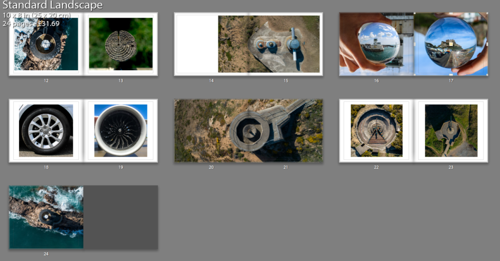
I am happy with this final design and I will send this to be printed. To start with, my title page and back page were designed to be eye catching yet simple and that’s why I chose those images. I used white text as it worked well with the background and a bold sans-serif font for effect. The back page is also simple and the circle contains text that explains the meaning behind the name ‘Latitude’.
The first image is Liberation Square in town (which happens to be a circle), the second set of pages represents the urban and rural contrast and also the differentiation of technique through the lens ball and tiny planet photography yet maintaining the circle shape, following out theme of Variation and Similarity. The next double page spread is La Hocq, then Noirmont bunkers, Janvrin’s tomb with a zoomed image, Batterie Moltke guns, tower to wood contrast between natural and man made structures. Then Noirmont targeting position, then lens balls of the harbor VTS and Mont Orgueil Castle, wheel and jet engine, Noirmont MP1, guns from Batterie Moltke and Lothringen and finally Noirmont Lighthouse.
I wish I had a larger variety of images however it was not viable due to cost but mainly because the book would seem overcrowded and maybe too jumbled, therefore I stuck to a basic set of images that worked together.
Project Evaluation
To conclude, I am extremely satisfied with the outcomes of the ‘Variation & Similarity’ project, in relation with my initial project specification I am confident to say that it reflects throughout my project and is clear in my final pieces. My initial action plan when approaching this project was ”I will produce photographs surrounding the theme of chaotic imagery. I plan to do this by creating photo-montages, collages and edits in response to the artists and photographers which I have and will research. I am going to relate this work to the issues of overpopulation and capitalism which have and still continue to play a big part in the overpowered development of the world. I will photograph all kinds of things relating to this theme as rather than limiting myself to one specific subject matter this will not allow me to produce pieces with chaos as the main part. These issues of overpopulation and capitalism are something which closely links Jersey with the rest of the world, through trade, immigration, politics and culture. I plan to explore this link and how it has developed over time, looking at the past and how it has become the present. And then how the future may look in terms of these issues. This will be executed by the use of archival and found imagery mixed with my own purposed photographs through means of collage and montage.” Which I can say with full confidence is something which I have more than met. Although my creative thought process and ideas have developed consistently throughout the project, I can safely say that the aesthetic which I was intending on producing from my initial thoughts is exactly what I have managed. My photo-shoots and gathering of visual material were a vital part of executing this project and again I can safely say that I followed my plans for these and it payed off as I managed to gather more than enough to work with than what was needed, which was massively ideal since I required a broad selection of textures, colours, shapes, forms, scenes, objects etc… The research I have done has clearly inspired the work which I have produced. Looking into the work of a total of 18 creative individuals has given me a good understanding of the style of work which I was aiming to produce, and this is definitely something which shows. Also learning about art movements which I was previously unaware of has allowed me to have a much better understanding of the creativity which I was working towards. Artists/Photographers Dexter Navy, Alice Wielinga, Peter Blake, Salvador Dali and Raoul Hausmann were definitely the most influential artists on my work which personally I believe is blatant within my work, as there are visual similarities within at least one of my final outcomes to each of these individuals. In terms of my two final displays they went completely to plan and I believe perfectly reflect my plans and mock-ups, and are overall a complete success. They are interesting and unusual outcomes and I believe that it was definitely worth spending my time on something slightly more complex than just a window mount or framing that wouldn’t show my images in a very eye catching way. They show my work in a way which can be individually interpreted by viewers as there are subtle meanings and messages within the work which can be noticed on closer inspection. So to say the least, I am overall extremely satisfied and confident in the way which this whole project has come together and worked.

