Erwin Blumenfeld – Photo Analysis

This image has an empty alt attribute; its file name is Screen-Shot-2019-03-18-at-09.55.52.png
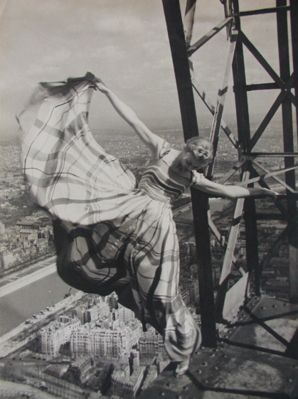
Lisa Fonssagrives on Eiffel Tower, Paris, 1939

This is a black and white image taken by Erwin Blumenfeld in 1939 showing a model wearing a long dress and hanging onto the Eiffel Tower, the composition on this image is very well thought out, the city of Paris stretching out into the background shows the detail on the buildings at the bottom of the photo and the vastness of the city as you look up the image. Although we can only see a small section of the Eiffel Tower in the right corner of the image we can still tell what it is due to its iconic structure, the geometric shapes and bold lines also act as leading lines in the image leading our eyes up and towards the models stretched out arm. The geometric shapes in the structure are echoed in the model’s long tartan dress which is flowing in the wind. The photographer could have been trying to communicate the idea of freedom and sublime in this photo, with the scene from way above the city it almost gives the idea of separation from the busy life on the streets bellow. The image has two opposing elements, the industrial look of the metal structure and the natural and soft look of the women and her dress, these two ideas are also reflected in the vast scene of the city bellow which I shown from a unique perspective. We are used to seeing images of cities from ground level looking up portraying them as busy, big and important however this image unusually does the opposite.

The women in this photograph is Lisa Fonssagrives, a Swedish model known as the first ever supermodel, she was born in 1911 and was trained as a dancer and sculptor. In 1936 she was first photographed and due to her natural elegance ability to be comfortable in front of the camera. These photos were sent to Vogue who then invited her for more test shots. Over the next tree years she continued to work as a model becoming one of the most sought after models at the time, featuring on many magazine throughout her career. The photo was taken for Vogue for the 50th anniversary of the tower dress by Lucien Lelong. In the 1930’s a new style of women’s magazine was emerging, it focused on female beauty. This photo was taken just before France was occupied by the Germans in WW2 and could reflect the last moments of freedom before Paris was occupied.

Comparison Of Work

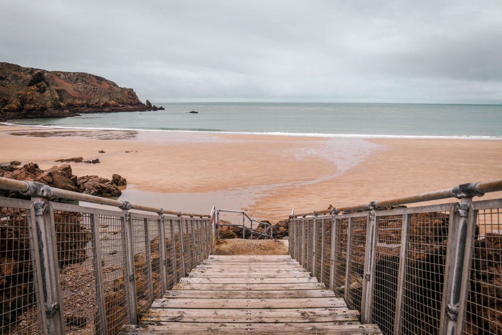
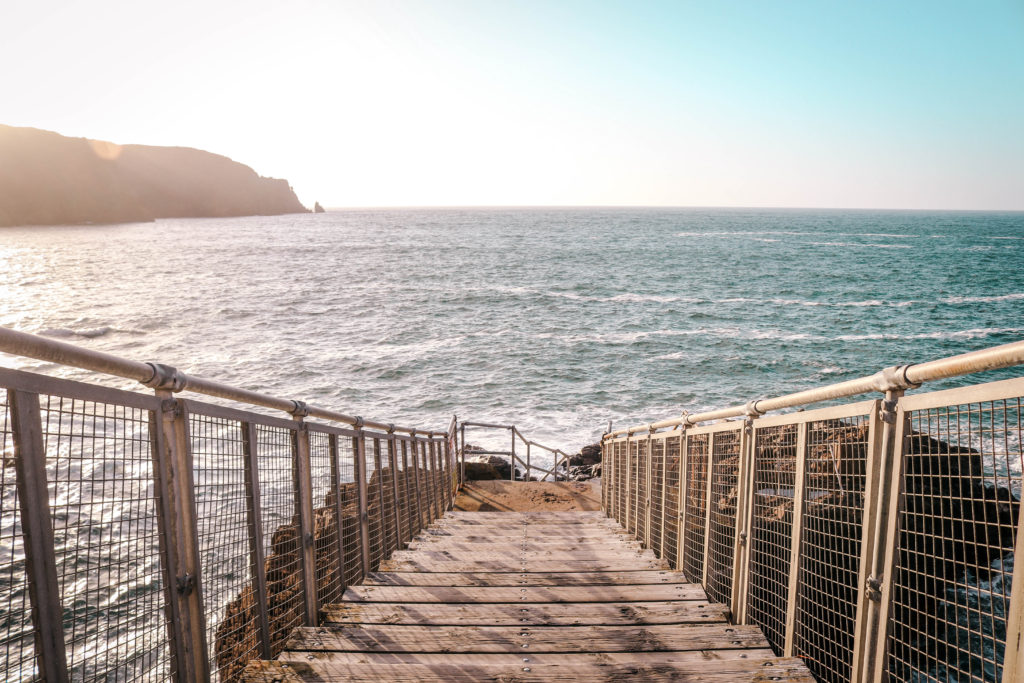
Severn Bridge, Monmouthshire. 8 and 9 March 2008. Low water 2.30pm, high water 8.20am

Inspired by Michael Marten I have responded to his work by selecting a location and photographing it at low tide and then returned at high tide to take photos in the same position. I feel as if I have displayed a clear understanding of his work through my responses and there is a strong correlation between the images seen above. Without taking Martens image into consideration it appeared we had a similar composition and framing by using the leading line of a man made structure. I like the sense of urban vs rural within this image and the metaphor that the tide could be suggesting that the urban landscape is invading the rural world. There is also an incorporation of the changing light and how it differs at different times of the day. I like how this change in light and tidal movement is directly compared from the same angle at a different time. Usually these changing matters cannot be seen without a photographic/video evidence of it. This stimulates the ideas about what we cannot see in our reality and has these deeper meanings about our perception. This links to the contextual research i have collated about metaphysical and the several theories suggesting whether things exist in our mind or exist independently. I like how within Martens image he has divided the horizon directly through the middle of the image which is similar to Sugimoto’s sea scapes project. I think when I complete my next shoot in this style i will aim to try and take some photos with this incorporation which will link my two artist studies together.

A2 Photography Exam – Compare and Contrast – John Baldessari

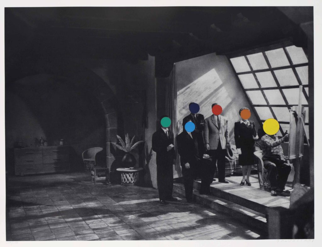
John Baldessari was a key artist in terms of experimentation as he himself as an artist has produced many interesting and weird artworks due his quote ‘I will not make any more boring art’, This sparked his coloured shapes in his artwork. Those exact artworks are what influenced parts of my images .

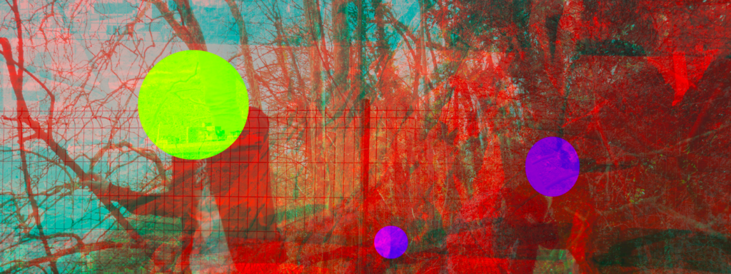
I used the sketch book app to put coloured circles over the faces in my images, which in itself was interesting. But these actually gave me the base layer for more interesting colours in my images, for after my 3d edits and cuts, lots of different colours popped from the images.

Again as a contrast to his work, my work is overall a lot more colourful and full on where as the coloured shapes he uses are more obscure and pop out of the images that bit more.

Reviewing and Reflecting

How well have ideas developed?

In my project I still feel as though I need to develop the concept and meaning behind my images in more depth. I started my project exploring ideas related to nature and beauty as it is something that interests me personally. My first idea for the project Variation and Similarity was to look at repetition in nature and planned to explore that in my first shoot. I then backed this up with research into photographers. As I’ve continued in my project I found that I wanted to add another concept to the project to make my images have more of a story behind them and to feel more conceptual. I think that exploring the use of videos in my work has developed my work well as it gives my project another element.

Are they sustained and focused?

I think that my blog posts are sustained and focused so far, exploring and researching different photographers styles and the concepts behind their work to inspire me. I still feel as though I need to explore more photographers to find a definite concept behind my project. My blog posts are not as focused as I want them to be and can only become sustained when I find another concept. I also want t add my photographers analysis to understand in more depth how various photographers take their image, and also analyse how they display their work i.e in a photo book.

Are they reviewed and refined?

I think that my blog posts are reviewed and refined as I explore the concepts and meanings behind how the photographers take images the way they do and why they do it. I also explain why I chose those photographers to look and and how they link to my project. For my photo shoots I think that I review my work well by analysing my images technically and conceptually and also evaluating the shoots, stating what I could work on and develop further in my project. To make my work more reviewed and refined I could explain more throughout my project what I am doing, and evaluate each week how my ideas are developing.

How many responses/ shoots?

I have done two shoot of my own so far where i have and gone to natural areas. In the first shoot I visited St Catherine’s woods and looked at repetition in pattern and shapes in nature to start generating ideas for my project. I also took some inspiration from Rinko Kawauchi in some of the images looking at light and exposure. I think that the images from this shoot were successful at starting off my project and leading me into my second shoot. For the next shoot I visited Queens Valley Reservoir and looked at the beauty in nature and took videos of aspects I found interesting in the landscape. For this i wanted to capture the movement in nature that wasn’t portrayed in a still image i.e the movement of water, the wind blowing leaves. I think that both these shoots were successful, but i still want to push my work to develop it further. I have also done responses to photographers in class such as John Baldessari, inspired by his book ‘Throwing Three Balls in the Air to Get a Straight Line’, representing Baldessari’s interest in language and games as structures. I also created a response to typologies at the start of my project, taking inspiration from Hilla and Bernd Becher and Andy Warhol to start generating ideas.

Command of camera skills/ photographic techniques and processes
Understanding of composition/ considering quality of light

In my photo shoots I have tried to focus on light and negative space, inspired by Rinko Kawauchi. I feel as though my work is inspired by her, but doesn’t directly interpret her work which is something I wanted to do. In all my images so far I have consider the composition of the natural objects and how the patterns are portrayed. For example, some of the images in my first shoot i made the patterns fill the entire frame as I thought it made the image most effective and the markings stand out more. So far when I have gone out to take images the lighting has been over cast and cloudy, in my future shoots I plan to go at different times of day like early in the morning or later in the afternoon towards dusk. This way I could play with the lighting more and experiment with different exposures.

What are the overall quality of the images?

I think that the overall quality of the images are good and I feel as though they continue on from my last project where I looked at a natural area as well. This means I have a good understanding of photographing natural objects and landscapes. I have tried to make interesting compositions ie. making the shapes symmetrical or using the rule of thirds. I think so far that my images are taken well technically but not conceptual enough meaning that they aren’t the best they can be. Moving forward I plan to do shoots towards a particular concept to refine my work.


How do they respond to research andrelate to artists references ?

My shoots respond to the research I have done on different art movements, like the romantic era looking at sublime, pastoral and picturesque in the 19th century. They also respond to the research on abstraction as I’ve focused on negative space and bold colours within the natural landscape. My earlier responses respond to typologies ie. Hilla and Bernd Becher where I photographed different versions of the same object to create series of images. My videos are responses to my research into video art and performance art, as well as the work of Edward Muybridge who was important for his pioneering work in photographic studies of motion and in motion-picture projection. I did my own interpretation of this, looking at nature and movement.

How do they interpret exam theme?

My images and videos so far interpret the exam theme as they were inspired by looking at similarities and variations in nature. From this point I developed my idea to explore beauty within the natural landscape. Also looking at fragility and femininity when photographing. In my photo shoots I have focused on emphasisng the light in the images, looking at negative space and exposure to create the right appearance.
Shoot Inspired by Laura El- Tantway

I took this shoot in my back garden one morning before going to school, as when I woke up the sunrise had created beautiful sunrise. So I thought that I would be able to use this sky in the background of some of the images. I feel that this shoot was successful as i did created some images that I really like. But as I was rushed for time as I was trying to leave for school on time, I didn’t have time to think and plan out some shots and I hadn’t really thought about what I had wanted to photograph previously . So I want to do another shoot in the same location, but to really take my time focusing on the small details that I could photograph.

Edits 

When editing these images I used Laura El- Tantawy for inspiration, as in her work there is an overriding theme of using pastel colours and having a fantasy/dream feel to them. I wanted my images to look obscure but still natural at the same time. For the editing of these photos the main technique that I used was double exposure as it is manipulating the images.

Metaphysical

Metaphysics is the branch of philosophy that examines the fundamental nature of reality, including the relationship between mind and matter, between substance and attribute, and between possibility and actuality. Metaphysics studies questions related to what it is for something to exist and what types of existence there are. Metaphysics seeks to answer, in an abstract and fully general manner, the questions:[

  1. What is there?
  2. What is it like?

I feel like this study links to the ideas of Zen Buddhism and the works of Hiroshi Sugimoto in the way there is a sense of deeper thinking. Through my works I have set myself the aim to have underlying messages about what exists past our reality for example underneath the sea at high tide. Also connections to what we may not be able to see in our reality such as the changing light as it happens. This has clear links to the ideas around metaphysical which is intriguing to me.

Topics of metaphysical investigation include existence, objects and their properties, space and time, cause and effect and possibility.

Image result for Metaphysical

There are two broad stances about what is “the world” studied by metaphysics. The strong, classical view assumes that the objects studied by metaphysics exist independently of any observer, so that the subject is the most fundamental of all sciences. The weak, modern view assumes that the objects studied by metaphysics exist inside the mind of an observer, so the subject becomes a form of introspection. Introspection is the examination of ones own conscious thoughts and feelings.

  • Metaphysics is a branch of philosophy that studies the ultimate nature of existence, reality, and experience.
  • Metaphysics includes all religions but transcends them all.
  • Metaphysics is the study of ultimate cause in the Universe.
  • Metaphysics is the only science capable of inquiring beyond physical and human science.

IMAGE ANALYSIS X 3

Image 1:

This image is a typology grid format of trees from my first shoot. I edited it in response to Bernd and Hilla Becher, who specialize in typologies. This black and white composition shows the varying patterns and markings on the trees I looked at. Editing it into black and white meant I could emphasize the tonal contrasts and shadows on each individual photograph, making them more interesting and compostionally strong. As I am looking at variation and similarity within nature, this image explores that well as it portrays the very different markings, but portrays similarity through the typology format of trees.

Image 2:

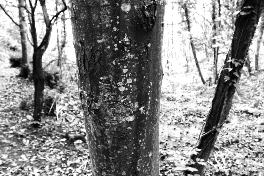
This photograph is also from shoot 1, but in a single-image format. I like this image as although it is a simple capture of woodland, the background is underexposed so contrasts well with the tree in the foreground. The high exposure highlights the moss and markings on the tree, and the leaves in the background.

Image 3:

My 3rd image from shoot 2: natural forms, is a composition of two similar photographs of a segment of rock. I positioned the rock against the white surface background to create a subtle contrast between the pale colours of the rock and the paper. My inspiration for this image is was Bernd and Hilla Becher for the composition and Karl Blossfeldt for the visual style.

A2 Photography Exam – Compare and Contrast – Civil War Stereography

The Civil war stereography was also a key influence in my work as the 3D anaglyph effect has provided my work with colours that were not originally there.

The 3D effect that were on the original civil war photos were added in reference to the distances they wanted the different parts of the photos to look as if it were looking through the human eye, as if they were there.

The effect I wanted to create was merely to move parts of my images in to different parts of the photos to create an extra detail, but also so that they were visually interesting to look at, which is the same reason that the civil war stereographs were made as well.

An obvious difference between my work and the civil war stereographs, is the fact that my work is in colour and theirs is in black and white, although they used plate cameras, this created small spots of extra natural detail to the photos, unlike my photos in which I had to manually create them through the app I used to create my stereographs.