exhibit write ups

CCA GALLERY

Overview of the cca gallery: The exhibition at the CCA gallery was a variety of more documentary focused aspect of photography, with some elements so highly edited when discussing new 20th century art and photography.

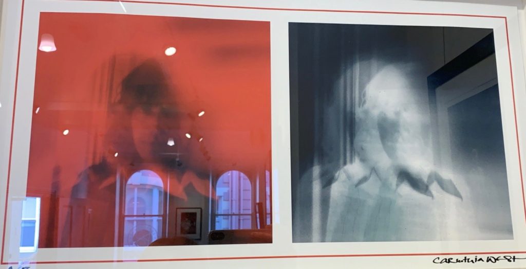
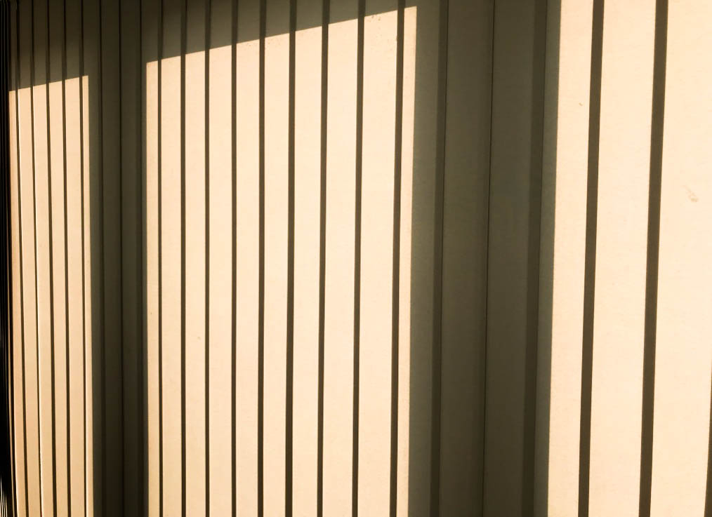
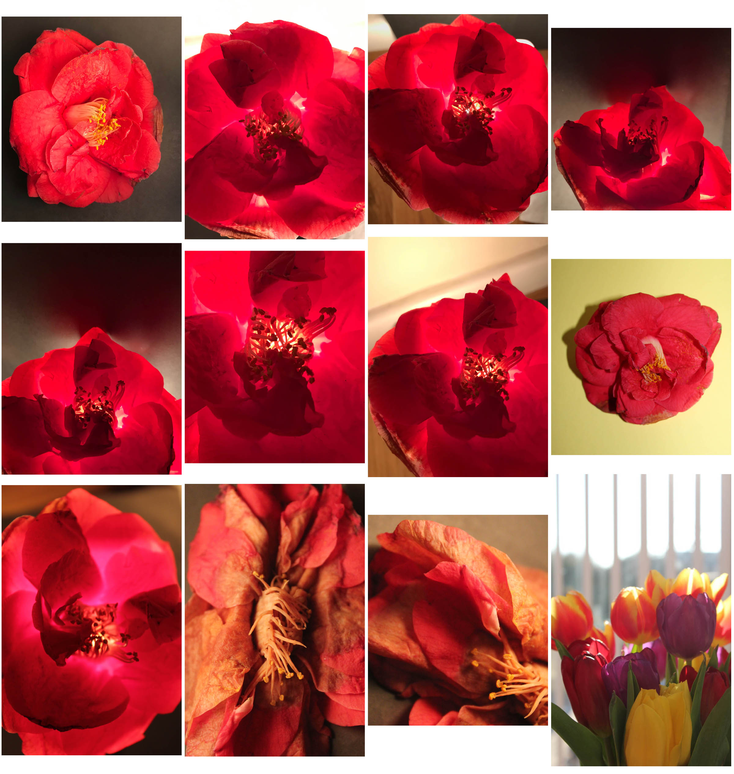
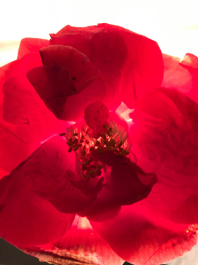
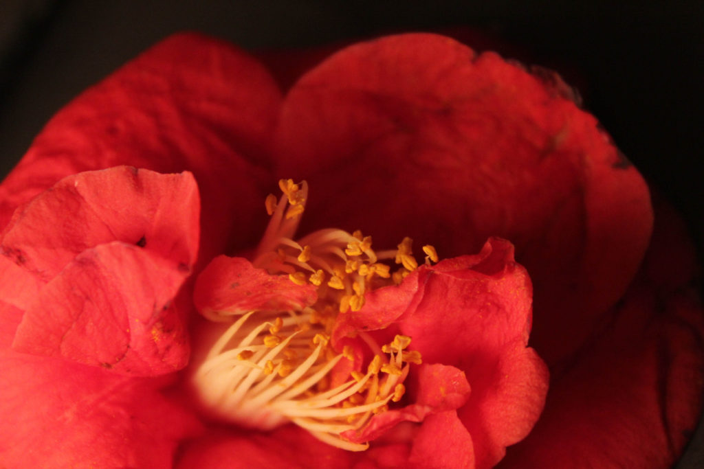
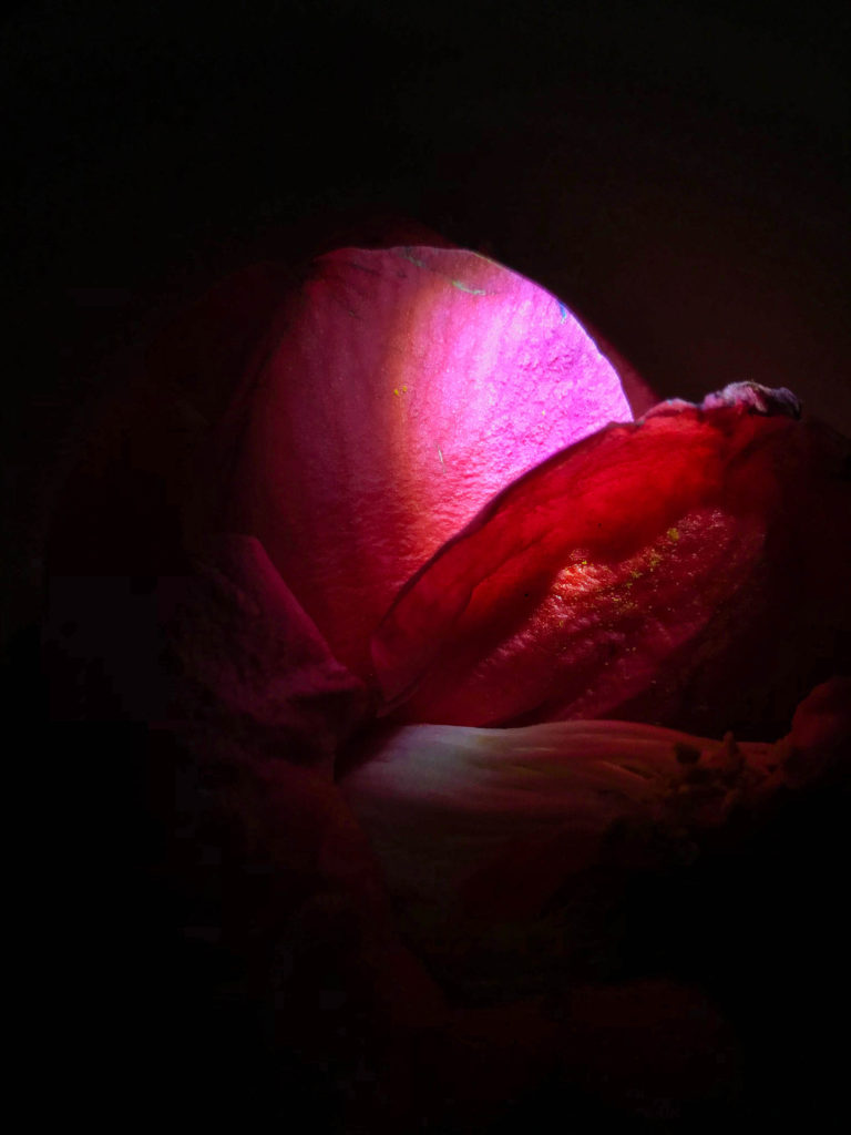
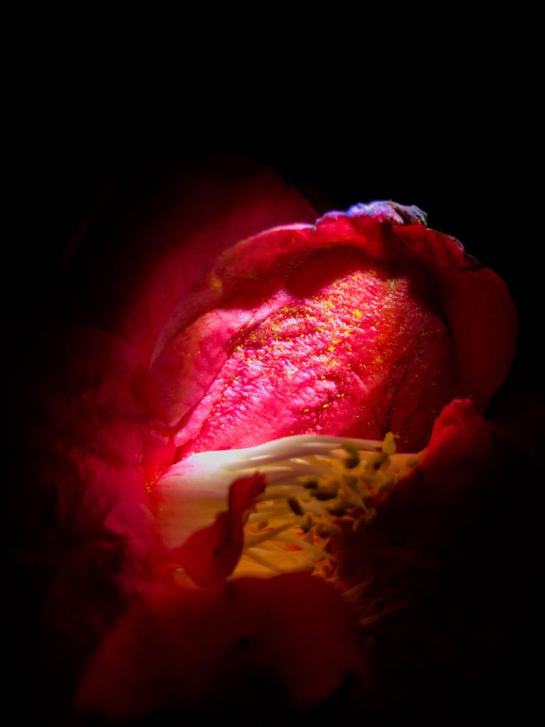
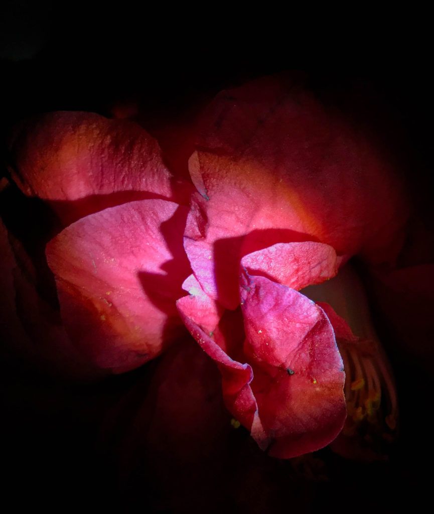
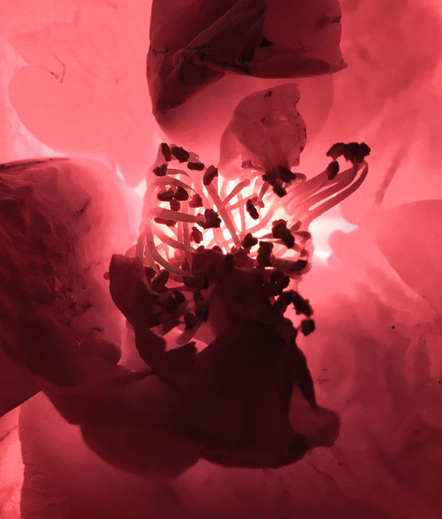
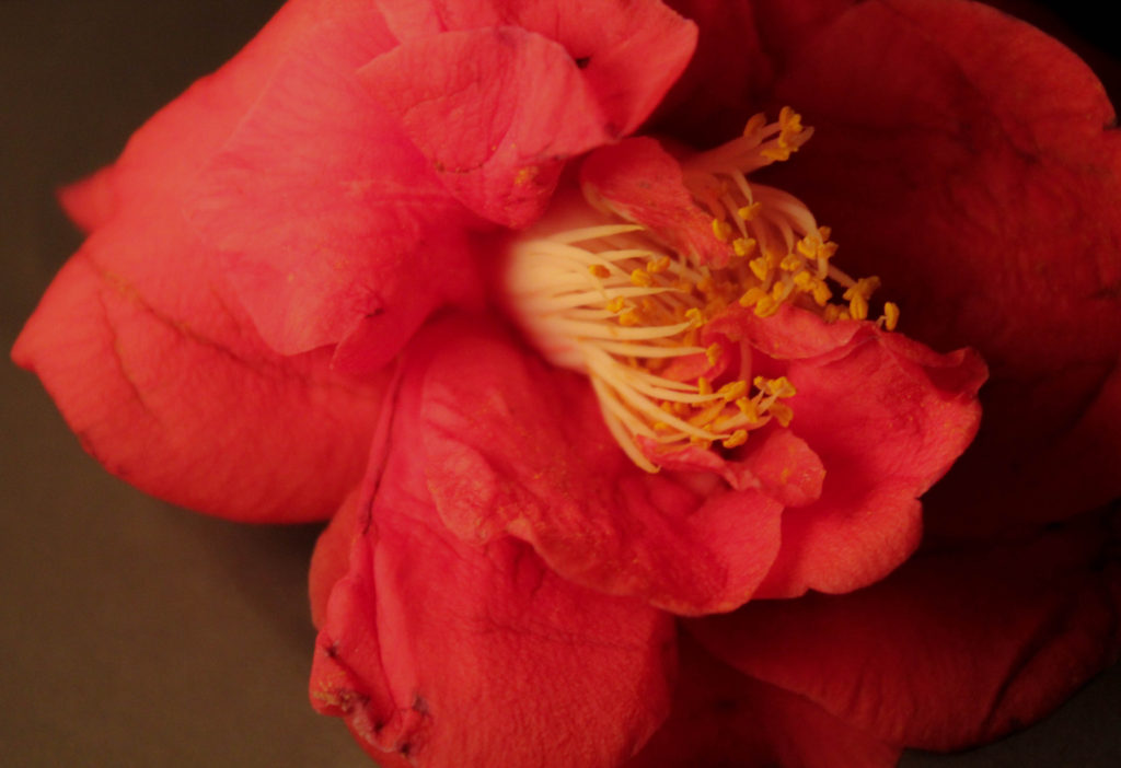
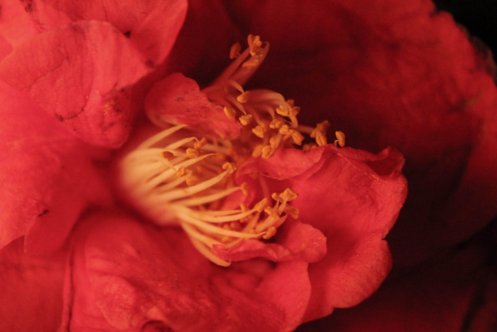
Going to CCA gallery I found two pieces which I belive could benefit my work and really influence the angle of my project. So far my work has been about the creation of beauty, However I have considered adding both beauty and chaos to form a disrupted narrative contrast, and I belive these two pieces perfectly fit into this possible expenditure of my theme. There is such a raw exposure of emotional expression, the sense of solitude and isolation coupled with the movement of the faces coming from within the centre of the composition, creating a new disposition of character. I also belive the use of red and black and white, creates not only a contrast between the pieces themselves, but both colours have strong connotations to strength of emotion. Red is a substantial denotation for that of suffering, pain and elements of blood. However, the black and white creates an element of exposure, as in you are looking into someone. This x-ray type of site shows an area well with-the aspect of your own chaotic image. My own work surrounding chaos could be produced more similarly to this work, but showing more of a movement instead of layered images, I will experiment with these effects, and possibly done with photos of different plants and mediums.

the artist: why they did this:

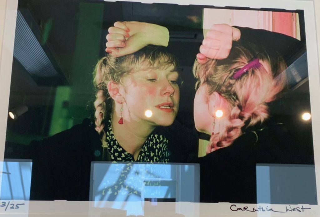
I chose this image also, as to my mind, there are clear connections to my shoot idea of self portraiture, there is a clear connection of emotional vulnerability, and almost a mocking or finding of personality. The character is presented as a form of mimicry, and done in such a way to show a vulnerability and a sense of false acts and emotions. I find it very interesting using objects such as a mirror to show a whole three dimensional view and performance of a person. I have spoken previously about the media within photography, and to my mind, this is a free flowing performance and an act of character, used in order to presented a certain display of masculinity or femininity, the use of the fist is only really visible to the viewer on the non reflected side, this sight of a tight fist accompanied with gritting teeth, perhaps is a warning or a clear dispute of women feeling anger and aggression as her posture and pose is very different from the femininity of the plait and jacket. I could link this to my project again finding what people find to be sad or happy and perhaps how unpredictable this could be due to someones appearance.

PUBLIC AND PRIVATE

The public and private was a very different exhibition than that of the CCA gallery. The exhibition was much more concentrated on the idea of pop art and pop culture. Much of the work was highly colourful, edited and abstract, made at the time of hugely monumental periods of popular culture. With many artists work such as, Andy warhol. Warhol was the artist who created the mediated expression, everyone one day will have 15 minutes of fame. I believe this is relevant to this exhibition as many of the works, were not created to from or create something seen but was to from and create a more controversial forming of elements. The exhibition itself was named ‘ pop icons of the 20th century, Britain and American pop art’ this work was emerging in the 1950’s in Britain and late 1950’s within America, the peak of pop art was in the 1960’s and went on to become the most recognisable art form of the 20th century. it was the revolt against the dominate approaches to art and culture and the traditional views on what art should be.

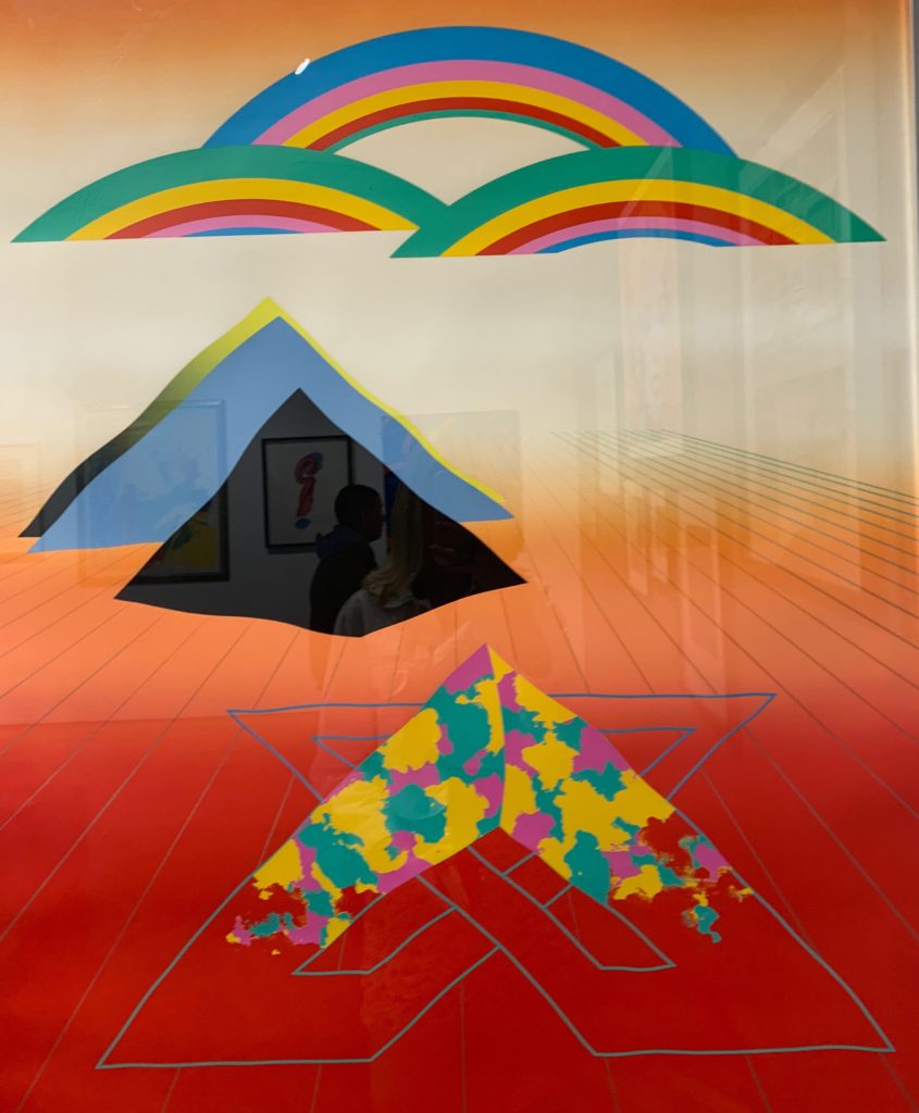
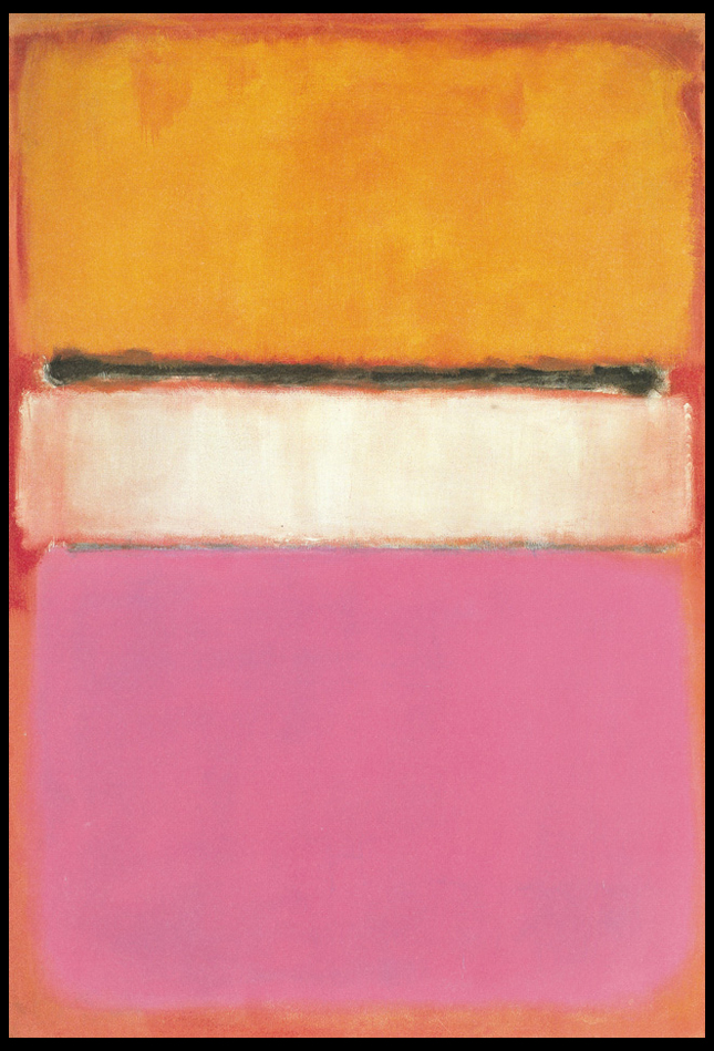
This piece I decided early on, was my least favourite piece I saw out of all three of the exhibitions. It is not to my taste, due to the wholly abstract lack of composition, showing three key areas, arranged with no intentional form scattered around the piece. Too, I belive the deep tonal red contrasting the the lighter abstract triangle, not only creates an uneasy element, but too contributes to the contrasting of red at the top of the piece. The lines are not straight, yet not so un-even to be considered an intentional element. I do not see the intention as to why this piece was formed, And this is my initial problem with the piece, It is definitely not conventional of art, yet does not, to my mind symbolise the revolution and refusal to show conformability of fine art previously seen. Additionally the contrasting of all the triangular shapes, to that of the rainbow and rectangular shapes , does not work well as an overall successful composition.

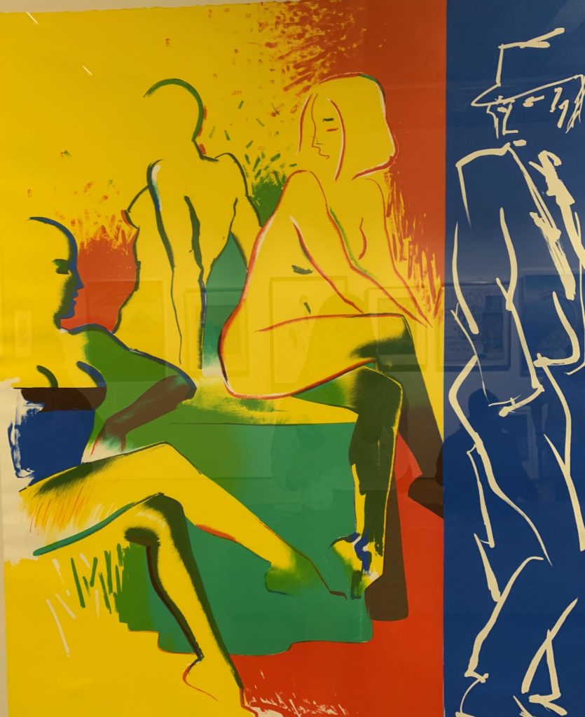
Lastly, I chose this piece as I found the use of the three primary colours, to be really successful. The piece itself, has such a strong centred composition with the primary attention being drawn into the female sitting down, the amount of levels within the piece allows your eye slowly to be drawn out and see everyone surrounding them. This piece was one of two from the artist Allen jones called table talk. I belive due to pop art being a more informal connection people are able to have and form a condition with art, this piece shows a demonstration of a real life scenario which too seems to mimic the everyday actions we all have. Not only within this piece is their a a clear element of seduction, but also a clear illusion of mystery within the piece, and perhaps a new form of seeing the male gaze. Their is also a clear juxtaposition of the women not wearing clothes and the male figure watching being dressed as a detective type of man. Because of this I believe it is changes form an unipersonal imagery, to emphasis a personal feeling and symbolism characterised into abstract expressionism of our own lives. Due to this piece being clearly a fine art piece and so not a photography image like my two previous inspirations, My intention of influence would be the way he so effortlessly captures an emotional connection shown through the sense of reality of the piece itself. The colours too are very bright and abstract which too is a pivotal element of seeing beauty within the world.

Shoot 2 – Home

Home shoot

For this shoot, I wanted to just focus on light and/or shadow affecting objects or areas in and around my house. I used my Canon camera for this shoot. Below are the contact sheets displaying my responses:

Contact sheet 1
Contact sheet 2
Contact sheet 3

Experimentation

To edit my images, I used lightroom. I adjusted the brightness, contrast, shadows, whites, blacks and sometimes the clarity. I also experimented with 2 black and white images but thought that the colour images looked best for these types of images, as light and shadow contrasts the best when in their natural colour.

Compare and Contrast

Mine

This image has an empty alt attribute; its file name is IMG_9585.jpg
My final image I edited using photoshop, I didn’t use double exposure in the final creation of the image as I felt that the reflection on the water was distorted enough. However I did change the colour balance and incred the levels of blue and red to give the image a blue/purple tint to it. This makes the overall image feel very cold, which is in contrast to Laura’s image. I do think that the image does feel very dreamy/fantasy like due to the colours and the fact that only some parts of the image are in focus

Laura El Tanawy

To create this image I think that Laura has used double exposure/layers. The image has a sense of dram/fantasy, due to the collection of the things in the image, the trees flowers, birds. The images give off the connotations, of tropical weather because the type of tree that is in the image in normally found in hotter climates, and the use of the reds and yellows in the image. Where as in tmy image has more of a colder feel to it. However of the things that is similar between the tow images is the use of pastel colours rather having the colors of the image be very bright and fully saturated.

Shoot 1 – Flowers

Flower studio shoot

I did this shoot at home, where I wanted to focus on nature and close-ups within my project of light and darkness. Some pink flowers had fallen off one of the trees in my garden so I took 3 different flowers and did a shoot inside with those flowers. I wanted to focus on shooting close-up images of the flowers, where I got someone to hold a torch onto the flowers so that it created clear light and shadows within my picture frame. I took these images with my Canon camera, and experimented with the ISO to see different photographic responses with the light I was using. I also varied between the use of the ‘close-up’ mode on my camera. Additionally, at the time I found these flowers, there was a bold stroke of sunlight that looked appealing on some flowers I had in my house – so there are 6 images in my contact sheets that were not taken in a studio shoot – I took them primarily due to the sunlight shining onto them through the window.

Contact sheet 1
Contact sheet 2
Contact sheet 3

This shoot was inspired by mainly 2 artists: Rinko Kawauchi was one of them. Her illuminance photo-book consists of images such as:

Rink Kawauchi’s image

Images of mine inspired by Kawauchi:


Experimentation

I used lightroom to edit these images. I wanted to experiment with adjusting the brightness and contrast, as well as the vibrance, highlights, shadows and clarity.

Image with low saturation
Same image as above but with high saturation
Image with low clarity (-95)
Same image as above but with high clarity (+95)

‘Concerning the Spiritual in Art’ by Wassily Kandinsky

Who is he?

Born in Moscow in 1866, Wassily Kandinsky took up the study of art in earnest at age 30, moving to Munich to study drawing and painting. A trained musician, Kandinsky approached color with a musician’s sensibility. An obsession with Monet led him to explore his own creative concepts of color on canvas, which were sometimes controversial among his contemporaries and critics, but Kandinsky emerged as a respected leader of the abstract art movement in the early 20th century. In Munich, Kandinsky was accepted into a prestigious private painting school, moving on to the Munich Academy of Arts. But much of his study was self-directed. He began with conventional themes and art forms, but all the while he was forming theories derived from devoted spiritual study and informed by an intense relationship between music and color.

Color became more an expression of emotion rather than a description of nature or subject matter. He formed friendships and artist groups with other painters of the time, such as Paul Klee. He frequently exhibited, taught art classes and published his ideas on theories of art. He had already formed the New Artists Association in Munich; the Blue Rider group was founded with fellow artist Franz Marc, and he was a member of the Bauhaus movement alongside Klee and composer Arnold Schoenberg. Back in Germany after clashing theoretically with other artists, he taught at the Bauhaus school in Berlin and wrote plays and poems. In 1933, when the Nazis seized power, storm troopers shut down the Bauhaus school. Although Kandinsky had achieved German citizenship, World War II made it impossible for him to stay there. In July 1937, he and other artists were featured in the “Degenerate Art Exhibition” in Munich. It was widely attended, but 57 of his works were confiscated by the Nazis.

What is the book about?

The book acts as a reflection of anticipating “the spiritual turning-point” where Kandinsky looks at how this could occur within people. To do this Kadinsky looks at the artistic meanings of the psychology of colour, the compositional interrelation of forms etc. As a result of this her main goal as an artist becomes the constant search to find the very innermost necessity that can be found within the spiritual foundations of any individual. When looking through the initial pages of the book it is made very clear that Kadinsky is trying to anticipate the emergence of abstract art as the purest form of influence on the human soul, allowing many to view the future optimistically, foretelling the upcoming emergences of spirituality. Some examples of the book and its content can be seen below:

After reading through a bit of his book and looking over some of his artwork, I decided to go onto analyse a piece of his work that for me summed up his points stated in the book and his link between spirituality and the individual. The image I have selected is called ‘On White II’, and was created 1923:

Visual: The piece overall is very aesthetic through its contrasting bright colours and the use of negative space to create feeling within the blocks and random assortment of shapes jotted around. The bright colours for me draw a sense of happiness linked together with gloom, this is due to how the vibrant colours compliment each other bringing about a sense of joy, however contrasted to this is the darker greens and black which for me derives the image of its joy and instead implemented some underlying perspective of loss of gloom which could potentially be interpretted.

Technical: When looking over the image its clear that though the image looks like a random assortment of coloured shapes each piece has been carefully placed to be as effective as possible to that it can impact the viewer through its paint splatter like composition. The use of black within allows to break up the overlapping shapes which otherwise would have become too overpowering without a border. For me the use of the negative space occationally included with a few black lines adds to the overall effectiveness due to how it boxes in and compresses the piece so that it is only confined to one area making it as a result more minimalist.

Contextual: Kandinsky used an array of geometric shapes and lines in a colourful and riotous contemporary display, prompting many artists to imitate his style. On White II, is located at Georges Pompidou Centre, Paris, France. As the title suggests, white is predominant in this painting, including the background. Kandinsky used white to represent life, peace and silence. The majority of the geometric shapes are presented in a variety of colours, reflecting the artist’s love for the free expression of inner emotions. Striking through the kaleidoscope of shapes and colours are bold, spiked barbs in black, representing non-existence and death. Kandinsky liked to paint while listening to music, and On White II, is his interpretation of the music, as created by his inner consciousness. The abstract and possibly mesmerising display of shapes and colours can be compared with the complexity of a musical composition.

Artist Study – Emily Allchurch

Sources:

To DO

  1. Produce a detailed plan of 3 shoots for each idea in your specification that you are intending to do;  how, who, when, where and why in the next 3 weeks?
  2. Think about lighting, are you going to shoot outside in natural light or inside using studio lights? Maybe shoot both inside and outside to make informed choices and experimentation. Remember to try out a variety of shot sizes and angles, pay attention to composition, focussing, scale, perspective, rule of 1/3rds, foreground/ background and creative control of aperture (depth of field) and shutter speed (movement). If appropriate, think about how to convey an emotion, expression or attitude and the colour palette, tone, mood and texture of your pictures. Consider mise-en-scène (everything in the frame) – e.g. in portraiture deliberate use of clothing, posture, choice of subject objects, props, accessories, settings. Make a selection of the best 15- 20 images for further experimentation. Produce 2-3 blog posts from each shoot and analyse and evaluate your photos through annotation showing understanding of basic visual language using specialist terminology.
  3. It is essential that you complete your principal shooting over Easter and return on Tue 23 April with a few hundred images ready for further post-production and editing.
  4. Upload blog post with above planning by Fri 5 April

Shoot plans

  • Shoot 1 – studio shoot experimenting with flowers. I will use a torch to adjust the lighting for my images and will get someone to hold this torch so I can make successful images. As this shoot is adjusted with artificial light, I do not have to do this shoot at a specific time of the day.
  • Shoot 2 – shoot around my house focusing on light and darkness. I will go in the garden of my house at around 5:30pm when the sun is setting. I want to also focus on repetition within looking into light and darkness, for example I have blinds in my house where the sun shines onto them to create light and dark tones on the blinds, as well as other interesting aspects in and around my house that create light and darkness.
  • Shoot 3 – shoot focusing on architecture and how light and darkness (shadows) are portrayed onto buildings.
  • Shoot 4 – shoot using a dark room to create images using different objects and models such as glow sticks, lights and using a long exposure technique with a waving torch to show the variation of light and dark tones.
  • Shoot 5 – shoot focusing on cutlery and using light to create shadows of darkness. shoot at the beach focusing on seascapes and interesting nature objects on and around the beach that fits into light and darkness.
  • Shoot 6 – shoot focusing on boats on the beach and how their specific architecture creates interesting light and dark aspects.
  • Shoot 7 – shoot focusing on cutlery and how using artificial light can create interesting shadows that portray light and darkness.
  • Shoot 8 – shoot focusing on nature and how light and darkness effects nature in different ways.

Contextual Study – Colour Field Paintings

What are field paintings?

Field painting was a term that originally was applied to the work from about 1950 of three American abstract expressionist painters, Mark Rothko, Barnett Newman and Clyfford Still. The words ‘colour field painters’ was the title of the chapter dealing with these artists in the American scholar Irvine Sandler’s ground-breaking history, Abstract Expressionism, published 1970.

From around 1960 a more purely abstract form of colour field painting emerged in the work of Helen Frankenhaler, Morris Louis, Kenneth Noland, Alma Thomas, Sam Gilliam and others. It differed from abstract expressionism in that these artists eliminated both the emotional, mythic or religious content of the earlier movement, and the highly personal and painterly or gestural application associated with it. In 1964 an exhibition of thirty-one artists associated with this development was organised by the critic Clement Greenberg at the Los Angeles County Museum of Art. He titled it Post-Painterly Abstraction, a term often also used to describe the work of the 1960 generation and their successors.

In Britain there was a major development of colour field painting in the 1960s in the work of Robyn Denny, John Hoyland, Richard Smith and others. Some examples of field paintings can be seen below:

Color Field Paintings emerged out of the attempts of several artists in the late 1940s to devise a modern, mythic art. Seeking to connect with the primordial emotions locked in ancient myths, rather than the symbols themselves, they sought a new style that would do away with any suggestion of illustration.The style was championed most enthusiastically by critic Clement Greenberg, who acclaimed the advances it achieved in the realm of form and composition. Bemoaning what he saw as the increasingly imitative, academic qualities of some action painters, he argued that Color Field Painting represented the way forward. His advocacy of the style proved highly influential.

From here I wanted to explore the typical aspects that could be found within many field paintings. To do this I would need to analyse a painting and look at the technical, visual and conceptual ideas behind each brush stroke. By doing this I would like to take inspiration from this and use it towards a future shoot regarding Franco Fontana, using a highly saturation landscape to create abstract work which highlight the texture and patterns that can be found in everyday life regarding hills around the coast. The painting I have chosen to analyse is called White Center (Yellow, Pink and Lavender on Rose) by Mark Rothko:

Technical:
The painting, top to bottom, signifies Rothko’s multiform style of abstract painting. A rose ground, darker in color on top and paler at the bottom, holds a horizontal yellow rectangle, followed by a black horizontal strip. A white rectangular band is in the center of the painting, and the bottom is lavender. Several tones of the colors were used, establishing the effect of a wide range of mood and atmosphere. Whilst not being that technical, the lack of form or structure presents the viewer with a piece that becomes aesthetic to the eye, however its simplicity provides effectiveness from how it allows the viewer’s mind to wonder and interpret each painting to a more personal level.

Visual:
Mark Rothko continued to simplify the compositional elements of his paintings. In 1950, he began to divide the canvas into horizontal bands of color. Despite the frontal composition and absence of spatial illusionism in these works, the broad bands of color appear simultaneously to float in front of the picture plane and to merge with the color field upon which they are place, as in White Center (yellow pink and lavender on rose), 1950. A luminosity results from the repeated layering of thin washes of paint, which allows some underpainting to show through the upper coats. In each work of this period, Rothko sought only subtle variations in proportion and color, yet achieved within this limited format a broad range of emotions and moods. The photo at the top displays this painting’s supreme color choices, namely yellow, pink and lavender on rose.

Conceptual:

The piece represents Rothko’s love for reduction, colour, shape, balance, depth and composition, all of which are surrounded by cloudy edges against a undetermined backdrop. The idea behind the piece was to reduce the colours and the forms expanded in size, dwarfing the background which disappears behind the towering coloured forms. Many can interpret it as a dominance of colour using vivid and lush colours provide contrast and symmetry, for many it presents us with the idea that Rothko is enveloping the viewer and inviting us to contemplate and emotively respond to the space he has created.

Historical references of black and white photography

Black and white images are authentic, they help us trace mans history step by step to his modern state. Its classical feel holds its true beauty. The first camera photography were invented in the 1820s, before that time, people relied heavily on traditional media for capturing images, for example, paintings, sketches, and drawings. However, when it emerged, it seemed to vividly capture more information or detail about an object than the traditional media.The first successful black and white image was taken by Joseph Nicephore Niepce a French developer. However, it got destroyed as the attempted to make copies of it. He was again successful in 1825, where he managed to produce a black and white image of a window

Printing is an ancient art, and colour printing has been possible in some ways from the time coloured inks were produced. In the modern era, for financial and other practical reasons, black-and-white printing has been very common through the 20th century. However, with the technology of the 21st century, home colour printers, which can produce colour photographs, are common and relatively inexpensive, a technology relatively unimaginable in the mid-20th century.Most American newspapers were black-and-white until the early 1980’s remained in black-and-white until the 1990s. Some claim that USA Today was the major impetus for the change to colour. In the UK, colour was only slowly introduced from the mid-1980s. Even today, many newspapers restrict colour photographs to the front and other prominent pages since mass-producing photographs in black-and-white is considerably less expensive than colour.

image analysis: I chose this image fo a multitude of reasons, both the composition is of a structured straight build, however, the angle of the lens creates a circular notion of growth and furthers the ideologies of a growing stark area of space. Although you are able to see the detail within the lines and the sense of narratology within the structuralism. despite there not being a choice within the fact of using colour of using black and white, It is clear this image is the most effective within the black and white tonal colours.

Black-and-white images are not usually starkly contrasted black and white. They combine black and white in a continuum producing a range of shades of gray. Further, many monochrome prints in still photography, especially those produced earlier in its development, were in sepia (mainly for archival stability), which yielded richer, subtler shading than reproductions in plain black-and-white. Despite colour being the primary conversion of photos, black-and-white photography has continued to be a popular medium for art photography, as shown in the picture by the well-known photographer Ansel Adams. This can take the form of black-and-white film or digital conversion to grayscale, with optional digital image editing manipulation to enhance the results. For amateur use certain companies such as Kodak manufactured black-and-white disposable cameras until 2009. Also, certain films are produced today which give black-and-white images using the ubiquitous C41 colour process. Colour can be a distraction; it can be dull and lifeless. One of the tasks of photographers is to simplify an image, distilling a scene down to its essence. Sometimes, that essence is colourless. Ansel Adams, discussing the differences between the two types of photography, said, “I can get a far greater sense of ‘colour’ through a well-planned and executed black and white image than I have ever achieved with colour photography.” When researching black and white photography, it is said to be something more then just a filter, as explained here ‘ There are seven essential elements of top-notch black and white photographs, which you’ll see shortly. First, though, is the most important thing to remember: You need to have a reason for shooting in black and white.Not every subject works well in monochrome. So, always ask yourself: Why are you eliminating colour from a particular photo? What makes it so important to shoot your subject that way?’ After considering this, I wondered what effect my images had upon the effect of the image itself. I decided all of the images I had edited to be in black and white were all for a purpose, and the direct effect of the colours created a more interesting effect to the final image itself, and a successful final composition.