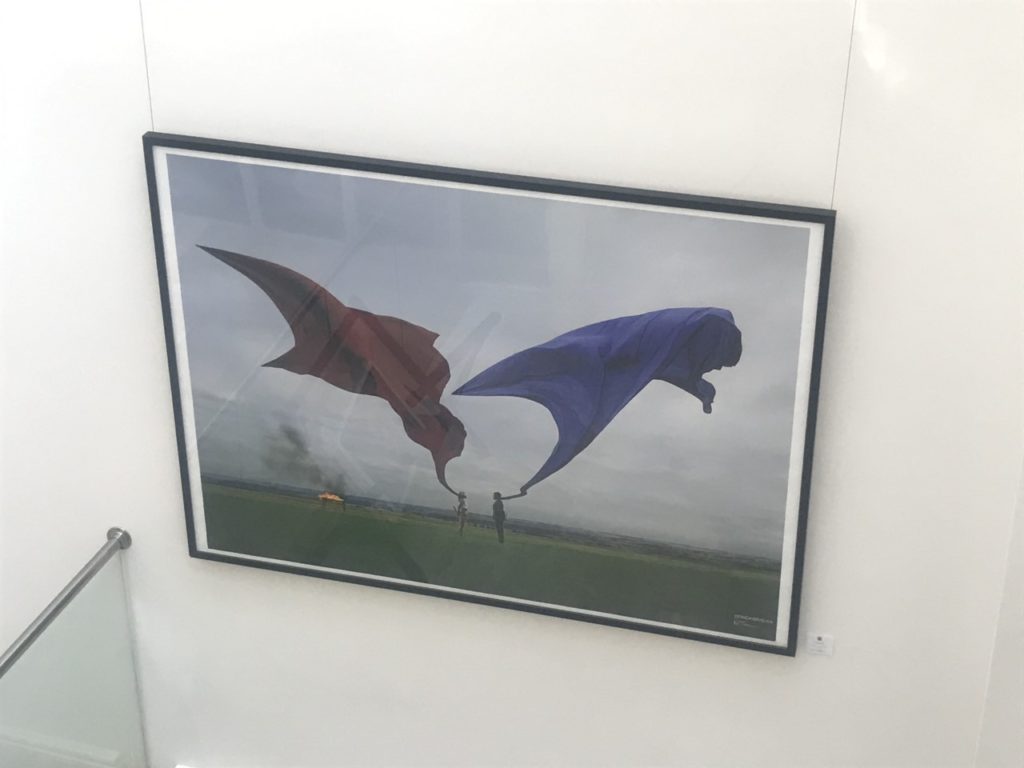
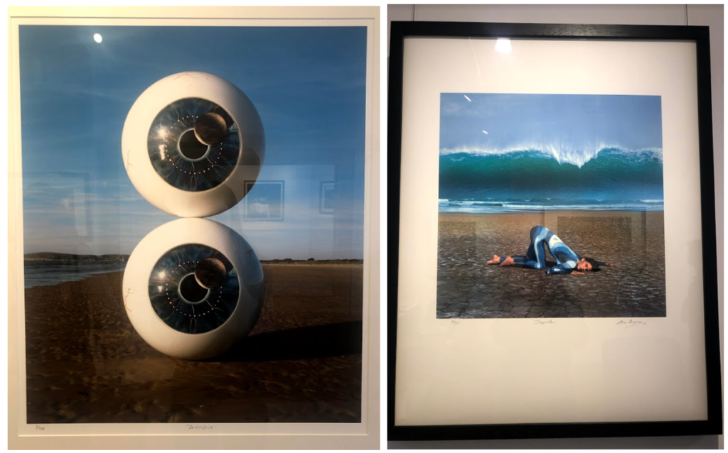
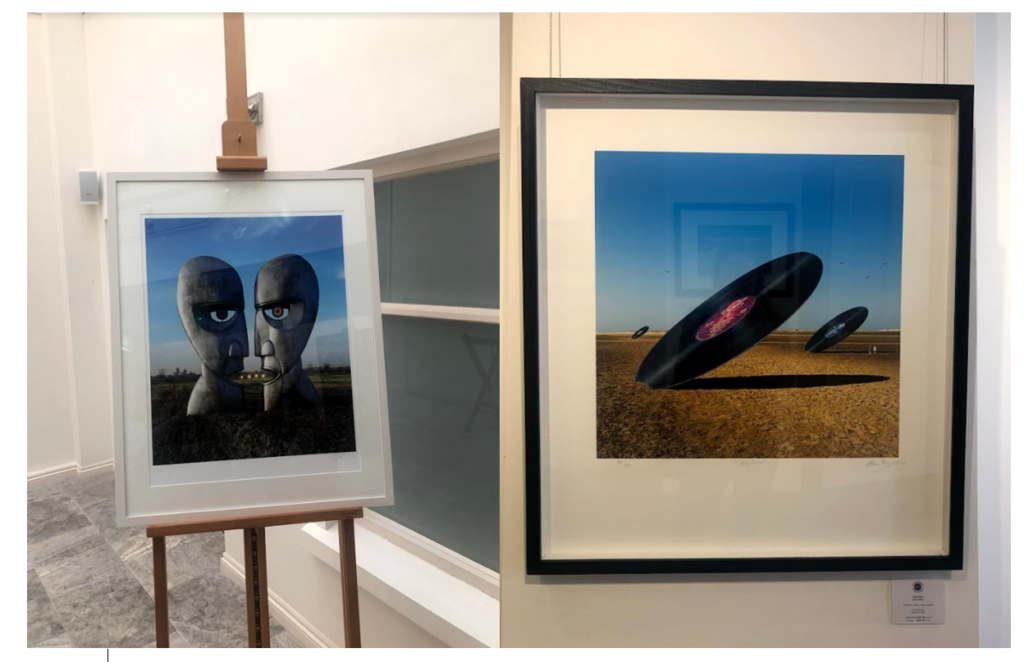
Behind the lens was an expedition that focused on 1960s-70s Britain. This included pop culture, counter pop culture, sexual revolution and rock documentary. The expedition was by Mike McCartney, Rupert Truman and Carinthia West. The main focus of the gallery was on street photography style images were the subject didn’t know the image was going to be taken. The images captured the raw moments of music artists such as Paul McCartney working in there natural environment. The gallery also had images which were going to used as album covers for bands such as Pink Floyd.
Public and private – Pop Icons
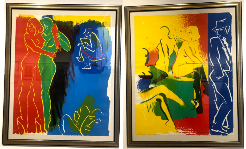
Exhibiting artworks by Andy Warhol, Roy Lichtenstein, David Hockney, Peter Blake, Robert Indiana, Tom Wesselmann, Eduardo Paolozzi, Patrick Caulfield and Allen Jones. The gallery focused on British and American Pop artists showing there work. Emerging in the mid 1950’s in Britain and late 1950’s in America, Pop Art reached its peak in the 1960’s and went on to become the most recognisable art form of the 20th century. It began as a revolt against the dominant approaches to art and culture and traditional views on what art should be.
Public and private – Being Human
The final exhibition we visited focused on female artwork. Being Human is an all-female art exhibition. The gallery holding the exhibition thought an all-female showcase needed to happen locally when they read the “Tate appears to have a 30% cap on the collection of female artists, with its allocation of annual budget is even worse, with as little as 13% spent on works by female artists in recent years.”
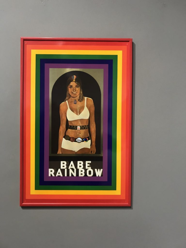
Sir Peter Blake – Babe Rainbow
Blake was commissioned by Dodo Designs to produce an enamel plaque that was issued in an edition of 10,000 and sold for £1. Due to a fault in the enameling process the work was eventually screen printed onto tin. Babe Rainbow was a fictional lady wrestler, the reverse of the work featured her biography. This was favorite artwork from all three exhibitions as I thought it best depicted its chosen art style which in this case was pop art. The artwork reminds me somewhat of a poster the way there is central figure in the image and the bold text writing.
The CCA had an exhibition on musical links to photography, for example to top two images here are Biffy Clyro album covers. I really liked the bottom left image, it goes well with my circles topic but also it is very eye catching and well constructed.
Private Public Gallery
This was my first time to the Private Public gallery and I noticed that the work seemed more contemporary than the CCA’s. It was mostly art rather than photography but there were photographs around, whether they be manipulated physically or digitally. One image that interested me was the bottom left about Lily Langtree. Lily was a model/actress in the late 1800’s to early 1900’s from Jersey. She had a global fan base and this image was supposed to be the draft print for a postcard but it was so good that hey kept it. The artist has blown it up and digitally manipulated it slightly and printed it. The image on the top right was pop art and is of a woman who was a boxer or wrestler (something like that) and was able to easily beat men at their own game. The image is aimed to represent women as strong and able to be better than men at things women are stereotyped not to be able to do.
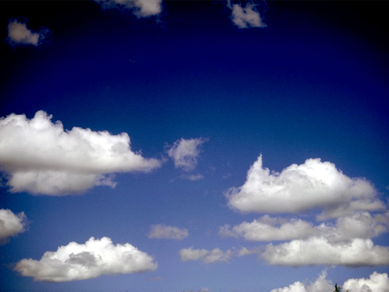
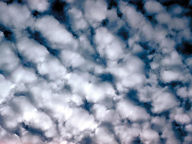
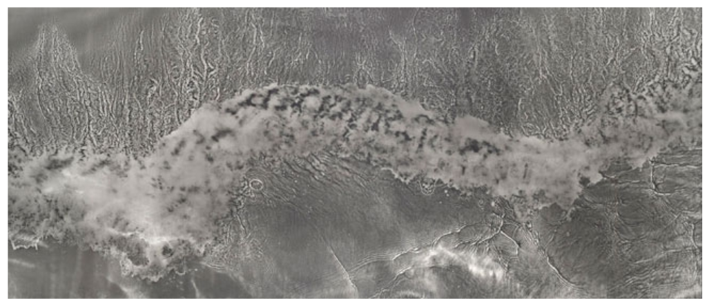
Cloudscape photography is photography of clouds or sky. An early cloudscape photographer, Belgian photographer Léonard Misonne (1870–1943), was noted for his black and white photographs of heavy skies and dark clouds. In the early to middle 20th century, American photographer Alfred Stieglitz (1864–1946) created a series of photographs of clouds, called “equivalents” (1925–1931). According to an essay on the series at the Phillips Collection website, “A symbolist aesthetic underlies these images, which became increasingly abstract equivalents of his own experiences, thoughts, and emotions”. More recently, photographers such as Ralph Steiner, Robert Davies and Tzeli Hadjidimitriou have been noted for producing such images.
Equivalents
In the summer of 1922, Alfred Stieglitz began to take photographs of clouds, tilting his hand camera towards the sky to produce dizzying and abstract images of their ethereal forms. In an article the following year, Stieglitz maintained that these works were a culmination of everything he had learned about photography in the previous forty years:
“THROUGH CLOUDS I WANTED TO PUT DOWN MY PHILOSOPHY OF LIFE—TO SHOW THAT MY PHOTOGRAPHS WERE NOT DUE TO SUBJECT MATTER—NOT TO SPECIAL TREES, OR FACES, OR INTERIORS, TO SPECIAL PRIVILEGES, CLOUDS WERE THERE FOR EVERYONE—NO TAX AS YET ON THEM—FREE.”
Over the next eight years, he made some 350 cloud studies, largely produced as contact prints on gelatin silver postcard stock. Stieglitz called these photographs Equivalents. More than describing the visible surfaces of things, the works could express pure emotion, paralleling the artist’s own inner state. Stieglitz, along with many of the artists of his circle, argued that visual art could assume the same nonrepresentational, emotionally evocative qualities as music. Indeed, music was an inspiration for the Equivalents, and this is reflected in the early titles he gave them: Music: A Sequence of Ten Cloud Photographs (1922) and Songs of the Sky (1923). Stieglitz did not limit himself to clouds, or allusions to music, in these photographs: one notable work, Spiritual America, shows a close-up of the nether regions of a harnessed gelding (a castrated male horse), the image serving as a metaphor for the artist’s impression of a diminished American culture in the same way that his depictions of clouds represented his emotions. Stieglitz often presented the Equivalents in series or sets, recombining different groupings of prints for exhibition.
The Cloudman
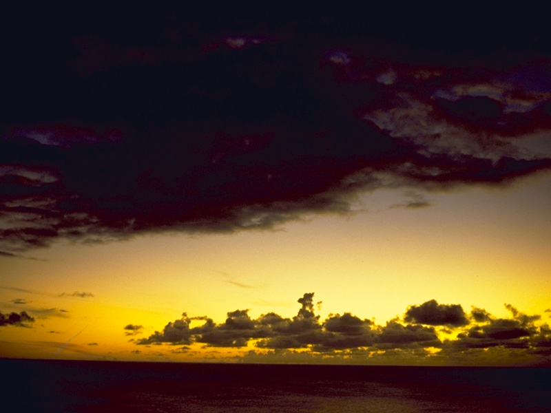
The “Cloudman“, Dr. John A. Day, is a professor emeritis from Linfield College, in Oregon, USA, who taught meteorology for over forty years and who has a great passion for sharing the wonder of clouds. Now in his nineties, he continues to write, teach, and inspire people of all ages, around the world. His photography and writings are found in international publications and museums, and are used by artists, musicians, teachers, and many other cloud lovers. In 1962 he was granted a Faculty Fellowship from the National Science Foundation to study Cloud Physics at Imperial College of Science and Technology in London, England. In 1971 he returned to England, this time on sabbatical leave, for intensive study of the History of Cloud Classification, focusing on the work of Luke Howard, England’s first meteorologist. Day’s interest in clouds was first of a technical nature, learning to forecast their appearance and development. Studies of clouds in the ‘50s, ‘60s, and ‘70s were directed toward gaining a fuller understanding of the physical causes that led to the formation of particular cloud types. In this period he started photographing clouds which led to an extensive collection of photographs. In later years his focus of interest has shifted form technical to artistic, and through the medium of photography, he attempts day by day to capture the beauty and majesty seen in the cloud forms that grace the sky. His photographs are rich in colour and greatly differ from the works of Alfred Stieglitz’.
MANY SKIES ARE SIMPLY BEAUTIFUL TO BEHOLD. THERE IS NO OTHER WAY TO SAY IT. SHEER BEAUTY! THE COMBINATION OF FORM, POSITION, GRADATIONS OF LIGHT AND SHADOW, AND EVEN COLOR IN THE LATE EVENING AND EARLY MORNING HOURS IS PLEASING TO THE EYE, AND STIRS AN INNER SENSE THAT CAUSES ONE TO BREATHE AN INAUDIBLE, “AHH, THE GREAT ARTIST AT WORK!”
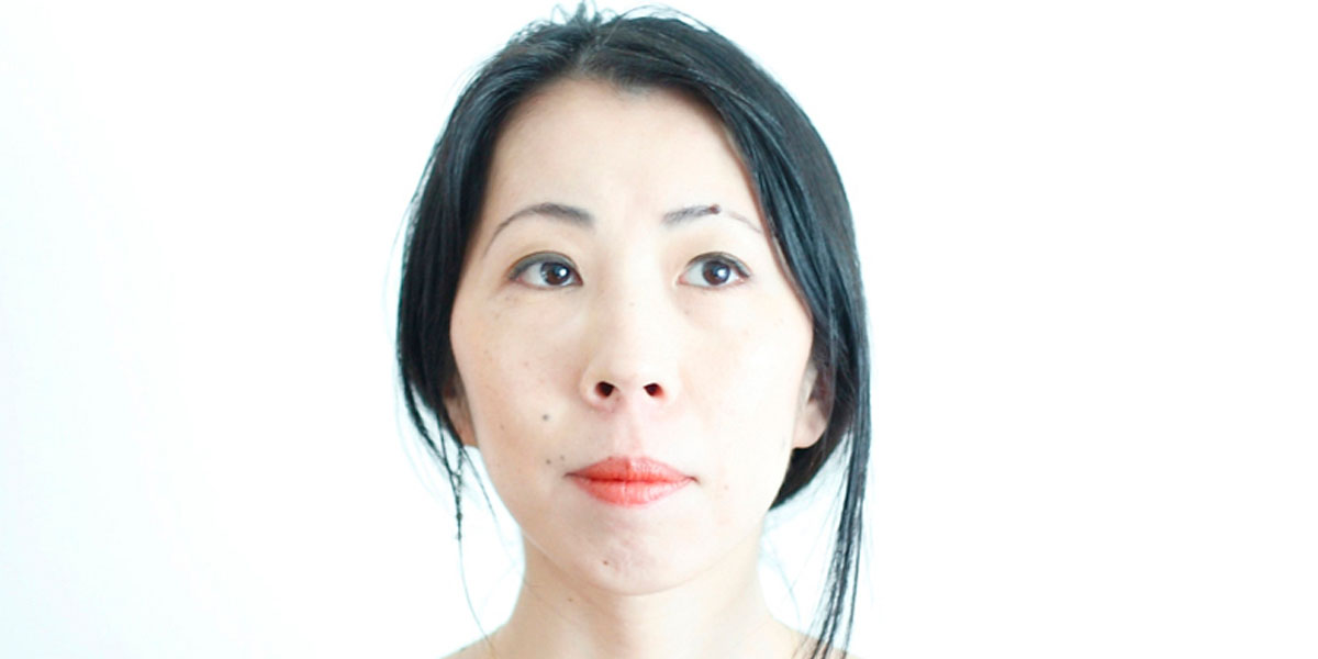
“Just when it seems that everything has been photographed, in every possible way, along comes a photographer whose work is so original that the medium is renewed. Such a photographer is Rinko Kawauchi, who makes simple, lyrical pictures, so fresh and unusual that they are difficult to describe or classify. Her images document everyday things, yet could not be described as documentary. They are generally light in tone, yet somehow dark in mood. They are almost hallucinatory, yet seem to capture something fundamental about the psychological mood of modern life.” Garry Badger on Rinko Kawauchi’s book “Utatane” (Siesta)
Rinko Kawauchi was born in Japan in 1972. Kawauchi became interested in photography while studying graphic design and photography at Seian University of Art and Design where she graduated in 1993. She first worked in commercial photography and advertising for several years before embarking on a career as a fine art photographer. In Japan Rinko Kawauchi has become one of the most celebrated photographers of her generation. After appearing in several museum exhibitions and festivals in Europe (among others “Rencontres de la Photographie”, Arles; Fondation Cartier, Paris; Huis Marseille, Amsterdam: Photographers’ Gallery, London) the Metopolitan Museum of Photography in Tokyo is preparing a major exhibition about the artist for May 2012.
In 2001 three of her photo books were published: Hanako (a Japanese girl’s name), Utatane (a Japanese word that defines a state between wakefulness and sleep ), and Hanabi (“fireworks”). In the following years she won prizes for two of the books in Japan.In 2004 Kawauchi published Aila; in 2010, Murmuration, and in 2011 Illuminance; in 2009. In the ‘Utatane’ series. Rinko demonstrates a concentrated intentness on what she calls “the little voices that have been whispering to her since childhood”. These are the source upon which she draws, the intimate origin of a world described here according to a highly personal aesthetic: Utatane re-creates a fragmentary and fleeting world in which every detail relates to notions of birth, life, death and the passage of time.
Rinko Kawauchi’s work focuses on ordinary things and everyday situations. Her photographs attain their specific quality through her use of cropping and choice of perspective as well as the subtle use of natural light in combination with often virtually transparent colours. Rinko Kawauchi works in series, which, in the form of open narratives, combine poetry and emotion with representations of mortality and occasional melancholy.
Kawauchi’s art is rooted in Shinto, the ethnic religion of the people of Japan. According to Shinto, all things on earth have a spirit, hence no subject is too small or mundane for Kawauchi’s work; she also photographs “small events glimpsed in passing’, conveying a sense of the transient. Kawauchi sees her images as parts of series that allow the viewer to juxtapose images in the imagination, thereby making the photograph a work of art and allowing a whole to emerge at the end; she likes working in photo books because they allow the viewer to engage intimately with her images.Her photographs are mostly in 6×6 format.However, upon being invited to the Brighton Photo Biennial in 2010, Kawauchi first photographed digitally and began taking photos that were not square. Kawauchi also composes haiku poems.
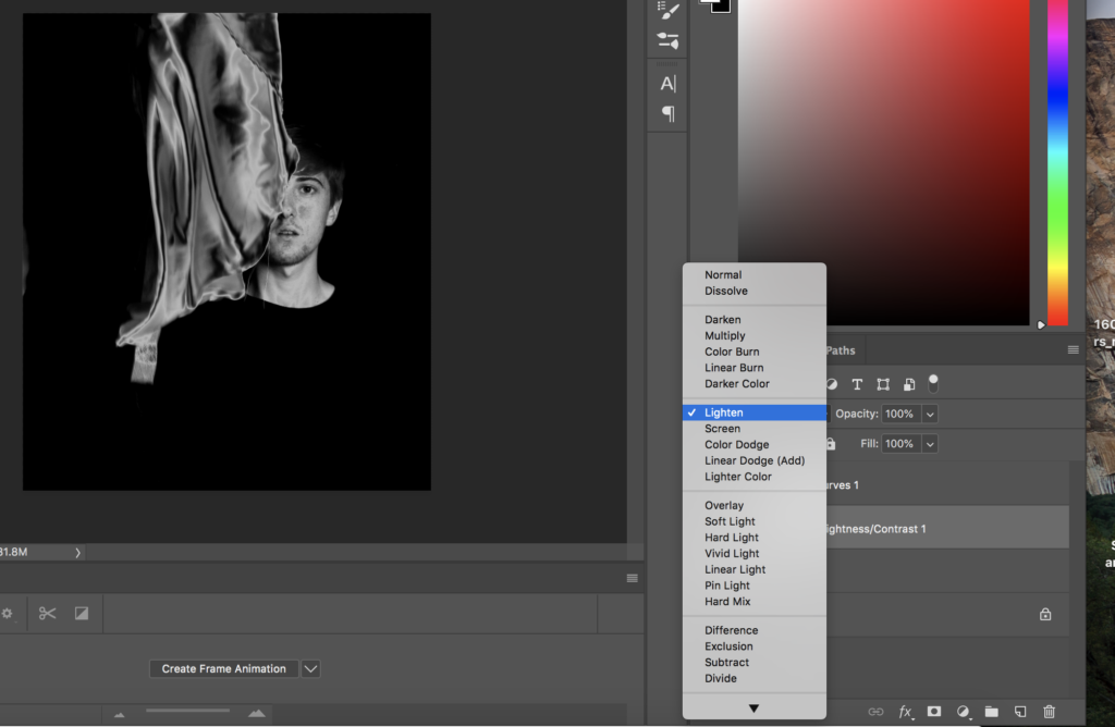
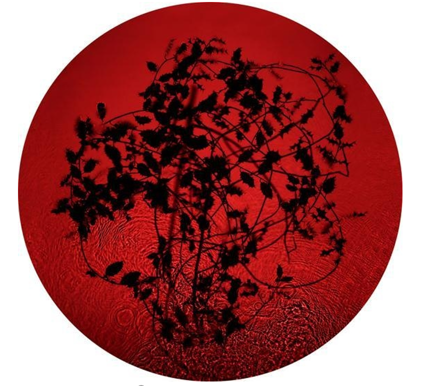
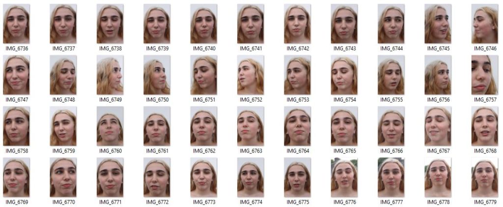
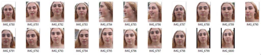
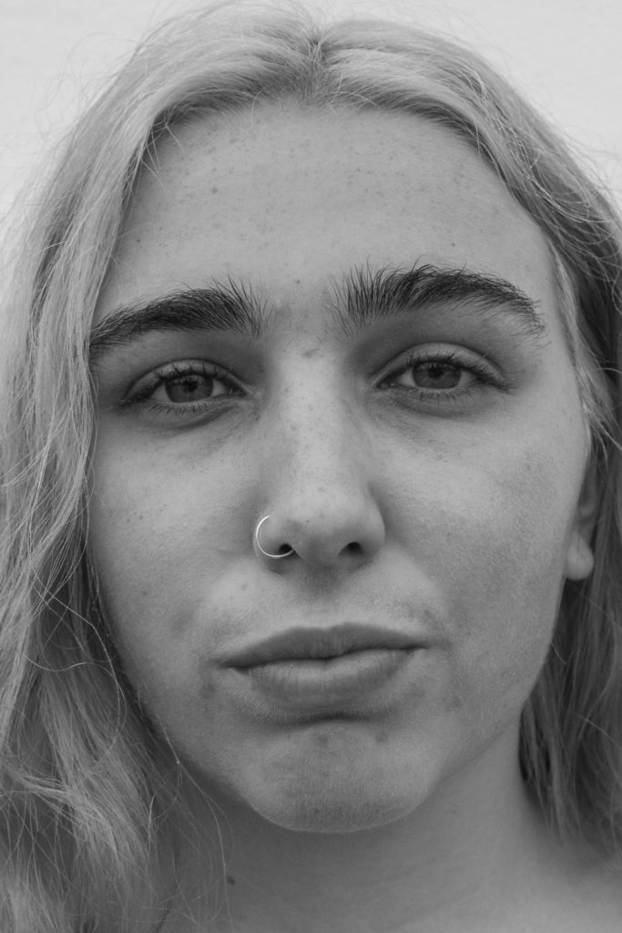
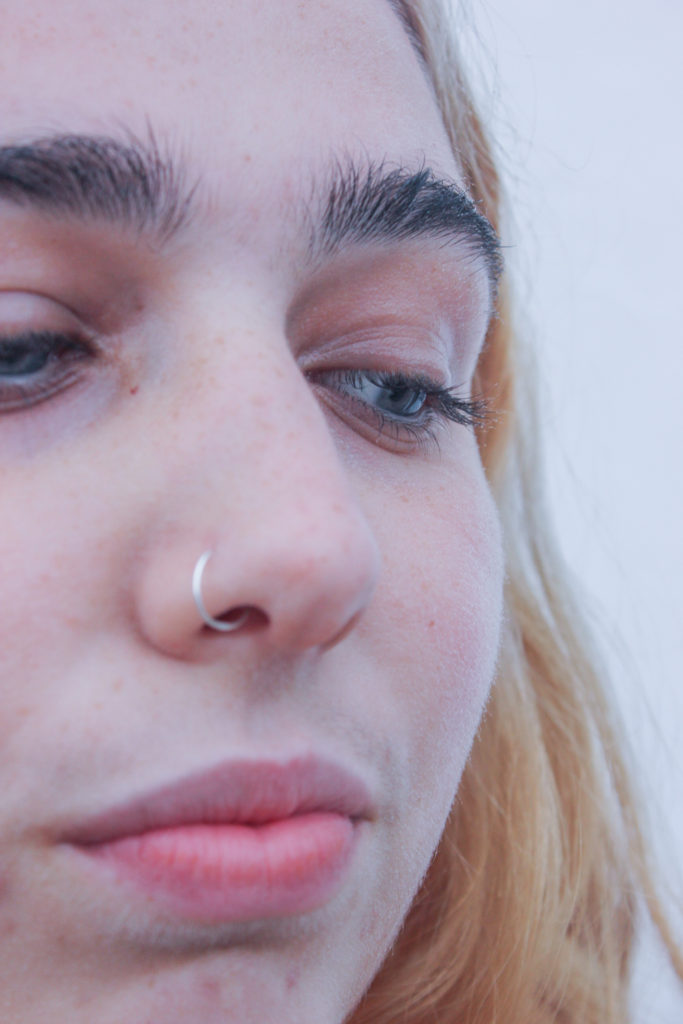
This experimentation, is to show how I could develop my images, into the same silver and black edits similar to ASTRES NOIRS BY KATRIN KOENNING AND SARKER PROTICK. in terms of variation and similarity, I believe the effect of using a repetitive edit system shows the similarity, yet the variation is between the slow movement of life, and the revolving from darkness, brith, life, decay and death. This evolution within my book creates a narrative construct that is able to express.
photoshop development: Turn Black and white , Flatten, Ctrl j, Circle ,Invert, Top two layer , Inward and later one, Control right merge ,Shift ,Play with other setting, Blending moulds, Darken, Final adjustments
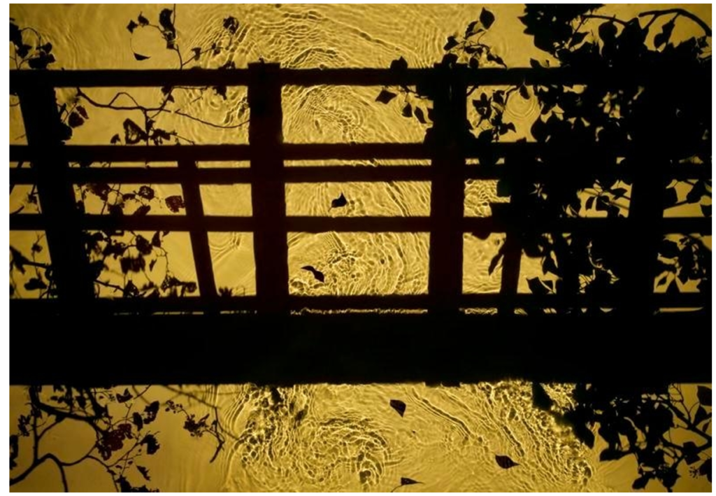
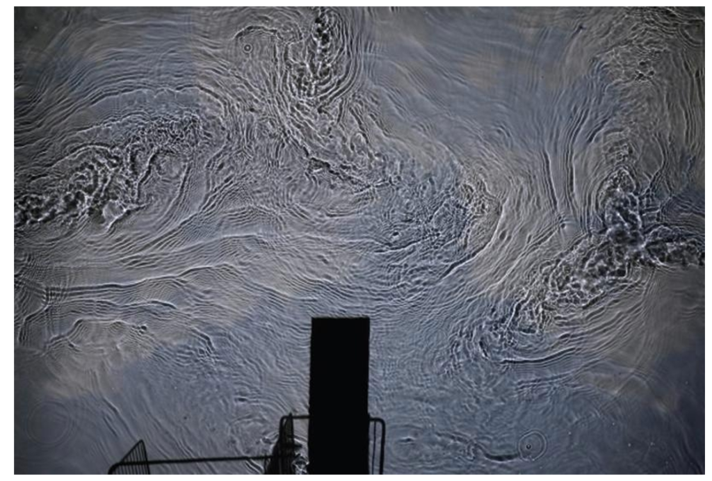
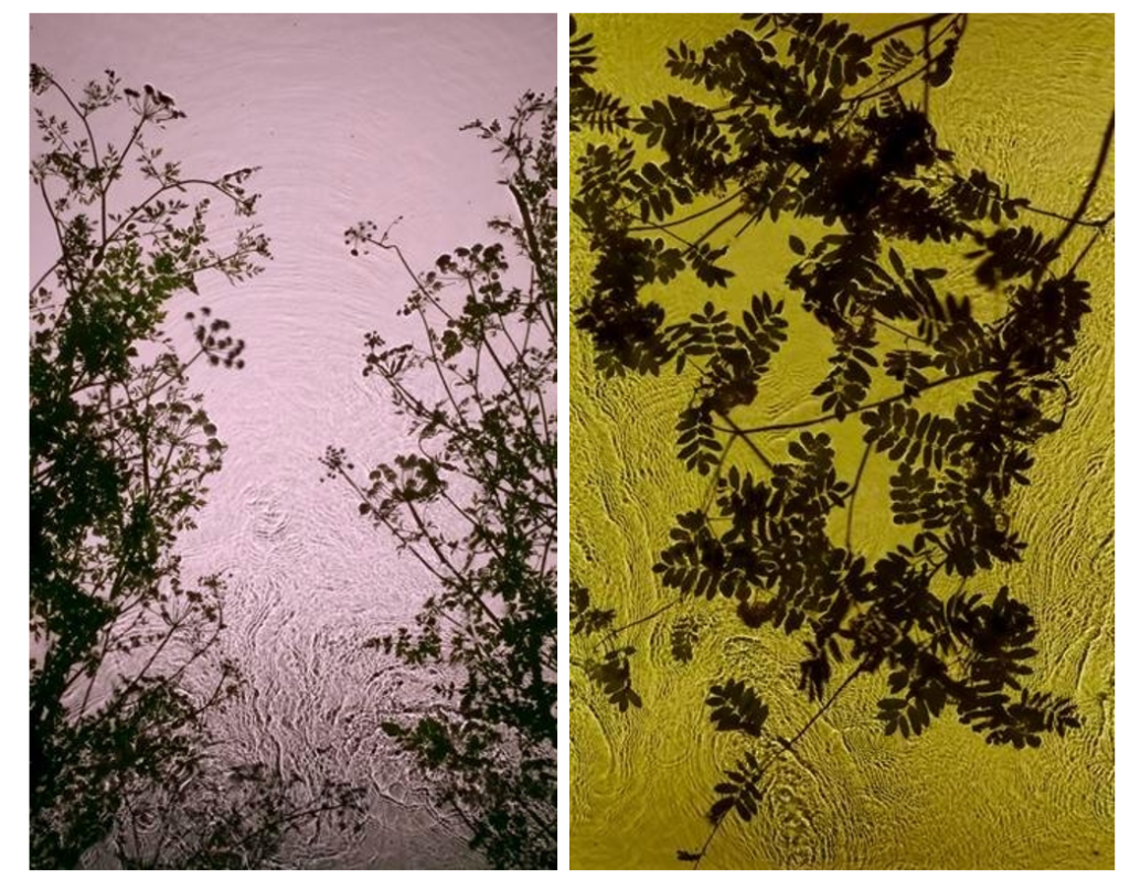
Susan Derges (born 1955) is a British photographic artist living and working in Devon. She specialises in camera-less photographic processes, most often working with natural landscapes.
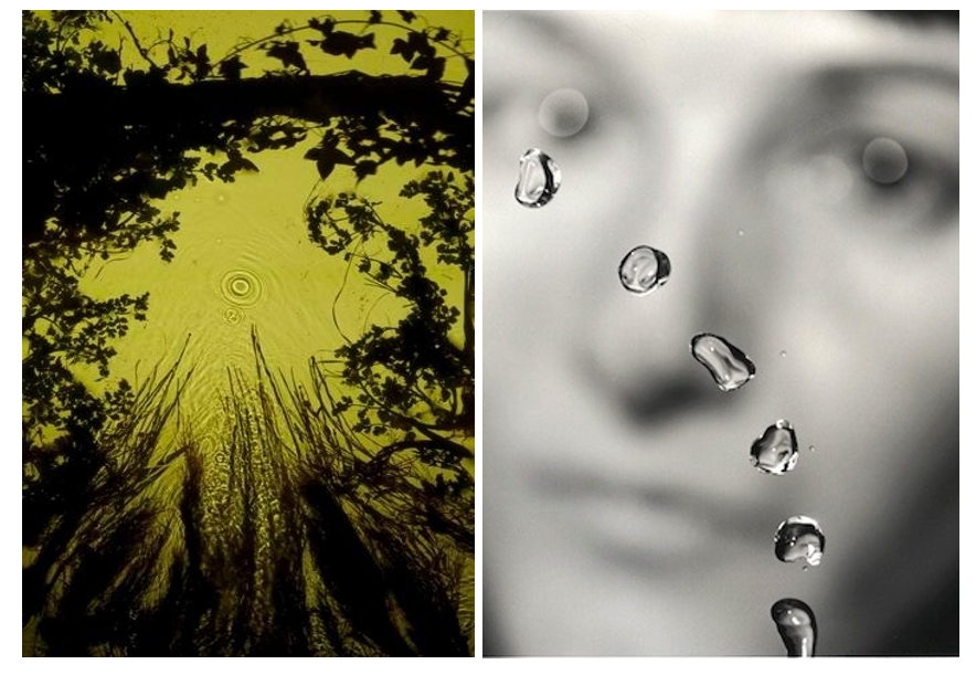
Derges’s 1991 series The Observer and the Observed explored the relationship between object and viewer, and art and science. Propelling a jet of water through the air, Derges used a strobe light to capture the suspended lens-like droplets set against a blurred image of her own face. During the 1990s, Derges became well-known for her camera-less photographs and her pioneering technique of capturing the continuous movement of water by immersing photographic paper directly into rivers or shorelines. Often creating work at night, she works with the light of the moon and a hand-held torch to expose images directly onto light sensitive paper.
Her work revolves around the creation of visual metaphors exploring the relationship between the observer and the observed; the self and nature or the imagined and the ‘real’. Ambient light affects the colour of the images which ranges from blue at full moon to green at new moon. Stormy weather conditions whip up sand in the water, which appears as dark vortices and spirals within the image of the wave.
Her 1997 River Taw series exemplified this direct interaction with the landscape. Using the river near her Devon home as a lens, Derges captured fragments of ivy, ice, and debris reflected in or passing through the water.
It was the river Taw that gave Derges the idea that transformed her work. “I was fed up with being the wrong side of the camera. The lens was in the way. I was stuck behind it and the subject was in front. I wanted to get closer to the subject. I had longed liked the idea of the river as a metaphor for memory. The river being a conscious thing containing memories – all the things it carries with it such as rocks, pebbles, shale. It is nature’s circulatory system. I was interested in the science of complexity – mathematical descriptions, information and stimuli, which are supplanted when a more ordered group of descriptions, information and stimuli come in. I was also working with beehives at the time as a model – seeing a connection between how human beings operate and how nature operates – studying the bees was a way of looking at human structures.”
It was working with a waterfall that Derges realised how fully involved she was with her subject matter. When unrolling a print of a waterfall, she was mystified to discover that there were two columns of information recorded. She realised that the second column was actually her fingertips, which had been holding the print in place. She found herself in the arena of her work, actually part of it. “In making the waterfall prints I could not help being part of them.
Derges’s images of botanical organisms and flowing water are metaphorically rich, alluding to the connections between ourselves and the natural world. Her 1997 River Taw series exemplified this direct interaction with the landscape. Using the river near her Devon home as a lens, Derges captured fragments of ivy, ice, and debris reflected in or passing through the water.
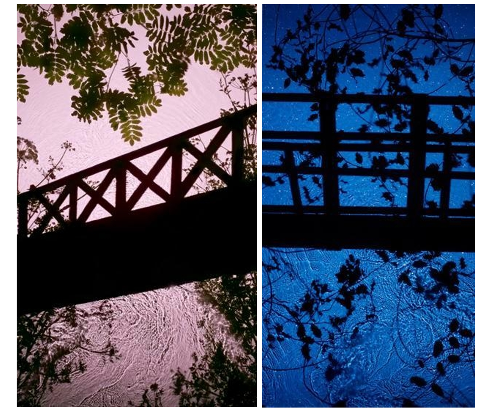
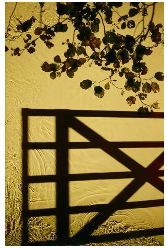
The structures and bridges in some of her images she stated were made with constructed silhouettes. It’s a reference back to growing up. It’s an imaginary place with the branches brought in. It’s a digital print made with a digital camera.”
Derges expressed an early interest in abstraction because “it offered the promise of being able to speak of the invisible rather than to record the visible”. She turned to camera-less photography after experiencing frustration at the way “the camera always separates the subject from the viewer”. Much of her subsequent work has dealt with this relationship – of separation and connectedness with the natural world. In Derges’ photography, nature imprints patterns and rhythms of motion, growth and form directly on the light-sensitive surface of the photographic emulsion, such as falling water drops etc.
Recently she has begun working in the studio combining analog and digital techniques to create new forms and perspectives hitherto impossible to capture. Her practice reflects the work of the earliest pioneers of photography but is also contemporary in its experimentation and awareness of both conceptual and environmental issues.
Adroplet of mercury lying in the bottom of an upturned speaker cone, which reflects the lens of the recording video camera, is subjected to a sweep of sine waves. The sound disrupts the spherical form of the mercury droplet into ordered shapes of increasingly complex geometrical structures until it passes beyond the range of response of the mercury and the camera ‘eye’ re-emerges on the surface of the droplet.
Franco Fontana was born in 1933 in Modena. He took up photography in 1961 and joined an amateur club. He held his earliest solo shows in 1968 in Modena, his native city, which marked a turning point in his career. He had published over severnty books with Italian, French, German, Swiss, Spanish, American and Japanese publishers. His photographs have appeared worldwide in over 400 exhibitions, solo and collective. His images are in collection in over fifty public and private, Itlaisn and international galleries. Many companies have asked him to collaborate on advertising campaigns, he had published photographs in The New York Times and various other major magazines, with Fontana being invited to hold photography workshops in various school, universities and institutes such as the Guggenheim Museum in New York. Every year he holds academic courses at the Politecnico di Torino, and the LUISS University, Rome. He is the director of the Toscana Fotoferstival and has collaborated with the Centre Georges Pompidou, the Japanese Ministry of Culture and the French Ministry of Culture.
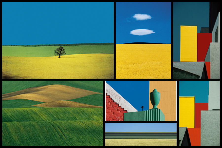
Fontans photography mainly depicts extremely aesthic portrayals of natural landscapes, using vibrant colours and a high saturation to link beauty to what would typically be seen in things such as flower, fields and the sky. What has inspired me is his use of aesthetics through a more unusually high saturation, depicting which would usually be everday scenes in a more visually appealing approach. Here I intend to go about photographing nature in a more aesthetic manner, using the textures and patterns found in each subject as a means of photographing a hidden viewpoint not usually seen to the everyday eye. Some examples of his work can be seen below:
After looking over some of his works I decided that I would go onto analyse one of his images, by doing this it would allow me to have a broader knowledge regarding the techniques used to photograph the pictures and the more conceptual side of them. To do this I would have to look at three categories, technicality, visual and conceptual, the image that I have selected to study is called Paesaggio Basilicata, and was photographed 1990, depicting the use of minimalist styled composition of a agricultural landscape:
Technical:
Technically the image is composed using a very minimalist technique, capturing and using only the yellow crops and the contrasted black and white backdrop to provide the image with an overall very aesthetic product. The photo has been taken in two filters, one being coloured and the other monochrome, by doing this it really highlights the shadows that make up the layers of the hill seen in the background and as a result create an abstract like effect which in a way depicts them as waves. To stop the monochrome becoming too overpowering Fontana has included two small trees located in the center of the photo, including this allows for a more symmetrical and aesthetic looks as the continual gradients of the hill are broken up and separated. The yellow contrasts this due to it being a contrast to black and so allows the shades on the hillside to pop even more.
Visual:
Looking at the image its evident that a high saturation has been used to create the vivid colour of the grass which is depicted unnaturally yellow. This is also contrasted by the monochrome hills which by doing so allows for all of the hills to have a layered portrayal used by the darker areas which have highlighted and smoothed out the grass to create a more gradient effect as a result. Composition wise the placement of the trees in the center has definitely been thought about, this is because of how it breaks up the otherwise consistent pattern found throughout the photo, with the yellow flowers taking on about 1/3 of the image up so that it cant become too overpowering due to its colours.
Conceptual:
The style used for this photo is based on his on vibrant language, Photographic Trans-avantgarde, abstracting the landscape and its colours. By using things such as a higher saturation he aims to create ideals for people regarding the aestheticism of an area which is often over-exaggerated in order to push a certain mind-set onto the viewer.
I visited the CCA gallery which had an exhibition called ‘Behind the Lens’ by Mike McCartney, Carinthia West and Rupert Trueman looking at Britain in 1960s-70s, pop/counter culture, sexual revolution, rock documentary.
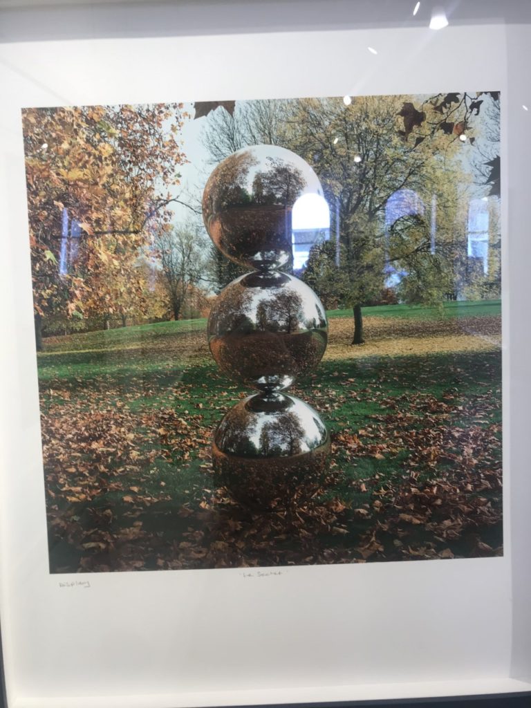
This image stood out to me in this exhibition as the mirrors had been physically put into the landscape rather than being digitally manipulated in. I liked this as it shows nature in a different way to other images I’ve seen. I like how the landscape looks artificial, but still shows the natural waterfall and grass in the background and foreground of the image. I also like the simplicity of the image, and how the tree is the main aspect of the image, with the shadow along the floor.
Pop Icons
The second Private gallery I visited looked was called ‘Pop Icons’ and looked at Pop-art, reflecting on mass consumerism, advertising, celebrity culture, iconography. Artworks by Andy Warhol, Roy Lichtenstein, David Hockney, Peter Blake and other artists were displayed.
1950’s in Britain and late 1950’s in America, Pop Art reached its peak in the 1960’s and went on to become the most recognisable art form of the 20th century. It began as a revolt against the dominant approaches to art and culture and traditional views on what art should be. I particularly liked these two pieces above by the same artist because of their use of primary colours and the sections in which they’re divided into. I think i have slightly explored this in my project where i focused on block colours when editing the original images. Adjusting the colours in these images make them link to the work in pop art, although they are not a bold colours, this is something I could explore in my project further. I also like the use if cured lines and shapes representing the figures i the images as I think they relate to shapes and lines that you fins in natures and plants, linking to my projects.
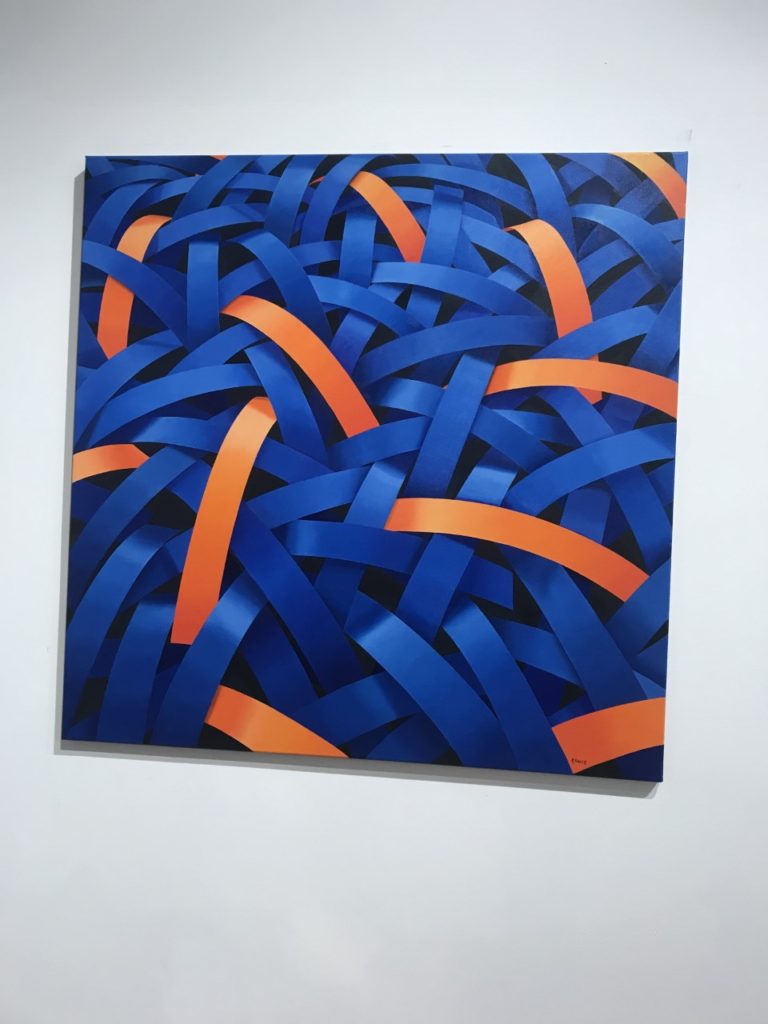
Gallery Director Chris Clifford said, “Pop Art often takes imagery that is currently in use in advertising. Product labeling and logos figure prominently in the imagery chosen by pop artists, seen in the labels of Campbell’s Soup Cans, by Andy Warhol who is one of the artists featured in this exhibition. I also liked this image I displayed above as the repetition of the curved lines and colours, links to the theme of variation and similarity. I also liked how the patterns in the 2D images looked 3D like they wee coming off the image. In his image I thought that the blue colours linked to colours in nature and water, and the bright orange also links to my experimentation where I have included colour which arena normally found in nature within my images to make them stand out.
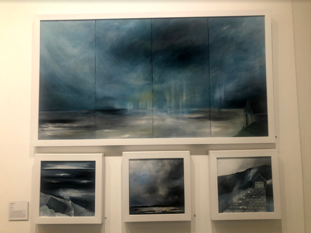
Being Human –
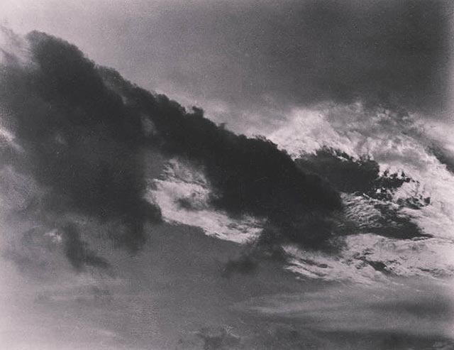
Feminism, representation of women artists in the art world, alternative voices etc.
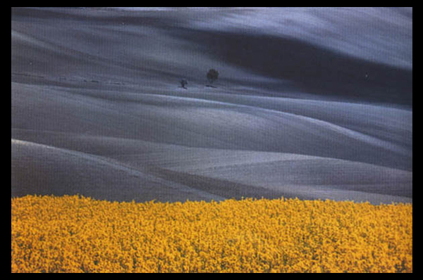
I think the this exhibition related well to this project as a lot of the work focused on nature, emphasising the representation of woman artists. This relates to my work as one aspect i am exploring is femininity in nature, looking at soft shapes that follow a stereotypical view of woman. I particularly liked these pieces above as I think that they represent ideologies of sublime, with the storm and dark clouds above the landscape, creating movement. The tones in the image are cool and emphasis the shadows, looking at the vastness in the scene. This relates to the work I am doing now as I have explored the ideologies behind sublime and beautiful, this type of image being something I could explore more in my project where I look at the other dangerous side to nature, rather than the fragility that i have focused on so far. So far i have explored warm, soft tones and colours in my images, this contrasts to these pieces where predominately cold dark colours are used, and is another aspect that i could look at in my work, contrasting cool and warm tones.