Category Archives: Uncategorized

Filters

Author:
Category:

Book Specification

How you want your book to look and feel:

I want the book to be simplistic in its nature but yet convey a powerful message about the elements. I am processing the book through Blurb so it will be to a high quality and look very professional

Format, size and orientation:

  • 74 pages
  • The book will be a
    standard portrait size , 7.75×9.75 in, 20×25 cm

Rhythm and sequencing:

There will be separate sections for each element in the book but images from different elements will be placed in these sections to make sure that the book flows and connects together. The aspect of the image that I have used to connect the images are the colour , shape, composition, depth of focus and shape. I want to make sure that with each image the image before and after it flow together as without this I think that the book will lack in it rhythm.

Structure and architecture:

Throughout the book there is a range of full bleed, single portraits, 3/4 pages, single landscape images of a double page spread to keep the book visually stimulating. ttrt

Narrative:

The book will look at the individuality, beauty and simplicity of each element and how different each one is but yet how each one is connected and dependent on the other to survive.

Title:

The book will not be given a title, as like Rorschach’s ink blot tests, in which there is no text, it is down to interpretation. I want the viewer to create their own relationship between the ink blots and the portraits partnered with them rather than be hinted at with the use of a title. The title of the book is Element, as the book is looking at the element, but I wanted the viewer to make their own connection

Images and text:

There is one quote at the begging of the book to give the viewer and insight of how I felt when creating the book, but mostly I have left it up to the viewer to create their own connection to the images and their own interpretation. ‘ Earth, water, fire and wind. Where there is energy there is life’ – Suzy Kassem

Colour and B&W (or a mix):

Most of the images are in colour only a view selected images are in black and white.

Paper and ink:

I have selected matte paper for the book as it will help to blend the flow of the images.

Final Print Analysis

I chose these two photographs as final pieces because these flowers are some of the more interesting and successful photographs from photo shoot 1. I decided to present these two photographs as a diptych because this creates variation due to there being multiple photographs and similarity because the photographs are of the same object, I feel like this was successful and using a window mount added a more professional finish. This final piece differs from my plan, I chose to have a larger border around the photographs, because this fit better due to using a window mount.

I chose these four photographs as final pieces because of the interesting and eye-catching effect created by the sequence, to aid the effect of the sequence I have presented the four photographs in a simple straight line on black card, to allow the photographs and the sequence to be the focal point of the presentation, I feel like this was successful in creating the effect I was aiming for.

I chose these two photographs as final pieces because these flowers are some of the more detailed and successful photographs from photoshoot 1. I decided to present these two photographs as a diptych because this creates variation due to there being multiple photographs and similarity because the photographs are of the same object, I feel like this was successful and presenting on black card allowed a simple but effective sleek finish.

I chose these three photographs as final pieces because the cartoon edit creates a striking effect. I chose a triptych because the three photographs together create the effect of variation in an interesting way. To create variation throughout my final pieces I chose to use foam board and black card to present these three photographs. I think this was successful in creating variation and achieving what I was aiming for within the overall presentation of my final pieces. This final piece differs from my plan, I chose to add a larger border around each image, I feel this worked well and better than a slimmer border, for this trio of photographs.

I chose these four photographs as final pieces because because of the bold and eye-catching colours, I have chosen this layout because it gives off pop art vibes which I think is an interesting bonus and the colours contrast nicely with one and other. I chose to present these four photographs on black card because I didn’t want a window mount or foam board to detract attention away from the photographs. I feel like my choice of presentation, black card, successfully showcases what I was aiming for in my presentation of these photographs.

I chose to this photograph as a final piece because I like the simplicity of the photograph but also how interesting it is, for example the model, the flowers, all the different colours. I chose to present this photograph like this because I wanted a simple presentation to not detract away from the photograph its self.

I chose to this photograph as a final piece for the same reason as the photograph above, they both give me a similar vibe in the way that I like the simplicity of the photograph but also how interesting it is, for example the model, the sand, all the different colours and the vibrant yellow dot. I chose to present this photograph like this because I wanted a simple presentation to not detract away from the photograph its self.

I chosen to present these photographs in a triangular formation because I feel like its something different and I wanted to have a variety of different layouts throughout my final pieces. I chose these photographs because they are all very similar but the change in position and distance creates variety within the trio. I also presented it as a sequence, for example, the top is the closest, the second on the left is further away and the third photograph on the right is the furthest away.

Editing: Final Layout/Presentation

I have chosen a variation of photographs, presenting them in a variety of different colours, styles and sizes.

I plan on presenting these four photographs like this, this layout allows the photographs to be directly compared due to the close formation, this also creates a high contrast. I have chosen this layout because the purple and pink contrast with the yellow and orange directly and then both with each other diagonally, creating a balance of colour and therefore more appealing and creates an eye-catching effect. I will present these photographs as A5 prints, this allows all four prints to almost create the effect on one A4 piece, while still being layed out, rather then printed as one. I will present on black foam board, creating a contrast between the colourful photographs and black card.

I have chosen to lay these photographs out in this order, because in this order a sequence of smallest to largest is created. Secondly I plan on presenting the photographs this way because the colours, orange, cream with pink and yellow tones and yellow work again almost as a sequence, darkest to brightest, allowing the layout to be balanced. These photographs will be presented as A5 prints, I have chosen A5 due to the colours and fact that there are three prints, I feel any bigger than A5 would to overwhelming and take away from the effect of the edit and photograph. When presenting these photographs I will use, black foam board, creating a contrast between the colourful photographs and black backdrop.

I have chosen to present these prints, four in a row, to allow the sequence continued in each photograph to be visible within the layout, this creates an interesting effect, leading to what becomes the focal point of the images, the hole in the shell. To successfully allow the photographs to stand out in the layout I will present them on black foam board, this will contrast against the light white shell. These photographs will be presented as A5 prints, I have chosen to present them as A5 prints due to there being four photographs, I feel if the photographs where any bigger, the size would distract from the layout and sequence.

For this layout I have chosen a simple double photograph layout, I have chosen to present these photographs side by side, because I feel this way it demonstrates variation and similarity successfully, for example, the similarity being they are of the same object, being similar, but the photographs are not completely the same, this being the variation within aspects of the photographs. I will present these photographs as A4 prints, I have chosen A4 due to there only being two photographs and I want the details to be visible due to the fact the photographs are so simple, the details are what make them appealing. I will present the two photographs on a black window mount, I feel like this will add an interesting aspect and add to the simple photographs.

This layout will be the same as the previous one, due to the photographs being similar and I want to create the same effect using similar but different photographs.

I have chosen this layout because I wanted to do something different and interesting and I wanted to add a variation of different layouts for my final pieces.

I have chosen this simple layout because this is one of my most successful photographs, so I want to present this as an A4, with a simple black border, to not detract from the photograph its self.

I have chosen to do a basic layout because this is one of my strongest photographs, I want to present this as an A4, with a simple black border, to not detract from the photograph its self.

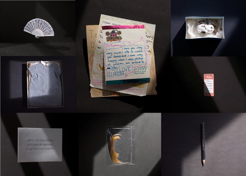
ESA // INITIAL RESEARCH: PHILIP TOLEDANO

Toledano was born in 1968 in London, to a French Moroccan mother and an American father. He grew up in London and Casablanca. He received a BA in English literature from Tufts University in Boston. I consider Toledano s conceptual artist. His work varies in medium, ranging from photography to installation, sculpture, painting and video.

I think Toledano’s work is very interesting and I believe that these photographs are very powerful as they can tell so many stories. If you look at every photograph individually, each object obviously belongs to a person and they can all have a million meanings. When looking at the whole collection, the viewer can begin to put a story together and guess various situations.

PHILIP TOLEDANO – MOOD BOARD

Again I have created a mood board using Toledano’s images. I am using these photographs as a visual plan for the sort of things I would like to photograph. For example, clothing, documents and other objects.

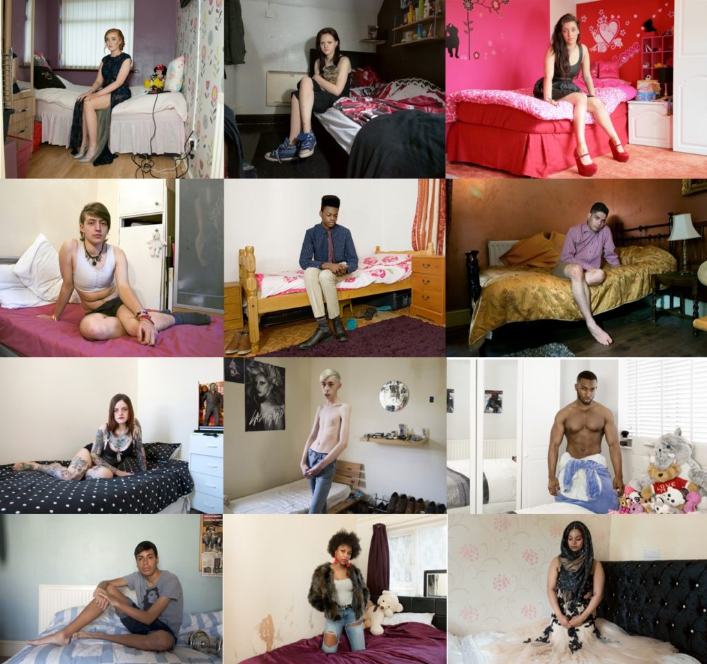
ESA // INITIAL RESEARCH: MICHELLE SANK

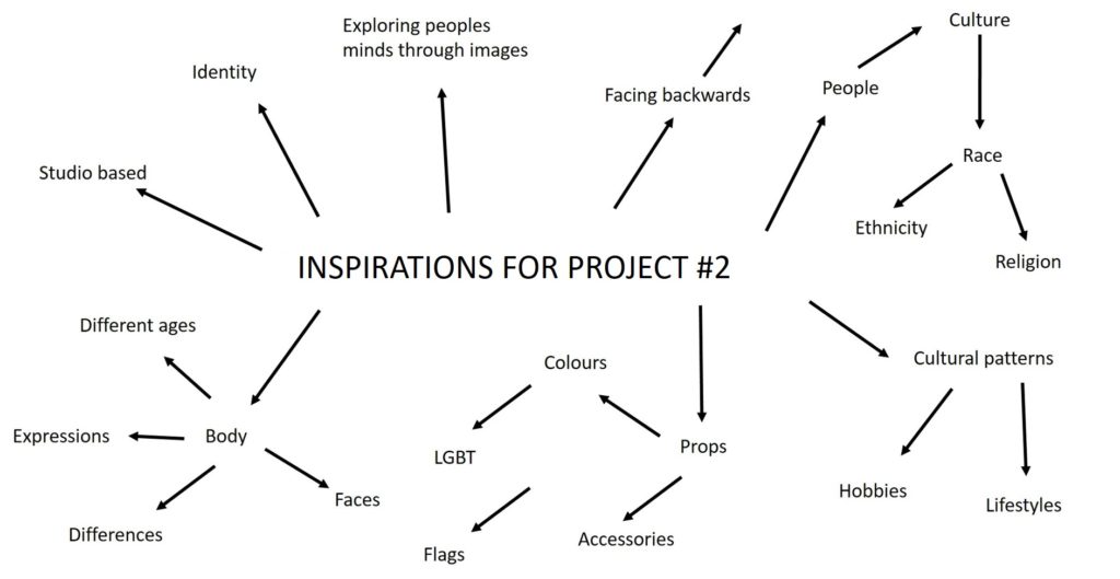
My other artist will be Michelle Sank. I enjoy looking at her work because she also focuses on portraiture, although she does not necessarily base her work on culture, but does photograph different people in different environments and i think these photographs tell stories about who these people are and show real personalities. I plan to use the same sort of approach of taking photographs of people in their everyday environments to show the real sides of people. I think the objects around these people are what bring her photographs together and really makes them interesting as there are always little things to look at.

Michelle Sankwas born in Cape Town, South Africa. She left there in 1978 and has been living in England since 1987. Her images reflect a preoccupation with the human condition and to this end can be viewed as social documentary. Her work encompasses issues around social and cultural diversity.

MICHELLE SANK – MOOD BOARD

Above is a another mood board that I have created using Sank’s images. I plan to use these ideas to take photographs of people of different cultures in their everyday lives, using furniture and other props to enhance the idea of alternative lifestyles and personalities.

ESA // INITIAL RESEARCH: MAHTAB HUSSAIN

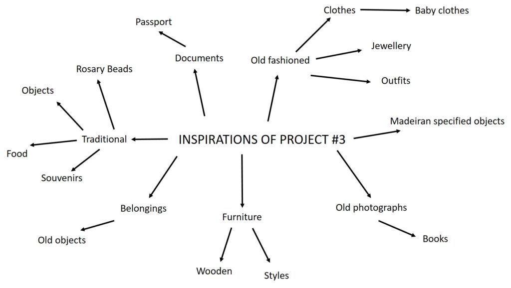
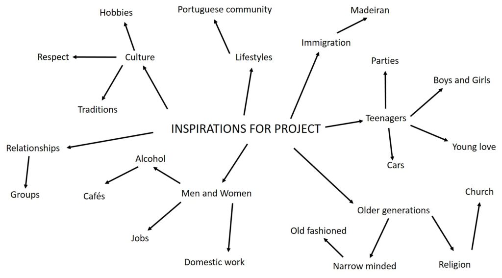
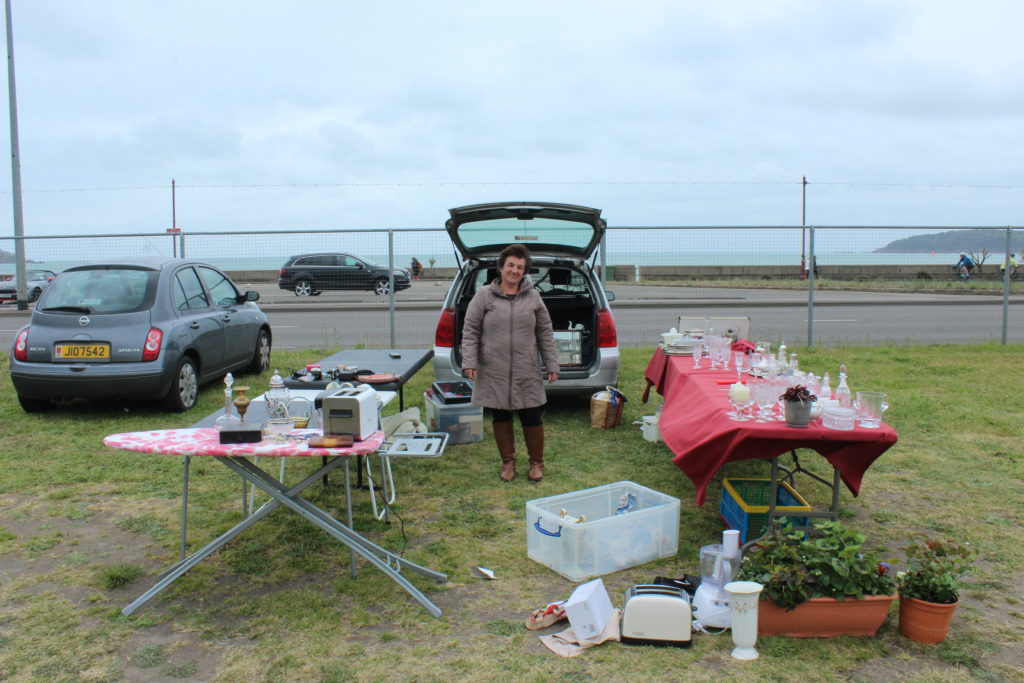
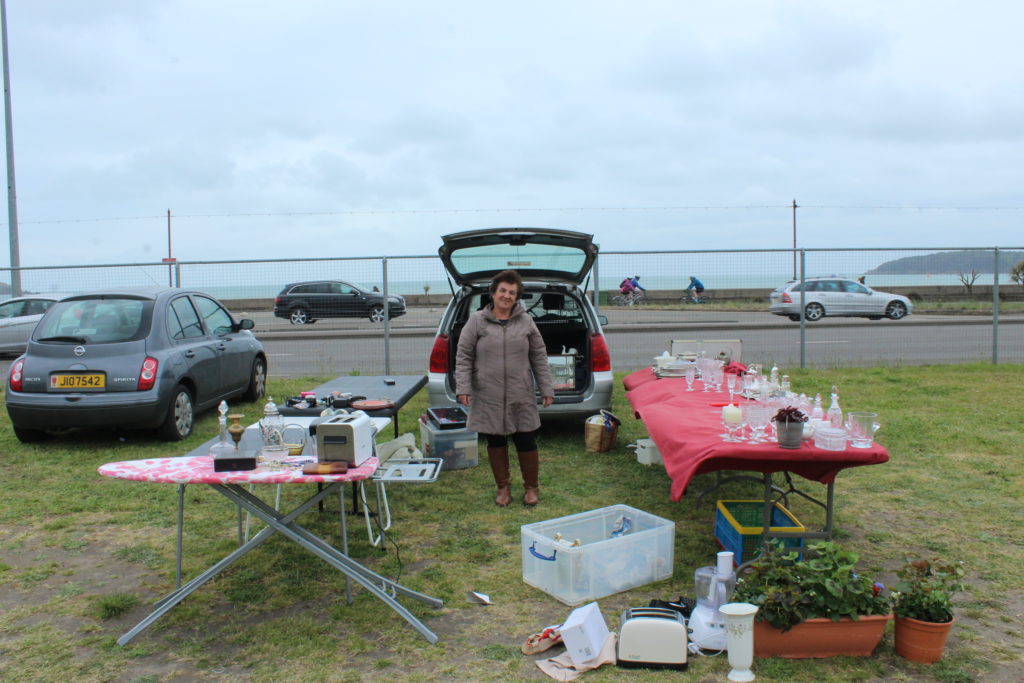
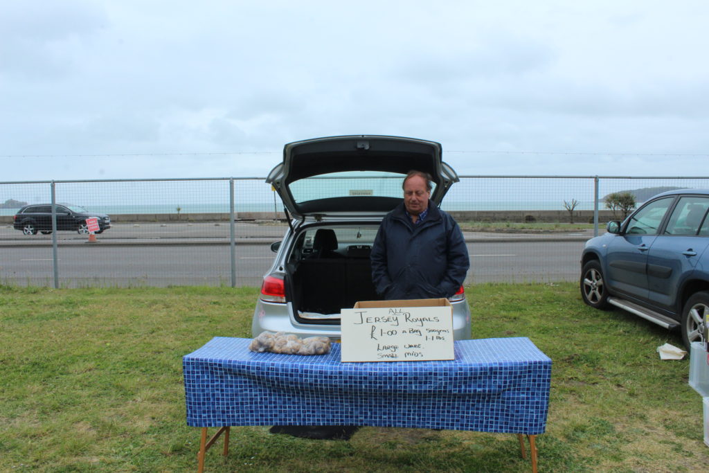
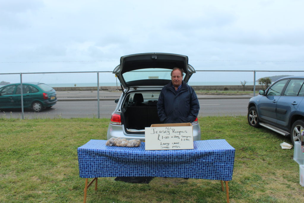
Above, is a mind map of my initial ideas. I have decided to go for a topic regarding displacement for immigrants and how different their day to day lives are. I plan to do this, mainly using portraiture. I specifically wish to explore the Portuguese community in Jersey, and enhance stereotypes. I will do this by capturing, lifestyles, cultures and traditions as a main objective. After researching photographers such as Mahtab Hussain, my interest for this project increased and it think his images are very powerful.

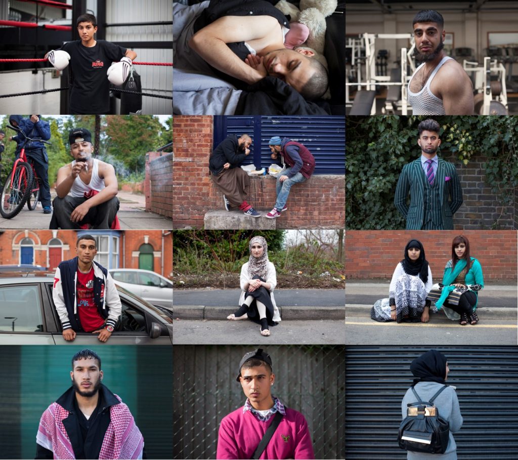
Mahtab Hussain is a British artist who captures images of his friends and family living their lives in a migrant country (in this case, London). These photographs show young Muslim men who no longer live in their native countries. Born in 1981, Hussain explores the important relationship between identity, heritage and displacement. His themes develop through long-term research articulating a visual language that challenges the prevailing concepts of multiculturalism. Hussian has publish 4 artist books. He specialised in Fine Art Photography in Goldsmith College and achieved an MA in Museum and Gallery Management, City University.

MAHTAB HUSSAIN – MOOD BOARD

Above is a mood board that I have created using Hussain’s images. I am using this photographer as a visual inspiration for my cultural photography plan. These photographs attracted my attention as most people are engaging with the camera and I think this give the images more context. My plan is to respond to this artist and explore this type of photography to a deeper level.

final evaluation of project, conceptual and visual

Final evaluation: Overall I believe this project has been my favourite throughout the past two years. It is unique, unlike anything I or anyone else has ever done previously, this innovation of colour, format and presentation creates a hyper realistic emphasis on the power of life. This godly narrative is so successful it subverts expectations of what I usually develop within my work. It is also the first project which has a successful narrative which really evolves throughout yet is linked and further connoted through the exponential editing. The power, delicacy and vibrancy seen throughout is something unexpected and I belive this is why it is so powerful.

How well have ideas developed? : I believe my project has developed incredibly well. I started off initially within the development of fine art, and the questioning of chaos within the media, this Further formed to create a clear distinction between what is important within life, and in what way does everything apply different to our own individual different lives. This having clear connotations between similarity and variation. Soon experimenting with beauty and presenting my own outlook in life I developed upon the idea of haiku and finding beauty within the reality of life, Focusing on beauty however, for myself, this was not enough of a narrative concept and did not allow me to form the type of narrative that I desired for my book. More so combining chaos and beauty The concept of the evolution of life became a clear indexical theme that further allowed more conceptual ideas and flames of inspiration to transpire. To do so I started developing more shoots of houses, objects and people in order to create a more diverse narrative. I achieved around 12 shoots in total, as I wanted this large index for me to be able to show a clear presentation of a long lifespan. I soon discovered much of life revolves around questions, asking how something was created, and or celebrating and worshipping around religion. God I believe is part of any peoples lives, so adding this impression of the story of creation and life and death, just adds in this other layer, which everyone has an understanding of yet is uniquely individual to us all, sensing the similarity and difference. I believe this concept was successful and I then started development for the better finish and narrowed down to achieve a much more successful concept throughout.


Are ideas explored and selective appropriate to intentions? :
I believe all of these ideas explored were definitely appropriate intentions to my project and in the end I was able to use my images of beauty and chaos as they both accessed this level of life experience and religious identity throughout my project as a whole. It enabled me to also form a stronger personal connection to my project, adding in photos of family members and my own personal narrative when it forms to the view of religion and Catholicism.


Are they sustained and focused? Are they reviewed and refined?`:
My shoot started off with basis of a chronological narrative following the story of creation, to do so I started off with what god was said to create first, images of land, nature and sea, so the basic elements of life, this then further explored to images of animals and people and then the outcomes of this soon evolved to objects, houses, and the forming of religion caused by this creation and belief in god. I wanted to create another narrative level however, this was to be using images of nature and the elements to also connote a human life, using water and underwater photograph to show a simulation of birth and sanctity, soon leading into darker tones throughout the book to show a demonstration of sin and decaying of the body.

How many responses/ shoots?Command of camera skills/ photographic techniques and processesUnderstanding of composition/ considering quality of light: I have done around 11-12 shoots, Around 8 of theme are perhaps visible within the book itself. Many of the shoots I put into one contact sheet if they had the same objective, such as the underwater and above water photoshoots. I needed to take a-lot of shoots to show this diversification and understanding of life, to experience things and elements which show a direct link and relevancy to everyones life around them. When photographing I was always looking for a different interesting dynamic of composition. This differed between macro images, Images of of landscapes, close up portraiture, slow exposure and fast shutter speed. This experimentation shows different feelings within each images and purposely done in order to create a dynamic representation. The quality of images was important, I wanted a clarity to be able to know what element everything holds, as this clarity is relevant to why it was created and the usefulness within everyone’s everyday lives. My editing process was unique, I looked at the composition of a piece and it’s main elements of interest and developed it in such a way to show a disposition of colours and light and contrast to create a whole image. This was my favourite part of the process, as it made all the images unique, dynamic, more abstract yet creates this angelic movement, and emphasised the understanding of the piece itself.


What are the overall quality of the images?: The quality of the images throughout the final presentations were very good. Despite being excessively large as an A1 presentation, the final outcome fo the piece. The images within my book are all in good detail, every details clips and the clarity is very good.


How do they respond to research?How do they relate to artists references?: Much of my research started off within looking at chaos, life, and then Catholicism and Christianity. I further looked into the practicality of black and white photograph and its accessibility and accuracy to get good photos. Looking into religion was a very important part, there is so much love yet chaos seen within the old testament, even the story of creation ends with falling and failure to live in a place which is anything but perfect. Because of this the essence of dying and the fous on sentiments which fits this narrative was a very important part of my research, because it was exactly what I wanted to take photos of. Looking at artist was personally My most effective part of my project as a whole, it not only enabled my original editing inspiration, but also exposed me to a type of photography I had never tried to do previously, and also conceptual meaning of how beauty can be found within chaotic and scary parts of life, such as death itself.:


How do the interpret exam theme? : The theme was evidently. variation and similarity. I believe this is shown within my project in a few levels. Firstly the similarity could be explored through the mimicking of editing processes throughout my work, and how this development of life is also just another way to show how may different images can combine into making this repeat exploration of silver and black narrative. Too simulation can be seen conceptually through the relevance of religion. Religion is an aspect fo life which has an affect on everyones, wether they are atheistic, Muslim, catholic and Christian. However the difference and variation is the beliefs and what religion means to them as an individual. When I was asking people about what they think to be beautiful, everyone had a different response, and I believe this to be the same with religion. It Independently varies as an individual yet repeated within the same religious construct. Another similarity the basis of birth and death, no one is able to escape this, it is something which is widely feared yet inevitable. However, I think the way in which you decided to live your life according to this is where it differs. If you choose to be stranded in fear of this you will never have a proper life, whether variation is found within what people choose to be with this information, life their life and seek freedom and independence of love, or not. The accessibility of my narrative is capable of everyone to find an element of relation and fascination, yet they will all receive a different message and final outcome from it. This is the variation and similarity

Hiroshi Sugimoto

Hiroshi Sugimoto born 23 February 1948 is a Japanese photographer and architect. He leads the Tokyo-based architectural firm New Material Research Laboratory. Sugimoto has spoken of his work as an expression of ‘time exposed’, or photographs serving as a time capsule for a series of events in time. His work also focuses on transience of life, and the conflict between life and death. He is also deeply influenced by the writings and works of Marcel Duchamp, as well as the Dadaist and Surrealist movements as a whole. He has also expressed a great deal of interest in late 20th century modern architecture.

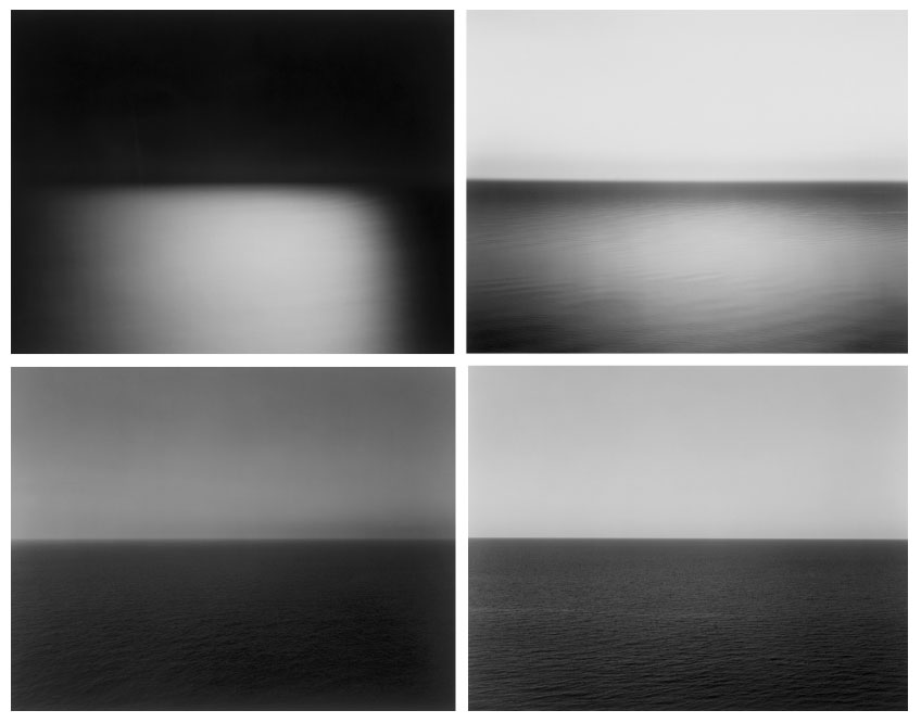
Sugimotos work “seascapes” interests me the most of his projects. In 1980 he began working on an ongoing series of photographs of the sea and its horizon, Seascapes, in locations all over the world, using an old-fashioned large-format camera to make exposures of varying duration (up to three hours). The locations range from the English Channel and the Cliffs of Moher to the Arctic Ocean, from Positano, Italy, to the Tasman Sea and from the Norwegian Sea at Vesterålen to the Black Sea at Ozuluce in Turkey. The black-and-white pictures are all exactly the same size, bifurcated exactly in half by the horizon line. The systematic nature of Sugimoto’s project recalls the work Sunrise and Sunset at Praiano by Sol LeWitt, in which he photographed sunrises and sunsets over the Tyrrhenian Sea off Praiano, Italy, on the Amalfi Coast.


All of Sugimoto’s images are very similar as they are all half sea and half horizon. And they are almost like typologies which is similar to the work of Eadweard Muybridge’s typologies. However where these artists are similar they are also different. Both Muybridge and Qingjun both work in colour primarily whereas Sugimoto works in B/W.

Analysis

Image result for hiroshi sugimoto seascapes

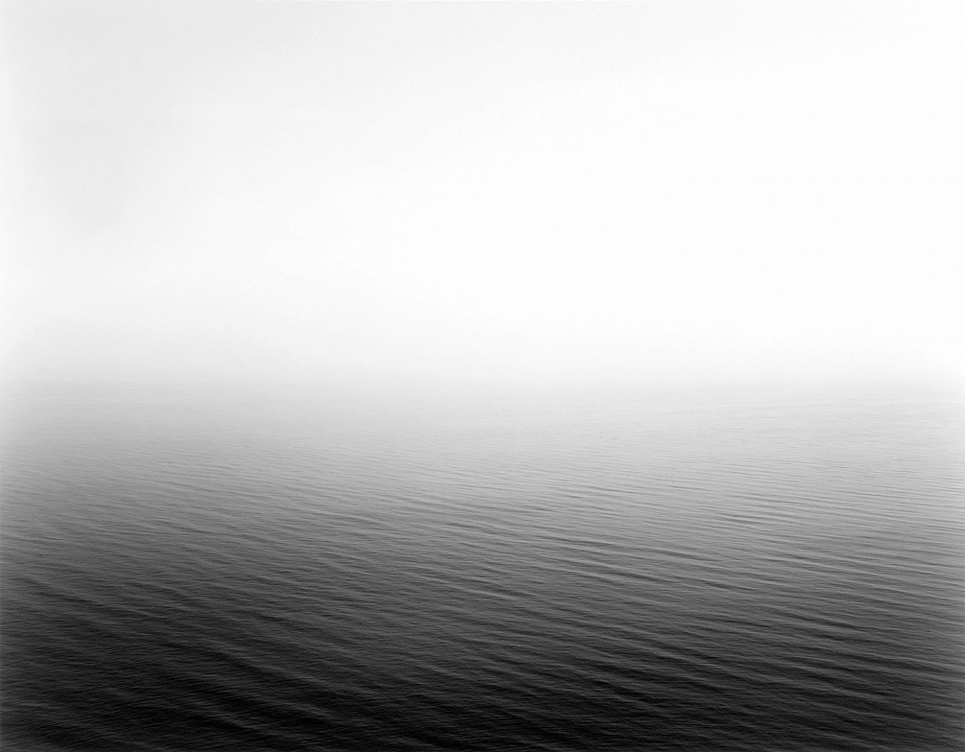
This image like the others in the “seascapes” projects are a natural black and white image. Also the images are very minimalist which makes it quite aesthetically pleasing. Within this image in particular there is no land or man-made features and unlike the other images this photos splitting line between the sea and the horizon is obscured by the fog and mist. The mist creates a sense of unease and when many people look out to sea we look at the horizon. By having the mist there it forces the eye away from the horizon and toward the sea which is where Sugimoto possibly wants us too look.

Eadweard Muybridge

Eadweard Muybridge, born April 9, 1830 and died May 8, 1904, was an English photographer important for his pioneering work in photographic studies of motion and in motion-picture projection.

Muybridge’s experiments in photographing motion began in 1872, when the railroad magnate Leland Stanford hired him to prove that during a particular moment in a trotting horse’s gait, all four legs are off the ground simultaneously. His first efforts were unsuccessful because his camera lacked a fast shutter. The project was then interrupted while Muybridge was being tried for the murder of his wife’s lover. Although he was acquitted, he found it expedient to travel for a number of years in Mexico and Central America, making publicity photographs for the Union Pacific Railroad, a company owned by Stanford.
In 1877 he returned to California and resumed his experiments in motion photography, using a battery of from 12 to 24 cameras and a special shutter he developed that gave an exposure of 2/1000 of a second. This arrangement gave satisfactory results and proved Stanford’s contention.

The results of Muybridge’s work were widely published, most often in the form of line drawings taken from his photographs. They were criticized, however, by those who thought that horse’s legs could never assume such unlikely positions. To counter such criticism, Muybridge gave lectures on animal locomotion throughout the United States and Europe. These lectures were illustrated with a zoopraxiscope, a lantern he developed that projected images in rapid succession onto a screen from photographs printed on a rotating glass disc, producing the illusion of moving pictures. The zoopraxiscope display, an important predecessor of the modern cinema, was a sensation at the World’s Columbian Exposition of 1893 in Chicago.

Analysis

Image result for Eadweard Muybridge

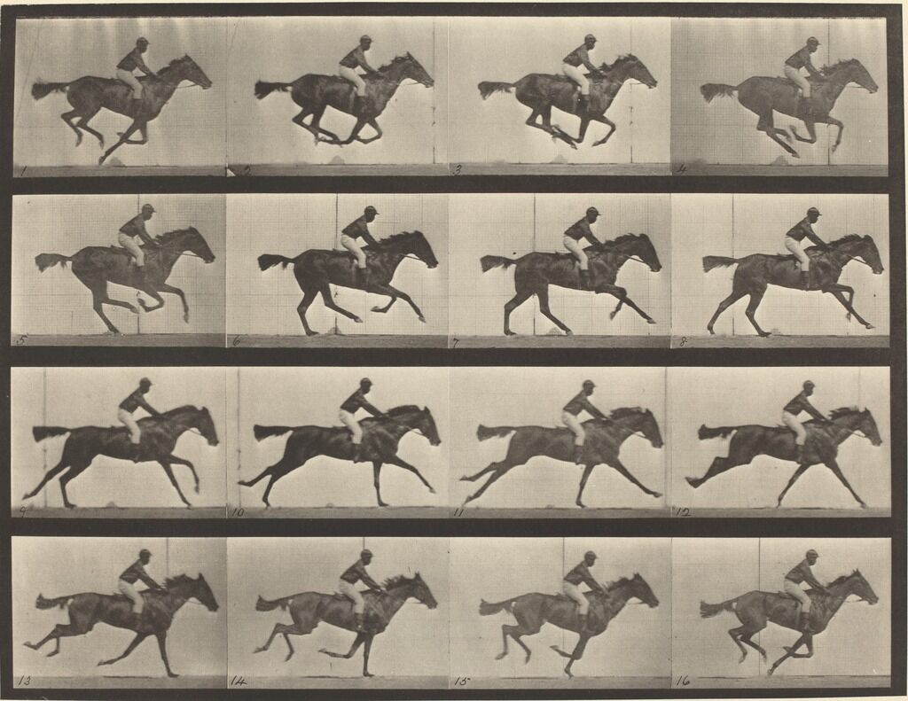
Muybridge’s most famous image is the image which started the cinematic world. This image is shows a horse running in a typology like grid, which when played in quick succession creates a sense of movement. Taken with a self made camera Muybridge created this image for railroad magnate Leland Stanford who wanted to prove that a horses legs don’t touch the ground in one point of its gallop. After this was proved many people dint believe it and discredited the project, which Muybridge lashed back at by creating a zoopraxiscope which was like a projector which played each image after each other creating a sense of movement. The image was taken with an exposure of 2/1000 of a second, and a special shutter he created to allow the right amount of light in to take the photo.

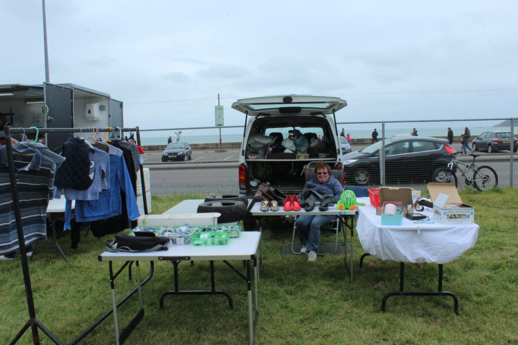
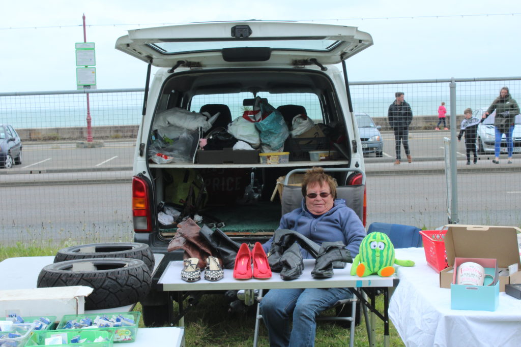
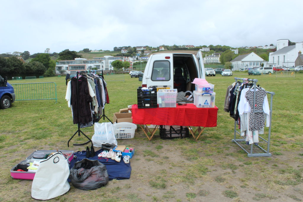
I feel I can use this in my work by creating typologies of stalls to tell a story about the subject of the photos. I feel it can also be liked to Qingjuns work as all of the images are similar, and can be put into a typology as well..