Category Archives: Uncategorized

Filters

Author:
Category:

Final Postcard Display Initial Ideas

For my final display I somehow want to display 24 of my final images as postcard sized prints, displayed somewhat how postcards would be by either a retailer or in a home. The reason I want to do this is because of how I’ve used postcards, archival and my own visual material in order to create my final pieces. And therefore I wanted to turn these back into new postcards that look at the idea of links between Jersey and the rest of the world through trade links, corporate activities, consumerism, tourism and employment; whilst executing this with a chaotic aesthetic as I intended from the beginning of this project. When searching for ways in which postcards are displayed I came across three different ways of doing this.
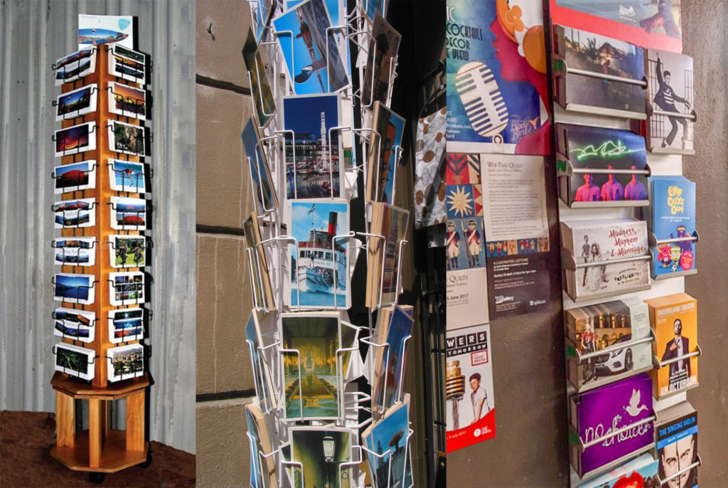
One being a metal postcard stand which you tend to find in souvenir retailers all over the world, these can either be strung up to a wall or on a rotating attachment. I think that these are a great way to display postcards, however the downside of this is that some postcard cover up those behind them, meaning that some may not be seen. Also with these stands they are very expensive and or would be very hard to get my hands on or make myself, so this may not be the best option for my final display, although it was good to consider.
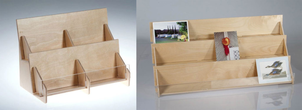
The second method of displaying postcards is a more accessible way of me being able to arrange my postcard sized prints. It is something which I could construct fairly easily with small pieces of thin plywood. I think that also having rows and columns of the prints works for a successful composition/layout of images, it means that I could arrange the postcards in order to create contrast and clashes between certain prints. However the issues with this method of display are firstly that the stand its-self, to fit all of my 24 prints, would have to be quite bulky and would also be a problem where portrait prints may slightly cover landscape ones.
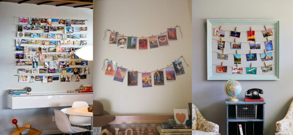
The third (and most fitting) option of display is some form of stringing up the postcards with pegs. This could be done nicely with a board of wood which is big enough to fit all of the postcard prints (most likely in rows/columns) of 6×4 or vice versa. This would be the most ideal way of displaying my final 24 postcard prints as it will ensure that I can space out each print without any issues of overlapping or covering up. It will also show a good narrative of my work and tell a story of how connected Jersey is with the rest of the world through trade connections which is the concept behind my whole project.

So after looking at all of these display options, it is clear to me that the most appropriate option for this would be the third, by stringing up each of the postcard prints in rows.

PRESENTATION IDEAS

First idea:

For my first idea i wanted to produce a large scale image showing my typology’s of products showing the consumerism. I wanted to print off the image at a large scale so I want to print the image too A1 size. The reason for it being at a large scale is to show that these products that are usually quite small and often overlooked will become visible and will be put as the the main focus. The image bellow is the order of the image I want the layout to be and also i want the images to be in colour to show the detail of the illustrations.

Second Idea:

For my second idea I wanted to use the same typology images as they are being highlighted but this time i wanted to separate the images more so there would be more focus on each individual product this time. To achieve this i was going to cut window mounts onto two boards splitting each board into 9 a5 images. For these images I wanted to Produce them in Black and white as this time i wanted to look at their tonal qualities.

Front Cover

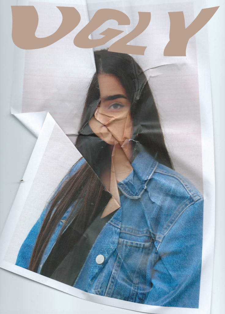
For the front cover I wanted to test out a variety of image and text combinations to see which would suit the style and message best. With my title being “UGLY” I wanted to make the corresponding image relevant and obvious with the idea and theme. The title is a comment on what beauty and therefore ugly actually is, I hope that it will challenge the viewers perspectives and make them question these commonly used words and ideologies. I wanted to keep the clastic magazine layout with the bold masthead across the top of the portrait page, and oppose the stereotypes seen in beauty magazines in other ways.

This font is bold and clear, I sampled it in a skin tone shade taken from there background image because this corresponds with running theme throughout the magazine of neutrals, browns and pinks. I tested having the font in the foreground (over the image) or in the mid ground (appearing to be behind the model). I achieved this by changing the layer opacity and erasing the parts of the word covering the models hair. This image is already distorted and unconventional with the folds and corners of the paper showing, acting ads a new frame inside the border on the magazine page.

I also tried warping the text, I like the way this turned out and fitted with the idea of distortion and imperfection. I want to develop this concept further with different fronts, warp effects and background images to see which work best together. The front cover should be striking and give the viewer and idea of what to expect inside, it ultimately sells the magazine. However saying this I also want it to be elegant and subtle.

I continued to work with the same warped text over a different image, this one is more lightly distorted and has the printed page boarder cropped out making a more minimal and classic look to the cover. I made the text white and layered it offset with a coloured version of the text to look like a shadow, I made this shadow n the nude colour along with a black version which looked more bold but didn’t fit in with the interior of the magazine.

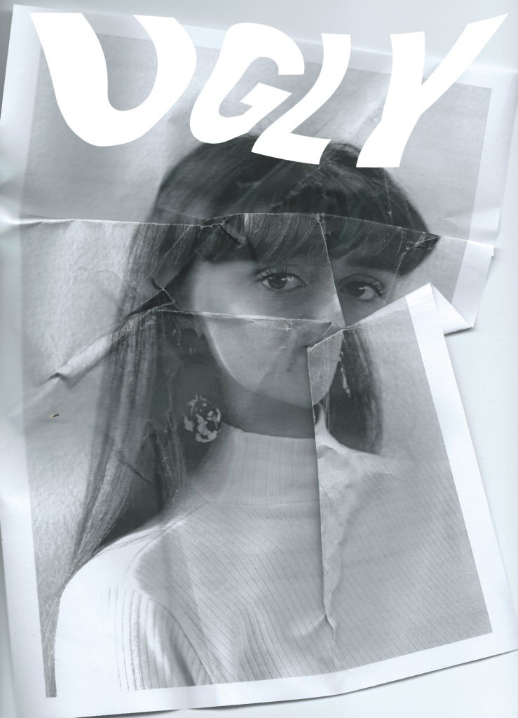
I continued to experiment with different texts, now over a black and white image. I tried black with a white shadow, and multiple layers of different nude shades stacked on top of one another as well as simple white

I used a font similar to what vogue and other big fashion and beauty magazines use, this is usually linked to a classy up market and professional style. I then warped the text similarly to the last text edit to give it a distorted look similar to the style and editing of the images inside. I also want to continues the style of the text on the cover throughout the magazine pages. I tried this style on top of this image because I like the faded colours and the way the text matched, the smudged foundation over he image created a blank canvas. I thought the black text was too heavy and the white blended in too much with the background. To solve this i added a subtle drop shadow behind the white text so it could be read better

Next I tried a text outline to give a more subtle look rather than the bold text. I experimented with this style in various ways adding nude colour layers and small drop shadows to help it stand out from the pale image.

ESA // Photobook Specification

How you want your book to look and feel:

Paper and ink: I will be using standard 80# paper and coloured ink for my photobook, I think that the coloured ink is important for the images because it helps provide a clear distinction between high and low tide, it also helps the vibrancy for the water.

Format, size and orientation: The photobook will be a square, 7in x 7in.

Binding: I am going to use a soft cover for my photobook because I want to create a feeling of movement throughout.

Title: I have chosen the literal title, ‘Tidal Movements’

Design and layout: I am planning to use a variety of image sizes throughout my photo book. The majority of the photobook pages will have single images, however, I am wanting to have some breaks to make it visually more interesting, therefore some pages will have grids of four images, or I will have some pages with two images to a page. I am also planning to have a double-page spread of a panorama. I am not planning to have any foldouts or inserts.

Editing and sequencing: I have chosen images that I feel flow throughout the photo book, the images I have chosen I feel create movement and therefore suggest a flow throughout the photo book.

Images and text: The text that I am using within my book is to show where the photographs have been taken, and whether the image is showing the low or high tide.


Final Prints and Exam Mock Up

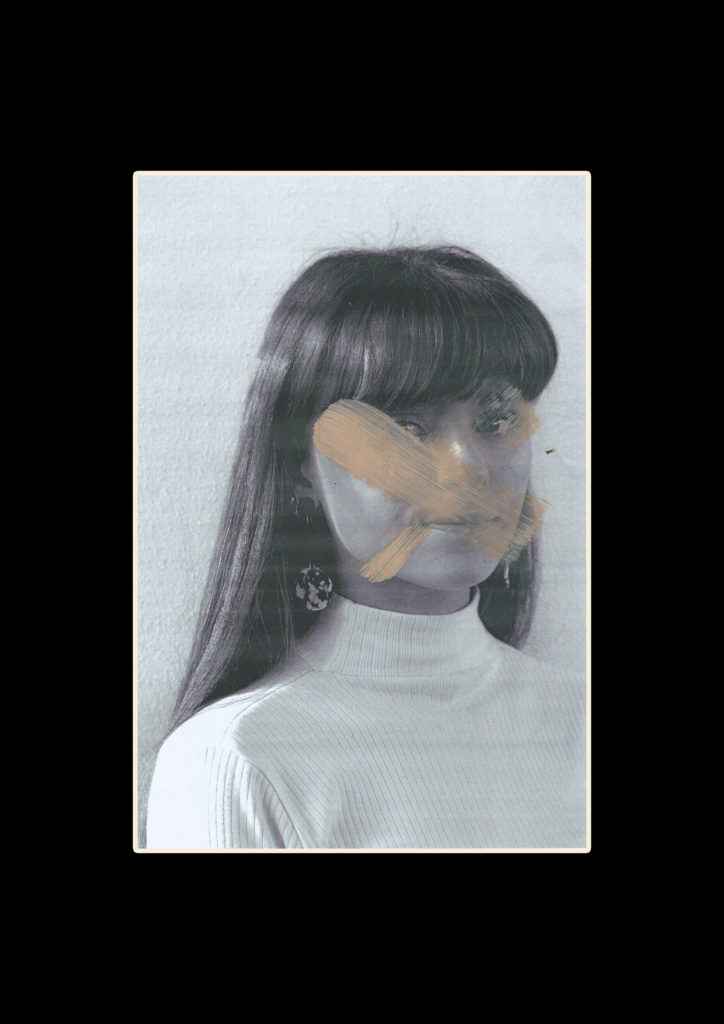
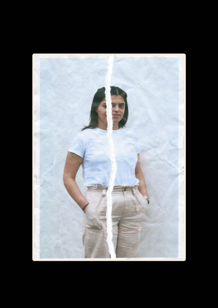
Along with the final outcome of the magazine I want to print a range off different edits which I can mount and display giving an overview of the project outcomes. For these two hand edited and re scanned images I want to simply frame them with a black window mount. I will use an A3 piece of black card and cut an A4 sized hole in the centre with a bevel cutter. I have chosen to do this so the editing and fine details stand out on their own, I also this the black boarder will help the slightly faded images look less washed out.

I want to do some more hand editing with these close up images, for the magazine I used photoshop to create a layered collage effect. I want to re create this in an A3 size using foam board as a backing. I am printing the background rectangular photos as A3 and the 4 square photos as slightly smaller than A5 allowing for a gap around the images for the background to show through. I will cut all the images so there is no white and back them on foam board o make them stand off the page, I will then Stick the 4 images onto the background image. Bellow i have made a mock up of what this might look like. The foam board will show slightly around each image helping to frame it. I will do this for both sets of images and once they are done I will review if they should be left as singles pieces or put together on another sheet of foam board.

Finally for these portrait images which I have printed as A4, I want to back then as a duo on white foam board. I think they are powerful images with complimentary colouring and look good next to one another. They are minimal but with the detailing on the faces I don’t want to distract by framing them with too many other images. The white foam board will match the white lines on the faces and some elements of the clothing whilst still showing up the grey faded background.

Book Specification – Rinko Kawauchi

Image result for illuminance rinko

Deconstruction of the physical and narrative features of ‘illuminate by Rinko Kawauchi :

Illumaiance is one of the book from a three part series called the ‘Utatane’ series, in which Rinko describes it as
‘Utatane re-creates a fragmentary and fleeting world in which every detail relates to notions of birth, life, death and the passage of time’. It focuses on the tiny elements of life that we would miss out on in out normal everyday life. The book has a female touch which is evident though the pastel and soft colours which is a running theme throughout the book. The book was published in 2011 and is £40. The book is very heavy to hold as it contains hundreds of pages of photos. Each of the pages are think in its quality which has helped to give the book and very professional feel to it.

Format, size and orientation:

The book is 11 x 8 1/2 inches, 163 pages, 144 four-color images. The book has been made as a cloth bounding a using Japansee binding to hold it together, due to this it gives the book a rough texture to the hands when it is held.

Rhythm and sequencing

The book focus of the book is a sublime and spiritual aesthetic that runs throughout the whole of the book. The book links together as a whole as each image links to the next one. Each image has a unique style which contains a spiritual element which Rinko is able to create easily. In the book there is the constant pattern flowing throughout the book of circles and the sense of moving, nearly on every page there is some form of circle weather it be tiny or small or the center focus of the image or just out of the frame. I think is meant to be a metaphor for the circle of life as Rinko said that the book is meant to ‘inescapable life and death and everything in between’. However some of the images that are presented next to each other are contrasting, its the contrast within them that works well together, such as the light and shadow and the line compared the circular shape.

Image result for illuminance rinko

Structure and architecture:

Her work is very much inspired by the religion of Shinto that all things on earth have a spirit, hence no subject is too small or mundane, which is evident in this book. I feel as if her book is a reflection of her view of the world, she is able to see more than the physical object such as a tree she sees the re marke able beauty in it. What inspired me most about her work, is how beautiful her images of everyday landscapes she has photographed in way that they appear beautiful. She is able to photograph the beauty in everyday life. Her images range from landscapes to portraits to abstract scenes, in her work she applies a soft touch to all of the images, so they look very relaxing and visually pleasing on the eye. Her work is very similar to the style of Laua El Tanaway, both of their work has a dream like feel to it, are very very bright and the colours in the images are very desaturated.

She brings a very contemporary and fresh feel to her work, she is breaking the conventional rules with her photography and shows her perspective of the world. The framing of her images are not always typical photography angles and would be sometimes consider incorrect but the way that she frames it and uses symmetry and patterns adds much more depth too her images, looking at her work as a viewer I am able to see Rinkos mindset and look on the world and I can tell that she views each work personality and emotion into each image and each image has a meaning and nothing is placed by accident, Which I hope that I have transferred into my work and a viewer of my work would be able to pick out these qualities in my book.

All of the images are 6x6squares that have been positioned on the top section of the page, this is consistence throughout the book

Narrative:

There is no narrative to the book in regards to telling a story, but there is this sense of flowing and everything come full circle. As the images are of everyday things and situations I think that these images must have been taken over a long period of time and then have been carefully selected to get this sense of connection between them.

Title:

The book is titled ‘Illuminance’,which is visually reflected in the images as all of the images are very light and look like they have been over exposed but Rinko had done it in a way which has given a nice aesthetic to the images which has become a trade mark style of hers.

Colour and B&W (or a mix):

All of the images are in colour but are very light and the tint of the colours to give them a certain look to them, almost as if they had been taken on a film camera but they had not.

Image result for illuminance rinko

makeup photoshoot

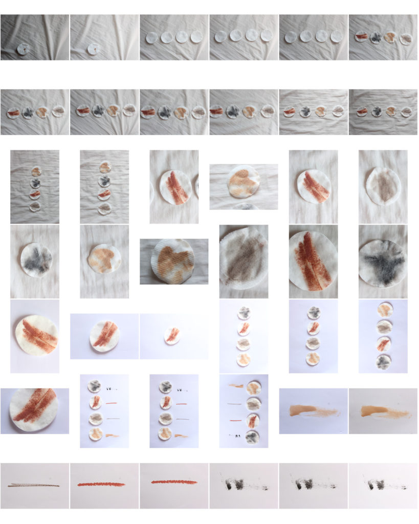
I conducted an extra photoshoot to fill pages in the magazine and compliment my portrait images. I wanted to capture the idea of how people use makeup to correct their faces and make them look a certain way. These images have similar colour pallets of pastels and skin tones to the portrait images I have taken meaning they will fit the theme well

I decided to edit these by duplicating them and turning them into pattern backgrounds to created breaks from portraits in the magazine pages.

Chen Po I – Photo shoot (Photo Shoot 6)

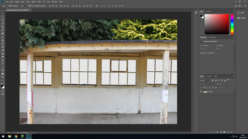
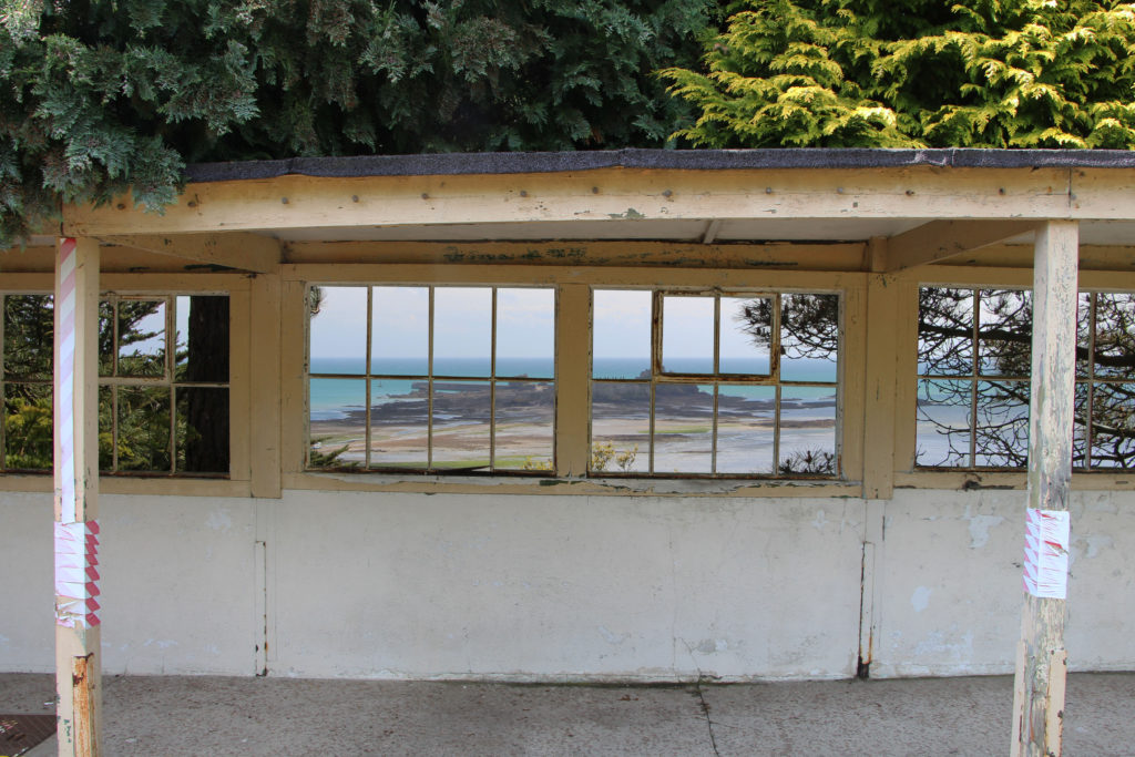
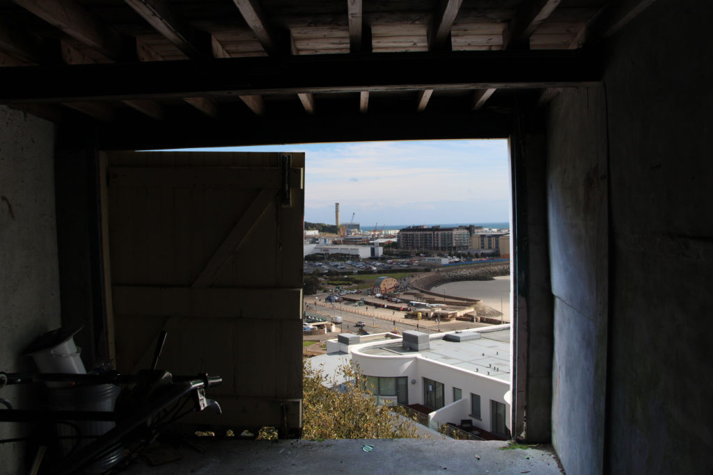
To complete this photo shoot I went to an abandoned location which I knew had a variety of windows, doors and openings which could be used as frames. I photographed these openings with the plan of removing the inside of them and replacing it with a different image. This is to follow in the style of Chen Po I who does a similar thing, the idea of this is to show the a different view of what would have normally be seen though the window.

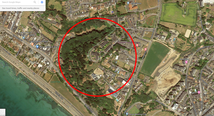
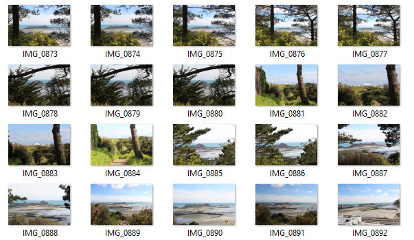
The building I chose to explore was an disused care home overlooking the town. The view from the home has been obstructed by the grow of a woods. I photographed past and through the woods to simulate what the view would have been like before the home fell into disrepair.

Photos of the potential frames I could use.
Photos of the view.
This image has an empty alt attribute; its file name is image-9-1024x576.png

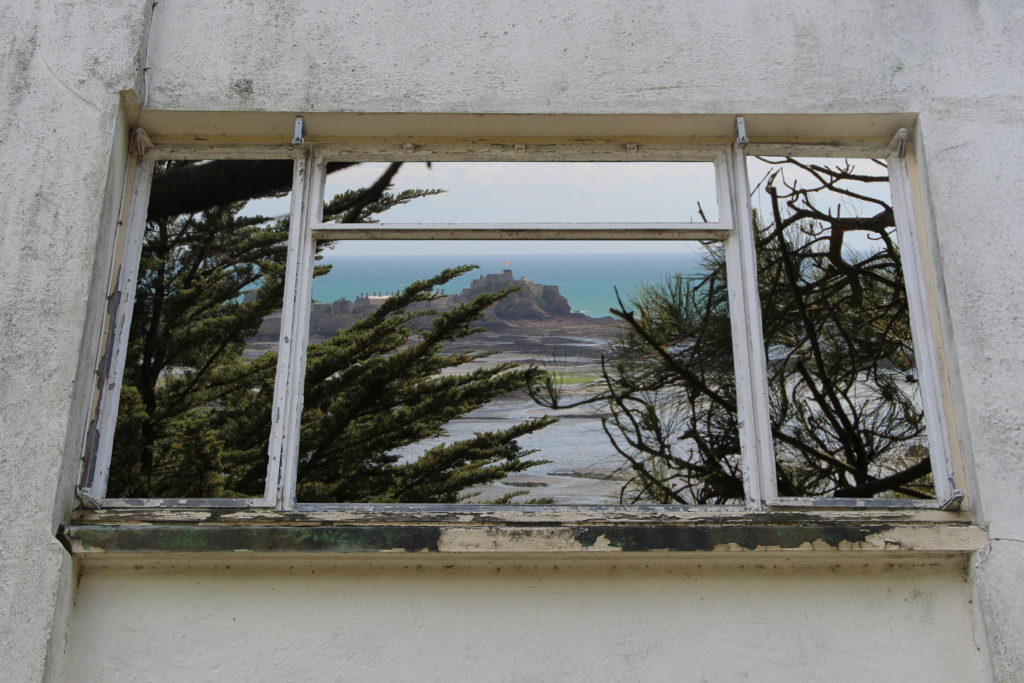
To manipulate the photos I used the lasso tool to cut out the middle of the window frames. I made sure to not just to use straight lines when cutting and instead used lots of little cuts to make sure it makes the damaged frames.

This image has an empty alt attribute; its file name is edit-1-1024x683.jpg

Once I was happy with the cutting I placed the background image behind the first image to create the effect that that is the real view from the frames.

This image has an empty alt attribute; its file name is edit-2-1024x683.jpg
This image has an empty alt attribute; its file name is edit-3-1024x683.jpg

Final Outcomes

The final prints I chose I think display the best images that I took over a array of different shoots all displaying water, earth, fire and air in a different but similar way. I have decided to present the A3 and a4 images together on a card to represent a summary of the project.

A3

Each of these image represent a different element Earth, Fire and Air as I fell as these images are the backbones of the project holding it up and I want to show the detail within the image clearly, however I have not chosen an image from fire as I feel as if its present in the project is not as important as some of the other work.

A4

A5


Final Postcard Prints Selection

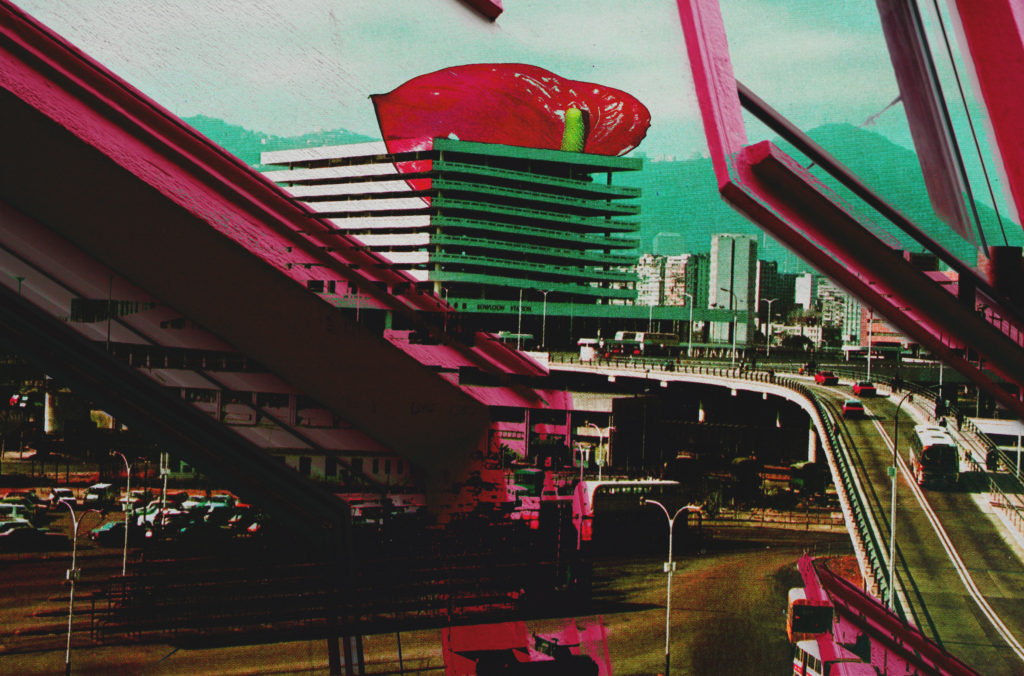
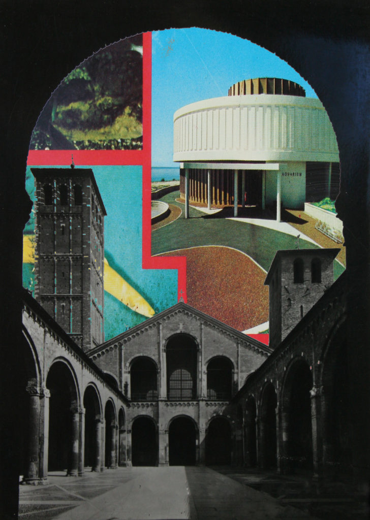
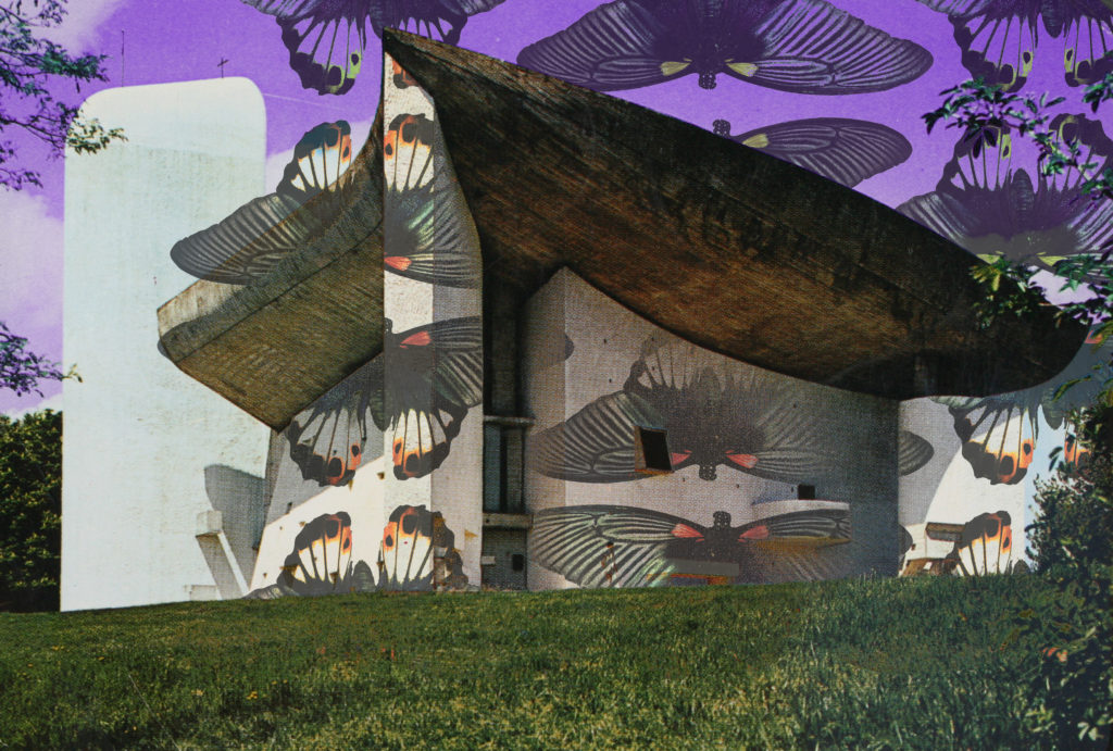
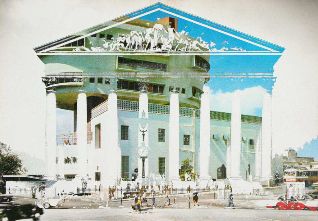
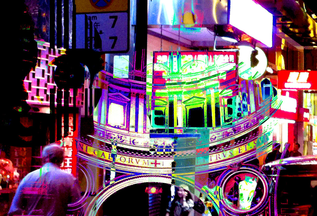
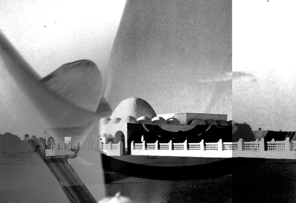
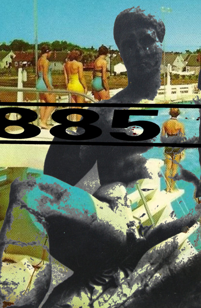
Aside from the 8 postcard backs which I have chosen to print (in my previous post) I will also be printing the following 16 photo-montages in postcard format. Through this project I have created nearly 50 variations of photo-montages which successfully meet my intention of symbolising and displaying the connections between Jersey and the rest of the world through trade, tourism, and actually visual surroundings within societies around the globe. Posts will follow this looking at how I will display these 24 postcard prints. Here are the 16 photo-montage prints which I have chosen, followed by an evaluation of why I chose these specifically.

Out of all the photo-montages which I have produced throughout this ‘Variation and Similarity’ project I have chosen these 16 above for a combination of reasons. First of all I believe that considering my initial specification which stated ”I will produce photographs surrounding the theme of chaotic imagery. I plan to do this by creating photo-montages, collages and edits in response to the artists and photographers which I have and will research. I am going to relate this work to the issues of overpopulation and capitalism which have and still continue to play a big part in the overpowered development of the world. I will photograph all kinds of things relating to this theme as rather than limiting myself to one specific subject matter this will not allow me to produce pieces with chaos as the main part. These issues of overpopulation and capitalism are something which closely links Jersey with the rest of the world, through trade, immigration, politics and culture. I plan to explore this link and how it has developed over time, looking at the past and how it has become the present. And then how the future may look in terms of these issues. This will be executed by the use of archival and found imagery mixed with my own purposed photographs through means of collage and montage.” That these 16 photo-montages most reflect the initial aim of my project along with showing inspiration from the artists, photographers and movements which I have researched throughout the project. Secondly I believe that they are a good combination of images as there are a range of different formats within them such as some monotone and some colour as well as some being portrait and some landscape. This will mean that the final display doesn’t look too uniformed and will in fact look like a collection of actual postcards which is the look I am going for. Third and finally the most basic reason for why I chose most of these as postcard prints was simply due to the fact that I thought these 16 outcomes were the most aesthetically pleasing and balanced.