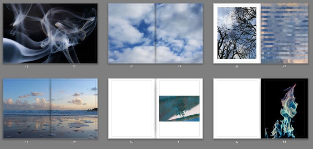
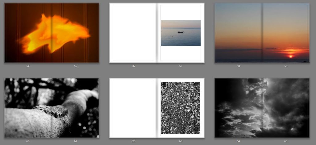
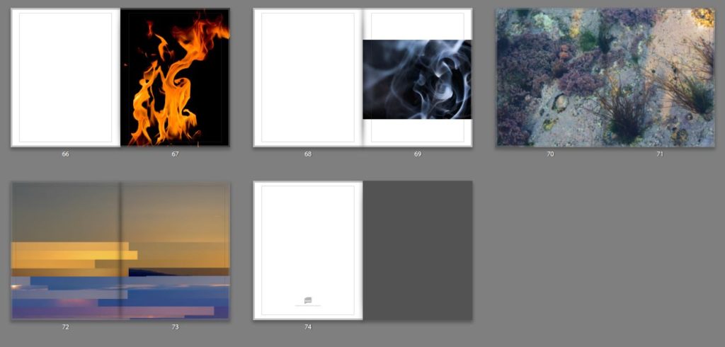
Here is a link to my final book,
Category Archives: Uncategorized
Filters
Specification
So far, within the ‘Variation and Similarities’ project I have explored
Eadweard Muybridge and Typologies, Hiroshi Sugimoto and the transience of life, and Huang Qingjun and documented the utilitarian lives of millions of ordinary Chinese people. From these people I have drawn inspiration for my project to create Photographs of people and their belongings which when looked at in detail can tell a story. After looking at different artists and their styles I have decided to follow the route of Huang Qingjun in exploring people and their belongings, and the ‘Variations and Similarities’ between them.
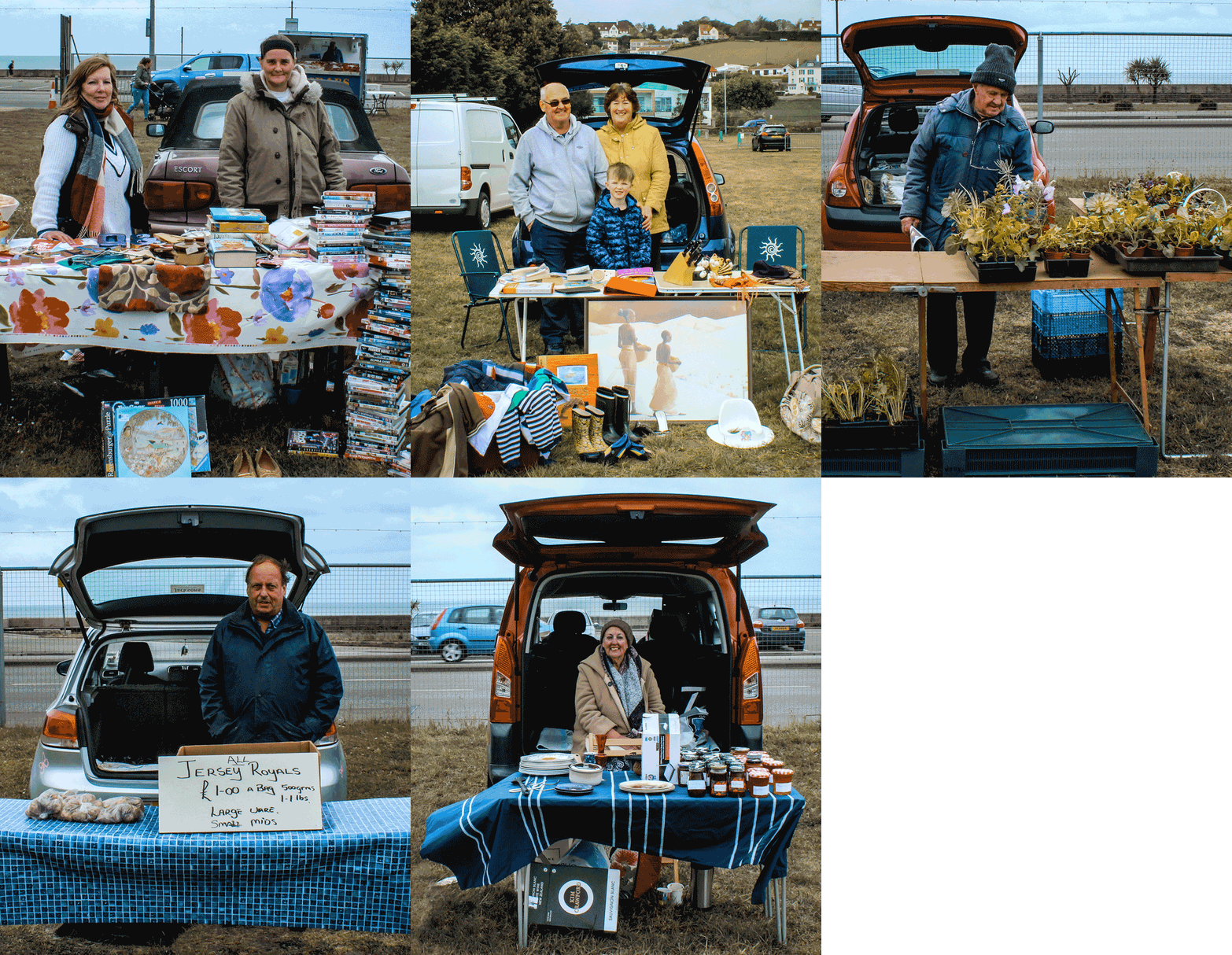
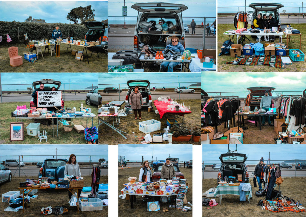
I have explored this area by photographing People and their belongings at car boot sales. I have experimented different ways of presenting these images, including GIFs and typologies. The different presentation techniques are all intended to allow the viewer to compare the different images and see the ‘variations and similarities’. To further my project I intend to photograph more car boot stalls and edit them using similar styles
Experimentation
Experimenting With GIF’s
How to Make a GIF
- Upload your images to Photoshop.
- Open up the Timeline window.
- In the Timeline window, click “Create Frame Animation.”
- Create a new layer for each new frame.
- Open the same menu icon on the right, and choose “Make Frames From Layers.”
- Under each frame, select how long it should appear for before switching to the next frame.
- At the bottom of the toolbar, select how many times you’d like it to loop.
- Preview your GIF by pressing the play icon.
- Save and Export Your GIF.
Experimenting With Typologies
How to Make a Typology
- First select the similar images you want
- Select an order to put them in
- Select each image and drag them onto one page
- Make them the same size and put them into order
Evaluation – Final Outcomes
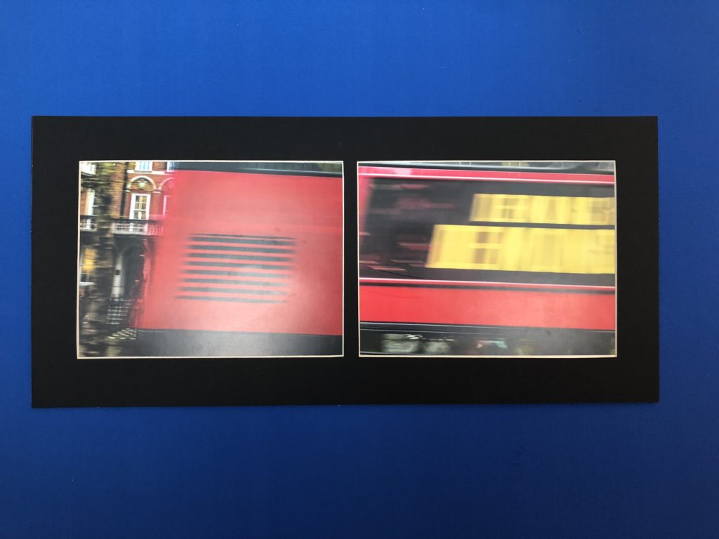
My final pieces are displayed in two forms. In a photo book and mounts. These two forms allow my images to have a sequence to give my photo book a narrative. The narrative for my photo book was pin pointing areas and objects, with vibrant colours, and then capturing those images through carefully thought out shoots throughout London and creating juxtapositions between the images to make the viewer compare the similarities between the two varying images. This is where my project theme comes in. My main influence and inspirations came from three notable photographers; Keld-Helmer Peterson, Saul Leiter and Siegfried Hansen.
From the start of the project ‘variation and similarity’ I was researching the work of photographer Michal Wolf. I was very intrigued by his project ‘Hong Kong Inside Outside’ as it showed the extreme diversity and variation between the locals. His images subjects where of extreme poverty among mass apartment units. he does this in a very formal and symmetrical way. From here i started looking into colour photography and researched the auto chrome, all about the begging of colour photography and how it was first produced. This made me question why so many photographer take images with beautiful colour then go in photoshop and make it black and white. All the hard work and innovation. I wanted to use this as motivation to produce colourful images for the project and show the variations of colours in the objects, buildings and nature. I started by researching the pioneer of colour photography, Stephen shore. This opened me up to a whole new range of colour photographers, such as; Keld-Helmer Peterson, Saul Leiter and Siegfried Hanson. All of these photographers have a noticeable influence in my photo book. This is what kicked my project into action. From here i carefully planned out shoots each inspired by a different reference
Photo Book:
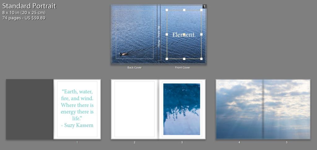
My photo book ‘The Colour And The Shape’. Was an overall success for a final display of my images to collate them a sequence. Throughout the design process, i thought of different colour combinations that would look suitable. I came to the conclusion of using tonal colours. I would colour match the focal colour in the image and i would make that the colour of the page. Although, i did not use this method for all pages. I found other colours that compliment the colours within the images to almost extent my own image. This is what helped me achieve the final result i was initially visualising and now that it is in physical form i couldn’t be any more pleased. To Conclude i am pleased with the final outcome of my final photobook as it meets specification points for the exam and my own specification for the project and the book.
Mounts:
The first set of images on the left are of a London bus that was traveling past. as i took a picture i took a burst to try and capture the full bus so that when it came to editing i could use them to build and image of the moving bus. Overall i am pleased with how this idea turned out in my final outcomes both in this layout and within my photo book.
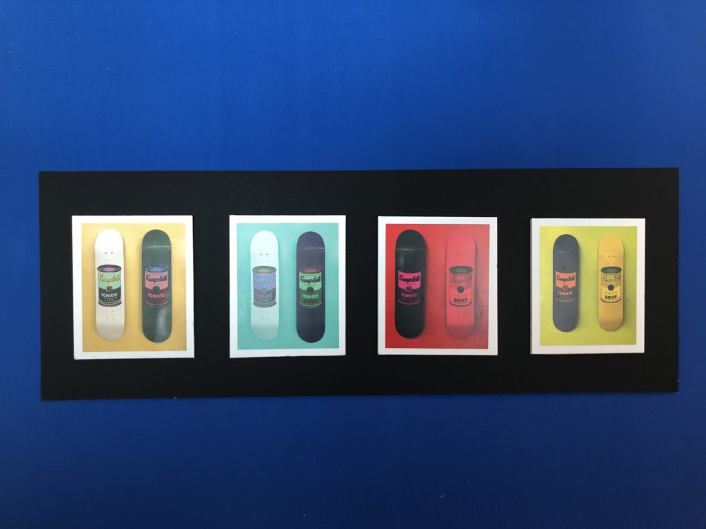
The middle layout is of Skateboards showing the variation of colour mixes in the images and the new mixes when compared to one another.
Finally the last layout is of my strongest images from the overall project. This is why i decided to Lay them all out in a large format to display them. They all share similar colours to each other but are in the form of other dimensions, materials, place and position. so as a result of this i believe this to be my strongest and most successful layout when it comes to consideration for the theme of the project and final execution of the layout.
I am pleased with the final result of my prints. I feel that they were the best ways to present my final outcomes in a larger format.
If I were to do this project again i would, Produce more images and shoots to work with a wider range of images. I would capture images that are focusing on similar subjects and show in almost a typology form the similarities and variations they share. I would also research other artist references that use interesting editing skills to give new meaning to the image. Such as, joiner images.
Final Postcard Display Planning
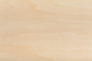
As I decided in my previous post I am intending on displaying 24 postcard prints strung up in either 6 rows of 4 or 4 rows of 6 on a wooden board of some form. I personally believe that a light tone of wood will look best as it will make the prints stand out whereas a darker wood may be too overpowering. Below is the sort of wood tone which I think will work best.
I need to make a choice as to whether 6×4 or 4×6 in terms or the print rows will make for a more successful outcome. and therefore I have created these very simple mock ups of how the compositions will both appear.
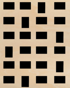
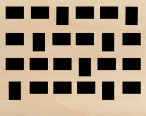
After composing these layouts in order to see what would work best I have decided the the second option (4 rows of 6) would work best. I’ve made this decision as looking at both layouts the second looks much better due to the fact that the majority of the postcard prints will be landscape. And therefore a landscape board of wood would be most appropriate visually. I will also buy brown string and some wooden pegs of the same tone so that everything displaying the postcards matches. Here is the kind of string and small pegs I will try to buy somewhere.
Then after making all of these decisions I thought it would only be right that I make a mock-up draft on Photoshop of what the display will probably look like. So I did this in three steps: one with just the postcards, one with the string and one with both the string and the pegs (As you can see below.)
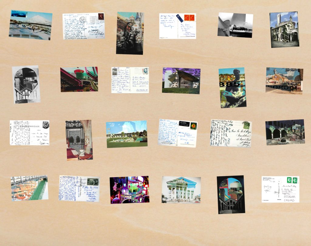


Overall with that as a mock up I am extremely happy as I believe it works really well, the composition of each postcard print is carefully considered as although it looks very random that was the point as I wanted to space out the prints depending on whether they were landscape/portrait, colour/monochrome, fronts/backs etc… Also doing this layout mock up has been useful in terms of working out what dimensions I will need to use for a wooden board, and I have come to the conclusion that I will need to use a 38 inch by 48 inch board. I intend to staple each string at both ends into the back of the board in order to tightly secure them so that the postcards can hang off them using the pegs.
FINAL PRESENTATION
Window-mount Boards:
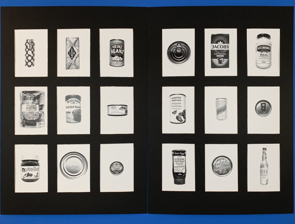
For these images i presented them in 3×3 a5 window mounts. This worked best for a typology as the images had equal space between them as well as having a clean border that works perfectly for a typology as they are meant to be the same size to show the individual differences. The contrast between the white of the background and the black board works well as it draws the images forward making the actual products stand out more. The equal divides between each image is interesting as it makes each image more individual giving them their own space. The tonal range and contrast in each of the products gives the image a deeper dimension as it is drawing away from the vibrance of the products which is used to draw consumers in and instead focuses on the products shape and illustration.
Evaluation of final book layout
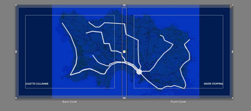


ESA // Photobook images and possible layouts
The images that I am planning to use in my photo book:
Possible layouts:
Peter Devito
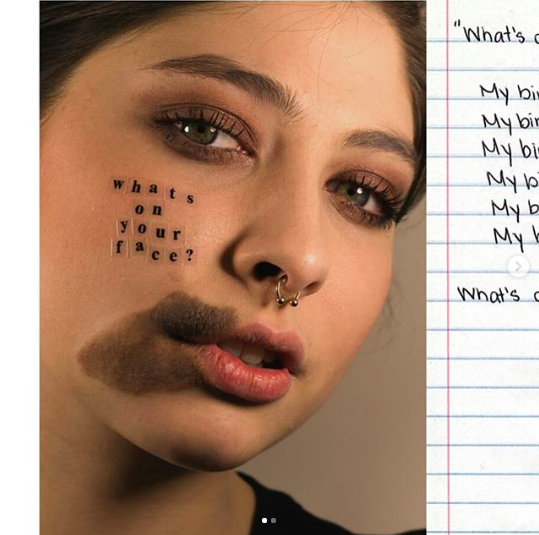
Peter Devito has become known for his work surrounding the issue of skin conditions recently on social media where his images have gone viral. Currently studying at the the Fashion Institute of Technology in New York City he has developed this project which has gained attention from bloggers and magazines. H became interested in photography in 2013 on a pre college program but still works in mix media including illustration. He uses his work to convey his perspective on the world, evoking deep thought in his pieces. He suffered from acne growing up and saw how self image involving skin conditions had affected many peoples mental health around him. By taking intimate, close up and unedited images of himself and other young people in similar positions, along with empowering and sometimes sarcastic humorous slogans he aims to turn the stigma around perfect skin on its head. He posts the art work on social media hoping to target the area where people can often feel most pressures to areas ‘flawless’.
“After posting my unretouched acne images on social media, I received numerous messages from people with albinism, vitiligo, freckles and birthmarks asking me to make work that they could relate to,” he says. “I wanted to expand what I’ve been working on and give people with other skin conditions a platform to tell their stories as well. I hope this project will empower people and help normalise skin conditions.”
Peter Devito
When taking the project further he aimed to show that there was more to the subjects than their skin condition and they would not stand to be defined by them. Accompanying each portrait petter displayed a hand written note from each person about their experience living with a skin condition. One reads “My birthmark does not make me ugly,”
“Doing this project, I’ve learnt that things can only define you if you let them,” Peter continues. “I hope that doing this project will make people realise that we need more models with diverse skin. The more models people see with different complexions, the more normal skin conditions will become.”
Peter Devito
Link to Peter Devito’s website and portfolio
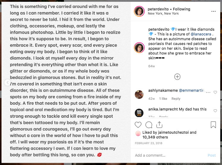
Photo Analysis: The above image is a macro of someones skin, with plastic lettering in the centre. This photo was probably taken in a studio with bright controlled lighting to illuminate the skin evenly and help the camera focus and capture the small details. The lighting has been controlled to look as natural as possible to fit with the aesthetic and aim of the image. A macro lens was most likely used to capture the fine details in the skin almost making it larger than life. The photo is predominantly a pink shade varying in light and dark tones, this makes it a very simple image to look at. The texture shapes and patterns in the photo are created through the skin ‘imperfections’ which are spread over the whole frame in a random and natural arrangement. The main focus of the text has been arranged in the centre of the image, it is the first thing we see and it is important that we read and understand the statement whilst viewing the whole image. The photograph has been cropped so that their is nothing else in the frame distracting us, for example and other body parts of background elements. This image was posted to Peter DeVito’s Instagram along with the majority of his work context of this image is, he explains that the photo if a autoimmune disease called psoriasis. Psoriasis is a common skin condition which speeds up the life cycle of skin cells, it is a chronic disease which can come can go over time showing red dry patches. Following the image is an account by the girl in the photograph, it explains her struggle being insecure about her skin from a young a age and how she has grown to embrace her her imperfections. The lettering in the image “I wear it like diamonds” suggests that instead of looking at the Psoriasis and seeing something ugly it that should be hidden and covered up she instead pretends it something stereotypically beautiful like glitter or diamonds. This could also link to the idea that diamonds last forever similarly to the disease there is no way of getting rid of them completely. Diamonds are one of the strongest known materials, this could link to the mentality of the model in this photograph who has been through a lot to get to acceptance. This photo as a whole is meant to portray something that would have previously been seen as a fault as a more beautiful and normal thing that shouldn’t be hidden. By sharing this photo Peter aims to create awareness about skin conditions in hope that people with the will feel less inlined to perfect them and hide them from the world.
Book Layout
I feel that it was necessary to create a book as a final outcome because I think as the topic that I chose is quite abstract in its nature, it needs to have some depth and quality to the images when looking at them as a whole to understand the project. But also by creating a book I feel that it helps the viewer to engage more with the images, as they are able to take their time looking at each image and take on its meaning, rather to when they are displayed on a wall, I feel that the images become very felt and don’t have much depth in comparison to a photobook.
I really wanted the book to convey a sense of simplicity but at the same time the images to be really powerful and to make the viewer stop and really take in what they are looking at. And make them stop in their everyday life to see the beauty that is around them if they take the change to stop and look.
My main inspiration for the style and genre of my book was Rinko Kawauchi’s book Illuminance which has been the inspiration of the whole of the project. Her book is very simplistic in its nature and each images flows really well into the next one which really helps to make the project link together, due to the atheistic of each image and the colour texture and composition of the image.
Which is something that I wanted to be able to work into my book. Which is why I didn’t separate the book by element as that would get very boring. The narrative within my book is individuality, beauty and simplicity of each element and how different each one is but yet how each one is connected and dependent on the other to survive.
For the the front cover I wanted a image that would draw the view into the book, but wasn’t too busy so it would ruin the aesthetic of the rest of the book. I really like the cover that I chose, I think as the cool tones of the blue is calming and links my idea of the taking the image to stop and look at the tiny details, as the viewer has to stop and turn over the back to see the duck swimming across the page to see where the ripples in the water are coming from. I chose to have a big white title in the middle of the page as I think that this juxtaposes the blue and makes a bright and bold front cover which is calming at the same times as being able to draw in the viewer.
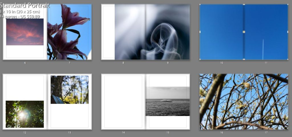
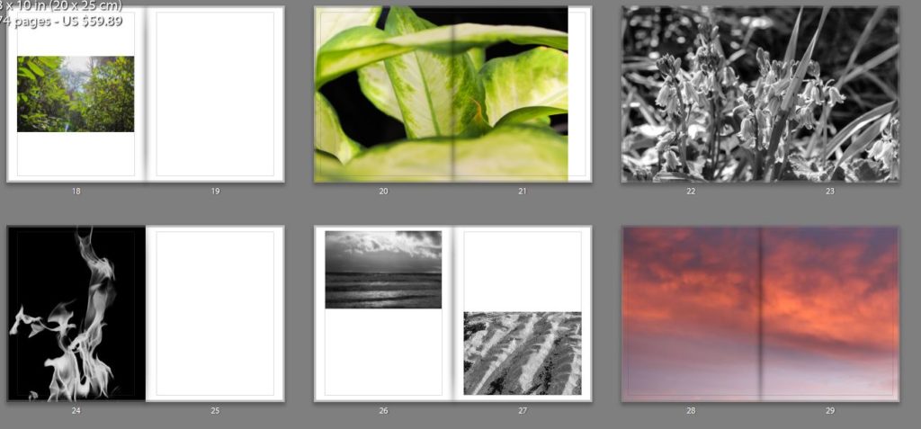
Most of my images are very colourful and the book as a whole is very contrasting in its colours, I wanted the viewer to be drawn in by the use of pastel colours. But I also wanted some images to juxtapose each other which why some but not many of the images are in black and white I also felt that is changed the sequence and flow of the book to help the viewer look at the images in a different light. I also felt that but some of the images in black and white helped to bring out the detail of them.
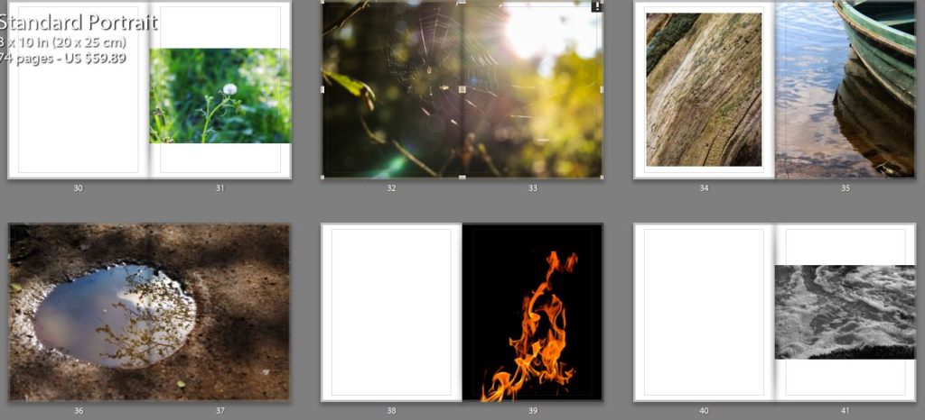
In the book there are different sections for each element but I wanted to make sure that each image had a connection to the image before and after it as this was a notable feature in Rinko’s work that I really liked also because I felt that it would help the viewer to understand the project more, and also create a sense of rhythm and structure for the book. However I didn’t want all of the image to be grouped together but element as I thought that this would become very boring and repetitive for the viewer.
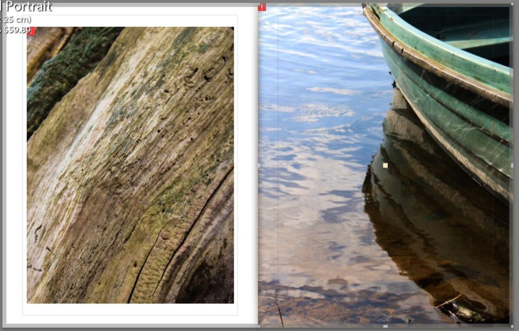
Below is an example of connections that I made between the images. One is an image is an unusual perspective of the bark of a tree, I but this image in the book as I feel that it is a visual representative of the idea that I wanted to get across of the beauty in everyday things. The other image is a close up of the side of a boast with the light reflection off the water onto the side of the boat. I decided put these two images together due to the texture and colours in the images and the lines in the boat and the lines in the bark.
Overall I think that this project has gone very as I have created a book that makes the viewer reflect on the way that they view the world and will hopefully make them some and look at the beauty that is around them which they are missing in their everyday lives. But I have also created a book that takes an in-depth look not only into the physical elements but the spiritual parts of the elements and the feelings that they convey.
