Category Archives: Uncategorized

Filters

Author:
Category:

Monets Haystacks Analysis

Image result for Monet's haystacks

Each painting within the Haystack series is different however they all share common qualities too. They were painted in the farmlands of Normandy, north of Parish. Each picture shows a field with hills and trees in the distance. In the foreground Monet painted haystacks – which lead to the title of the group of paintings. Sometimes there is one stack, sometimes two or three. The haystacks themselves are put together by binding a large base of hay and then adding a cone shaped layer of hay on top. Each stack is close to 20 feet tall and weighs an enormous amount, withstanding the harsh weather until it is time to harvest them.

Impressionist artists like Monet were interested in seeing the world in a new way. In doing so, they wanted to show that viewing their surroundings could be much more beautiful and complex than what is on the surface. Through painting subjects that were common images, not heroic stories or sublime natural beauty, Monet shows that importance can be found in everything. His Haystacks elevate the status of common bales of hay, highlighting the importance hay plays in agriculture and sustaining life. Impressionism, and Monet specifically, often give importance to working class elements of life, like farming, by painting them.

Impressionism is a 19th-century art movement characterized by relatively small, thin, yet visible brush strokes, open composition, emphasis on accurate depiction of light in its changing qualities (often accentuating the effects of the passage of time), ordinary subject matter, inclusion of movement as a crucial element of human perception and experience, and unusual visual angles. Impressionism originated with a group of Paris-based artists whose independent exhibitions brought them to prominence during the 1870s and 1880s.

This impressionism technique was a quick way of working and was necessary for Monet to accomplish the real goal of his painting. Monet was looking at objects, haystacks, and at the “atmosphere that colors it differently at different times of the day/times of the year.” He had to work quickly to capture the changing light and how it colored his surroundings. Often we have an image in our head, but Monet was showing that that image should differ throughout time. A haystack covered in snow might appear white in our minds, but depending on the light, it would appear blue, yellow, or pink at sunset. Focusing on a single subject twenty-plus times gave Monet the ability to show the effects of changing light. It took his art from being focused on objects as subject, to being about light, or lumière, as subject. This idea about focusing on lighting/textures as appose to a subject matter links to the artist research I have done on Hiroshi Sugimoto and his project Seascapes.

Making GIFs – repetition

As I start to develop my ideas for the variation and similarity project I will experiment with some quick ideas that might help give me inspiration or starting points for my own idea. On the theme of repetition I will be researching and creating own GIFs.

A GIF is a file format which supports both still images and animations, it is a condensed file taking up less space than a video but working in a similar way. GIFs have been used for year in advertising but in 2015 Facebook begum to support them on their site and they grew in popularity on social media and creative outlets. They generally show cartoons, graphic designs or stop animations from photographs.

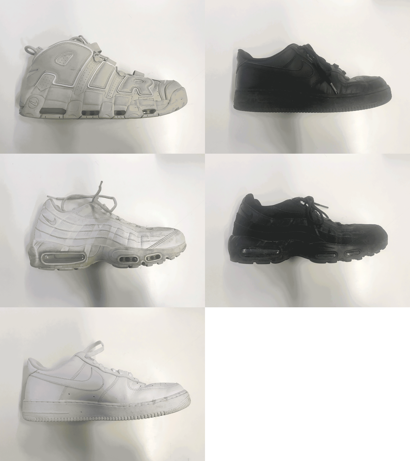
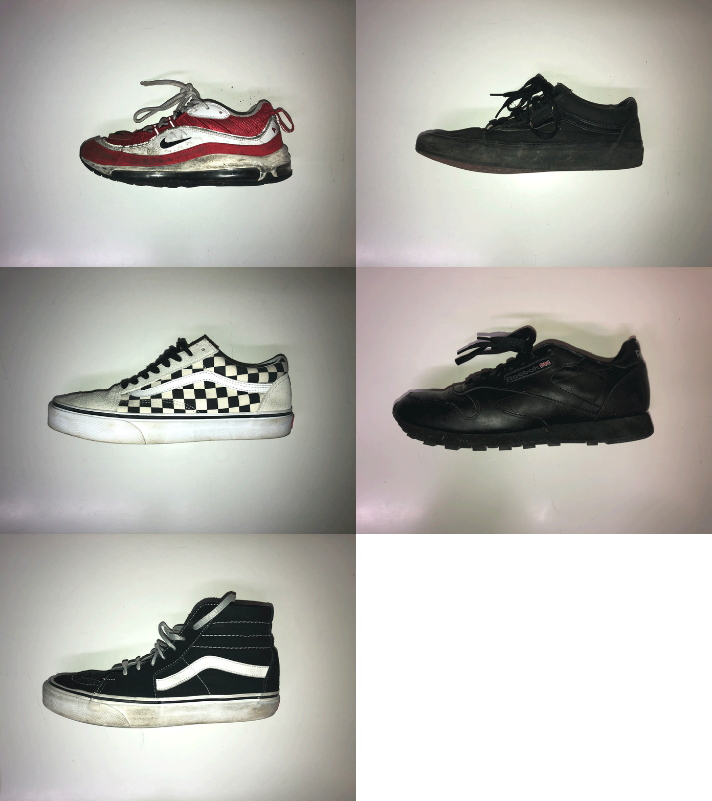
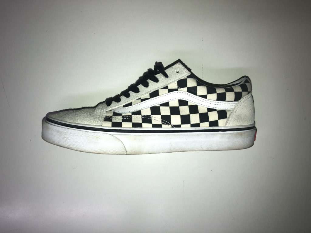
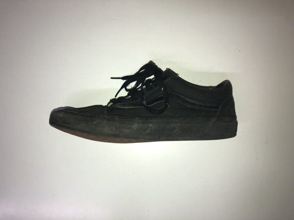
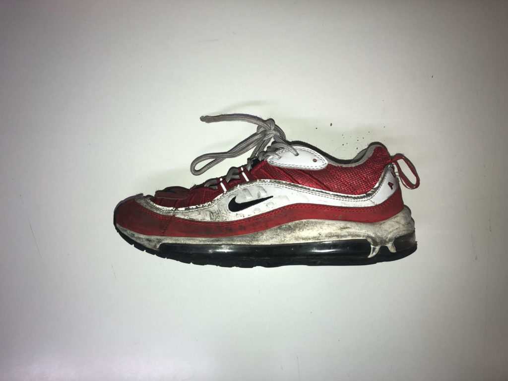
To create my own GIFs I started by choosing a topic or theme, I then took a variety of pictures of the shoes. I made sure to line up each shoe in the centre of the frame to make the GIF as smooth as possible. I then dragged each image into photoshop and onto a timeline where I set the duration to 0.1 seconds so it flicked through the images relatively fast. Using the same background with slightly different subjects it shows the variations and similarities between each photo.

GIF Experiment

The graphics interchange format (GIF) is a bitmap image forma that was developed by a team at the online services provider CompuServe led by an American computer scientist Steve Wilhite on June 15 1987. It has since come to widespread usage on the World Wide Web due to its wide support and potability. Giffs are  less suitable for reproducing color photographs and other images with color gradients, but it is well-suited for simpler images such as graphics or logos with solid areas of color.

Below is an example of a GIF

Below is my examples of a GIF

GIF Experimentation

A GIF (Graphics Interchange Format) is a bitmap image format that was developed by a team at the online services provider CompuServe on June 15, 1987. Since then it has been a commonly used image format, usually as an animated loop, on the internet due to its support and portability.  This is an appropriate way of creating imagery for this variation and similarity project, as it is a way of displaying typologies (similar objects/frames)

A2 Photography Exam – Definitions and Synonyms

Similarity

  1. An aspect, trait, or feature like or resembling another or another’s
  2. The fact that people or thing look or are the same.

some common synonyms for similarity are:

Closeness, comparison, analogy, likeness, association, conformity, homogeneity, identity, parallelism, proportion, relation, similitude, synonymity.

Variation

  1. A different form of something; variant.
  2. amount, rate, extent; or degree of change.
  3. The act, process, or accident of varying in condition, character, or degree.
  4. The transformation of a melody or theme with changes or elaborations in harmony, rhythm, and melody.
  5. A varied form of a melody or theme, especially one of a series of such forms developing the capacities of the subject.
  6. Ballet, a solo dance, especially one forming a section of a pas de deux.

some common synonyms for variation are:

deviation, variety, fluctuation, diversity, alteration, change, alteration, abnormality, contrast, modification, distinction, dissimilarity, novelty, unconformity.

Experimenting- GIFS

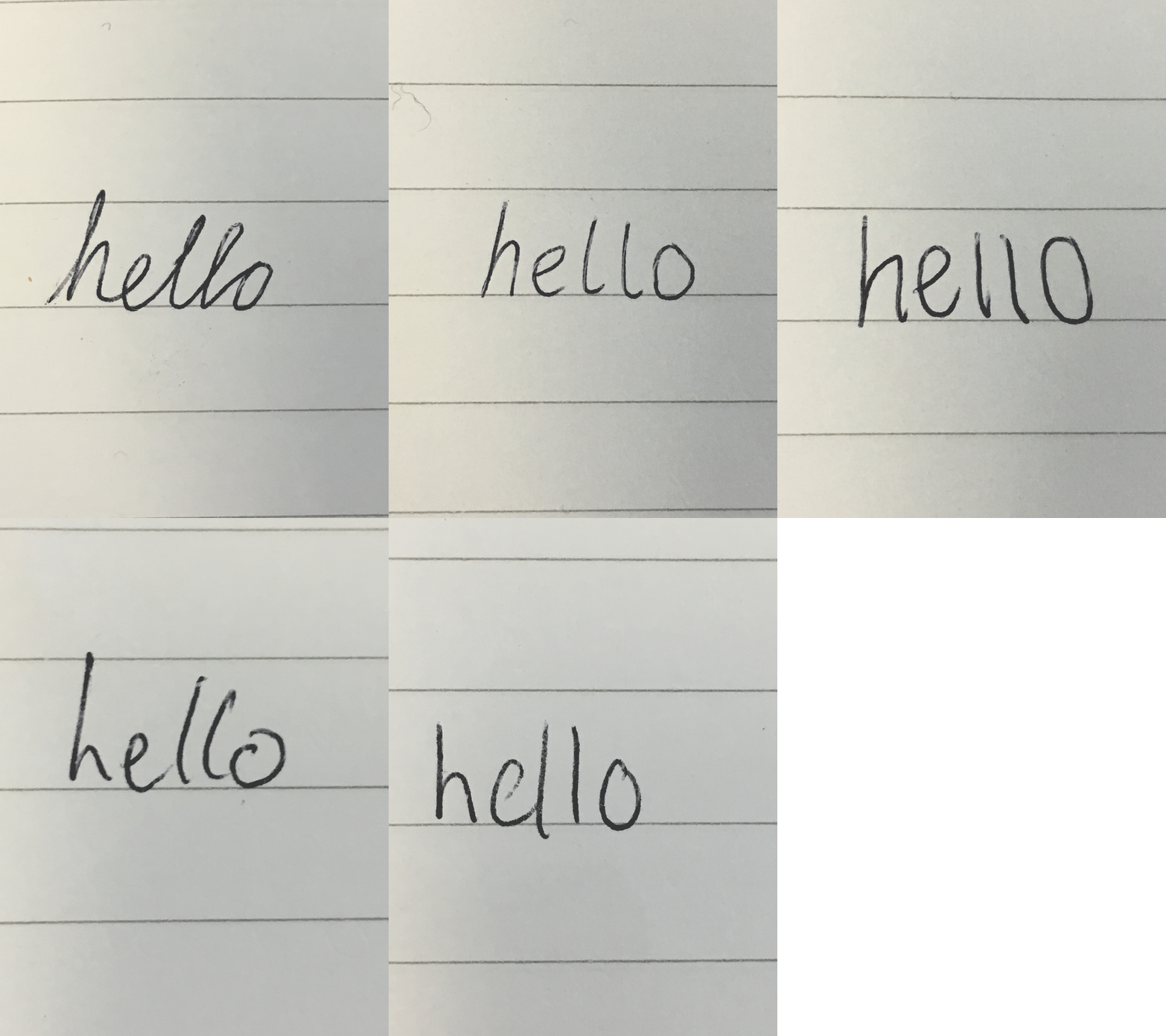
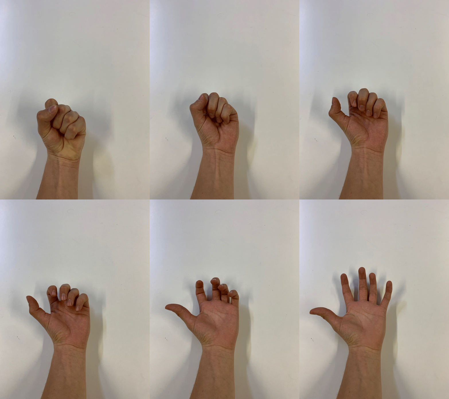
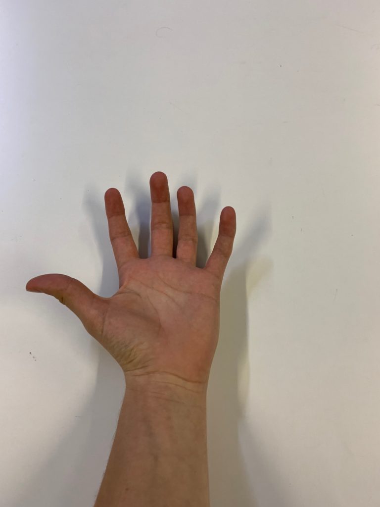
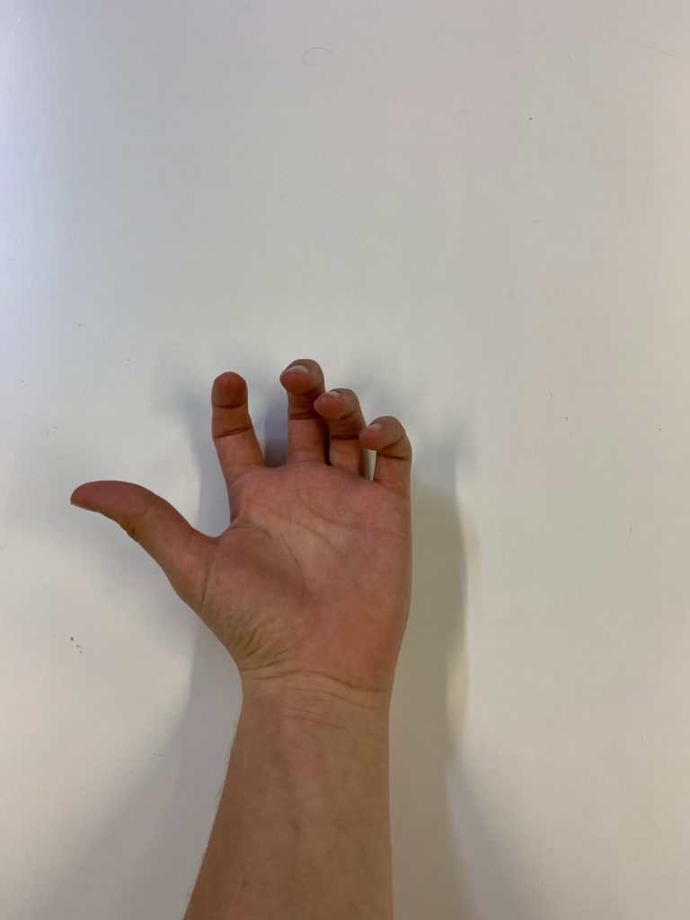
For this task I looked at GIFs and Video art. I took photographs that i used to produce a Gif In Photoshop. GIFS work well with the theme as they are repeated in a continuous loop.

A GIF Standing for ‘Graphics Interchange Format’ is an image that’s been encoded using the graphics interchange format where it has multiple frames encoded into a single image file and a web browser or other software will play those images back in animated sequence automatically

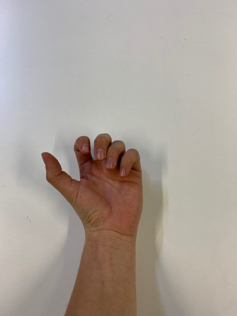
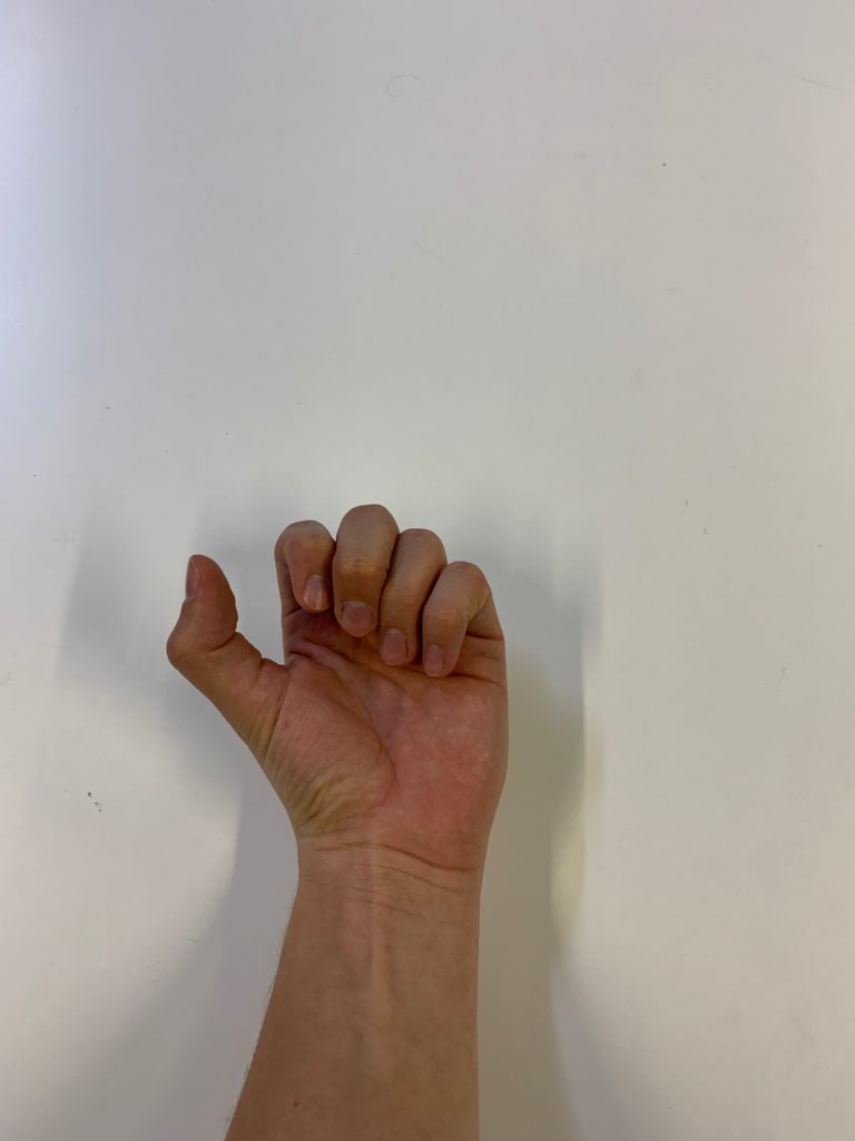
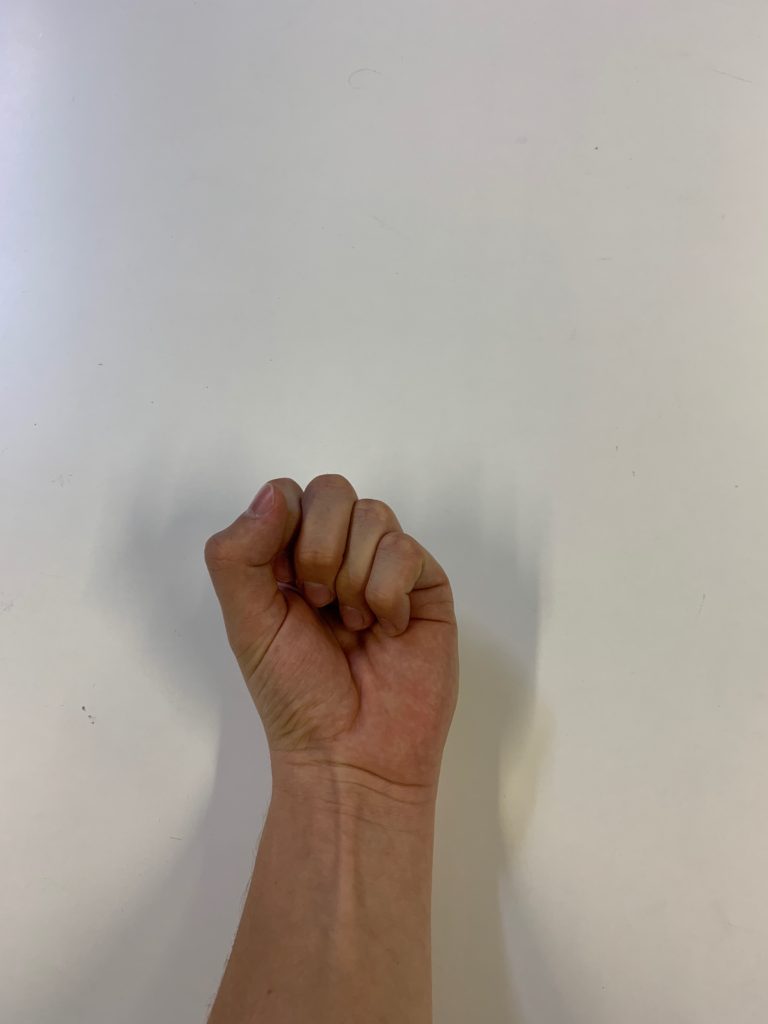
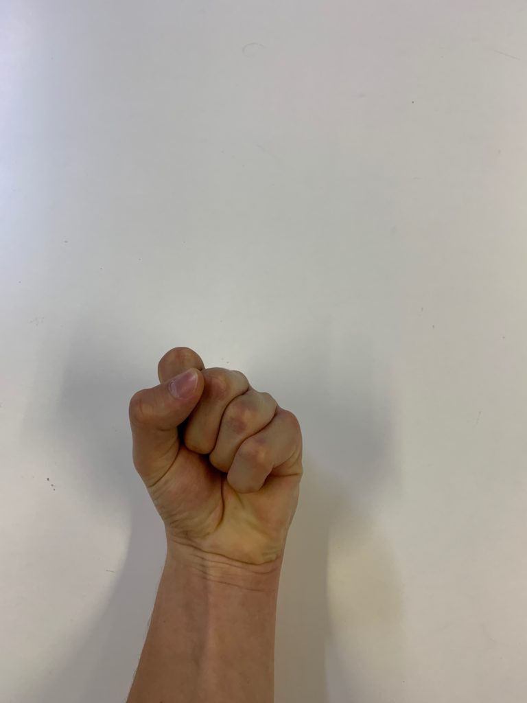
HAND-GIF

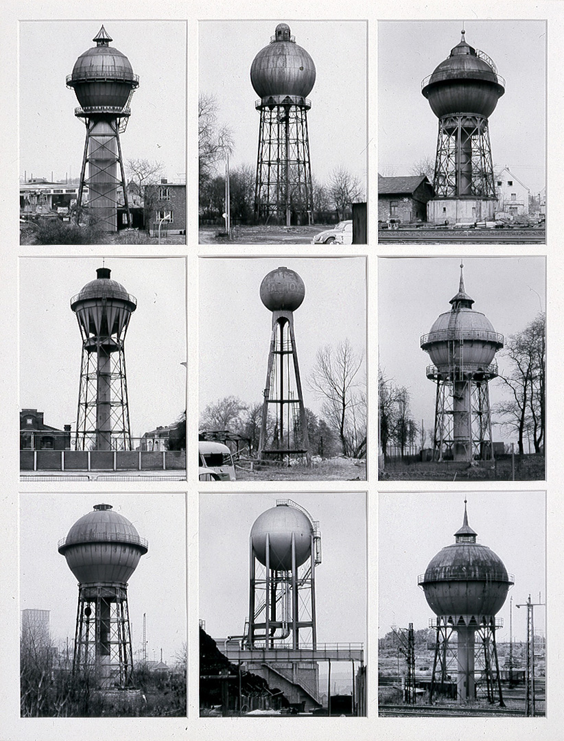
Typologies Research – The Bechers

Typology (in urban planning and architecture) is the classification of usually physical characteristics commonly found in buildings and urban places, according to their association with different categories, such as intensity of development (from natural or rural to highly urban), degrees of formality.. Individual characteristics form patterns. Patterns relate elements hierarchically across physical scales (from small details to large systems). The definition of ‘typology’ is “a classification according to general type, especially in archaeology, psychology, or the social sciences”.  Essentially it is the study of types.

Bernhard Becher, and Hilla Becher, were German conceptual artists and photographers working as a collaborative duo. They are best known for their extensive series of photographic images, or typologies, of industrial buildings and structures, often organised in grids. As the founders of what has come to be known as the ‘Becher school’ or the ‘Düsseldorf School’ they influenced generations of documentary photographers and artists.

Meeting as students at the Kunstakademie Düsseldorf in 1957, Bernd and Hilla Becher first collaborated on photographing and documenting the disappearing German industrial architecture in 1959. They were fascinated by the similar shapes in which certain buildings were designed and noticed many industrial buildigns shared many distinctive formal qualities.

Image result for the bechers

Together, the Bechers went out with a large 8 x 10-inch view camera and photographed these buildings from a number of different angles, but always with a straightforward point of view. They shot only on overcast days to avoid shadows, and early in the morning during the seasons of spring and fall. Objects included water towers, cooling towers, coal bunkers, oil refineries, blast furnaces, gas tanks, storage silos, warehouses and much more. Their work also highlighted the need for preservation of these buildings. The end result of their work presented us with groups of photos  in a grid of six, nine, or fifteen that highlighted the similarity between industrial structures. It is a very interesting concept to look at for the viewer which engages them to compare the forms and designs of the buildings.

Image result for the bechers

wealth and media

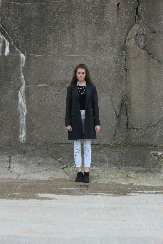
Being in jersey for a project which is very concentrated around natural beauty and finding a elements of visceral within the world is highly beneficial, however, I did belive it would too be interesting if I were to look more in depth at the word ‘opulence’ and what this demand to the people of jersey. In my previous posts I spoke much about ‘opulence’ being about what we consider to be wealth, the feeling or looking rich which brings us joy. And it is known jersey is one of, if not they biggest financial islands within the world, with billions invested into it, The very structure of jersey is the wealth which keeps everything turning, and because of this, I belive it would be beneficial to discuss if this wealth is peoples most important aspect to them, living in jersey. Although not everyone in jersey is wealthy, A large majority are, or a very few are incredibly rich with assists. Because of this the expenses of jersey is much more costly, but in tern, this is still a contributing factor as why jersey is such a pivotal essence of importance. However not only is his wealth within money a huge factor to jerseys success and why many people living here would view it as opulent, but also many belive jersey is and can be considered paradise, it is only an island 9-5 but it has many beaches vast and long, with beautiful bays, and award winning views. Its hospitality is enormous, and much of the reason jersey itself used to be considered an island wholey for tourism. However because this wealth of money is now the biggest factor of why I am to again these images I thought, it would be interesting to loOk at the issues of wealth from a mediated point of view, considering different philosophies and angles, in order for me to gain more knowledge as to why and how I could develop my work to see a new angle of jersey, that perhaps tells the truth even more so than my current shoots. Media: I believe throughout this project my knowledge on media could only but benefit my work as a whole. I belive if I were to expand my project more into fashion and fine art, possible focusing more on the beauty of people, I could once again add in the discussion of the male gaze and the female gaze. This also links into my project in the reflection of personal identity then to comes down to the relation for beauty, so using self portraits. I could use my perspective from being female in order to produce such a look which questions a gender perfomativity, and use elements such as the twin mechanises to form elements of schophilia, and create an elements that people might want to look at.