Category Archives: Uncategorized

Filters

Author:
Category:

Haystacks by Monet Response – Golden Hour Light

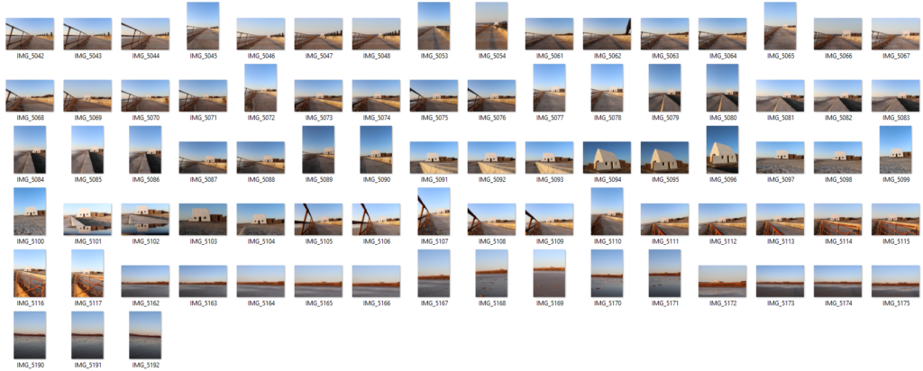
Inspired by Haystacks and the notion of effects of changing light I have decided to peruse a shoot series looking at this. For these shoots I have focused on a specific location this being the white house at St Ouens bay. The reason I chose this location was due to the fact it is a popular location for local photographers on the island and therefore will be a very different approach to how the majority of people chose to photograph it. Also i like how the shape of the building linked with the shape of haystacks with a cone shaped top. I have decided to achieve the best result i will photograph it at different times of the day also whilst varying on the days I shoot to get a variety of weather conditions. Through this series of photo shoots I will be showing the changing light and how it colored the surroundings of the same place. Also inspired by Sugimoto there will be a representation of time and movement within this. I will use the typology method at the end of all the shoots to show the impact the light has on perspective.

Contact Sheet
My Edited Images

Overall, I think this photo shoot has been successful in demonstrating the golden hour light upon the white house. I think I have clearly portrayed the lighting within this hour and through the editing process in Lightroom I have made this much more enjoyable for the audience. Originally the photos were much too harsh and the harsh yellows did not blend well causing a distraction for the viewer. Therefore in Lightroom I adjusted the yellows to become slightly more orange whilst changing the blues to aqua to create a nice contrast. These two colors compliment each other creating an overall successful aesthetic. To further develop this shoot I think it could be interesting to mess around on photoshop trying to create brush strokes in the style of ‘impressionism’ and like Monets haystacks series. Or perhaps i could try and create a faded look similar to Sugimotos seascapes project. I have intentions on re-visiting this location when it is cloudy and dark creating more dramatic and moody images that will transform the landscape into something that will far differ from the one I have depicted in this shoot.

Analysis of my favorite Image from the shoot

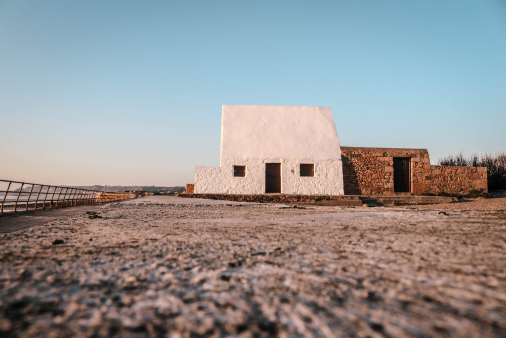
I captured this image using natural lighting which allowed me to bring out the natural shadows and shapes within the sand and sky. Using natural lighting was one of the key factors that i had in mind when going on this shoot as my overall intention is to show how a landscape is transformed in different lighting/weather conditions. There is a subtle tonal range with the most part of the picture dominated by the brightness of the sky there are also some variety of highlights and shadows within the sand creating a very interesting texture. Clearly, these images were captured on a very sunny and bright day therefore a low ISO of 100 was used with a relatively fast shutter speed of 1/200. Having a low ISO allowed me to keep a high resolution image preventing little to no grain in the image.

I really liked this image due to the overall composition and textures that are present. Linking to Sugimotos seascapes project I have incorporated a method that he used where he bifurcated exactly in half by the horizon line however I have used the sea wall as my point to divide from. The interesting textures within the sand help to draw the viewer to the main subject thus being the white house. I also like how there is a direct contrast between the many textures within the bottom half of the picture compared to the top half were it is all one constant texture. This incorporation of variety at the bottom and similarity at the top is a direct link to the exam project title.

The concept behind this image is the notion of movement and time implied through the light which although appears in this photograph as something that is always there, is not and is always changing. Also the textures within the sand help to show this sense of time as it appears to be moving just like how the sun is always moving that creates a variety of light. The photographs from this shoot show just one perspective of a landscape and indicate the one perspective we usually have of a landscape. However through multiple shoots at the same location I intend to show how the image should differ throughout time.

A2 Photography Exam – Dafna Talmor response

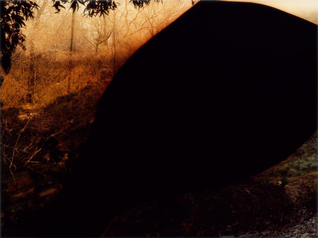
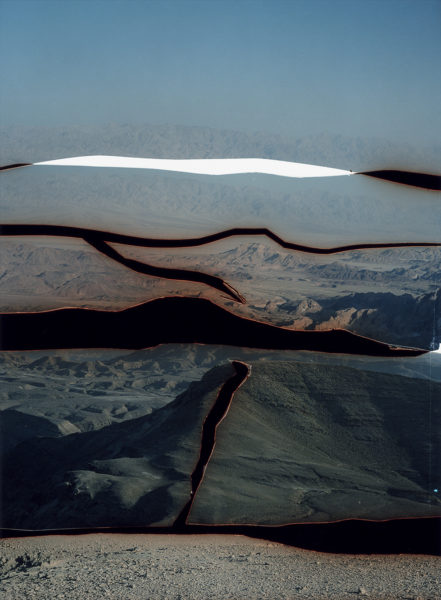
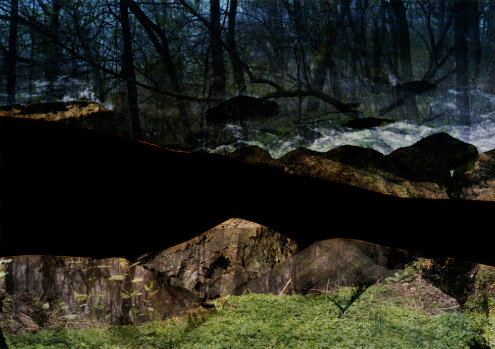
Dafna Talmor created a project called Contructed Landscapes in which she used multiple photographs from many shoots to create her own constructed landscape, she did this by creating her own edges, filtering through photos on top of each other and using different colour filters on top.

This is the photo I shall be using as reference to make a response from

To create a response to her work, I have used a selection of images from my trip to Ireland, in which hills, trees, and lakes are featured.

To work with these photos, I put them into black and white and increased the contrast to full, and used the brightness tool accordingly to make them all look a similar tone.

I then got to work on cutting up parts of the images on photoshop using the magic wand tool and moving the cut out parts onto an empty black landscape template to create my own bold edges to the image.

After placing all of the cut out parts on the black template, I used the colour balance tool to put in the red and yellow tones within shadows, mid-tones and highlights.

After that I then used two of the black and white images, and colour balanced them in the same way and overlay them on top of the image I had made using a hard light overlay and made a second with pin light overlay.

Initial Ideas and Research

Idea 1: I was planning on going on a trip to London and during the time in London i am planning on photographing buildings. Exploring the extreme variation between modern and post modern architecture within the city and how it developed and evolved into the city it is today. In addition, i would like to look into future building plans and compare them to recently finished structures and much older structures. When taking the pictures i will take into consideration, the golden ratio (Fibonacci sequence), geometry, symmetry, opposites, dramatic juxtapositions.

Idea 2: For my second idea I looked at size, shape and colour within the streets and natural landscapes. Colour is everywhere in our lives so i wanted to explore the aesthetic. Colours have been assigned to many different signs and and objects over the years; such as, traffic lights, red means stop and green means go. or the blue flashing lights on emergency vehicles, or uniforms. I want to explore the colours we see everyday, artificial and natural, to compare and contrast between them. I will research the origins of colour photography and how it has progressed with modern technologies.

Idea 3: For my third idea i was planning on focusing on similar shapes and sizes of objects and show the variations between them. For this idea i would explore Standardisation. This is when components of parts and or just about everything. It is when things are made so that they can be assembled easily, used with comfort. They take into consideration human orthographic which is the average human dimensions. This shows how everything we have build is designed around the human body so i thought this would be an interesting concept.

To conclude, the idea i would like to use for my variation and similarity project is idea 2. I feel like this will be the most exciting and interesting idea to go ahead with, this is because alot of photographers use black and white. Why take away the natural colours? I want to go in an opposite direction from black and white into vibrant and saturated images that pop with colour.

VARIATIONS AND SIMILARITIES

GOOGLE DEFINITION
GOOGLE DEFINITION

My idea for this project sprung whilst analysing the exam spectrum. Variations and similarities is a very broad subject and can be explored in different ways. From this, I researched the deeper meanings behind these words and how they are used in order to get a deeper understanding.

Variations refers to a change or difference in conditions usually within certain limits. It is more simply: a different or distinct version of something. After a lot of research I discovered that there are different types of meanings for the word, variation. The biology term of variation refers to the occurrence of an organism in more than one distinct colour or form. This is called genetic variations and are the differences in DNA or genes between each individual being. I found this very interesting to explore as everybody is similar as we all have genes, are made up of the same organs and our own DNA but no individual has the same exact genes as we all vary from one another. Variations in terms of people, can be identified as the differences among the individual of the same species.

When researching similarities, I found that this word also used humans and biology as an example. It describes this word as being an aspect, trait or features that could meant the “the similarities between people of different nationalities”. Overall it simply means, the state or fact that makes things comparable.

I found it very interesting to see how both words separately can link to the same this, humans, and therefore I have decided to base this project on life while also using it to show that we are all similar no matter our religion, race, ethnicity, authority, etc.

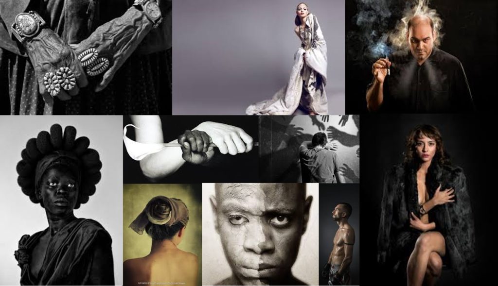
Here is a mood board of what I plan to achieve in my portraits using studio lighting only.

Artist Reference – Hiroshi Sugimoto and David Prentice

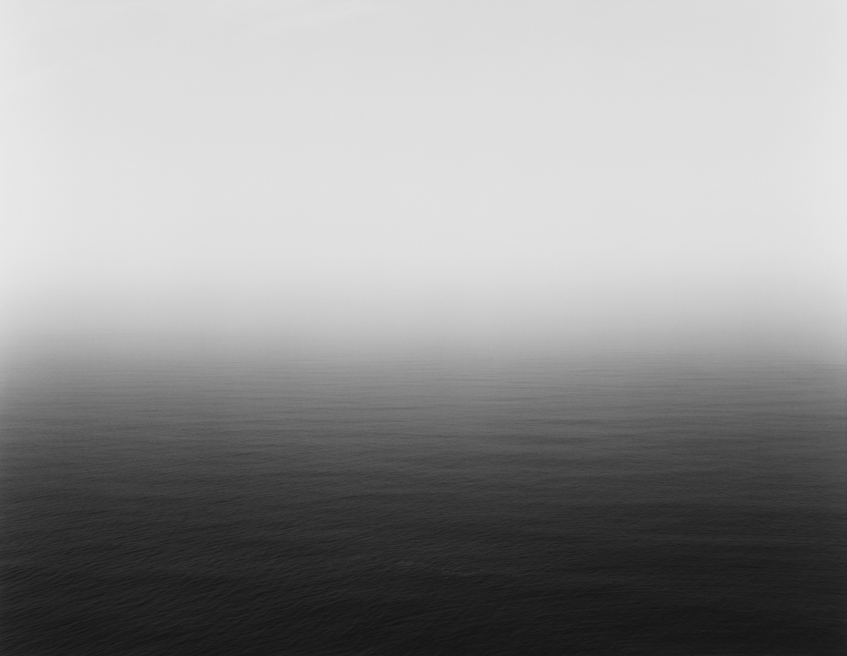
Hiroshi Sugimoto is a Japanese photographer and architect, he was born in 1948 in Tokyo. He took his earliest photographs in high school, photographing film footage of Audrey Hepburn as it played in a movie theater. He leads the Tokyo-based architectural firm ‘New Material Research Laboratory’. Sugimoto has spoken of his work as an expression of ‘time exposed’, or photographs serving as a time capsule for a series of events in time. His work also focuses on transience of life, and the conflict between life and death. His work includes photographs of waxwork-museum figures, drive-in theaters, and Buddhist sculptures, all of which similarly blur distinctions between the real and the fictive. Sugimoto is also deeply influenced by the writings and works of Marcel Duchamp, as well as the Dadaist and Surrealist movements as a whole.
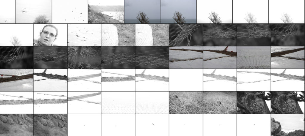
Image result for Hiroshi Sugimoto
Aegean Sea, Pilion

David Prentice

David Prentice was a English born painted who died aged 77, had an unusual trajectory as an artist. In the 1960s, when he was one of the founders of the Ikon Gallery in Birmingham, his work was hard-edged, abstract, close to the Op art of a period when young artists and architects were full of ideas for new beginnings. David’s art was about new forms, his hero Piet Mondrian.

Image result for david prentice artist

‘Above Llanberis Lake’

His subject for the majority of his work was the Malvern Hills of Worcestershire he knew these hills very well as he took many walks over these hills in which he always had his sketchpad in hand. The forms of the hills were a constant, the weather constantly changing. He painted with the concern for structure and surface that had characterized his earlier work. The watercolors, often done on the spot, were more specific but the paintings done in the studio were as carefully constructed as ever.
His range of landscapes expanded to include dramatic cityscapes of London, The river themes, and the landscape of Skye, Lake District and the Welsh mountains.

I think that there is a clear connection between the works of David Practise and Hiroshi Sugimoto , they both take more of an abstract approach when looking and a landscape. In both of their works there is an absence of any man made structure, do it makes their works have a lack of identification to them, although we are able to guess where the work is based off, as to where the artist live and work. However their works do have a graet contrast between them, Prentice paints with a wide range of colour and the vibrancy of the colour is a noticeable feature of his work. Whereas the lack of colours in Hiroshi Sugimoto work is what makes his work more interesting a re in forces the sense of life and death in his work.

Artist research: Étienne-Jules Marey

Image result for etienne jules mareys

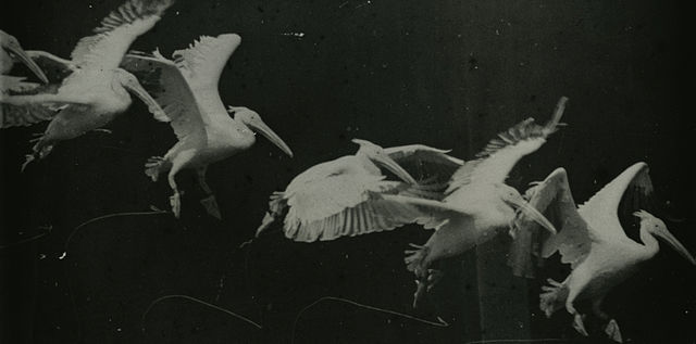
Étienne-Jules Marey, born 5 March 1830, in Beaune, was a French scientist, physiologist and chronophotographer.

To study the flight of birds, he invented a camera in 1882 with magazine plates that recorded a series of photographs; the pictures could be combined to represent movements. In 1894 he adapted the motion-picture camera to the microscope.

His work was significant in the development of cardiology, physical instrumentation, aviation, cinematography and the science of laboratory photography. He is widely considered to be a pioneer of photography and an influential pioneer of the history of cinema.

Marey’s chronophotographic gun was made in 1882, this instrument was capable of taking 12 consecutive frames a second, with all the frames recorded on the same picture. Using these pictures he studied horses, birds, dogs, sheep, donkeys, elephants, fish, microscopic creatures, molluscs, insects, reptiles, etc. Some call it Marey’s “animated zoo”. Marey also conducted the famous study about cats always landing on their feet. He conducted very similar studies with a chicken and a dog and found that they could do almost the same.
Although Marey was a man of science, one cannot ignore his profound contribution to photography.

Image result for etienne jules mareys

Image Analysis

Image result for Étienne-Jules Marey image analysis

I have chosen this photograph of Étienne-Jules Marey to anaylse because I like the effect of sequencing and want to incorporate it within my project in a way. This photograph is extremely old and the outcome and effects on the photograph are not intentional but a product of the time and camera, but I like the contrast of blacks and whites/creams and the almost border that is created by the white circle surrounding the two people, the focal point of the photograph. The blur adds an interesting abstract effect to the photograph. In conclusion this photograph is complex and interesting and has factors that I hope to photograph and include in my own project.

David Prentice – Linking to Hiroshi Sugimoto

David Prentice was an English artist and former art teacher. In 1964 he was one of the four founder members of Birmingham’s Ikon Gallery. His work is hard-edged, abstract, close to the Op art of a period when young artists and architects were full of ideas for new beginnings.

For many years, his subject was the Malvern Hills, which he knew intimately from countless walks with sketchpad in hand. The forms of the hills were a constant, the weather constantly changing. He painted with the concern for structure and surface that had characterized his earlier work. The watercolors, often done on the spot, were more specific but the paintings done in the studio were as carefully constructed as ever.
In time his subjects expanded to include dramatic cityscapes of London, especially of the river, and the landscape of Skye, or rather its approaches.

Image result for david prentice artist
Images from David Prentices gallery
Image result for Hiroshi Sugimoto
Hiroshi Sugimoto Image from Seascapes Project

I believe there are direct correlations between the work of David Prentice and Hiroshi Sugimoto. The key similarity is the attention to lighting and textures as appose to detail and displaying a landscape how we would usually see it. Instead, Prentice uses large brush strokes giving a faded/blury look to the landscape with emphasis on accurate depiction of light. Sugimoto focuses on using slow shutter speeds to bring about this faded look like Prentice does. Despite Sugimoto’s images being in black and white I believe there is a main focus on how lighting/weather can transform the similar landscape that he focuses on. Another key similarity in their works is the elimination of any man made features creating a difficulty in identification of a place.
Kensuke Koike

https://www.kensukekoike.com/


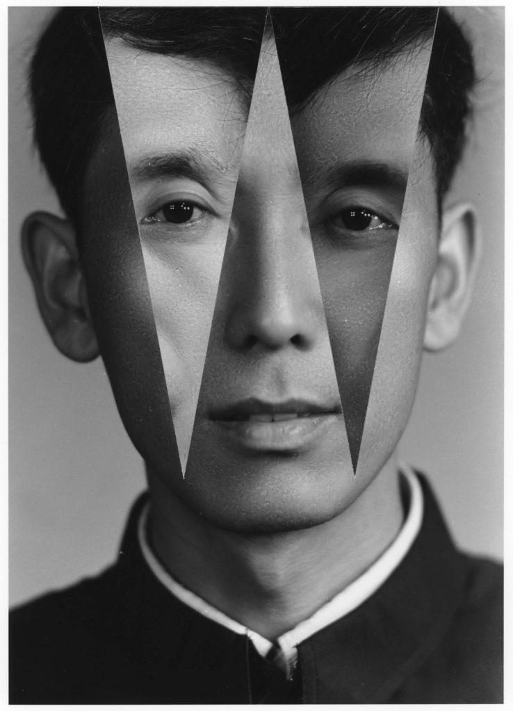
From the series No More No Less Kensuke Koike & Thomas Sauvin

Kensuke Koike is a Japanese contemporary artist, currently living in Slovenia, widely known for his exceptional skills in collage making.The Japanese artist has thus developed a certain taste for image destructuring. These new images have therefore their own independent life, barely connected to that of the original photos, showing that in the end everything depends on our point of view of reality and what we take into consideration. In kensuke’s images none of the images only moved around, which is a philosophy that he applies to all o this work “nothing is removed, nothing is added”. When editing my images inspired by his wok I will try to work by this same philosophy.

This image is from the sires No More No Less by Kensuke Koike & Thomas Sauvin. In the image there is a potrrt of a young Chinsee boy, in which two triangles have been cut out of his face. These two triangle cover the section where his eyes would be, these two sections have then been swapped around, to give a new perspective on the image. When I first saw this image I thought that the two sections of triangles, before I knew that these image where scraps that Kensuke had found I thought that the two triangles where the boys Mother and Father, I thought that it gave the image a new perspective and added a lot of conceptual meaning to the image.

For example take an old portrait of a loving couple, cut their eyes out, switch them around and the relationship takes a new direction. This is what Kensuke’s work is about getting a new perspective on the way that images can be viewed. The image above is taken from his project in collaboration with Thomas Sauvin ‘No More No Less’ which is a photobook which was published last November. The publication came about after Koike was invited to work with Sauvin’s archive of old images that he recovered from Beijing silver-recycling centres.

The images where made by an unknown Shanghai University photography student in the 1980s, simple black-and-white studio headshots that have an evenness of style, tone and lighting throughout.

Abstract Pattern Shoot #1

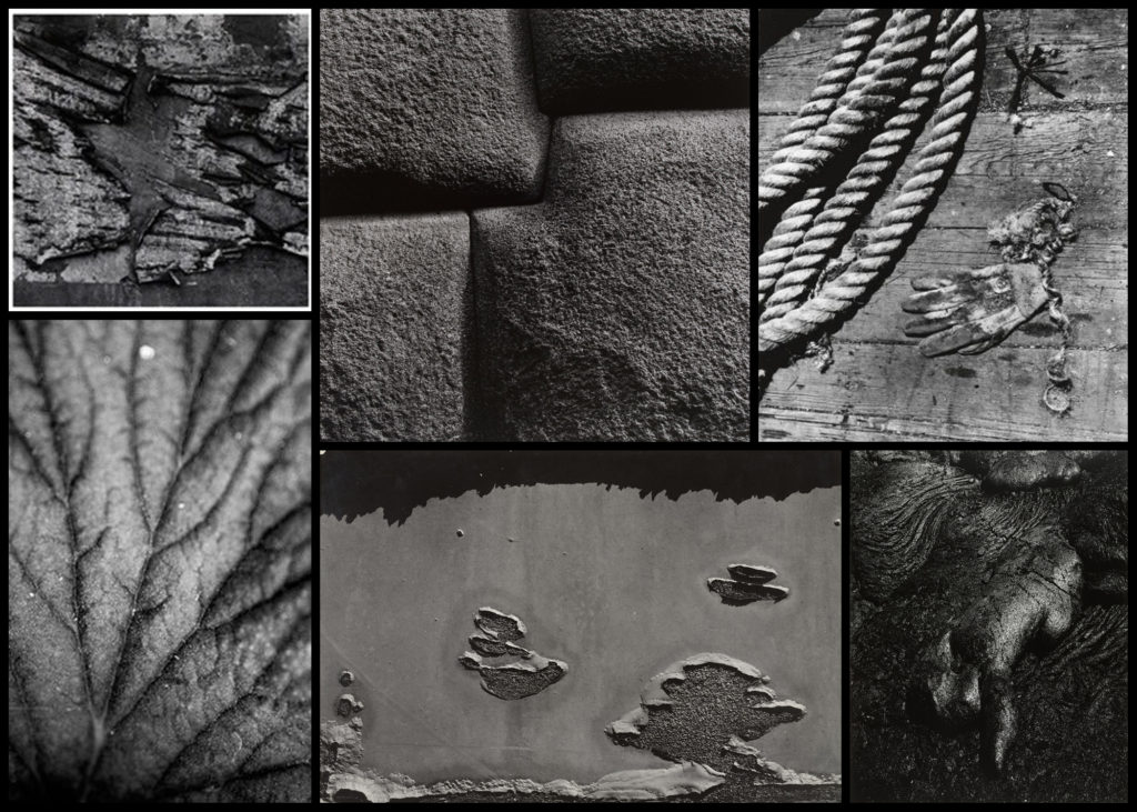
For this shoot I wanted to explore the use of natural forms in abstract and unusual ways using a monochrome filter to do so. Here I would walk around on specific area photographing the subjects in a highly contrasted light, which once edited would differ visually to what I originally saw. The photographer who I wanted to use as a reference of photography for this was Aaron Siskind, someone who specialised in abstract photography within streets as a means of creating a political view. What I especially looked at in his works were how he used only monochrome filter to create this images, choosing to take an angle upon the object that completely warps it compared to its original state. Here are some examples of his works:

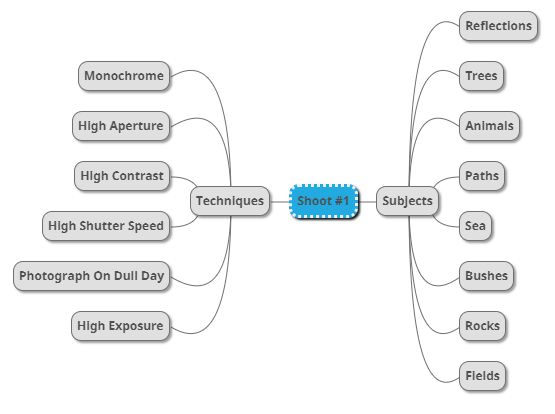
From here I wanted to go on to produce a mind-map, by doing this it would allow me to focus on the things I intend to photograph when on the shoot, preventing me from capturing subjects that would have no relation to what I was doing at all. Not only would this make me more efficient, but also make the results of my shoot overall more effective. Here are some of my ideas for the future shoot:

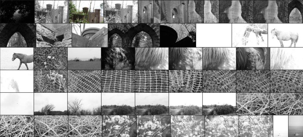
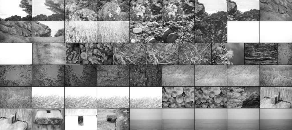
Once I had finished with my ideas I decided it was time to move onto the shoot itself. For the shoot I would be exploring the North of the Island as I found that was the area of Jersey that had the highest ratio of agriculture and natural landscapes. Using the mind-map as my reference I decided footpaths would be my main go to. Here are the results of the shoot:

Once I had finished the shoot I then decided to whittle all the images down to a selection of only ten. By doing this not only would it make it easier for me to decide on an image that best reflects the overall idea of the shoot, but also the one that both technically and visually is best. Here are my choices for the ten best images:

After I had selected the ten images I found most effective I then decided to once again whittle the selection down to now only fives images. In doing this it would allow me to analyse each image in more depth than the rest, looking at why the image was chosen, the technical aspects of it and its overall relation to the entire topic, whilst making it easier to pick the final image. Here are my choices:

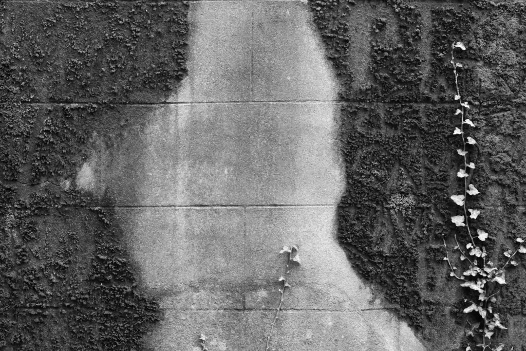
I selected this image because I loved the contrast between the wall and the surrounding ivy which grows upon it. For me by photographing a slither or concrete contrasted by the ivy it produces an abstract effect where two different environments merge into one, warping the images as you make your way to the centre of it. Composition wise I found the use of the darker ivy as a border to be effective as it slowly joins with the lighter shades of the brick, making use of any negative space which could have been there whilst producing an aesthetically pleasing result. I found that the use of a higher contrast was particularly effective here as it really highlights the hidden feature within the moss and bricks, creating more depth whilst also stopping parts of the piece from becoming too eye-sore for viewers.

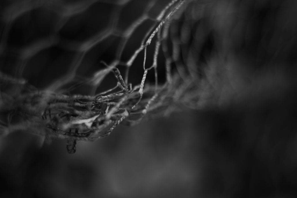
For this image the reason I chose it was because of the great use of a depth of field. By only focusing on one part of the mesh wire I found that it produced an abstract effect that messes with the mind regarding where the focus come into play. The detail of the actual focused wire that separates itself from the rest of the image for me creates a huge aesthetic feel, as the fluid transition from focus to out of focus really compliments each other, especially through the use of shades such as greys and blacks. Regarding the composition I really like how it is not centred in the middle, but rather the top left, this really gives a sense of depth within the piece as the background becomes blurred and the then is up to the viewer to interpret what could be surrounding the fence.

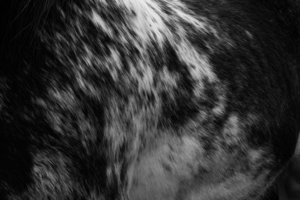
What I loved about this image was how the varying shades of the horse create an aesthetic abstract effect where each shades merges into the next. I largely chose this image because of how the composition portrays the side of the horse, with the whites coming down from the left and the rest of the piece being surrounded by black hairs which provide the photography with a natural border. What sold the image for me was how the use of a high contrast really brings out the definition within the side of the horse and the form of the body, this in a way isolate the actual horse from its side as it takes the viewer a few moments to actually figure out what the image is of, with only hints giving it away.

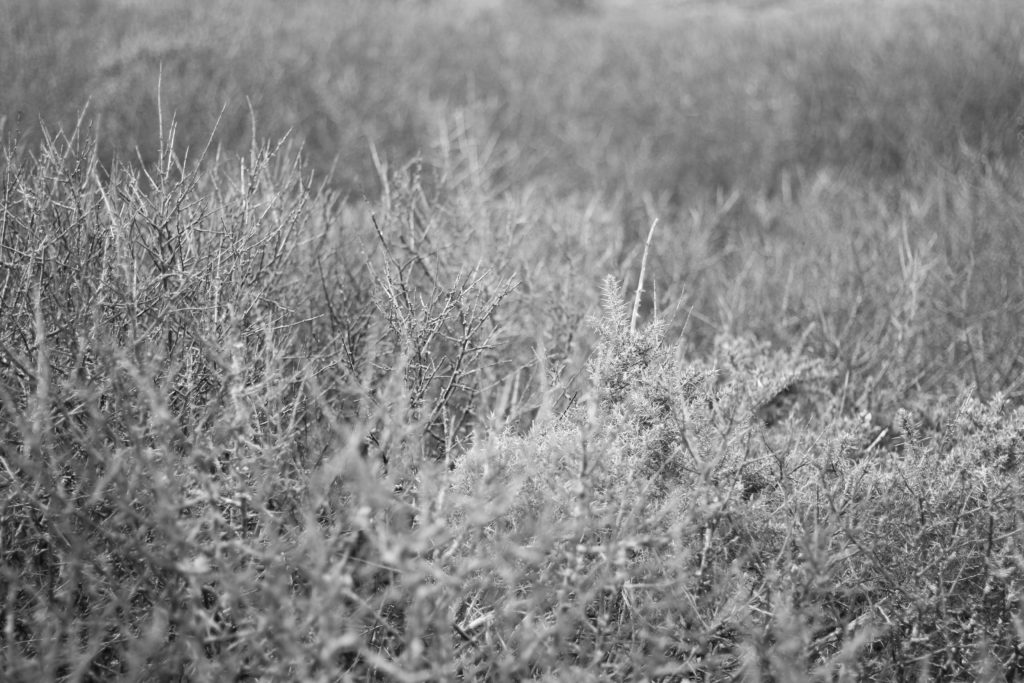
For this image I was drawn towards once again the depth of field within the landscape. By focusing on only one layer of the bushes it creates a feel or vastness within the photo as it highlights the sharpened ends of the branches whilst softening the rest of the area. This contrast for me really brings a sense of aestheticism over the whole image, as by using only a monochrome filter it leaves the image devoid of any distractions to rather allow us to look at the formation of the natural subjects within. The composition of the focused areas is also a major reason why I selected it, this is because of how there is a larger area of focused bush on the left which grows smaller as you progress, stopping the blurred backdrop from becoming more overpowering than it actually is.

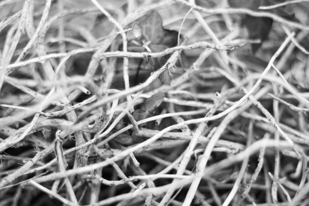
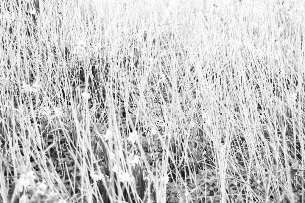
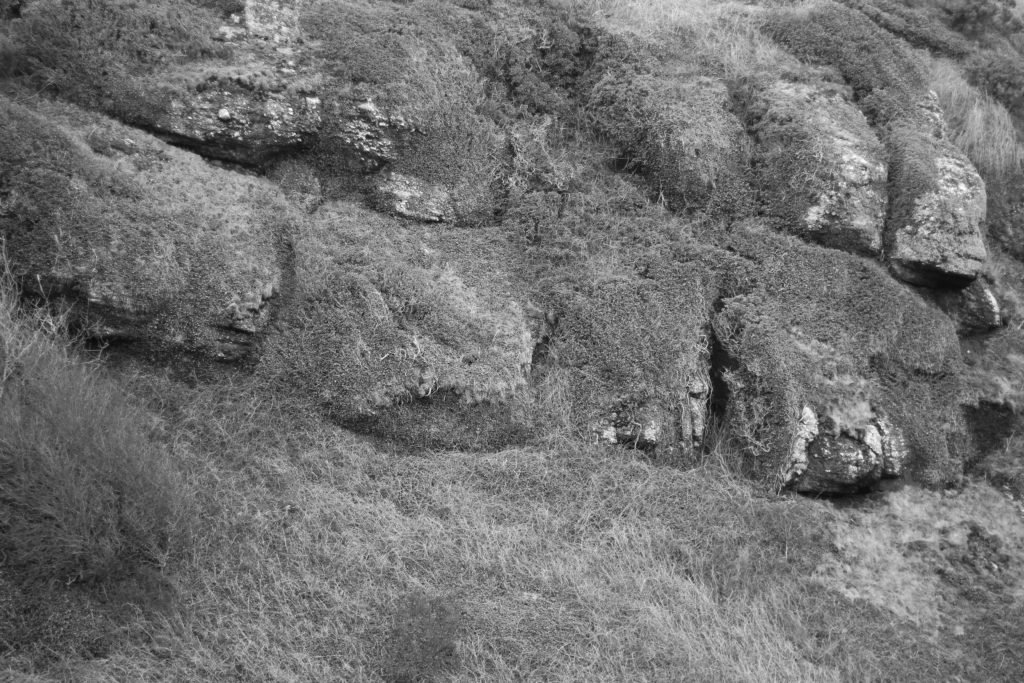
Finally I selected this image because I loved how the overlapping twigs presented themselves as a sort of abstract mess, with there being no actual order to how or where they are coming from. I also really liked how the shadows between the twigs were really contrasted opposed to the lighter shades of the wood which consisted mostly of lighter areas. This was complimented through once again a use of depth of field which blurs some of the layers of twigs out, by doing this for me I found it to be more effective due to how its stopped any eye-sore from occurring for the viewers, prevented us from not being sure where to draw our eyes to.

Once I had analysed and selected the five images I thought were most effective regarding their technical, visual and relevance to the overall topic I then proceeded to chose my best photo:

FINAL IMAGE:

The reason I chose this as my final image was because of the composition, contrast and definition that was present inside this photo. What drew this to me the most was how the piece was perfectly focused with some use of depth of field, whilst using a variety of different shades present on the horses side to create an abstract effect that mimics the natural environment around it. In relation to the entire topic of variation and similarity I found that this image reflected well the differing aspects regarding the textures and patterns which can be found within the different landscapes of Jersey, where the North could consist of more natural ones like this, whereas the South could maybe be more concrete and urban. As well as this the image for me presents me with a new perspective regarding how textures and patterns can also be found in living things found in these particular landscapes rather than just the way you personally view the landscape as well.

A2 Photography Exam – Artist Research – Dafna Talmor

Dafna Talmor is a photographer, artist and lecturer who is based in London. She works with photography, video, and collaborations with other artists. Some of her work is displayed in in public galleries like Hiscox, Deutsche Bank and many private collections across the world. Her work work is also included in Robert Shores book, Post Photography: The artist with the camera, also Brady Wilks book, Alternative Photographic Processes: Crafting handmade images and been featured in many publications from Elephant Magazine, 1000 words, ArtReview and more.

Talmor’s most recent commission was from the FT weekend magazine for their supplement of Photo London 2018. Her most recent work includes that of Constructed Landscapes at the the TOBE Gallery in Budapest, 2018, and Photofusion in London a year earlier.

Talmor is also a associate Lecturer for the fine art course at Solent University in Southampton, and also leads the yearly summer school of fine art at Goldsmiths, University of London. She also works freelance as an international lecturer, and has run multiple workshops.