Category Archives: Uncategorized
Filters
Experimenting With Black and White and Motion Blur
Comparison Of work
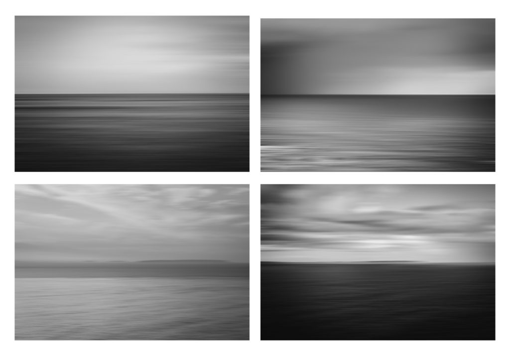
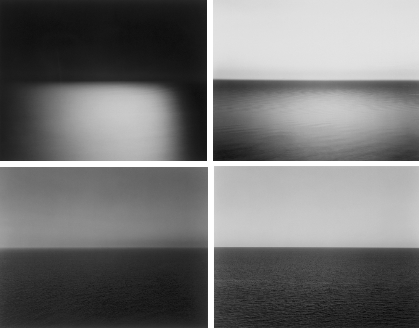
Third RESPONSE TO HIROSHI SUGIMOTO’S
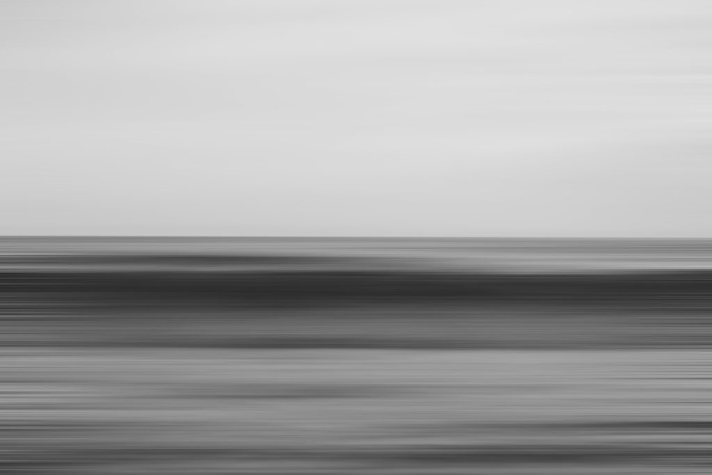
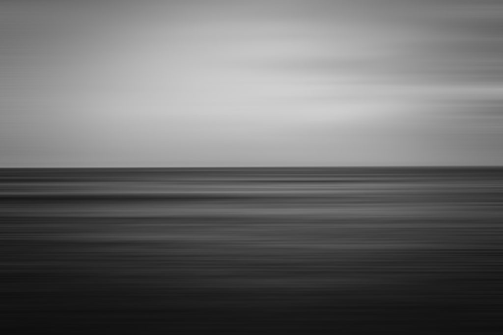
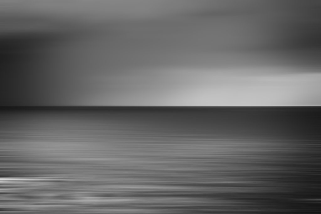
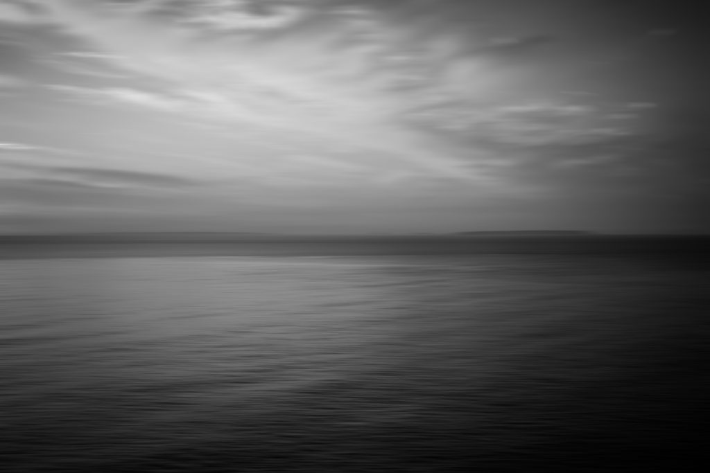
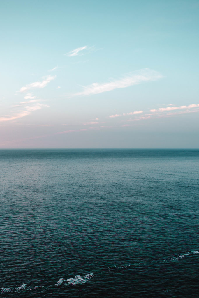
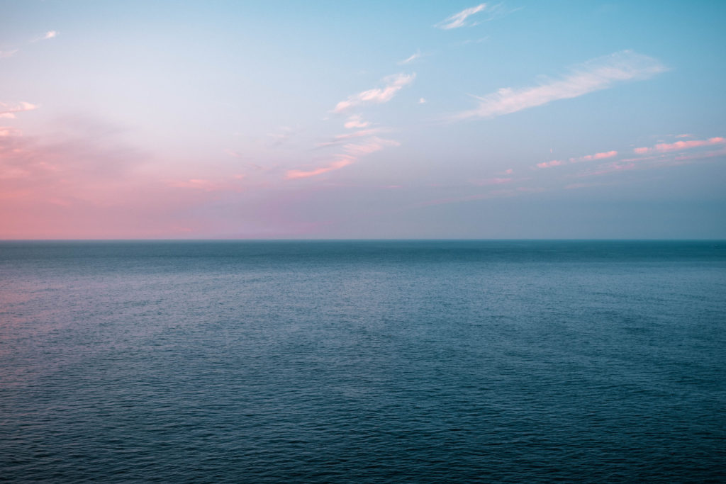
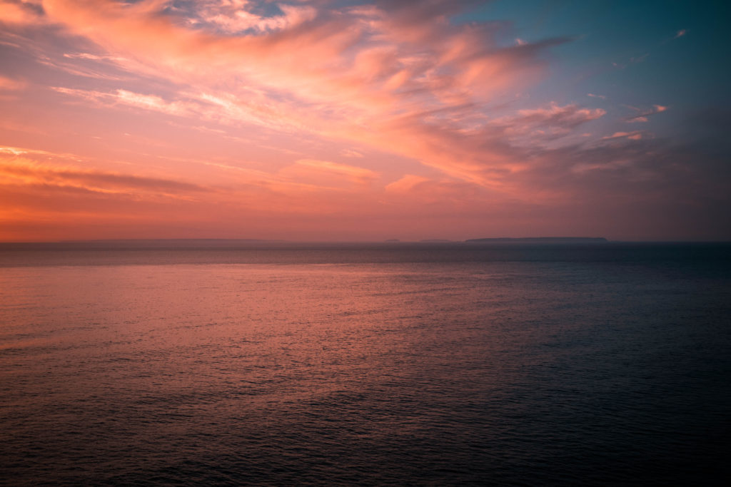
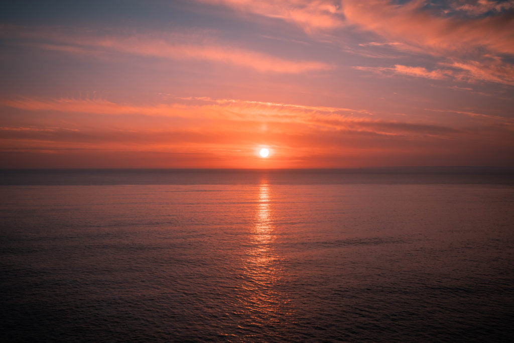
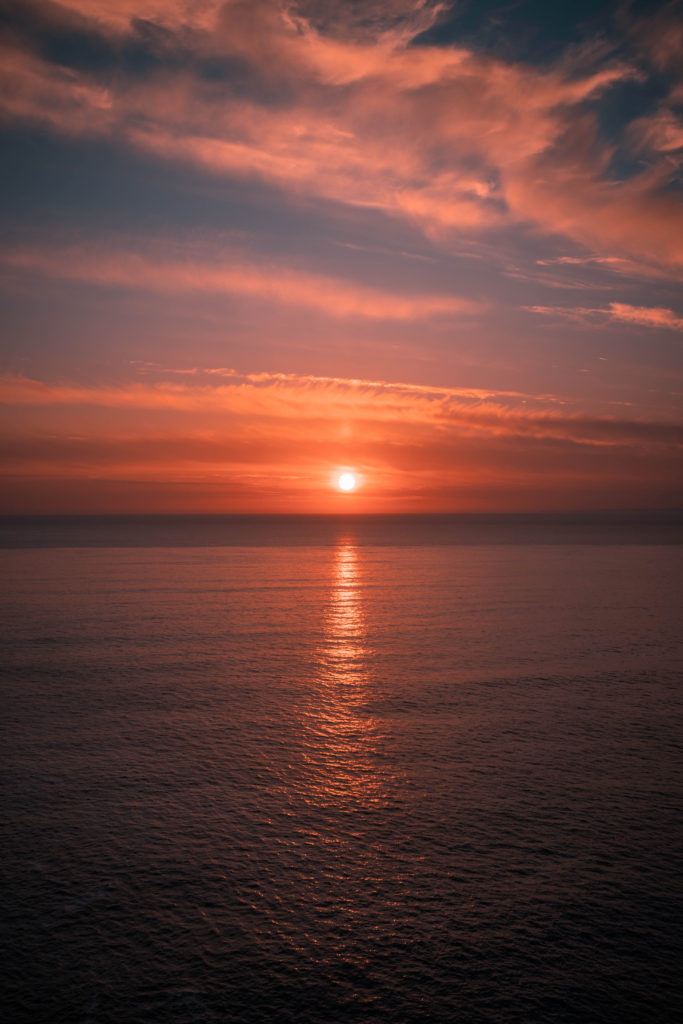
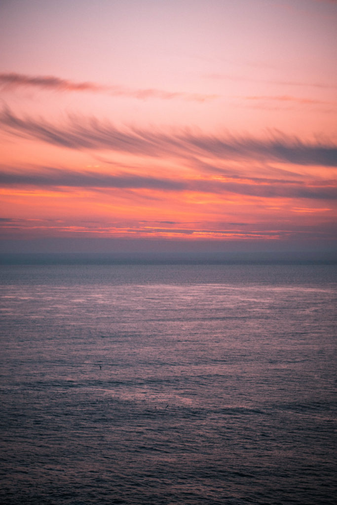
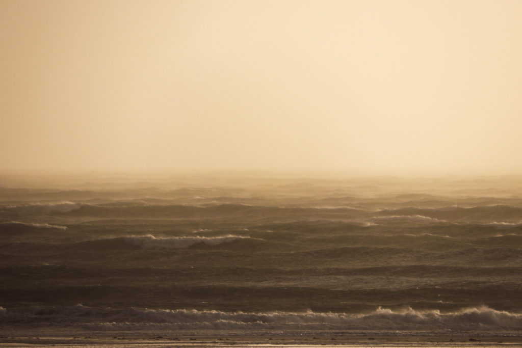
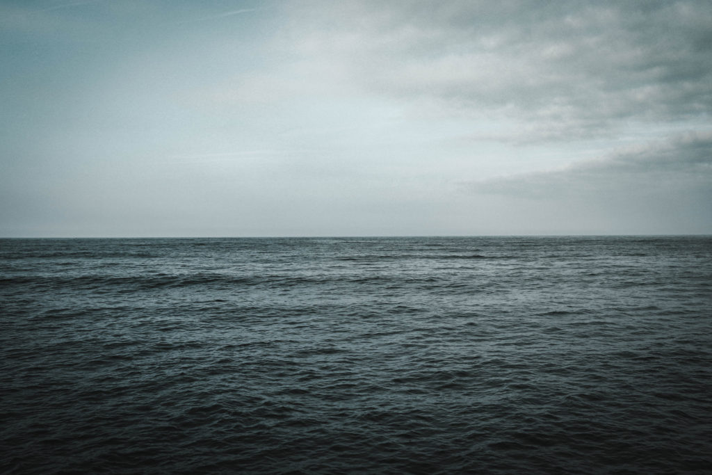
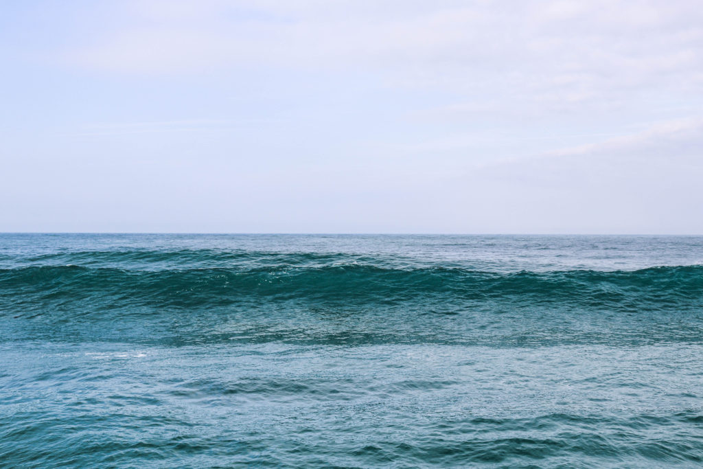
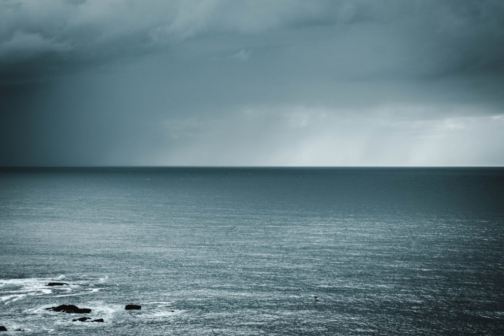
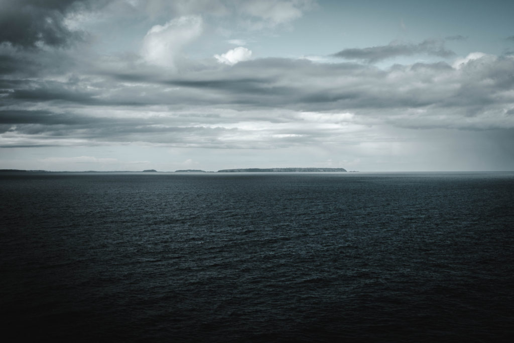
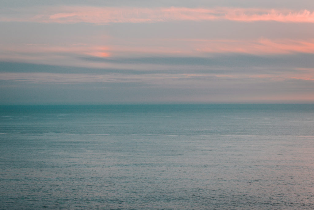
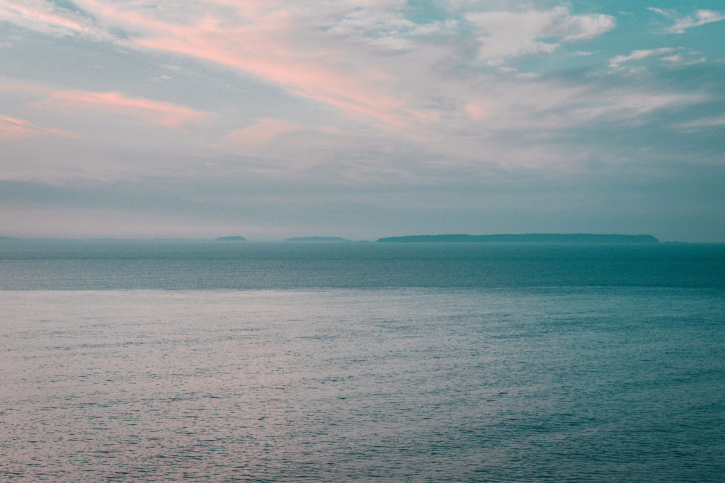
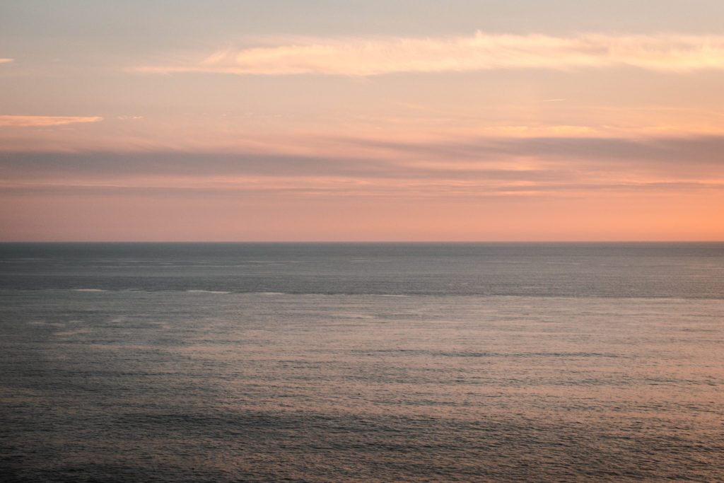
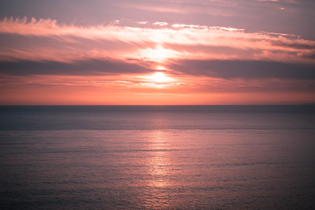
Over the course of my project I have been collecting images that reflect inspiration taken from my original artist reference Hiroshi Sugimoto. It was much easier to collect a variety of lighting over a long time period therefore every-time I went on a shoot I would snap a couple of Images in the style that can be seen below. This allowed me to collect a wider range of weather conditions and lighting than if I were to go out on specific shoots for this. I think this process has worked very well in allowing me to collect a variety of seascape images with a sense of changing lighting and weather conditions.
Edits
For this shoot i wanted to take a different approach to the typical photos that have influenced my interest in the ocean by Hiroshi Sugimoto. His photos usually portray a moody atmosphere through the choice of B&W formatting. Despite his project all containing B&W images there is still a clear focus on the depiction of light. However i wanted to try and emphasize this focus on changing light and how it shapes the landscape as appose to the traditional landscape images from the romantic genre. I feel as if I have successfully achieved this aim with a wide variety of weather conditions and lighting on the same landscape.
What is Photo-montage, Dadaism and Surrealism?
PHOTOMONTAGE?
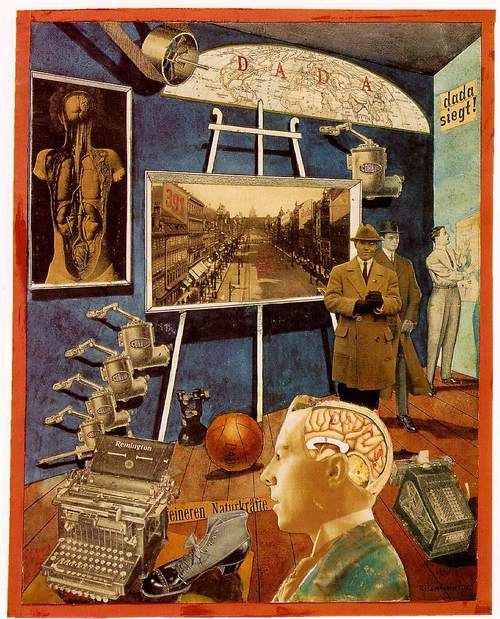
Photo-montage its self is a medium in which another composite photograph is made up by combining, gluing, overlapping, rearranging two or more photographs in one way or another. This can either be done digitally or physically, and even sometimes photo-montage is produced in a video format. The medium of photo-montage tends to be either used in a way that challenges political affairs, or challenges issues that we face in society as a whole. Photo-montage seems to have first been used around 1915 by the Dadaists (a movement I will explain shortly). The medium then began to be used by the Surrealism movement who began to combine images with no seeming connection or association, this was with the intention of ”releasing the creative potential of the unconscious mind.” Soon after, In 1923 the Russian constructivist Aleksander Rodchenko who was part of the Russian avant-garde movement (linked my post looking into this movement) began experimenting with photomontage as a way of creating politically fuelled challenging imagery concerned with the placement and movement of objects within a given space. Below are some modern examples of photo-montage techniques being used, and it is clear to see that this is an aesthetic which has remained prominent within art since its origin…
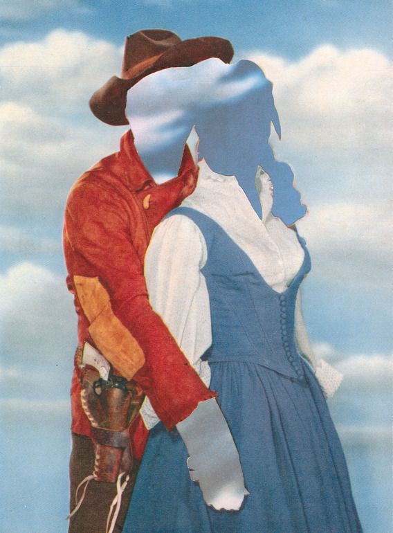
Joe Webb – 2012, Assemblage / Collage “Daydream III”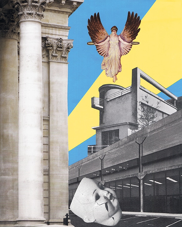
Broken Photo-montage 2017 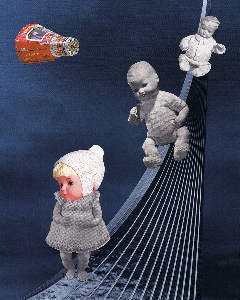
Special Delivery Photo-montage 2017
DADAISM?
Dadaism was an creative avant-garde movement in modern art which began during the First World War. It was a reaction to the negativity and horror that was occurring during the war, and a focus on going against the standards of society. It was done in a somewhat dark humorous way as it was ridiculing the modern world. It originated in Zurich, Switzerland and quickly spread to New York in 1915 and to Paris soon after 1920. Pioneers of the Dadaism movement included artists such as: Marcel Duchamp, Raoul Hausmann and Max Ernst among many others. Here are some examples of work from these three artists.
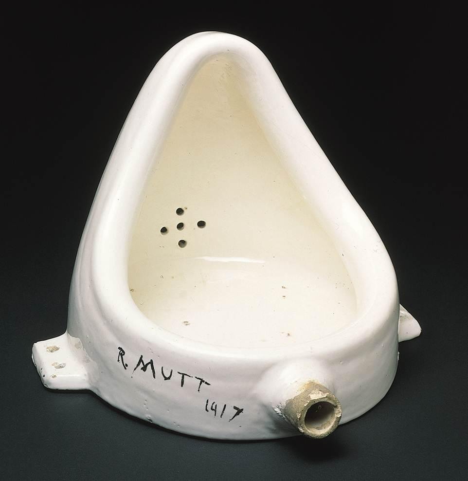
Marcel Duchamp – Fountain 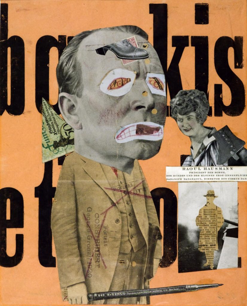
Raoul Hausmann – The Art Critic 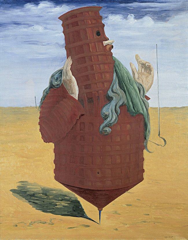
Max Ernst – Ubu Imperator
SURREALISM?
Surrealism is an abstract artistic movement which also began in the early 20th century inspired by dadaism and abstractism. The purpose of surrealism was to challenge the unconscious mind and the creativity within all human mind. It ”aimed to revolutionise human experience, rejecting a rational vision of life in favour of one that asserted the value of the unconscious and dreams. The movement’s poets and artists found magic and strange beauty in the unexpected and the uncanny, the disregarded and the unconventional.” So to put it simply this art movement was basically a way of trying to activate the creativity within the unconscious human mind, by means of unconventional techniques and aesthetics. Surreal as a word its self suggests something beyond reality which is exactly what this art entails; a lot of the time showing a form of dream or imaginary worlds etc… This is evident written as ”Many surrealist artists used automatic drawing or writing to unlock ideas and images from their unconscious minds, and others sought to depict dream worlds or hidden psychological tensions.” Some of the worlds most famous modern artists such as Salvador Dali, Pablo Picasso and Frida Kahlo belong to the Surrealist movement. Below again are some examples of work from these three artists that contributed to surrealism.
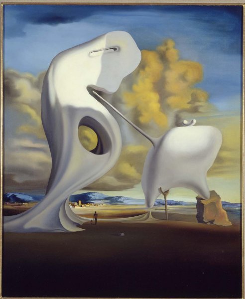
Salvador Dali – Figueras (1933) 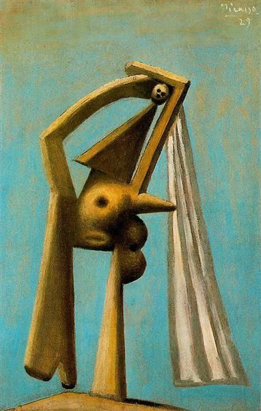
Pablo Picasso – Bather (1929) 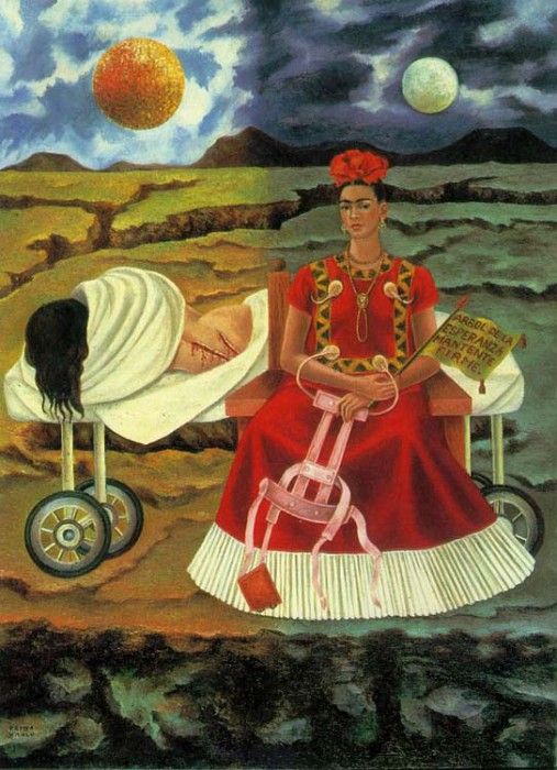
Fride Kahlo – Tree of hope (1946)
Russian Avant Garde (Context & Analysis Study)
WHAT IS RUSSIAN AVANT-GARDE?
Russian avant-garde was a very influential movement in the world of avant-garde art, that was at its height in Russia, from around 1890 to 1930 however it is said that its beginning could be as early as 1850 and its end could be as late as 1960. However personally I believe this may be due to the influences continuing from the movement which I will talk about, and the beginning is debatable as there were many things that inspired the movement in the first place. The Russian avant-garde movement includes many separate but closely related art movements that were prominent at the time of the movement as a whole. These closely related movements included movements such as: Suprematism, Constructivism, Russian Futurism, Cubo-Futurism, Zaum and Neo-primitivism. The movement reached its most publicly popular height in the period of the Russian Revolution between 1917 and 1932, at which point the ideas and concepts of the avant-garde clashed with the newly emerged state-sponsored direction of Socialist realism. Socialist realism was the complete opposite of what Russian avant-garde was about, it was a style of realistic and state approved art which, it emerged at the end of the Russian Revolution where it was first used in 1932. I believe what most solidifies the fact that it was pretty much completely influenced by the soviet state was that the term was settled upon in meetings that included politicians of the highest level, including Stalin himself.
In order to gain a better understanding of the Russian avant-garde movement, these two videos made by the museum of modern art (MoMA) help a lot.
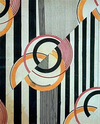
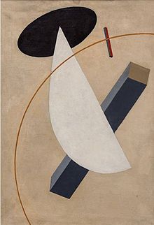
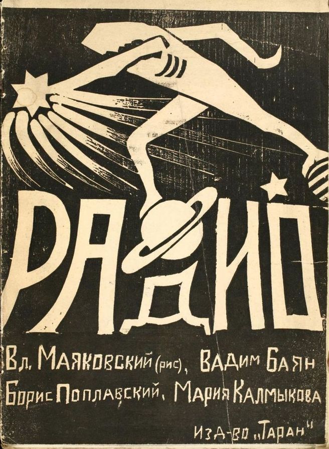
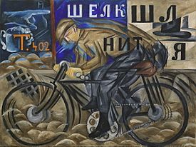
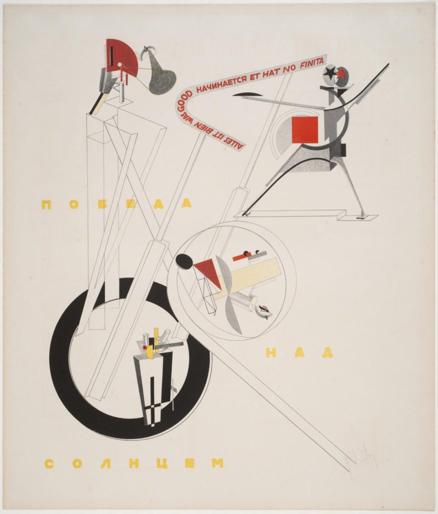
3 examples of work from the Russian avant-garde movement which I am particularly fond of…
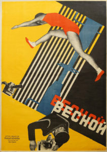
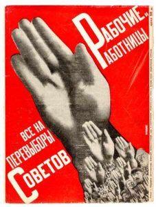
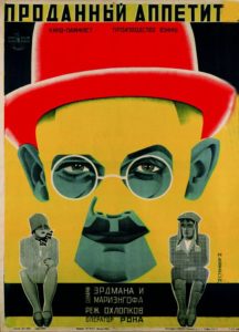
SUB-MOVEMENTS OF RUSSIAN AVANT-GARDE…
As I mentioned, within Russian avant-garde there were many closely related styles/sub-movements of art. In order to give myself a better understanding of the whole movement I then began to look into each sub-movement and what was included in each, here is some insight on a few of these sub-movements…
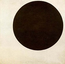
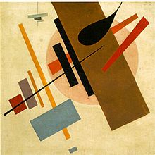
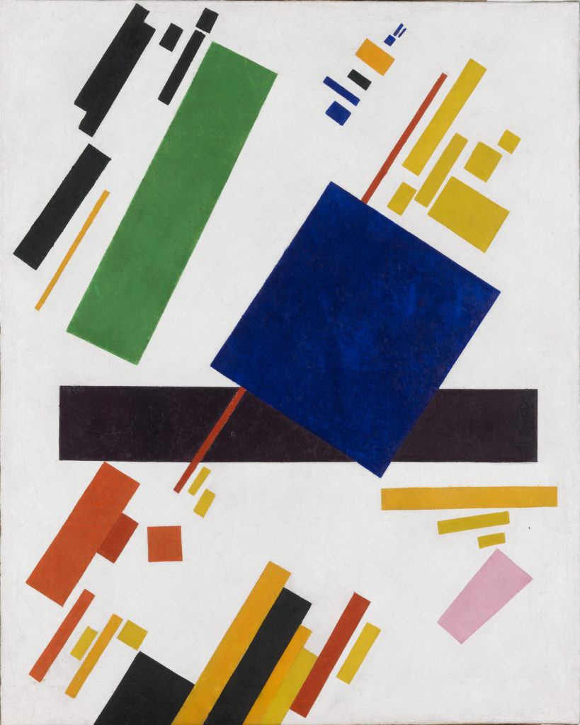
SUPREMATISM: this was an art movement which focused on basic geometric forms found in everyday life, such as circles, squares, lines, and rectangles, which were painted in a limited range of colours. The main artist involved in this movement was Kazimir Malevich who was believed to have founded the movement in 1913, which he then officially announced at one of his exhibitions in 1915. The actual term of supematism itself is a reference to the form of art that was based upon “the supremacy of pure artistic feeling.” This was instead of a realistic depiction of subjects. Said about constructivism by Malevich was that ”Under Suprematism I understand the primacy of pure feeling in creative art. To the Suprematist, the visual phenomena of the objective world are, in themselves, meaningless; the significant thing is feeling, as such, quite apart from the environment in which it is called forth.” Below are some examples of the art which came from the movement, all 3 from Malevich.
CONSTRUCTIVISM: This was a movement of ”architectural” art which the same as suprematism began in 1913. It began at this time, founded by artist Vladimir Tatlin. The constuctivism movement was actually very influential on the art world as a whole, causing major effects upon sculpture, graphic design, industrial design, architecture, theatre, film, dance and fashion. Below are some examples of the artworks which came from the constructivism movements. As you can see however, there were a lot of visual overlaps and similarities between constuctivism and suprematism.
RUSSIAN FUTURISM: This was another movement within the overall Russian avant-garde movement. It was a style and philosophy of work which was adopted by Russian artists who were influenced by the principles of Fillippo Marinetti’s ‘Manifesto of futurism.’ This manifesto expresses an overall concept called futurism that referred to a rejection of the past and a celebration of speed, machinery, violence, youth and industry. The Russian futurism movement is said to have begun in 1912 (a year earlier than the other two sub-movements which I have looked into) However instead of being influenced by an individual artist, this time the movement was influenced by a group of artists called Hylaea who were based in Moscow. It is only fair that I list the artists who equally made up this group, it included: David Burlyuk, Vasily Kamensky, Velimir Khlebnikov, Aleksey Kruchenykh, Vladimir Mayakovsky, Mikhail Larionov, Natalia Goncharova, Kazimir Malevich and Olga Rozanova. When looking at works of art from this movement it quickly became evident to me that a frequently used piece of symbolism within the art was the depiction of wheels and physical speed. The presumptions which I make from this is that the wheels and speed represent moving into the future. Below again are some examples of artwork from the movement which I have just spoken about.
INFLUENCES ON MODERN CULTURE AND FASHION FROM RUSSIAN AVANT-GARDE…
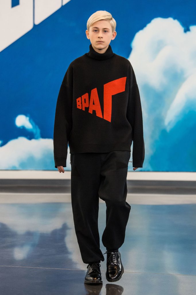
As I began to explain before, the Russian avant-garde art movement has continued to influence many forms of creativity since its hay day. In terms of how it is still influencing creativity today, there are two creators that stand out to me as being particularly influenced by the movement, and they are fashion designer/photographer Gosha Rubchinskiy and graphic artist/obey clothing brand owner Shepard Fairey. These two artists show clear visual influence within their work from Russian avant-garde. This is particularly through the use of colour, shape, form and elements of text.
Gosha Rubchinskiy (Гоша Рубчинский), a Russian himself, shows a significant amount of influence from Russian avant-garde when it comes to the design of the garments which he designs for his self-named ”Gosha Rubchinskiy” brand. A brand which is very well known in the street high-fashion industry, who have collaborated with worldwide fashion brands such as Adidas, Levi’s, Burberry and Dr. Martens. The main way in which I believe the designs which Gosha produces reflect the movement is in terms of its political statements/rebellion and the use of bold graphic text. Below you can see examples of his work which I believe give a better understanding of my suggestions.
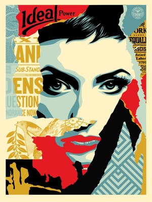
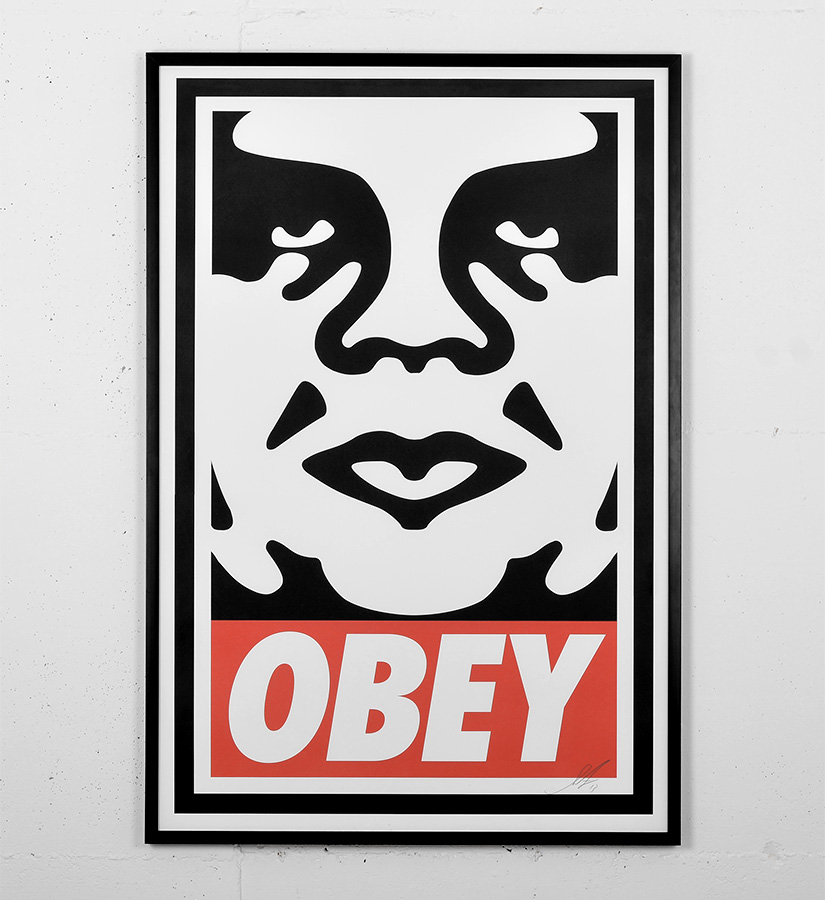
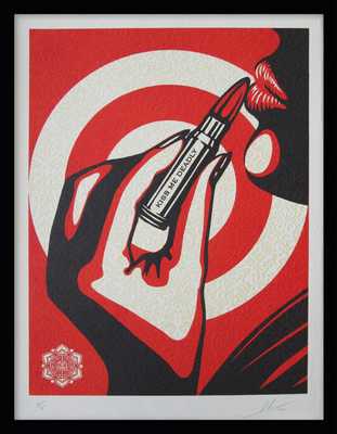
Shepard Fairey who as I said also takes inspiration from the Russian avant-garde. He emerged as a street artist from the skate scene and is best known for his ‘OBEY’ branding and the notorious Andre The Giant logo which he began his brand with as a sticker campaign. Similarly to Rubchinskiy, Fairey also reflects the movement is in terms of its political statements/rebellion and the use of bold graphic text. He is influenced by the Russian graphic rebel propaganda used at the time of the movement and also by the constructivism sub-movement which I explained earlier. His work seems to intend on using the similar effective aesthetic values of the Russian movement in order to get across messages about the political and social issues which we face within our modern society today. Below are some examples of Fairey’s graphic art which I have spoken about.
Visual analysis of a work by Shepard Fairey…
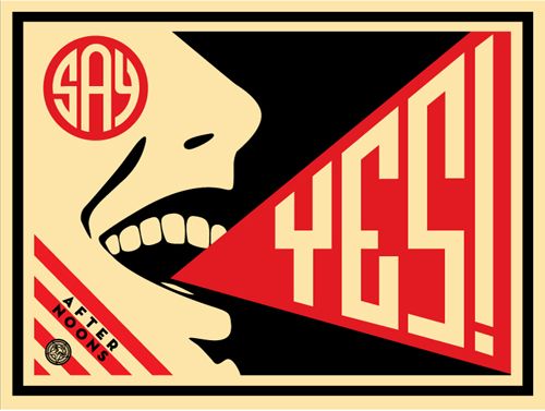
Here we have a piece of work titled Say Yes by Shepard Fairey, a screen printed graphic which was published in 2008 by Fairey. My first thought on this image were that there was a clear political message being put across by Fairey with the ‘say yes’ slogan which I initially believed to have been a link with the OBEY branding surrounding Fairey’s career, and that maybe ‘say yes’ was a message about conforming to society and political changes which is what the OBEY brand entails. Come to find out however that this piece is not intending on conveying any sort of political message, and however is actually a poster created for one of Fairey’s friends Steven Scott who is a part of the ‘afternoons’ band, the artwork is for a song called ‘say yes’ and from there the poster was printed 150 times as part of the project. This is better described by Fairey himself saying ”My friend Steven Scott who works at my favorite LA breakfast spot, The Mustard Seed Cafe, gave me a copy of his band’s demo CD. The band is called AFTERNOONS and their music is very symphonic, uplifting, indie rock in the vein of the Polyphonic Spree or newer Flaming Lips. The standout track is called “Say Yes” and I was so inspired by it that I decided to make a poster for the band to put up on the street, and a few to sell to recoup printing costs. The edition is only 150.” I then begun to become aware of the feeling that I had seen something very similar to this piece and quickly realised that in fact when researching the constructivism sub-movement of Russian avant-garde, I came across a poster by Aleksandr Rodchenko from 1924 which depicts a woman screaming a slogan however in Russian with blatant visual reflections to Fairey’s ‘say yes’ poster. Here is the Rodchenko poster which I believe to have somewhat inspired Fairey.
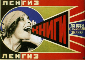
As well as many other clear aesthetic similarities, the joyful expression of the mouth in both Fairey and Rodchenko’s artwork clearly shows a great similarity. And although I am actually unable to find any hard evidence as to whether Fairey was directly inspired by Rodchenko’s piece, I am quite confident to say that I would be nearly certain that Fairey’s piece is a refence to this and that if not it would be a considerable coincidence which I have come across. Overall I believe that Fairey’s ‘say yes’ piece is a very successful work. The composition of the piece is great as it is full yet remains graphic and not over-complicated, also Fairey’s choice to only use 3 colours (most likely due to the screen-printing technique) is easy on the eye and reflects the style of Russian propaganda in which they tended to also limit the amount of colours used.
A2 Photography Exam – Photoshoot 2 – Beach
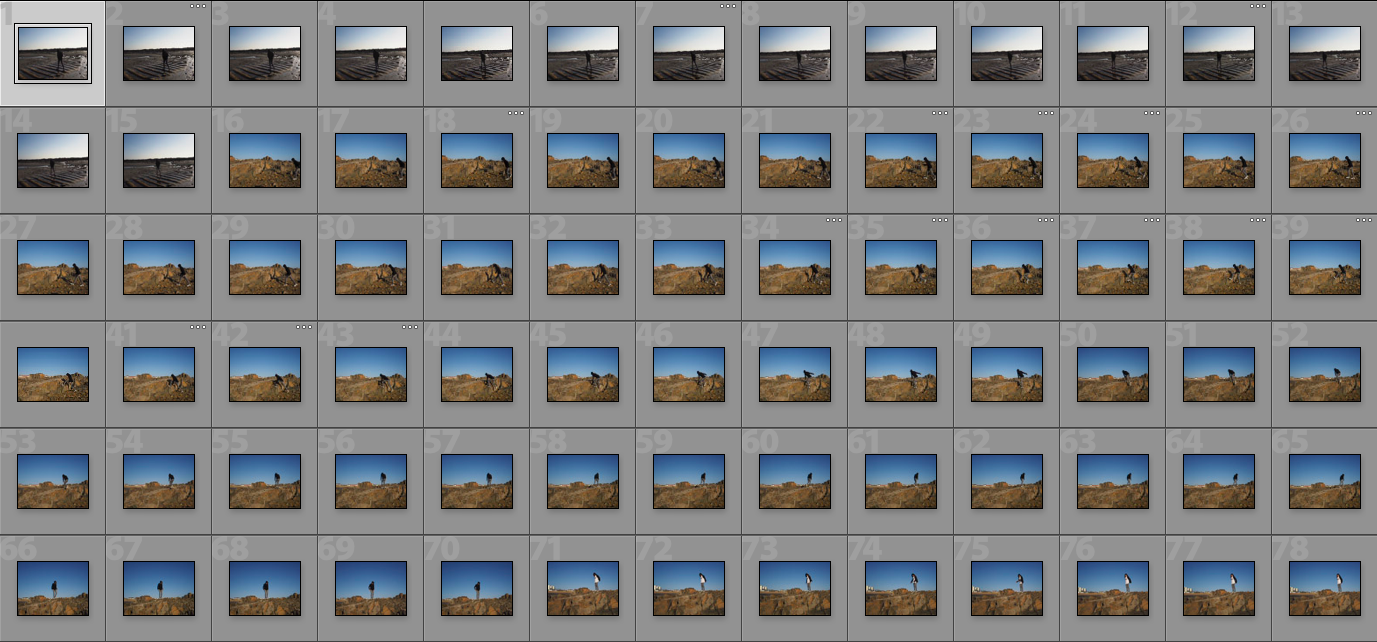
For my second photoshoot I used the same person for the shoot as the first. For this shoot I went to Le Mare beach and got the subject to do roughly the same thing, which again created a variety of interesting shots.


CHAOS EDITS AND SHOOT

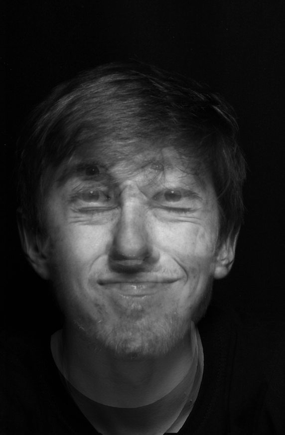


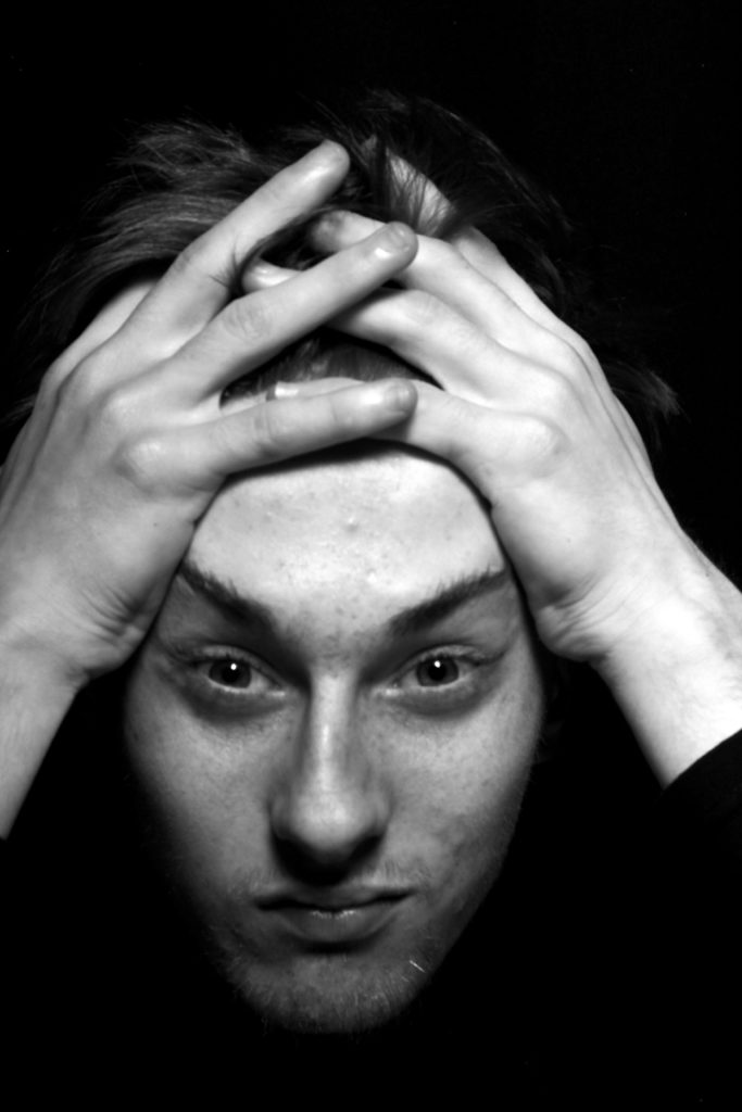
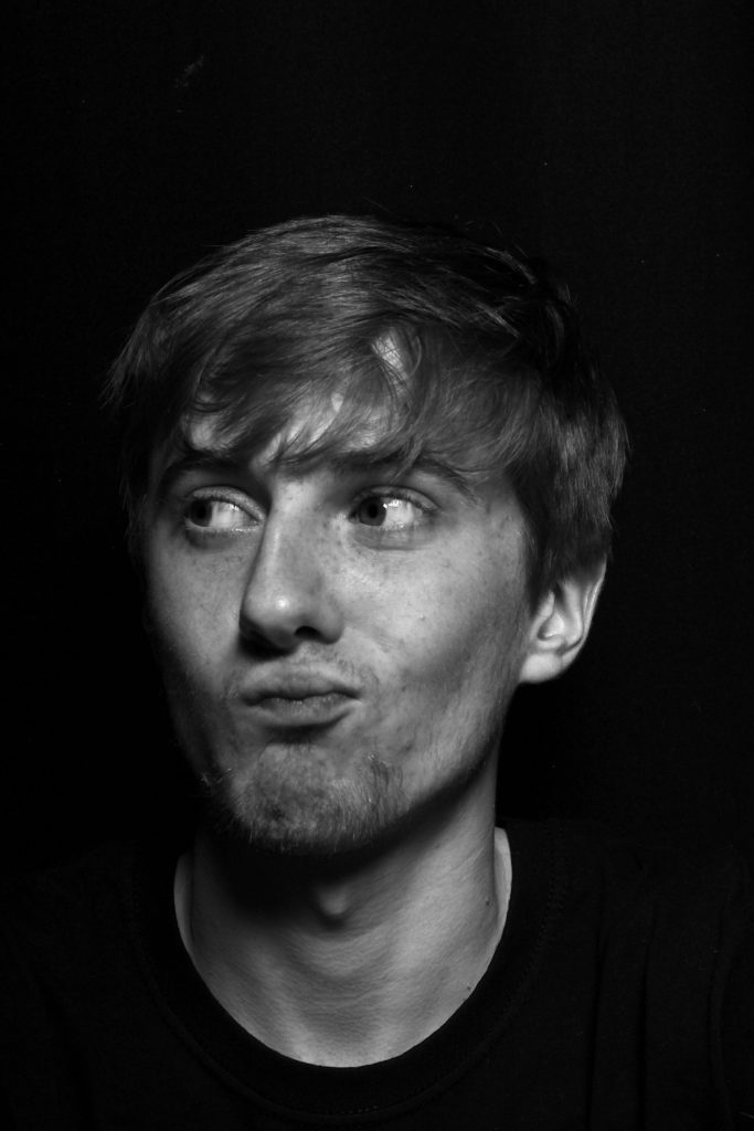
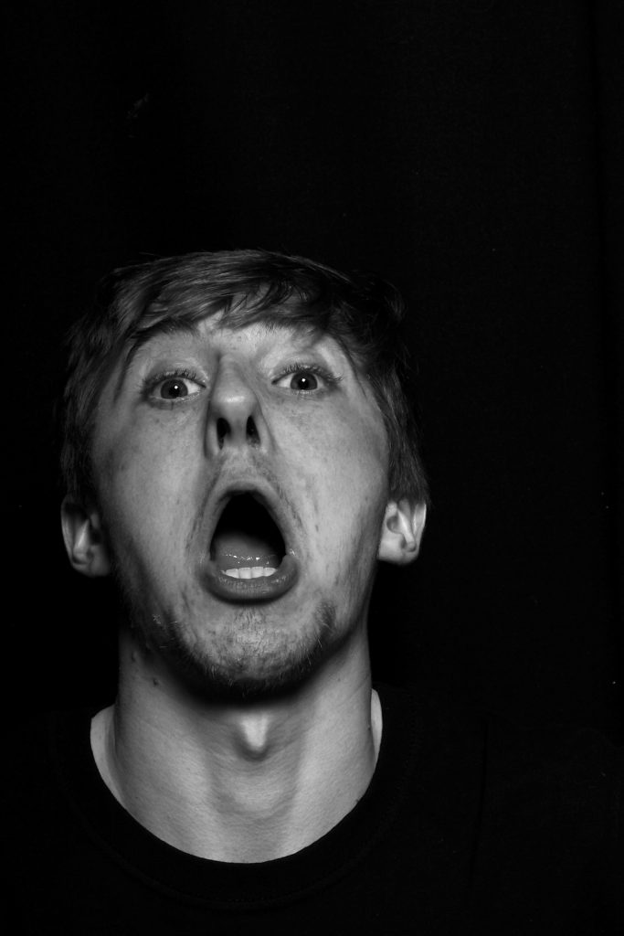
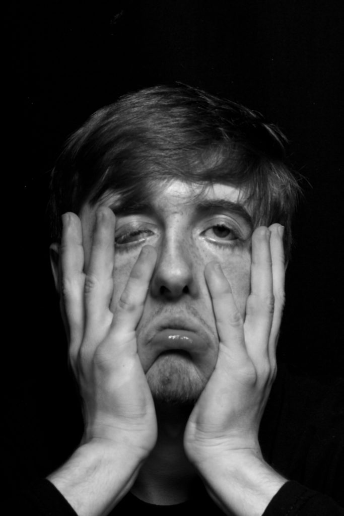
ANYLSIS: This shoot of Chaos, was once again one of my three main original starting points. I wanted to still experiment within the theme of chaos for a short period, as I belive it is fascinating the reactions and effect of the hypodermic needle is to audiences, and how one persons actions can effect the actions of so many more. The influence of what we see within the media and how this not only influences our own acts, but the influence of our mind set is significant. With the continuous promotion of only negative news, their comes a time where this negativity creates an illusion that this is the whole premis of what their is within the world, and a false reality of the vast majority of the world is a bad place filled with bad people. Hovwer I want to break free form this idea and create a sense of emotional vulnerability within these images. I have spoken previously about exploring a sense of exposing the true emotions and feeling of myself and others, considering what we fine beautiful and what we view most important with others and ourselves. I belive many people hide their emotional state and have a tendency to only show a false sense of their feelings, especially towards the news. The news and chaos within the media is to my mind a from of the elephant in the room, we know it is their and we justify its news given yet I do feel it negatively effects us as a collective. This is a set of images where I wanted to cover each image with many others all expressing a different over- exaggeration of emotions, in order to create an aspect of importance and relevance to our justify our feelings. The effect of the editing of the amount of opulence you se in each image and how you are able to see all the layers and feel a movement to the image, almost personifies the world chaos into an image itself. I belive this Is why I find this shoot so interesting, not just the outcomes, but the original importance of the shoot itself. I could create a juxtaposition from these images and how what we should see and feel in the world with an accurate representation of emotions for people. A contrast of hate to love, and negativity to positivity. Life should not be so concentrated by a monopoly of negative issues, but a celebration of the beauty and experience others are having in the world around us.
Artist Research: August Sander
August Sander, born 17 November 1876 – 20 April 1964, was a German portrait and documentary photographer. Sander’s first book Face of our time was published in 1929. Sander has been described as “the most important German portrait photographer of the early twentieth century.”

Sander was born in Herdorf, the son of a carpenter working in the mining industry. While working at a local mine, Sander first learned about photography by assisting a photographer who was working for a mining company. With financial support from his uncle, he bought photographic equipment and set up his own darkroom.
He spent his military service (1897–99) as a photographer’s assistant and the next years wandering across Germany. In 1901, he started working for a photo studio in Linz, Austria, eventually becoming a partner (1902), and then its sole proprietor (1904). He left Linz at the end of 1909 and set up a new studio in Cologne.

In 1911, Sander began with the first series of portraits for his work People of the 20th Century.
His work includes landscape, nature, architecture, and street photography, but he is best known for his portraits, as exemplified by his series People of the 20th Century. In this series, he aims to show a cross-section of society during the Wiemar Republic. The series is divided into seven sections: The Farmer, The Skilled Tradesman, Woman, Classes and Professions, The Artists, The City, and The Last People (homeless persons, veterans, etc.). By 1945, Sander’s archive included over 40,000 images.
Image Analysis

I haven chosen this photograph of Sanders to analyse because this photograph is a similar style to the type I want to photograph in my third photoshoot, a model in a open natural landscape. I like this photograph because the backdrop of the fields creates an interesting effect in the way that the fields create a very nateral backdrop, its very simple and allows as much attention on its self as the model, creating a perfect balance. The model is an interesting factor in the photograph, oppose to being stood still, lifeless, he is stood in an intriguing pose, creating a more engaging photograph. The texture of the mud creates a noticeable contrast within its self and the model and fields, dividing the photograph into sections, allowing there to be more to look at within the photograph. In conclusion this photograph is simple but engaging and similar to what I hope to photograph myself for my project.
WILLIAM YE STUDIO SHOOT 2
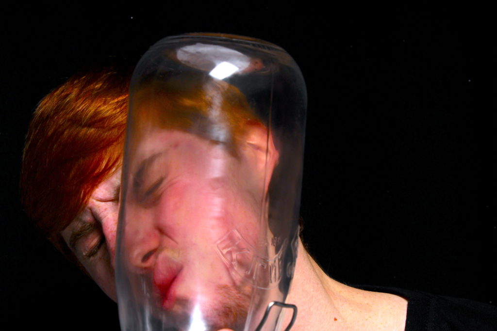
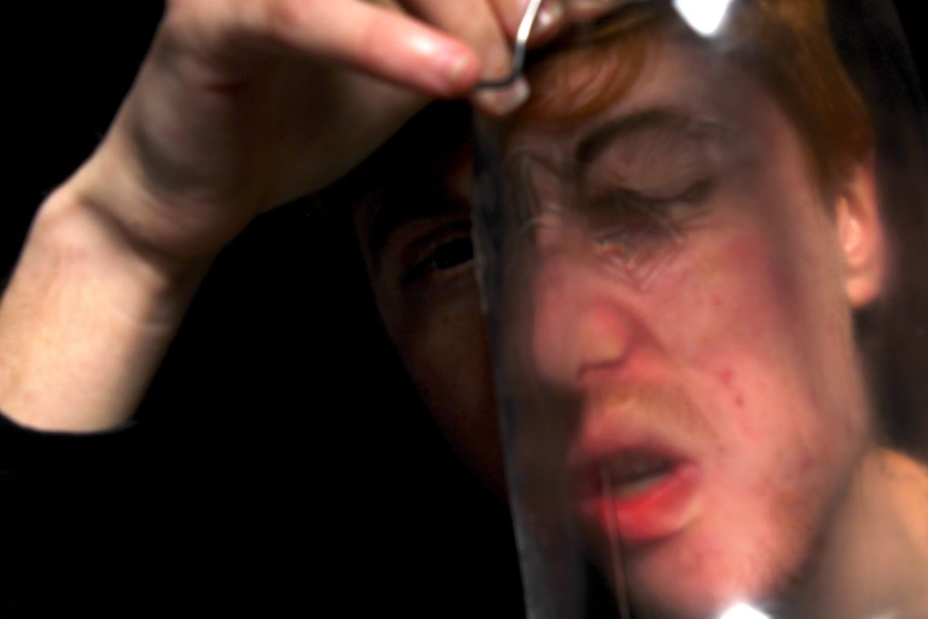


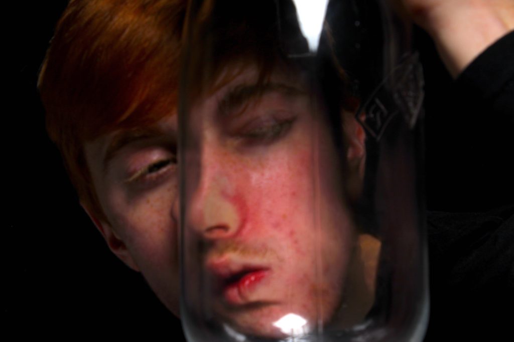
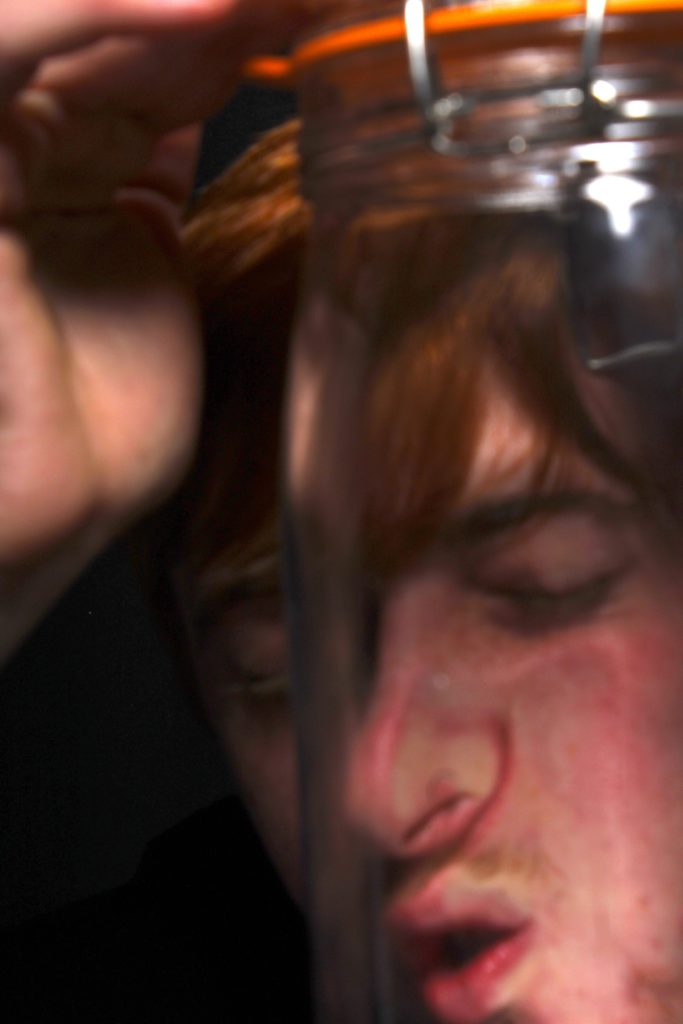
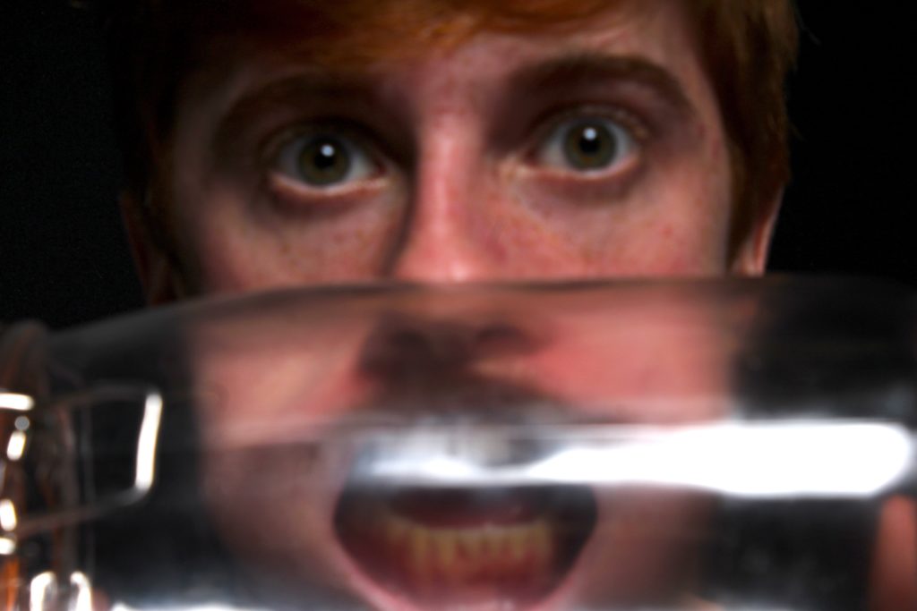
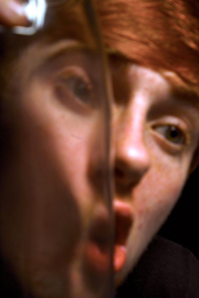
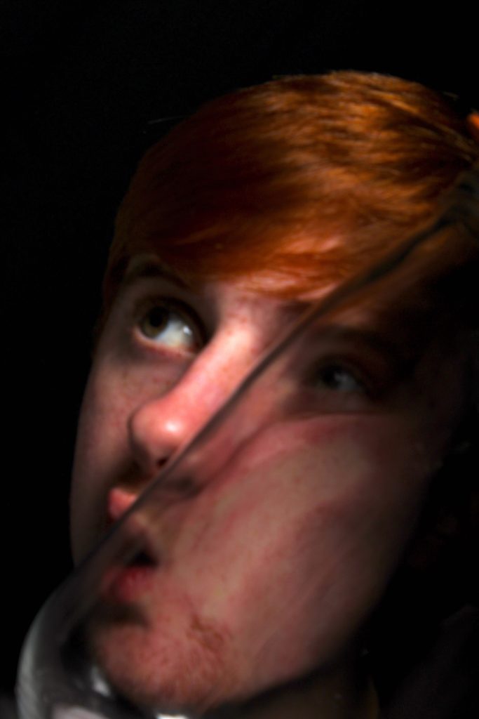
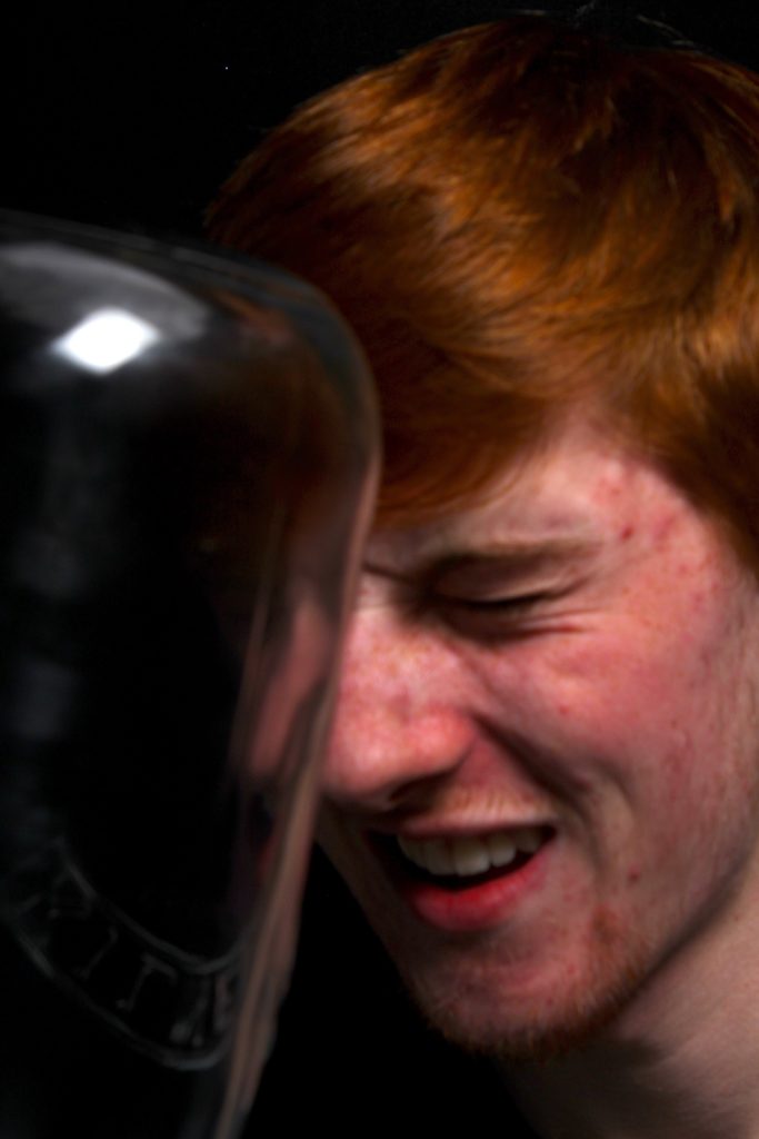
INSPIRATION: My inspiration for this shoot was both the combination of William ye, which is evident, And how he uses a large jar and conceptually takes images of people through it in order to extend and manipulate their faces and make a more abstract representation of people and their emotional wellbeing. However, my other inspiration is a much more abstract and once again fine art related artist, who presses faces up against jars, and then paints and manipulates the images themselves in order to create a much more worked into and unique colour and composition.

WHERE NEXT: As this artist, clearly works and edit more into their work, I believe next I should experiment with developing these images further, and possibly even doing so with the intent of creating a small representation and grid of the images similar to above. Due to these shoots being a-lot more dark and brutal to my current theme exploring the essence of beauty, I belive I should connect this shoot with the media and the relation of emotional well being linking to chaos in the news. And how we should ignore this to see the beauty within the world.
Modernism Vs Post-Modernism
POST-MODERNISM AND MODERNISM
Postmodernism was a reaction against modernism. Modernism was generally based on idealism and a utopian vision of human life and society and a belief in progress. It assumed that certain ultimate universal principles or truths such as those formulated by religion or science could be used to understand or explain reality. Modernist artists experimented with form, technique and processes rather than focusing on subjects, believing they could find a way of purely reflecting the modern world. It is generally very simple and non decorative. Modern art rejected tradition so it looked very different to anything anyone had seen before.
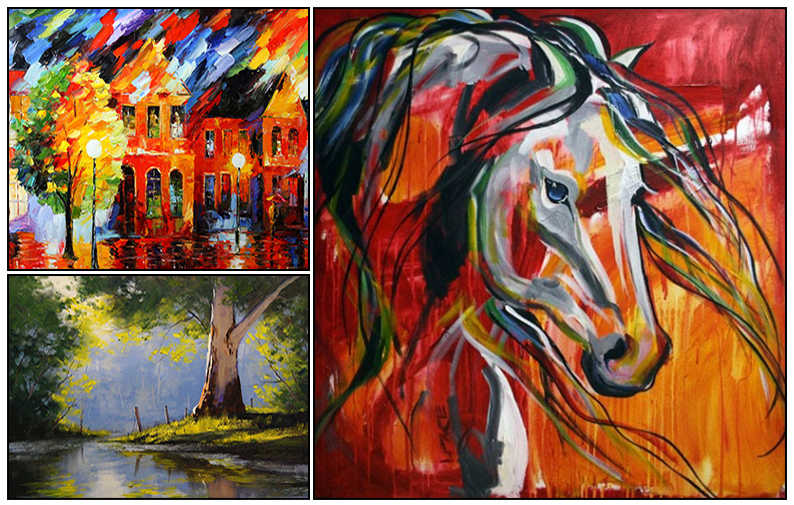
While modernism was based on idealism and reason, postmodernism was born of scepticism and a suspicion of reason. It challenged the notion that there are universal certainties or truths. Postmodern art drew on philosophy of the mid to late twentieth century, and advocated that individual experience and interpretation of our experience was more concrete than abstract principles. While the modernists championed clarity and simplicity; postmodernism embraced complex and often contradictory layers of meaning. Cultural identity was a big part of postmodernism, with people realizing that modernism was dominated by straight white men. Within post modern art, it is popular to include quotes or words on their art since it fits with the idea of questioning things. There are no rules about what postmodern art is but there tends to be a lot of contrasting and questioning. The works of post modernism are often abstract and somewhat strange. There is an objective to display that everyone has different reality and there is such thing as human nature instead of nurture.

The modernist approach links to my previous studies of Sugimoto and Monet’s Hay Stacks that focus on mainly the depiction of light and how it shapes the environment. Rather than focusing on subjects these artists use lighting and textures as a way of reflecting the modern world.

Modern Art
Time Period – From 1450 – 1960
Gender Spread – Most of the artists in the modern times were male
Mindset – Go with the ideas in every way
Influence – Political and society pressure
Postmodern Art
Time Period – From 1960 to present
Gender Spread – Mixture of both
Mindset – Question the changes and movinf towards new ones quickly
Influence – Free of any pressures
In the Modern work, whatever the meaning was given by the writer was considered to be the only meaning but in postmodern times, people tend to make their own mind and deduce the idea according to their will. In modern era people tended to enjoy the modernism but in the postmodern era, people are questioning the changes and moving towards new ones quickly. Arts in the modern times was influenced by political and society pressure while the postmodern art is free from all those factors.

