Category Archives: Uncategorized

Filters

Author:
Category:

Experimentation -Play

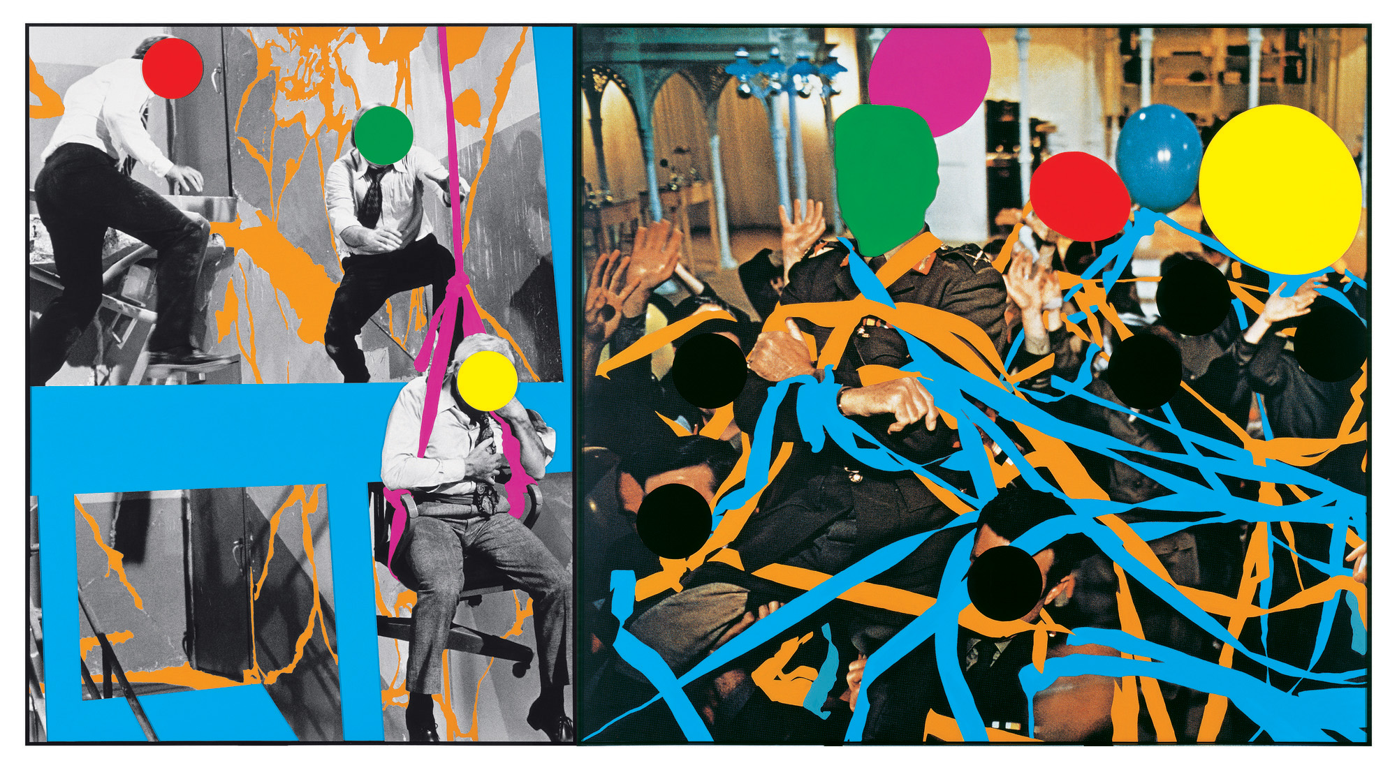
To look at the idea of play within photography we experimented with archival images and the way John Baldessari edits and manipulates them in a fun way to create expressive works of art. He used colourful price stickers to cover peoples faces in photos ultimately hiding their identity and creating a level playing field between them all . His art can be seen as radicle and chaotic with a strong playful element. Born in 1931 in America he is known for his conceptual art, incorporating found photography with text, paint also making creating using video. There is really no rhyme or reason to his work an he is known for

Image result for john baldessari

https://aeon.co/videos/everything-you-need-to-know-about-john-baldessari-godfather-of-conceptual

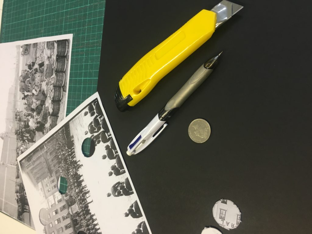
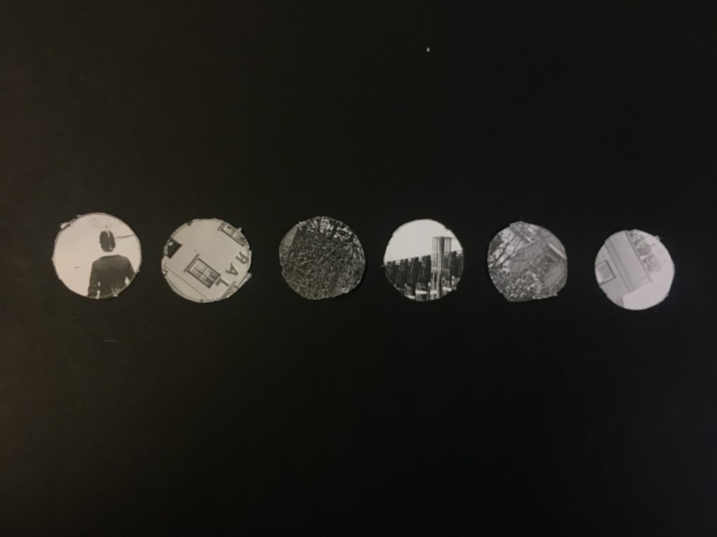
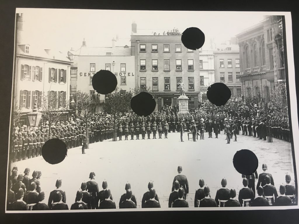
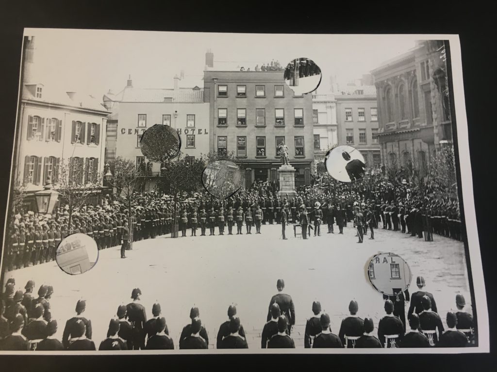
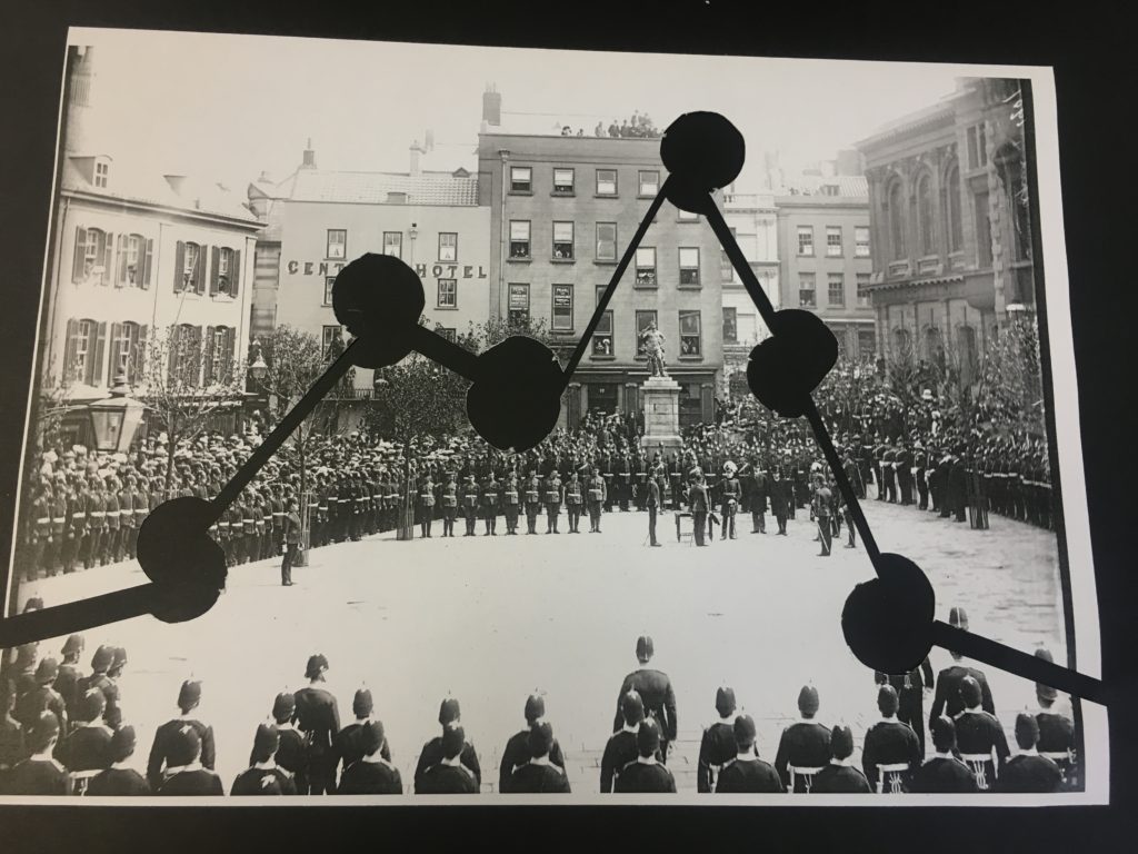
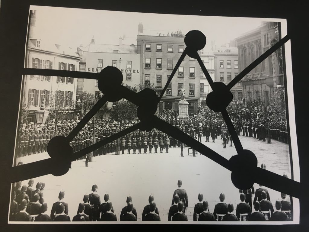
As a response to John Baldessari’s work and the idea of play and experimentation we flipped a coins above a archival image taken of Jersey. The photo I chose was take in the royal square on a special occasion, it shows soldiers standing in order. the photo is in black and white and has a high contrast making it very striking on its own. Wherever the coin landed we drew a circle around it, after doing this 6 times I used a stanley knife to cut out the circle shapes. I then chose to experiment with the cut out pieces if different ways arranging them and re capturing them in new positions.

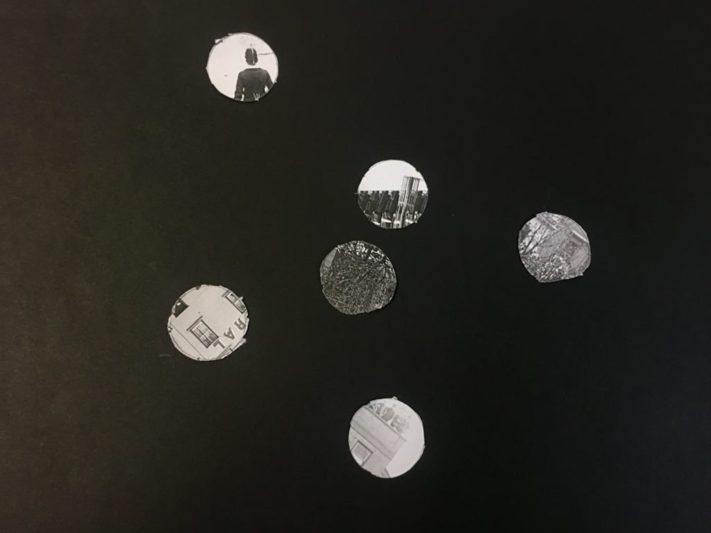
The circles are all a uniform size however the variation in the new cicular images is very different and tell a whole new story. The shapes are fun and completely re invent the scene from the original image demostraiting how the idea of play within photography can work.

I placed the original image with the cut out holes over a piece of black card do that the circle shape stand out. I then replaced the cut out pieces on top of the image offsetting them to leave a segment shape to give the look of a shadow.

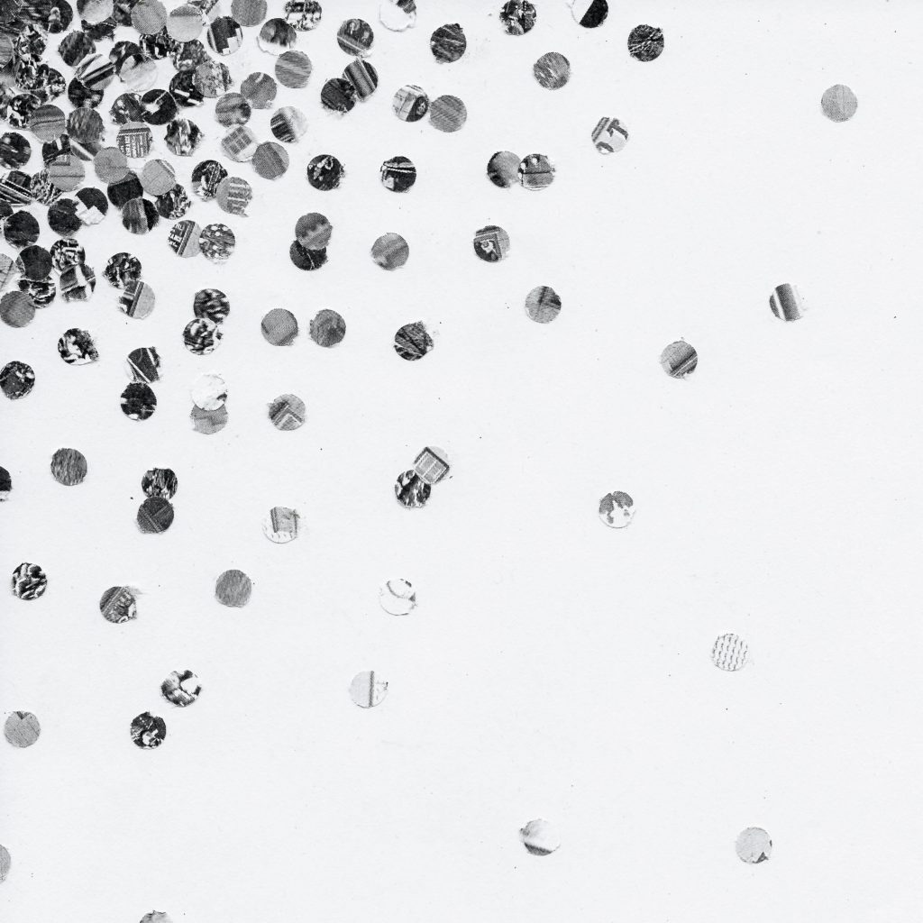
Finally I used the left over parts of the photo and cut it into smaller uniform circles using a whole punch. I then collaged them all together onto a plain white page concentrating the darker ones to the top left hand corner and having the disperse over the page.

Experimentation/colour: Photoshoot 2

I have chosen a select amount of photographs from photoshoot 2, rocks and shells, to experiment on using different processes and methods in Photoshop.

Original Photographs:

Edit 1:

To create this effect, in Photoshop I used the ‘threshold’ tool, making the images grainy, black and white, I then used the ‘gradient map’ to add colour, the block colours creates a pop art effect.

Best outcome: I have chosen this as my best outcome because I like the composition and the contrasting colours, that create an eye-catching pop art effect. For example, I like the fact that the shell in directly in the middle of the photograph, this allows the photograph to appear more professional and planned. Also the contrasting purple and orange, the dark purple really stands out against the deep orange, creating a very pop art effect when paired with the other photographs.

Edit 2:

For this edit I simply put the images in black and white, creating a simple but effective edit. The use of the white back drop gives the photographs a professional feeling.

Best outcome: I have chosen this as my best outcome, because I like the simple white backdrop paired with the contrasting colours of the shell and also the added detail of the break in the shell, giving the audience something more to look at. The contrasting dark black and white colours of the shell add to the detail and texture creating a more interesting photograph and the white back drop allows the shell to be focal point of the photograph.

Original Photographs:

Edit 1:

To create this, in Photoshop I used ‘threshold’, the black and white creates an abstract effect, also giving an ink blot vibe, this effect makes you look further into the photograph, trying to figure out what it is of.

Best outcome: I have chosen this as my best outcome because of the texture create by the ‘threshold’ effect, also the fact that the photograph now has a abstract quality, for example due to the heavy block black, its more difficult to actually make out whats in the photograph.

Photoshoot 2

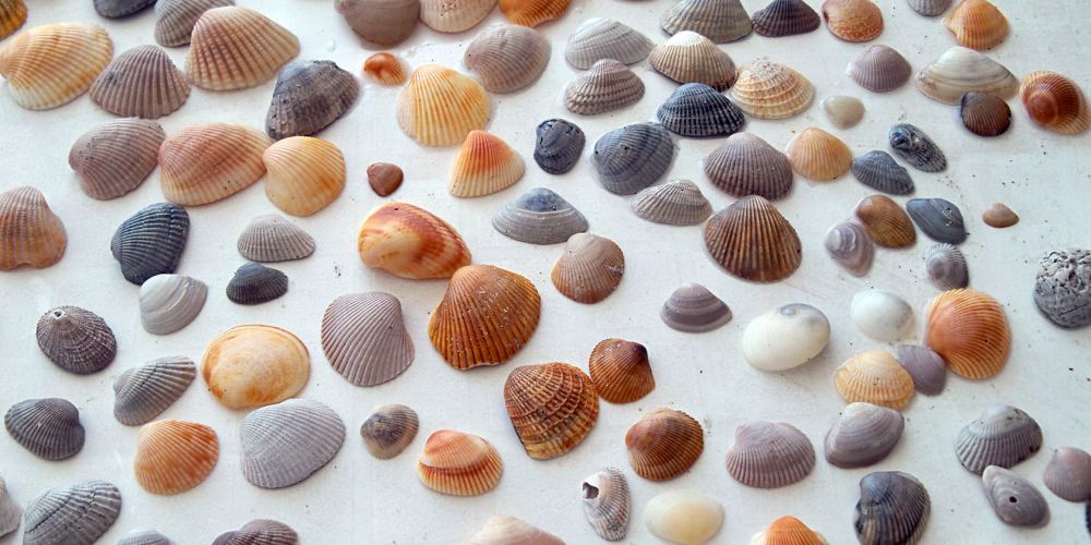
For this shoot I have chosen to photograph rocks and shells as a way to demonstrate ‘variation and similarity’ because there is the opportunity to photograph a wide range of similar objects but at the same time have them differ to each other so much, therefore being a variation of similar objects, objects found on the beach, within nature, rocks and shells. I photographed the same group of rocks and shells on a white backdrop and on a bed of smaller rocks, this also creates variation and also allows me to experiment with what creates a more successful photograph.

Most successful photographs:

I have chosen this as one of the most successful photographs because of the interesting shell, the hole cut through the middle is an eye-catching aspect that makes the photograph less boring, also the contrast of all the smaller rocks against each other and then contrasting against the white shell as well creates a striking effect. I made the large shell the focal point of the photograph by centering it and placing it on top of the other smaller rocks, this also giving it an interesting backdrop. I took this photograph outside in natural lighting.

I consider this one of my more successful photographs and have chosen this photograph because of the sequence that has been created by paring this shell a white backdrop, a sequence/ pattern of white, black, white, black is created going inwards towards the middle of the photograph, I took this photograph in natural lighting at a birds eye angle to create this effect.

Planning: Photoshoot 2

For my second photo shoot I want to photograph rocks and shells as ‘objects from the beach’, I have chosen objects from the beach to photograph as part of variation and similarity because there is a wide variety of objects on the beach, meaning my selection of photographs will be larger. I also plan on using a variety of backdrops; smaller stones and a white backdrop, this allows me to create the factor of variation while taking photographs of the same object, creating the similarity. To create a more interesting effect I want to photograph the rocks and shells with the sand and dirt on them from the beach before also washing them and photographing them, I hope this adds more texture and detail to the shells and rocks when photographing them.

Types of shells I hope to find and photograph:

  • Mollusks
  • Cockle
  • Butter cup
  • Cardita
  • Crossed rib venus

Places to photograph:

  • Le Mare Beach
  • Le Hocq Beach
  • Le Rocq Beach
  • Gorey Beach
  • St Ouen

Equipment:

  • Camera
  • White paper (backdrop)
  • Smaller stones (Backdrop)
  • Shells/Rocks
  • Natural light
Image result for types of shells

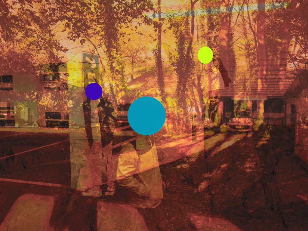
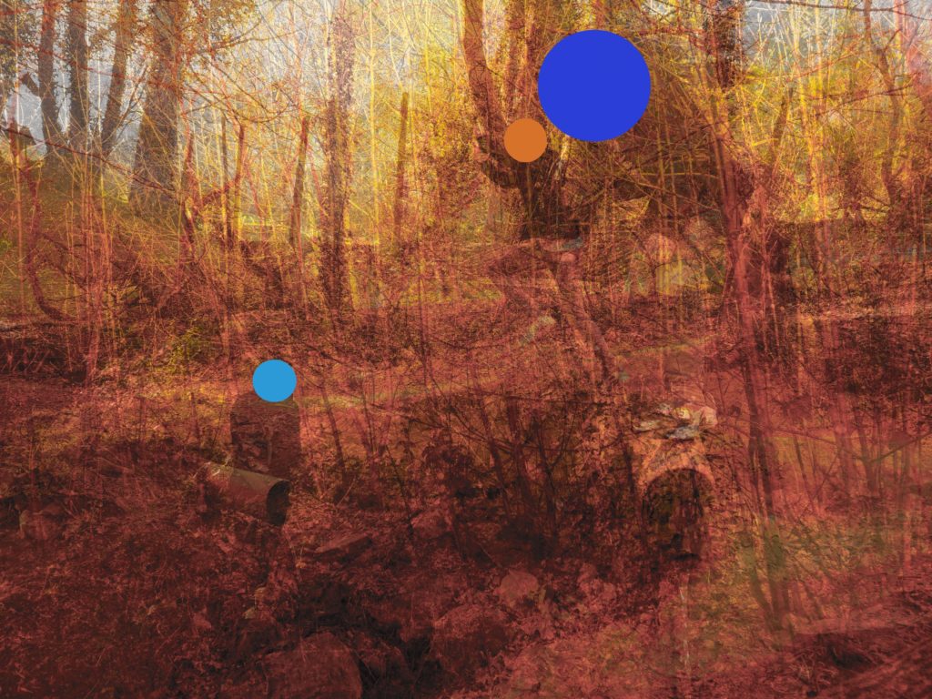
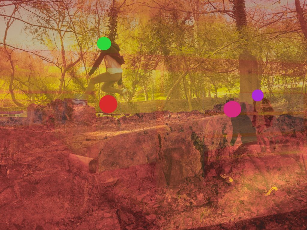
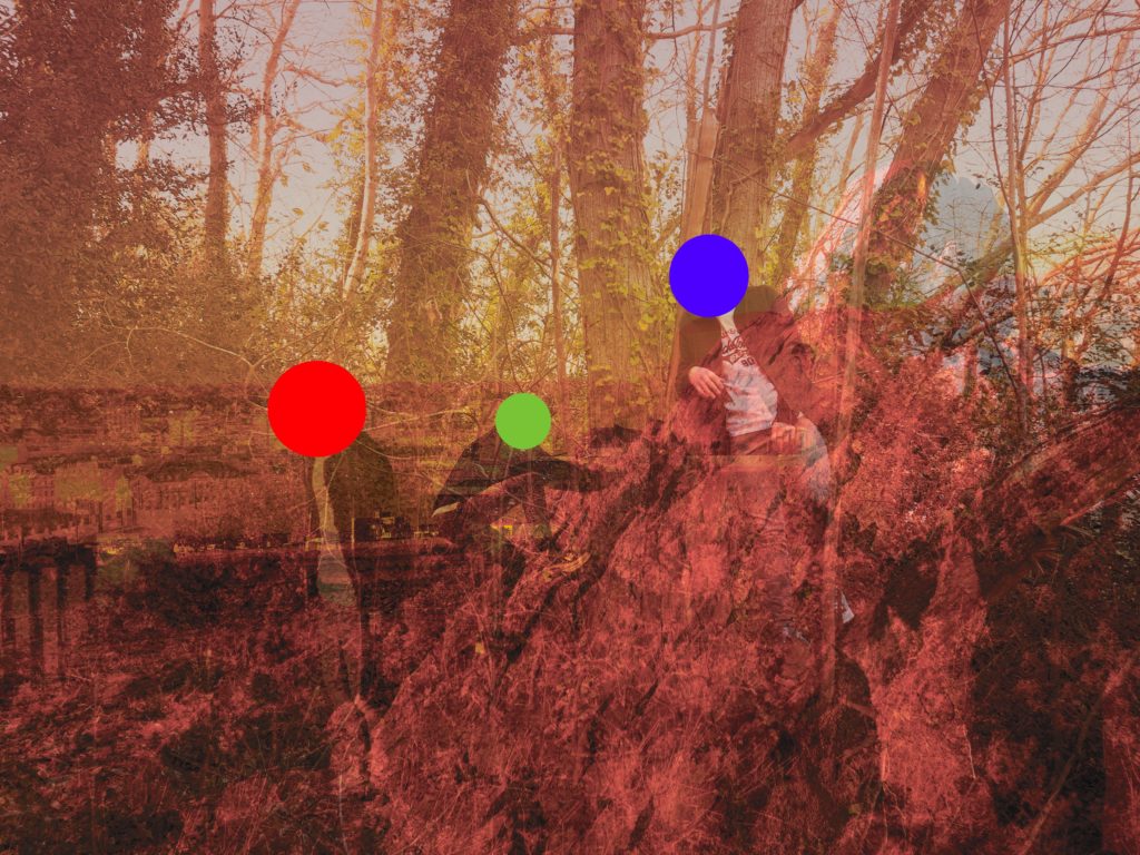
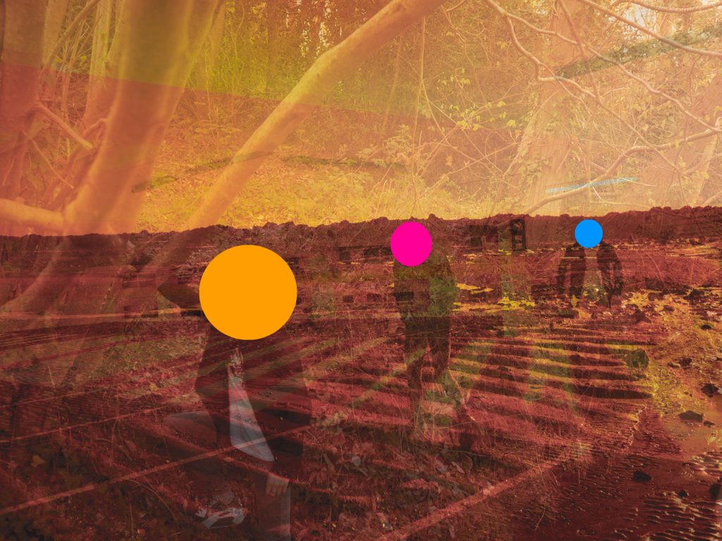
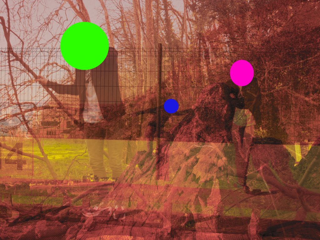
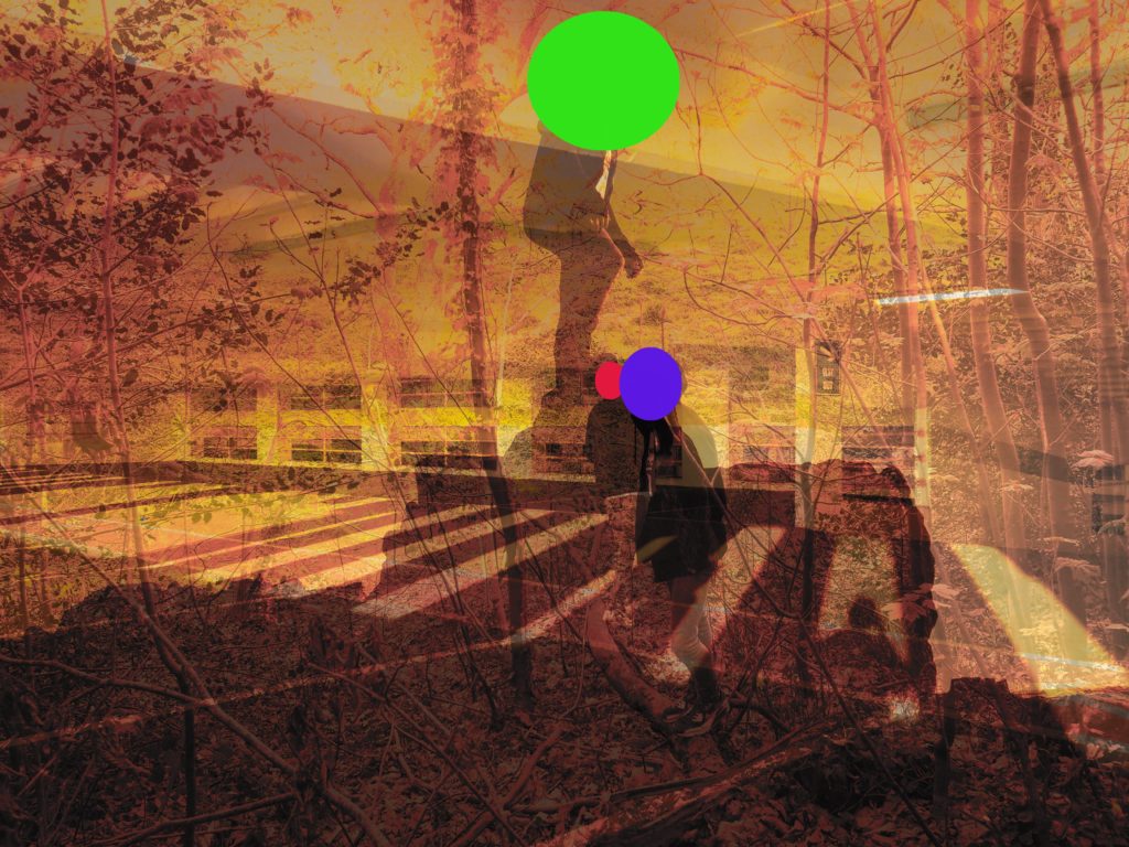
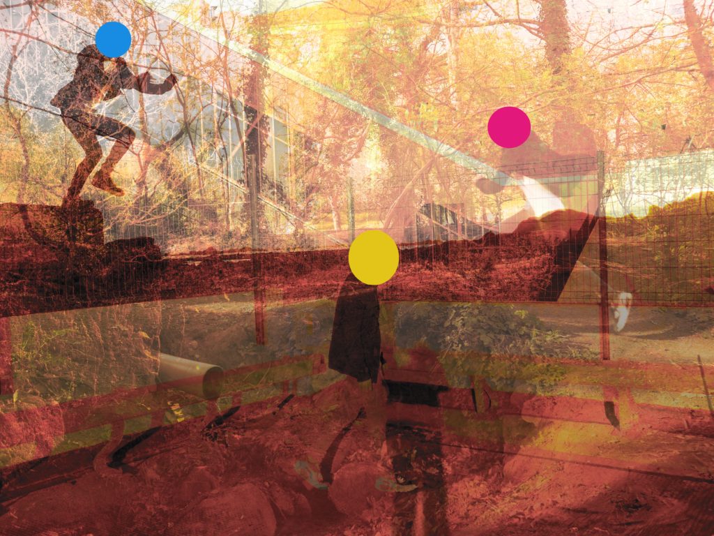
A2 Photography Exam – Edit Set 2 -Opposing Colour Shapes Into Images

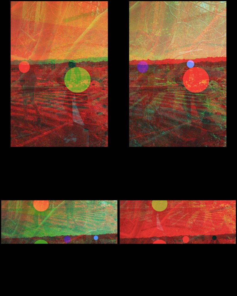
For this Set of edits, I have used the edits from the previous set to work on.

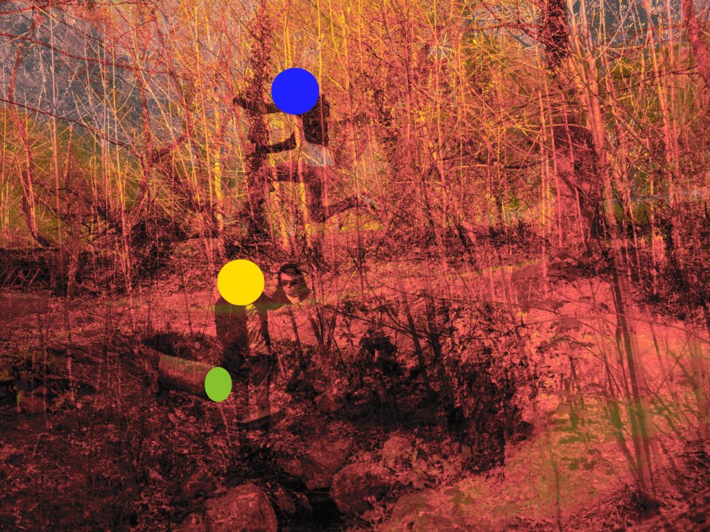
I have used influence from John Baldessari and the way he used shapes to cover peoples face and make the images he made more obscure to the eye.

I have tried to replicate this method through the application, sketchbook, of which I made circular overlays on top of the faces that are in my photos.

Experimentation/colour: Photoshoot 1

I have chosen a select amount of photographs from photoshoot 1, flowers, to experiment on using different processes and methods in Photoshop.

Original Photographs:

Edit 1:

To create this effect I inverted the colours, creating a eye-catching glowing effect.

Best outcome: I have chosen this as the best outcome becuase I like the way inverted colours switch the colours, the purple and white petals turn a vibrant green and the dark green grass turns shades of purple, the glow, this bright colours creates a eye-catching contrast.

Edit 2:

To create this effect, in photoshop I posterized the photographs, popping the colours.

Best outcome: , making I have chosen this photograph as the bets outcome because I like the way ‘Posterize’ creates a cartoon like effect, this also makes the photograph look like a painting, making the colours block together as if they have been painted and this makes the photograph standout and appear brighter.

Original Photographs:

Edit 1:

To create this effect, in Photoshop I used ‘Gradient map’, this creates a spray paint like effect and I chose to group together contrasting colours; purples, oranges and blue to make the images stand out.

Best outcome: The gradient map effect creates a glowing effect, making the flower the focal point of the photograph stand out and the back drop contrast with it.

Edit 2:

I recreated the ‘posterize’ effect in Photoshop to create these images, experimenting with the white backdrop.

Best outcome: this is the most successful image because the bright orange is heightened by the posterize effect and contrasts well with the white backdrop.

Experimenting with similar photographs, ideas and effects is very helpful in finding the best possible outcome for the photographs, for example I used the ‘Posterize’ effect on both sets of flower photographs, white back drop and grass backdrop, experimenting with both allowed me to see that one us more successful then the other, for example the grass backdrop produces better outcomes because it creates contrast and is more colouful, creating a more interesting photograph.

A2 Photography Exam – Edit Set 1 – Colour Balanced Filtered 3 Photo Images

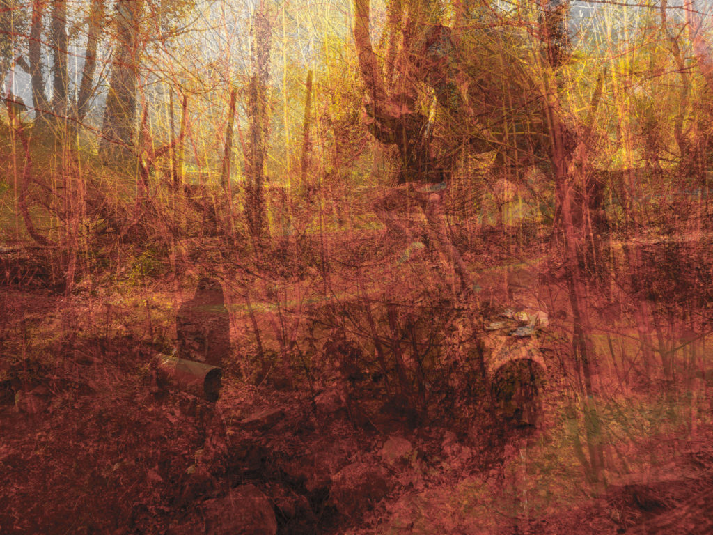
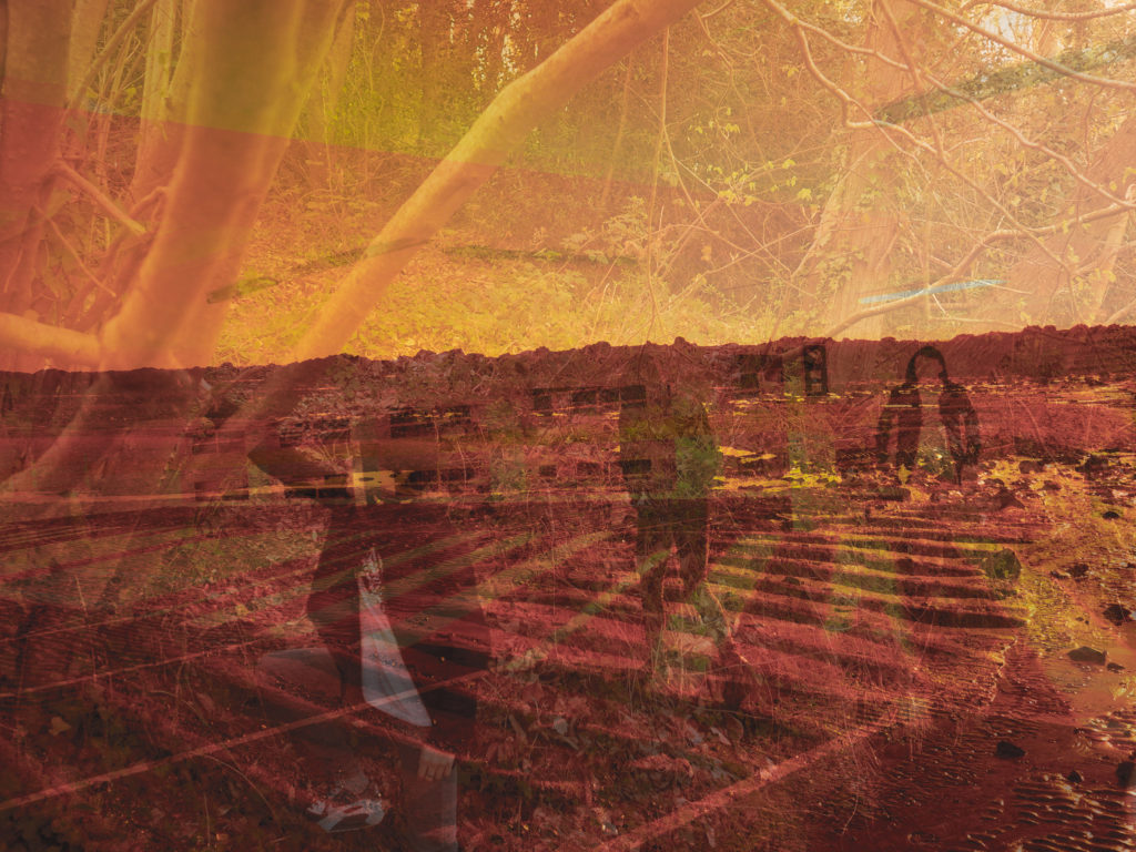
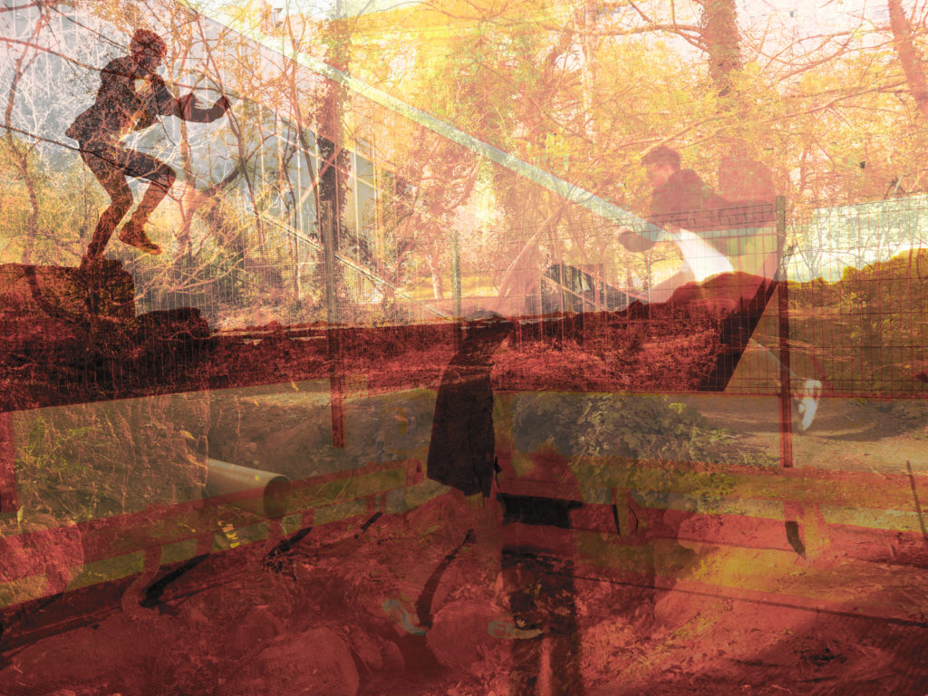
For each of the edits that I have done in this set I filtered between 3 images, the beach shot on a shadow colour balance setting, the woods shot on a midtones colour balance setting and the car park shot on a highlights colour balance setting.
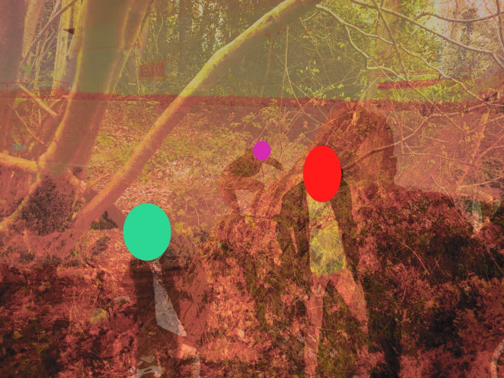
I then adjusted the opacity of the two images in front of the beach photo accordingly so that all the people in the shots were equal in visibility. After that I then adjusted the brightness and the contrast to increase the highlights and shadows within the images.

Then as a final touch I went to the vibrance tool and decreased vibrance fully and increased the saturation by 50% to create an almost burnt out look on some of the edges.