Category Archives: Uncategorized

Filters

Author:
Category:

Gallery Visit

The first Exhibition we went to was BEHIND THE LENS (March 8 – April 28) It showcased the unseen aspects of photographing celebrities, from behind the lenses of Carinthia West, Rupert Truman, Storm Thorgerson and Mike McCartney. A photograph that stood out to me was this one by Storm Thorgerson which was used as the album art and cover for Biffy Clyro album ‘only Revolution’ He was the founder of Storm studios formed in the 1990’s who created designs for diverse projects including logos, websites, books, but their most known work existing on album covers.

“In thinking that the music was strong-minded yet lyrical persuaded us to think of material flapping in the wind like flags – the flags of a revolution. Not little flags or small bits of fabric, but enormous flags the size of a modest office block, which we affixed to a scaffold tower on the top of a hill on a windy day. The sound of the undulating material was affecting, let alone the bizarre shapes. The actual cover used red and blue flags to represent the sexes.”

Storm Thorgerson

This photo stood out to me due to its size and attention to detail, the print was suspended on a wall and was around 2metres wide. I have seen this image before as an album cover but when seeing it blown up I noticed small things such as how the flags cover the peoples eyes and how they are holding weapons behind their backs. I also read more into the meaning of the image when seeing it on this scale.

The second exhibition be went to was at the public and private displaying the best of pop art called ‘Pop Icons of the 20th Century’ which featured work from Andy Warhol, Roy Lichtenstein, Sir Peter Blake and many more. Pop art is a movement which became popular in the 1950’s in the UK and US, it challenged traditional fine art techniques by using imagery of popular culture, such as advertising, comic books and culturally popular objects.The two paintings caught my attention due to the use of basic primary colour and mixture between abstract shapes and line figures.

Andy Warhol was an American artist, one of the most well know in the pop art genre. Known for his bold screen prints commenting on the ideas of consumerism and celebrity culture linking with the idea of post-modernism. His most known work was of the Marilyn Monroe the famous American actress, he used an existing image of her and simplified it to show the main textures on her face, he then went over the image will various screen print templates which allowed his to layer up bright colours corresponding will relevant parts of her face. This image was reproduced again and again which degraded the quality creating unique prints with variation. This idea came from his work as a commercial illustrator where he traced or drew by hand using ink and pressed a clean sheet of plain paper onto the tines, creating spontaneous and expressive images.

The idea of consumerism and celebrity culture seen in his work links to my project because of how it promoted the idea that buying branded items and materialism. Modern attitudes towards success root from the idea of being rich, famous and having desirable possessions. It is often through that buying things can make a person more ‘Beautiful’ or desirable, especially in the terms of clothes and beauty products and procedures. This could link to the way products are advertised to sell a lifestyle that people think the product will help them achieve. The following quote sums up the idea of becoming an online celebrities who display the best parts of their lives creating a hyperreality which other people persevere as reality and want to achieve.

In the future, everyone will be world-famous for 15 minutes.

Andy Warhol, Catalogue Moderna Museet, Stockholm
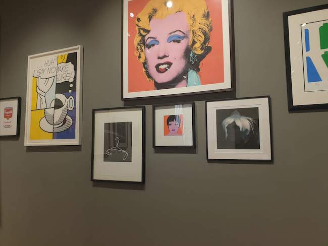
Pop_Icons_Ehxibition.jpg
Photo of the gallery space at the public and private

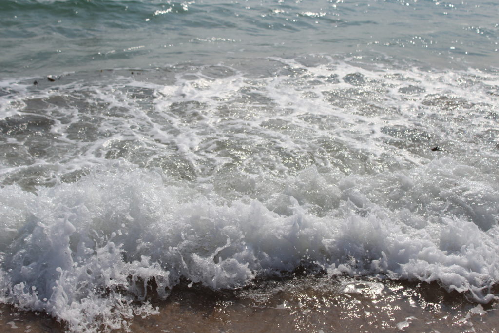
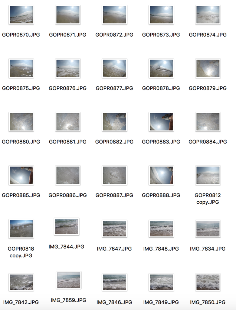
Sea shoot, above and underwater

DCIM\100GOPRO\GOPR0826.JPG
DCIM\100GOPRO\GOPR0818.JPG
DCIM\100GOPRO\GOPR0844.JPG

For this shoot I wanted to show both a combination of underwater and both above water photography, I wanted to capture water as I believe it can-stand for two religious sentimentalities, one being the concept of birth and rebirth, forming a new life from water, and the ability to breath underwater. The fluidity of water also shows a sense of vulnerability and also beauty. Another aspect is the power of god, through the ability to create the natural elements, such as through the creations story. I wanted to show an arrange of different white and black tonal colours, as this differers different meaning depending on weather I think that photo should denote strength of beauty.

LOSS AND SKIN SHOOT

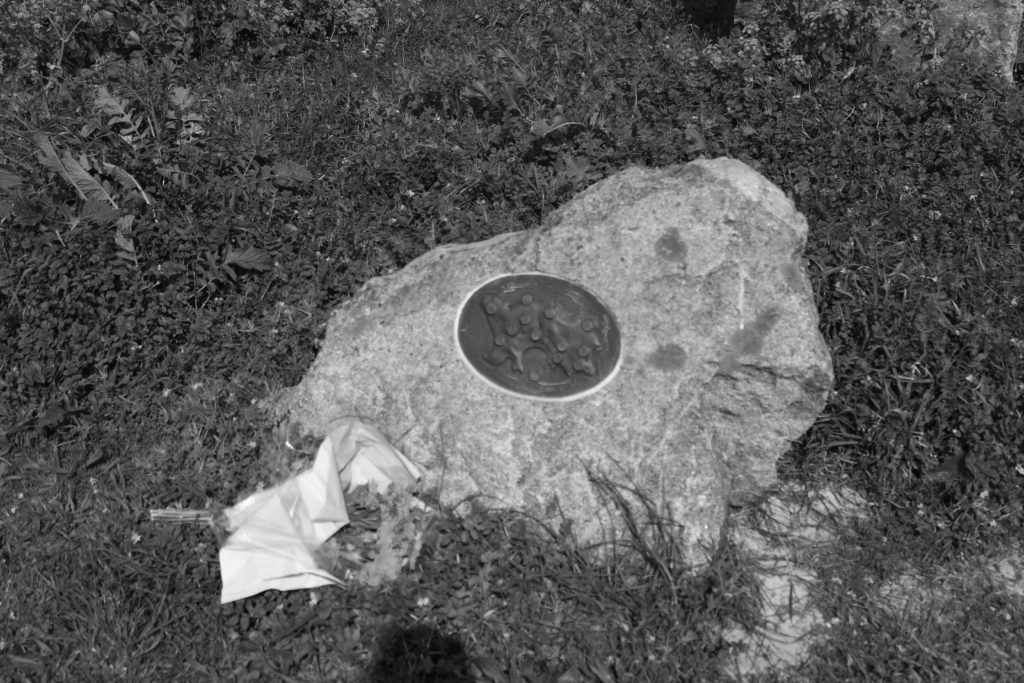
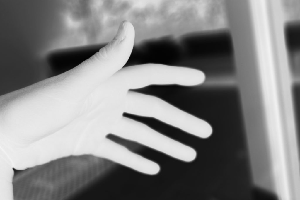
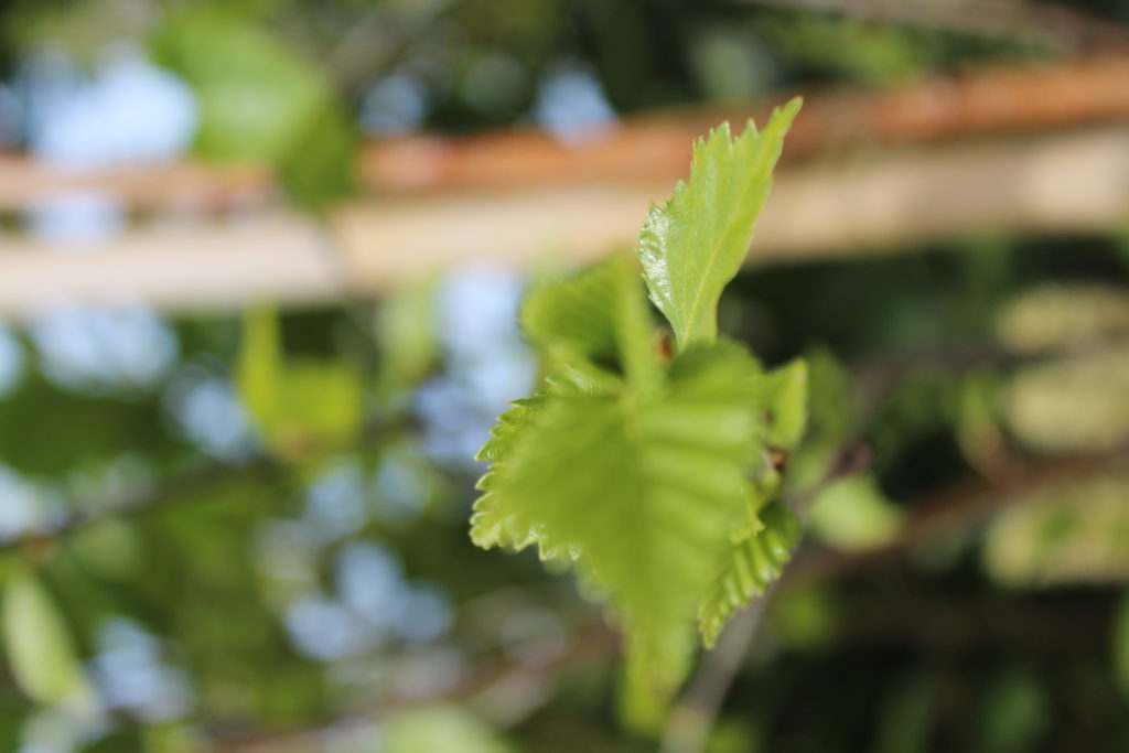
This shoot was about a theme of loss, connoting the themes of death but seen within inanimate objects. I knew I wanted to do a skin shoot in order accentuate personalised aspect of myself into the project. I also wanted it to be used as a comparative to the shoot of the much older skin, to show the progression of skin deterioration . I wanted to take shots as-well of the hands shape without the essence of looking primarily at the texture, this is once again to connote a form of isolation, however, when editing the hand into white, it connotes an essence of the hand of god coming done and allowing a snese of help, a larger presence than our own. I wanted to take macro shots As I believed The small details of looking more at patterns and shapes is almost a personification to see whatever you imagine, it has an aberrant feel of exploring and creating out won inner meaning within each of the photos. My favourite piece form this shoot is the bench, it allows such a light aspects of loss, yet still structured, showing an ability to be remembered, and also showing the bonding of man made creation surrounded by the natural creation.
RELIGION, LOSS, WATER AND TEXTURE SHOOT

CONTACT SHEET:

OUTCOMES AND EDITS:

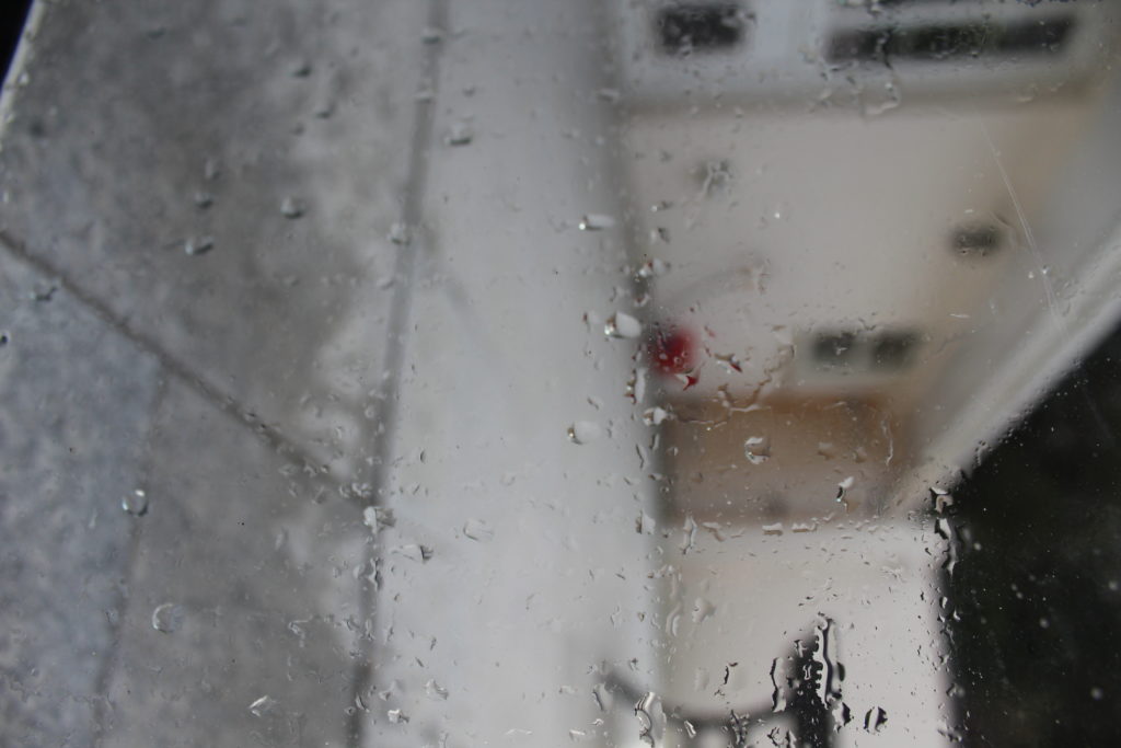
EVALUATION : the intentions for this shoot was to develop a more personal connection to our surroundings, and not to take for granted that of life and creation. I wanted also to accentuate themes of isolation, seen within the objects of an abandoned tea cup. I also wanted to show connections between rain and the element themselves in this shoot, so again gods creation but seen in a more personable way, in relation to god. The different textures and life within nature are done so in order to show a macro affect.

ABSTRACT LIGHT SHOOT

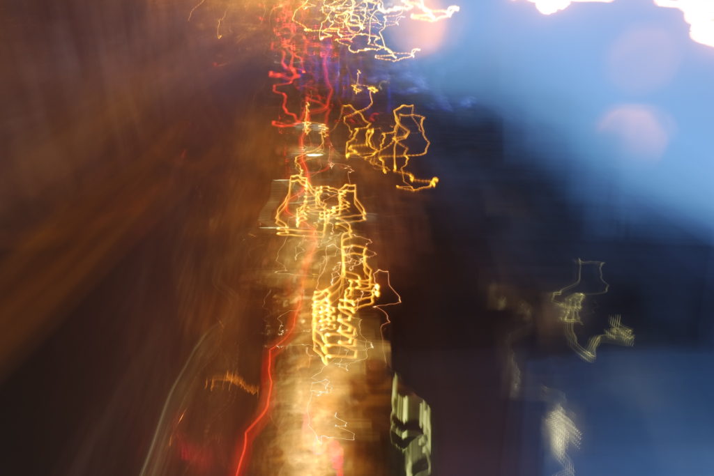
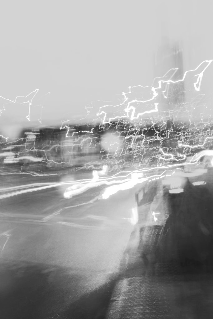
I wanted to do an abstract light shoot, As I believe it is an explosion of an abstract chaos to life, and the world living around us. I originally Wanted to show this light shoot in two ways, more in a more planned and constructed shoot, creating specific patterns an movements. But for this first shoot I want to show the liveliness in the lights around us, and the world in which we live, This is due to the fact that our life experience is hectic and unplanned, this shoot is more real to that of create a more planned tablo shoot.

Shoot 2:

Plan: capture images with varied colours, shapes and sizes.

Influential photographer: Siegfried Hansen

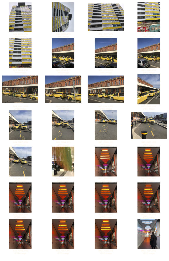
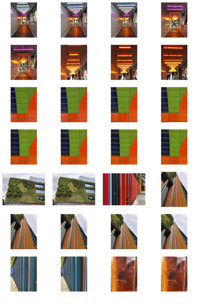
Contact sheet:

Edited:

Images analysis:

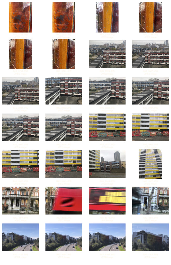
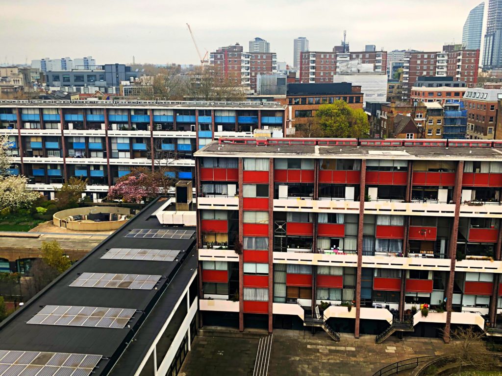
This images was taken in Barbican, London of an apartment complex, It was taken around midday under a cloudy influence of natural light. The images is very well composed with strong, even and symmetrical lines. This influence came from Siegfried Hansen and his photography using lines within the image. It shows an apartment complex, with barricades, that is yellow and white in colour. The barricades added an interesting pop of colour. I liked the look of the yellow and white together so i aligned the camera up to capture the building in an almost abstract way. Much like my photographer reference.

FURTHER HAIKU AND BOOK DEVELOPMENTS

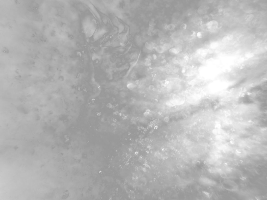
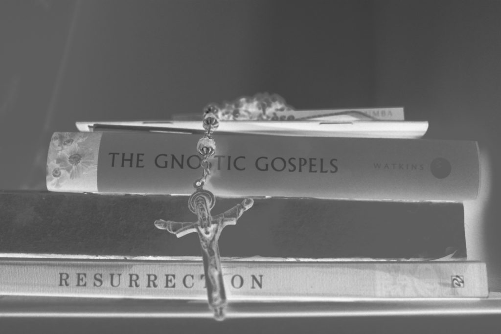
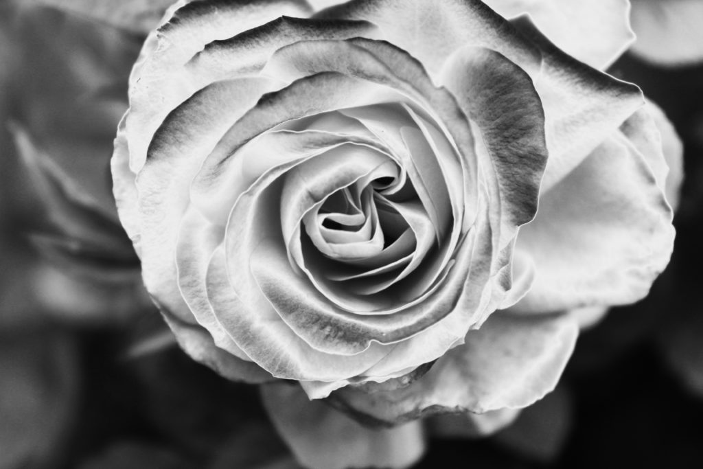
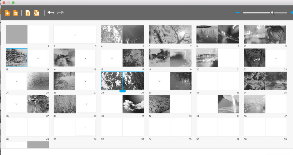
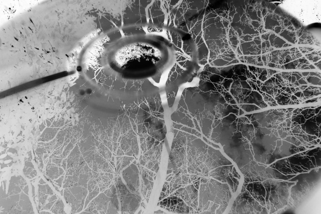
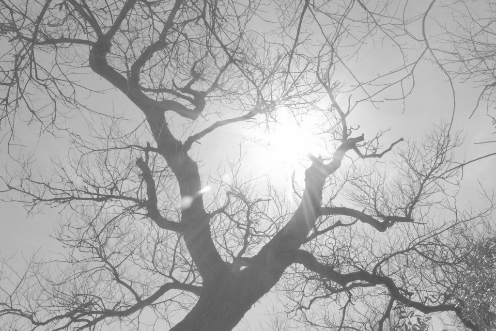
For the following edits below, I wanted to concentrate on developing images which are more within my new themes of the evolution of life seen through religion, but presented in the silver and black tonal range. So I re-edited some photos from my previous haiku shoot that are the most relevant to that of my new narrative. I used the previous edited process of turning to black and white, flattening, inverting the images and then further editing that is the most appropriate for the specific image itself. I chose images which are more abstract, however, Connoting more themes to do with life and birth, so closer to the beginning of the book itself. Due to me knowing I wanted to create a book from the beginning, I am slowly adding in my images, in order to start creating a successful narrative. At the beginning of my book it is all about, birth, creation, innocence and nature, looking conceptually about the narrative and growing of life itself. I want my images much like the artists’ I am inspired by, To attract that abstract vision of the wonderment of life. I want the images to be more conceptual so they allow a subjectivity of others putting their own meaning onto the images themselves. Overall I believe so far there is a real delicacy within the narrative of the book and a true beauty. My book will be much longer than my previous, as I want each page to have an image, alongside this, I want the narrative itself to be long, to almost keep a true sense of time of life.

Within these book page developments, you are able to see me adding in four shoots, haiku, water refection, macro and abstract light shoot. All of these show a re-birth and smallest details of beauty, this experience of life creates a sentimentality of love and desire for the world. I belive with the many more images I wish to take My work should really show an evolution of life. When further looking at the book development itself, I wanted to make sure I was thinking of each images tonal capabilities. Many fo the images are more inverted than others, and I do not want two very light images next to each other, I wanted a passing of colours narrative throughout. Another area I need to consider, Is where and how I should add in portraits in the best flowing manner, to fit in with the primarily object and landscape oriented book.

To my mind this shoot is much more successful edited into a more sophisticated black and white, it allows a focuses on the actual construct of the image itself, and shows a more successful narrative for the book as a whole concept. With this project I really wanted to create something which I have never focused on previously, Because of this, every page is a development of life having a narrative, which I have never done previously within my photography, Too in this project it shows a more conceptual view of how to take photos, showing themes other than surrealism of the use of props and tablo shots.

Shoot 1:

During my first shoot I will try to capture images that explore colour in landscapes and objects.

Image analysis:

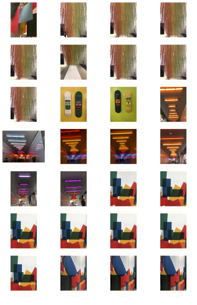
This image was taken in liberty warf and it was taken under the influence of artificial lighting from the electric lighting on the roof. I shot diagonally down to the right to capture the feeling of depth in the image, This makes the shapes in the image more interesting and full. In the foreground of the image is a bright red table i shot this as my focal point as it is so loud. Then in the mid ground are the multi colour tables and chairs. This fills the mid range will varied colours and shapes.

This image shows the variation and similarity between the sizes shapes and colours of the chairs because although they look they same each one is unique and important in the image.

Jersey Archival Trade Photographs

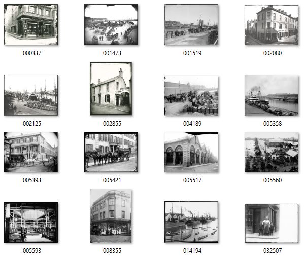
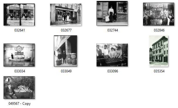
As I stated in my project specification I intended to explore how Jersey’s trade has developed over time from past to present and then looking into future projections. As part of this I have gathered a selection of Archival Imagery from the Societe Jersaise Photo Archives that show forms of trade on the island from the past, which I am going to use in photo montages as a way of looking at the past of Jersey’s Trade with other places. These photographs were taken by four Jersey based archival photographers: Ernest Baudoux, Francis Foot, Percival Dunham and Albert Smith. These photographers documented the people, the buildings, events and just the general goings-on of the island in the late 19th and early 20th century. Percival Dunham was Jersey’s first ever photojournalist. In 1913 and 14 Dunham worked for Jersey Illustrated Weekly and then the Morning News, which was the main competitor for many years for the Evening Post which is now the Jersey Evening Post (JEP) which has now been Jersey’s only daily newspaper for several years. Ernest Baudoux was originally from France and worked in Jersey from 1869 as a portraitist, taking pictures of important islanders’ houses, he also took a large number of pictures documenting the outdoors of Jersey. Francis Foot had an interest in photography in the early 20th century after being born in 1885, his family were known as those who owned the HMV franchise for Jersey selling gramophones and records, notorious for its F.Foot HMV sign which has recently been restored in 2018. Some of Foot’s photographs were published as postcards around this time. But eventually the gramophone and record side of his business became more important and took over the larger shop in Pitt Street, where Francis was still selling records in the 1950s and 60s. The fact that this was the story behind Francis Foot is something which I believe nicely fits into this project as I have been looking at trade on the island.

Constructing Typologies

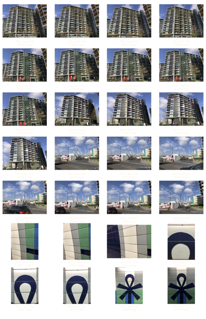
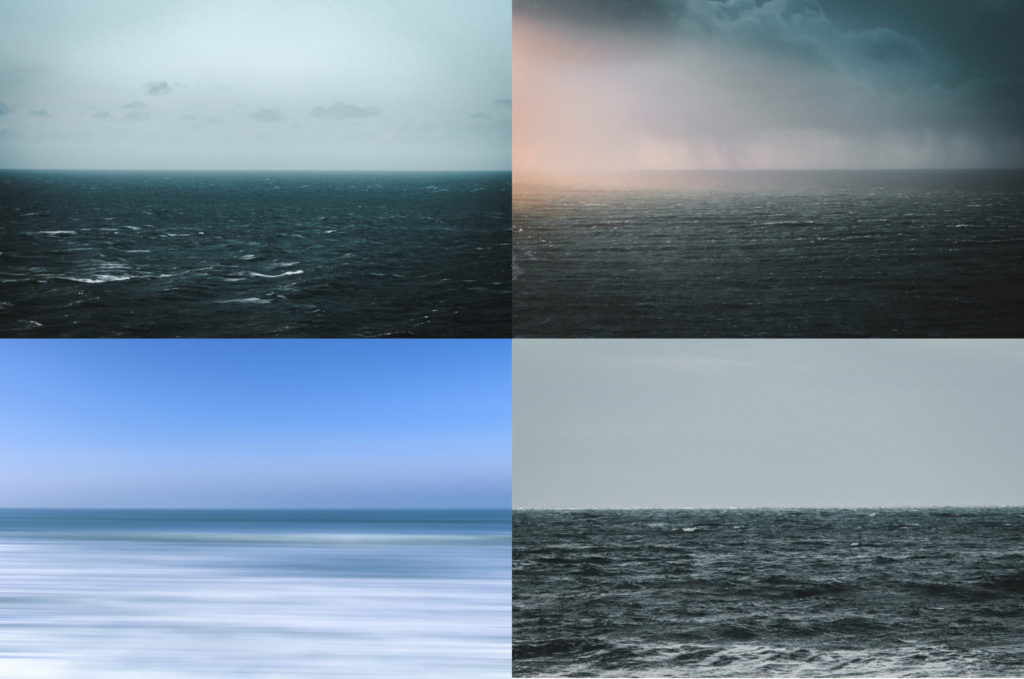
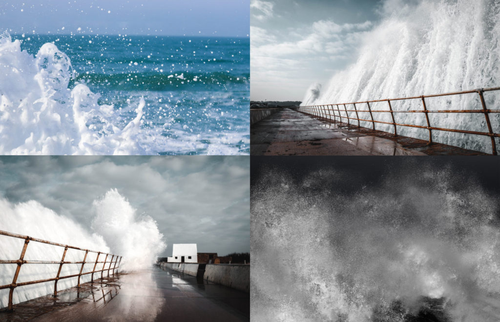
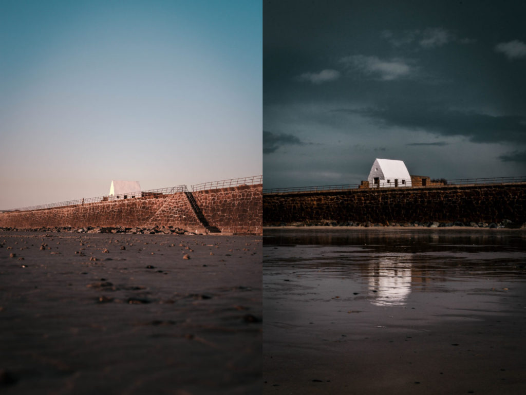
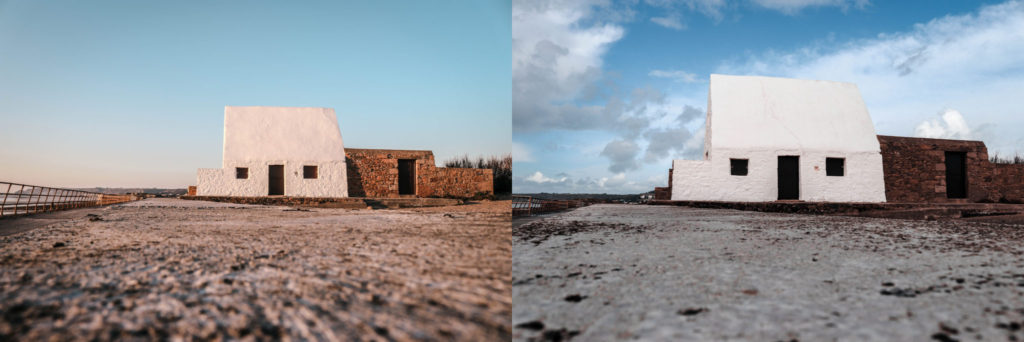
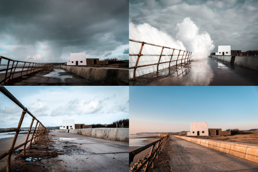
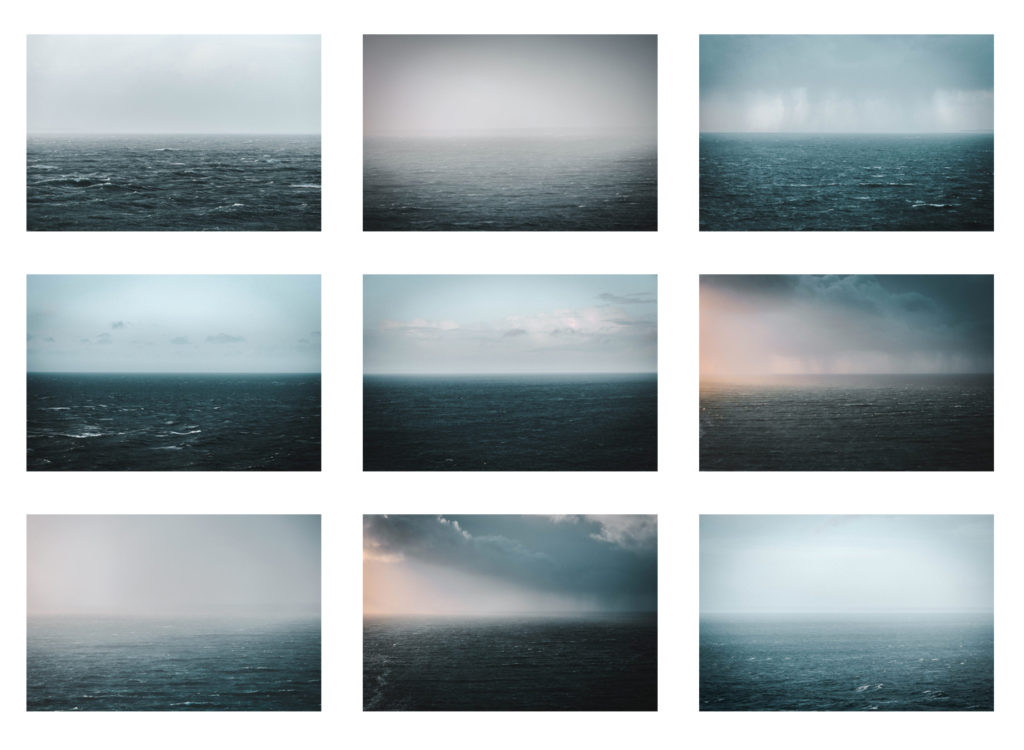
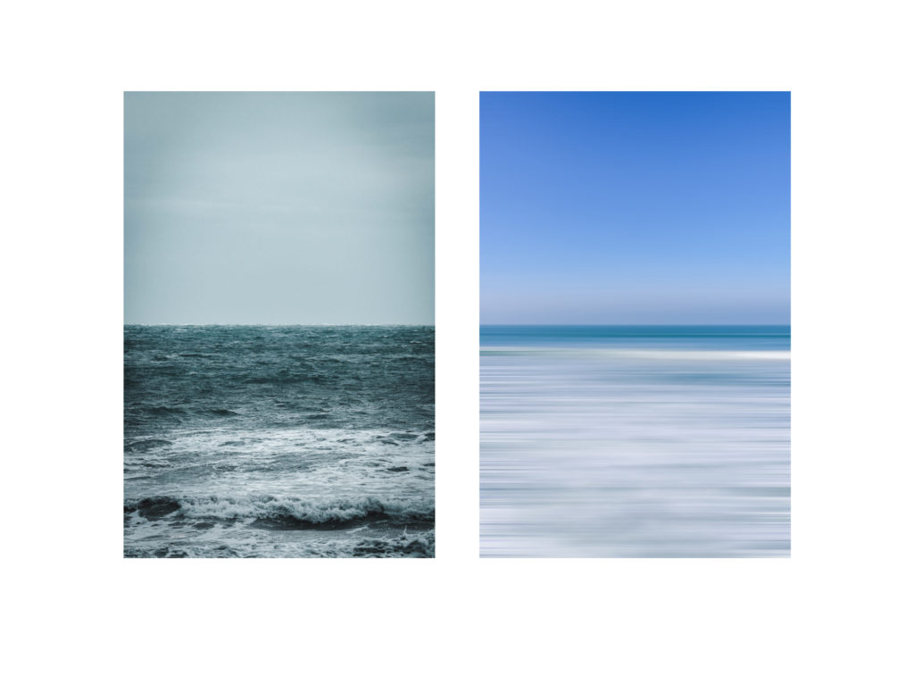
After completing a series of shoots displaying the depiction of light I wanted to give a direct comparison of how the light alters a landscape and changes our perspective. I thought the best way to do this was to construct a variety of typologies to give a direct and easy comparison of this change. I feel as if this typology method would give an easy understanding for the viewer to see how the landscape can be transformed by these external factors such as light and how it creates a different mood and feeling. To progress further I want to create larger typologies with around 16 images however i need to undertake some more shoots in order for this to be successful. I think this experiment would also work effectively with my images that show a change in water height as the comparison is easily distinguished. All of the typologies below focus on the depiction of light however there is one which shows the power of the ocean shown from a variety of perspectives. I thought it was interesting how the waves look so different from different angles and focal lengths yet they’re essentially the same thing.