Category Archives: Uncategorized

Filters

Author:
Category:

Air Photoshoot

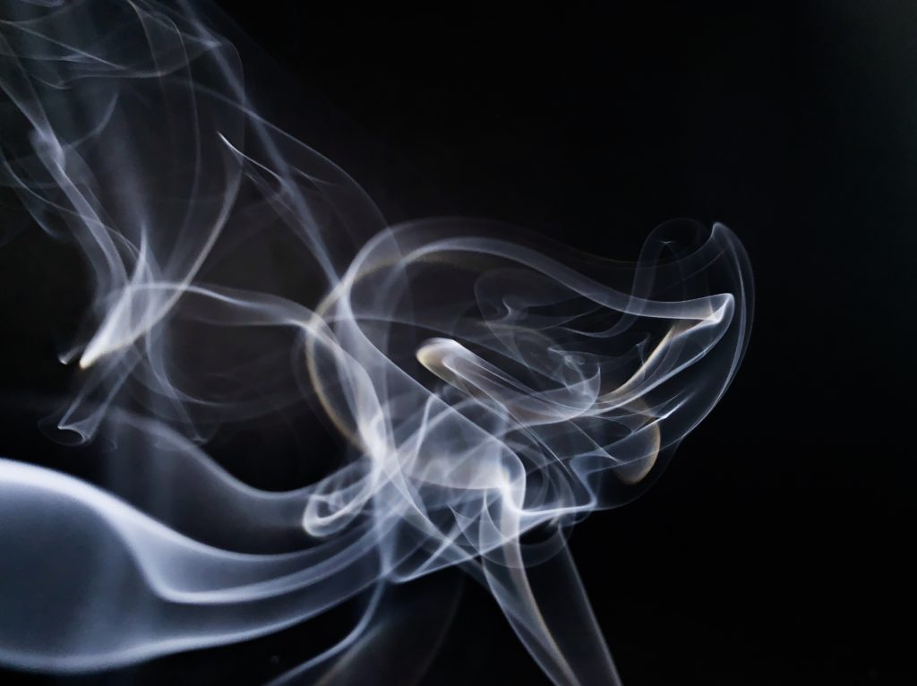
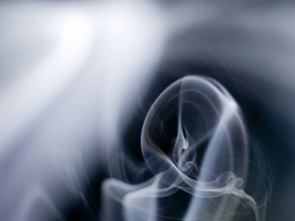
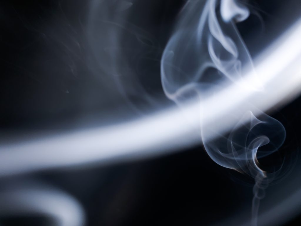
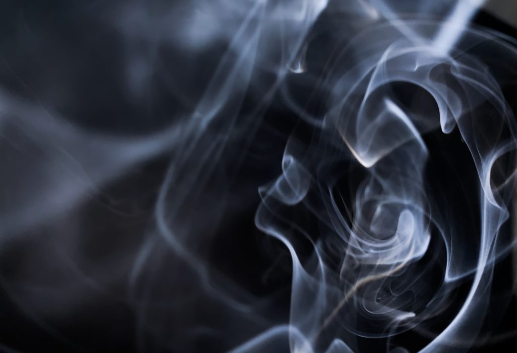
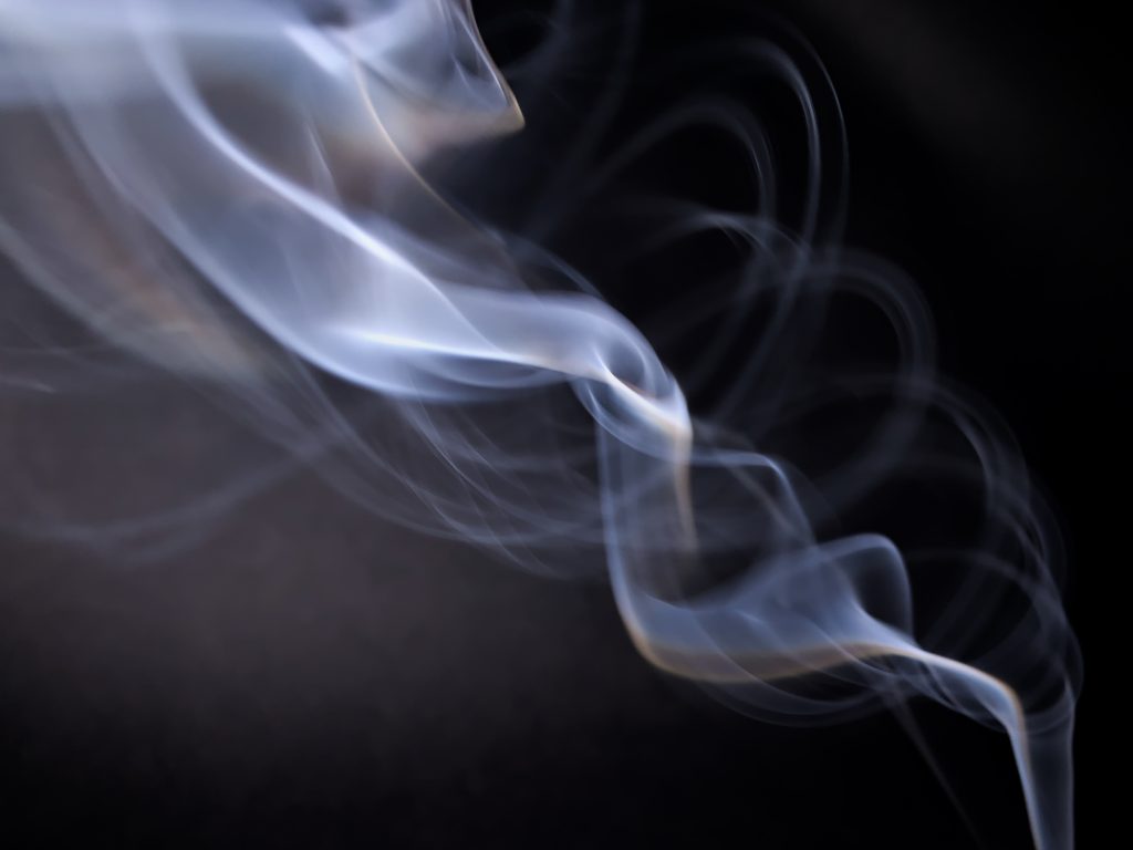
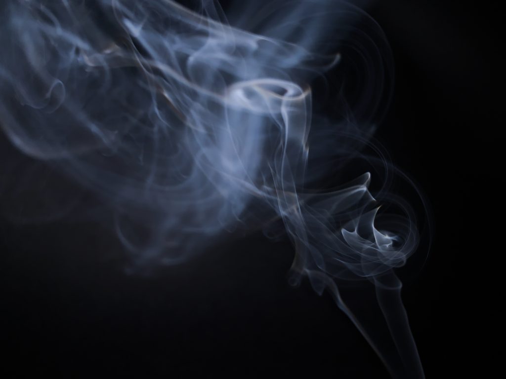
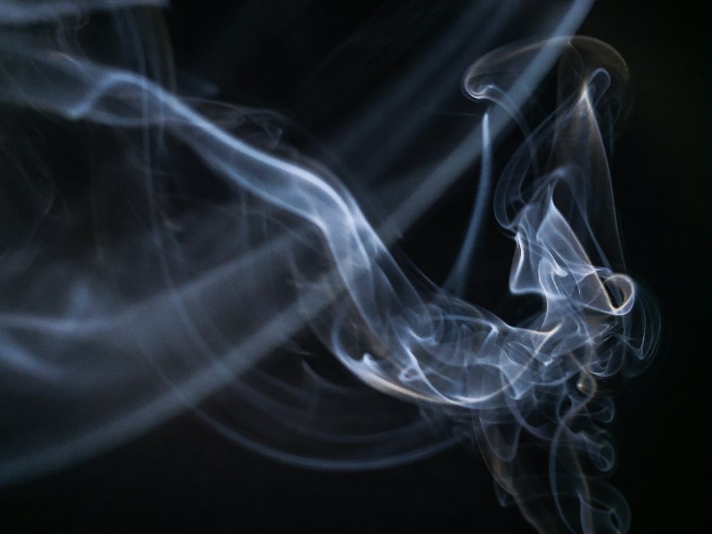
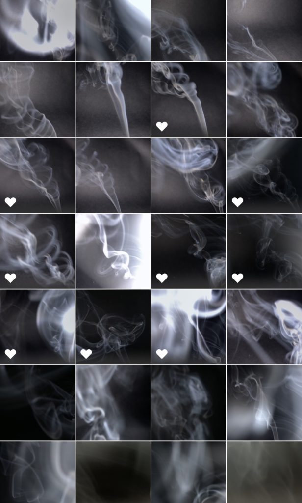
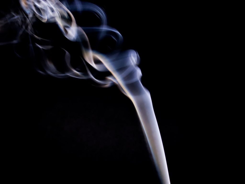
When I first began to think about how to photograph each element I was struggling with ideas of how to photograph air, as it invisible. So I thought of the fact that smoke visualises air. I found some incense sticks that I had in my room and use a backdrop which I had used in previous shoots. For this shoot I had to use my iphone, as my DSLR camera wasn’t able to focus in time to capture the smoke, also when I used the flash it only made the photo overexposed. I edited these images on the Lightroom app on my phone, I didn’t have to do a large amounts of editing only increasing the contrast, vibrance and white balance. This shoot was very successful and I have got a lot of image that I am very happy with, the image that I have created are very contrasting to what I already had for the element of air and had added another perspective of the element.

Book Specification

How you want your book to look and feel

I want my book to be eye catching, i will achieve this by using vibrant and bold colours such as red. The front would be finished in matte to give a clean and professional look and feel.

Format, size and orientation

The book will be in landscape with the dimensions of 25x20cm to fit the average standardised photobook.

Design and layout

The design will vary from page to page to keep each page fresh and different. I will use double page spreads, full bleed and different sized images to create a different atmosphere in shape and colour.

Rhythm and sequencing

Images will be carefully selected to support each other with a strong bond. In this case that bond is colour. Each page will be a different colour from the last.

Structure and architecture

image sizing and shape will vary thought the book. To keep every page unique and important.

Narrative

The narrative of my photo book is based around colour and shape by photographing and pin pointing areas and objects, with vibrant colours, and then capturing those images through carefully thought out shoots throughout London and creating juxtapositions between the images to make the viewer compare the similarities between the two varying images.

Title: The Colour And The Shape

Images and text

There will only be text on the outside of the book, this writing will be my title. I want a bold interesting title so i went with The Colour And The Shape after carefully selecting the most suitable title for my photo book. The text will be in black so that it contrasts with the yellow and red.

Colour and B&W (or a mix)

My photo book will include images of colour only. As this is the main aspect of my photography. Although there will be some dark contrasting images and background colours.

Paper and ink

I will use a matte finished paper texture as it feels smooth and professional. Colour ink will be used to fill in blank pages pages with colour to make the book burst with colour.
Further Photo-montages

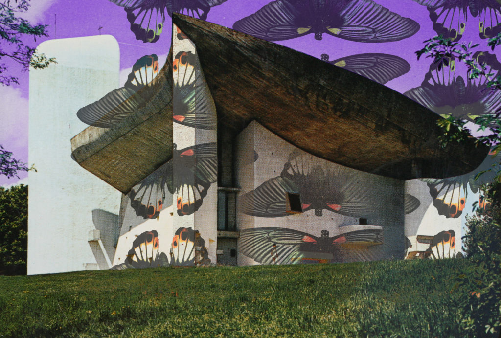
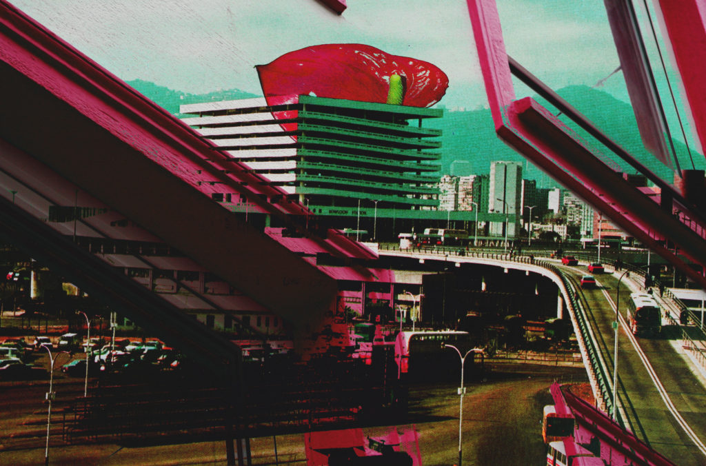
Since reflecting on my initial work, I have continued with the photo-montage process whilst gathering further visual material and taking more photographs to use. I believe that following a similar process to that in my two editing process posts has helped me to consistently produce successful outcomes which I am very satisfied with. This post is simply a display of the work I have produced since reflecting, I will go on to describe and explain my outcomes in further posts where I begin to select those which are most successful. So here just some of the outcomes which I have since made…

Keld Helmer-Petersen: 122 colour photographs

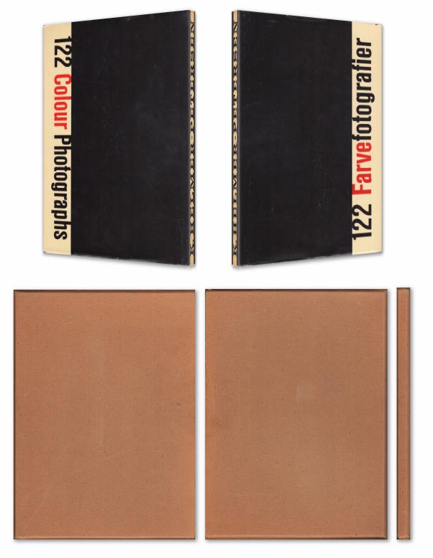
Keld Helmer-Petersen’s 1948 publication of 122 Colour Photographs stands as an extraordinary accomplishment. Inspired by the realism of the Neue Sachlichkeit movement, Helmer-Petersen concentrated on the mundane and the everyday, creating geometric abstractions out of curved doorknobs, crates of tomatoes,

Book in hand: how does it feel? Smell, sniff the paper.
Paper and ink:

The front cover has a hardcover with dust jacket in a publisher cardboard slipcase.
Format, size and orientation: portraiture/ landscape/ square/ A5, A4, A3 / number of pages.

Design and layout: image size on pages/ single page, double-spread/ images/ grid, fold- outs/ inserts.

Rhythm and sequencing: flow of images/ juxtaposition of photographs/ editing process.

Structure and architecture: how design/ repeating motifs/ or specific features develops a concept or construct a narrative.

Narrative: what is the story/ subject-matter

Title: literal or poetic / relevant or intriguing.

Images and text: are they linked/ introduction/ essay/ statement by artists/ use of captions (if any.)

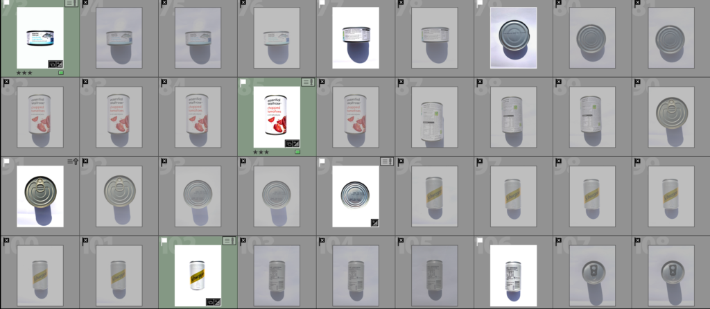
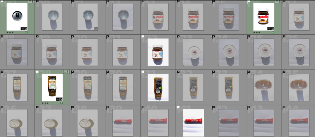
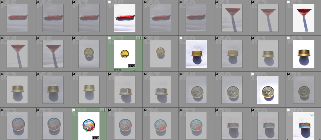
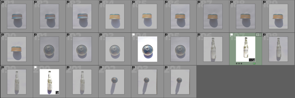
Consumerism Shoot- Contact Sheets

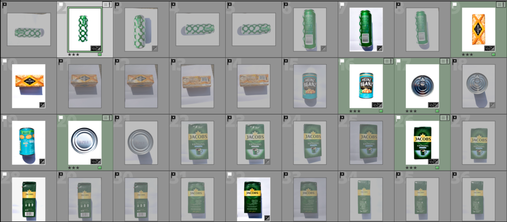
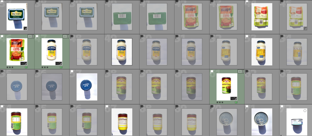
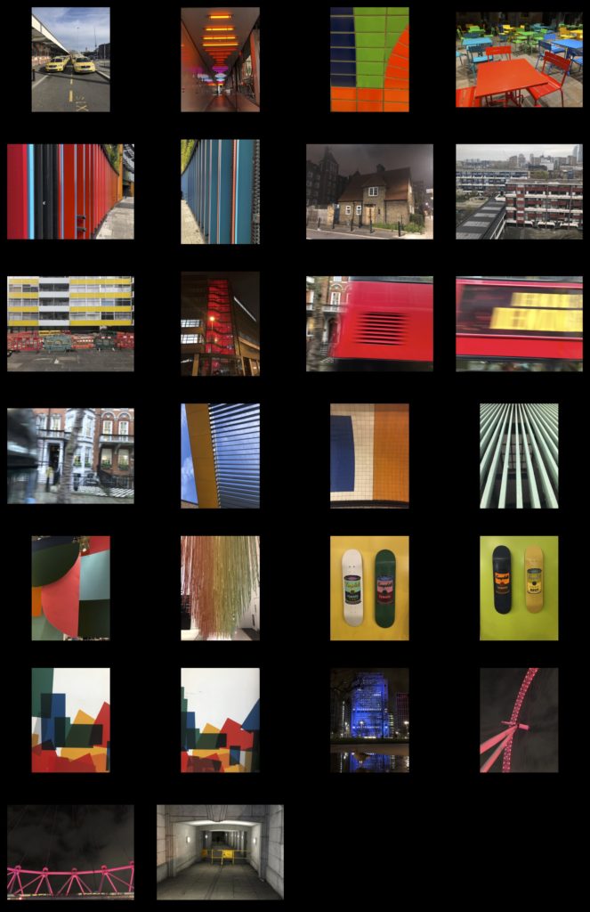
For this Shoot I set up a booth to photograph these object using a large white sheet to reflect the sunlight and so the background would be clean. Unfortunately this cast heavy shadows but they were easily removed when editing in photoshop to clean the background.

The Screenshots bellow show my selection process that I have done reducing the images to the most successful ones which have a white flag and the ones that didn’t work as well with a black crossed flag. The Images in green are the images that I selected as they worked best and edited them.

Final Selection

These are the images i am deciding to edit and use as final prints and in my photobook. I carefully selected these images from the 4 shoots i did. I strongly believe that these images best fit my specification and project theme of variation and similarity. They also show influential features from the photographers i studied in order to carry out my photo shoots.

When it comes to displaying my images and how they will be viewed in their final element, i would like them to be collated throughout a photobook, With juxtaposing sequences and layout variation.

Editing Process

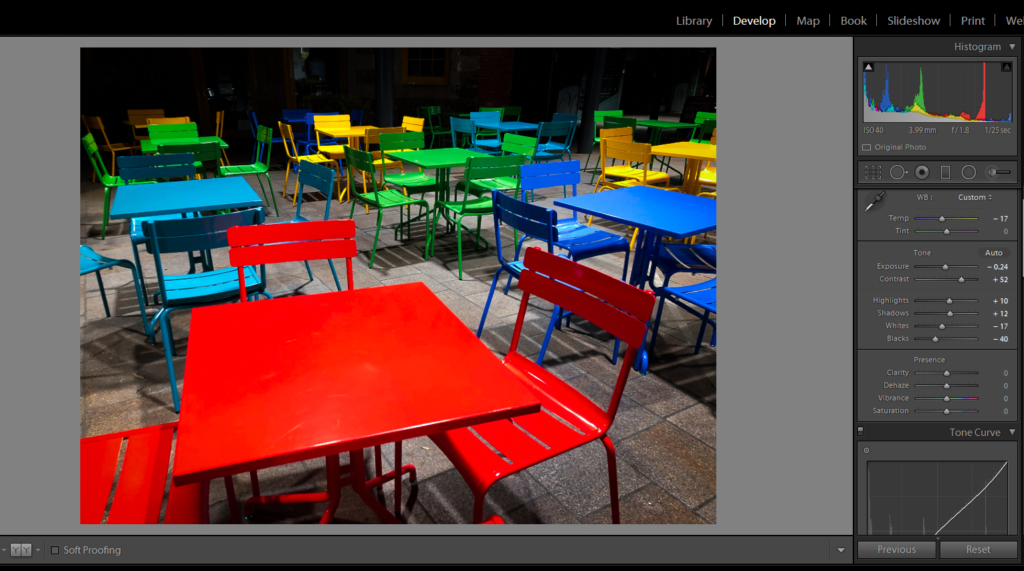
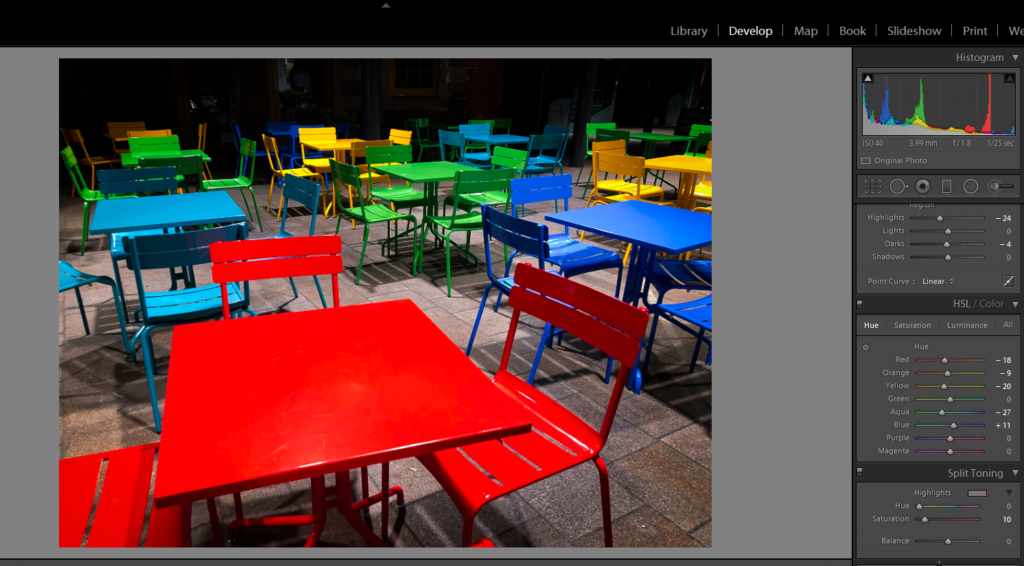
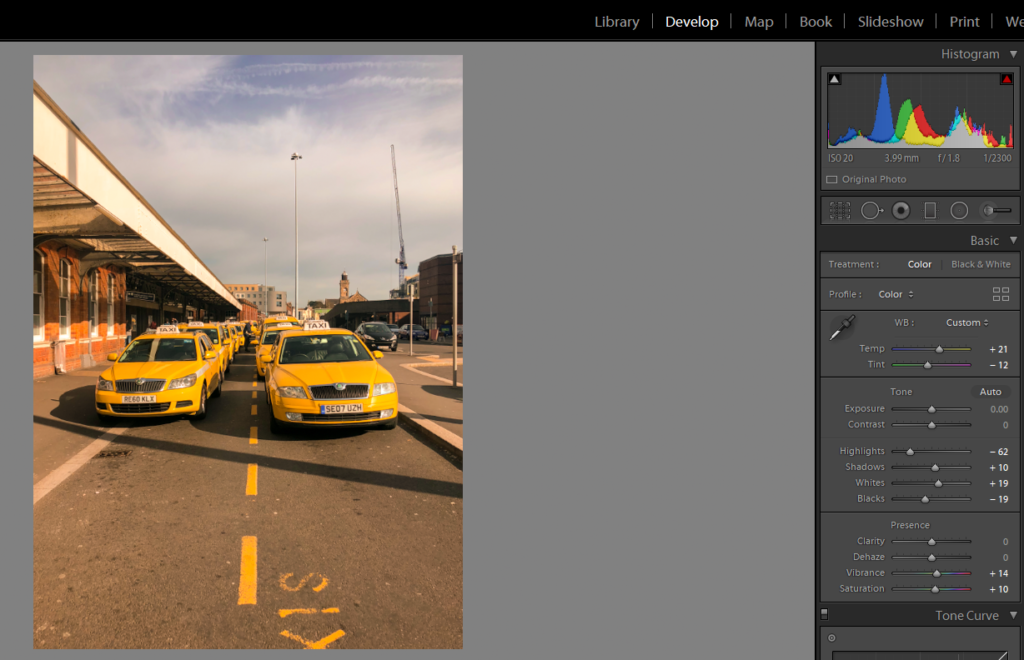
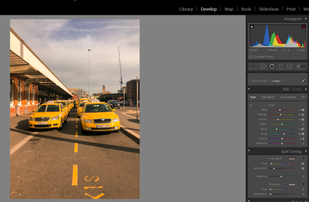
I took a relaxed approach when it came to editing and manipulating my images. This was my intention as i did not want to destroy and ruin the images that i thought were ready with minor adjustments. My process for most if not all my images was similar. I would crop the image to my desired size or no crop it at all if i think it will take away from the image. From here i would create an even balance between Dark and light tones with a slightly increased contrast. Then I would increase the vibrance and saturation of the image but not excessively. I would only increase it to give the colour a slight pop so that it stands out among other details of the image as that is my main intention for my project.

Here is the process: The Adjustment units are on the right hand side of the image. All Images Edited in Light Room


Editing Process 2

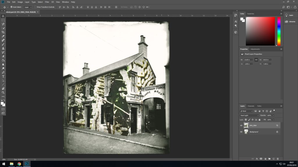
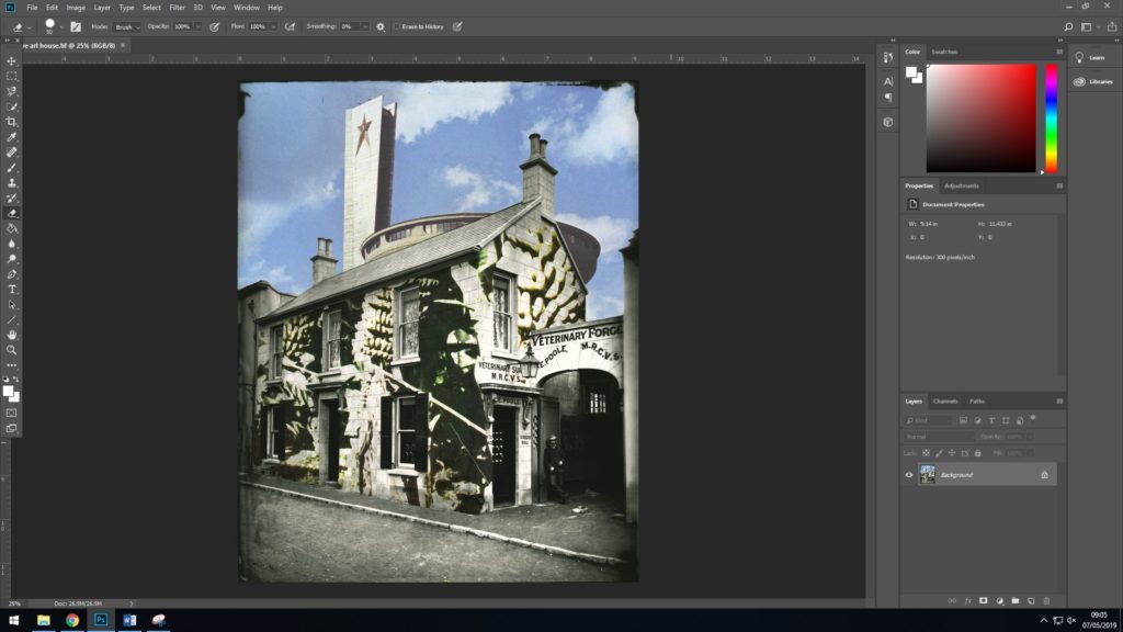
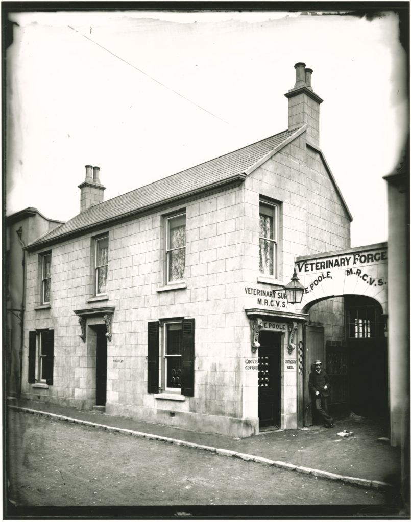
So I began this photo montage with an archival photograph which I believe depicted trade within Jersey, It is an image of a veterinary surgery taken by Francis Foot.
I then cropped the original image down so that the boarder remained with some of the tarnished edges.
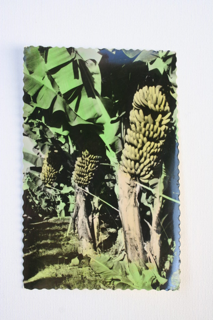
I then wanted to cover the building in the image using a photograph of a high contrast with a simple 2 colour scheme, as I believed this would give a graffiti-Esq aesthetic. So I chose this image above of a postcard of a banana farm in Madeira. This imagery would then depict the link between Jersey and the Mediterranean in terms of trade in the food industries.
Then using double exposures and blending modes I began to fix the postcard image to the archival image.
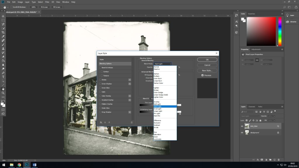
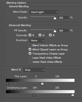
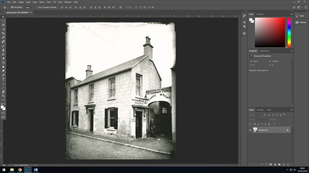
Here is how I set the blending options in Photoshop, using the ‘Hard Light’ blend mode, setting the top layer at 0/136 and the underlying layer at 104/255. This causes the top layer to lay almost perfectly within the light tones of the underlying layer.
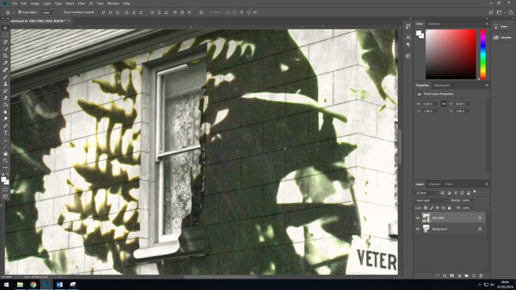
Here above is how the layers set together using the blending options which I explained. I was satisfied with how this had turned out as the aesthetic which I was going for with the bold tones had worked effectively.
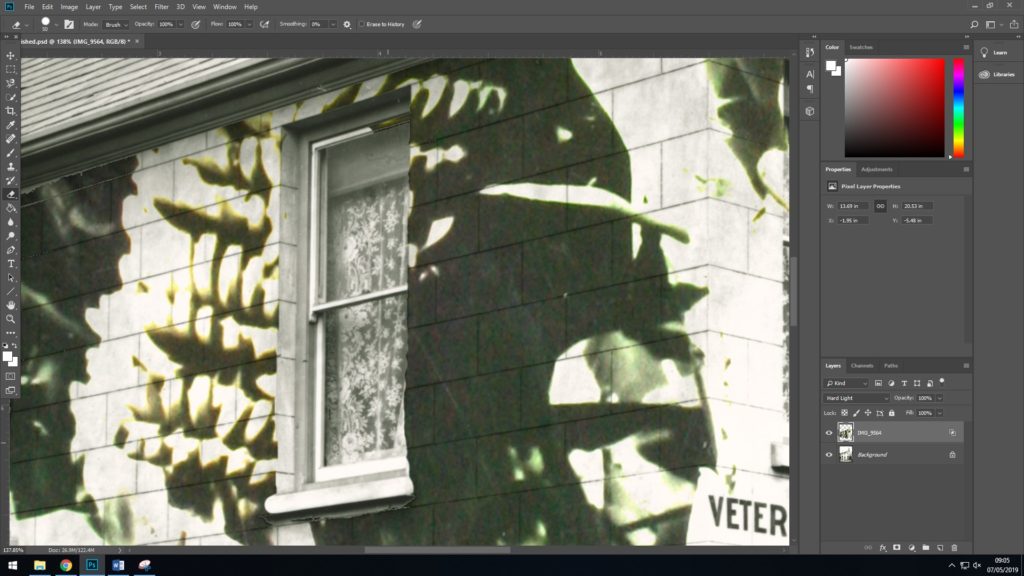
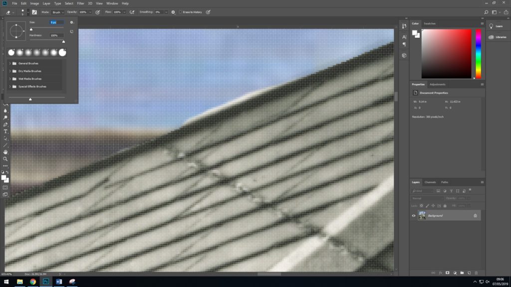
However as I said before the layers sit ”almost perfectly” but there were certain parts of the image that once scaled up didn’t look quite right. I therefore began to go round sections of the building such as window frames, the roof and where the building meets the street, rubbing out the imperfections of where the top layer overlapped too much.
As you can see here I just simply used the rubber tool in Photoshop to get rid of the sections i wasn’t happy with.
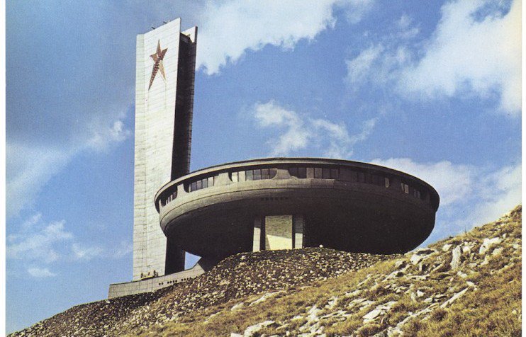
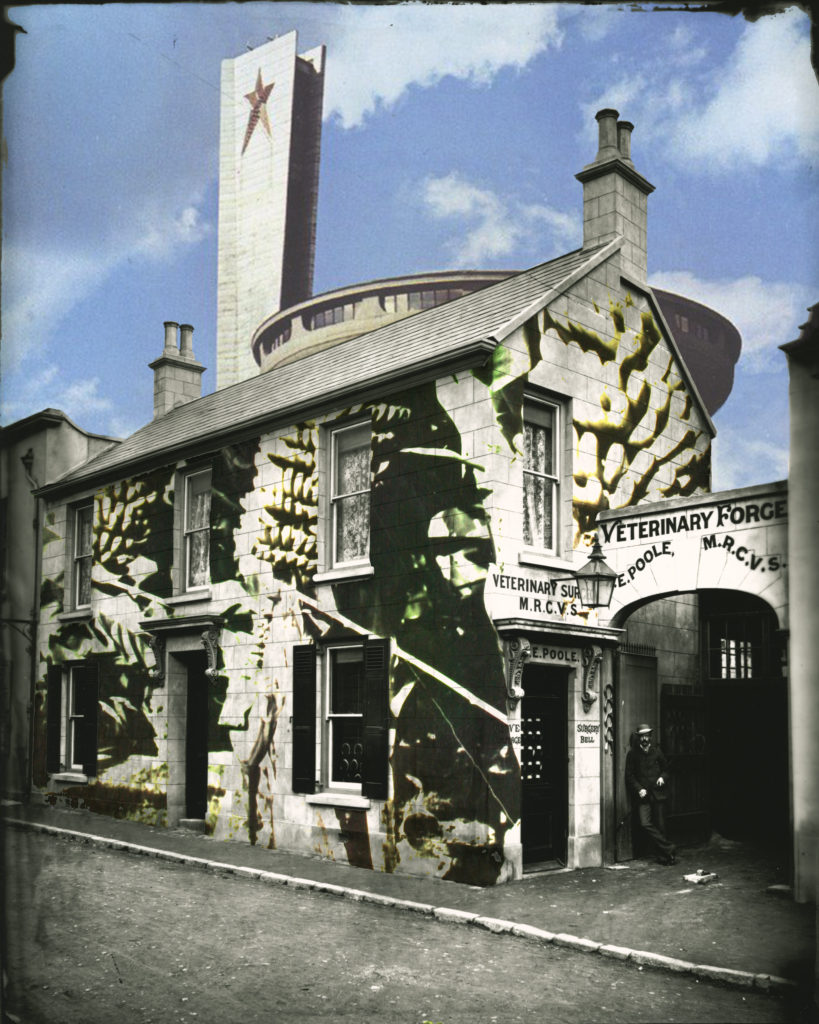
Once I was satisfied with how the first two layers came together, I thought that the piece was still lacking another element, and i was immediately drawn to the empty space left by the sky which I thought could be filled nicely by an image which incorporated a blue cloudy sky and maybe some form of a modern structure. I then looked through the postcard shoot which I did and found this image of what appears to be an army or security base, it fitted the kind of photo which I was looking to add to the piece.
In the same way as I did with the second layer I blended the army base photograph into the sky of the image so far. again I used the ‘Hard Light’ blend mode, setting the top layer at 0/136 and the underlying layer at 104/255.
However the same as with the first part of blending I did there were slight imperfections from where the image overlapped the roof of the building and the chimney as well. So again as I did before I used the eraser tool to remove any of these imperfections.
After this whole process I was very satisfied with how the piece looked and rather than adding any more elements which could over complicate the image i decided to leave it as it was. I believe that this image was very aesthetically successful as the composition is simple yet interesting with elements of chaos. Context-wise I also believe it is very successful as it subtly shows links between Jersey and the rest of the world which is what I was aiming for. I believe that this piece is successful enough to safely say that I can use it as one of my final pieces.

Shoot comparison

Shoot 1 – Although i only used one image from this first shoot, i believe that it is the most important images of all as it is what made me want to explore colour photography for my exam unit. It is one of my strongest images that supports the theme and style of variation and similarity. Compare to the other three shoots this one is the least successful due to the lack off images but i got one really strong one out of it.

Shoot 2 – This is my best and most successful shoot for what i was trying to capture and display at the end of the project. I got many of my final images from this shoot which really allowed me to open and explore. This will also help when it come to designing my photobook and experimenting with print layouts. Overall this will allow me to create a narrative sequence within my photobook.

Shoot 3 – Shoot 3 was an experimental, one off shoot. to explore colour in nature and landscape. although i thought this was a good idea i felt that none of the images would work with the images from the other shoots, so i’m deciding to leave them out. In addition, this one off experiment helped with my final shoot as it made me think about shooting under a different lighting influence and exploring colour and experimenting with new contrasts.

Shoot 4 – I believe that my 4th shoot was my second most successful shoot. I captured many of my strongest images for the project during this shoot. This shoot was different when it came to use of lighting as i shot in underexposed areas of coloured lights and objects. Unlike the other shoots, the images had a different feel to them with the new contrasts and tones. This, in my opinion is what made this shoot an overall success.

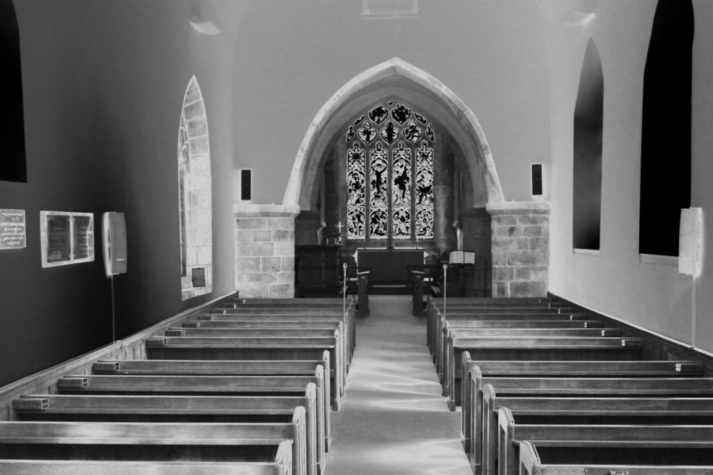
Graveyard and church shoot

contact sheet:

edits:

Analysis: This shoot had a direct narrative purpose, to show a clear evident relation to death itself. I wanted to capture an element of atmosphere throughout this shoot, accessing elements such a the surrounding area and combining this with forge-grounding and backgrounding. And many of my images were about the beginning of creation, showing nature, human life seen within a more positive manner, I thought it was necessary to get a direct presentation of the aspects of death and religion itself, but last to get images that were of a structured building and form t contradict and from a different composition than those that didn’t. Not only this but within the old church building and the dark deteriorating stone, compared to the life filled trees I was able to capture these huge contradicting colours and tones which personally I think is what makes this shoot the most successful.