Category Archives: Uncategorized

Filters

Author:
Category:

First Easter Shoot (Photo shoot 4)

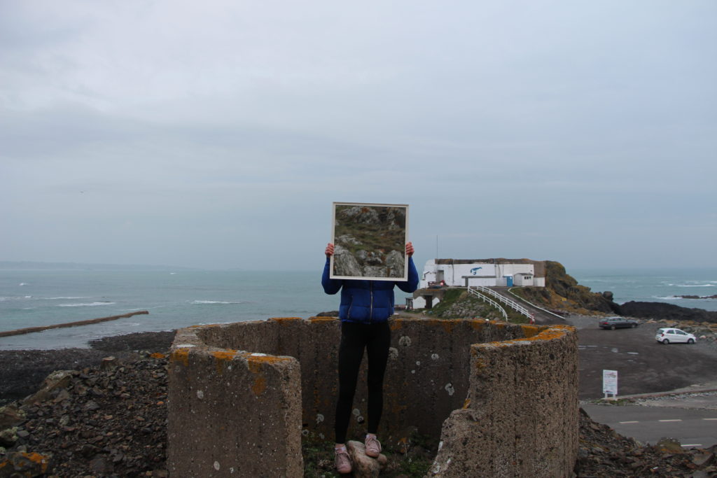
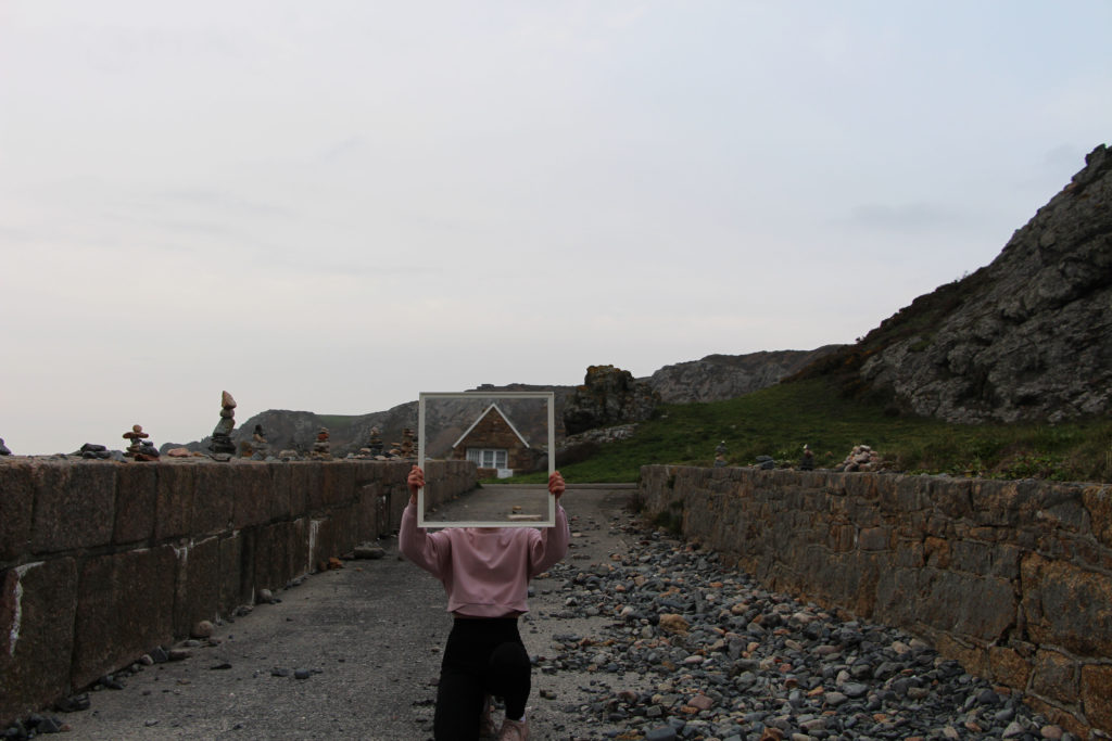
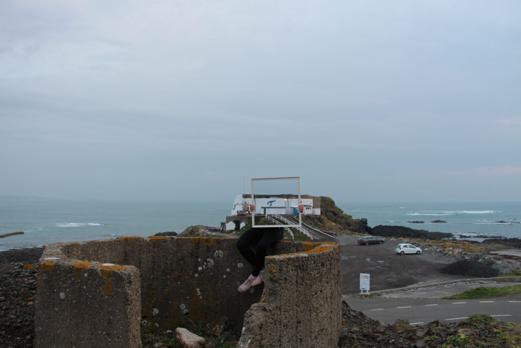
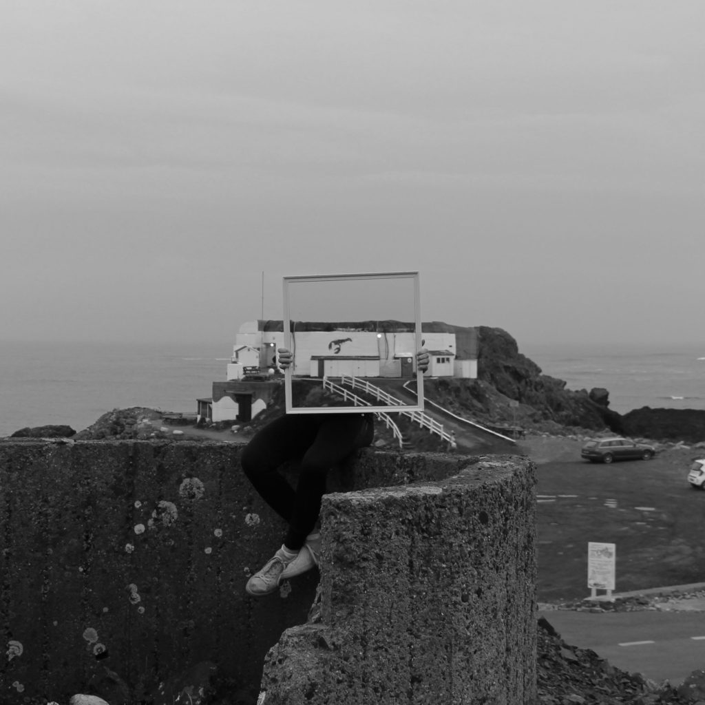
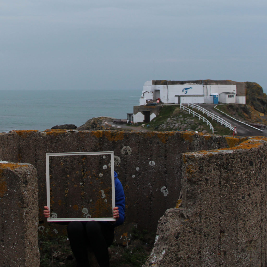
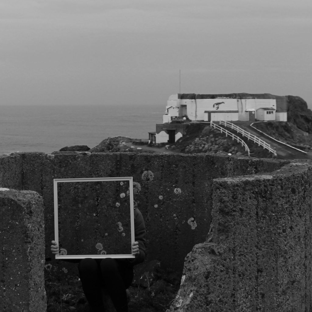
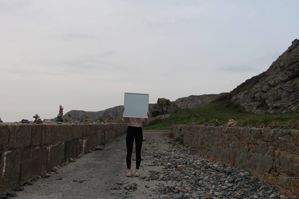
Photo shoot one For my first photo shoot I am planning to further develop my previous mirror shoot by doing a similar photo shoot be in a different location to add to this idea. For the location, I am planning to go to a beach/ rocky beach location. I am also going to try to use different size and shaped mirrors also using a model to hold the mirror. To complete the shoot I will use a tripod to make sure the photos are taken from exactly the same place each time.

This was the first photo shoot I completed over Easter to develop the idea of using a mirror as a frame. After completing and reviewing this shoot, I think in the next shoot using a mirror I should use something like an easel to hold the mirror instead of the person. This is to look the images look more professional and take attention away from the model.

Original unedited images

Edited images

ELDERLY PERSON SHOOT and edits

I wanted to do this shoot as I wanted to show a physical representation of the end of life, and show the complete evolution of what is the religious embodiment of the correct life cycle. When taking pictures for this shoot I wanted to be able to show lines and texture within the afce, and then be able to further emphasise this using the editing technique I have used all along.

When taking the images I did so in front of a window and on the setting of macro so I was able to see a clear transparent representation of the skin itself, and have the clarity of the light to further enhance the photo. I didn’t want to specifically tell her what facial expression to have or what pose, I wanted to have a more natural presentation of ageing, I allowed her to speak throughout and ensure I could show an aspect fo life still within her. As there are only two indexical representations of people within my book this being one, and the other being the boy wrapped in cloth to symbolise the coming of death and lack of identity with body and personality once you have died, I think this shoot really contrasts and also brings a sense of emotion and vulnerability.

SAMSUNG CAMERA PICTURES

Throughout this observation I wanted to make sure I took images sectioned off to different places and areas on the face itself, I then wanted to crop and accentuate the areas which had the most amount of life and obvious lines throughout. My favourite image is the first, as the dividing from black to white resembles a really interesting and successful effective of their contrast between youth and age. it too symbolises a conceptual side of deterioration and the visual representation of slipping into death itself. Overall I think this shoot was successful and a good way forward to show the life cycle of youth.

The four elements

The four elements also could be known as the Classical elements are Water, Earth, Fire and Air. These elements were proposed to explain the nature and complexity of all matter in terms of simpler substances.

However cultures have different names and different elements such as in Chinese culture. The Chinese Wu Xing system also known as Five elements, lists Wood (), Fire (火 huǒ), Earth (土 ), Metal (金 jīn), and Water (水 shuǐ), as the basic elements, this order of presentation is known as the “mutual generation. t is a fivefold conceptual scheme that many traditional Chinese fields used to explain a wide array of phenomena, from cosmic cycles to the interaction between internal organs, and from the succession of political regimes to the properties of medicinal drugs. What I liked most about the Chinese theories surrounding the elements is that each element has it own set of attributes attached to it each and holds a different value in their society. Whereas in Western cultures connections to the elements are very basic eg fire, warthm, summer, the colour red.

Wood

Wood also sometime translated to Tree. is the growing of the matter, or the matter’s growing stage.[Wood is the first phase of Wu Xing. Wood is the most yang in character of the Five elements. It stands for springtime, the east, the planet Jupiter, the color green. The color blue also represents wood .In Chinese Taoist thought, Wood attributes are considered to be strength and flexibility, as with bamboo. It is also associated with qualities of warmth, generosity, co-operation and idealism. The Wood person will be expansive, outgoing and socially conscious. The wood element is one that seeks ways to grow and expand. Wood heralds the beginning of life, springtime and buds, sensuality and fecundity. 

Fire

In Chinese philosophy, fire is the prosper of the matter, or the matter’s prosperity stage. Fire is the second phase of Wu Xing. Fire is yang in character, it relation to the Chinese philosophy of yin and yang. Its motion is upward and its energy is expansive. Fire is associated with Summer, the South, the planet Mars, the colour red, associated with extreme luck, hot weather, daylight. The element plays an important role in Chinese astrology and feng shui. Fire is included in the five elements in their yin and yang forms which combine with the 12 Chinese signs of the zodiac, to form the 60 year cycle.

Earth

Earth is considered to be the changing point of matter, it is also the third cycle in the Wu Xing cycle. Earth is a balance of both yin and yang, the feminine and masculine together. Its motion is inward and centering, and its energy is stabilizing and conserving. It is associated with the color yellow and the planet Saturn, and it lies at the center of the compass in the Chinese cosmos. It is associated with the turn of each of the four seasons and with damp weather. It governs the Spleen, Stomach, mouth and muscles. Its negative emotion is anxiety and its positive emotion is empathy. Its Primal Spirit is represented by the Yellow Dragon.

Metal

Metal is the fourth phase of the Chinese philosophy of Wu Xing, is the decline of the matter, or the matter’s decline stage.[Metal is yin in character, its motion is inwards and its energy is contracting. It is associated with the autumn, the west, old age, the planet Venus, the color white, dry weather.attributes are considered to be firmness, rigidity, persistence, strength, and determination. The metal person is controlling, ambitious, forceful, and set in their ways as metal is very strong. They are self-reliant and prefer to handle their problems alone. The metal person is also wise, business-oriented, and good at organization and stability. 

Water

In Chinese culture water is considered is the low point of the matter, or the matter’s dying or hiding stage.[Water is the fifth stage of Wu Xing, the five elements. Water is the most yin in character of the five elements. Its motion is downward and inward, and its energy is stillness and conserving. Water is associated with certain colors, with the planet Mercury, with the moon which was believed to cause the rise and fall of the tides, with night, with the north, with winter or cold weather. In Chinese Taoist thought, water is representative of intelligence and wisdom, flexibility, softness, and pliancy; however, an overabundance of the element is said to cause difficulty in choosing something and sticking to it. In the same way, water can be fluid and weak, but can also wield great power when it floods and overwhelms the land.What I found the most interesting about this system of elements is the lack of the element of air as to me this is vital element that is missing

Another element that I interested was the Indian system. In Indian culture they have a fifth element know as ‘aether/void’. Which is the material that fills the region of the universe above the terrestrial sphere. The concept of aether was used in several theories to explain several natural phenomena, such as the traveling of light and gravity. In the late 19th century, physicists postulated that aether permeated all throughout space, providing a medium through which light could travel in a vacuum, but evidence for the presence of such a medium was not found in the Michelson–Morley experiment, and this result has been interpreted as meaning that no such luminiferous aether exists. After finding out this information I wanted to challenge myself to see if I would be able to photograph the ‘void’. But how would I go about photography something that isn’t physically there. So I began to think about the connotations of what the word ‘void’ means. Below is the definition of ‘void’ if you search the word into google.

void/vɔɪd/adjective

  1. 1.not valid or legally binding.”the contract was void”synonyms:invalid, null and void, null, nullified, cancelled, revoked, rescinded, abolished, inoperative, ineffective, not binding, not in force, non-viable, useless, worthless, nugatory; More
  2. 2.completely empty.”void spaces surround the tanks”synonyms:empty, emptied, vacant, without contents, containing nothing, blank, bare, clear, free, unfilled, unoccupied, uninhabited, desolate, barren”the cathedral has vast void spaces”

noun

  1. a completely empty space.”the black void of space”synonyms:gap, empty space, space, blank space, blank, vacuum, lacuna, hole, cavity, chasm, abyss, gulf, pit, hiatus; More
  2. a suit in which a player is dealt no cards.”a hand with a singleton club is more likely than one with a void”

The main definition that sticks out to me is ‘completely empty’ I thought that I would be able to photograph this concept in two different ways. If the word is taken very literally I would experiment with taking pictures of different empty spaces, but visually I don’t think that would be very interesting. But if I took the phrase figuratively I think that I would create image that are significantly more interesting. Below is a mindmap of the connotations that I could think of connecting to the phrase.

What gave me the most inspiration was the colours of black and blue. As these colours are often connected to the feelings of sadness and emptiness. So I will try to incorporate this into my next photoshoot.
Black and White Experimentation / Image Analysis

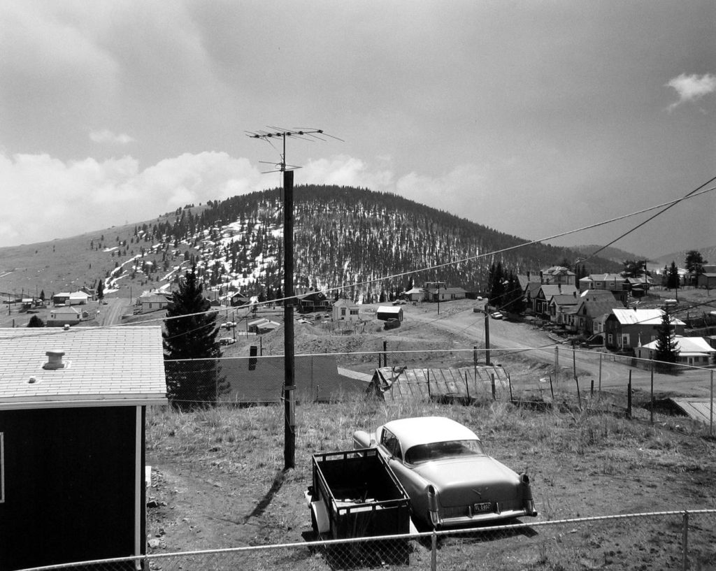
After continuously producing photo montages that are coloured I decided to do some monochromatic experiments, some completely new and some modifying montages which I have already made. I personally believe that these experiments are great in terms of how they show shape and form, as removing the element of colour allows for more focus on the simple elements of each piece. I also believe that with reference to romanticism and the new topographics, with photographers such as Ansel Adams and Robert Adams; that these pieces which I have produced give a great sense of depth and drama. Here are some examples of Romanticism/New Topographics which I am refering to…

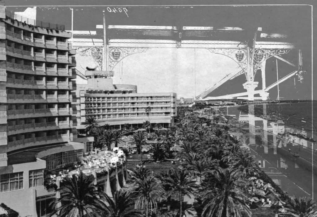
I also feel like due to the chaotic photo-montage aesthetic, that once in black and white these pieces have a sense of mystery and the unknown. Here are all of the black and white experimentation which I have done, a few of my favourite experiments are followed by a description as to why I believe they are successful…

This experiment is one of my favourites from those which I have done. This is because i believe that the shapes and forms within the image are really enhanced by the dark elements in contrast with the bright inverted sections. The shape and form within this piece its self is something which I believe works very nicely as the smooth curves of the archways balance out the sharp corners and lines of the roofs and the sectioned elements above.
This piece above is also one of my favourite outcomes from this black and white experimentation. Again I absolutely love the contrast between the dark tones at the bottom of the image and the light at the top. Another thing which stands out to me in this image is how well the empty smooth sky element of the image balances out the detailed and full section of the image lower down. The grain which i have also added to the image is something which I believe definitely benefits the overall aesthetic of the image as it gives an aged/dated visual characteristic.
Finally, this is also one of my favourite outcomes from this series of experimentation. With this image I brightened the overlaying element of the image and darkened the background, on top of this I inverted the whole piece. My intention of doing these two things was to give a ghostly and mysterious aesthetic to the figure and its surrounding objects upon a simple dark background. This worked great and my intentions were met as I believe that the visual quality i was aiming for was met once editing this image.

Consumerism Shoot- Edits

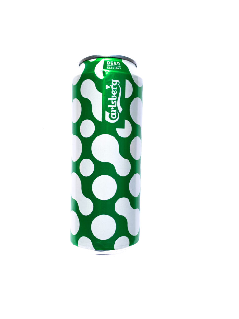
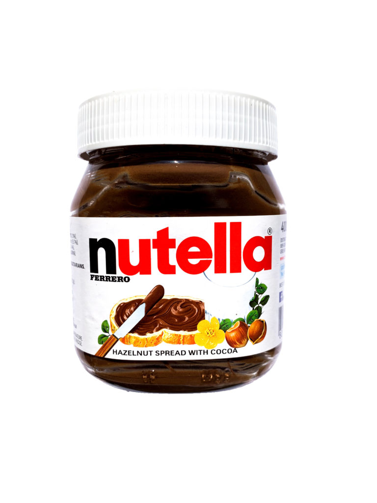
For this photoshoot I wanted to create images that would highlight how people both consume brands even when they are choosing their food and drink. In this i wanted to highlight everyday products that people may consume and make the viewer think about the brands behind the products which they may not even notice when compulsively buying these items.

For the Editing of the images I had to go back into each photograph to remove the shadows which were causing a contrast between the product and the shadow which was bringing away from the direct focus on the product. Using Photoshop I was able to remove the shadows as well as unwanted marks in the background.

TYPOLOGY EDIT :

For these images I wanted them to create a typological order and feel to the image so i had clean backgrounds so it is just focusing on the products. For these image i slightly increased the exposure to give the background a cleaner feel making the products stand out as well as increasing highlights and contrast of the images so that the detail in the images such as text or shapes stood out.

Origin of Framing in Art and Photography (Summer Shows) – Research

Salon of Art Exhibitions

Image result for salon of art exhibitions

Salon, official exhibition of art sponsored by the French government. It originated in 1667 when Louis XIV sponsored an exhibit of the works of the members of the Académie Royale de Peinture et de Sculpture.

RA Summer Show

Image result for RA summer shows

Running continuously for 250 years, the Summer Exhibition is the world’s oldest open submission exhibition – which means that anyone can enter their work to be considered for inclusion. The works in the Summer Exhibition are selected and hung by Royal Academicians – who also exhibit works in the exhibition, creating an eclectic mix of work by established artists alongside emerging talent and first-time exhibitors. In previous years, nearly two thirds of the exhibits were by non-Academicians, £50,000 worth of prices was awarded and over 5,000 works were sold.

The expeditions included lots of frames because there were so many people who wanted to show their work off and this was the best way to fill the walls with art works.

Fire Shoot

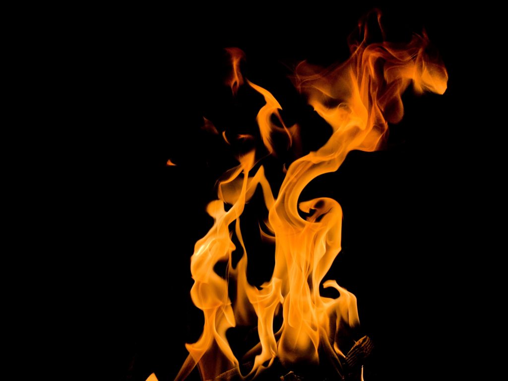
When I began this project I didn’t have any images of fire from previous shoots so I knew that this was going to be the element that I would have to work the hardest element on getting quality images. I did this shoot in my house, because the house that I live in is very old it has multiple fire places which I was able to use. What I liked about taking the image in my house meant that the fire was very small and contain because I feel that if it was any bigger I wouldn’t have been able to capture the image in a detailed way. I took these images on my Iphone once again as I would that my DLSR wasn’t able to capture the images quick enough to get the detail that was being created. I edited these image on my phone on the Lightroom app, I didn’t need to do much edited as the fire in the image was already very vibrant and sharp. The only editing that I did in post production was the increasing the levels of contrast and levels of low light in the image to isolate the the fire and reduce the visibility of the background. By doing this it increased the intensity and the colour of the fire which I think had improved the overall quality of the images greatly.


Experimentation

After editing the image from the shoot I found that the image became very repetitive and not that interesting, so I did some experimentation with the hue of the image but the image that I liked the most was the fire being monochrome.

Low Tide Vs High tide shoot comparison

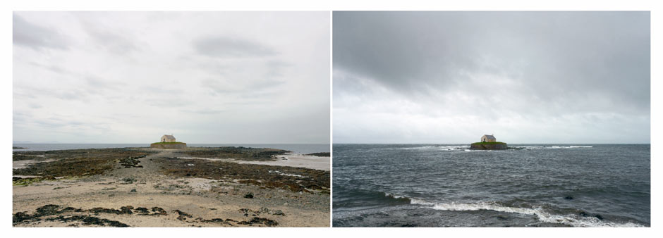
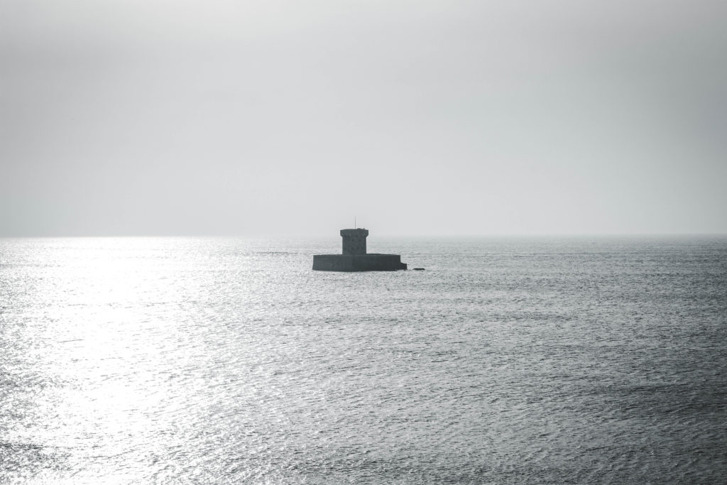
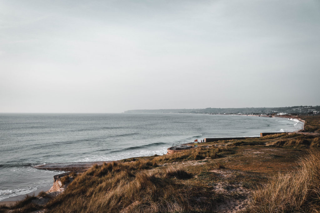
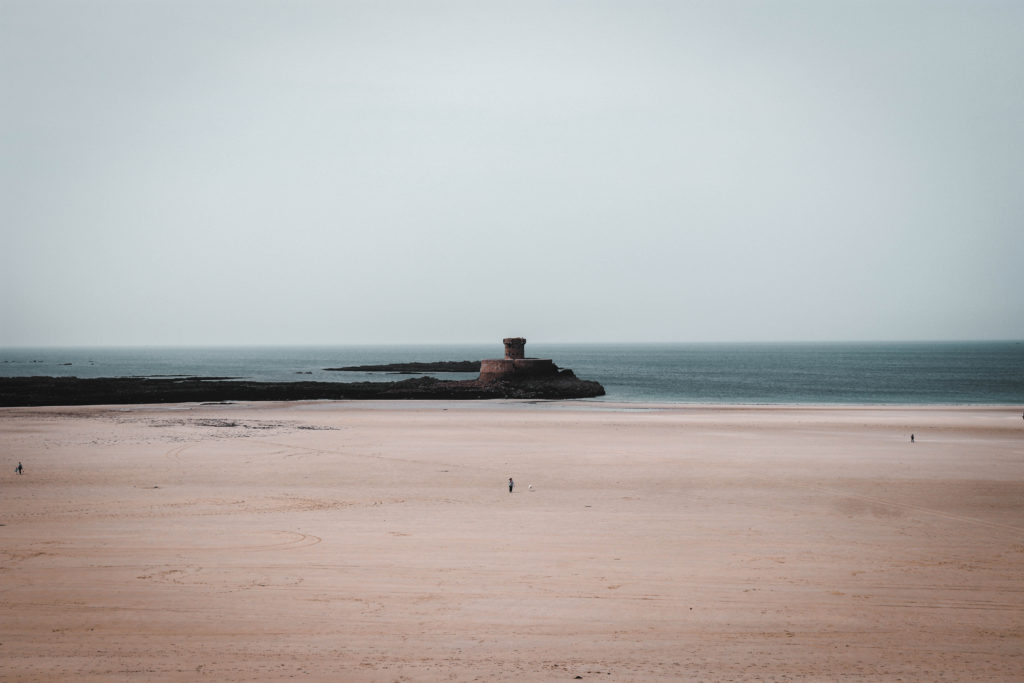
After having completed the two shoots, one at low tide and one at high tide, I wanted to directly compare the photos taken at the same spot. This allows for an easy understanding of how drastic the tidal movement is on our island. It also shows the force and power of nature which is somewhat scary to consider. This was inspired by Micheal Martens photo book ‘sea change’ which I really enjoyed when looking through it. The locations which i chose to photograph are the most commonly photographed locations in Jersey. I wanted to bring a new way of photographing these areas which would be very different from the stereotypical shots. Despite the many photographers in Jersey, I have never seen any images that contrast this tidal movement.

Comparison of work

Image result for michael martin sea change
Michael Martens Images

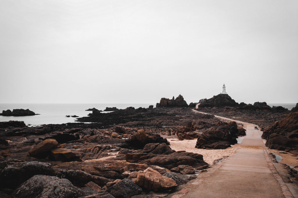
There is a clear similarity within the work that I have produced and Michael Martens too. I ensured that I had a main focal point for the viewer to look at which made the sea change more distinct and easy to see. This is also evident within Martens work where he has a building structure centered in the middle of his image. I took a slightly different route within the composition of my subject. I framed the structure to the right slightly to meet the demands of the rule of thirds which i believe is more aesthetically pleasing. Whilst Marten has a typical one third of sea and two thirds of sky i have opted for half sky and half ocean inspired by Hiroshi Sugimoto. Another difference is the way in which Marten has allowed for similar lighting within the two images where as I have portrayed the changing light throughout the day as well as the changing tide. Thus being reflected through the low tide image being mid day and the high tide image being at sunset.

High tide Shoot La Rocco and Corbiere

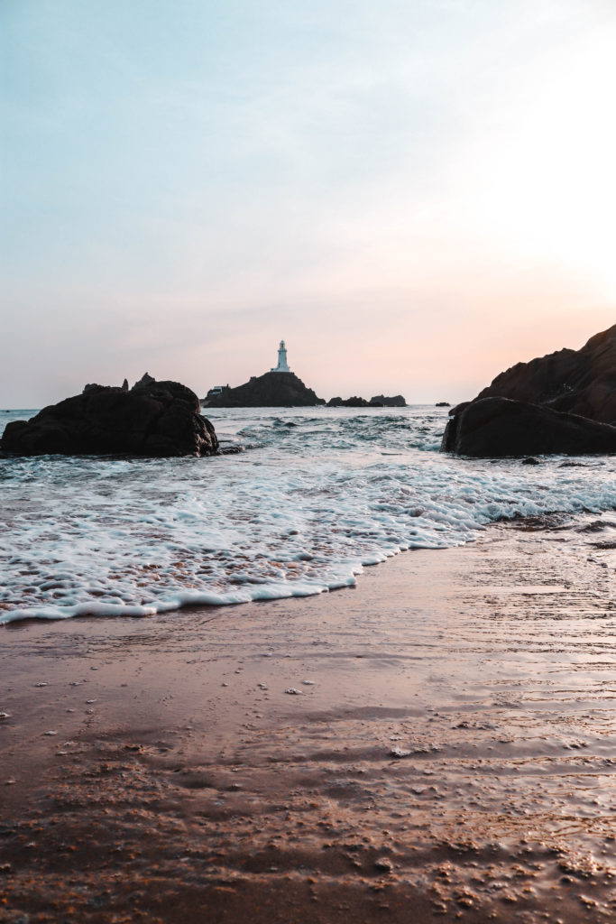
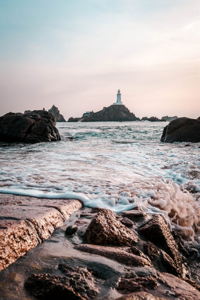
After having conducted a shoot at low tide I wanted to return at high tide to show this sense of variety within one place. Personally, I prefer high tide as I believe there is a sense of mystery about what lies beneath the surface. I think it is really interesting to imagine that there is a whole other world under there which makes me appreciate the beauty beyond just the water itself. This links to the ideas of Zen Buddhism and trying to find beauty in everything. For this shoot, I went down to the same locations as the low tide shoot to capture similar images that in post productions i could easily show a comparison.

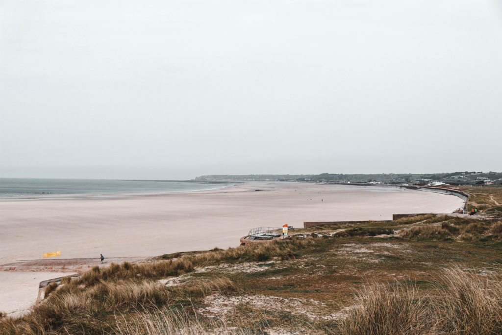
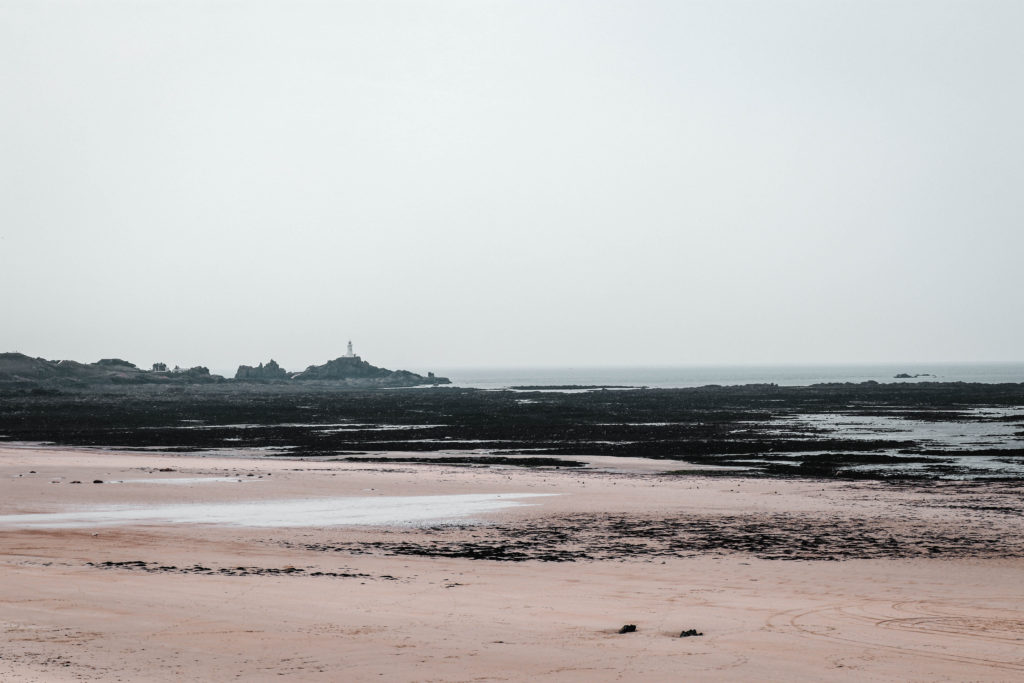
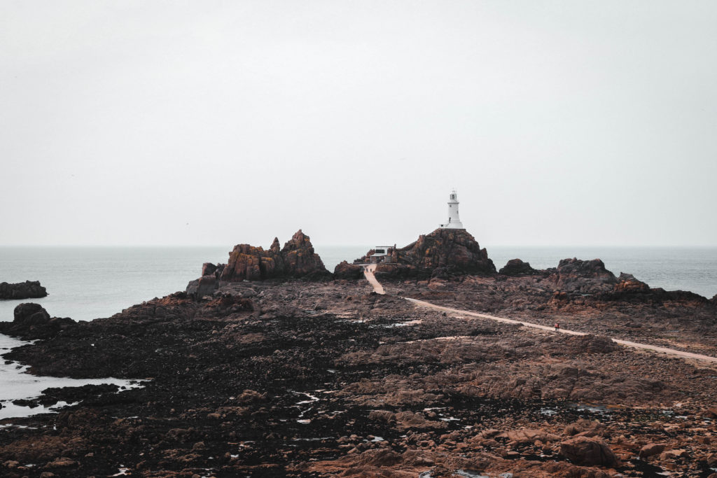
Low tide Shoot La Rocco and Corbiere

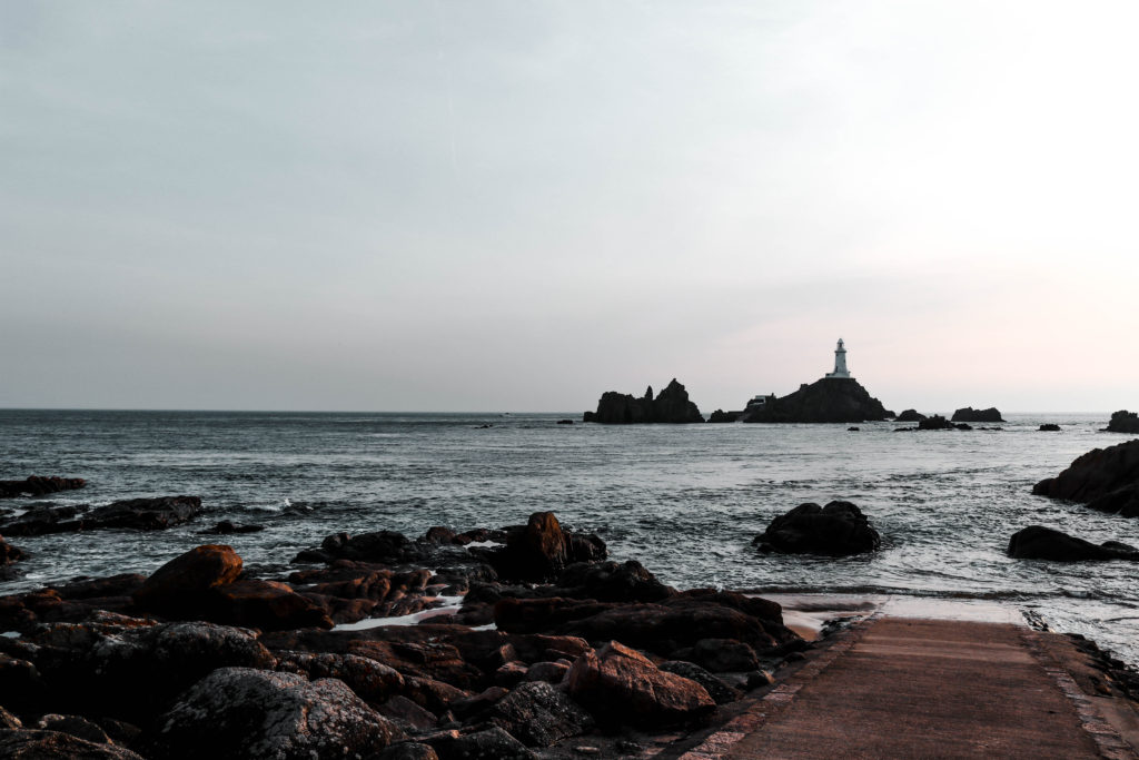
Inspired by Michael Martens project I wanted to complete a second shot displaying the large tidal movements here in Jersey. I found it very interesting how significant the sea change plays in changing the landscape causing variation within the same location. The force of nature that is present through the comparison of the low and high tide photos really intrigue me. It is oddly satisfying to see the same landscape with a different sea level which stimulates ideas in my head about the reality we are seeing. With this interest I decided to go to La Rocco and Corbiere to conduct a photo shoot at low tide.